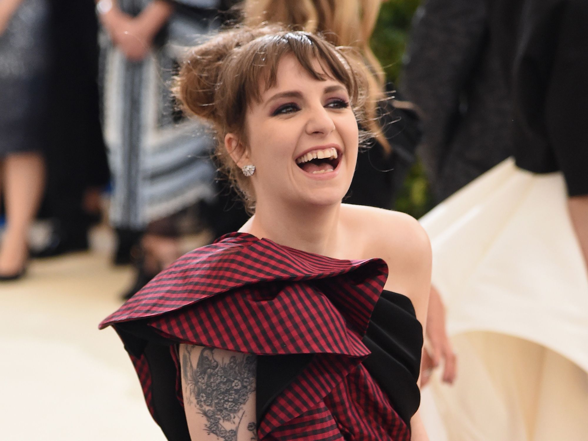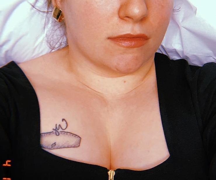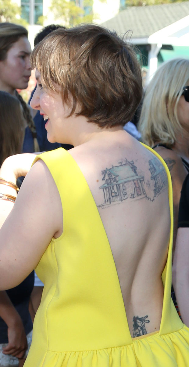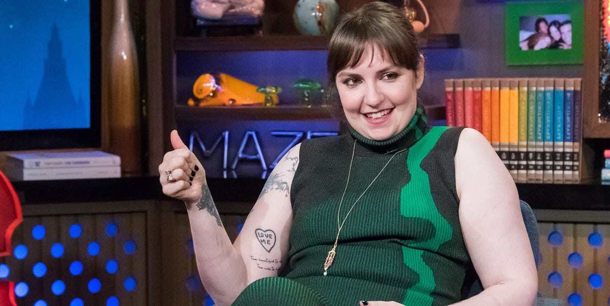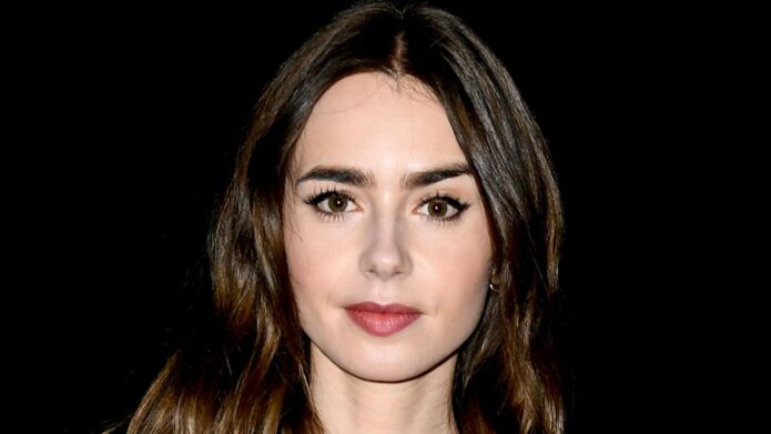
codex

Lily Collins Tattoos: Her Back Script, Rose Foot Ink and Fine-Line Details

Lily Collins tattoos have a quiet, personal feel. They are mostly fine line, easy to miss at first glance, and tied to ideas like love, family, self-belief, and growing into your own skin. The collection is not built around one huge sleeve or one loud visual theme. Instead, small placements do the work. A phrase sits below the neck, a rose follows the curve of the foot, and a little butterfly rests near the wrist.

That subtle scale is part of what makes Collins’s ink interesting. The designs are delicate, but they are not empty or random. Her back piece combines words with a small figure and floral detail. Her foot piece mixes a rose with a short line of writing. A butterfly feels like a private sketch, while the Peter Pan image adds a playful storybook note. Together, the pieces feel collected over time rather than planned as one matching set.

Photos do not explain every meaning, so it is better to stay close to what the ink actually shows. The clearest Lily Collins tattoos are romantic, readable, and placed where they can stay personal when she wants them to. They also offer useful ideas if you like small tattoos but still want each one to have a clear shape and a little room around it.

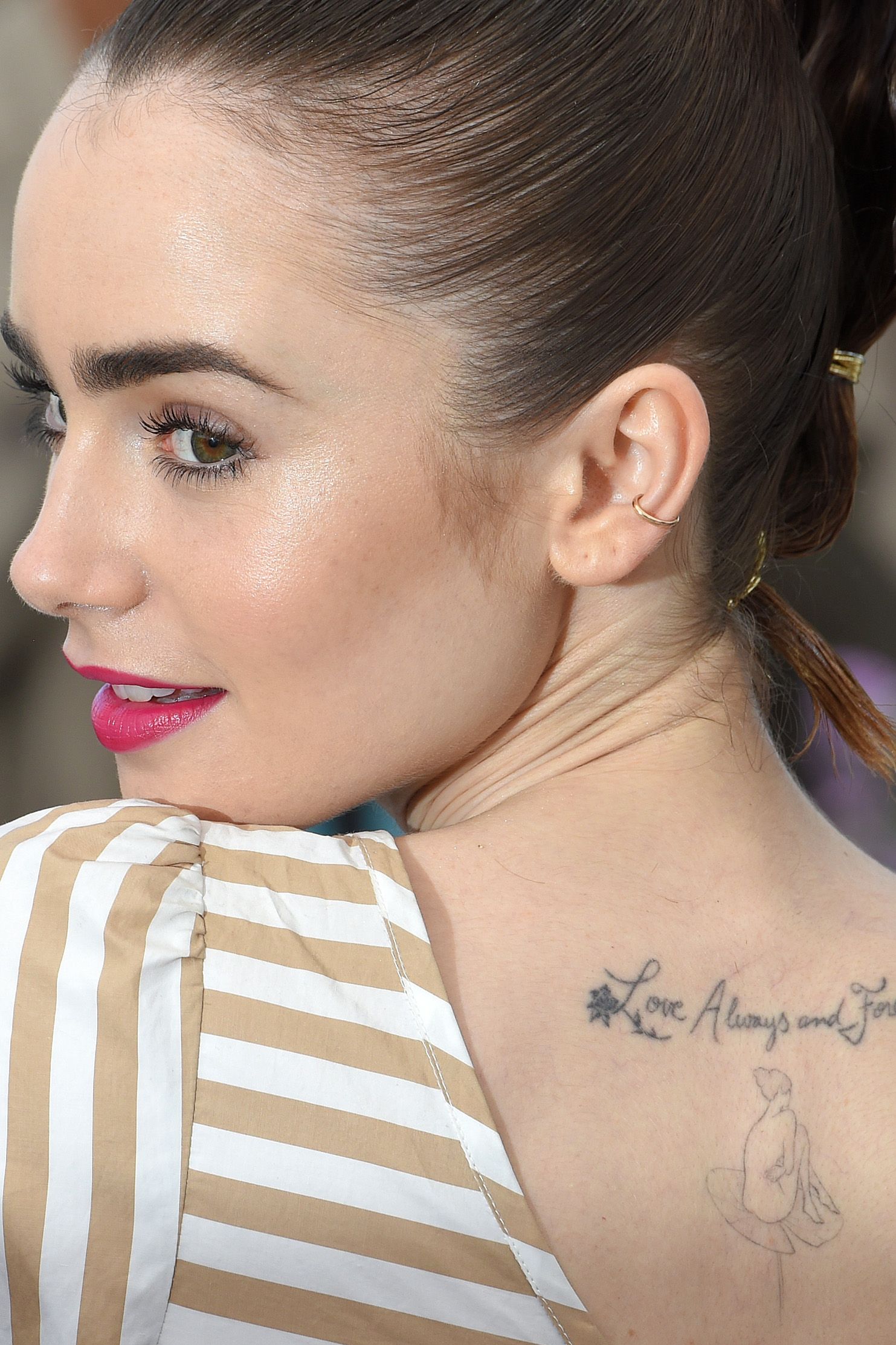
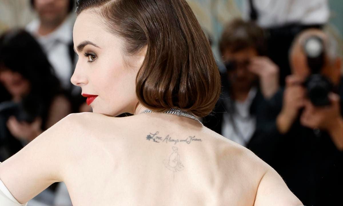
Lily Collins’s back script tattoo pairs a phrase with a delicate figure
Lily Collins tattoos: clear upper-back script and figure tattoo view

The back piece is the design most people recognise first. It sits high on the upper back, just below the neck, and starts with a small floral mark before moving into cursive lettering. The words read “Love Always and Forever.” Beneath the script is a fine-line figure seated on a lily pad, which gives the design a second focal point instead of leaving the lettering on its own.

Seen from a distance, the tattoo looks like a narrow horizontal line. A closer photograph tells a different story. The letters have a loose handwritten rhythm, while the figure below adds a little vertical movement. The design follows the natural space between the shoulder blades without trying to fill the whole back. That restraint keeps it light and makes the tattoo work with open dresses, straps, and one-shoulder tops.

The phrase has an obvious romantic tone, but the design is more than a block of text. The flower and lily imagery soften the words, and the small figure makes the tattoo feel like a scene. This is a useful lesson for anyone who wants script but does not want a plain sentence. A tiny illustration can give the lettering an anchor and stop it from looking like it was simply typed onto the skin.

Placement changes how the tattoo reads. Because it sits high on the back, Collins can show it in a red-carpet pose without making it the only thing people see. Turning one shoulder toward the camera reveals the ink gradually. It feels like a detail discovered by the viewer rather than a design that demands attention from across the room.

The best part of the back piece is the balance between words and breathing room. The script is readable, but there is enough skin around it to keep the fine lines from becoming a dark patch. If you are planning something similar, bring several type references to your artist and test the size on the actual curve of your back. A phrase that looks tiny on paper may need more height to stay clear as it ages.

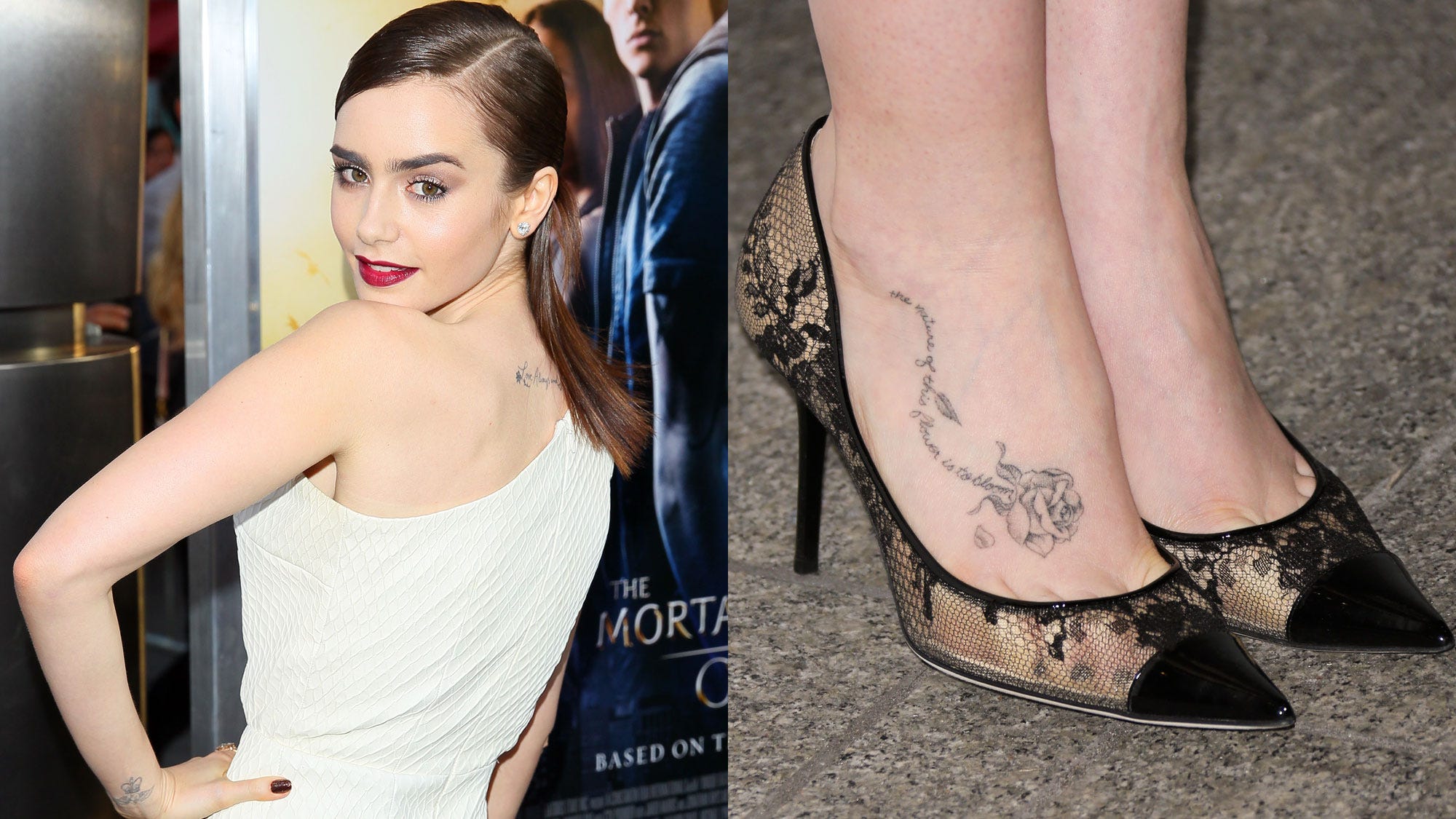
The rose on Lily Collins’s foot tattoo works with a longer line of script
Lily Collins tattoos: rose and quote tattoo on the foot

Collins’s foot piece has a classic floral feeling. A shaded rose sits across the top of the foot, with leaves and petals spreading along the skin. A line of cursive writing runs beside it and follows the shape of the flower. The tattoo is delicate, but the rose gives it enough weight to remain visible beside open shoes.

Foot tattoos can be difficult to photograph well. Straps cover parts of the design, bright carpets create harsh contrast, and the angle of a shoe can make the skin look flat. In the clearer images, you can see the outline, the soft gray shading, and the way the writing curves beneath it. The details are not perfectly heavy, which gives the piece a slightly worn-in, lived-with character.

The phrase is linked with the idea that a flower’s nature is to bloom. That wording suits the design because the rose is not shown as a single isolated icon. It has a stem, leaves, and movement around it. The image suggests growth without needing a large botanical sleeve. A small foot piece can carry that same feeling if the shape has a clear direction and the lettering is given enough space.

There is also a practical style choice here. The rose is placed where the shoe will frame it, not hide it completely. The black straps become part of the picture, almost like a border. Clothing and accessories will appear beside the ink for most of its life, so the design can be planned with those everyday details in mind.

Fine floral work looks strongest when the petals stay open and the writing is not squeezed into every gap. Collins’s piece leaves enough skin between the flower and the surrounding edges. That helps the tattoo keep its shape when the foot bends or the camera catches it at an angle. If you want similar ink, ask your artist how the design will move when you walk, stand, and point your toes.

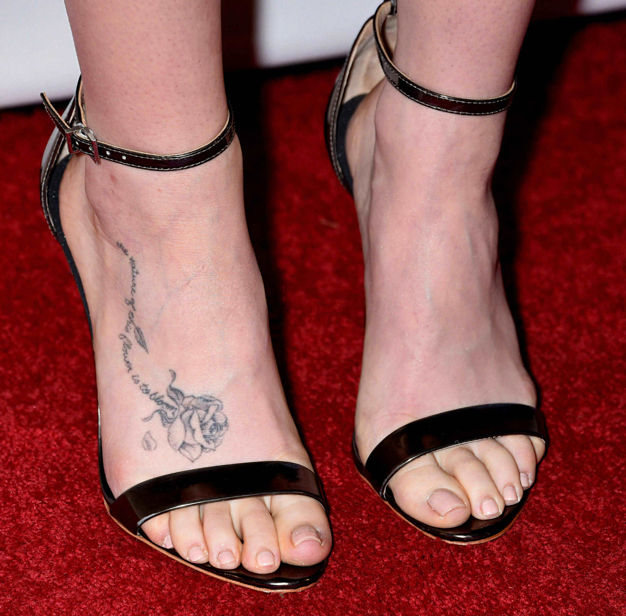
A second foot view shows the rose’s placement more clearly
Lily Collins tattoos: alternate close-up of the rose foot tattoo

Another clear foot photograph gives a closer look at the same floral work from a different angle. The rose sits on the upper side of the foot, while the script travels along the arch and toward the ankle. Seeing the piece without a full-body pose makes the placement easier to understand. It is not a tiny mark tucked beside the shoe. It has enough width to be read as one connected composition.

The close view also shows why the piece has a gentle look rather than a bold traditional one. The petals are shaded with fine gray lines instead of packed black. The lettering is narrow and slightly loose, and the small falling petal adds motion. The result feels romantic without becoming overly formal.

Using two elements together can make a small piece feel complete. A rose on its own is familiar, and a quote on its own could disappear into the skin. The combination gives both parts context. The flower carries the image, while the words give it a personal voice. That is a useful approach if you want something meaningful that still looks calm and wearable.

Foot placement needs more care than people expect. The skin rubs against socks and shoes, and fine lines can fade or soften faster than they would on a protected part of the body. A clear reference photo shows how much scale is needed. Collins’s rose is not enormous, but it is large enough for the flower and script to keep their separate shapes.

When a piece has both an image and a quote, let each part have its own lane. The rose should be recognisable before the viewer reads the words. The lettering should remain legible without cutting through the petals. That simple separation makes the whole foot look cleaner and gives the design a better chance of aging well.

The butterfly near Lily Collins’s wrist ink feels like a private little sketch
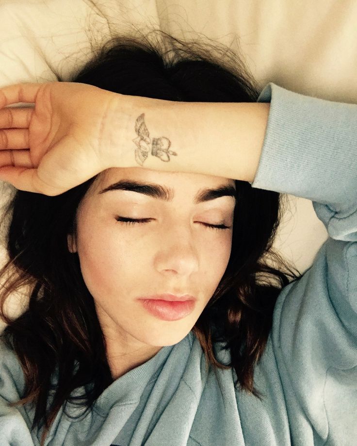
Lily Collins tattoos: fine-line butterfly wrist tattoo

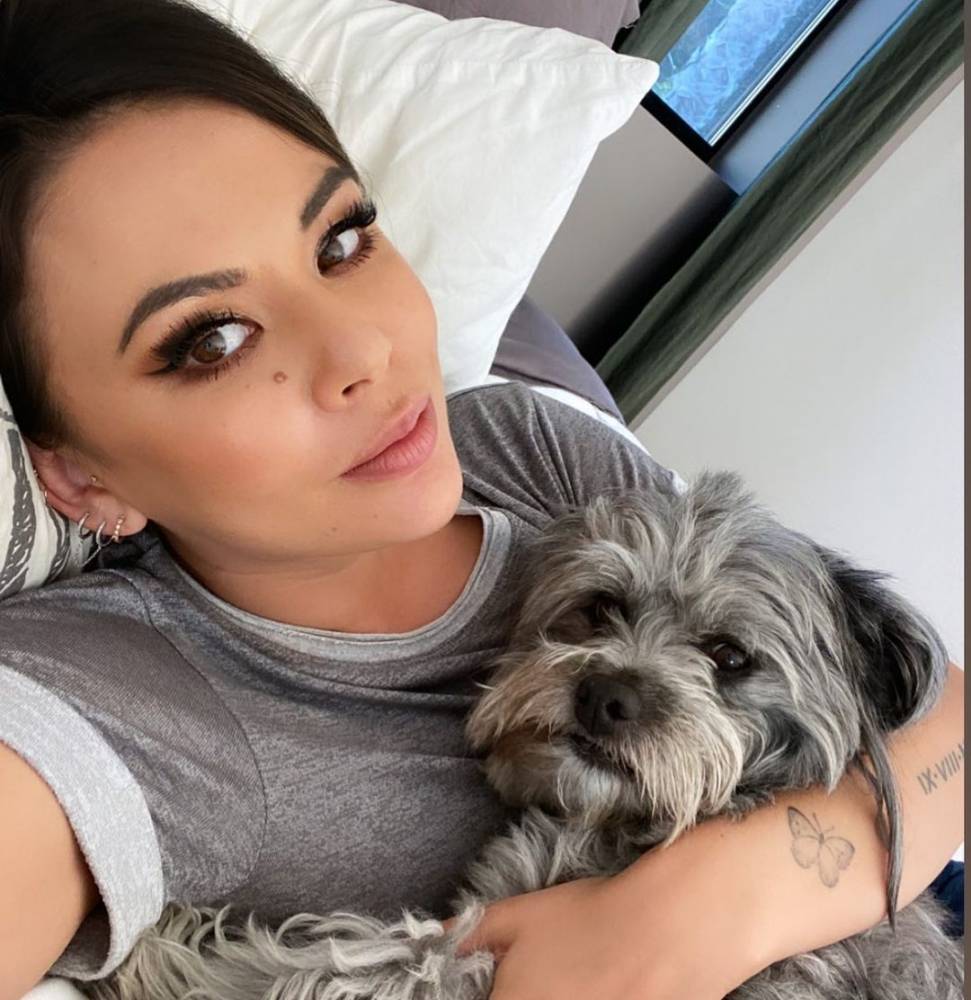
The butterfly is much smaller and more casual than the back and foot pieces. In a relaxed photograph, Collins rests her forearm across her face and the fine-line butterfly appears near the wrist. The image is simple, almost like a quick personal snapshot, which suits the scale of the mark.

Small butterflies can become generic if their outline is too heavy or their wings are packed with detail. This one keeps a light shape. The wings are readable, but the mark does not try to imitate a full natural-history illustration. It looks more like a little emblem, which is why it can sit comfortably near the hand without competing with rings, sleeves, or movement.

The wrist is useful for anyone who wants a piece they can see often. It is visible when the hand is relaxed, but it can be covered by a watch or cuff when needed. The placement makes the butterfly feel like a reminder rather than a display piece. It is close enough to the wearer to be personal, even when other people only catch a glimpse.

There is a nice contrast between this mark and the script on Collins’s back. The back piece is carefully staged in formal portraits. The butterfly shows up in a quieter, everyday frame. Both are delicate, but they work in different moods. A collection does not need every piece to have the same level of polish or visibility.

If you like the idea of a small wrist piece, keep the silhouette clear. Tiny interior shading can disappear quickly, especially on a moving joint. A clean outline, a little open skin, and a size that suits the wrist usually give the design more staying power than a miniature scene with too many details.

The Peter Pan design gives the collection a playful storybook edge
Lily Collins tattoos: Peter Pan figure tattoo on the upper back

One of Collins’s most playful pieces is a small Peter Pan figure on the upper back. The character is shown in a light, fine-line style, close to the phrase and floral details already in that area. It gives the collection a little bit of childhood wonder without changing the overall delicate look.

The figure is easy to miss because it is not a solid black silhouette. It has a soft outline and sits in open skin, so it becomes clearer when the hair or clothing moves away. That subtlety is part of its charm. It feels like an illustration tucked into the larger back area instead of a separate graphic stamped onto the body.

Storybook pieces work best when the reference is recognisable but not overloaded. Peter Pan is a strong choice because the flying pose carries the idea even at a small scale. Collins does not need a full scene with a skyline, stars, and several characters. One figure and a few fine lines are enough to suggest the story.

It also shows how an existing area can grow. The original script, flower, and figure read together as one composition. Adding a small character does not require a full redesign of the back. The newer detail can sit beside older lines as long as the scale and line weight stay compatible.

A tiny character needs clear movement more than tiny detail. When the pose is easy to understand, the piece keeps its personality even if some finer lines soften over time. That is useful for anyone considering a favourite book, film, or childhood image in a small format.

Why the collection feels balanced even though the pieces are small

The collection has a consistent mood without repeating one exact style. The back and foot pieces use delicate script and floral imagery. The butterfly keeps the wrist light. The Peter Pan figure brings in a little narrative. These choices are different enough to be interesting, but they share fine lines, open skin, and a preference for images that can be read without taking over the body.

Placement does a lot of the organising. The back pieces sit high and stay close to the centre of the body. The foot rose follows a long horizontal line created by the shoe and the arch. The butterfly stays near the hand, where it can be seen in everyday moments. Each piece has its own small stage, which stops the collection from looking crowded.

There is also a clear balance between visible and private work. A red-carpet pose can reveal the upper-back phrase, but a jacket can cover it completely. The foot rose appears with sandals and disappears under closed shoes. The wrist butterfly is visible during ordinary gestures, yet it is still small enough to feel personal. That flexibility may be part of why the pieces continue to suit different versions of Collins’s style.

The collection is a good example of how a plan can grow without becoming a full-body project. You can start with a phrase, add a flower later, then choose a tiny symbol that carries a different kind of meaning. The pieces do not need to match perfectly. They only need enough shared line quality and scale to sit comfortably beside one another.

Small pieces work best when the idea is specific and the artwork is allowed to stay simple. Collins’s ink shows that a short phrase, a rose, a butterfly, or a storybook figure can carry real personality when the placement is chosen carefully. The goal is not to fill space. It is to give each piece enough room to be itself.

Planning a small idea with the same calm feeling

If you like this look, begin with the story rather than the picture. Decide whether you want a phrase, a flower, a symbol, or a character. Then think about the body area and how often you want to see it. A wrist piece can act as a daily reminder. A back piece can stay more private. A foot piece can work with your shoes and change when you move.

Use reference photos that show the actual skin and placement, not just a cleaned-up drawing. Fine-line work needs realistic sizing. The phrase might look elegant on a screen but become unreadable if it is reduced too far. The rose might need more space between its petals than you expect. Your artist can adjust the drawing so it remains clear after healing.

It is also worth leaving room for the collection to change. Collins’s pieces show how a small illustration can be added beside older lettering without making the area feel overloaded. You do not have to plan every future piece today. Choose a strong first design, protect the surrounding skin, and let later ideas arrive when they make sense.

Delicate does not mean disposable. Fine-line work still needs thoughtful placement, careful aftercare, and realistic expectations about fading. Shoes, sun, friction, and moving joints all affect how ink settles. The quiet look works because the pieces are clear, not because they are careless.

Watch Lily Collins talk about her style and creative work

Collins’s interviews offer a little extra context for the thoughtful, detail-focused style that also comes through in her body art.
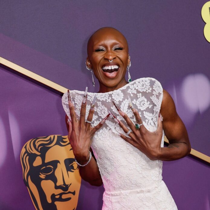
Cynthia Erivo Tattoos: Her Back, Arm, Chest and Wicked Ink

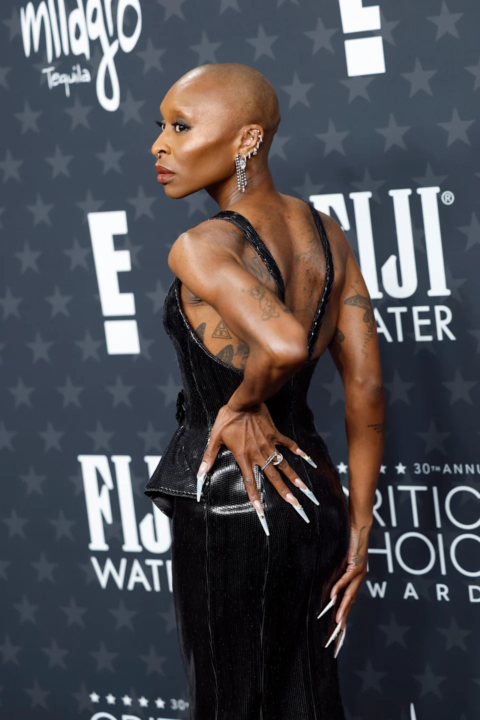
Cynthia Erivo tattoos are a big part of her personal style. They show up when she wears a backless gown, when a close portrait catches her forearms, and when she turns toward a red carpet camera with her shoulders uncovered. Her collection is not built around one tidy theme. It moves from delicate hearts and fine-line flowers to darker, fuller pieces that cover the back and arms.

That mix is what makes Erivo’s ink fun to look at. Some designs are easy to read in a quick photo, while others need a closer view. The back pieces have an almost sketchbook quality, with portraits, symbols, and loose shading sitting together. Her arm work is denser and more detailed. Then there are the small tattoos that feel personal, like the three hearts at the center of her chest and the matching hand designs connected to For Good.

Erivo has also spoken about tattoos connected to her friendship with Ariana Grande and their time making Wicked. The matching poppy designs refer to the poppy fields in the story, while the words “For Good” connect the ink to the film’s central friendship. Those newer pieces sit alongside older tattoos linked to music, family, and the people who have shaped her life. Here is a closer look at the designs that are easiest to spot.

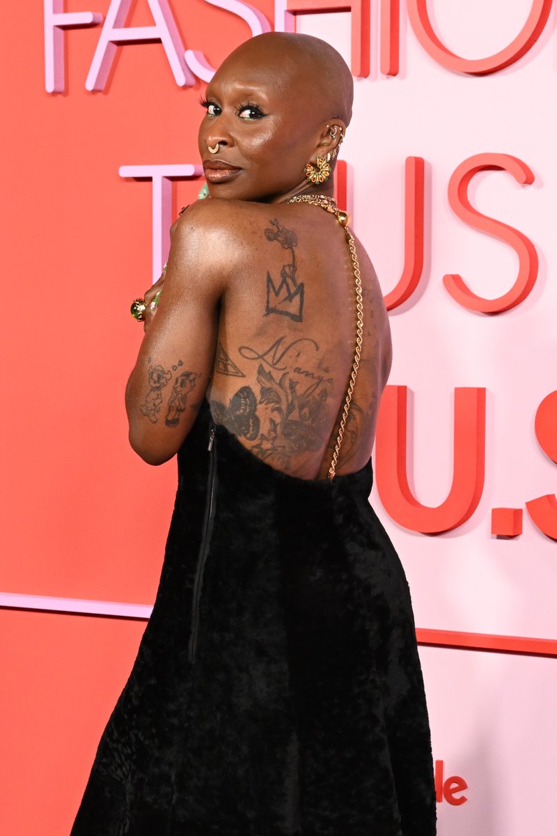
Cynthia Erivo’s back tattoo collection is packed with layered line work

Cynthia Erivo tattoo image 1

The clearest look at Cynthia Erivo’s tattoos comes from the back. With her shoulders uncovered, you can see that the space is filled with several separate designs rather than one simple central picture. A large shaded composition runs down the middle of her back, while smaller marks sit around it and flow toward her ribs. The result feels busy, but the different weights of the lines keep it from looking flat.

There is a soft portrait quality to some of the shading, especially around the middle of the back. Other parts are much more graphic, using strong outlines and compact blocks of dark ink. That contrast gives the collection movement. Your eye can travel from a light, open section near the shoulder to a heavier patch lower down, then back toward the small symbols along the sides.

The placement is important, too. A back tattoo can disappear under a shirt for most of the day, then become the focus of an entire look when the neckline drops. Erivo often uses that reveal in a way that feels deliberate. The ink does not seem added just to decorate a dress. It changes the mood of the outfit and gives a polished red-carpet look a much more personal edge.

Her shoulder and upper-arm tattoos mix flowers with personal symbols

Cynthia Erivo tattoo image 2

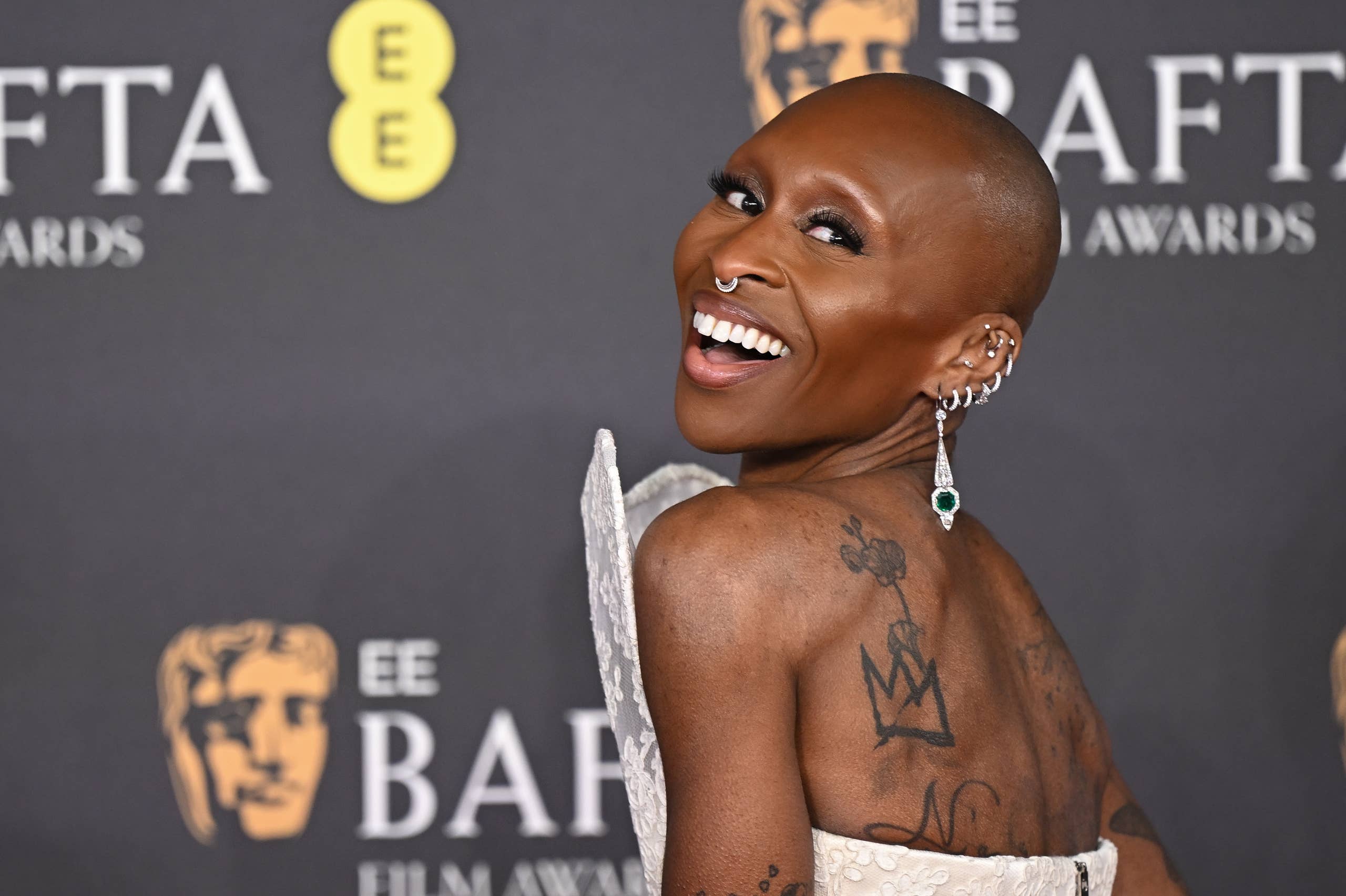
A second view shows how the back work connects to the shoulders and upper arms. On one shoulder, a small outlined symbol sits above a larger flowing design. Farther down the arm, there are bands, shapes, and shaded details that look different from the softer work across the back. The collection reads like it grew over time, with each new tattoo allowed to keep its own style.

The upper-arm placement also makes the designs easy to frame with clothing. A sleeveless top can show the shoulder pieces without revealing the whole back. A halter dress can expose the shoulder line while leaving the lower work hidden. That gives Erivo plenty of control over how much of the collection is visible at any one time.

What stands out most is the way she mixes open skin with detailed ink. The tattoos are not packed into every available inch. There are gaps around the symbols, and those gaps help the individual shapes stay readable. If you like the look of a tattooed shoulder but do not want a solid blackout effect, this kind of spacing is a useful idea to keep in mind.

The forearm tattoos show Erivo’s most detailed fine-line work

Cynthia Erivo tattoo image 3

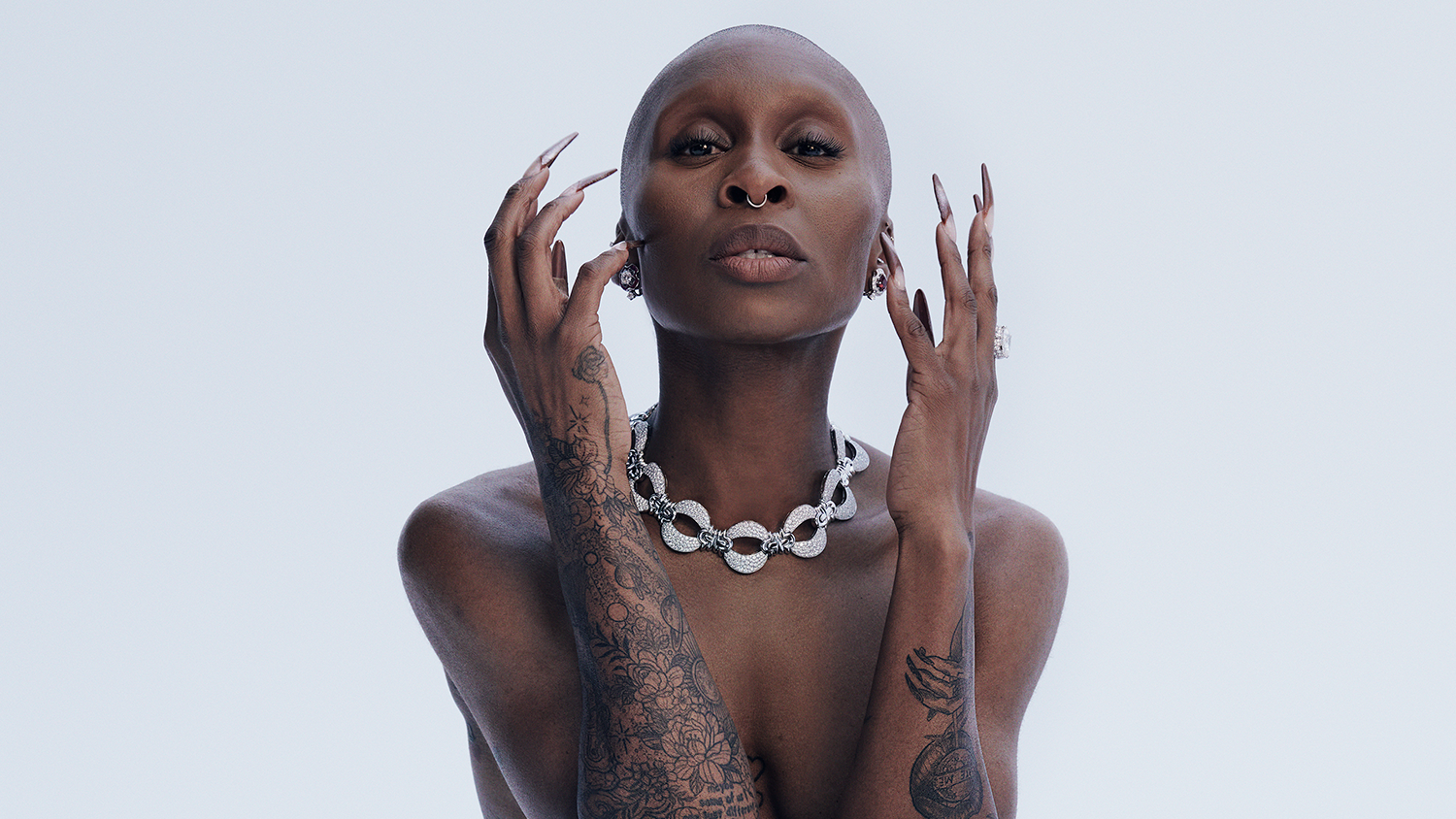
Close-up portraits bring the forearms into focus. One arm carries a dense mix of flowers, leaves, circles, and fine outlines. The pattern has the feel of a botanical sleeve, but it is not completely uniform. Some sections are tightly shaded, while others leave more breathing room around the line work. That change in pace makes the piece look handmade instead of stamped on.

The other forearm has darker shapes and a few more solid areas. Together, the arms create a nice balance: one side feels delicate and illustrative, and the other has a bolder graphic quality. This is one of the strongest parts of Erivo’s collection because it shows how two different tattoo approaches can sit on the same person without competing.

Her arm tattoos also connect to the way she presents herself as a performer. She works with strong gestures and dramatic clothes, so the ink becomes part of the movement. When her hands frame her face or rest near her shoulders, the lines on her arms extend that pose. The tattoos are not static decoration in those photos. They help direct the eye and add another layer to the image.

Some coverage has connected Erivo’s body art to musical influences, including Billie Holiday and Nina Simone. It is best to be careful with exact design identifications unless the image makes them clear, but the larger point is easy to see: music sits close to her personal sense of style. The mix of portraits, flowers, and symbols feels thoughtful without looking overly planned.

Three small heart tattoos sit in the center of her chest

Cynthia Erivo tattoo image 4

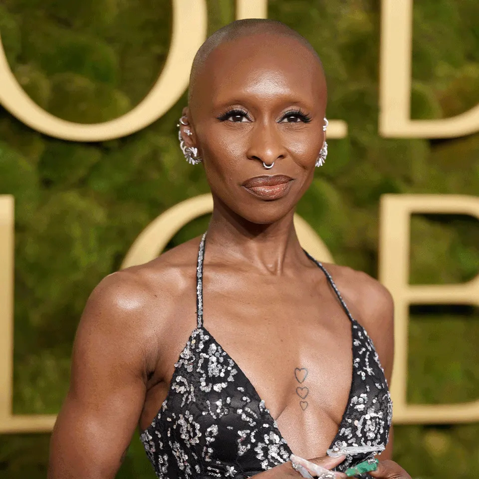
The three heart tattoos on Cynthia Erivo’s chest are much smaller than the work on her back and arms, but they may be the easiest designs to copy as inspiration. They sit in a vertical row down the center of her chest, with the hearts getting slightly smaller as they move downward. The outlines are light, clean, and simple.

This kind of placement changes the usual heart tattoo idea. Instead of one large heart over the breast or a tiny heart hidden near the collarbone, the three shapes create a narrow line that follows the center of the body. The arrangement feels balanced, and it works well with a deep neckline because the tattoo stays visible without taking over the look.

The design is also a good example of how scale can change the feeling of a tattoo. Erivo’s back pieces are dramatic because of their size and texture. The chest hearts are quiet. They do not need heavy shading or extra decoration to stand out. If you prefer small tattoos, repeating one simple shape in a slightly changing scale can give the design a little more personality.

A second red-carpet angle shows how her back tattoos flow into the shoulders

Cynthia Erivo tattoo image 5

This second red-carpet angle makes the connection between Erivo’s upper back and shoulders easier to see. The lines do not stop neatly at one body zone. They travel across the shoulder blades and continue toward the arms, which gives the collection a natural sense of movement. A design can feel much larger when it follows the shape of the body instead of sitting inside one small rectangle.

That same sense of movement helps explain why the shoulder work looks good from different angles. From behind, the central back composition is the focus. From the side, smaller marks on the shoulder and upper arm come forward. It is a useful reminder that placement is not only about the front view. A good tattoo can change shape as the body turns.

Erivo’s newer matching hand tattoos with Ariana Grande still add a personal Wicked chapter to the wider collection. The poppy flowers refer to the story, and the words For Good connect the ink to their friendship and the duet. Those designs are smaller and more openly symbolic than the older back work, but they fit the same idea of using tattoos to mark a meaningful chapter.

There is a practical point here as well. Hands are exposed, move constantly, and can be difficult places for fine lines to stay crisp. Anyone thinking about a similar tattoo should take the placement seriously and talk through touch-ups, daily wear, and how much visibility they really want. The appeal is obvious, but it is not a hidden spot.

Why her mix of styles works so well

Across the collection, the strongest pattern is contrast. Erivo has large pieces and tiny pieces, soft floral line work and heavy black shapes, tattoos that disappear under clothing and tattoos that sit in plain view. That variety keeps the collection from feeling like a single trend.

Her placement choices are just as interesting as the designs. The back gives her room for larger ideas. The arms let detailed work move with her gestures. The chest hearts create a small center point, while the hand tattoos make a shared memory visible. Each area has a different job, and the collection feels more personal because the designs are not all trying to do the same thing.

If you are collecting ideas from Cynthia Erivo tattoos, start with the part of her style that actually fits you. Maybe that is the clean simplicity of the three hearts. Maybe it is the open spacing around her shoulder work, or the fine-line botanical feeling in her forearms. You do not need to copy the whole collection. A strong placement and a design with a reason behind it can be enough.

What makes her ink memorable is that it feels lived in. The tattoos work with her clothes, her stage presence, and the different parts of her story. Some are bold enough for a red carpet reveal. Others stay quiet until a close photograph catches them. That balance gives the collection its own rhythm, and it is why Cynthia Erivo’s tattoos continue to stand out whenever she lets the camera see them.

Katie Price Tattoos: Her Back Wings, Floral Ink and Leg Designs

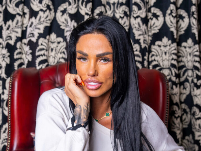
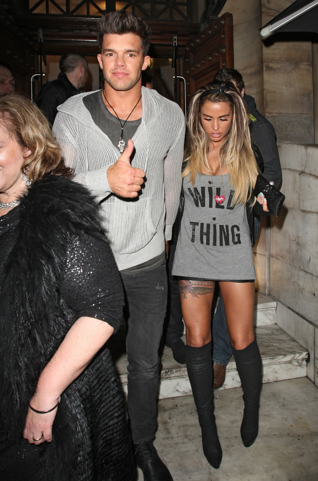
Katie Price tattoos are hard to miss. Her collection moves across her back, arms, stomach, thighs, and wrists, with each area carrying a different kind of design. There are huge feathered wings, floral work that wraps around the body, script, bracelets, and pieces tied to people and moments in her life. The overall look is bold, busy, and very personal.

Price has never treated tattoos like tiny finishing touches. She often chooses designs that can be seen from across a room, then builds around them with smaller details. Her latest back work is a good example. The angel wings stretch over the shoulder blades and down toward the waist, changing the whole shape of her back. Elsewhere, a horse, flowers, and eagle-style wings create a separate composition around the stomach and thighs.

Some of her ink has changed over time. The phrase “tattoo transformation” fits that evolving story better than a fixed snapshot. Names and relationship tattoos have been covered, altered, or joined by newer work. That makes the collection interesting because it looks lived in rather than frozen at one moment. Here is a closer look at the pieces that stand out most in clear photos.

Katie Price’s giant angel-wing back tattoo is the main statement

Katie Price tattoos: large angel-wing back tattoo across the shoulder blades

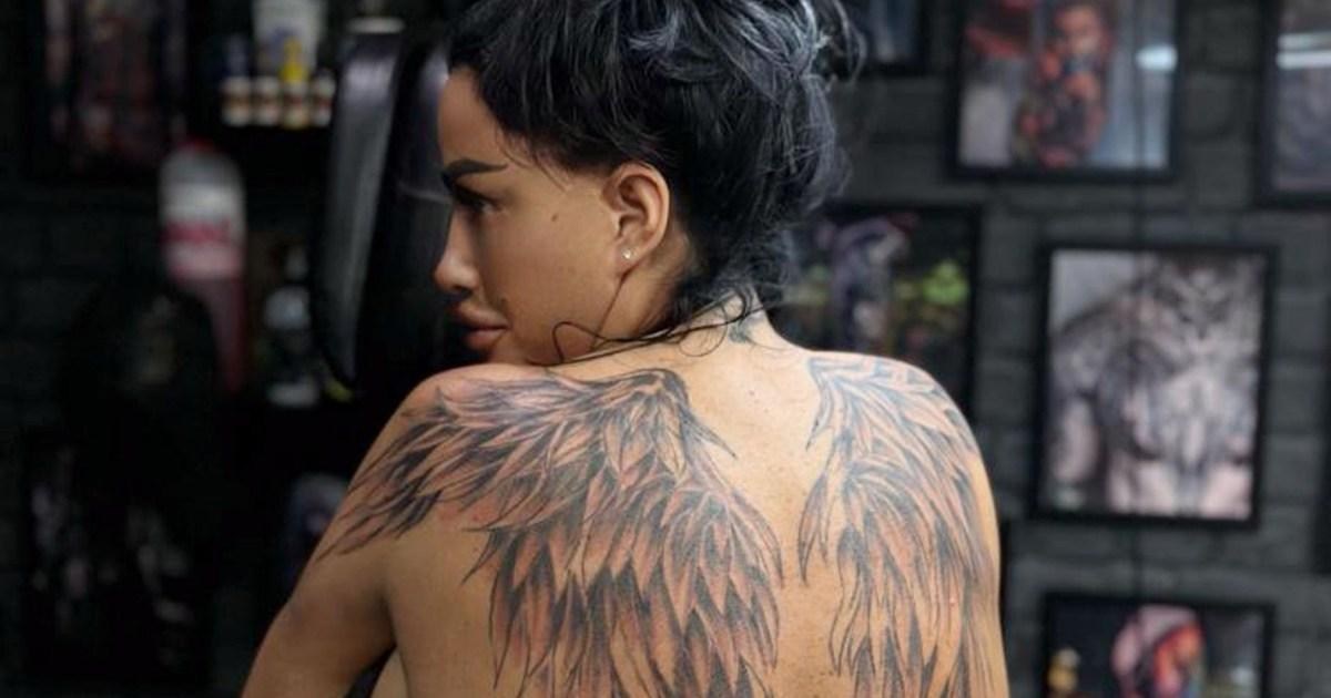
The newest and most dramatic part of Katie Price’s tattoos is the large pair of angel wings across her back. The feathers begin high on the shoulders and spread outward before narrowing as they move down the spine. In photos, the wings look soft at the edges but darker through the middle, giving them a layered, almost shaded-pencil effect.

This is a design that changes the way the body reads. A small back tattoo usually acts like one detail on the skin. These wings become the skin’s main shape. They widen the shoulders, draw the eye toward the center of the back, and create a strong outline under a crop top or a dress with an open back.

Price has also shown the piece while it was still fresh, when the ink looked darker and the skin around it was still settling. That early stage makes the feather structure easy to study. Each feather has its own direction, but the sections overlap enough to make the wings feel connected. The design does not depend on a simple solid outline. It gets its size from many smaller marks working together.

Angel wings are a popular tattoo idea, but the scale makes this version different. The larger the wings become, the more important the shoulder blades, spine, and lower back are to the design. Anyone thinking about a similar piece needs an artist who can keep the feather flow balanced on both sides. A small mismatch can become obvious when the design spans the whole back.

Her older back and shoulder ink shows a layered layout

Katie Price tattoos: second angle showing layered feather and shoulder placement

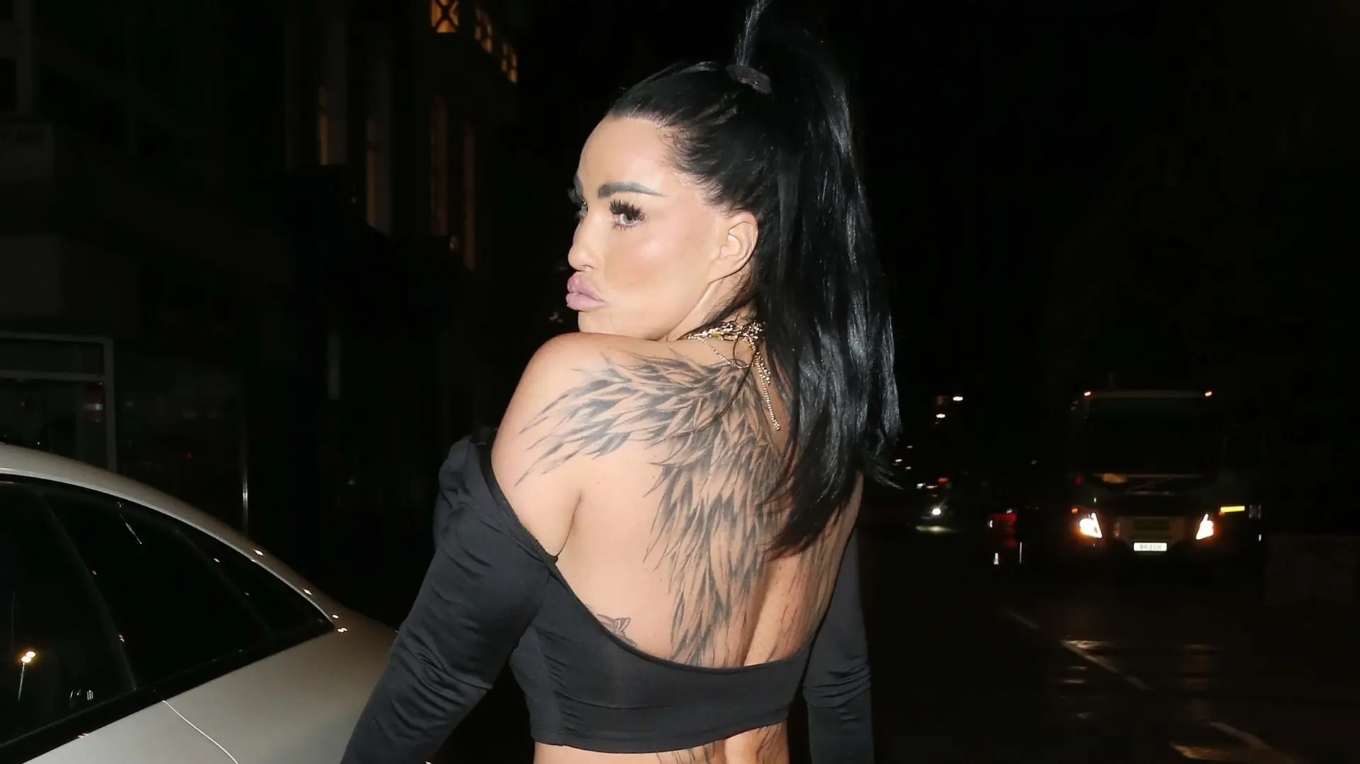
A second photo shows the back wings from a different angle and makes the layered placement easier to see. The feather shapes do not sit in a perfect mirror image. They curve around the shoulders and leave some open skin through the center, which gives the composition room to breathe.

That view also shows how older tattoos can sit underneath or beside a newer major piece. Price has several different marks across her shoulders and upper back, including smaller details that have their own line weight. The new wings do not erase the personality of those older tattoos. Instead, they create a larger frame around them.

This kind of collection is useful inspiration if you like the idea of building slowly. You can start with one strong design, leave space around it, and add related work later. The key is not forcing every tattoo into the same style. Price’s back has fine outlines, heavier shading, and small personal symbols together, but the placement gives each part enough room to be seen.

Back tattoos also give the wearer plenty of control. A low-cut top can reveal the upper feathers, while a shirt can hide everything. That makes a large design surprisingly flexible. It can be a full statement for a night out or completely private during an ordinary day.

Floral and horse tattoos bring movement to her stomach and thighs

Katie Price tattoos: horse, flowers, and feathered thigh tattoo composition

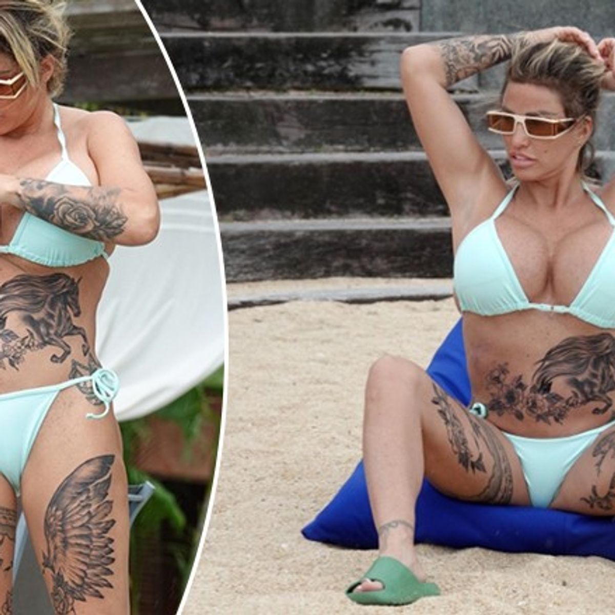
Price’s stomach and thigh tattoos have a very different energy from the back wings. In beach photos, a detailed horse sits across the stomach with flowers and leaves spreading around it. Matching or related wing shapes run down the thighs, creating a wide arrangement that follows the curves of the body.

The horse gives the composition a clear focal point. It has a recognisable head and flowing mane, while the flowers soften the edges and keep the design from feeling like a single block of black ink. On the thighs, the feathered shapes point downward, which helps the eye move with the legs instead of stopping at the hips.

This is a good example of designing for movement. The stomach bends when a person sits, and thighs change shape when the legs turn or walk. The tattoos are not placed on a flat page. They have to work while the body is relaxed, stretched, and in motion. The open areas between the horse, flowers, and feathers help the design stay readable in different poses.

The floral details also connect the stomach and legs to the rest of Price’s collection. Flowers appear in several areas of her body, but they do not all look identical. Some are lighter and more decorative. Others sit inside darker shading. Repeating a theme without repeating the exact same image is one way to make a large tattoo collection feel connected.

The garter tattoo on her thigh is a very different kind of design

Katie Price tattoos: black and pink garter-style thigh tattoo

One of Price’s older thigh tattoos is a black and pink garter design. It sits high on the leg and was photographed with a short dress and tall boots, so the ink reads almost like part of the outfit. The tattoo uses the shape of a garter rather than a single picture, wrapping around the thigh with a decorative, lingerie-inspired feel.

Compared with the feathered back work, this piece is smaller and more graphic. It does not need a large surface to make its idea clear. The placement does most of the work. A thigh tattoo can stay hidden under everyday clothes, then appear with shorts, a skirt, or swimwear. That gives it a playful quality without requiring a huge composition.

Garter tattoos can also be tricky to size. The band needs to follow the leg without looking like it is sliding up or down. The line has to stay clean as the thigh changes shape, and the decorative details need enough space to remain separate. Price’s design shows why a simple outline can be more effective than stuffing a narrow band with tiny patterns.

It is also a reminder that not every tattoo in a collection needs to match the mood of the largest pieces. A person can have a massive back tattoo and still choose something cheeky, bright, or fashion-inspired for the leg. That contrast keeps a collection from feeling too serious.

Katie Price’s arm sleeve mixes flowers with darker shading

Katie Price tattoos: full floral arm sleeve with dark shading

The floral work on Price’s arm is one of the easiest parts of her collection to recognise in a close portrait. The sleeve runs from the wrist toward the upper arm, with flowers, leaves, and dark shaded sections layered together. The full floral arm sleeve has enough contrast to show clearly even in a night-time photograph.

Unlike the back wings, which are built from repeated feather shapes, the arm sleeve has several different textures. Some petals are outlined and left open. Other areas use heavier black or gray shading. That change keeps the arm from looking like one flat panel and gives the flowers room to stand out.

Price has described getting floral work connected to her mum, and the image makes that kind of personal choice easy to understand. Flowers can carry a meaning without needing a long sentence or a portrait. They also age well as a visual idea because the design can be expanded later with leaves, stems, or surrounding shading.

Arm sleeves are practical in a way that back pieces are not. They are visible during everyday gestures, so the tattoo becomes part of how a person moves and presents themselves. A hand near the face, a folded arm, or a short-sleeved top can change which part of the design people notice first.

What ties the whole look together

Price’s tattoos feel recognisable because they are confident about scale. She is comfortable with a design taking over the back or covering a large section of the leg. At the same time, she uses smaller script, bands, and wrist details to break up the larger work. The collection has contrast without losing its sense of personality.

There is also a clear interest in symbols that carry a story. Wings suggest protection or transformation. Flowers can point to family. A horse reflects a long-running love of horses. Garter ink brings a fashion and lingerie reference into the mix. Even when the exact meaning is not explained, the choices feel connected to Price’s public image and private life.

If you are using Katie Price tattoos as inspiration, think about the placement before the subject. A wing piece needs enough back space to spread. A flower sleeve needs a plan for how the shapes will wrap around the arm. A thigh band has to move with the leg. The same design can look completely different when it is squeezed into the wrong area.

Her collection also shows why cover-ups and additions do not have to be embarrassing. Tattoos change as people change. A name can be crossed out, a relationship can end, or a new chapter can call for a different design. The finished result may contain several eras of a person’s life, and that history can make the ink feel more real.

What stands out most is the willingness to let tattoos be visible. The designs are not timid. They use the back, arms, and legs as large spaces for artwork, then let clothing reveal different sections at different times. That mix of bold placement, personal symbols, and changing styles is what gives Katie Price’s tattoos their unmistakable look.

Mia Khalifa Tattoos: Her Arabic Script, Cross and Hand Ink

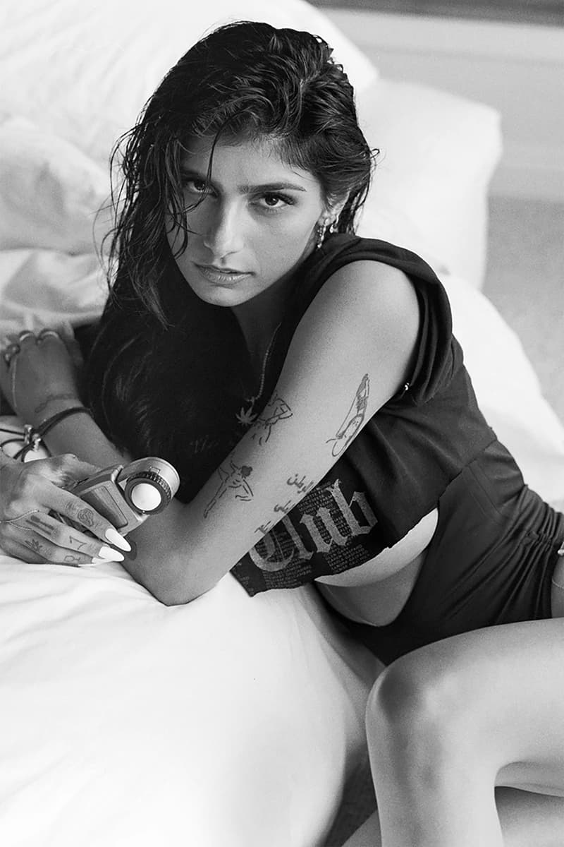
Mia Khalifa tattoos are easy to spot once you know where to look. Her collection runs across both arms, her wrists, her hands, and the side of her body, with a mix of Arabic lettering, tiny symbols, simple line drawings, and darker pieces. Some designs are small enough to disappear under a sleeve. Others show up the moment she lifts a hand or turns toward a camera.

The collection does not follow one strict style. There is delicate script beside a bold red cross, small finger marks beside larger arm drawings, and newer pieces that feel more graphic than the older lettering. That variety gives the tattoos a relaxed, lived-in feel. Nothing looks like it was chosen to make every piece match. Each design has its own shape and its own place on the body.

Her tattoos have also changed over time. The red wrist cross became part of a public conversation about Lebanon, and she later discussed covering it with another design. That makes it useful to look at the photos as a record of different points in her life, instead of treating one image as the final version of the collection. Here is a closer look at the designs that read most clearly in high-resolution photos.

Mia Khalifa’s Arabic forearm script is one of her clearest tattoos

Mia Khalifa tattoos: Arabic forearm script in a clear close portrait

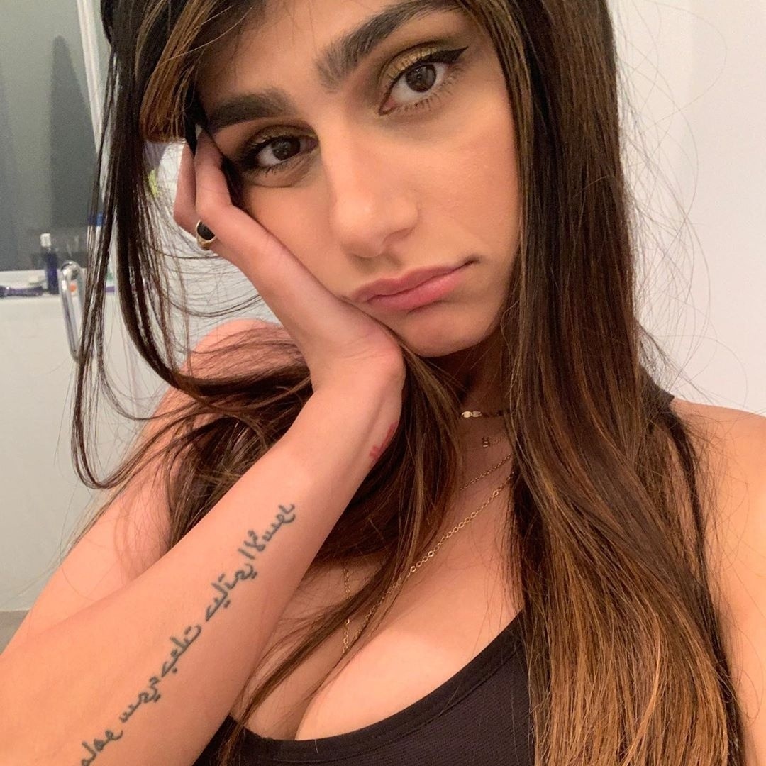
The long Arabic script on Mia Khalifa’s forearm is one of the most recognisable pieces in her tattoo collection. It runs in several lines along the arm, giving the design a strong vertical shape. The lettering is dark and fairly open, so the words stay readable even when the arm is photographed from a short distance.

Script tattoos depend heavily on spacing. If the lines sit too close together, the lettering can turn into one dark block as it heals. In Khalifa’s photo, the lines have enough room to breathe, and the rounded Arabic forms create their own visual rhythm. The arm stays soft around the words instead of looking packed from wrist to elbow.

The placement also changes how the tattoo appears in everyday photos. A bent arm brings the writing toward the camera, while a relaxed arm lets the design follow the natural length of the forearm. It is a useful example of choosing a body area that supports the shape of the lettering. A long quote or several short words usually need a little more room than people expect.

If you like the look of Arabic script, work with someone who understands the language and can check the text before it reaches your skin. The lettering should be reviewed by a fluent reader, not copied from a random image. The design can still be simple, but the details need to be right.

The red cross on her wrist carries a complicated chapter

Mia Khalifa tattoos: red wrist cross and tiny hand symbols

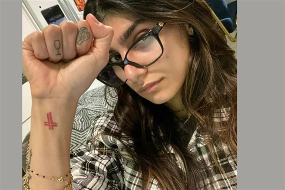
The red cross on Khalifa’s wrist is one of the most visible pieces in close-up portraits. Its colour sets it apart from the black lettering around it, and the small size keeps it from taking over the whole arm. When she raises her fist, the cross becomes the first detail most people notice.

The design was connected to her Lebanese background and to her father’s political views. Later, after the Beirut explosion, she said she wanted to replace it with a map of Lebanon and use the moment to support relief work. The tattoo therefore sits inside a bigger personal and public story. It is not simply a decorative red symbol.

From a design point of view, the wrist is a demanding spot. It moves constantly, rubs against clothing, and gets plenty of sun. A compact symbol works well there because it can stay clear without needing fine detail. The strong red ink also gives the design a little visual weight even though the tattoo itself is small.

The change in the piece is worth remembering if you are planning a tattoo with a political or relationship meaning. A design can feel completely right at one point and different later. Khalifa’s wrist shows how a cover-up or replacement can become part of the history of the collection instead of something that has to be hidden.

Her hand tattoos include tiny symbols and a wine glass

Mia Khalifa tattoos: multiple arm and hand tattoos in a clear raised-arm photograph

Khalifa’s hand tattoos are small, but they are some of the easiest to recognise in a selfie. A tiny wine-glass outline sits on one finger, while another finger carries a small rounded symbol. The marks are light compared with the larger arm drawings, so they read like little pieces of punctuation around her jewellery and manicure.

Finger tattoos have a different visual rhythm from forearm work. They move with the knuckles, disappear when the hand closes, and can look wider or narrower depending on the angle. A tiny outline that looks neat in a straight-on photo may spread when the finger bends. That is part of the charm, but it is also why simple shapes tend to work best in this area.

The hand pieces also show how a tattoo collection can mix serious subjects with playful details. The Arabic lettering carries a message, while the wine glass feels lighter and more everyday. Putting both on the same hand keeps the overall look from becoming too formal. It feels like a collection built over time, with room for small impulses as well as larger decisions.

Anyone considering finger ink should think about visibility and upkeep. Hands are exposed to soap, sun, friction, and constant movement. Fine lines may need a touch-up sooner than a tattoo on the upper arm. Small symbols like Khalifa’s still work because their shapes are clean and uncomplicated.

The arm collection mixes line drawings with bolder black ink

Mia Khalifa tattoos: line drawings and bolder black ink across the arms

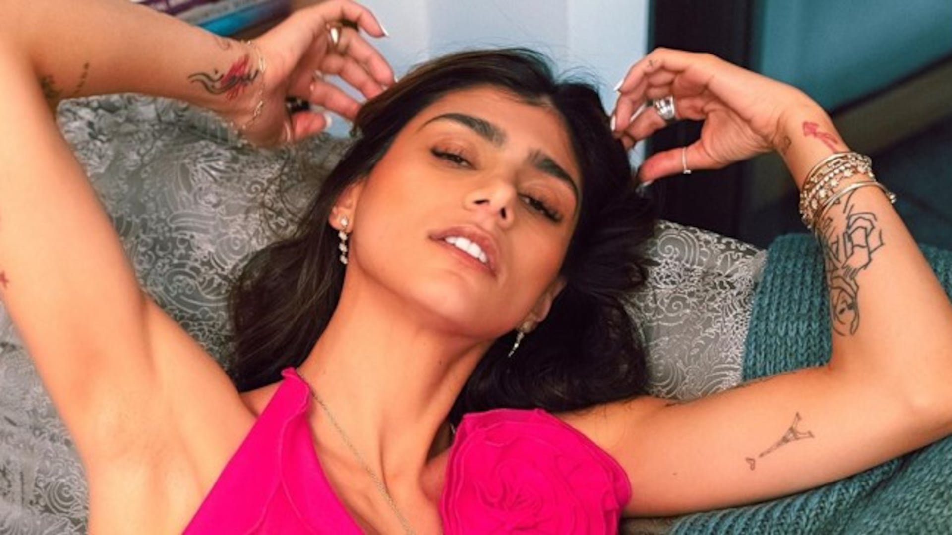
A black-and-white portrait gives the clearest sense of how much the arm collection has grown. Several line drawings sit along the upper arm and forearm, with Arabic script, small figures, and darker outlines appearing together. The pieces do not form one solid sleeve. There is open skin between them, which lets each design keep its own identity.

That spacing is one of the strongest parts of the layout. Large open areas help the eye move from one image to the next, while the darker sections act as anchors. If all of the designs were pushed together, the details would compete. The gaps make the collection feel less crowded, even though there is a lot happening on both arms.

The line drawings have a handmade quality. They are not trying to look like one polished illustration. Some are delicate, some are heavier, and some are placed at slightly different angles. That unevenness gives the tattoos character. It also makes the collection easier to build slowly because a new piece does not have to match a complete sleeve.

There is a practical lesson here for anyone planning several tattoos. Leave enough space for future work, but do not treat every blank patch as a problem that must be filled. A few clear designs with breathing room can age better than a crowded layout. Khalifa’s arms show how contrast and spacing can do as much work as the tattoo subjects themselves.

A close look at the map and star-style designs

Mia Khalifa tattoos: map, stars, and small graphic marks on the arm

Other photos show smaller graphic marks around Khalifa’s arms and the side of her body. A map-style outline, star shapes, and short symbols sit beside the larger lettering. These designs are simple enough to recognise quickly, but they still add a different texture to the collection.

Small symbols are useful when you want a tattoo to feel personal without making it the centre of the whole look. A map can point toward a place or a family connection. Stars can work as decoration, a memory marker, or just a shape the wearer likes. The meaning is not always public, and a clear photo does not automatically explain why a design was chosen.

The placement keeps these pieces from competing with the script. They sit on the arm and upper body as separate stops for the eye, rather than becoming one large composition. That makes the collection feel more casual. You can notice one symbol in a close portrait, then see a completely different piece when she changes clothes or raises her arm.

What ties the designs together is the use of clear shapes. Even the more detailed pieces rely on outlines that read well in ordinary photographs. There is no need for every tattoo to be large or heavily shaded. A small map, a star, or a short line of script can hold its place if the placement gives it enough space.

Why this mix works

The strongest feature of Mia Khalifa tattoos is the contrast between scale and mood. The Arabic forearm script is calm and deliberate. The red wrist cross is bright and immediately visible. The finger symbols are tiny and playful. The arm drawings bring in more texture, while the smaller map and star shapes keep the collection from feeling heavy.

Her placement choices help the mix feel organised. The forearms carry the most readable words and pictures. The wrists and fingers hold the smallest marks. The upper arms and side areas give the larger designs room to sit without turning every inch of skin into one block. It is a good reminder that a collection can feel connected without using the same style everywhere.

If you are using Khalifa’s ink as inspiration, start by deciding what deserves the most space. A meaningful sentence needs a different plan from a tiny symbol. A hand tattoo needs more maintenance than an upper-arm design. A bright colour like red will pull attention faster than a soft black outline. Those choices matter before the needle starts.

Most of all, the collection shows the value of letting tattoos record change. Some pieces carry family or national meaning. Others are small marks chosen for their shape. Some designs may be covered or reworked later. That does not make the earlier tattoo pointless. It gives the overall collection a timeline, with different chapters visible in different photos.

Mia Khalifa’s tattoos feel personal because they are not over-organised. The lettering, cross, hand symbols, maps, stars, and line drawings sit together like real memories do. There is enough space for each design to be noticed, but not so much matching detail that the collection loses its relaxed edge. The result is easy to recognise and still full of small details worth studying.

Hilary Duff Tattoos: Her Tiny Script, Saturn and Fine-Line Ink

Hilary Duff tattoos have a very particular feel. They are small, personal, and often placed where a sleeve or a denim cuff can hide them. Then a hand turns, a wrist lifts, or a camera catches the inside of an arm and another little design appears. That is part of the charm. Her collection never looks like one giant plan. It feels like a scrapbook built over time, with family names, tiny drawings, old friends, music, and a few playful ideas sharing the same space.

Duff is also a good example of how a small tattoo can still have plenty of personality. Some of her earliest pieces are fine line and delicate. Newer work brings in cleaner geometry, a little more black ink, and crisp symbols that read clearly even when the tattoo itself is tiny. The best Hilary Duff tattoo ideas are not loud, but they are easy to recognize: a small swallow, a neat word, a miniature planet, a rose, or a simple shape that carries a private meaning.

The photos below show the designs that are easiest to identify, rather than random red carpet shots where the ink is hidden. That makes the collection useful if you are looking for inspiration. You can compare placement, scale, line weight, and spacing without having to guess what you are seeing. Duff’s tattoos work especially well for anyone who likes understated pieces that can stand alone or sit beside other tiny marks.

Hilary Duff’s swallow and number tattoos keep her wrists personal

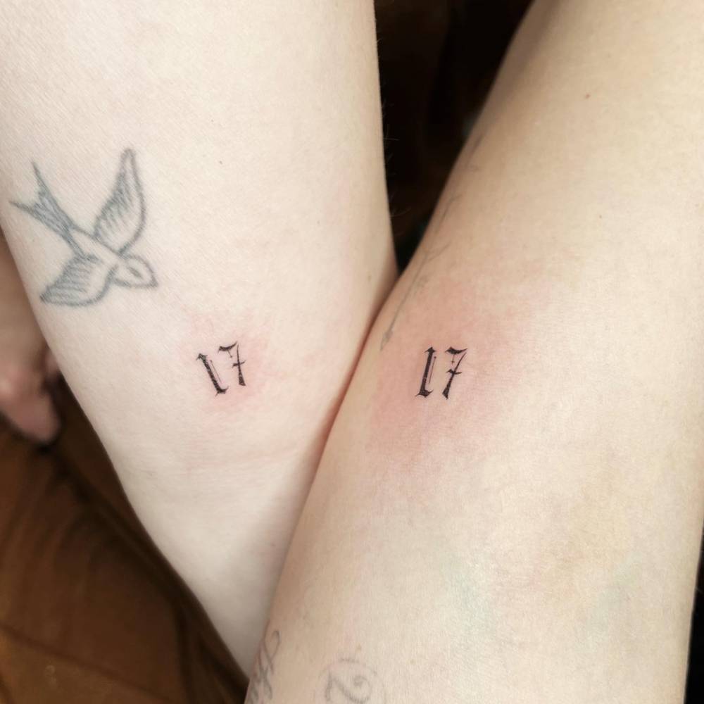
Hilary Duff tattoos: single-needle swallow and paired number tattoos on the inner forearm

The swallow is one of the clearest little tattoos in Hilary Duff’s collection. It sits on the inner forearm and has the classic lightness people expect from a single-needle bird. The wings are open, the body is compact, and the outline does not try to fill every inch of skin. It looks soft rather than heavy, which is why the design still feels wearable years after it was done.

Nearby, the small number tattoos add a completely different mood. The paired numbers are tiny and clean, with a slightly old-fashioned type style that makes them feel like a private code. That contrast is fun: the swallow has movement, while the numbers stay still and graphic. It is a nice reminder that a wrist tattoo does not need a complicated drawing to feel specific.

If you like this direction, keep the bird simple and leave enough breathing room around it. A swallow can be made softer with fine lines and a small amount of shading, or sharper with a compact black silhouette. For a number tattoo, the font matters more than people think. Test the lettering at the final size before you book the appointment, because tiny serifs and narrow gaps can blur as the tattoo ages.

The lotus and evil-eye arm tattoo is one of her boldest pieces

Hilary Duff tattoos: lotus and evil-eye arm tattoo with hands and fine-line rays

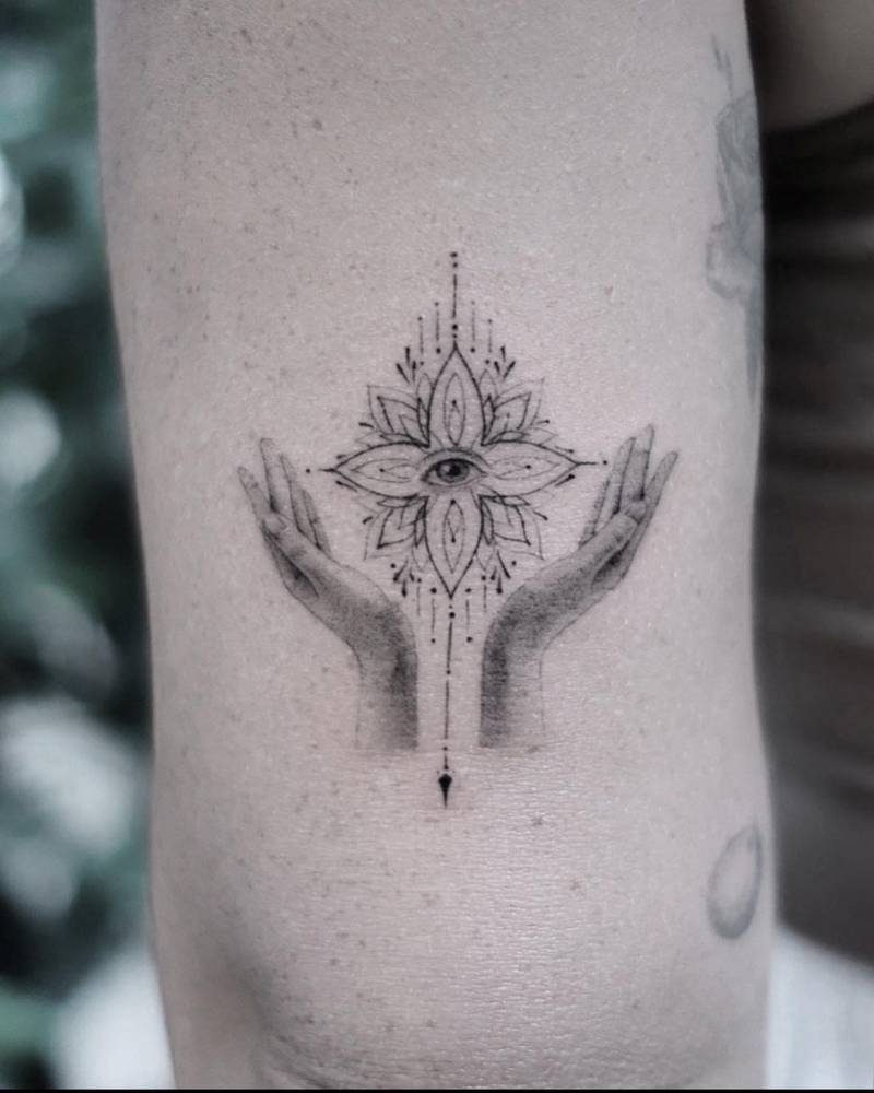
The lotus and eye design on Duff’s arm is where her collection gets more detailed. It combines a central eye with layered petals, small rays, and two hands that hold the shape from below. The drawing has a calm, almost protective feeling, but it still has enough detail to look like a complete piece instead of a quick symbol. It is also the kind of tattoo that rewards a close look, since the fine marks give the design its character.

The placement works because the arm gives the image a clean vertical space. The hands lead your eye upward, the lotus widens in the middle, and the eye sits right at the centre. That built-in structure is what keeps a detailed tattoo from feeling messy. Even in a black-and-grey style, the outline and the open skin do most of the work.

For your own version, think about how much detail you really need. The eye, petals, and hands could be simplified into three clear shapes and still read well. If you want the same delicate mood, ask for thin linework with soft grey shading instead of dense solid fill. This is a good design to place on the forearm, upper arm, or calf, where the artist can keep the vertical flow intact.

Her tiny Saturn tattoo keeps the space theme simple

Hilary Duff tattoos: tiny Saturn planet tattoo on the arm

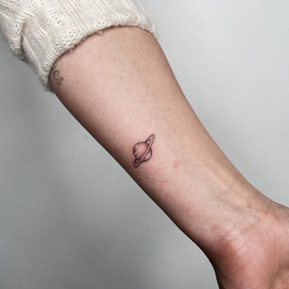
One of Duff’s most approachable tattoos is the little Saturn on her arm. It is a small planet with a clean ring and just enough line detail to make the shape obvious. There is no heavy background and no extra constellation around it. The design works because it stays focused on one recognizable object.

Small planets are popular for a reason. They can suggest curiosity, a love of space, a personal birthday reference, or simply the feeling of having your own orbit. Duff’s version has a relaxed, almost doodled quality, which keeps it from looking too formal. It also sits comfortably beside the other small marks on her arms without competing for attention.

If you want a tiny Saturn tattoo, the ring is the detail to protect. Ask your artist to leave enough room between the planet and the ring so it does not close up later. A slightly larger version will usually hold its shape better, especially if you want a little texture on the planet. You can keep it black, add a touch of muted colour, or pair it with a very small star while keeping the overall footprint light.

The Matthew name tattoo is a quiet family tribute

Hilary Duff tattoos: fine script family name tattoo on the wrist

The fine script name on Duff’s wrist is one of the most personal-looking designs in the set. It reads as a family tribute rather than a decorative word, and the placement keeps it close to the pulse. The lettering is thin, slightly loose, and handwritten in a way that feels more intimate than a polished display font.

Name tattoos can be tricky because the lettering has to feel natural at a very small size. Duff’s example shows why a little irregularity can help. The letters do not look stamped on. They have the uneven rhythm of a real signature, which makes the tattoo feel connected to the person it represents. When the meaning is the point, a simple handwritten line can be stronger than a more elaborate design.

If you are planning a name or word, bring a few handwriting samples to your artist. Try the word in a normal note, a quick signature, and a slower version with more loops. Your artist can then build a stencil that keeps the personality without making the letters too fragile. A wrist, inner arm, rib, or collarbone can all work, but make sure the final size leaves each letter open and readable.

Her mother lettering and Take Fountain script show the softer side of her ink

Hilary Duff tattoos: mother lettering near the neck with visible face and placement

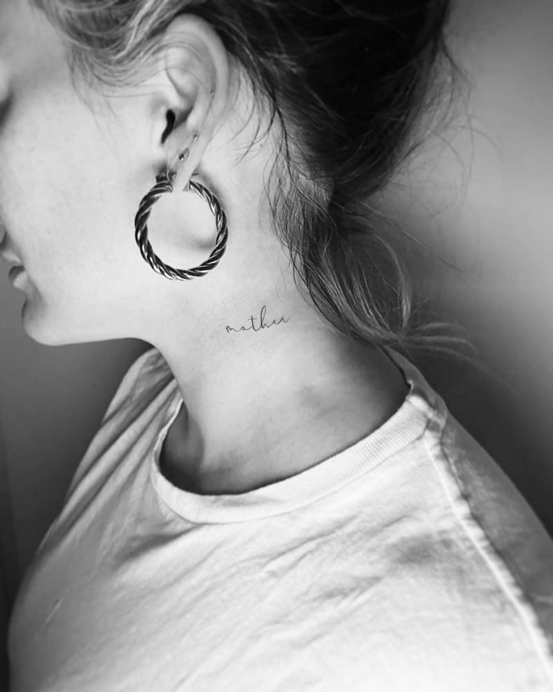
The small mother lettering near Duff’s neck is a lovely example of how placement can make a short word feel important. It sits close to the face and hairline, so it can be hidden or shown depending on the hairstyle and neckline. The script is light and uncomplicated, which keeps it from overwhelming the neck.

Her Take Fountain tattoo has a different shape but the same personal energy. The words are written in a flowing script that takes up more room on the arm, yet the line stays airy. The phrase is associated with Bette Davis’s famous advice about finding a shortcut, so it carries a little Hollywood history without needing a large illustration. It feels like the sort of tattoo that started as a private reference and gradually became part of her public style.

These two pieces are useful inspiration if you like lettering but do not want a block of text. Short words can fit behind the ear, at the side of the neck, on the wrist, or along the inner arm. Longer phrases need a little more space and a script that will not collapse into a dark line. Leave room between letters, choose a size you can live with, and let the words breathe.

How her collection fits together

Look at the collection as a group and the pattern becomes clear. Duff likes tattoos that feel light on the skin, but she is not locked into one subject. Family names sit beside birds, roses, a planet, numbers, and graphic symbols. That mix keeps the overall look relaxed. It also gives each new piece a place to land without forcing every tattoo into the same visual language.

Placement does a lot of the organizing. The wrists and inner arms hold the words and tiny symbols, while the more detailed lotus has enough space to make its shape readable. The neck lettering is small and close, and the rose and other fine-line pieces soften the collection with a little organic detail. Spacing is the quiet trick behind the whole look. The tattoos do not have to match when they are given room to exist.

If you are building a similar patchwork collection, start with the designs you care about most. Think about which pieces should be easy to see and which can stay private. Mix one or two bolder tattoos with smaller marks so the set has a natural rhythm. You do not need to copy the exact symbols. The more useful takeaway is the balance between scale, placement, and personal meaning.

Simple ideas you can borrow from her style

There are plenty of practical ideas here for a first or second tattoo. A single-line swallow can bring movement to the wrist without taking over the arm. A tiny Saturn works as a quiet symbol with a little personality. A family name can be written in real handwriting, and a short word near the neck can stay meaningful while remaining easy to cover. Even the lotus and eye can be simplified into a smaller black-and-grey emblem.

Before choosing, decide whether you want a picture, a word, or a mark that only you understand. Pictures usually need a little more space, while lettering needs enough room for each character to stay open. Symbols are flexible, but they can become generic if there is no personal reason behind them. The strongest small tattoos tend to have one clear idea and no unnecessary extras.

It is also worth thinking about how the tattoo will look in five years. Fine lines can soften, and tiny lettering can become harder to read. An experienced artist can adjust the scale, line weight, and placement to protect the design. Keep the reference simple, be honest about the size you want, and listen when your artist says a little more room will help the tattoo age well.

Why her collection still feels current

Hilary Duff’s tattoos still feel current because they are personal first and trendy second. The collection includes styles that have cycled in and out of fashion, but the pieces do not feel like a mood board. A name is there because it belongs to someone. A rose, swallow, or planet can be read as a memory or a small piece of personality. That meaning gives the designs staying power.

The visual side is just as easy to live with. Most of the tattoos are small enough to work with everyday clothes, and the lighter linework keeps the arms from feeling crowded. When a larger or more detailed piece appears, it has enough space to make an impression. That balance is a big reason her tattoos make such useful reference material for anyone who wants ink that feels collected rather than overplanned.

You can take the same approach with your own ideas. Start with a few designs that genuinely matter, then let the collection grow at its own pace. A tiny tattoo can be meaningful without needing a long explanation. A larger design can anchor the group when you are ready for one. The goal is not to recreate a celebrity’s body map. It is to find the mix of scale, placement, and symbols that feels like you.

Final take on Duff’s style

Hilary Duff tattoos are a good reminder that a collection can be soft, varied, and personal without looking random. Her clearest pieces include a swallow, small numbers, a Saturn, family lettering, roses, and the detailed lotus and eye on her arm. Each design has a different mood, but the light linework and thoughtful placement help them sit together.

If you are saving ideas, pay attention to the details that make these tattoos work: open spacing, simple outlines, handwriting that still looks natural, and placements that match the scale of the design. A small tattoo can be a quiet nod to a person, a place, a song, or a moment. It does not have to shout to be worth keeping.

Janel Parrish Tattoos: Moon, Deer, Finger Letters and More

Janel Parrish tattoos are easy to read as a collection of memories. She has small symbols, fine script, lettering tied to her family, and pieces that connect back to the people and places that matter to her. Some are tucked away on the feet or fingers. Others sit right at the nape of her neck or run along an arm where they show up in photos. Together, they feel personal without looking overly planned.

Parrish has also been open about the fact that many of her tattoos mean something specific. Her ink includes references to Hawaii, family, music, her Pretty Little Liars character, and the loss of loved ones. That mix gives the collection a warm, lived-in quality. The most useful thing to borrow from Janel Parrish’s tattoo style is the sense that every small mark can carry a real story.

The close-up photos below focus on actual pieces rather than general celebrity portraits. That matters when you are comparing line weight and placement. A moon looks different when it is built from clean fine lines and small blossoms. A deer at the nape needs a different approach from a word on the bicep. Parrish’s collection offers plenty of ideas if you like tattoos that are meaningful, delicate, and easy to make your own.

Janel Parrish’s moon tattoo turns a family memory into a fine-line piece

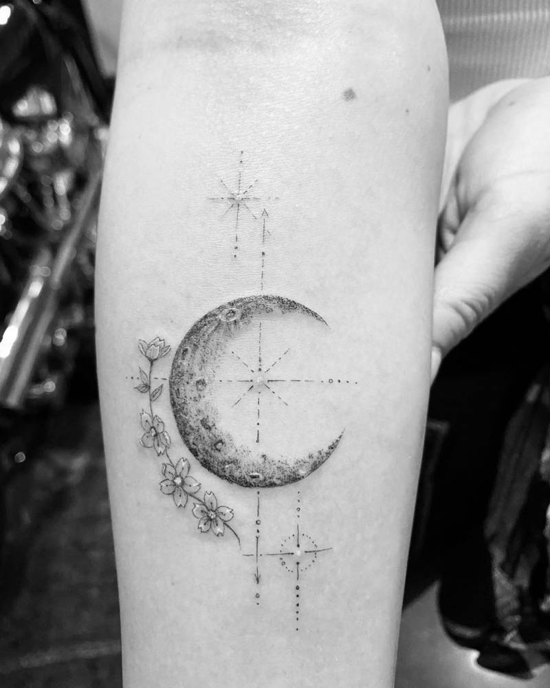
Janel Parrish tattoos: crescent moon with flowers and fine geometric marks on the forearm

The moon on Parrish’s forearm is one of the clearest examples of her personal approach. It is a crescent with a soft, textured edge, surrounded by a small arrangement of flowers and fine geometric marks. The design feels delicate at first glance, but there is enough detail in the moon and blossoms to make it hold attention. It is not just a tiny outline floating on the skin.

Parrish has explained that the moon connects to her grandmother’s middle name and nickname. That gives the piece a quiet memorial quality without turning it into a heavy or sombre image. The flowers add a little softness, while the open space around the crescent keeps the whole composition light. It is a good example of how a memorial tattoo can feel gentle rather than overly literal.

For a similar idea, think about the shape that carries the memory first. It could be a moon, a star, a plant, or another object with a private connection. Then add only the details that help the image feel like yours. Parrish’s tattoo works because the flowers and marks support the moon instead of competing with it. A forearm gives the artist room to keep the lines crisp, but the same idea could be scaled down for a wrist or upper arm.

The deer tattoo at her nape is small but impossible to miss

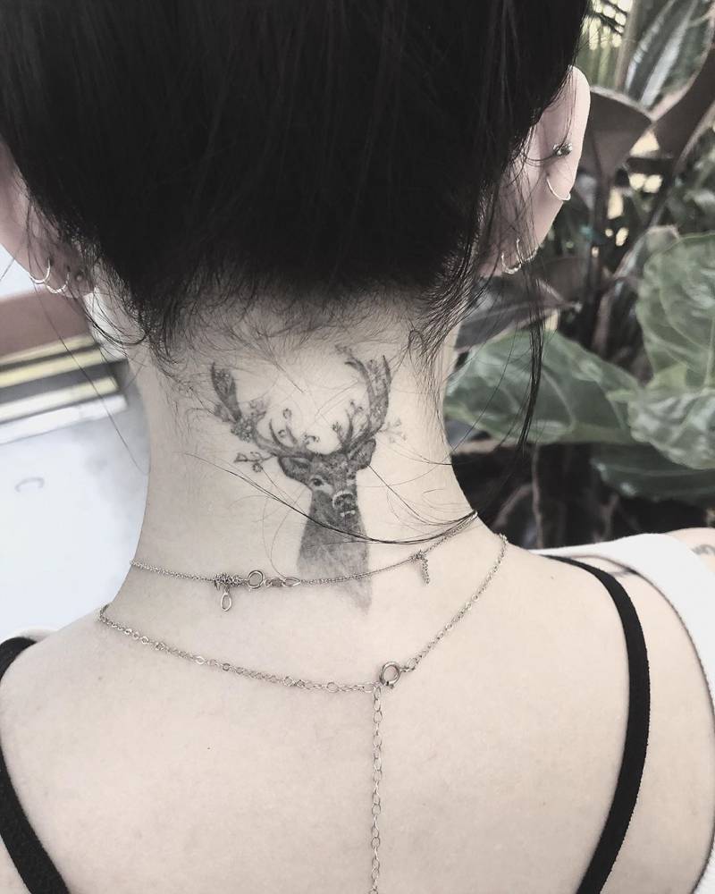
Janel Parrish tattoos: small black-and-grey deer head with antlers at the nape

The deer at the back of Parrish’s neck has a very different mood. It is a small black-and-grey head with branching antlers, placed right below the hairline. That location makes the tattoo easy to hide with a longer hairstyle, but it becomes an immediate focal point when the hair is tied back. The nape is a narrow area, so the compact shape suits it well.

There is a calm, watchful feeling to the image. The eyes and antlers give the deer presence, while the fine shading keeps it from becoming a solid block of black. Good nape tattoos usually need a strong silhouette first and tiny details second. From a distance, you should still be able to understand the shape. Up close, the shading and linework can add the personality.

If you are considering an animal at the nape, bring references that show both the full shape and the amount of detail you like. Ask your artist how the image will follow the curve of the neck and how it may look when your head turns. A little breathing room around the antlers can help the tattoo age cleanly. You can also move the same idea to the upper back if you want a larger, more detailed version.

Her Pretty Little Liars finger tattoos keep the meaning close at hand

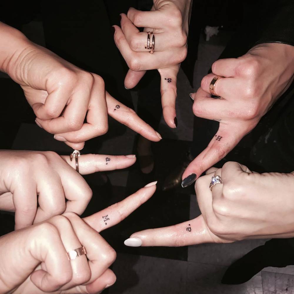
Janel Parrish tattoos: Pretty Little Liars character initials and tiny finger lettering

Parrish’s finger tattoos are tied to one of the most recognizable parts of her career. The Pretty Little Liars cast got character initials on the inside of the index finger, matching the shushing gesture from the show’s opening. Parrish received an M for Mona. The group idea gives the tiny letters a shared story, but the placement still makes each mark feel personal.

Finger tattoos are small, visible, and a little unpredictable, which is part of their appeal. The skin gets plenty of movement and friction, so simple lettering tends to work better than a detailed drawing. In the close-up, the letters are compact and easy to understand. They do not need extra decoration because the meaning is already doing the heavy lifting.

If you want a finger initial, ask your artist about orientation before the stencil goes on. A letter can face you, face outward, or follow the way your hand moves during a gesture. It is also smart to accept that finger ink may soften or fade faster than a piece on the forearm. Keep the shape clear, choose a size that will not crowd the skin, and plan for a future touch-up if needed.

The butterfly tattoo shows how tiny symbols stay light

Janel Parrish tattoos: small butterfly tattoo visible on the forearm in a face-visible portrait

The butterfly on Parrish’s forearm is a much smaller, softer piece than the deer at her nape. In the portrait, it sits close to the lower arm and reads as a fine outline with just enough detail to show the wings. It is the kind of tattoo that can disappear under a sleeve, then show up when the arm turns toward the camera.

Butterflies are familiar, but placement and linework can keep one from feeling generic. Parrish’s version has an airy shape and plenty of open skin inside the wings. That open space is what helps a tiny butterfly stay readable instead of becoming a dark little blur. A small symbol like this can mark change, freedom, or a personal memory without needing a large explanation.

If you want a similar piece, look at the wing shape before you choose the size. Very fine interior lines may need a little extra room, especially on skin that gets sun. A wrist, forearm, shoulder, or ankle can all work. Keep the outline clean and let the artist decide how much detail will still look good once the tattoo has healed.

A wider look at the deer tattoo shows why placement matters

Janel Parrish tattoos: wider placement view of the deer tattoo below the hairline

A second view of the deer gives a better sense of how the image sits below the hairline. From farther back, the antlers follow the curve of the neck and the head stays centred above the shoulders. That balance is important because a nape tattoo is seen in motion, not only in a straight-on close-up.

The wider photo also shows why the design does not need a large background. The deer already has a strong outline, and the dark hair around it creates natural contrast. A good placement can do some of the visual work for you. Instead of adding extra leaves, stars, or shading, the artist can let the shape of the neck frame the image.

If you are planning a piece in the same area, ask to see the stencil from several angles. Turn your head, relax your shoulders, and check how the image moves with you. A design that looks balanced while standing still should also feel comfortable when you walk, tie your hair up, or wear a lower neckline.

How the collection hangs together

Parrish’s collection has variety, but it does not feel scattered. The common thread is meaning. A moon can hold a family memory. A deer can mark a personal chapter. A finger initial can preserve a cast friendship. A phrase can act as a daily reminder. Even the balloon and its later cover-up show how the story can keep moving.

The visual thread is fine linework with carefully chosen areas of darker shading. The smaller marks do not need to match exactly because they share a light touch. Her lettering is allowed to look like lettering, while the moon and deer get enough shape to read as images. That balance makes the collection feel collected instead of overly coordinated.

If you want to build a similar group, start by listing the memories you would actually like to carry. Then decide which ones belong as words, which belong as symbols, and which need a larger image. You can let the pieces arrive gradually. A collection built over time often feels more natural than trying to fill every available space in one appointment.

Simple ideas you can borrow from her style

There are a few practical lessons in Parrish’s choices. Use a small symbol when the meaning is strong enough to stand alone. Give a phrase the room it needs instead of shrinking it until the letters blur. Put an image at the nape when you like the option of showing it or covering it. Keep finger lettering simple. These choices are not flashy, but they make the tattoos easier to live with.

Placement can also change the mood of a familiar idea. A moon on the wrist feels casual and visible. The same crescent on the ribs becomes more private. A deer on the neck has presence, while a tiny animal on the ankle can feel almost hidden. Think about when you want to see the tattoo yourself, not only when other people might notice it.

Finally, do not skip the boring parts of planning. Check the spelling. Ask how the lines will age. Look at healed work from the artist, not only fresh photos. Make sure the design has enough room and that the placement fits your daily life. Those small decisions are what help a meaningful tattoo stay readable and comfortable for years.

Why her choices feel personal

Janel Parrish’s tattoos work because they are connected to real parts of her life. The collection is not built around one trend or one visual gimmick. It moves between family, friendship, Hawaii, music, work, memory, and simple reminders about how she wants to live. That gives even the smallest letters a reason to be there.

The result is a style that feels warm rather than intimidating. You can like the moon without copying the exact flowers. You can take the idea of a character initial and use a letter that belongs to your own story. You can choose a deer, a phrase, or a tiny balloon because it says something to you. The point is not to recreate Parrish’s collection. It is to notice how naturally personal details can become good visual choices.

That is why her close-up images are useful inspiration. They show how a tattoo can be small and still have a clear identity. They also show that a collection can change. An old piece can be softened, covered, or joined by something new. There is room for the story to keep developing.

Final thoughts

Janel Parrish tattoos have a soft, thoughtful quality, but they are not all the same. The moon and flowers carry a family memory. The deer gives the nape a strong focal point. The Pretty Little Liars initial keeps a career friendship close. The French phrase offers a quiet reminder, and the balloon shows how a piece can evolve into something else.

If you are saving ideas, focus on the parts that make each piece work: clear shapes, open spacing, readable lettering, and a placement that matches the meaning. A tattoo does not need to be huge or complicated to stay with you. Sometimes a single letter, a small crescent, or a few careful words can do the job.

Ricochet Tattoos: Full Sleeve, Chest Script and Wrestling Ink

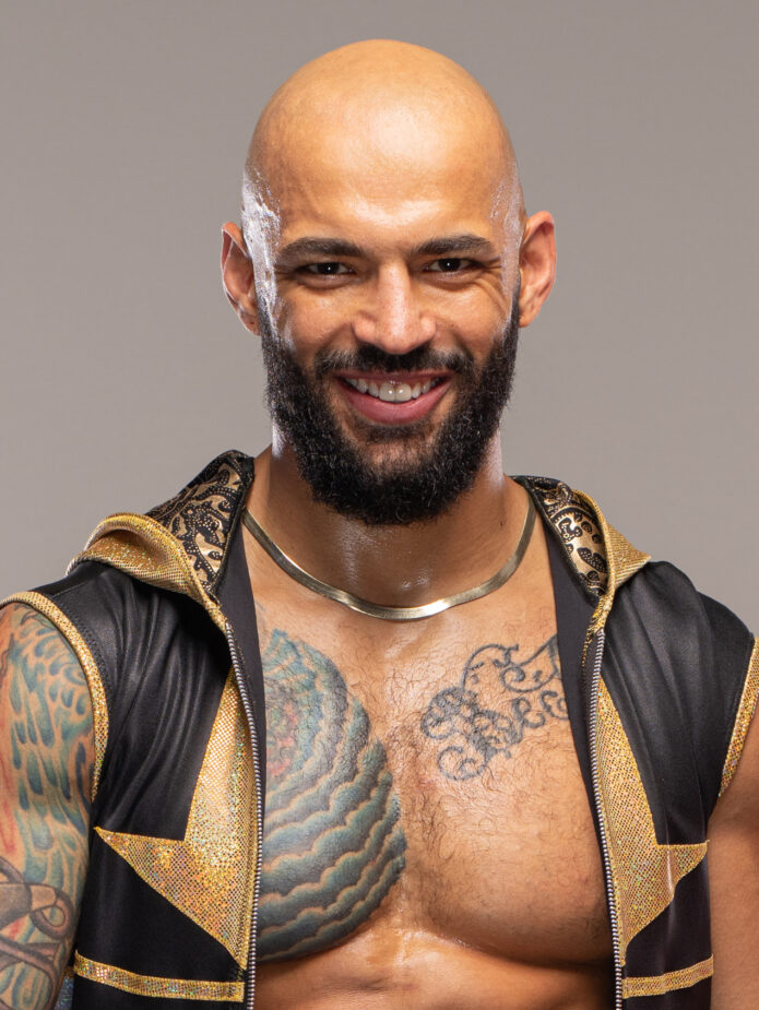
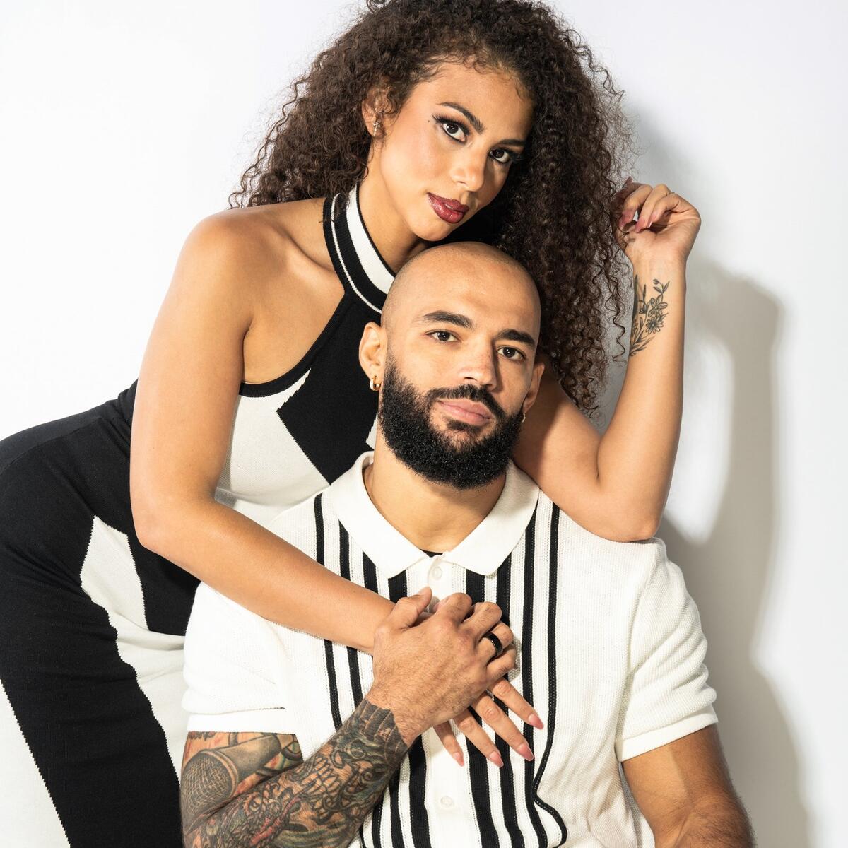
Ricochet tattoos are easy to spot because they match the way he moves. His left arm is packed with color and detail, while the chest pieces give the whole collection a clear center. Nothing feels hidden or overly delicate. The designs are built to read from a distance, which makes sense for a wrestler who spends most of his working life under bright lights and in motion.

His collection has a mix of traditional color, bold black outlines, script, and pieces that sit close together without looking completely planned as one giant sleeve. That slightly lived-in feeling is part of the appeal. You can see a dragon-like chest image, swirling shapes, lettering, and smaller details traveling down the arm. The result is recognizable even when he is moving across a ring or landing from a big spot.

Ricochet has also shown his tattoos in very different settings. A staged portrait makes the colors and linework look crisp. A ringside photo shows how the sleeve changes when his shoulder flexes. A close crop lets you study the chest script and the way the ink sits against the curve of his body. Looking at those views together is more useful than relying on one generic portrait.

Here is a relaxed look at the main ideas in his tattoo style, plus some practical design lessons if you like colorful sleeves, visible lettering, and pieces that feel connected without being too neat.

The full left-arm tattoo sleeve does the heavy lifting

Ricochet tattoos: Full left-arm sleeve and shoulder color reference

The first thing most people notice is Ricochet’s left arm. It is not a single flat block of blackwork. The sleeve has several zones, with color and shading doing a lot of the work between the larger outlines. There are warm red and orange notes, cooler green and blue areas, and plenty of darker shading to keep the arm from looking washed out under arena lighting.

That mix gives the sleeve a traditional feel, but the coverage is modern. Instead of leaving one tiny emblem to stand alone, the tattoos are allowed to build around the shape of the arm. The shoulder, upper arm, elbow area, and forearm all carry visual weight. From far away, the sleeve reads as one strong silhouette. Up close, it breaks into smaller scenes and textures.

The useful design lesson is flow. If you want a sleeve with this kind of energy, think about how one piece leads into the next. A tattoo does not have to share the exact same subject as its neighbor. Repeated line weight, a shared palette, or a similar background texture can do enough to make the collection feel related.

Ricochet’s arm also shows why negative space matters. Even with heavy coverage, the skin between shapes helps the main designs breathe. That keeps the sleeve from turning into one dark blur. When planning a colorful arm, leave room for the strongest shapes to stay readable instead of filling every gap just because the space is there.

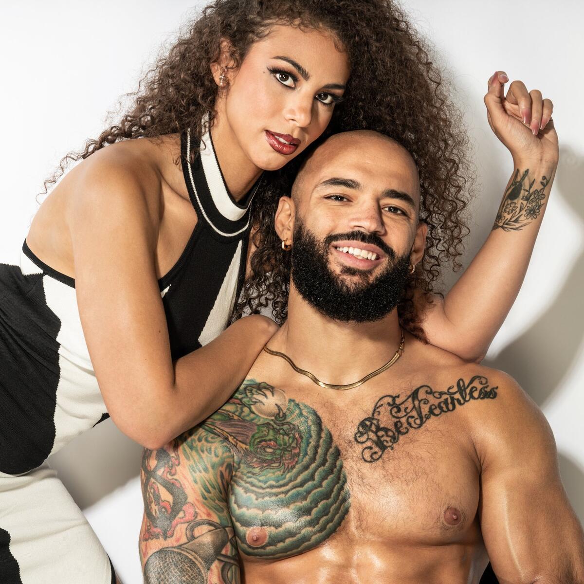
The chest tattoo gives Ricochet’s look a clear focal point

Ricochet tattoos: Chest tattoo focal point and shoulder placement

The chest is where his tattoo layout gets a strong anchor. The large colored piece sits high on the left side and spreads toward the shoulder, so it acts almost like a shoulder badge and chest panel at the same time. It is visible when he wrestles shirtless, but it also peeks out around open ring gear, which makes it part of his public look.

The shape works because it follows the body rather than fighting it. The curved lines move with the chest and upper arm, and the shading creates a sense of depth without needing a hard rectangular edge. That is a good reminder that big tattoos often look better when the artist designs for the body first and the flash sheet second.

There is also a nice contrast between the saturated color and the plain skin around it. The chest piece does not need a full background to be noticeable. Its outline, texture, and color changes already give it enough presence. For anyone considering a large chest tattoo, this is a useful approach: choose one main subject, give it a clear boundary, and let the surrounding skin help frame it.

His chest ink is also a good example of how placement changes the mood of a design. The same image on a forearm might feel more compact and private. Across the chest and shoulder, it feels bigger, louder, and more tied to performance.

The script across his chest adds a softer layer

Ricochet tattoos: Chest script lettering and nearby forearm ink

Near the larger chest design sits a sweeping script tattoo. The lettering has a softer rhythm than the heavier sleeve work, and that difference keeps the collection from feeling like one repeated texture. The script follows the chest line and gives the eye a place to slow down after taking in the color and dense shading on the arm.

Script tattoos can be tricky because the letters need to remain legible as the body changes shape. Ricochet’s placement works because the phrase is large enough to hold its own. It is not squeezed into a narrow wrist or hidden inside a busy sleeve. The open chest gives each letter a little room, and the curved baseline makes the piece feel intentional.

Good lettering needs breathing room. That is probably the biggest takeaway here. If you have a phrase that matters, do not shrink it just to fit a favorite placement. The right size lets the linework age more gracefully and keeps the words readable in photos years later. It also makes the tattoo feel like part of the person’s identity instead of a tiny detail people have to squint at.

The script also adds personality without taking over the whole look. It is a personal note inside a collection that is otherwise dominated by large images. That balance is worth copying if you like bold tattoos but still want one quiet, text-based element.

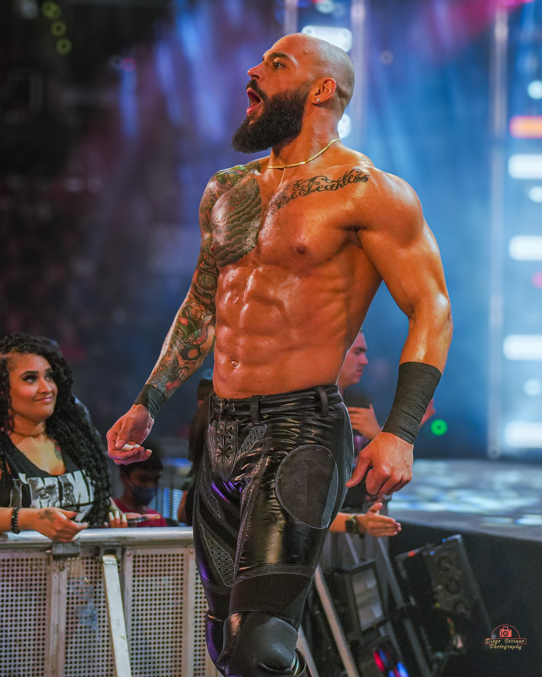
A full-body angle shows how the arm sleeve travels

Ricochet tattoos: Wide tattoo layout showing the relationship between chest and arm

A wider view makes the placement story much clearer. When Ricochet is standing in ring gear, you can see how the ink travels from the shoulder toward the elbow and forearm. The sleeve is not just something placed on a flat front-facing panel. It wraps around the side of the arm, which means the designs keep appearing as he turns or reaches.

That movement matters for a performer. A front-only tattoo can disappear when the arm rotates, while a wrapped layout gives the audience different details at different angles. Ricochet’s sleeve feels active because it changes with his stance. It supports the athletic look instead of sitting like a sticker on top of it.

For everyday tattoo planning, this is a useful way to test a design before booking. Stand in front of a mirror with your arm relaxed, raised, bent, and turned sideways. Ask where the main shape goes in each position. If the tattoo only looks right from one angle, it may need a little more wrap or a better focal point.

The wider photo also shows that the sleeve does not have to match the costume perfectly. It works with bright ring gear, dark street clothes, and simple shirtless portraits. Strong linework and a confident silhouette give it enough structure to survive changes in styling.

The older arm tattoos still read clearly in the ring

Ricochet tattoos: Older arm tattoo visibility and ring readability

One reason Ricochet’s tattoos stand out is that they have been seen in motion for years. The arm work is not only made for close-up studio photography. It has to hold up while he is running, climbing, flipping, and landing. That gives the collection a practical quality. The shapes are clear enough to register quickly, even when the camera is not close.

Older tattoos can sometimes lose their edge when photographed in harsh light, but the larger pieces still have a readable structure. The main outlines remain easy to follow, and the color blocks keep the images from disappearing into the skin. That is a good argument for choosing contrast over tiny detail when a tattoo will be visible from a distance.

Readability is not the same as simplicity. A design can be detailed and still be easy to understand if its darkest lines, brightest areas, and main silhouette are placed well. Ricochet’s arm shows that you can have several ideas in one area without making every part compete for attention.

If you are building a sleeve slowly, this is also a reminder to leave yourself options. Start with the piece you care about most, then let future tattoos respond to it. A little planning around size and direction can make later additions look natural instead of forcing you into one rigid plan.

The color work keeps the sleeve from feeling flat

Ricochet tattoos: Color work, contrast and tattoo texture

The color in Ricochet’s tattoos is not used as a soft wash. It helps separate the shapes. Greens, reds, and blue-gray shadows give the sleeve depth, while black outlines keep the edges firm. That contrast is especially helpful in a full-color arm because skin, lighting, and camera exposure can all change how the work looks.

Color also changes the mood of the chest. In a darker arena photo, the ink feels gritty and intense. In a clean portrait, the same work looks more illustrative. That range is a sign of a solid palette. The tattoos can look dramatic without relying on a filter or heavy editing.

If you like this approach, ask your artist how the colors will sit beside each other after healing. Fresh ink can look brighter than settled color. A thoughtful palette usually includes a few anchor shades, some skin breaks, and enough dark contrast to keep the design readable. You do not need every color in the tray to make a sleeve feel rich.

There is a practical side to the color choice too. Bright areas draw attention, so they can guide the eye toward a favorite part of the tattoo. Dark shading can then support the shape without stealing the spotlight. That kind of hierarchy is what makes a busy sleeve feel deliberate.

What Ricochet’s tattoo layout can teach about placement

Ricochet tattoos: Overall tattoo placement and body flow reference

Ricochet’s collection is a useful study in placement because it combines three different scales. The arm sleeve is the largest visual group. The chest pieces create a second focal area. The script gives the eye a different texture and pace. Those layers work together without requiring every tattoo to follow the same theme.

The biggest lesson is to choose a clear starting point. If your favorite idea is a large upper-arm piece, let it set the direction for later work. If the script matters most, protect space around it so the words stay open. If you want an old-school sleeve, decide which colors and outline styles will repeat before adding small filler designs.

It is also worth thinking about visibility. Ricochet’s tattoos are easy to see during a match, which suits his career and image. That does not mean every tattoo needs to be public. You can borrow the same design logic on a shoulder, thigh, back, or rib placement if you want more control over when the work appears.

The strongest tattoo collections feel lived in. They show taste, history, and a little change over time. Ricochet’s tattoos have that quality. They are colorful, confident, and connected by the body they sit on, but they do not look like they came from one perfectly matching catalog page.

That is why his ink makes a good reference point. You can take the useful parts without copying the exact images: a bold main piece, a clear line of movement, a small amount of text with enough room, and a palette that still works when the lighting changes. Start with what means something to you, then let the rest of the design grow around it.

Jake Paul Tattoos: Tiger, Angel Sleeve, Torso Ink and More

Jake Paul tattoos have grown from a few small personal pieces into a loud mix of blackwork, realism and large story-driven designs. His collection moves across his arms, chest, ribs, legs and feet, so there is no single style that explains everything. Some pieces are clean and graphic. Others are packed with shading and tiny details that are meant to be studied up close.

That variety is what makes Jake Paul’s ink worth looking at. He has a tiger on his foot, an angel running down his leg, skull and skeleton work, chest lettering, a Polynesian-inspired design and smaller marks that connect the bigger sections. The collection feels like it was built in chapters rather than planned as one perfect sleeve from day one.

A tattoo can look different in a mirror selfie, a fight photo or a close-up from a studio. Placement, body movement and lighting all change what stands out. This guide breaks down the visible pieces so you can see what makes them work and which ideas might translate into your own tattoo plan.

The tiger foot tattoo is the sharpest focal piece

Jake Paul tattoos: Tiger foot tattoo, controlled colour and long placement flow

The tiger foot tattoo is one of the easiest Jake Paul pieces to recognise. The face sits low on the foot with the eyes, nose and open mouth doing most of the work. Warm colour in the eyes and fur gives it a fierce, almost alive feeling, while the darker stripes keep the design grounded. It reads immediately when he is wearing shorts or low shoes.

Foot tattoos are tricky because the skin moves, rubs against socks and takes daily wear. That makes a detailed animal portrait a serious commitment. The tiger works because the face is large enough to keep its main shapes clear. A smaller version could lose the eyes and mouth, so anyone borrowing the idea should be honest about the size needed for the detail to survive.

The long shape is useful too. Instead of placing a round tiger head in the middle of the foot, the tattoo stretches along the natural line of the leg. The stripes guide the eye upward, and the darker background makes the face feel connected to the rest of the body art. If you want an animal tattoo in a difficult spot, think about the body part first and choose an image that follows its shape.
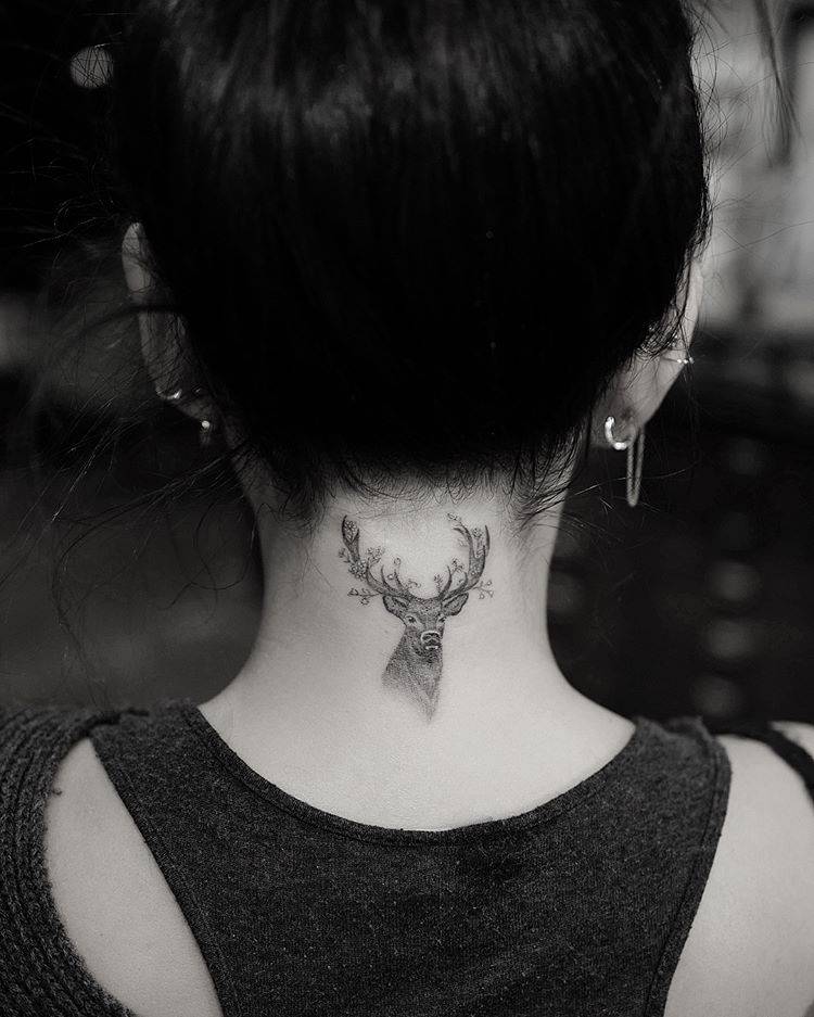
Colour is another reason this piece stands out from the mostly black and grey work around it. The amber eyes become a small hit of contrast rather than a full bright palette. One controlled accent can make a large blackwork piece feel much more alive without changing the mood of the whole collection.

The angel sleeve turns the leg into a full scene

Jake Paul tattoos: Angel sleeve scene and long composition

The angel and leg work create a very different mood. Instead of one isolated symbol, the tattoo uses a tall composition with wings, a figure and smoky shading that follows the length of the leg. It feels closer to an illustration or a book page than a simple flash tattoo, giving the viewer something to follow from the upper section toward the lower leg.

A long leg design needs a strong visual path. The wings and body provide that path, while the shadows act like transitions between separate sections. If every part has the same weight, the piece can look busy. Varying the dark and light areas gives the eye a place to rest and lets the main figure stay readable.

The figure also brings softness into a collection that includes tigers, skulls and heavy tribal shapes. That contrast helps the sleeve feel less one-note. You can use the same trick without copying the exact subject. Pair a hard-edged animal with a softer botanical section, or balance a dark mechanical piece with open skin and fine line work nearby.

Large leg tattoos need patience during planning. The reference should be checked from the front, side and back because the leg twists when you walk. An artist may change the size of the wings or turn the figure slightly so the main face stays clear. The best sleeve designs are made for the body, not pasted onto a flat template.

The torso tattoos mix lettering, skulls and movement

Jake Paul tattoos: Torso tattoos, lettering, skull and tentacle movement

The torso is where Jake Paul’s collection feels most layered. The chest includes lettering near the collarbone, an octopus or tentacle form, a bird, a heart and other pieces that sit close together without becoming one solid block. The result is busy, but there is enough skin between the designs to let each image breathe.

The skull and tentacle work is strong because the shapes move across the chest instead of sitting like a sticker. Curved lines create direction, and the tentacles help join the upper and lower parts of the composition. This is a smart idea for anyone planning several chest tattoos. You do not need matching images if the lines and flow help them talk to one another.

The lettering is more restrained. Small words near the collarbone can be read at a glance, but they do not overpower the larger images. That balance matters on the chest, where too much text can make the area feel crowded. A short phrase is often easier to place well than a long sentence, especially if the body changes with muscle movement.

There is a useful mix of organic and symbolic shapes here. The octopus and bird bring natural movement, while the heart and lettering feel direct. That combination gives the torso a personal scrapbook feeling. It does not look like every piece came from the same catalogue, but the black linework and grey shading keep the overall look tied together.

The newer eleven-piece tattoo session added speed and variety

Jake Paul tattoos: Eleven-piece session, skeleton detail and layered leg work

One of the biggest updates to Jake Paul’s collection came after an eight-hour session that added eleven pieces. The work included a shoulder, thigh, foot and much of the left leg, with several artists contributing during the same stretch. The images show a Polynesian-inspired design, a tiger, a skeleton, an angel and a butterfly among the additions.

That kind of session is unusual because most people build a collection slowly. Getting multiple pieces at once can make the body look dramatically different overnight, but it also creates a demanding healing period. Each tattoo needs room to settle, and several fresh pieces can make sleep, training and clothing much harder for a while.

The biggest design lesson is variety inside a clear visual mood. The subjects are different, but darker outlines and dramatic shading give them shared energy. That is a better way to plan a collection than forcing every tattoo to match exactly. Choose a common approach to line weight or contrast, then let the subjects reflect different parts of your life.

There is also a useful reminder about scale. A butterfly can sit beside a large skeleton without disappearing if the placement and contrast are handled well. The small piece becomes a pause between heavier images. When you plan a sleeve, leave breathing room so larger pieces do not turn into one wall of black.

The arm and rib work show his preference for personal symbols

Jake Paul tattoos: Newer collection, animal imagery and contrast between large and small pieces

Jake’s smaller tattoos add meaning that is not always obvious from a full-body image. He has spoken about a time-based tattoo connected with his late bodyguard Shadow, plus the Gotcha Hat piece tied to the incident around his brother Logan’s fight with Floyd Mayweather. He has also worn branding-related ink after making tattoo bets connected to business and boxing.

These pieces show why a celebrity tattoo collection cannot be judged only by visual style. A simple number or phrase can carry more weight than the biggest portrait. The design may look plain to someone else, but the story behind it changes how the wearer sees it every day. That is worth remembering before choosing a name, date or private reference.

The rib area is another example of how commitment affects the design. Paul has described a rib tattoo as taking around twenty-two hours, which says something about both the scale and the pain involved. Ribs give an artist a large canvas, but the skin moves with breathing and the area can be difficult to sit through for a long session.

If you like the idea of a meaningful symbol but do not want a huge piece, keep the central mark clear and let the surrounding decoration stay simple. A number can use clean type, a phrase can follow the ribs or collarbone, and a small object can be framed with just enough shading to make it feel finished.

How the full collection hangs together

At first glance, Jake Paul’s tattoos can look like a random pile of ideas. A closer look shows repeated choices: high contrast, bold outlines, dramatic figures, animals and placements that are easy to see during training or public appearances. Even the smaller tattoos tend to have a direct message or a story behind them.

His best-known pieces also use the body as part of the design. The tiger stretches along the foot. The angel follows the leg. The torso work moves across the chest rather than staying in one small square. Those choices make the tattoos feel more natural because the artist is responding to the shape of the body.

You can borrow that approach without copying any exact image. Start by choosing a placement and deciding how the tattoo should move when the body moves. Then choose a subject that supports the shape. A snake can wrap, wings can open across a shoulder, and lettering can follow the collarbone. Good placement often matters more than chasing the latest trend.

What to take from Jake Paul’s style

The first takeaway is to let the collection grow in chapters. You do not have to know what your entire body will look like before getting the first tattoo. Leave useful space, photograph healed work and see how the next design can connect to what is already there.

The second is to respect the difference between a portrait and a symbol. Realistic animals and figures need large enough placement, strong reference images and an artist who understands shading. A meaningful number or short phrase needs a different kind of care, especially around spacing and type. Matching the technique to the idea is what keeps the tattoo readable.

The third is to build contrast deliberately. Black and grey can still have variety when an artist changes line weight, texture and open skin. A small hit of colour, such as the tiger’s eyes, can work because it is surrounded by a mostly darker palette.

Finally, choose a story you can live with. Jake Paul’s ink includes jokes, business bets, memories, symbols and dramatic artwork. That mix is personal to him, which is why it feels more interesting than a perfectly coordinated set of random designs. The strongest inspiration is not copying the image. It is finding the part of the idea that actually belongs to you.

Jake Paul’s tattoos are a good reminder that a collection can be bold without being uniform. Use clear placement, give detailed images enough room, protect open skin and let meaningful pieces lead. Whether you want a tiger, a full leg scene or one small symbol with a private story, the useful part is the planning behind the ink.

Chrisean Rock Tattoos: Face Portrait, Neck Ink and Hand Details

Chrisean Rock tattoos are hard to miss because they sit right in the middle of her look. Her collection leans bold, personal and very visible, with face work, neck ink, hand lettering and large portrait designs all sharing the same rough black-and-grey feel. These are not tiny tattoos that disappear under a sleeve. They change the whole mood of an outfit.

What makes her ink interesting is the contrast between delicate lettering and heavy portrait shading. One piece can look soft and handwritten, while the next has a deep black shadow that reads almost like a photograph. She also uses placement in a very direct way. The face and neck pieces frame her features, while the hand and body work keeps the style connected below the neckline.

A lot of tattoo inspiration gets flattened into one generic celebrity photo. That does not help much. Chrisean’s tattoos make more sense when you look at close views of the neck, cheekbone, face portrait and side profile separately. Here is the useful breakdown, with design ideas you can actually take to a tattoo artist.

The neck tattoo creates a dark frame under the jaw

Chrisean Rock tattoos: Layered neck tattoo and the way dark shading frames the jaw

The neck is one of the strongest parts of Chrisean Rock’s tattoo style. A dark, layered design rises from the upper chest toward the jaw and side of the neck, giving the area a solid visual weight. It is easy to see why this placement became a signature part of her look. Even when the rest of an outfit is simple, the neck ink fills the gap between clothing and face.

The shading is not timid. Large black areas give the tattoo a soft edge in some places and a dense, almost charcoal look in others. That can be useful if you like the idea of a neck tattoo but do not want a thin outline that gets lost against the natural shadows of the body. A good artist would need to plan the piece around the curve of the neck, especially where the skin turns toward the collarbone.

There is also a nice lesson in scale here. The design does not stop at a tiny central symbol. It takes up enough space to feel intentional, but the edges still leave some breathing room. If you want a smaller version, keep one strong focal shape and let the shading fade outward instead of trying to copy every dark patch.

The cheekbone ink makes the face portrait feel built in

Chrisean Rock tattoos: Cheekbone ink and placement near the hairline

Chrisean has also shown ink running along the cheekbone and beside the ear. This placement is more subtle than the large face portrait, but it still changes the balance of the face. The lines sit close to the hairline and jaw, so they can look different depending on the hairstyle, makeup and angle of the photo.

Side-of-face tattoos need a steady hand and a clear plan. There is very little room for a design to drift without changing the expression of the face. The cheekbone area also moves constantly when you smile or talk, so a tattoo artist has to think about how the shape will sit at rest and in motion. Fine lettering can work there, but it needs enough spacing to stay readable as it settles.

If you like this placement but want something less intense, a small botanical sprig, star group or single word can follow the cheekbone without filling the whole side of the face. The main idea is the direction. Lines that follow the cheek and ear usually feel more natural than a design that floats in the middle of the skin.

The Blueface portrait is the collection’s biggest statement

Chrisean Rock tattoos: Large face portrait, heavy shading and surrounding lettering

The large Blueface portrait is the piece most people notice first. It covers a broad area on the side of the face and uses heavy black shading, a strong outline and realistic facial details. It is a huge commitment, both visually and emotionally. The tattoo is not just an image placed on the skin. It becomes part of how the face is read.

Portrait tattoos live or die on the eyes, nose and mouth. If those features are slightly off, the whole piece can look strange. Chrisean’s portrait has enough contrast to read from a distance, while the darker sections help the image hold its shape in photos. The surrounding hairline lettering and small marks add more texture without competing with the face at the center.

For anyone thinking about a portrait, this is a reminder to bring a genuinely strong reference photo. A tattoo artist cannot fix a blurry or badly lit reference with magic. Pick an image with clear facial planes, decide how much of the portrait should be shaded, and think about how the design will look in profile. A half-face portrait can feel more natural than forcing a full rectangle onto the cheek.

The face tattoo looks different in a close crop

Chrisean Rock tattoos: Close crop of portrait shading and the face structure

A close crop shows why the face portrait has so much impact. You can see the dotwork, soft gradients and small line details that disappear in a full-body photograph. The upper edge of the portrait sits close to the hairline, while the darker lower section follows the cheek and jaw. That makes the image feel attached to the structure of the face instead of pasted on top.

This kind of work needs careful contrast. Too much solid black can turn the portrait into one flat block after healing, but too little contrast can make it vanish when the lighting changes. The best balance usually comes from leaving small areas of skin tone between the darkest shadows and the mid-tone grey. It keeps the face readable without relying on a perfect camera angle.

The surrounding lettering is worth noticing too. Chrisean’s face ink mixes portrait work with script, which gives the design a more personal and layered feeling. If you like the idea but do not want a full portrait, a short name or phrase near the temple can create a similar rhythm with much less commitment.

The side profile shows how the face and neck ink connect

Chrisean Rock tattoos: Side-profile view of the face portrait and connected cheek and neck ink

A side profile is useful because it shows the portrait, cheek lettering and neck tattoo in one line. The placement flows from the temple toward the jaw and then drops into the neck, so the design reads as one connected panel even though it contains several separate ideas. This is the kind of view that helps when you are planning a tattoo around a curved area.

It also shows how much the angle changes the tattoo. From the front, the portrait is the main event. From the side, the neck shading and the lettering near the hairline become just as important. If you are working on a large piece, ask for reference photos from more than one angle before you commit. A design that looks great straight on can feel cramped when the skin turns.

The hand lettering is another part of Chrisean’s wider style, even when it is not in this side crop. Small words on the hand bring the same personal feeling to a lower-commitment placement. Keep that kind of detail simple, give the letters room to heal and check how it looks with your hand relaxed instead of stretched flat.

How the collection works together

Chrisean’s collection has a clear visual language: black and grey shading, strong outlines, personal names or portraits and placements that are hard to hide. The face and neck sit in high-visibility areas, while hand lettering adds a smaller detail that people notice only when they are close.

There is also a useful balance between large focal pieces and supporting marks. The portrait carries the most visual weight. The neck and cheekbone ink guide the eye around it, while script adds rhythm and personality. That is a smart way to build a collection. One or two big designs can lead, and the smaller tattoos can fill the spaces without fighting for attention.

You do not need to choose the same placements to get a similar effect. You can use a portrait on the upper arm, keep a short phrase near the collarbone and add a small wrist symbol later. The trick is to repeat one or two ideas, such as black shading, script or a limited palette, so the collection still feels like it belongs together.

What to borrow from Chrisean Rock’s style

The first lesson is confidence in placement. Face and neck tattoos are not background details, so they work best when the design has a clear purpose. The second is contrast. Her darker pieces show why a tattoo needs strong values if it has to read in ordinary indoor light, phone photos and moving video.

The third lesson is to separate a personal reference from a trendy design. A portrait, name or phrase carries more weight than a random flash symbol. If you are choosing something permanent, ask yourself what will still matter when the trend has passed. That question is especially important for hand, neck and face tattoos because they become part of your everyday presentation.

Finally, plan the collection instead of rushing it. Start with the design that means the most, leave space for future work and let each new tattoo settle into the larger picture. Chrisean’s ink is bold because it is visible, but it is also memorable because the strongest pieces have a clear story behind them.

At the bottom of this guide is a relevant video look at the face portrait and removal conversation. It adds useful context, but the design details are easiest to understand when you study each tattoo placement on its own.

Lena Dunham Tattoos: Bull, Floral Arm, Houses and LOVE ME Ink

Lena Dunham’s tattoos don’t look like one matching sleeve planned in a single sitting. There’s a storybook bull, a row of houses, a detailed floral piece, direct lettering and smaller marks on her chest and hand. Each has its own mood; the way they sit on her body gives the collection some order.

It helps to follow the placements rather than count the tattoos. Illustration runs along the arm, the flowers spread across the upper arm, the houses sit on her back and the lettering stays easy to spot. The designs feel personal because each one has a different job.

The Ferdinand bull tattoo brings a storybook drawing onto the upper arm

Lena Dunham tattoos: close-up of the fine-line Ferdinand bull surrounded by flowers on the upper arm

The Ferdinand bull is one of the clearest personal references in Lena Dunham’s collection. A fine-line drawing sits on her upper arm, with flowers and soft shading around it. It comes from The Story of Ferdinand, the book about a bull who would rather smell flowers than fight.

The close-up shows why the light linework holds together. The bull’s profile is easy to recognize, the flowers frame it and open skin keeps the picture from turning into a gray patch. It looks more like an illustration placed on the body than a design picked from a flash sheet.

The upper arm gives the drawing a gentle curve without making it wrap too far. Flowers fill the space around the bull and stretch the design beyond a small emblem. The nearby marks on her hand and wrist still have room to read on their own.

A personal reference works best when its main shape stays clear. The book connection makes the bull meaningful without needing a caption in ink. Leave some open skin around the figure, then use smaller details to frame it.

A floral upper-arm tattoo packs detail into one clear shape

Lena Dunham tattoos: high-resolution red-carpet photo showing the floral upper-arm tattoo clearly

One of Lena’s floral tattoos shows how a dense design can still have a clear outline. The black-and-gray work fills the space below her shoulder, with petals, leaves and smaller marks packed into one piece.

It has more visual weight than the Ferdinand bull, but it follows the shape of her arm instead of sitting there like a sticker. The shoulder lets the upper edge spread out, then the design narrows as it runs down the arm.

The red-carpet photo shows the tattoo in an ordinary pose. You can see how it sits beside her clothes, how the darker areas read from farther away and how the lighter details come through when you look closer.

Detailed flowers still need a strong outer shape. Texture can fill the petals and leaves, but the tattoo should read as one idea before anyone studies the fine marks. That keeps an arm piece from becoming a blur.

The chest tattoo stays small while the surrounding placement does the talking

Lena Dunham tattoos: clear close-up of the small chest design peeking above the neckline, with the placement easy to identify

The small chest tattoo is easy to overlook, so the close-up helps. It sits near Lena’s neckline and just above the black fabric. The mark is compact, but its position makes it feel chosen rather than hidden. You notice it after the larger arm and back designs.

The chest moves with the collarbone, clothing and folds of the skin. A small tattoo works there when its edges stay clear; it doesn’t need to cover the whole area to belong.

That scale adds variety to Dunham’s tattoos. The bull is an illustrated arm piece, the floral work is denser, and the chest mark gives the eye a short pause. A collection feels more individual when each tattoo isn’t trying to be the main event.

Small doesn’t mean unimportant. A compact chest tattoo can be a pause between larger designs. Place it where clothing and nearby ink won’t swallow its outline.

The house tattoos turn Lena Dunham’s back into a small piece of architecture

Lena Dunham tattoos: red-carpet back view showing the two architectural house tattoos across the upper back and the lower-back figure

The two houses across Lena’s upper back are among her most recognizable tattoos. Their windows, roofs and uneven lines give them the feel of small architectural drawings. A separate figure sits lower on her back, with open space between the designs.

The red-carpet photo shows how the houses sit on her back. Her dress exposes the shoulder blades without turning the tattoos into one large panel. They feel like private illustrations that appear when an outfit happens to reveal them.

The houses suggest home without spelling out a long explanation. Their hand-drawn lines keep them from feeling like a logo. The small windows reward a closer look, while the larger outlines remain clear from a few steps away.

The back gives architectural drawings room to breathe. Squeeze the houses between the shoulder blades and the small details would lose their charm. Here, the roofs, windows and open gaps stay distinct.

The LOVE ME heart and arm script make the collection feel direct

Lena Dunham tattoos: clean talk-show portrait where the heart-shaped LOVE ME arm tattoo and nearby script are plainly visible

The LOVE ME heart on Lena’s arm has a different feel from the bull and the houses. It’s blunt, small and easy to read. Nearby script follows the arm in a looser line, so the two marks sit together without becoming one dark block.

The talk-show portrait catches the tattoos in a normal seated pose. The heart is on her arm, the script runs below it and the older upper-arm piece is still visible higher up. Nothing depends on a dramatic photo angle.

That mix of lettering and illustration sums up the collection. Some tattoos use a clear phrase; others rely on a character, a house or flowers. The variety keeps the designs from falling into one predictable style.

Simple words work best when they have room to speak for themselves. The heart doesn’t need a long explanation. Its size, placement and outline make the point, while the script nearby feels more handwritten.

The collection has a rhythm, even as the styles change. Larger illustrations invite a closer look, small words read quickly and open skin keeps the designs apart. That balance matters more than making every tattoo use the same line weight.
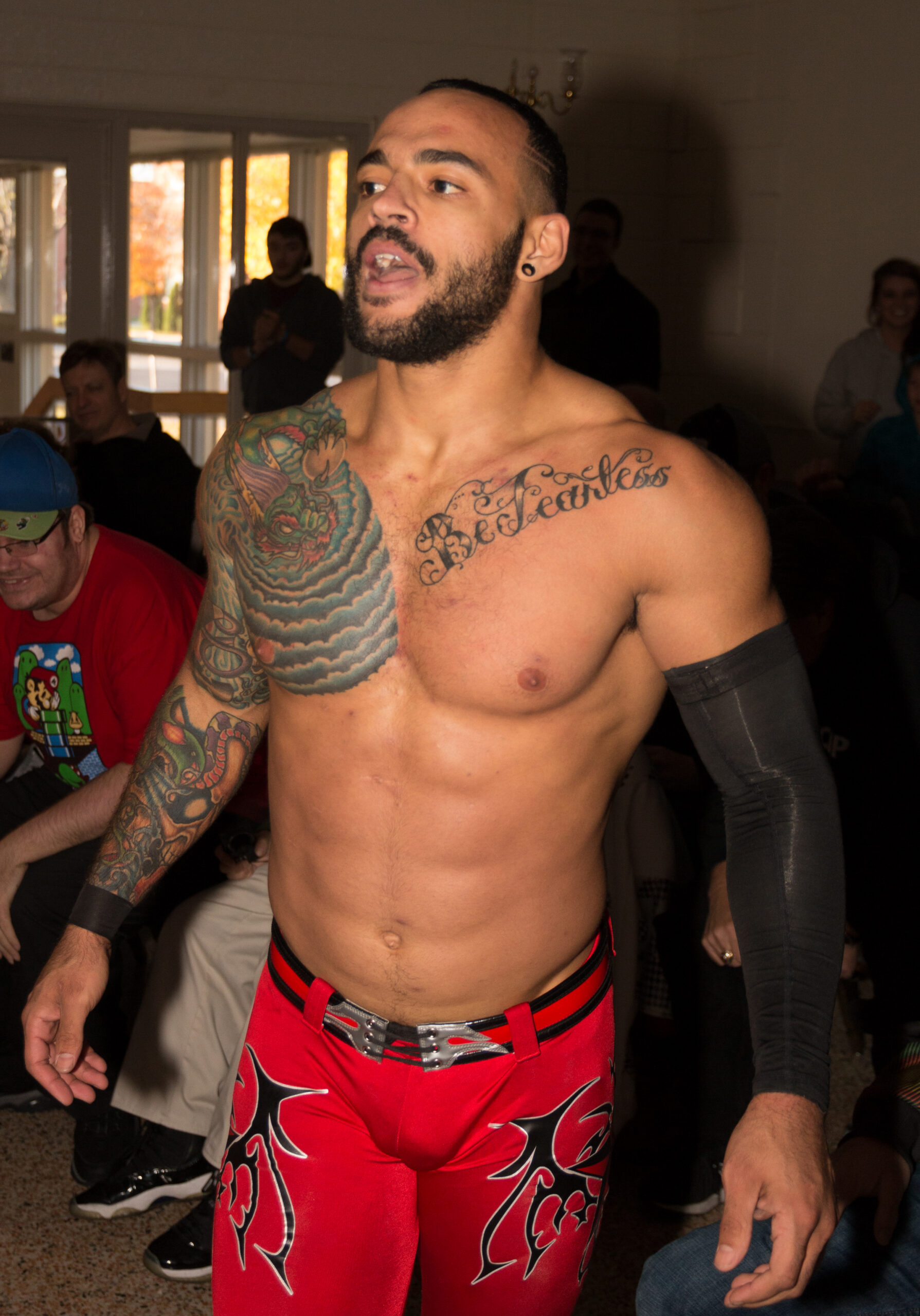
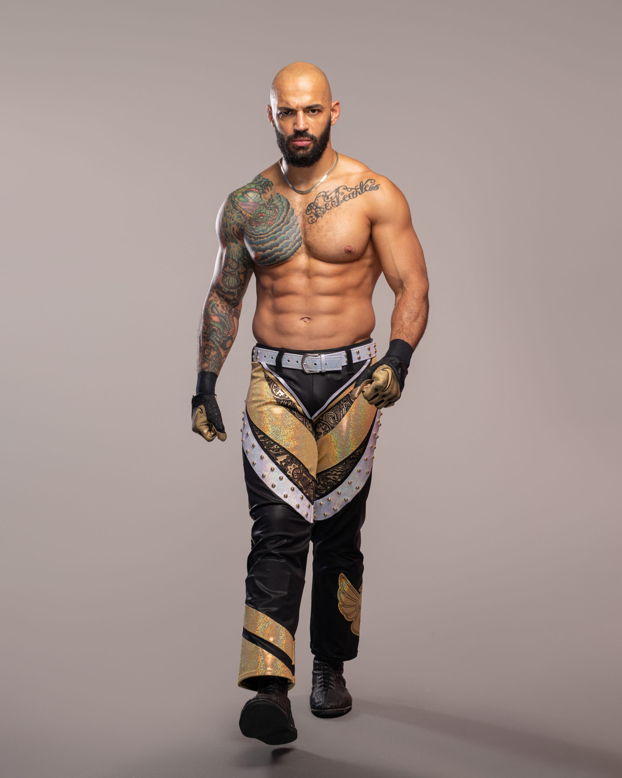
A drawing can carry a private reference and still be easy to recognize. The Ferdinand bull connects to the book, but the picture makes sense on its own. The houses suggest home while keeping their own simple visual language.
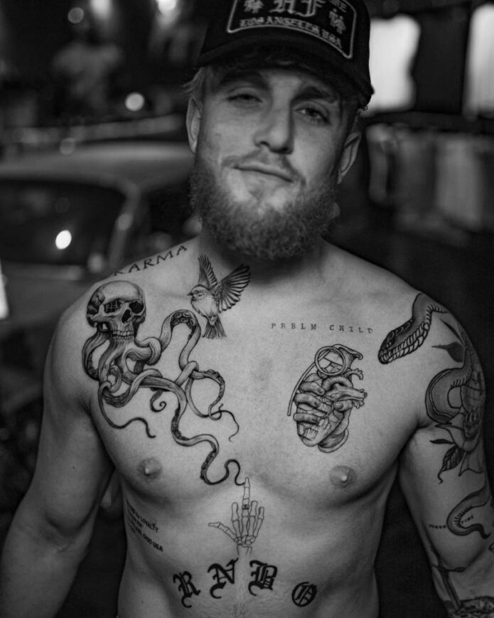
The floral work takes another route. Flowers are a familiar subject, but the shoulder placement and shifts in line weight give this piece its own character. A common design can feel specific when its size and position suit the person wearing it.

Back tattoos need their own kind of planning. The houses need a broad enough area for their small details, and the lower figure benefits from the space below them. Packed into one rectangle, the drawings would lose their sketchbook feel.

The arm’s curve adds movement to its tattoos. The bull and the LOVE ME heart change a little when Lena bends her elbow or turns her wrist. That’s fine; a well-placed design moves with the body rather than pretending skin is paper.

Lettering deserves a close check before it’s inked. Read the words from a normal distance, see how they sit when the arm hangs naturally and leave space around them. Clean letters stay easier to read than a crowded line of tiny details.

If you like Lena Dunham’s tattoos, take note of how each idea has its own place. Use a broader area for an illustration, keep a short phrase clear of busy edges and let the open skin around a house or flower become part of the design.

You don’t have to copy the bull, heart or houses to get a similar feel. The better inspiration is the mix of direct and unusual choices. A collection can hold a book reference, a plain phrase and a familiar flower without losing its point of view.

For more actor ink ideas, browse the site’s actor tattoo guides and compare how performers use the back, arm and chest. Dunham’s collection shows that a group of tattoos doesn’t need one perfect theme to feel complete.