
Andre Gray’s tattoos cover his chest, shoulders, arms, hands and back. The Watford striker’s designs move between family, faith, lettering and portraits. There isn’t one theme repeated over every inch, but each area has a reason for being there.
The back piece is the one people recognize first: a black-and-gray tribute to figures from Black history, with portraits, headlines, scenes and short phrases in one large composition. On the front, roses share the chest with a Roman war scene; his arms carry names, quotes, religious imagery, faces, birds and smaller symbols.
That makes Andre Gray tattoos worth a closer look if you like work that can grow over time. Some parts are meant to read from a distance; others reveal more detail up close. Here’s what stands out across the collection, and what the placement can teach you when planning your own.
His full back is a Black history tribute, not just a large mural
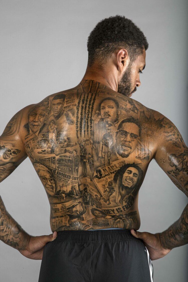
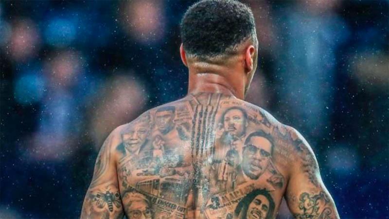
Gray’s back tattoo is the collection’s centrepiece. It brings together Nelson Mandela, Martin Luther King Jr., Malcolm X, Rosa Parks, Muhammad Ali, Marcus Garvey and Bob Marley, alongside Black Panther imagery and newspaper-style lettering. There’s a lot in the design, but the shared subject—people and movements that changed how Black history is remembered—keeps it from feeling random.
Portraits fill the shoulders and upper back, while smaller scenes and text sit lower down. That creates a clear order: the faces catch your eye first, then the headlines and background details come into focus. Several portraits need that kind of hierarchy, or a back piece can become a wall of gray shading.
Gray has said the project took months. The scale makes that believable: an artist has to match lighting and proportions across portraits, then make them sit together as the back bends and moves. With a large tribute, it helps to plan the full composition before settling on each small detail.
If you’re planning a tribute back piece, start with the people who matter most and keep the first draft to a manageable group. More space around each portrait makes the whole image easier to read. Gray’s tattoo uses a personal history to organize a full back without relying on one oversized symbol.
The chest combines roses with a Roman war scene
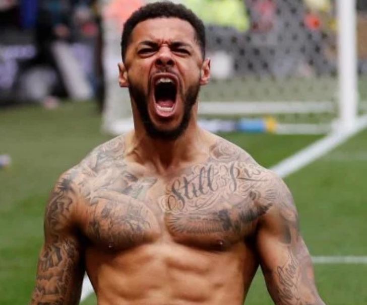
Roses sit near Gray’s shoulders, while a Roman war scene covers the right pec. The scene includes a masked general, armed troops and the Roman numeral MCMXCI, or 1991. Its mood differs from the historical tribute on his back, but the black-and-gray shading helps the two pieces belong to one collection.
The war scene follows the curve of the pec rather than sitting in a flat rectangle. Darker details gather near its center, while the roses soften the shoulder edges and leave the upper body some open skin.
The scene needs room for faces, armor and background lines. Compressing the same idea into a small tattoo would cost it expression and movement. When several figures carry the story, make the placement large enough for the smallest important detail to stay clear.
Roses are familiar, but their position changes their role. Here they frame the chest instead of taking it over. A rose in the center would be the subject; Gray’s shoulder roses support the larger historical image.
His arms are layered with names, quotes, portraits and faith imagery
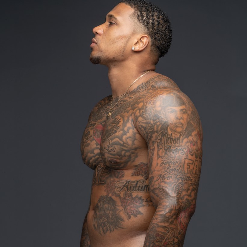
Gray’s arms hold some of the collection’s most personal and varied work. One upper arm has his name inside a crown; other areas include a quote, a Bible verse, a rose, religious figures and portraits. The opposite arm shows a fly, feather, woman’s face, crowned princess, butterfly, tribal face and the words “No Good Without God.”
Because the tattoos arrived at different times, the arms don’t read as perfectly matched sleeves. That’s part of their character. Lettering gives the eye a pause between portraits, and smaller birds or symbols fill spaces without competing with the faces. It feels closer to a visual diary than a set of matching designs.
The crown around his name gives simple lettering a defined edge. A name alone can look unfinished; the frame gives it a shape. The bicep quote works in a similar way, following the length of the muscle.
Planning matters when several tattoos share an arm. Portraits need clean space around eyes and mouths; text needs enough room between letters. Filler doesn’t have to mean another large picture—a bird, feather or small geometric mark can join two pieces without crowding the sleeve.
If you’re adding to an arm gradually, choose the largest portrait or symbol first and leave the connecting areas open. Photograph the tattoo after it has healed before planning the next piece. Fresh ink can look darker and tighter than it will after settling, so the spacing you need may only become clear later.
The shoulder and upper chest carry some of his most recognisable detail
Gray’s upper-body tattoos meet across the chest, shoulder and upper arm. The Roman scene runs into nearby shading; small stars, lettering and portraits bridge the change in direction. That transition can make a collection feel connected instead of divided into separate panels.
Realistic tattoos rely on contrast. Dark shadows separate the figures from the skin, while lighter gray keeps the scene from turning into a heavy patch. On a moving body, that difference helps the image read when Gray turns his shoulder or lifts an arm.
When a design crosses a joint, check the stencil in more than one position. A layout that looks balanced with the arm down can stretch when the shoulder rolls forward. Gray’s tattoos follow the body’s curve, so the portraits remain anchored as the pose changes.
Not every area needs the same darkness. Lighter passages around faces and lettering add depth and give the eye a place to rest. If the background is equally dark everywhere, the details that matter can disappear.
Small hand and forearm details keep the collection visible every day
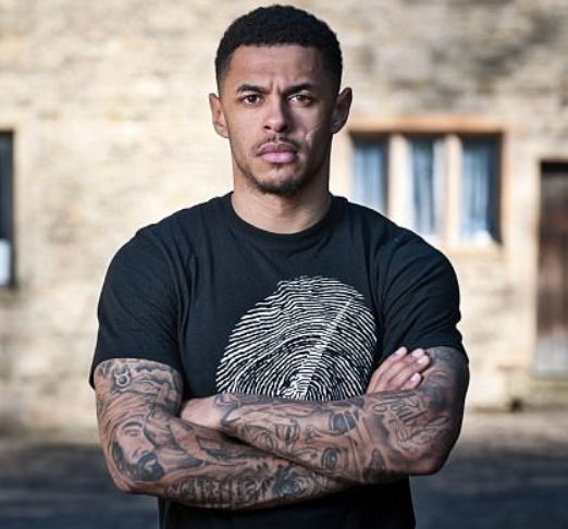
Gray’s lower arms and hands carry ink that’s hard to hide. Roses, compact lettering and small symbols sit near the wrist and forearm, adding to the sleeve without repeating one large image. They show when he’s holding a ball, pointing or celebrating.
Hands and wrists move constantly and get plenty of sun and friction. Clear outlines matter more than tiny decoration, and a design has to read quickly. Gray’s smaller pieces use strong shapes and short details rather than trying to fit a full scene onto the smallest areas.
These marks also break up the scale of the collection. If every tattoo were a portrait, the whole body could feel heavy. A rose or short word gives the eye a pause. Varying the size of the designs is one way to make a heavily tattooed body feel organized.
Before getting hand or wrist ink, think about how it will sit beside a watch, sleeve cuff or jewelry. Photograph the area in a normal daily position, not only with your hand spread flat; you’ll see where the design bends and what might be hidden when the wrist turns.
Gray’s collection carries a story without forcing every piece into one style. The back honors people and movements, the chest combines historical imagery with roses, and the arms gather names, faith, words and portraits. The best starting point is deciding what deserves space on your skin, then choosing a placement where it can be seen clearly.