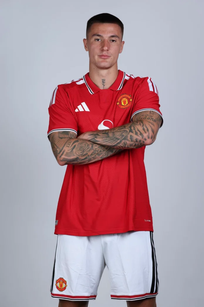
Benjamin Šeško’s tattoos come with a rare advantage: he has sat down and explained many of them himself. In Manchester United’s “The Story of Sesko’s Body Art,” the Slovenian forward walks through a collection that runs from his legs to his neck, mixing family tributes, faith, short pieces of lettering and larger illustrative work. The clearest starting point is his first tattoo, on his left calf: a winged football beside the line “Don’t wish for it, work for it.”
That first design gives the rest of the collection a useful frame, but it doesn’t explain every image. Šeško has said some tattoos are personal, while others are there because he likes the design. Here’s what he has actually shared, and what the visible pieces show, without turning every rose or clock into a made-up symbol.
The chest lettering sits among larger images
The most immediate words on Šeško’s torso are “BALANCE” across the upper chest and “God’s Plan” lower down. The first is framed by fine leafy branches; beneath it, the second phrase is paired with crosses and the number 777. In the Manchester United feature, Šeško links his faith to the way he thinks about life, so the religious words aren’t just an internet guess based on a photograph.
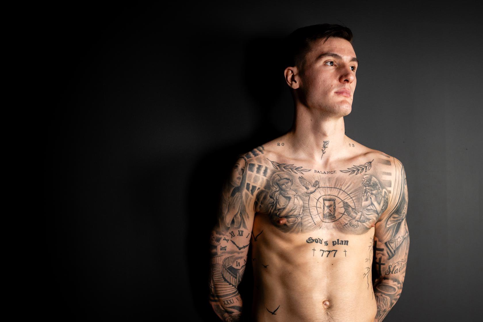
The placement makes the two phrases read differently. “Balance” sits high and wide, almost like a short title across the chest. “God’s Plan” is more compact and central, with the crosses and numerals giving it a denser, emblem-like shape. From a distance, the chest reads as a few strong anchors. Up close, those anchors sit inside a much busier field of illustrative work.
That contrast is part of what makes the layout distinctive. Fine lettering and narrow branches share space with shaded figures, wings, clock faces and darker blocks of ink. The chest isn’t one single picture with a simple border. It’s a collection built up in separate pieces, with changes in scale and line weight doing some of the work of separating one image from the next.
There are also small marks near the collarbones and a rose at the front of the neck. They can be easy to miss in match photographs, where the shirt covers most of the torso and the camera rarely holds a close-up. A full-body tattoo portrait shows how much of the design is concentrated above the waist, while the chest lettering remains readable without needing a dramatic crop.
The religious portraits are personal, not a puzzle to solve
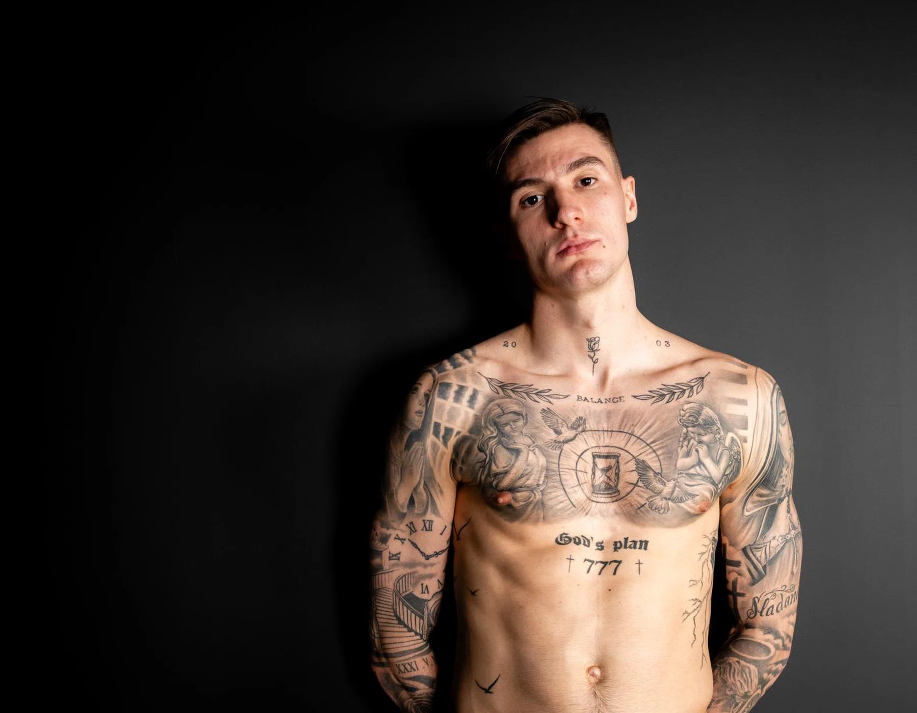
Religious imagery appears across Šeško’s chest and arms. Photographs show praying figures, a woman holding a cross, and a smaller haloed figure among the sleeve work. Coverage of his 2026 tattoo interview also identifies references to Zeus. The safe way to describe the collection is to name what is visible and keep the meanings he has stated separate from other people’s guesses.
Šeško has spoken openly about believing in God. That makes the faith-related subject matter a documented part of his story, but it doesn’t give outsiders permission to assign a precise meaning to every figure, cross or number. A picture may be recognizable as a religious subject; the private reason he chose that exact composition can still belong to him.
The upper-arm portrait is a good example of why close, clear photographs matter. In a shirtless image the figure’s face, hands and surrounding shading are visible as a single composition. In a training photo, the same section can look like a dark patch on the sleeve. The design reads much more clearly when the arm is turned toward the camera, and the portrait can be distinguished from the surrounding script and ornamental fill.
Rather than treating the whole sleeve as one giant statement, it helps to look at how the pieces meet. The portrait has a central focal point; smaller lettering and symbols sit around it; shaded transitions connect the shoulder to the lower arm. That gives the tattooed area a continuous feel, even though it contains several separate images.
Some online tattoo roundups attach elaborate explanations to details such as clocks, stars and clouds. Unless Šeško has confirmed a meaning, those readings should stay in the category of speculation. The interview provides enough real context already: faith matters to him, and he chose to show and discuss the work in his own words.

His arm lettering puts motivation and faith into words
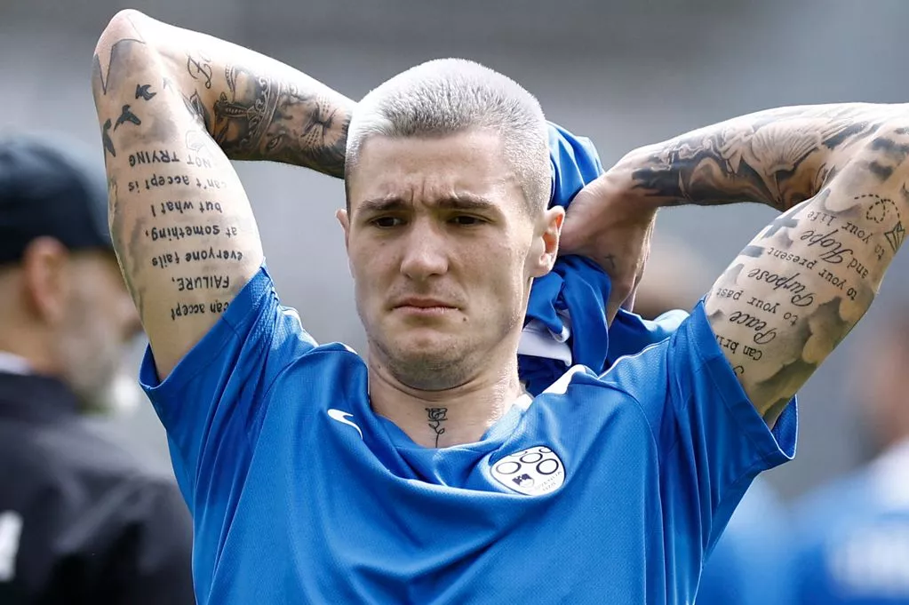
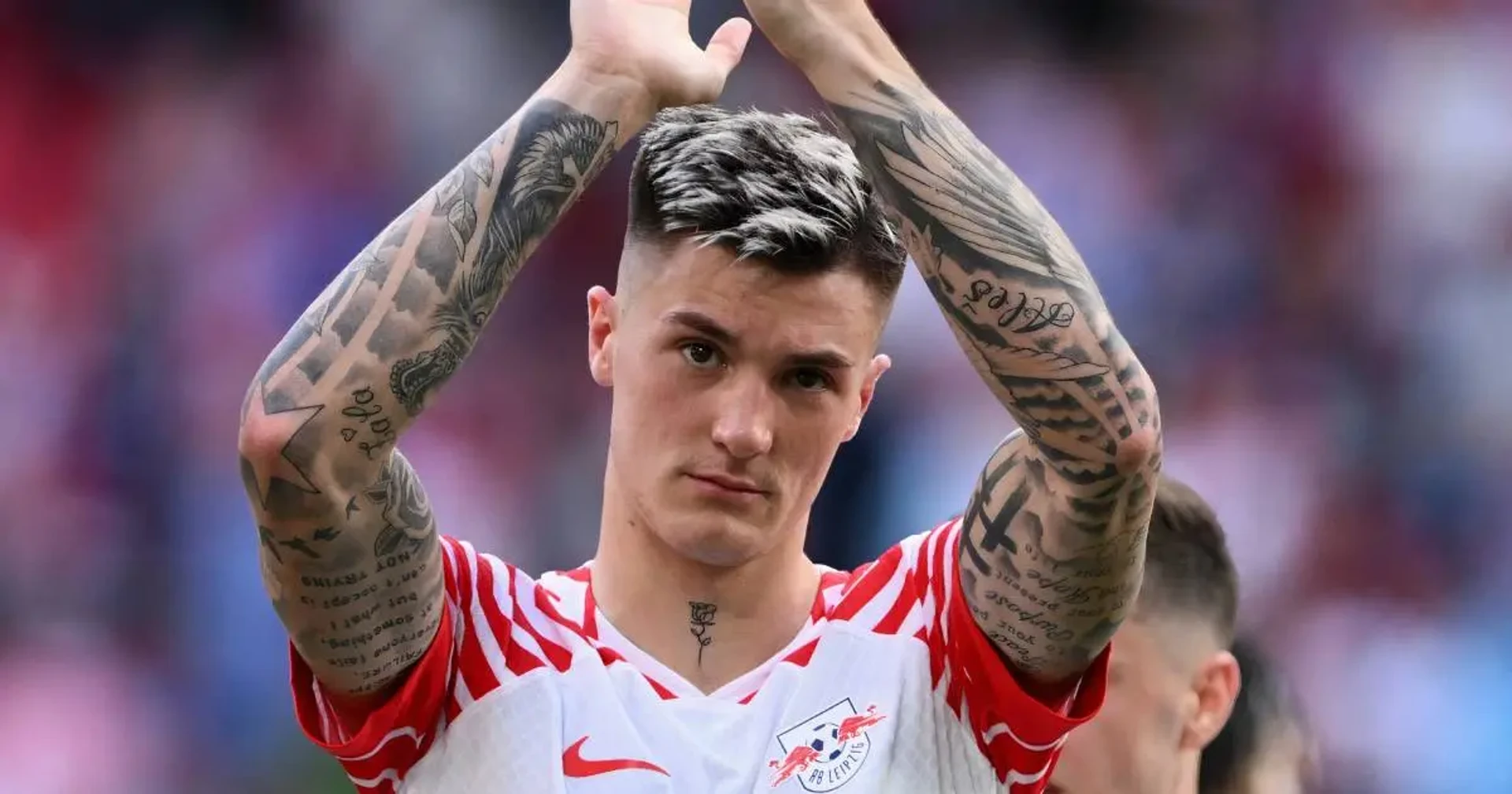
Text is a major part of the arm work. One visible quotation reads, “I can accept failure, everyone fails at something, but what I can’t accept is not trying.” It is widely attributed to Michael Jordan. Another script passage carries a religious message about peace in the past, purpose in the present and hope for the future. A training photograph with both arms raised makes the lines especially easy to see, while also showing how the writing sits among the surrounding illustrations.
The two quotations have different visual rhythms. The Jordan line is arranged as a longer block of text, while the faith passage uses flowing script. On a moving athlete, lettering can disappear into folds, shadows or the angle of an arm; in a still image, the lines become a deliberate part of the composition rather than background texture.
Šeško has connected the first calf tattoo’s work-for-it message with visualization and everyday motivation. That gives the words a practical role in his account of the collection. It is more precise to say that he has described visualization as important to him than to claim that each phrase is a direct football manifesto. A tattoo can be personal without being a slogan for every part of its owner’s life.
Across the arms, fine script has to share space with darker portraits and larger shaded panels. The writing is not isolated on blank skin; it’s layered into a sleeve that changes as the arm turns. This is why different photographs can tell different parts of the story. One frame makes the words readable, another shows the figures around them, and a wider view explains how the pieces fit together.
The family tattoos are his most direct personal tribute
Šeško’s family tattoos are unusually clear in both their subjects and the reason he gave for them. The calf design is reported to show Benjamin and his sister Zala between their parents, Aleš and Slađana, with a line about staying together even when distance separates them. He said he was proud to have his family’s names tattooed and spoke about how much he values the time they spend together.
There is a practical detail behind that choice. Šeško has spent periods away from home since he was young, and he described staying close to his parents and sister while living abroad. The tattoo turns that everyday connection into something visible, rather than relying on a broad symbol that needs an outside interpretation.
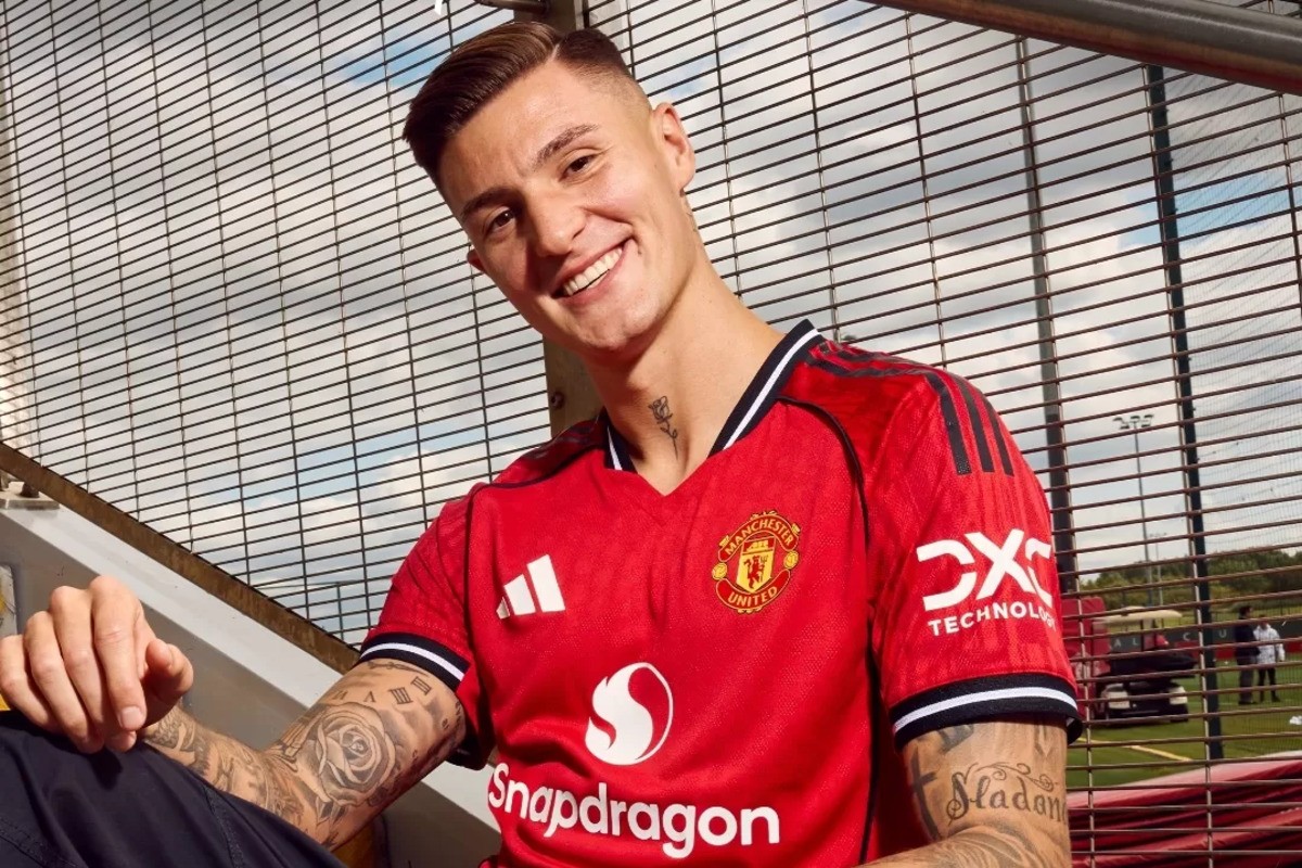
Photographs also show his mother’s name, “Slađana,” among the arm work. That is a separate visible placement from the family group on the calf, so the two should not be mistaken for one single design. Taken together, the pieces make family one of the most plainly documented themes in his collection.
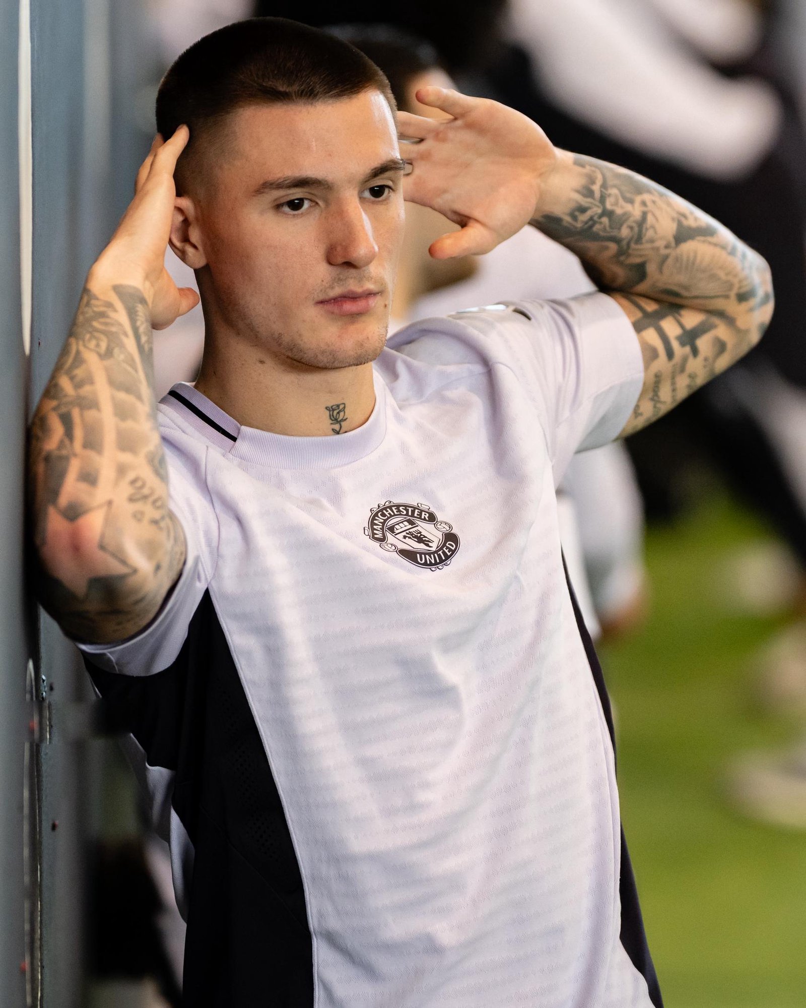
A second angle shows the same name and surrounding sleeve from a different moment. The lettering is part of a larger arm composition, while the calf tribute remains a separate piece; keeping those placements straight matters when matching a photo to the story.
The sleeves combine portraits, roses and smaller motifs
Šeško’s arms hold the broadest mix of styles. The visible work includes roses, clocks, portraits, religious imagery, script and small symbols. Manchester United’s interview presents these designs as separate stories rather than one fixed theme. That matters: it’s tempting to give every familiar motif a stock meaning, but the most dependable explanations are the ones he has personally shared.
Roses appear in more than one place, including the neck and arm. The petals and leaves create softer, curved shapes beside the harder geometry of lettering and clock faces. Some of the arm photographs show a rose tucked into a larger shaded composition; others reveal how branches and smaller marks help fill the spaces between focal images.
Clocks are another visible element, sometimes surrounded by roses. A clock face can invite guesses about a birth time or a milestone, but a photograph alone can’t establish that. The same caution applies to stars, clouds and small numerals. Unless a meaning is in Šeško’s own explanation, the honest description is the design and its placement, not a story invented to make it sound more mysterious.
The full sleeves also show why “one tattoo” is a poor description of the collection. There are multiple independently readable pieces, with different amounts of shading and detail. Some are graphic and legible from across a room; others reward a close look. The result is dense, but the images are not all competing equally. A portrait or large flower tends to catch the eye first, while small symbols and writing emerge after.
The upper arms and forearms are dense enough that a single photograph rarely shows every piece clearly. A broad image is useful for seeing the overall coverage, while closer views reveal how a portrait, flower, clock and lettering sit alongside one another. That mix of wide and close photographs gives a more faithful sense of the sleeves than repeating one tight crop.

The neck details sit within a collection still growing
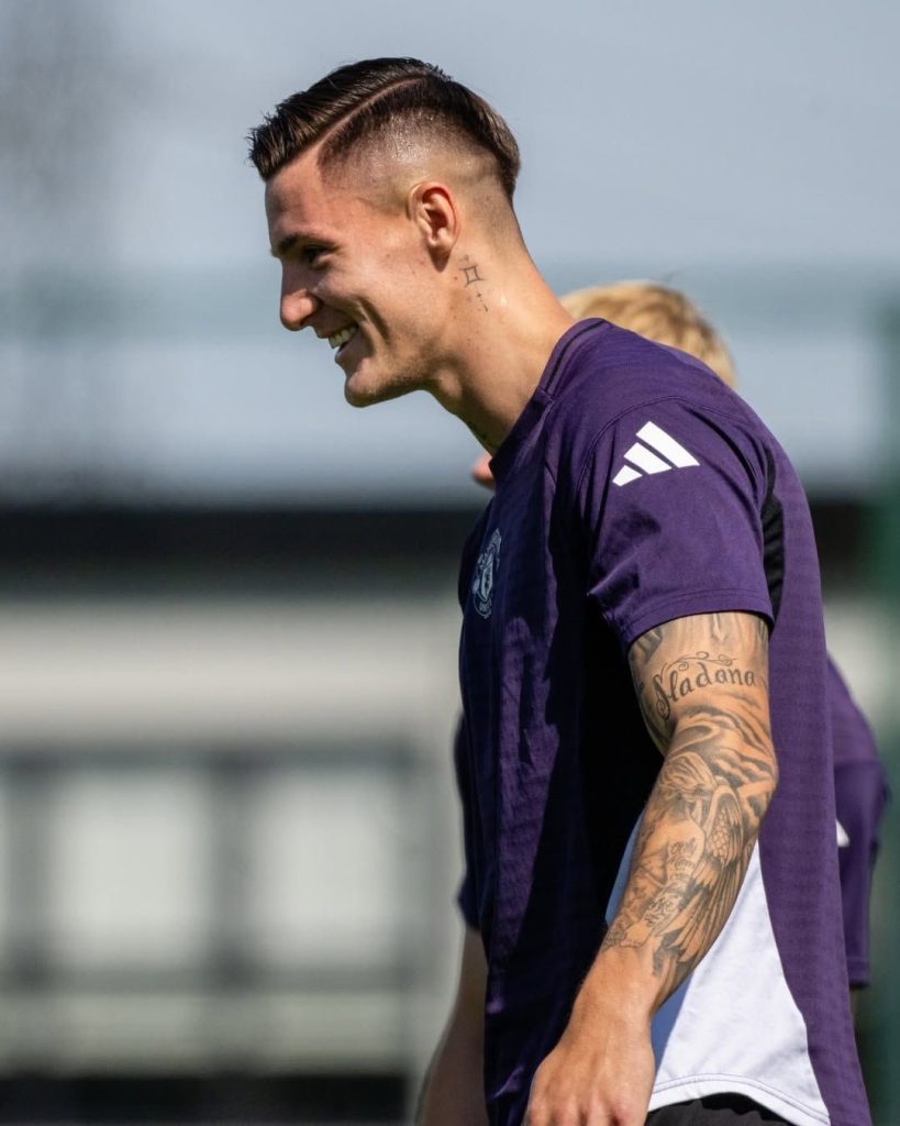
A small rose sits at the front of Šeško’s neck, with other compact marks visible near the collarbones and below the ear in close-up photographs. These placements are easy to lose in action shots, but a side-profile view makes the neck ink clear. It also shows how the small marks sit above the much larger chest and arm compositions.
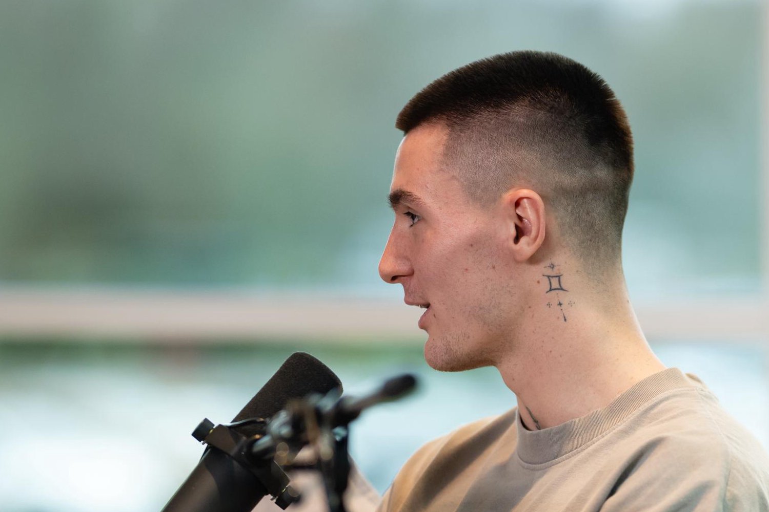
In the interview coverage, Šeško said he had liked tattoos since childhood and that seeing tattooed people made him want some of his own. He joked that once you start, it’s hard to stop, while also saying he would leave some room for future trophies. That line sounds light, but it tells us the collection is still open rather than a finished catalogue.
He has also discussed a future large piece for his back. That is a plan, not a tattoo he already has, so it shouldn’t be described as part of the current collection. The distinction is useful when photographs and older articles circulate together: body art changes over time, and an intention to add a design is not evidence that the design has been completed.
Šeško’s account makes the collection feel less like a set of internet “meanings” and more like a personal archive. The first calf piece connects effort with a visual image of a winged football. The arm and body work includes the names of close family members, while faith-related images reflect beliefs he has discussed publicly. Other designs may simply appeal to him aesthetically. He has not said that every tattoo needs one grand explanation.
That mix is what gives the tattoos their character. The large portraits and sleeves are immediately striking, but the smaller phrases reveal the quieter, more direct side of the collection. Together, they show a young footballer choosing images for different reasons, adding them over time and leaving space for more. He has not said that every tattoo needs one grand explanation. The most accurate guide is still the one that separates what Šeško has explained from what a viewer can only guess.
Watch Šeško talk through the collection in the Manchester United feature below.