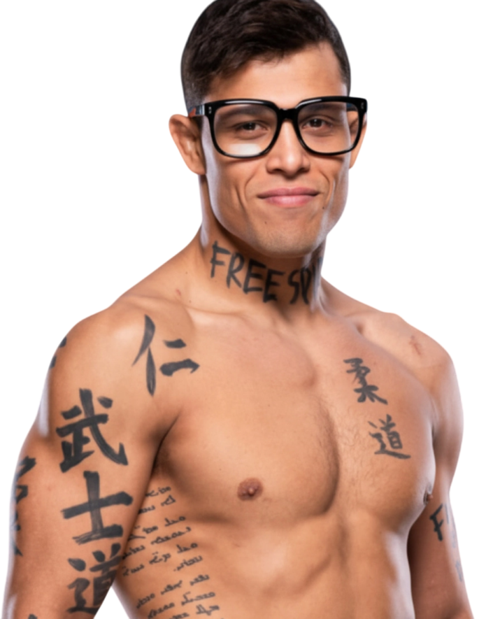
Caio Borralho doesn’t have the sort of tattoos that sit quietly in the background. The words on his neck show up before the fight starts, before the first takedown, and usually before you’ve had time to work out what kind of fighter you’re watching. FREE SPIRIT is written across his throat in rough, heavy lettering, while Japanese characters run down his chest and more ink sits across his arms.
That makes his tattoos pretty easy to spot, but the interesting part is that the designs aren’t just there to make him look tougher. Borralho has talked about the neck piece and the feeling behind it. The rest of the collection fits with the same idea: freedom, martial-arts discipline, and the stubborn willingness to keep going when a fight gets ugly.
There is a useful difference between reading a tattoo from a photograph and knowing what the wearer meant by it. The photos can confirm the lettering and where the ink sits, while Borralho’s interviews are what give the phrases their proper limits. That is why this collection is worth looking at without turning every mark into a mystery. Some pieces have a clear explanation. Others are simply visible parts of a fighter’s body, and it is better to leave them there until he gives them a fuller story.
The Brazilian middleweight is also known by the nickname “The Natural.” He came through the UFC Contender Series, built his place at Fighting Nerds, and turned up to media days in the now-familiar glasses that became part of his look. The tattoos help fill in the picture, but they don’t explain everything for him. They’re more like quick signals.
Who Is Caio Borralho?
For readers who only know him from a highlight clip, that background is useful. He is not presenting the tattoos as a separate fashion project. They appear in the same interviews where he talks about preparation, opponents and the work required to stay competitive. The ink is part of the fighter people already see, not a replacement for the fighting itself.
Borralho is a Brazilian UFC middleweight from Maranhão. His career has been built around a mix of physical pressure and a very obvious interest in learning. He has spoken about science, training and the small technical details that make a fight work. That is a slightly different image from the usual all-gas-no-brakes fighter, and it suits the Fighting Nerds identity he helped build.
He also has a look people remember. The glasses, the lean frame, the Japanese lettering and the giant neck phrase all stand out in a sport where fighters are often trying to look as intimidating as possible. Borralho’s style is still intense, but there’s a bit more personality in it. The tattoos don’t feel like a costume. They feel like part of the same odd mix of curiosity and aggression.
FREE SPIRIT Across His Neck
The neck tattoo is the first thing most people notice. FREE SPIRIT runs across the front of Borralho’s neck in large black letters, with the words following the shape of his throat. It’s not delicate lettering and it isn’t hidden away. You see it when he’s speaking at a media day, standing at weigh-ins or walking to the cage.
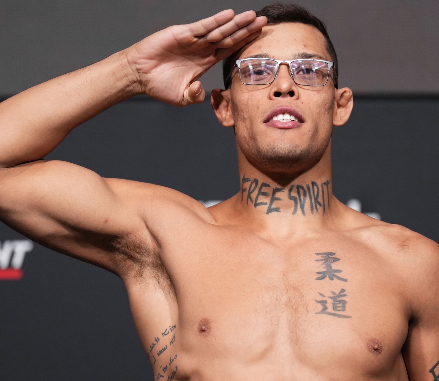
Borralho has explained that the phrase means something specific to him inside the Octagon. He described the feeling of being free there, able to do what he chooses and fight in his own way. That doesn’t mean the tattoo is a claim that he ignores coaching or preparation. It’s more about the mental space he wants when the door closes and the fight becomes his problem.
That distinction matters. A phrase like “free spirit” can sound generic when it’s printed on a T-shirt, but on Borralho’s neck it’s tied to a very particular place. He isn’t talking about wandering around without a plan. He’s talking about having room to trust his instincts after all the drills, sparring rounds and game-plan conversations are finished.
Judo and Bushido in Japanese Script
Below the neck lettering, Borralho has Japanese characters across his chest and upper body. The visible script includes references to judo and bushido, along with characters associated with ideas such as benevolence and justice in the official UFC imagery. The exact translation of every mark shouldn’t be guessed from a photograph alone, but the martial-arts connection is clear.
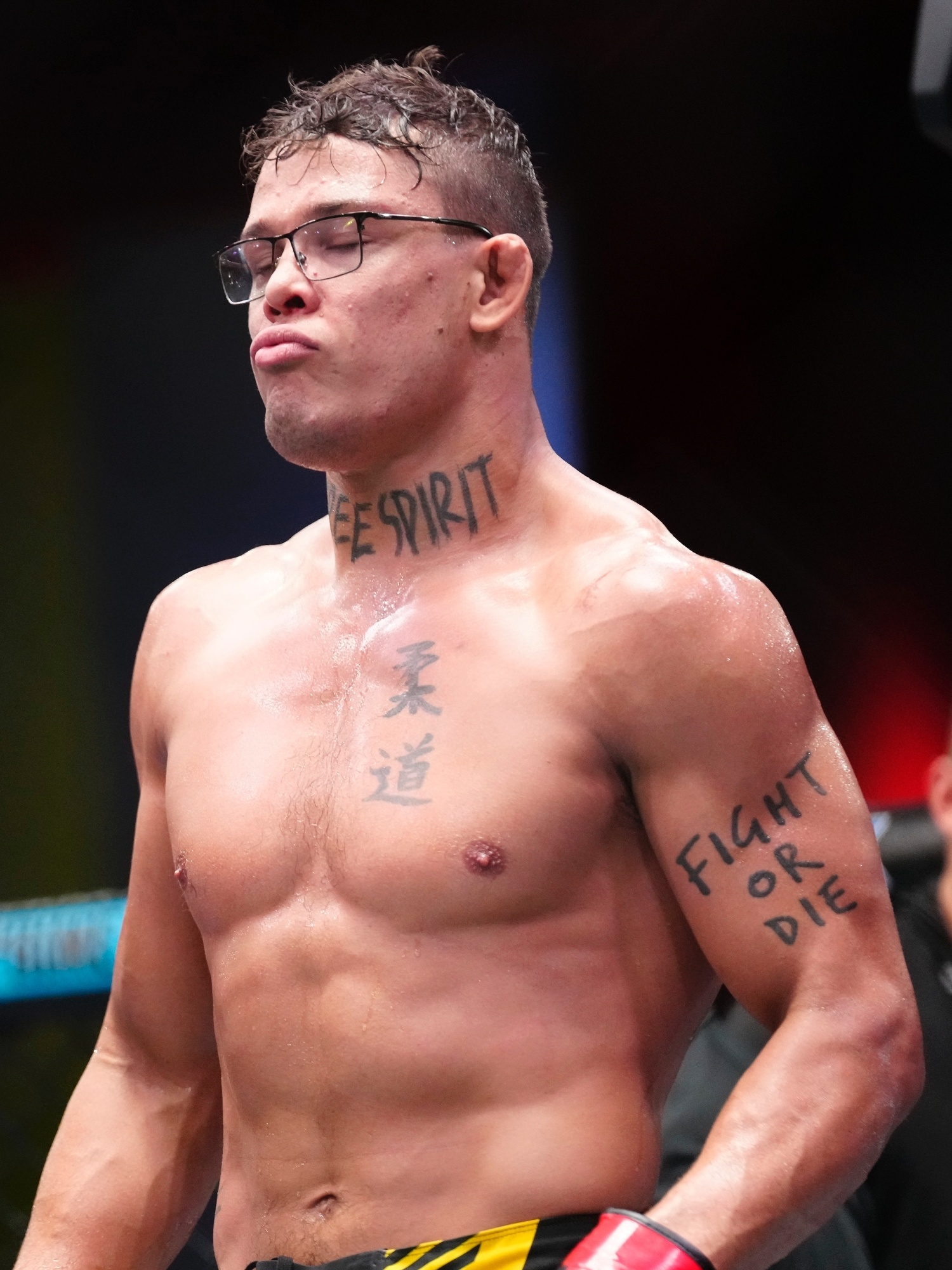
Judo makes sense as part of Borralho’s fighting identity. It points to throws, balance, grips and the kind of close-range control that can change a round in a second. Bushido brings a broader code of discipline and conduct into the picture. Borralho’s tattoos don’t look like a random collection of symbols copied from a search result. They sit alongside his actual training life.
The chest placement also gives the script a different feel from the neck piece. FREE SPIRIT is loud and readable from across a room. The Japanese characters ask for a closer look. They work more like personal markers than a slogan for everybody else.
Fight or Die on His Arm
Another phrase that turns up clearly in Borralho’s fight photos is FIGHT OR DIE on his arm. It’s blunt, and it’s a lot less open-ended than the neck tattoo. There’s no need for a long explanation to understand the mood. This is the language of someone who has chosen a difficult sport and knows that hesitation can cost a fight.
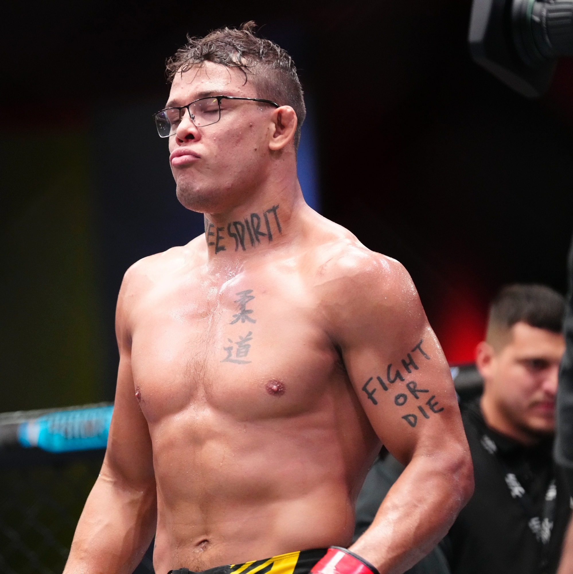
There’s still a reason to be careful with it. The phrase is easy to see, but the sources I checked don’t give a detailed personal story for exactly when he got it or who designed it. So it’s better to describe the tattoo as visible fight-focused lettering than to invent a family meaning or claim it represents one specific bout.
Placed on the upper arm, the words move with Borralho’s striking and grappling. They’re visible when he raises his hands and when he turns his shoulder into an opponent. That makes the tattoo feel connected to the work rather than added as decoration after the fact.
Ink in His Fight Photos
Portraits and weigh-in photos show more of the collection than the neck phrase alone. You can see the Japanese writing down the chest, smaller script along the side of his torso and additional ink across both arms. The images don’t always show every mark clearly, but they do make one thing obvious: Borralho’s tattoos are spread across his body rather than built around one single centerpiece.
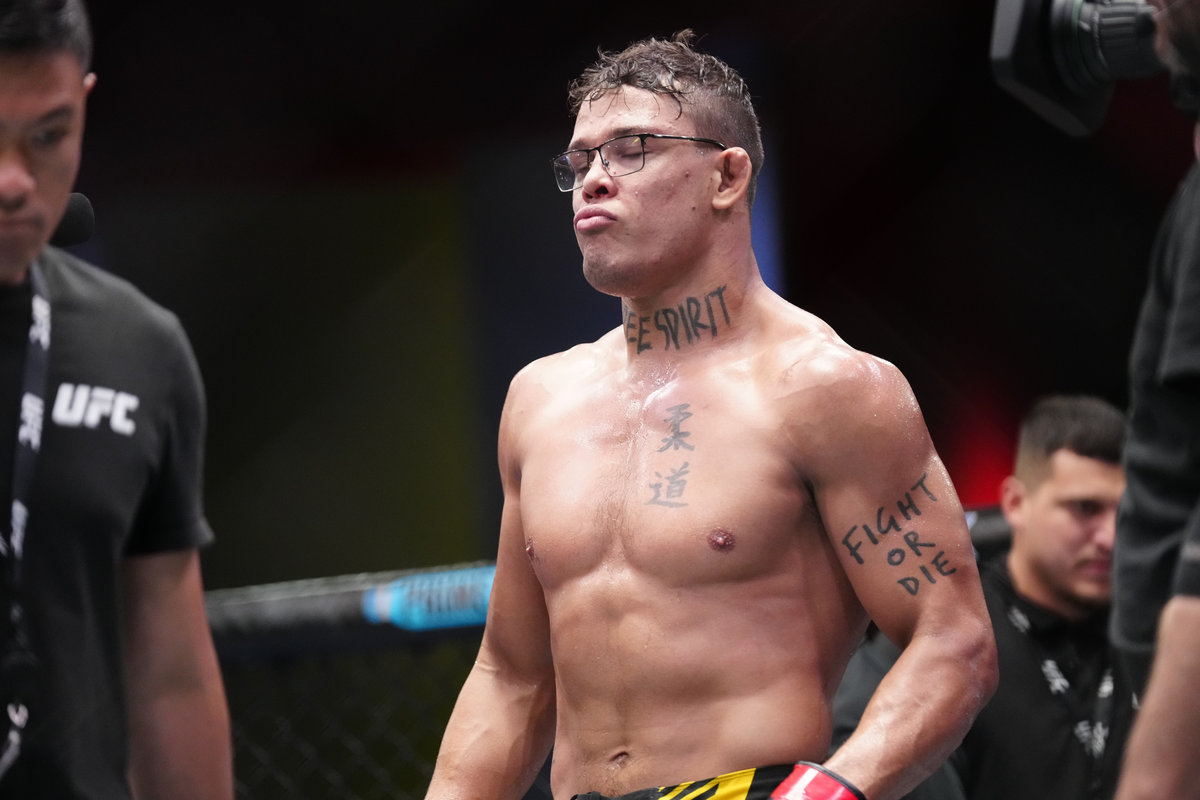
The different photographs are useful because each one catches a slightly different angle. One frame makes the neck lettering the focus. Another shows the chest characters more clearly. A wider fight image brings the arm text into view. None of that changes the meaning of the tattoos, but it gives a more honest idea of what the collection looks like on a moving fighter.
That matters with MMA tattoos. A posed studio image can make everything look flat and perfectly arranged. Borralho’s ink is usually seen under bright arena lights, after a hard cut to weight, or while he’s still breathing heavily after a fight. The tattoos are part of that setting.
Why the Ink Fits His Fighting Nerds Identity
Borralho’s tattoos fit the unusual identity around Fighting Nerds. The team became known for mixing serious training with glasses, science talk and a less predictable public image. The ink adds another layer. It gives him visible signs of a fighter who cares about martial-arts tradition but still wants to define himself on his own terms.
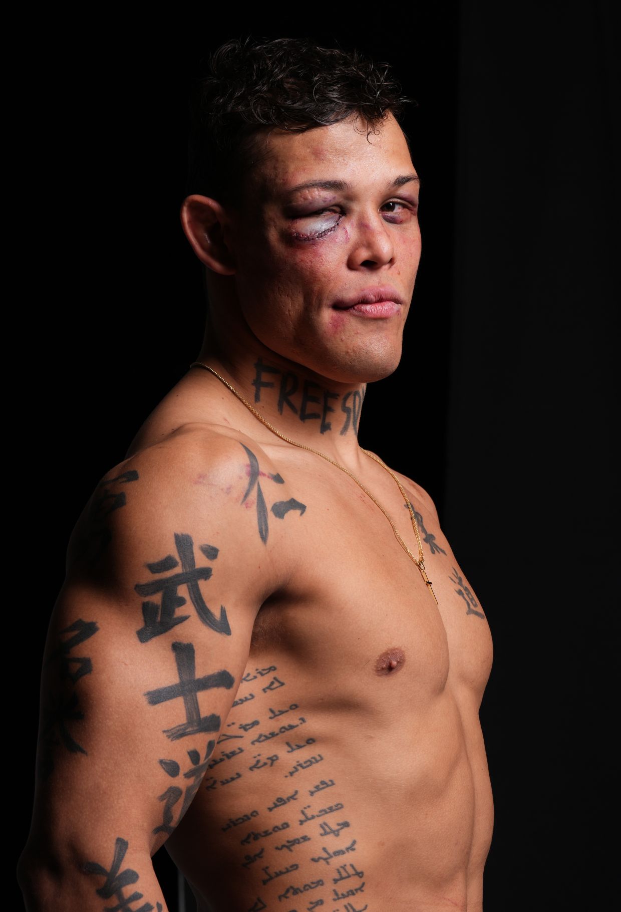
The contrast between the pieces is what makes the collection work. FREE SPIRIT is direct and modern. The Japanese script is quieter and more formal. FIGHT OR DIE is pure fight-poster language. Put together, they suggest someone who likes clear ideas but doesn’t need every tattoo to look the same.
There’s also a useful lesson in the way the tattoos are placed. The neck piece is the statement. The chest and arm work give it context. If you’re planning a collection of your own, that’s a better starting point than copying one symbol because it looks good in a photo. Think about which idea deserves to be visible first, then let the smaller pieces build around it.
Final Take
Caio Borralho’s tattoos are easy to recognise because the biggest one is right on his neck, but FREE SPIRIT is only the opening line. The Japanese lettering connects to judo, bushido and martial-arts discipline. The arm text brings the hard-edged side of fighting into view.
What makes the collection work is the tension between freedom and structure. Borralho wants to feel free once the fight begins, but he gets there through years of rules, repetition and technical work. His tattoos say both things at once. They’re loud enough to read from the cheap seats, but the details reward a closer look.
If you like tattoo ideas with a strong point of view, Borralho’s ink is a good example of how a collection can be personal without being overly complicated. Pick the phrase or symbol that matters most, give it the best placement, and let the rest of the tattoos support it instead of competing for attention.