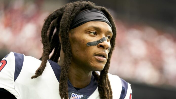
DeAndre Hopkins’s tattoos are a mixture of family history, peace symbols and different artistic traditions. He has a father tribute across his back, a tiger across his chest and shoulder, the word “Metta” on his arm and a watercolor peace sign on his hand. In his GQ Tattoo Tour, Hopkins talks about the designs with the same curiosity he brings to his football style. He likes switching between Japanese and American art instead of forcing everything into one matching sleeve.
The halo and wings tattoo remembers DeAndre Hopkins’s father
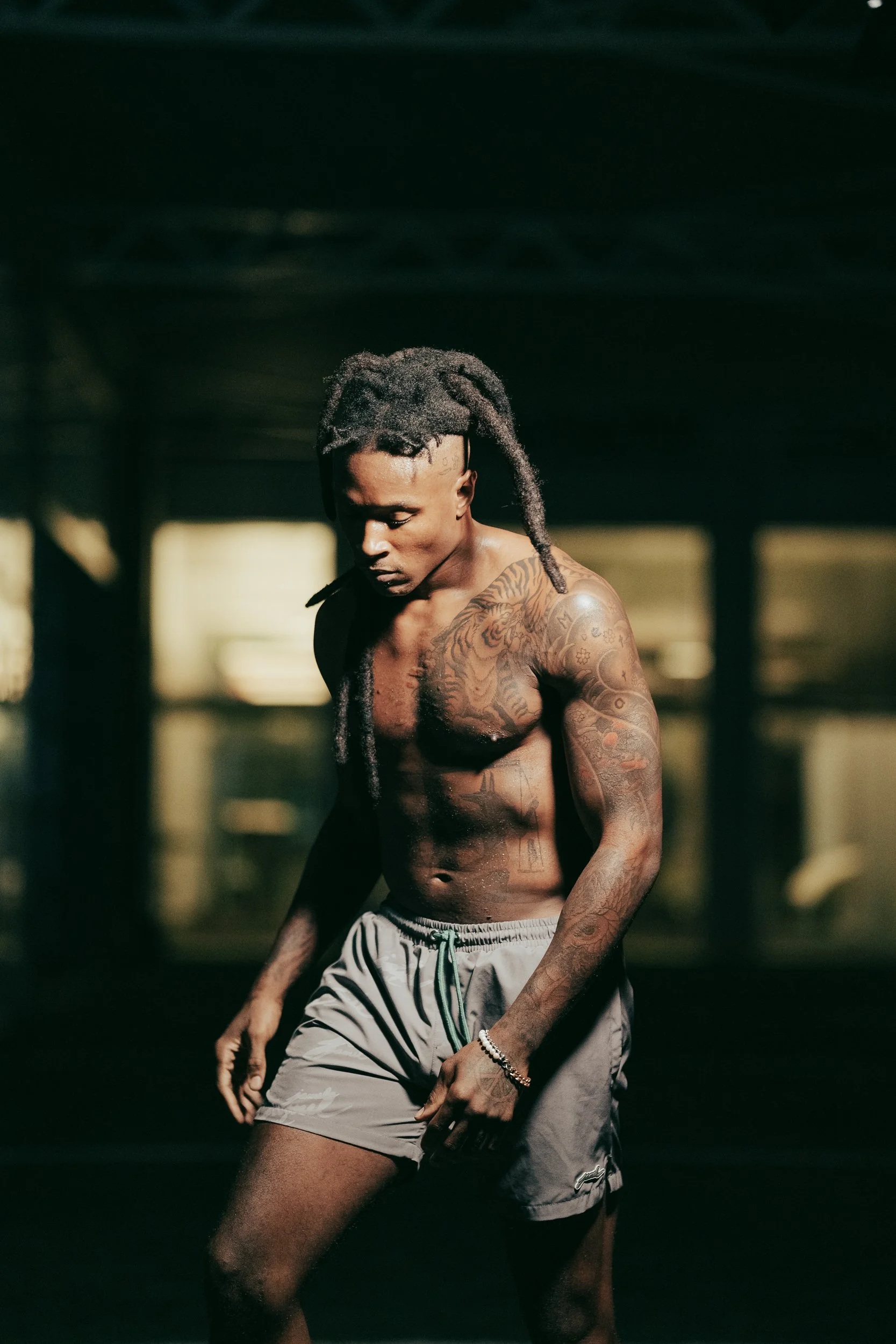
Hopkins says his favourite tattoo is the one dedicated to his father. He was a child when his father died, so the design became a way of keeping that memory close. The piece includes a halo and angel wings across his back, and Hopkins explains that the wings represent his father’s legacy and impact on his life.
The placement was partly practical. Hopkins says he tried to hide the tattoo from his mother for as long as possible, and putting it on his back made that easier around the house. That detail gives the piece a different kind of origin story from a tattoo chosen for public display. It started as something personal that he could keep covered, even though it later became one of the most recognisable parts of his collection.
Back tattoos are difficult to document properly. A front-facing interview shot can show a shoulder edge or a small piece of the wing, but it cannot establish the complete layout. The clear rear photograph matters because it shows how the wings spread over the back rather than treating one visible feather as a separate design.
Hopkins also says his first tattoo came when he was fourteen. He describes it as a signature-style piece done by a friend, joking about the quality of the equipment. That early tattoo sits at the start of a collection that later became much more planned. The contrast is useful: not every part of his tattoo history began with a professional studio or a detailed concept.
A tiger chest tattoo brings Japanese and American ideas together
The tiger was designed to fit the shoulder and chest.
Hopkins says he designed the tiger himself and gave the Japanese tattoo artist a clear idea of the style he wanted. The result is bigger than a simple animal portrait. The stripes, flowers and surrounding shapes run from the chest into the shoulder, so the tiger still reads when his arm is raised or covered by a jersey. That placement also explains why different photographs show different parts of the design.
He has said he likes switching between Japanese and American tattoo ideas rather than forcing the whole collection into one style. The tiger is the clearest example of that choice: it has a traditional Japanese influence, but it belongs to a larger personal mix that includes lettering, family references and modern colour work.
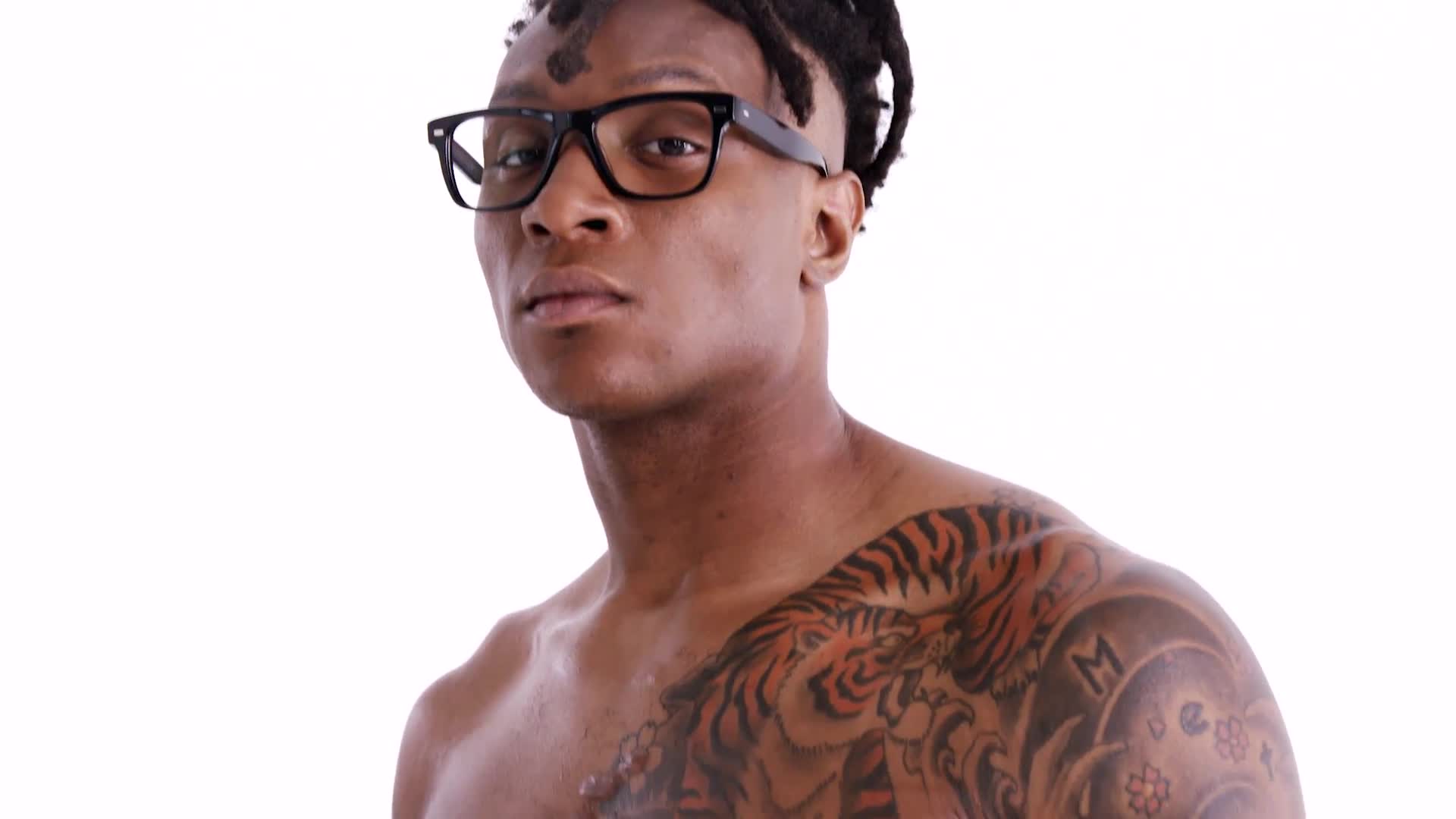
The tiger on Hopkins’s chest is one of the boldest designs in his tattoo collection. He says he designed the concept and worked with a Japanese artist who had done many tigers before. He wanted a particular style and a certain look, so the final piece was shaped by both his own idea and the artist’s experience.
The tiger spreads from the chest toward the shoulder, with additional flowers and patterns around it. In a single photograph, the animal can look like the whole tattoo, but the surrounding lines are what make the area feel finished. A wider image shows the composition; a tighter GQ frame makes the tiger’s face and stripes easier to inspect.
Hopkins is open about mixing styles. He says he likes different eyes, different views and different kinds of art, mentioning Japanese and American work in the same conversation. That helps explain why the collection is not built around one strict visual language. The tiger can carry Japanese influence while sitting beside lettering or symbols that came from another part of his life.
The chest also shows how sports photography can be misleading. A jersey hides almost everything, while a shirtless portrait reveals the tiger, flowers and the work moving down the arm. The tattoo has not necessarily changed just because a game photograph shows less of it. The clothing and camera angle have changed.
Metta and the watercolor peace sign hand tattoos show Hopkins’s interest in peace
“Metta” and the hand piece were meant to be seen.
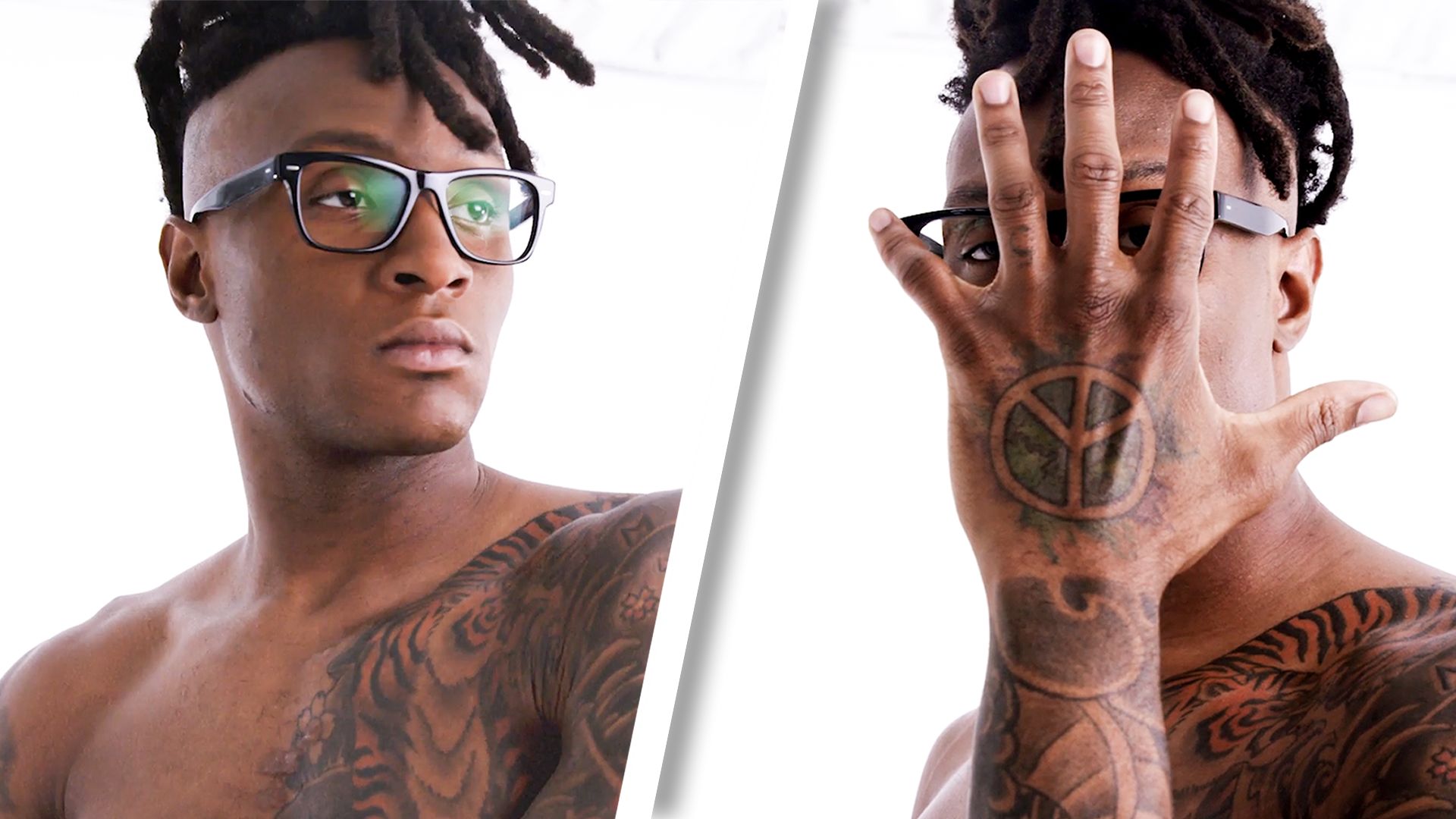
The word “Metta” is on Hopkins’s arm, and he explains that it means world peace. The hand tattoo is a separate idea: a watercolor peace sign that changes from purple toward blue and green as the ink settles and the light shifts. He wanted that design on his hand so it could still be seen with a button-down shirt on. Those are two different tattoos, so they deserve separate descriptions even though they sit inside the same broader peace theme.
That distinction also makes the imagery easier to follow. The arm photograph should be used for the lettering, while the close hand frame is the useful evidence for the watercolor peace sign. A full-body portrait can show where both sit, but it cannot replace a clear detail photograph of either design.
The word “Metta” sits on Hopkins’s arm. He explains that it means world peace, which gives the lettering a clear purpose without needing a long theory around it. It is a compact word, but its placement lets it work as a visible part of the larger collection.
The watercolor peace sign is even more distinctive. Hopkins calls it one of his favourites and says it was his last tattoo at the time of the GQ interview. He wanted it on his hand because it represents who he is and because he wanted people to see it even when he wears a button-down shirt.
He also points out that the colours change in different light. What began with more purple tones later looked more blue-green. That is a useful reminder that colour tattoos are not fixed in every photograph. Lighting, healing and age can make the same ink appear warmer or cooler.
The peace sign is a good example of a tattoo chosen for public visibility. The back wings started as something Hopkins wanted to hide from his mother. The hand design does the opposite. It is deliberately placed where a sleeve or shirt cannot completely cover it. The two pieces show different sides of the same collection: private remembrance and visible self-expression.
Seen together, Hopkins’s tattoos are not a random set of sports-celebrity decoration. The back carries his father’s memory, the tiger reflects his interest in art and the peace designs spell out a value he wants associated with him. The images need to remain genuinely different because each view proves something different: the back shows the wings, the GQ close frame shows the tiger and hand work, and the full portrait shows how the separate areas connect.
Hopkins’s own comments keep the meanings clear. He does not say every small mark has one grand explanation. He talks about styles, memories and the ideas he wanted to draw. That is enough. A careful guide can describe the visible placement, name the designs he identifies and leave uncertain details alone rather than assigning a story that the photograph cannot prove.
The wider tattoo collection includes smaller details that are easier to miss when Hopkins is wearing football equipment. The hand is the most obvious example because the peace sign can appear between a ball, a glove or a sleeve depending on the photograph. His arm lettering can also be partly covered by pads and jersey fabric. That is why a guide based only on game-day images would make the collection look much thinner than it really is.
Hopkins’s comments about drawing are important too. He says he likes creative expression and that he used to draw over tests and homework as a child, even when he had answered the questions correctly. That habit gives some context for the way he approaches tattoos. The designs are not only things he picked from a catalogue. He talks about choosing the look, working with the artist and changing the idea until it feels like his.
The Japanese influence is most obvious in the tiger, but Hopkins says he likes different styles rather than treating one tradition as a rule for the whole body. The result is a collection with an intentional mix of clean lettering, a large animal, floral details, a peace symbol and the angel imagery on the back. Each group has its own visual language, and the body becomes the place where those languages sit together.
There is also a timeline hidden in the way the pieces are discussed. The first tattoo arrived when Hopkins was fourteen. The father tribute came from a much more serious family memory. The tiger reflects a later interest in design and collaboration, while the watercolor peace sign was the newest piece in the GQ tour. A photograph from one period cannot be treated as a complete current inventory without checking when the image was taken.
The father tattoo should also be kept separate from the peace designs. Both can be described as meaningful, but the meanings are different. The wings remember someone Hopkins lost and the legacy that person left behind. The peace sign is a statement about how Hopkins wants to move through the world and how he wants that idea to remain visible. Combining them into one vague “inspirational” story would lose the detail that makes each piece worth discussing.
Readers will also notice that the colour does not look identical in every image. Hopkins says the watercolor peace sign shifted from purple toward blue-green as time passed. The tiger can appear warmer under studio lights, while the wings may look softer in a dark rear portrait. These are normal differences between photographs, not reasons to assume that a design has been replaced or redone.
In the end, Hopkins’s ink works because it is personal without being locked into one style. A family memorial sits beside an animal design, world-peace lettering and a hand symbol that he deliberately wants people to see. The strongest photographs are the ones that show a specific area clearly, and the strongest descriptions stay close to what Hopkins actually said.
That balance is especially useful for a heavily tattooed athlete. Some marks are obvious from the sideline, while others only appear when he chooses to show them. A respectful inventory does not need to pretend that every shadow is a confirmed symbol. It can name the tiger, wings, Metta and peace sign, explain their stated context and let the remaining small details stay open until a clear photograph or direct explanation supports them.