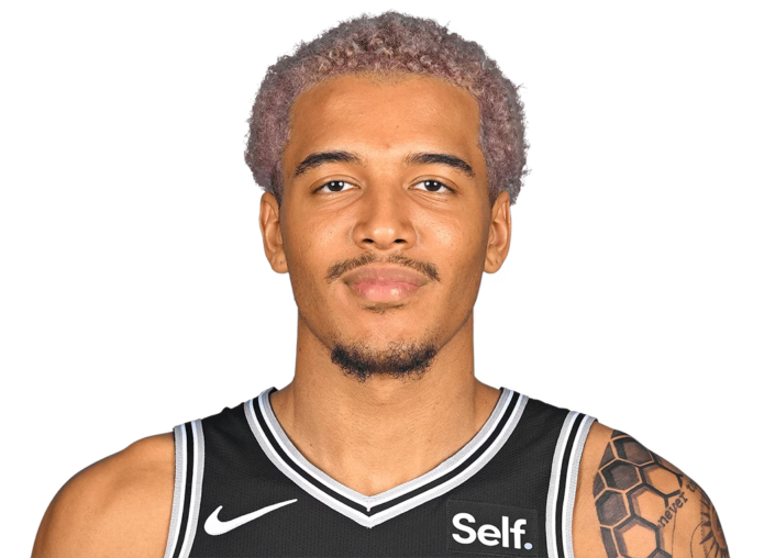
Jeremy Sochan’s tattoos are a mix of family, Polish roots and big ideas he carries with him. Some are tiny. Others cover most of his back or run down an arm. That contrast is what makes the collection interesting. It doesn’t look like one perfectly planned sleeve from day one. It feels like it has grown with him.
Sochan has also worked with tattoo artist Zac Lefty Colbert, whose black-and-grey style shows up in the newer work. A few meanings come directly from Sochan or from reporting around the tattoos. Other details are only visible in photographs. Keeping those two things separate makes the guide clearer.
The back piece is a tribute to the women in Sochan’s family
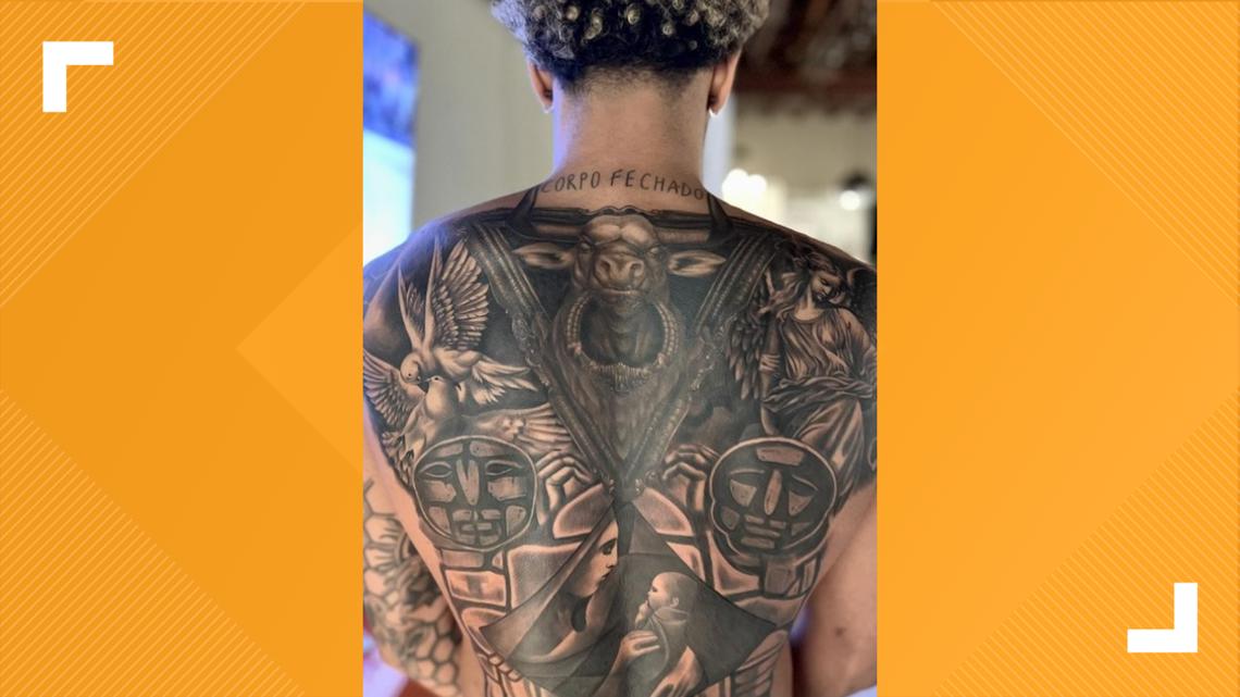
The biggest piece is the full back tattoo Sochan showed off in 2024. KENS5 reported that it honours his mother, grandmothers and aunts. That gives the tattoo a clear personal centre. It isn’t just a dramatic black-and-grey back piece picked because it looks cool.
The main scene shows a mother and child, with protective figures around them. Doves sit in the wider design, and a bull appears at the top. The bull also connects with Sochan’s Taurus identity, but the family tribute is the main point. The zodiac reference adds another layer without taking over the whole tattoo.
The photograph is important because NBA jerseys hide nearly all of the work. Even training pictures can show only a small part of it. In a clear back shot, the layout makes more sense. The figures, wings and geometric panels are placed to read as one scene rather than a bunch of random images stuck together.
O2’s later coverage showed the finished work, while KENS5 provided the clearest explanation of the meaning. That combination gives readers both sides: what the tattoo looks like and why Sochan wanted it. There’s no need to invent extra symbolism around every face or shape.
The matching teraz tattoo keeps his Polish roots close
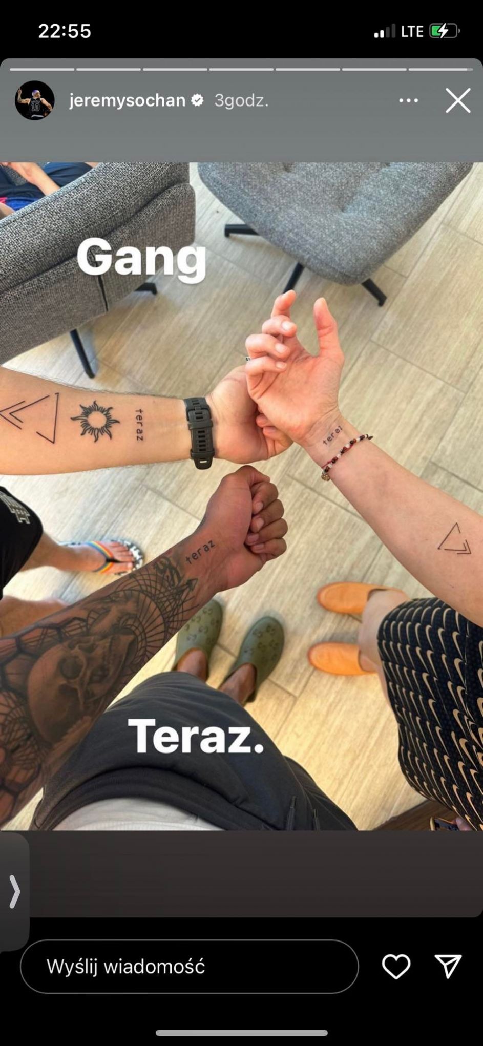
Teraz means “now” in Polish. Sochan showed the small tattoo alongside family members who had the same design. Interia and TVP Sport connected it with his Polish background. The shared part matters here. It turns a short word into a family tattoo rather than just a bit of lettering chosen for its look.
The design is small, with arrows and sun-like details around the word. It’s easy to miss in a game photograph, especially beside Sochan’s larger arm work. The family photo is much better evidence because everyone can show the matching piece at the same time.
The meaning doesn’t need to be dressed up. “Now” is a simple word, and the family connection gives it the weight. It works as a reminder to stay present, but the stronger documented point is that Sochan and his family chose it together. That’s enough.
The honeycomb helps hold the arm sleeve together
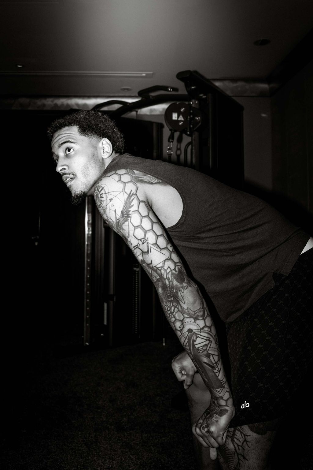
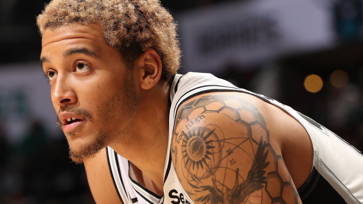
The honeycomb pattern is one of the less flashy tattoos, but it does a lot of work. Sochan has described it as part of the way the sleeve connects. The repeated hexagons sit between larger images and give the arm a steady rhythm.
Without that kind of linking pattern, a sleeve made from portraits, symbols and lettering can start to look scattered. The honeycomb fills spaces without turning the whole arm into a solid block of black ink. It gives the eye somewhere to move between the bigger designs.
A close arm photograph shows the geometry much better than a full-body sports photo. You can see how the pattern follows the arm and changes scale around the other work. The black-and-grey approach associated with Colbert also stands out here. Heavy outlines make the shapes clear, while the open skin keeps the sleeve from looking flat.
The arm looks different from every angle
The arm tattoos don’t look exactly the same in every photograph. That’s normal. The shoulder, upper arm and forearm bend away from the camera, and a jersey can hide half the work. A training photograph may show the pattern clearly, while a game image might only show a dark edge.
That is why one image shouldn’t be used to describe the whole sleeve. The honeycomb is one part. The surrounding symbols, religious imagery and smaller marks need their own visual context. A wide shot gives the overall feel, but a closer one lets readers see what is actually there.
The sun tattoo goes back to a family trip
Sochan has said his first tattoo was a sun on his thigh, done when he was 16 during a family trip to Croatia. His stepfather got a matching sun. That detail makes the tattoo memorable without needing a complicated explanation.
The age, the place and the matching decision are the story. It was an early tattoo, tied to a particular trip and shared with someone close to him. The design may be small compared with the back piece, but it marks where the collection started.
It also shows why the older tattoos shouldn’t be judged against the newer ones. A small sun from a family holiday has a different job from a large back tribute. One records a memory. The other turns a whole family story into a large piece of artwork.
Icarus is Sochan’s reminder to stay balanced.
Sochan has also talked about an Icarus reference in his tattoos. His explanation focuses on not getting too high or too low. The myth is usually told as a warning about flying too close to the sun, but Sochan’s version is more practical. It’s about keeping control when life is going well and when things go badly.
That makes sense for a young athlete whose career can change quickly. A great game can bring huge attention. A bad run can feel just as loud. The tattoo works as a reminder not to get carried away by either extreme.
It’s better to stick with that explanation than turn Icarus into a grand statement about ambition. Sochan has already given the useful meaning. The rest is interpretation.
The Mary and Jesus design started with a keepsake.
Sochan has linked the Mary and Jesus design to a wooden figure his mother gave him. That family object is the important detail. The tattoo is not being used here as proof of a particular private belief or a complete religious programme. It is a documented piece with a clear connection to something his mother gave him.
That makes it sit naturally beside the sun and the Icarus reference. One comes from a trip with his stepfather. One is a warning about balance. One grew from a keepsake from his mother. The sleeve has different subjects, but family keeps showing up in the background.
Photographs can show the placement and the style. Sochan’s comments explain the link to the wooden figure. Neither source needs to do the other job. Keeping the evidence separate stops the article from making the tattoo sound more mysterious than it is.
The back tattoo works as a full composition.
The back piece deserves more than a quick mention of the bull or the mother-and-child scene. The upper section catches the eye first, while the side figures and doves help frame the main subject. The lower panels pull attention back toward the people at the centre.
That gives the tattoo a clear visual order. The bull is striking, but the family tribute is the reason the piece matters. The design uses dramatic imagery without losing its focus. You can enjoy the scale and detail while still understanding who the tattoo is for.
The black-and-grey shading helps all of those parts sit together. Different colours might have split the image into separate sections. Instead, the heavy lines, softer shading and open skin create one connected scene. That level of detail is easy to lose in a small social-media image, which is why a large photograph makes such a difference.
Teraz is simple, but the shared design gives it weight.
The “teraz” tattoo is much smaller than the back piece, and that’s part of its charm. The word is readable, the design is neat and the family connection does most of the emotional work. It doesn’t need a hidden code.
The arrows and sun-like marks add movement around the lettering. Still, the word stays at the centre. Sochan’s Polish background is visible through the language, while the matching tattoos show the family side of it.
A small tattoo like this can disappear in a sports image. It can also look different when the wrist or forearm turns. The clearest family photograph does more than a distant game shot because it shows the tattoo and the people who share it.
Sochan’s collection is still growing.
The back tribute, the matching teraz tattoo, the honeycomb pattern, the early sun and the Icarus reference give us a solid inventory. The Mary and Jesus design adds another family connection. Together, they show a collection that mixes memories, warnings, Polish identity and large-scale artwork.
Not every dark mark in an action photo needs a name. If the image is too distant, the honest description is that the tattoo is visible but the detail is unclear. That is better than turning a blurry line into a confident claim.
Sochan’s tattoos make the most sense when each one stays connected to its own photograph and explanation. The back piece tells a family story. Teraz keeps his Polish roots close. The honeycomb ties the arm together. The sun records an early trip, and Icarus is about balance. It’s a varied collection, and it doesn’t need one big theory to hold it together.