
Most photos only give you a quick look at the ink: a sleeve breaking out below a rolled-up cuff, a forearm caught in a mirror selfie, or a tattooed arm disappearing at the edge of a frame. That’s enough to make the collection interesting, but not enough to invent a catalogue of symbols that nobody has actually identified.
The reliable picture is fairly simple. Recent coverage shows a full-looking sleeve on one arm, while other photos isolate a large forearm section. The work appears dense and mostly dark, with geometric and ornamental shapes visible in the clearest interview frame. The exact designs, artist, dates, and meanings haven’t been publicly documented in a way that supports a more dramatic breakdown.
That restraint matters here. There’s a temptation to turn any visible patch of ink into a story about family, survival, or reinvention. Some of those themes may be part of the wearer’s private reasons, but the photographs don’t prove them. What they do show is a young man whose tattoo collection has become much more visible during a new public chapter around his memoir and television work.
The sleeve photo that started the conversation
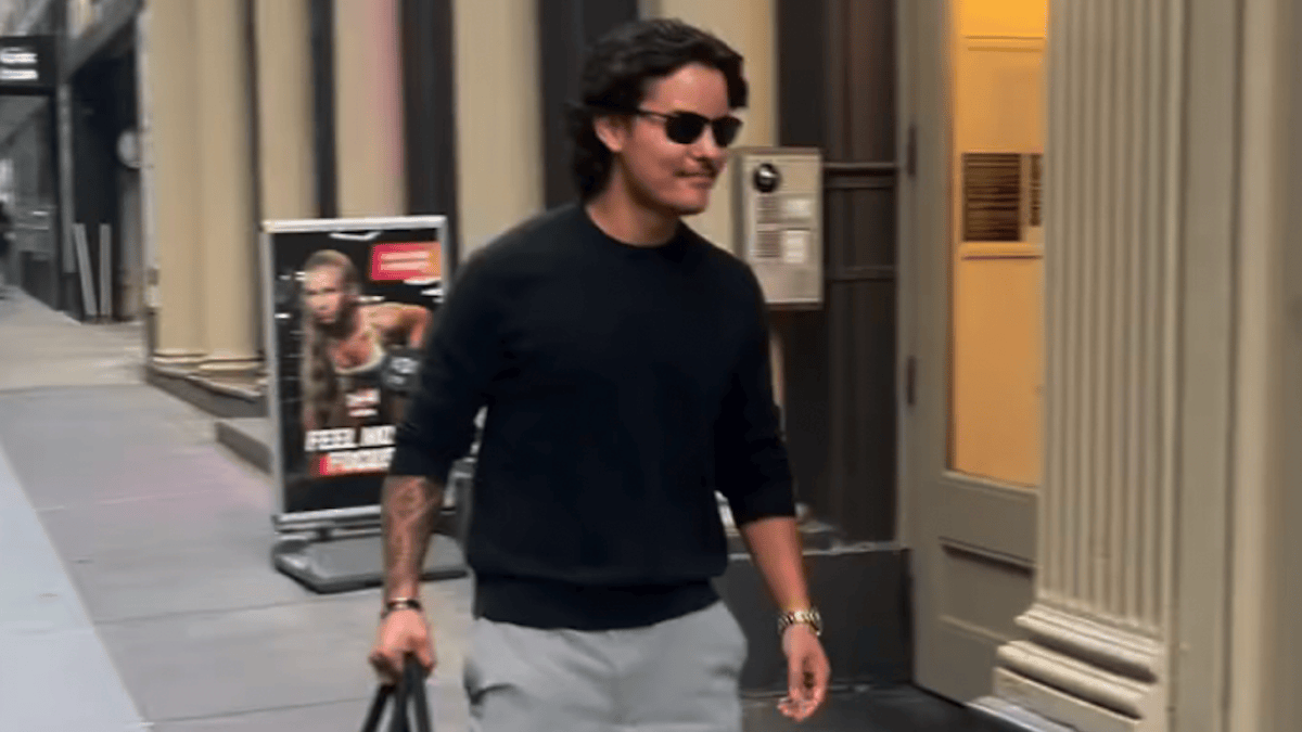
Us Weekly’s June 2026 coverage showed him walking in New York ahead of the release of his memoir. The photograph is not a clean studio shot. He’s wearing a dark long-sleeved top, sunglasses, and casual clothes, and only part of one arm is exposed. Even so, the visible forearm makes the larger point clear: this isn’t one tiny symbol tucked near the wrist. There’s a substantial amount of work on the arm, and the coverage described it as a full tattoo sleeve.
That wording should be handled carefully. A sleeve can mean a complete arm covered in ink, or it can be used loosely for a large connected collection that looks sleeve-like in a particular photograph. The image supports the second part with confidence: a big section of tattooing is present and extends beyond the small area shown. It doesn’t let us map the entire arm or decide where one design ends and another begins.
The exposure is useful because it shows how everyday clothing changes the way a sleeve reads. The tattoo pushes past the cuff, so you see it as part of a moving arm rather than a flat design board. The lines look dark and compact from a distance. There’s no reliable basis in this image for calling the work traditional, blackwork, Japanese, or any other specific style label.
For anyone planning a large arm project, the practical lesson is obvious: the tattoo has to work with the clothes you actually wear. A sleeve may be hidden most of the time, then become the first thing people notice when the sleeves roll up. That transition is part of the design, not an afterthought.
The forearm tattoo in the interview frame
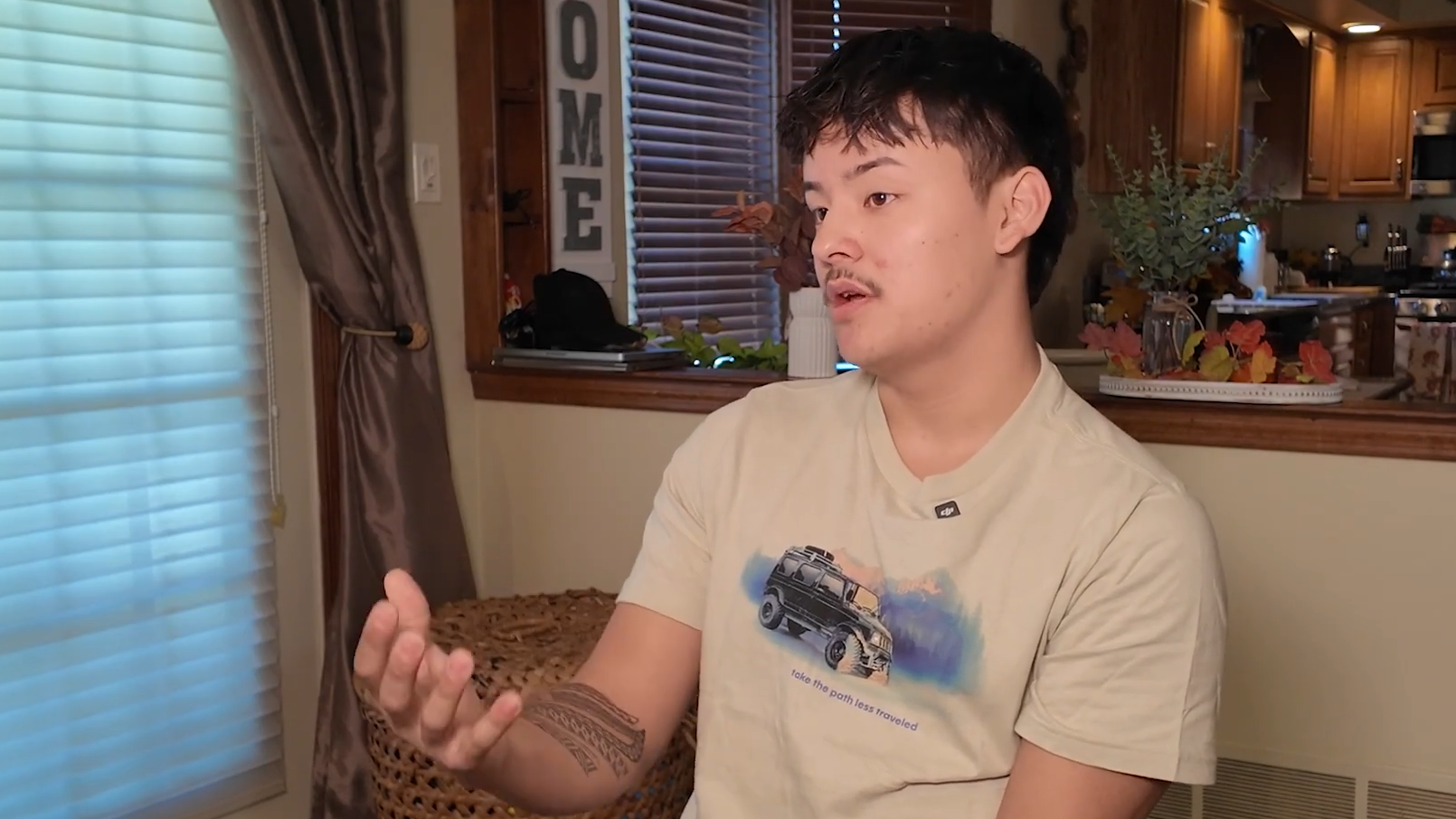
A separate interview photograph gives the clearest look at the forearm itself. The exposed section contains dark bands, repeated shapes, and tightly packed linework. It has a geometric or ornamental feel when viewed as a whole, but the source image doesn’t identify individual symbols. The safest description is also the most useful one: this is a dense forearm piece with repeating black shapes and connected patterning.
The placement gives the design a natural visual boundary. It runs along the forearm instead of stopping at a single small emblem, so the eye follows the length of the arm. Some parts look heavier than others, creating a rhythm between solid black areas and narrower lines. That contrast keeps the tattoo from becoming one flat block of ink.
It’s also the kind of piece that looks different depending on the arm’s position. In a seated interview, the forearm turns toward the camera and the pattern is easy to read. In a walking photograph, the same ink is broken up by movement, shadow, and fabric. Neither view is more “accurate.” They simply reveal different parts of a tattoo that wraps around a three-dimensional body.
The image doesn’t confirm a meaning, a date, or a connection to the memoir. That doesn’t make the work anonymous. The choice to use a substantial, high-contrast forearm design is already a style decision. Patterned ink can carry presence without needing a caption, and the photograph works best when it’s allowed to be visual evidence rather than a prompt for a made-up backstory.
How interview photos frame the subject
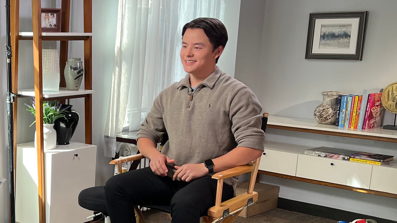
Another interview frame shows how quickly the details disappear when the camera pulls back. The arm is still visible, but it’s no longer the subject of the photograph. The face, clothing, room, and conversation all compete for attention, so the ink becomes part of the overall silhouette.
That’s how most people will encounter this collection. They won’t be looking at a tattoo reference sheet. They’ll see a candid, an interview, or a red-carpet photograph where the tattoo happens to be visible. In those situations, the arm reads as a dark visual anchor. You can tell that the work is extensive, but you can’t responsibly name every shape.
This is a good reminder for tattoo research in general. One image may prove that a piece exists, while another may reveal its placement or scale. A third might show how it sits when the body moves. Those are separate observations. Combining them can produce a fuller impression, but it shouldn’t turn partial views into a fictional inventory.
The interview setting also adds useful context without becoming tattoo evidence. The warm room, casual shirt, and relaxed pose make the ink feel less like a red-carpet accessory and more like part of his everyday appearance. That’s the right role for this photograph: it shows the person wearing the work, not a new design that needs decoding.
A different public image
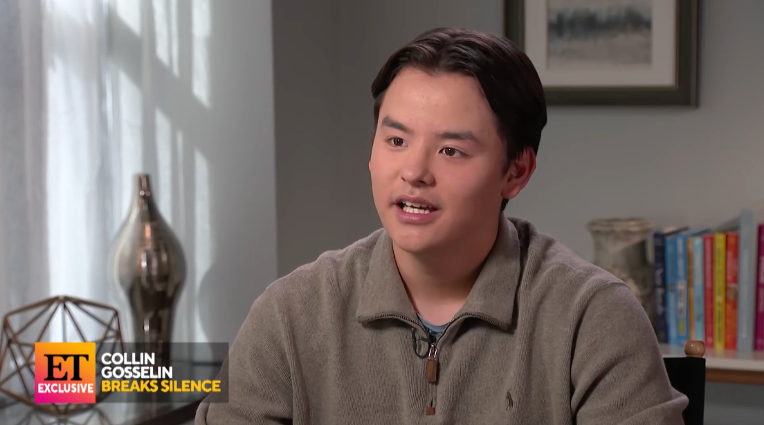
Earlier interview coverage presents a different version of his public image. One frame shows him seated for a conversation in a bright, lived-in room, with the camera focused on his face and posture rather than his arm. It’s useful because it shows how much a person’s presentation can change when the setting is built around conversation instead of a street photograph.
The relaxed chair, soft light, and casual clothes create a quieter impression than the recent New York shot. That kind of visual shift can make body art seem newer or more dramatic than it really is. A change in haircut, clothing, or body language changes the frame around the person wearing it.
There’s no need to force a timeline that the available photographs don’t support. The recent coverage shows tattoo visibility in 2026, but it doesn’t give a complete date-by-date account of when each section was added. It’s better to say the work is clearly present in recent images than to claim a precise start point based on a cropped arm.
For design inspiration, this is still a worthwhile comparison. A large tattoo collection doesn’t have to dominate every outfit or photograph. Depending on the sleeve, a person can look understated in one setting and heavily tattooed in another. Visibility is part of the style, and clothing gives the wearer control over how much of the story is on display.
Memoir-era context
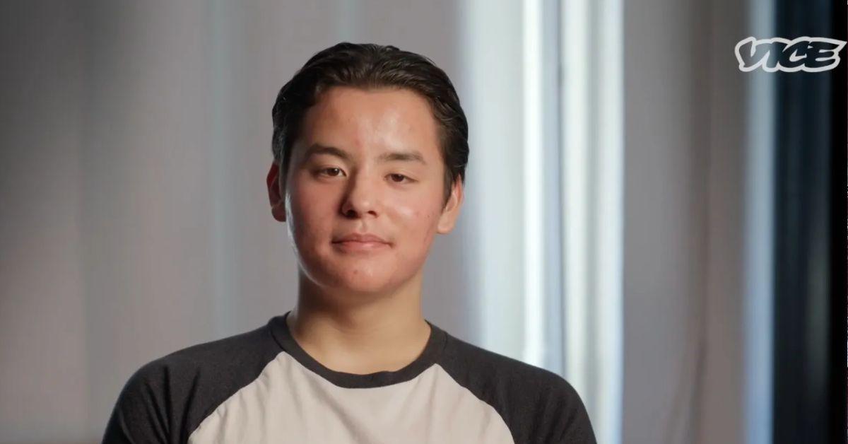
A face-visible portrait from Radar provides a cleaner sense of the person behind the coverage. He’s seated against a softly lit background, looking toward the camera. The composition is simple, and the frame keeps attention on his expression rather than turning the photograph into a close-up of his arm.
That balance is helpful. A feature like this still needs to show the celebrity as a person, not just a collection of body parts. A clear portrait gives readers a stable point of reference while the closer photographs do the more technical work. It also makes it easier to compare how the same face, hairstyle, and general presentation appear across different dates.
This frame isn’t meant to prove a new design or a specific meaning. Use it as contextual portrait photography, then return to the closer arm image when discussing linework and placement.
That separation keeps the gallery honest. A featured portrait should introduce the subject; it shouldn’t pretend to be the best close-up. The two jobs are different, and the article is stronger when each image is allowed to do its own job.
What the photos actually confirm
Across the available coverage, several points are solid. He has a large tattooed section on one arm. At least one forearm photograph shows dense dark patterning and connected ornamental or geometric shapes. The work can look like a sleeve in a full-body or street photograph, while a closer frame reveals more detail in one section. The collection is visible in current editorial and interview photography, not just in an isolated social-media crop.
Other claims need more caution. The sources reviewed here don’t establish a complete list of motifs. They don’t confirm the tattoo artist, the exact dates, the total number of pieces, or a personal explanation for the design. There’s also no reason to attach a particular symbol to his memoir unless he makes that connection himself.
That may sound less exciting than a list of invented meanings, but it gives the images room to speak. The work is substantial, graphic, and built to read across the arm. It doesn’t need a fake explanation to be visually interesting. If the wearer shares more about the collection later, the details can be added then.
A practical visual takeaway
The clearest takeaway is the way repetition creates cohesion. Even without naming the individual shapes, the forearm image shows a consistent use of dark linework and repeated bands. That kind of visual language can connect separate tattoos without forcing every piece to be the same subject.
If you’re building an arm over several appointments, you can use a similar approach. Choose a shared quality, such as heavy black areas, fine ornamental lines, a limited palette, or a preference for vertical shapes, and let the subjects vary. That gives the collection a family resemblance while leaving room for tattoos acquired at different times.
Spacing matters just as much. A sleeve can look packed in a close-up and still have breathing room when the arm turns. Skin breaks, changes in line weight, and shifts between dark and open areas keep the design readable. The goal isn’t to fill every inch as quickly as possible; it’s to make the whole arm hold together from several angles.
The photos also show why a tattoo should be planned for movement. A forearm bends, rotates, and disappears under a cuff. A shape that looks perfectly centered on a flat reference can shift once the arm is relaxed. Long bands and repeated patterns are forgiving because they can wrap with the body instead of depending on one frozen viewpoint.
A collection that’s still being documented
There may be more ink than the current photographs reveal, and future appearances may show different sections of the arm. For now, the honest version is enough: a substantial sleeve-like collection, a clearly visible dark forearm piece, and a style that leans toward dense pattern rather than one tiny standalone mark.
That makes this a slightly different kind of celebrity tattoo story. There isn’t a confirmed meaning for every line, and there shouldn’t be. The most interesting part is watching the same work appear in ordinary moments, interview frames, and event photography. Each setting gives you a different amount of information.
So look for the things the images can actually support: where the ink sits, how far it extends, which parts are exposed, and how the pattern changes as the arm turns. Leave the private explanation private unless he chooses to share it. A good tattoo breakdown doesn’t have to solve every mystery. Sometimes it’s enough to describe what’s there, notice what makes it work, and avoid pretending the camera showed more than it did.