Noma Han trained as a tattoo artist in New York while building a career as a model. W Magazine described him as a South Korean model who also worked at Black Fish Tattoo in Koreatown, and reported that he had more than 50 tattoos in his twenties. His collection moves between portraits, pop-culture references, blackwork, lettering and a large Buddhist figure.
“If it’s cool in their eyes, then it’s cool.” The line fits a body of work shaped by different interests instead of one matching plan.
The Kate Moss portrait tattoo
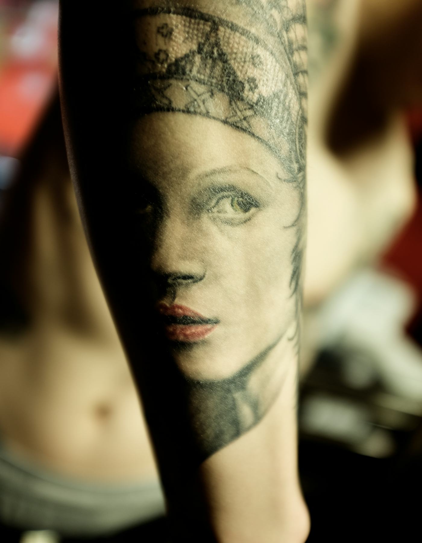
Vogue has described Han’s Kate Moss portrait on his forearm. In the close-up, the face is cropped tightly and softened by warm light, more like an old photograph than glossy colour realism.
The expression remains easy to read among the other marks on his arm. For a portrait reference, bring a clear photograph and let the artist adapt the crop to the curve of the forearm instead of forcing a rectangle onto it.
Why Noma Han’s sleeves feel collected, not planned
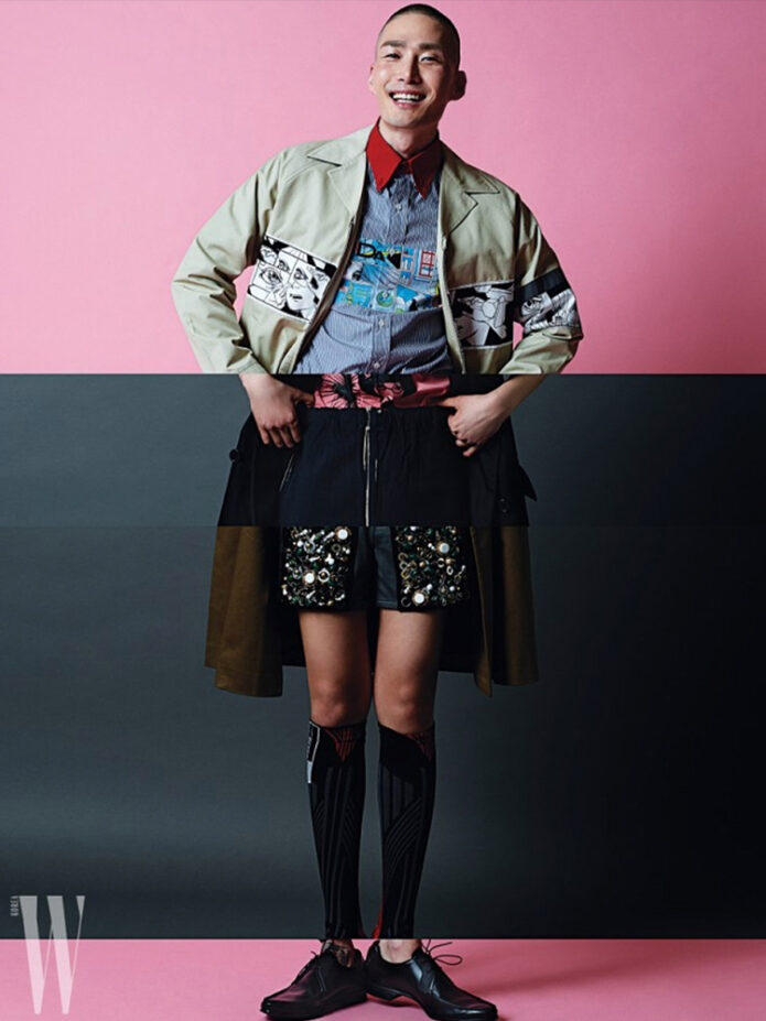
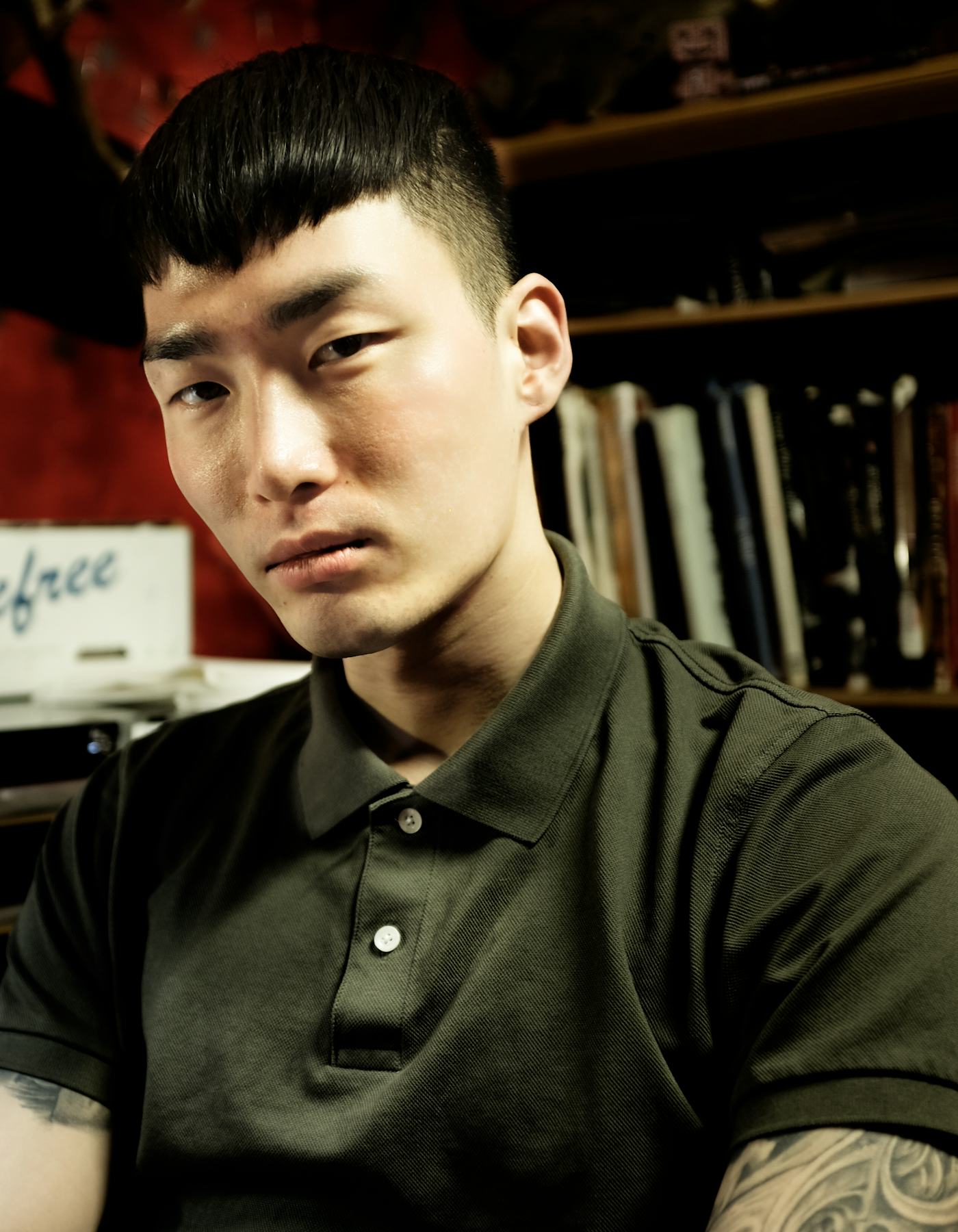
This editorial image isn’t a close record of a particular tattoo; the sleeve is only visible at the edge of the frame. It does show how Han’s ink can sit within a simple look without taking over the photograph.
His collection mixes portraits and playful characters with fine lines and heavier blackwork. The pieces don’t all share one size or finish, and the open skin between them keeps the arm from reading as one solid block. A sleeve can grow gradually; there’s no need to fill every gap at once.
The Buddhist figure on his back
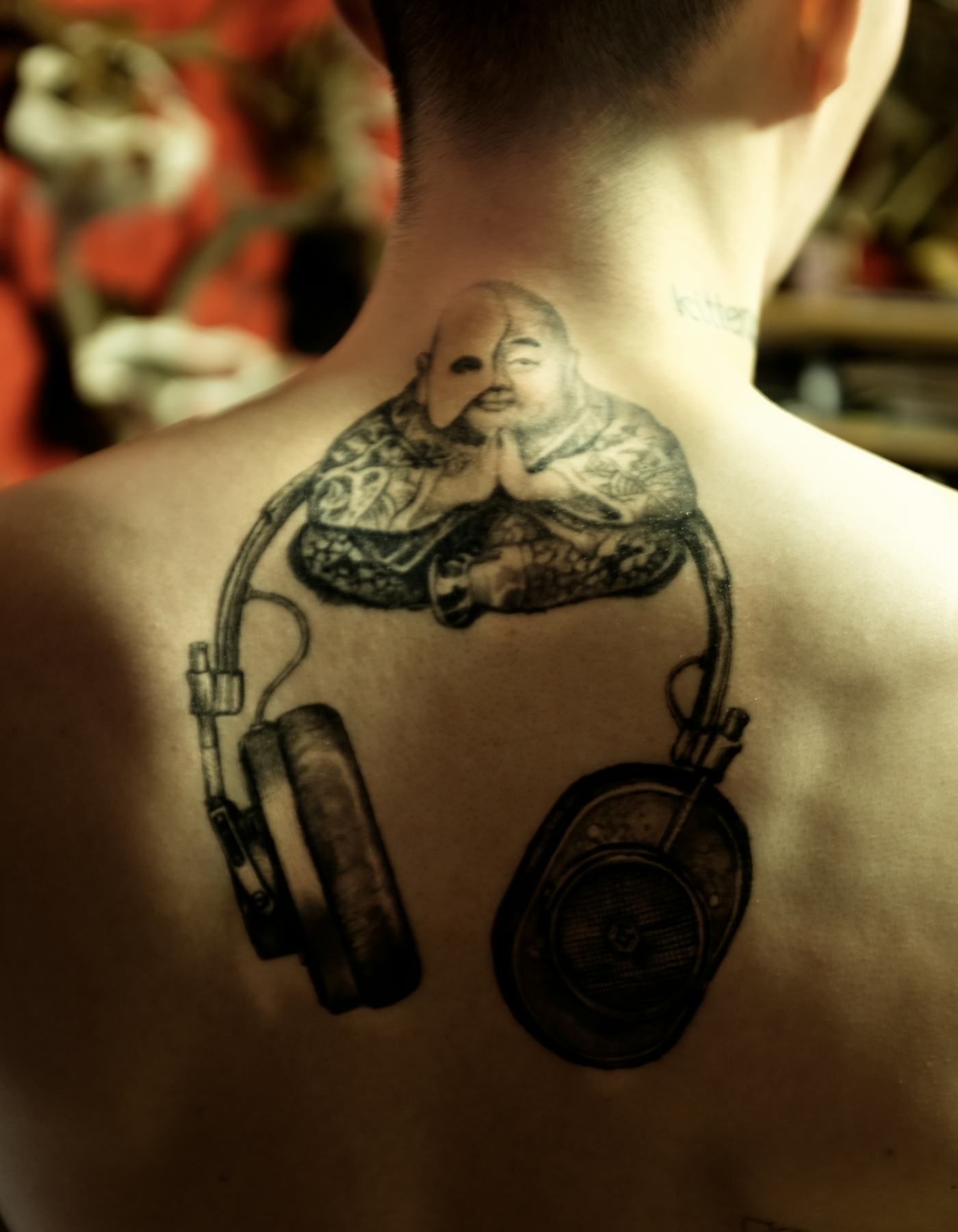
A W Magazine photograph shows a large seated Buddhist figure on Han’s upper back, surrounded by black-and-grey linework and a rounded element lower down. The composition is dense, but the central figure stays clear.
The scale gives the artist room to build around that subject. Before settling a back piece, check how it sits as the shoulders move and where its edges meet the spine and shoulder blades.
The mixed sleeve: portraits, pop culture, and texture
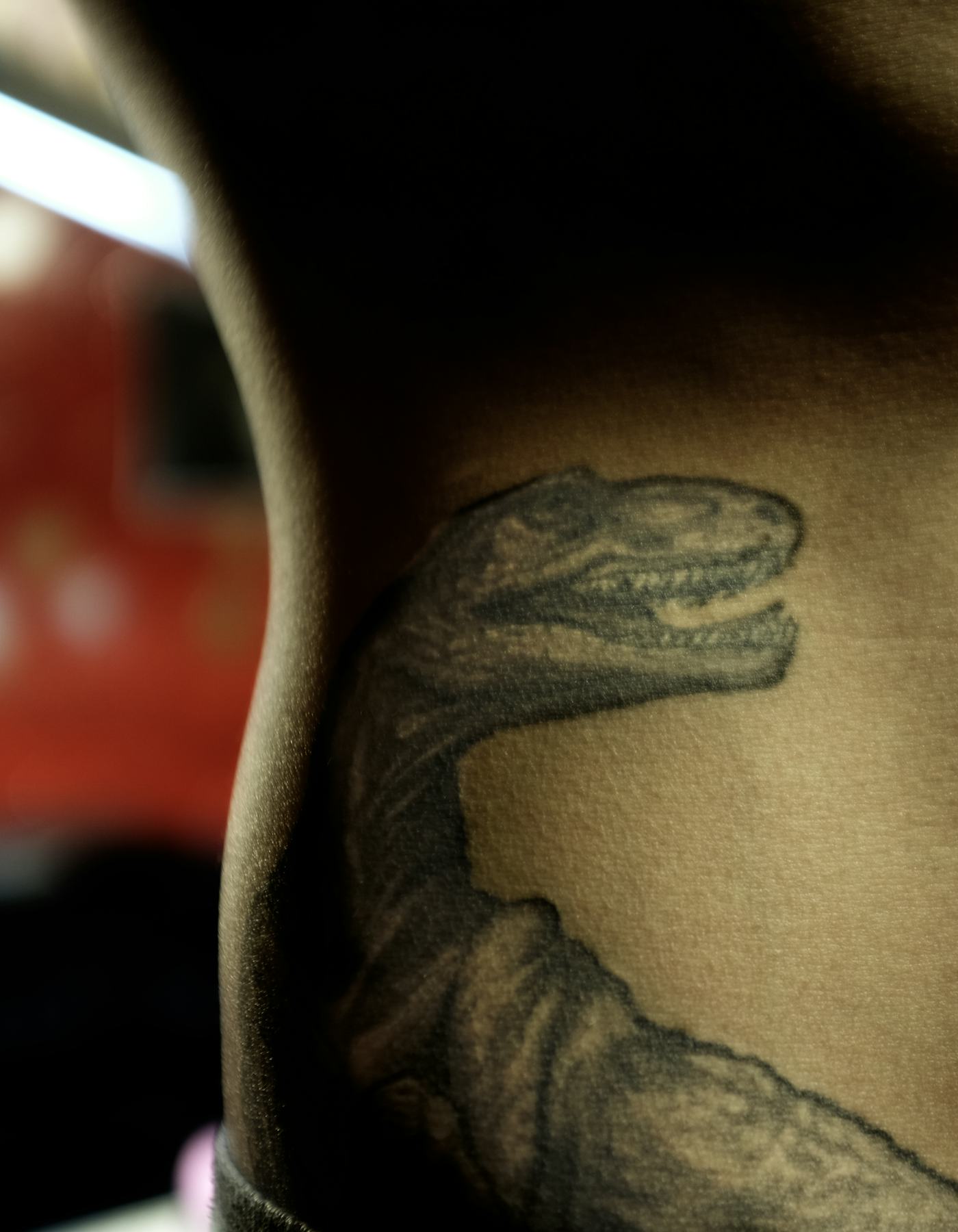
The sleeve close-up puts a portrait, heavy outlines and graphic marks beside one another. W Magazine has also noted Banksy and Totoro references on the same arm as the Kate Moss portrait.
The subjects differ, but black ink, soft grey shading and a slightly rough treatment give them common ground. A collection can feel connected through a repeated line or texture without making every tattoo match.
The work behind the look
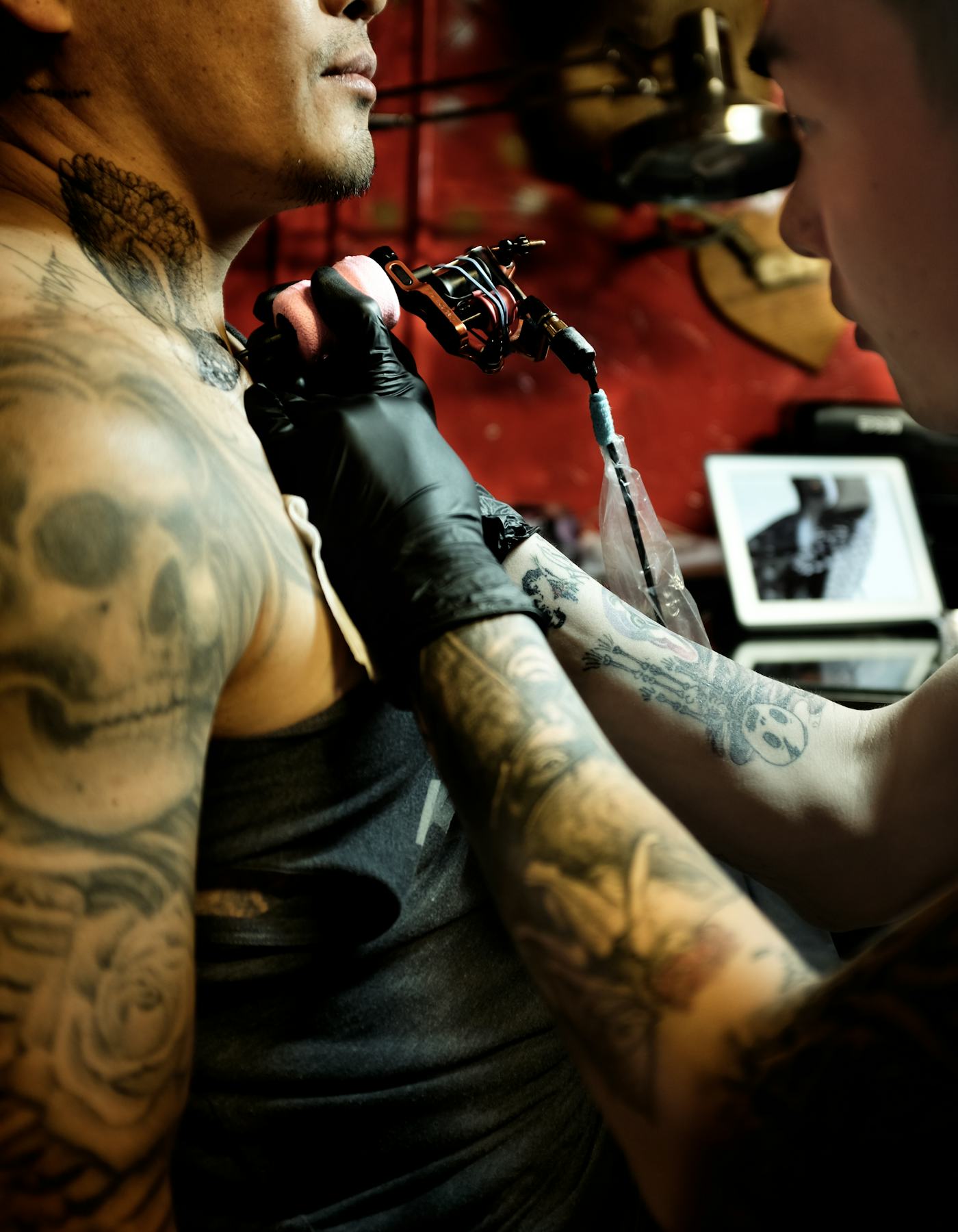
Another W Magazine photograph catches Han tattooing: machine and gloves in the foreground, with a client in the chair. It shows him at work rather than presenting a finished sleeve.
Working as an artist gives him a close view of how lines wrap around moving skin and where contrast gets lost. His own collection also looks like a record of that curiosity: portraits, symbols and experiments chosen at different times. A tattoo that feels rougher than expected can still hold a memory of why you chose it.
Modeling and the same visual instinct
Modeling and tattooing both depend on how the body moves. A portrait on the forearm changes the silhouette; a back piece can affect how a jacket sits. The editorial photo here offers style context, not close evidence of a tattoo.
Visibility and contrast are worth considering before an appointment. A large black design reads differently beside a pale shirt than fine lettering does, while a hand tattoo will be more exposed than one on the thigh. Those effects can help with placement, even if they don’t decide the subject.
What to borrow from Noma Han’s approach
Han’s collection draws on fashion, art, pop culture and tattoo craft without forcing them into one style. Start with the image or phrase you keep returning to, then find an artist who works well in that medium. A portrait, a character silhouette and fine lettering call for different skills.
You can let the rest of a sleeve develop over time. If you want more examples, browse our tattoo ideas and notice the choices behind each piece: scale, line weight, placement and open skin.
Jordyn Woods has the kind of tattoo collection that rewards a close look. Nothing feels thrown on just to fill space. There’s a delicate quote along her forearm, a small heart tucked behind her ear, a stack of geometric chakra symbols down her back, and tiny marks that only show up when a photo catches them at the right angle. Even the bigger pieces stay fairly clean and personal.
Her tattoo count gets reported a little differently depending on when the list was made. In a Women’s Health body scan, Jordyn talked through eight tattoos and seventeen piercings, while tattoo catalogs have documented a few smaller pieces that are easy to miss. That’s normal with a collection this fine-line heavy. A new piece can hide under a sleeve, disappear behind her hair, or look like a stray mark in a grainy event photo.
What stands out most is how often the tattoos connect to family, home, or a quick feeling she wanted to keep. Jordyn has described herself as impulsive with some of her tattoos, but the designs don’t read as random. They’re mostly small, neat, and placed where she can choose to show them or keep them private. The result is a really wearable mix of delicate script, symbols, and tiny black-ink details.
A closer look at her public style
The largest and easiest-to-recognize piece in Jordyn Woods’ collection is the vertical chakra tattoo on her upper back. It runs straight down the center of her back in a tidy column, with each symbol stacked beneath the next. The image reads more like a fine-line diagram than a heavy traditional tattoo, which suits the rest of her collection.
From the photo, you can make out a series of geometric shapes, including circular and diamond-like forms. The arrangement is compact and balanced, so it follows the line of her spine without spreading across her shoulders. That placement gives it a strong visual rhythm. It’s centered, but it doesn’t take over the whole back.
Jordyn has spoken about the chakra design as her biggest tattoo. That makes sense when you compare it with the smaller script and symbols on her arms, hands, neck, and ankle. It’s still a fairly restrained back piece. There’s no broad shading or dense blackwork, just a sequence of symbols that stays crisp against the skin.
For anyone thinking about a similar tattoo, the useful idea here is the spine placement. A vertical design can feel substantial without needing to be huge. A row of flowers, moons, numbers, or small spiritual symbols could work in the same space. The key is keeping the spacing even and letting the natural line of the back do some of the work.
Design takeaway: a narrow vertical tattoo can have plenty of presence when every symbol is given room to breathe. Jordyn’s piece is a good example of keeping a meaningful design light instead of filling the whole area.
The personal details behind the look
On Jordyn’s shoulder is a small script tattoo that reads “forever”. The lettering is connected to her mother, Elizabeth Woods, and has been described as being written in her mom’s handwriting. That personal detail changes the feel of the piece. It isn’t just a pretty word in a script font. The handwriting gives it the little variations that make a tattoo feel like it belongs to one person.
The tattoo sits high on the shoulder, close to the collarbone and neckline. That spot works well for a short word because it can peek out from a tank top or disappear beneath a wider neckline. It also gives the tattoo a softer, more intimate feel than the same word would have on a forearm or hand.
In the photo, the ink is small and dark, with a loose handwritten shape rather than a formal calligraphy look. That’s part of the charm. When people ask for a family member’s handwriting, the best results usually come from keeping the original quirks instead of cleaning everything up. A crooked connection or uneven letter can be exactly what makes the design feel real.
This is also one of the clearest examples of Jordyn choosing meaning over spectacle. The tattoo doesn’t need to be large to carry weight. It’s easy to cover, easy to spot in the right outfit, and tied to a person rather than a trend.
Design takeaway: handwriting tattoos work best when the source handwriting stays recognizable. Ask for a clean scan, but don’t let the lettering get turned into a generic digital font.
The script quote on her forearm
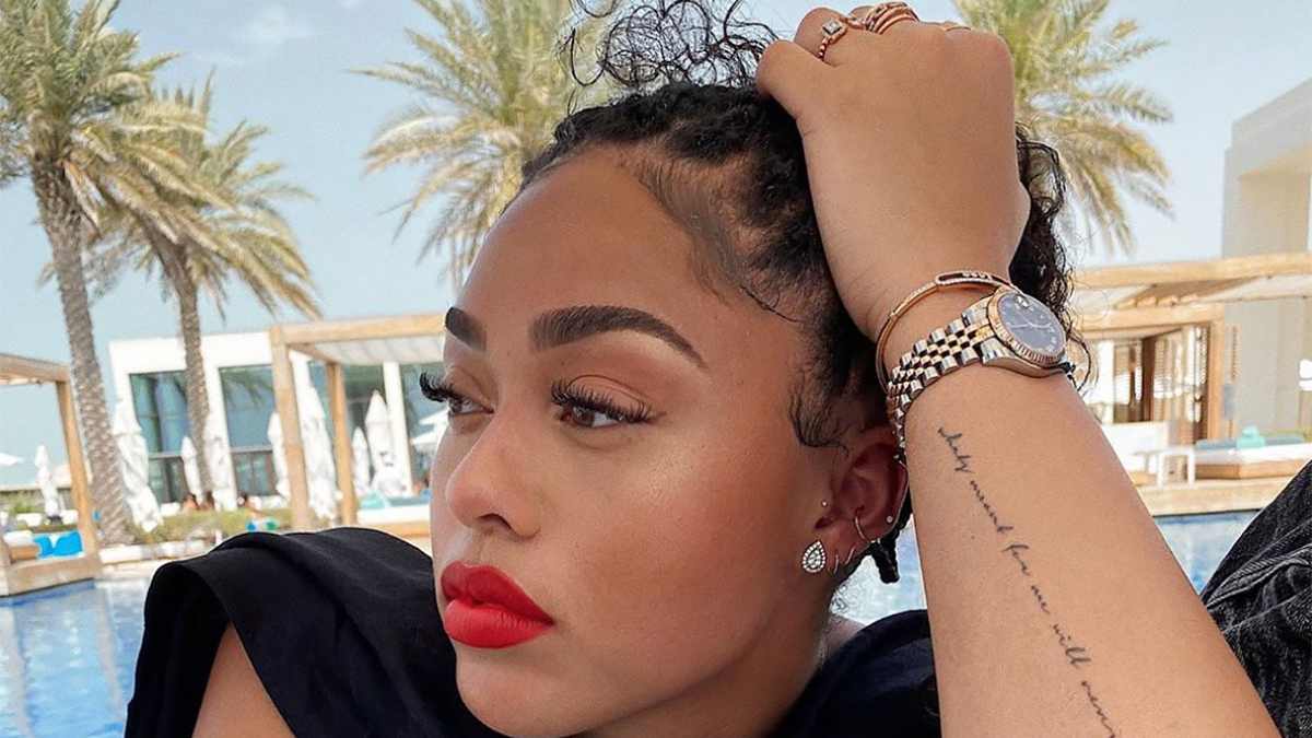
Jordyn also has a longer script tattoo running along the inside of her forearm. The line is fine and slightly loose, with the letters following the length of the arm. Photos and tattoo catalogs identify the quote as “What’s meant for me will never miss me”. It’s a sentence that works well in this placement because the eye can read it from one end of the forearm to the other.
Fine-line quotes can be tricky. If the lettering is too tiny, the words blur together as the tattoo settles. If the spacing is too tight, the whole sentence can look like a dark stripe from a distance. Jordyn’s tattoo has enough separation to keep the writing legible while still looking delicate. The line is long, but it doesn’t feel bulky.
The inside forearm is a practical spot for a quote because it’s visible to the person wearing it. Jordyn can see it when her arm is resting in front of her, but it isn’t as exposed as a hand tattoo. That makes the placement feel intentional rather than purely decorative. It’s a reminder she can look at herself, not just a sentence meant for everyone else.
If you like this style, think carefully about the exact wording before you book the appointment. A quote tattoo needs to sound like something you’d still say years later. Jordyn’s sentence is simple, personal, and short enough to fit the arm without forcing the lettering into an unreadable size.
Design takeaway: the best quote tattoos leave enough room between letters for the ink to age well. A slightly smaller sentence in a comfortable size beats a longer line squeezed into the skin.
Why the style feels so wearable
Behind Jordyn’s ear is a tiny outlined heart. It’s one of those tattoos that can vanish completely when her hair is down, then pop into view when she tucks it back. The heart is drawn in black ink with an open center and a slightly soft outline, giving it a simple hand-drawn feel.
Behind-the-ear tattoos are popular for a reason. They’re discreet, but they still have a little flash of personality when the placement is visible. A heart is also easy to personalize. You can make it solid, leave it outlined, add a tiny initial, or use a shape that looks slightly uneven and handmade.
Jordyn’s version stays uncomplicated. There aren’t extra leaves, names, or heavy shading around it. That keeps the design from competing with her earrings and piercings, which sit very close to the same area. The tattoo and jewelry work together instead of fighting for attention.
The skin behind the ear can be sensitive, and small tattoos there need a steady hand. It’s a curved area with limited room, so a design that looks perfect on paper may need to be adjusted once it’s placed against the ear. Jordyn’s heart is small enough to follow that curve naturally.
Design takeaway: a tiny tattoo behind the ear doesn’t need extra decoration. A clean outline gives the placement enough character, especially when it sits beside earrings or other piercings.
What to borrow from her look
Jordyn has another very small tattoo near her ankle that’s commonly identified as “LA.” It sits just above the shoe line, so it’s easy to miss unless she’s wearing shorts or cropped trousers. In the available photo, the mark is tiny and dark, tucked close to the ankle rather than spreading across the foot.
A location tattoo like this can be personal without looking like a souvenir stamp. The two letters are compact, easy to cover, and clear enough to read up close. It also gives Jordyn’s collection a little sense of place without needing a skyline, a map, or a larger city illustration.
Ankle tattoos tend to get a lot of friction from socks and shoes, so placement matters. Keeping the ink above the highest rubbing point can help protect the lines while the tattoo heals. The area can also swell, which is another reason to keep a small design simple and avoid cramming in tiny details.
If “LA” isn’t your city, the same idea can work with initials, a short airport code, or a small abbreviation that means something to you. The design stays low-key, but the person wearing it knows exactly why it’s there.
Design takeaway: tiny location lettering works best when it’s placed where the shoe or sock won’t constantly drag across fresh ink. Keep the letters clean and give them a little breathing room.
Other small details in Jordyn’s collection
The five tattoos above are the easiest to match to clear photographs, but they aren’t the only marks that have been documented. Tattoo catalogs and body-scan coverage also point to smaller symbols around her fingers, hand, neck, and arm. Some are only visible in close-up photos, and some are described differently depending on the source.
That’s why it’s better to be careful with the tiny pieces. A blurry circle can look like a dot, an eye, or a letter. A small neck number can be read one way in a zoomed-out photo and another way in a clearer shot. The broad details are easy to confirm, but the exact meaning of every little mark isn’t always public.
There’s a common thread through the collection anyway. Jordyn tends to choose designs that can sit neatly on the body without taking over. Even when the subject is spiritual or emotional, the artwork stays light. Her tattoos feel more like a private set of reminders than a single sleeve or a planned full-body theme.
That makes the collection useful inspiration if you like tattoos but don’t want one big, locked-in style. You can borrow the placement, the scale, or the idea behind a piece without copying the exact design. A fine-line back tattoo, handwritten family word, tiny heart, and small location mark can all live together because the ink weight stays consistent.
The overall look in plain terms
Jordyn Woods’ tattoos are mostly fine-line black ink, small script, simple symbols, and discreet placements. The chakra tattoo gives her collection its biggest visual anchor, while the “forever” shoulder piece and forearm quote add the most obvious personal writing. The heart behind her ear and LA ankle mark keep things playful and low-key.
The collection also shows why placement can matter as much as the design itself. A word on the shoulder feels different from the same word on a hand. A heart behind the ear can be hidden in seconds. A quote inside the forearm can stay visible to the wearer all day. Those choices make the tattoos feel connected to everyday life, not just a photo shoot.
If you’re pulling ideas from Jordyn’s tattoos, start with the part that actually fits your life. Maybe that’s a family member’s handwriting, a symbol with a spiritual meaning, a hometown abbreviation, or a short line you want to keep close. Then choose the size and placement around the way you dress, work, and move. The strongest small tattoos usually feel obvious in hindsight because they belong exactly where they are.
And don’t rush the tiny lettering. Let the artist size it honestly, check the spacing, and show you how it will sit on your body. Jordyn’s collection works because the ink is allowed to stay simple. There’s no need to add extra decoration just because the design is small.
Bottom line: Jordyn Woods’ tattoos are personal, fine-lined, and easy to wear. The chakra back piece brings the biggest impact, while the script, heart, and ankle lettering show how much personality can fit into a few quiet marks.