Dorothy Martin’s tattoos fit the rest of her look: bold enough to feel intentional, a little rough around the edges, and never separated from the rock ’n’ roll life she’s built around them. The DOROTHY singer has talked about old ink she wants to rework, the designs she keeps close to the body, and the traditional Japanese sleeves she’d like to explore next. There’s a real sense of movement to the collection. Some pieces are staying, one is being removed, and the next chapter is still taking shape.
That makes her ink more interesting than a simple list of symbols and placements. Martin has a visible arm and hand collection, tattoos around the ankles, and larger pieces that are easier to understand through her own descriptions than through a single photo. She’s also open about the fact that not every early decision survives forever. A cover-up can be part of the story too.
The useful distinction here is between what’s clearly visible and what Martin has described in interviews. The photographs below show genuine tattoos on Dorothy, but they don’t make every individual design readable. The named details come from her tattoo reporting; the close visual notes stay limited to what the frames actually show.
Dorothy Martin’s visible forearm and ankle tattoos
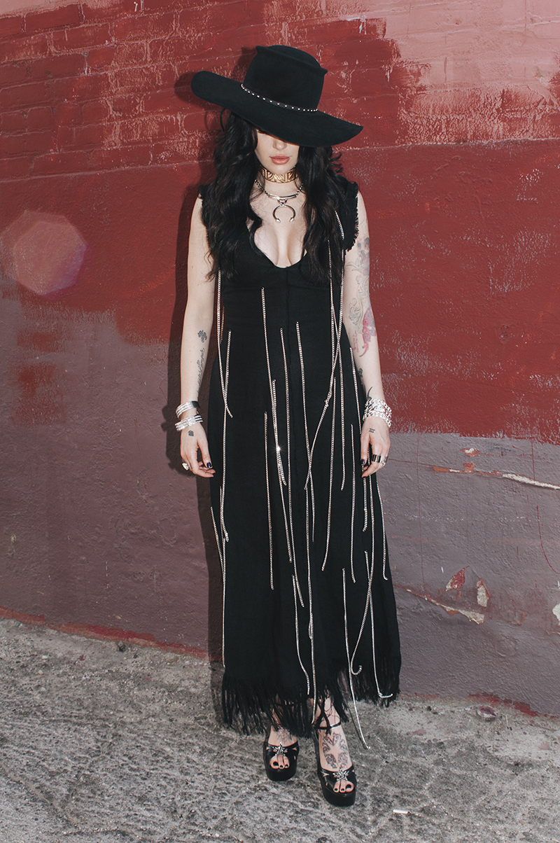
One of the clearest views of Martin’s collection comes from a full-body portrait where tattoos are visible across her forearms, hands, and lower legs. The frame isn’t a medical-style close-up, so it’s not the right image for inventing exact lettering or pretending every symbol can be identified. It is useful for something more basic: seeing how much of her look is already built around body art.
The ink doesn’t sit in one isolated spot. It moves with the way she dresses and performs. Forearm designs appear when she wears sleeveless clothes, hand ink comes forward when she grips a microphone, and ankle work shows up when boots or short hems leave a little more skin uncovered. That spread gives the collection a lived-in feeling instead of making it look like one carefully staged reveal.
Inked has reported “Holy Ghost” lettering on Martin’s ankles, along with a Jesus tattoo positioned behind her leather pants and angels on her back. Those details suggest a collection with a strong religious thread, but the photographs shouldn’t be pushed further than they can support. A tattoo is still genuine evidence when the exact design is too small to read. The honest description is simply that Dorothy’s ankle and leg ink is visible, while the reported names give the wider collection some context.
The religious imagery she’s talked about
Martin’s tattoo choices aren’t random decorations in the way a busy photo can sometimes make them seem. The Jesus tattoo, angel imagery, and Holy Ghost lettering all point toward a visual language she has returned to more than once. That doesn’t mean every piece has one neat explanation, but it does make the collection feel connected.
Religious imagery can be handled in dozens of ways. Some people go for a quiet line drawing, some want an old-school flash look, and others prefer something that feels closer to a painting. Martin’s public image leans toward the heavier end of that spectrum: leather, dramatic makeup, strong black clothes, and the kind of stage presence that can carry a large image without making it feel delicate.
The placement matters as much as the subject. An ankle phrase stays relatively private until the shoes and hemline change. A back piece can be completely hidden during a normal day and become the main event onstage. A tattoo behind clothing has a different relationship with an audience than one placed across the forearm. Martin’s collection seems to use that contrast well.
There’s also a practical lesson for anyone borrowing the idea. Religious imagery doesn’t need to be copied literally to have the same mood. The important part may be the old-world linework, the sense of devotion, or the contrast between a serious subject and a rougher rock wardrobe. Find the piece of the language that actually means something to you before choosing a design.
The old design she plans to cover

Martin has described one early design as a bad tattoo: a sunset with flowers that she’s been lasering away. Her plan is to cover the area with a sleeve, which is a much bigger decision than simply booking a small touch-up. Laser removal can take time, and a future cover-up still has to work with whatever ink remains underneath.
That part of the story is relatable because plenty of people have a first tattoo they’d make differently now. Maybe the idea was right but the execution wasn’t. Maybe the placement stopped fitting after a change in style. Or maybe the design belonged to an earlier version of the person who got it. A cover-up doesn’t erase that history, but it can turn an awkward patch of ink into something that feels deliberate again.
A sleeve is also a useful way to think about scale. The new work has to cover the old sunset and flowers, but it can’t just be a dark block dropped over the top. The artist needs a strong shape, enough contrast, and a flow that works around the arm. Traditional Japanese work is especially good at that kind of movement because the major elements, background, and body contour can be planned together.
That may be why Martin has mentioned traditional Japanese sleeves as a style she loves. A planned sleeve gives her room to connect the forearm tattoos already there with new work instead of treating every patch as a separate object. It also lets the artist make choices about wind bars, waves, clouds, or other background elements that help the whole arm read as one piece.
The process is more important than the promise of a dramatic before-and-after. Until the old ink is fully treated and the sleeve is actually finished, it’s better to describe this as Martin’s intended direction rather than a completed design. Tattoos change slowly, and the most interesting part may be watching the decisions happen in stages.
A rock wardrobe with room for leather
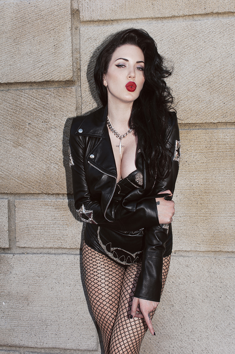
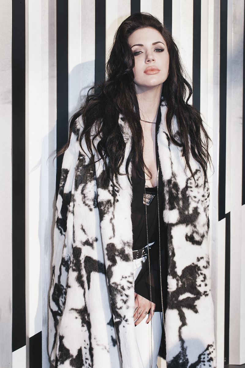
Dorothy’s fashion makes sense beside her tattoos because both have a little grit. She can move between leather, fur, vintage references, dramatic black pieces, and the kind of styling that looks made for a stage rather than a quiet office. The tattoos don’t have to carry the entire visual identity. They’re already working inside a strong visual frame.
That’s worth remembering when looking for celebrity tattoo ideas. The same design can feel completely different depending on the clothes around it. Small ankle lettering might look almost hidden with boots and jeans, then become a sharp detail with a shorter hem. Arm tattoos can look rough and rebellious in one outfit and surprisingly clean in another. Placement gives the wearer options.
Martin’s images also show why a tattoo collection shouldn’t be judged from one portrait. A face-focused photo can hide almost everything below the collarbone. A full-body photo may show the spread of the ink but not enough detail to identify the designs. Live performance images bring movement and sweat into the picture. Editorial portraits bring careful lighting. Each kind of image answers a different question.
The most reliable approach is to use a close tattoo photograph for the design itself and broader portraits for context. That keeps a good-looking photo from being mistaken for proof of a specific symbol. It also gives the reader a better sense of the person behind the ink, which is usually the reason celebrity tattoo collections are interesting in the first place.
Why a future Japanese sleeve could work
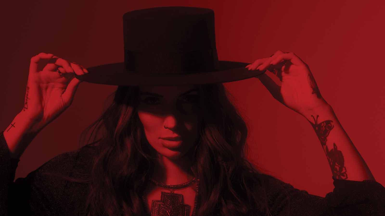
Traditional Japanese sleeve work is built for the arm’s movement. It can follow the shoulder, wrap around the bicep, narrow through the elbow, and keep moving toward the wrist. The result is usually designed as a whole rather than assembled from unrelated stickers. For somebody who already has visible arm ink and a cover-up to solve, that kind of planning could be a natural fit.
It would also give Martin a chance to balance the existing religious references with a different visual system. Japanese tattooing has its own history, composition, and symbolism. A sleeve inspired by that tradition shouldn’t be treated as a random collection of dragons and flowers picked from an online board. The artist, reference material, and cultural respect all matter.
From a purely visual standpoint, the sleeve idea could help the arm look more connected. New work can use larger shapes to give the eye somewhere to travel, while background patterns can keep older pieces from appearing stranded. A good cover-up doesn’t pretend the old tattoo never happened. It makes the entire area feel like it was planned with the current wearer in mind.
Anyone considering a similar move should start with the existing ink, not a favorite flash image. Photograph the arm in relaxed and bent positions. Mark the areas that need the most coverage. Talk with an artist who has real cover-up experience and ask to see healed work, not only fresh photographs. The strongest sleeve is the one that still makes sense six months after the appointment.
The small spade on her hand

A separate portrait gives a much cleaner look at the small spade on Martin’s hand. It’s a compact black symbol placed where it can appear in a close-up without taking over the whole frame. The design is simple enough to read instantly, which is exactly what you want from a small hand tattoo.
Hand placement changes the practical side of a design. The skin moves constantly, gets washed, rubs against objects, and spends a lot of time in photographs. A small symbol can still look sharp, but the artist has to work with the shape of the hand and the way the ink will age. Martin’s spade is a good example of keeping the graphic idea clean instead of crowding the space with extra detail.
What the photos reveal, and what they don’t
Martin’s photographed tattoos are easiest to appreciate when the frame gives them some space. In tighter portraits, a forearm mark might be cropped out and a hand tattoo can blend into shadows, rings, or clothing. That doesn’t make the ink unimportant. It just means the image has a different job.
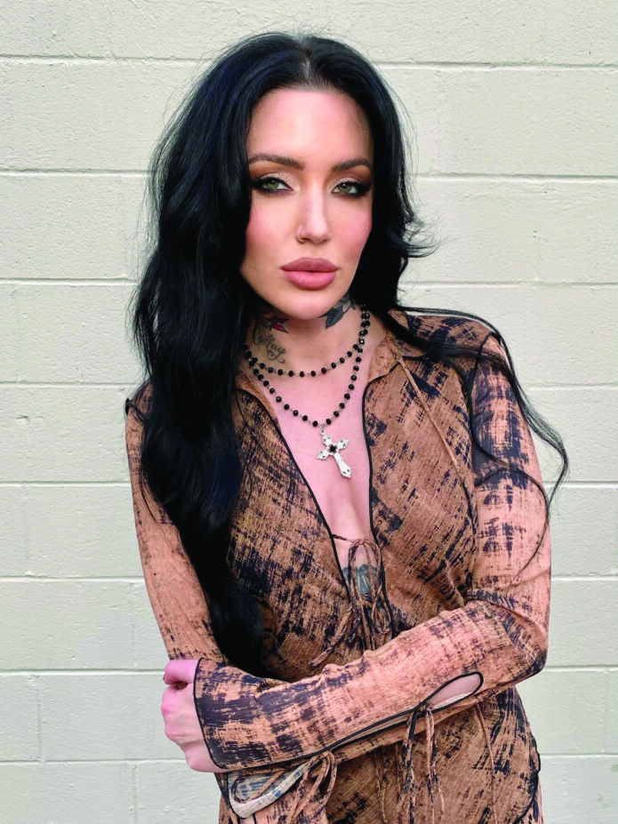
The Inked headshot used as the featured portrait is a good example of that distinction. Dorothy’s face is clear, the neck ink is visible, and the image works as a proper portrait. It isn’t being used to claim that every tattoo in her collection can be identified from one close-up. The separate inline photographs do the work of showing her arm, hand, and ankle tattoos in context.
This kind of care matters because tattoo pages often turn vague visual guesses into hard facts. If a design is blurry, call it blurry. If an interview names a tattoo but the available photo doesn’t show it, keep the report and the visual proof separate. Readers can handle uncertainty. They’re much less forgiving when a guessed symbol gets repeated as if it were confirmed.
When an old idea stops fitting
The sunset-and-flowers cover-up is probably the most relatable part of Martin’s collection. Tattoos are permanent, but taste isn’t. The design that felt exciting at twenty can feel out of place later, especially when a person’s work, style, or relationship with their body changes.
Laser removal and cover-up work aren’t shortcuts. They can involve pain, waiting, multiple appointments, and a lot of planning before the final image is even tattooed. Dark sections may need to fade enough for the next artist to build over them. Some colors respond differently to treatment. Skin has to heal between steps. It’s a project, not a quick correction.
Martin’s reported plan shows why it helps to think beyond the single appointment. If you know a sleeve might be the destination, bring that idea to the consultation even if the first session is only a small part of the cover-up. The artist can leave room for future work instead of closing off the arm too early.
It’s also okay if the final plan changes. A Japanese sleeve may be the direction today, but the actual design should respond to the body, the old tattoo, and the artist’s advice. The best result is rarely the one that follows a mood board line for line.
Final take on Dorothy Martin’s style
Dorothy Martin’s tattoos have the same tension as her music and styling: dramatic, personal, and still willing to get a little messy. The visible forearm, hand, and ankle ink gives her photos a strong edge. The reported Holy Ghost lettering, Jesus tattoo, and angels add a religious thread. Then there’s the old sunset with flowers, which she’s having removed before building toward a larger sleeve.
The collection isn’t finished, and that’s the point. A tattoo can be a favorite design, a private reference, an old mistake, or the first layer of something much bigger. Martin’s story includes all of those possibilities. If you’re looking for ideas, take the useful parts: choose a placement that works with the way you dress, give a cover-up room to breathe, and let the design grow from your own history instead of copying a photo. That long view matters more than a quick flash of inspiration.
Most of all, look closely before making a claim. Some of Dorothy’s ink is easy to see. Some of the named pieces come from her own reported descriptions. Some details disappear in the frame. Keeping those categories clear makes the collection feel more real, not less. Her tattoos don’t need a made-up explanation or a forced grand meaning. The visible ink, the planned rework, and the choices still ahead already give the story plenty of shape.