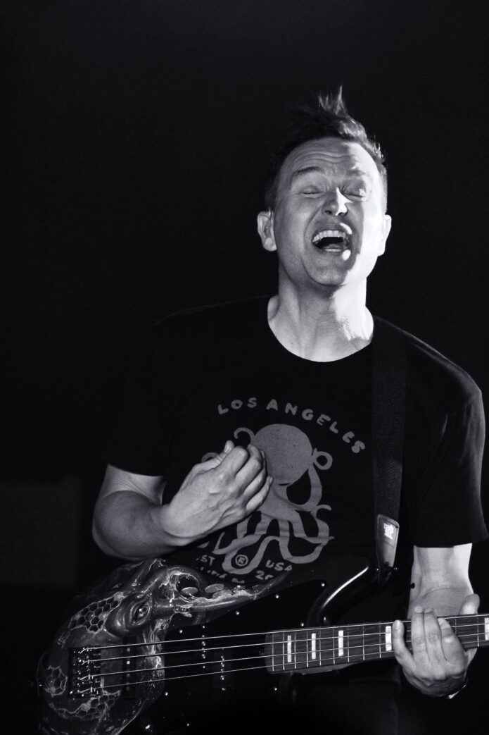
Mark Hoppus has spent most of his career making things feel bigger than they look. A simple bass line turns into a full-on singalong. A goofy video becomes a memory people carry for years. His tattoo collection works in a similar way. There aren’t dozens of designs competing for attention, but the pieces he has shown publicly have a clear emotional weight.
The best-known example is the cartoon grim reaper on his forearm. It’s a big, colorful character with a scythe, a dark cloak, and bright red shoes. The image is playful at first glance, but the timing gives it a much sharper meaning: Hoppus got it after beating stage four lymphoma. Beneath it, there’s also a script tattoo reading Skye, the name of his wife.
That combination makes the ink feel very Mark Hoppus. It has the humor, the color, and the pop-punk edge you’d expect, but it’s still tied to real life. Nothing about the design feels like a random flash piece chosen just because it looked cool in a shop window.
The small collection behind the big story
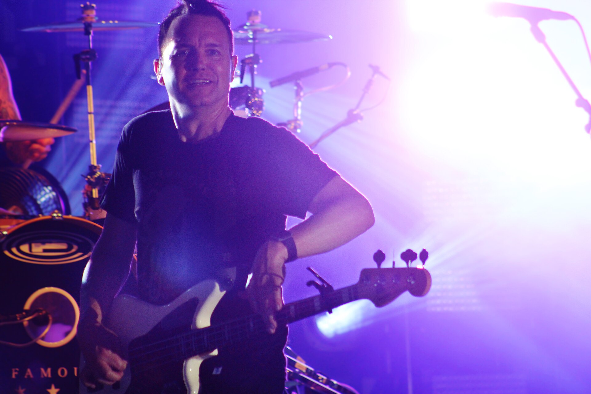
Mark Hoppus performs with Blink-182.
The available coverage around Hoppus’s tattoos is fairly focused. The standout piece is the cartoon grim reaper, which covers a good part of his forearm. It was designed by the art duo Dabs Myla and tattooed by Dan Smith. Hoppus shared the finished work after his cancer treatment, and the artists also posted about the collaboration.
The second design people often notice is the name Skye in script. Skye Everly is Hoppus’s wife, so the tattoo has a straightforward personal meaning even if the lettering style is loose and decorative. In the photo of the new reaper, it sits lower on the arm, close enough to the newer piece to read as part of the same visual area without being folded into the character itself.
That’s the short version: one bold character, one intimate name tattoo, and a lot of meaning packed into two very different approaches to lettering and illustration.
The cartoon grim reaper on his forearm
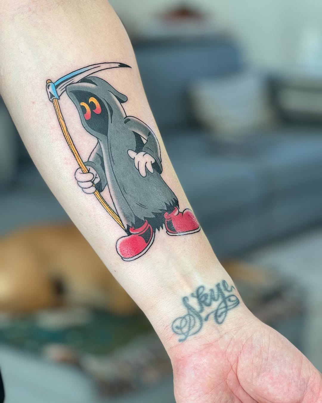
Mark Hoppus’s cartoon grim reaper and Skye lettering.
The close-up makes the details easy to see. Hoppus’s forearm carries a grim reaper in a gray hooded cloak, a curved scythe, pale hands, warm yellow details, and bright red shoes. The older Skye lettering is visible lower on the arm.
The design is deliberately not a terrifying, realistic reaper. The face is rounded and almost cute, while the oversized eyes and red shoes push it toward animation. The scythe is still there, so the symbol hasn’t lost its connection to mortality, but the character feels more like a weird little survivor than a threat.
That balance is what makes the tattoo work. A traditional grim reaper can be heavy, gothic, and very literal. Hoppus’s version keeps the idea of death but changes the emotional temperature. It looks like a character who has been through something and came out the other side with a sense of humor intact.
The color helps too, especially because the brightest tones are used sparingly. The cloak uses cool gray and charcoal tones, while the scythe handle brings in a warm yellow line. The red shoes create the strongest pop of color, giving the whole figure a slightly mischievous energy. It’s not a muddy black-and-gray piece that disappears when the arm turns. It has a clean cartoon silhouette that reads quickly.
There’s also a practical lesson in the way the figure is built. The main shapes are open and easy to recognize. The hood, face, arms, scythe, and shoes all have room to breathe. Even with the smaller details, the tattoo isn’t trying to cram a full illustration into a tiny patch of skin. That kind of clarity is important when a character needs to stay readable for years.
Why the reaper fits the story behind it
Hoppus publicly revealed his lymphoma diagnosis in 2021 and later shared the news that he was cancer free. The grim reaper tattoo arrived as a direct response to that chapter. IHeart’s report describes it as a tattoo commemorating his recovery, and the design team’s “Not this time, DEATHY!” message gives the piece an unmistakably defiant edge.
That phrase explains the tone better than any grand symbolic reading. The tattoo isn’t pretending the experience was funny or easy. It’s using a cartoon version of death to say that death didn’t get the final word. The red shoes and wide eyes turn a grim symbol into a character Hoppus can carry around without making the tattoo feel like a monument.
For a lot of people, a recovery tattoo is the sort of thing that gets described in solemn language: strength, survival, a new beginning. Those ideas are all there, but Hoppus’s design has more personality than a generic phoenix or a block of dates. It feels like an image he could actually live with. There’s room for seriousness without losing the sense that he still wants to have fun.
That’s often the difference between a meaningful tattoo and an overly literal one. The meaning doesn’t have to be written across the skin. The person wearing it already knows why it matters. The image can be strange, funny, or visually specific and still carry the full weight of the experience.
There is also a quieter detail on the same forearm: the Skye lettering.
The script reading Skye gives the forearm a completely different kind of feeling. Where the grim reaper is a full illustrated character, the lettering is personal and direct. It points to Hoppus’s marriage rather than to a public chapter in his career or health.
Name tattoos get a bad reputation because they’re often treated like a dramatic gamble. But the context matters. Hoppus and Skye Everly have been together for decades, and the tattoo is part of a longer relationship rather than a new celebrity romance being turned into permanent ink overnight. The script itself is casual, with a handwritten quality that makes it feel closer to a personal note than a formal monogram.
Placed below the reaper, the word also gives the arm a little visual rhythm. The larger piece carries the eye from the hood down to the shoes, then the lettering adds a lower anchor in a softer line. The two tattoos don’t match, and that’s exactly why they work together. One is a colorful image about surviving something huge. The other is a name that stays close to home.
If you like the idea of a name tattoo but don’t want it to look stiff, the lettering is a useful reference. A tattooer can work from handwriting, a note, or a signature and keep the natural wobble that makes the mark feel human. The goal isn’t perfect typography. It’s a letterform that still feels connected to the person whose name it carries.
Hoppus’s visual world outside the stage
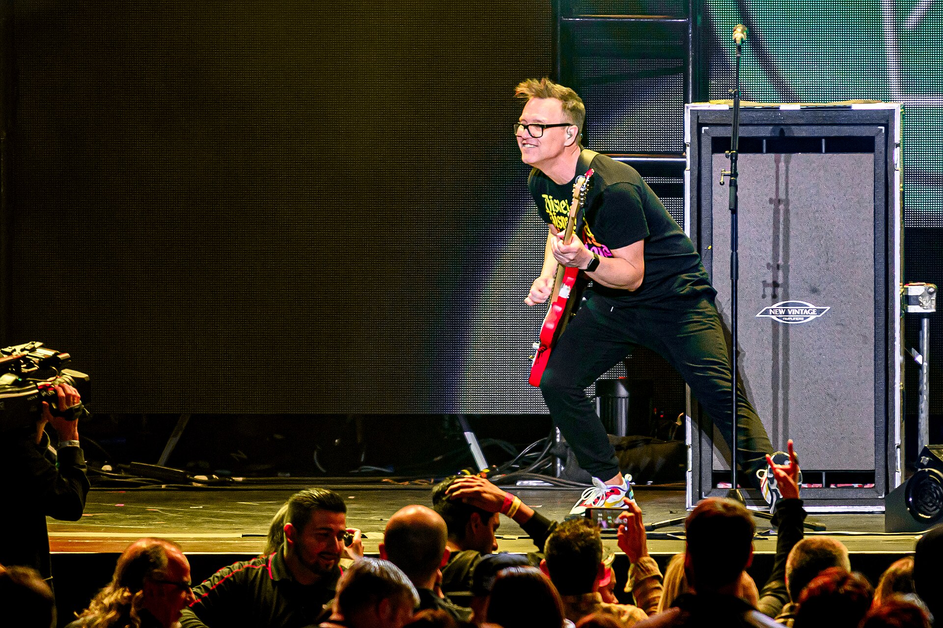
Mark Hoppus on stage with his bass.
Hoppus’s designs sit comfortably inside pop-punk culture, but they avoid the easiest visual shortcuts. There’s no giant band logo doing all the work. There isn’t a wall of random skulls or a sleeve built only from aggressive black shapes. The reaper has a cartoon personality, and the lettering is intimate.
That gives the collection more staying power. A personal design connected to music doesn’t have to look like merchandise. It can borrow the same sense of humor and energy that runs through a great punk song without copying the exact iconography of a band shirt. The reaper feels like a character from Hoppus’s own visual universe, not a logo pulled from a poster.
The scale is important as well. The forearm gives the illustration enough space to show the face and the scythe, while the lettering can remain smaller and looser. If both designs had been forced into the same size, one of them would probably have lost something. Good placement lets each idea speak in its own voice.
Color that keeps a character readable
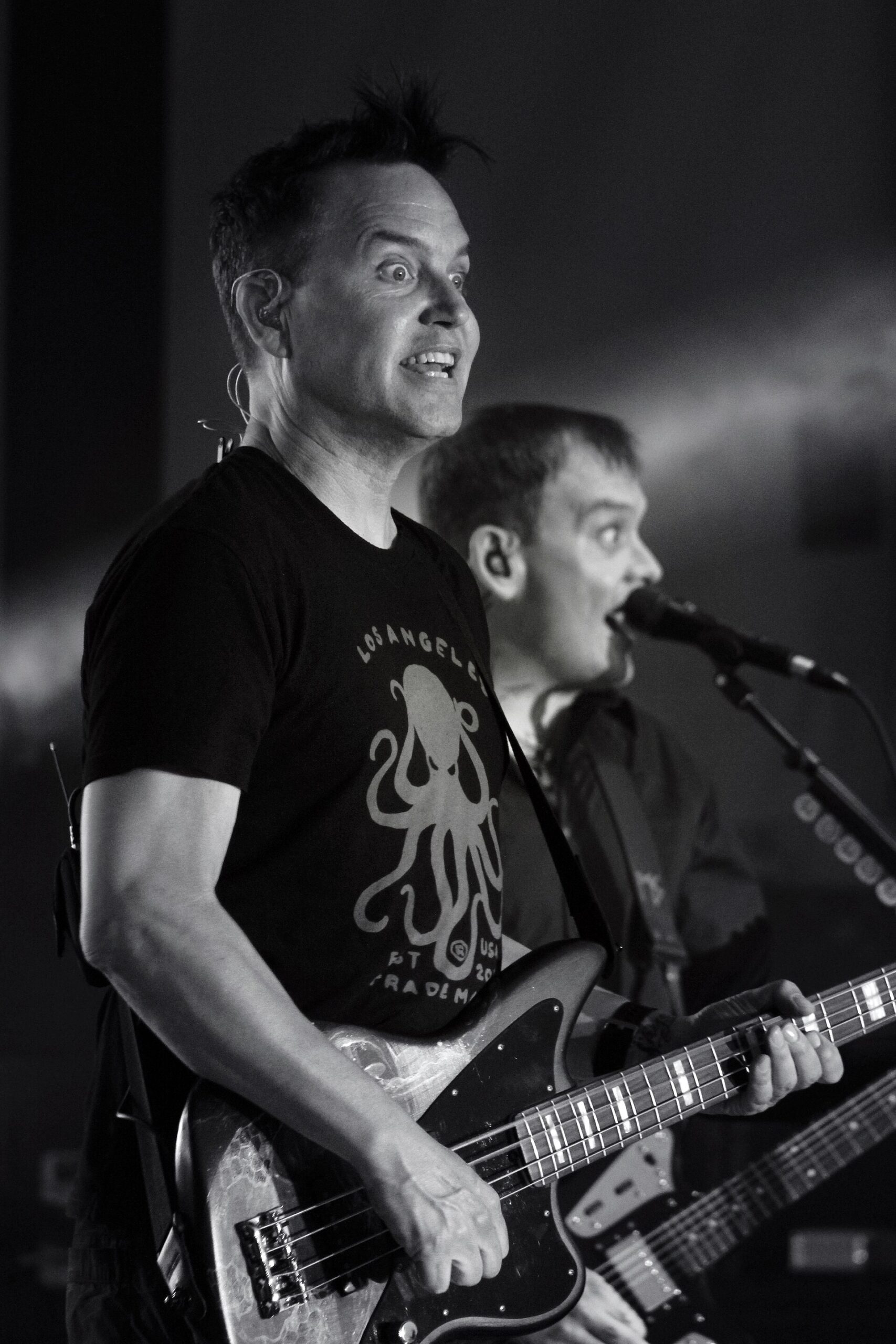
Mark Hoppus performing in black and white.
The reaper is a good example of how a small color palette can carry a whole design. Most of the character is built with gray, black, and muted skin tones. The warm yellow scythe handle and the red shoes do the rest. Because those brighter colors are used selectively, they feel intentional rather than noisy.
If you’re planning a colorful character design, you don’t need every part of it to be saturated. Pick one or two areas that deserve the strongest color and let the rest support them. A red hat, yellow detail, or blue shadow can become the part people remember. Too many competing colors can flatten the hierarchy and make the design harder to read.
Line weight matters too. The outer contour of the reaper is strong enough to separate it from the skin, while the interior marks stay lighter. That gives the character structure without turning every fold in the cloak into a heavy black stripe. It’s a smart way to keep a cartoon piece clean as it ages.
The right tone for a serious story
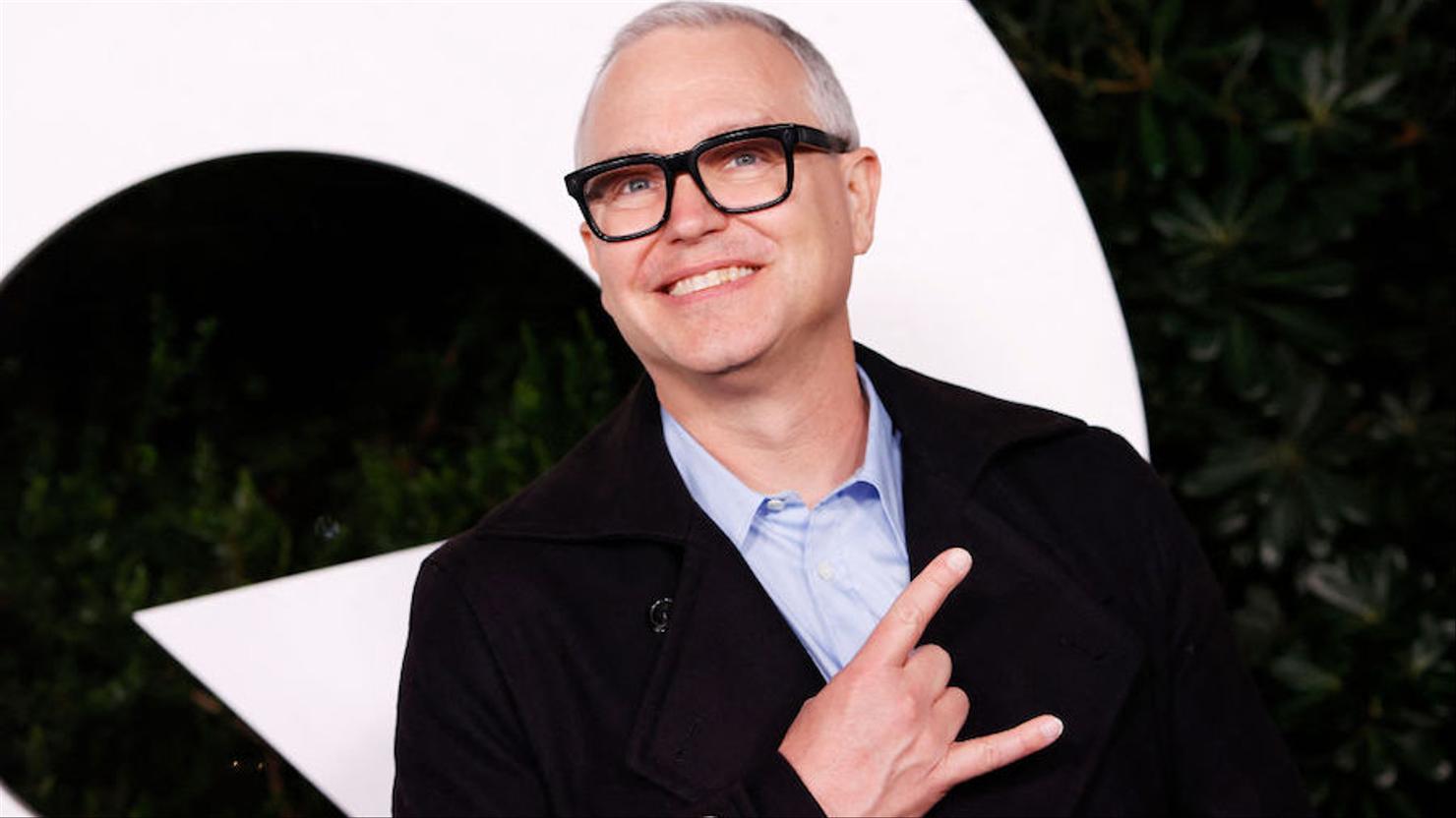
A portrait of Mark Hoppus.
The useful takeaway from Hoppus’s ink isn’t “get the same grim reaper”. It’s the way he connected a serious experience to an image with a little humor. If you’re thinking about a recovery piece, start by asking what tone actually feels like you. Maybe the right image is gentle, weird, bright, or quietly stubborn. It doesn’t have to look solemn to be important.
Give the design room to work at the size you want. Character pieces need enough space for faces, hands, and small props to remain clear. A tattooer can simplify the reference and adjust the proportions for your arm rather than tracing a photograph or squeezing too much detail into a narrow spot.
For lettering, choose words that still mean something outside the moment that inspired them. Hoppus’s Skye tattoo is powerful because it’s tied to a long-standing relationship, not a passing trend. If you’re using a name, lyric, or handwritten note, think about how it will feel when the original context is no longer fresh. The best text pieces keep their meaning even after the story stops being public.
A small collection with a lot behind it
Mark Hoppus’s tattoos aren’t a giant catalogue, but they don’t need to be. The grim reaper is visually memorable because it mixes mortality with cartoon humor. The Skye lettering is simple, personal, and placed close enough to the larger design to feel connected without becoming a matching set.
That combination is what makes the collection worth looking at. The tattoos aren’t just decoration, and they aren’t over-explained. One carries a public story about recovery. The other points to the private life underneath the music. Together, they show how two very different pieces can share the same arm and still feel natural.
If you’re looking for celebrity tattoo inspiration, that’s probably the part to keep. Choose an image that has a real reason to be there, let the design keep some personality, and don’t force every piece to look like it belongs to the same collection. A little color, a clear shape, and one honest connection can be enough.