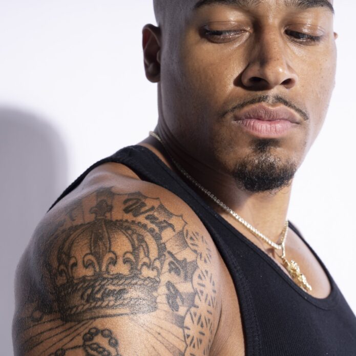
Carmelo Hayes’ tattoos are easy to spot when he’s in the ring, but the smaller details deserve a closer look. A crown sits high on one arm, big lettering runs beside it, and a dark eye curves around the opposite shoulder. Lower down, a lion, a clock and a flower share one forearm. Then there’s the little stack of characters near his wrist, a much quieter piece than the rest.
The WWE wrestler mixes bold black shapes with soft shading and compact writing. Some designs announce themselves straight away. Others need an angle that shows the inside of his arm. That’s part of what makes this collection interesting: it doesn’t rely on one style, one theme or one giant picture to hold your attention.
Hayes has talked through these pieces in WWE Tattooed, and his explanations give them a pretty personal feel. Music, growing up, ambition and everyday values all come into it. Here’s a closer look at five parts of his collection, what they look like and the stories he connects with them.
Crown shoulder tattoo: a Lion King connection
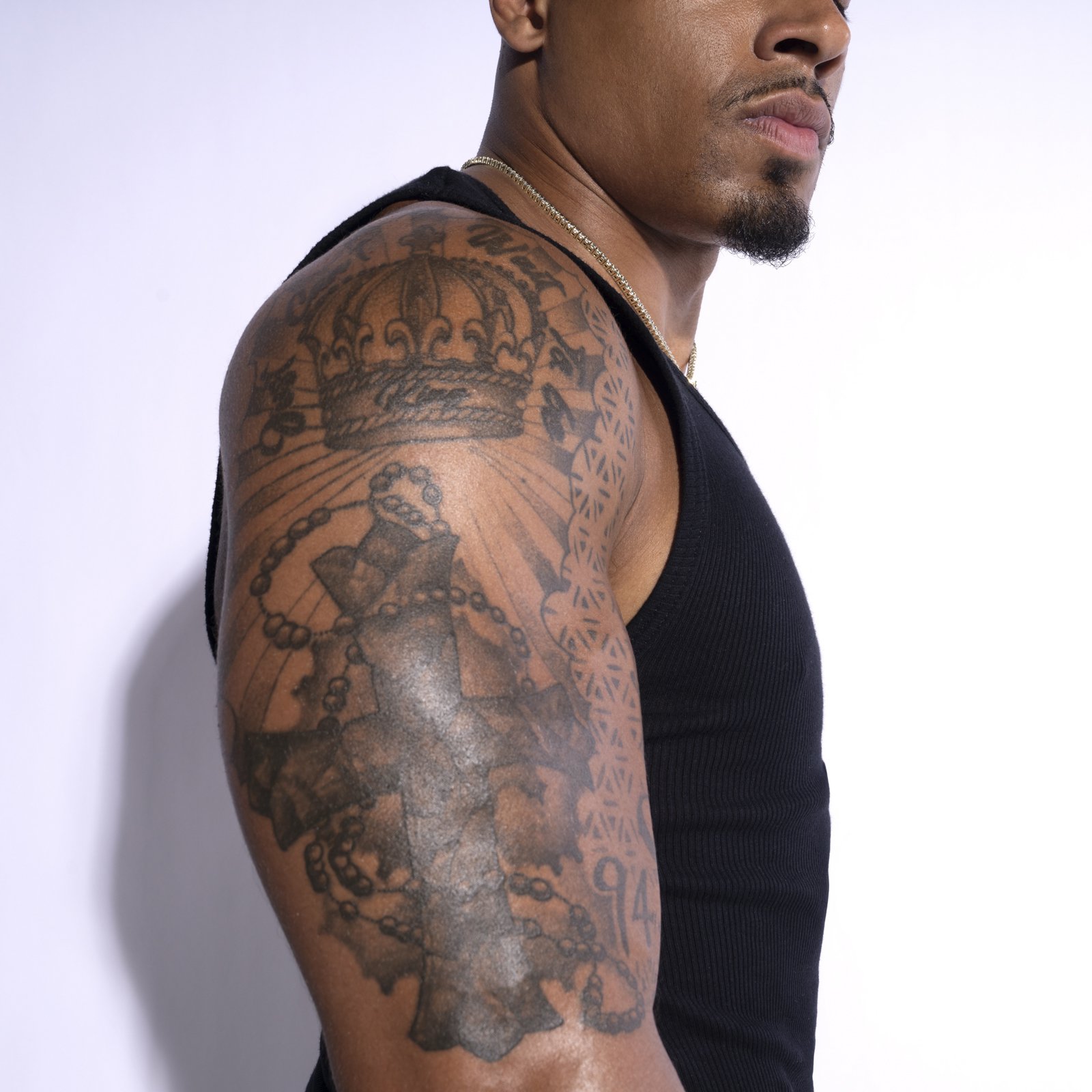
The crown is the first thing your eye lands on at the top of Hayes’ right arm. It’s a large rounded design with a dark lower band, curved points and small decorative shapes inside. Lines fan out beneath it, while lettering follows the shoulder’s curve above. That rounded placement suits the crown: it occupies the broadest part of the arm without looking squeezed into a narrow strip.
The crown connects to The Lion King. Hayes has explained that Simba’s path toward becoming king means something to him. He pairs the crown with the film’s familiar I Just Can’t Wait to Be King phrase. For him, that idea reaches past a wrestling championship. It’s about how he values himself and moves toward the life he wants.
It’s a nice distinction. A crown can look like a trophy, but his explanation gives this one a feeling of looking ahead. The shape stays bold and traditional enough that you don’t need to recognize a Disney reference to appreciate it. Once you know the connection, though, the words around it make the whole arrangement feel more specific.
There’s plenty going on below the crown, too. A large cross and bead-like loops fill much of the upper arm, and a narrow patterned strip sits along the edge. Those surrounding details give the crown a setting rather than leaving it floating on bare skin. The repeating small marks have a different rhythm from the long lines below the crown, so the upper arm has both texture and direction.
If you’re drawn to this piece as a design idea, notice the shape before the story. Its broad top and darker base give it a clear outline. The curved lettering belongs to the shoulder instead of fighting against it. A crown design doesn’t have to copy Hayes’ phrase or layout to use that same sense of balance. The useful part is choosing a size and position that let the main symbol stay readable.
Upper arm lettering tattoo: All Eyes on Me
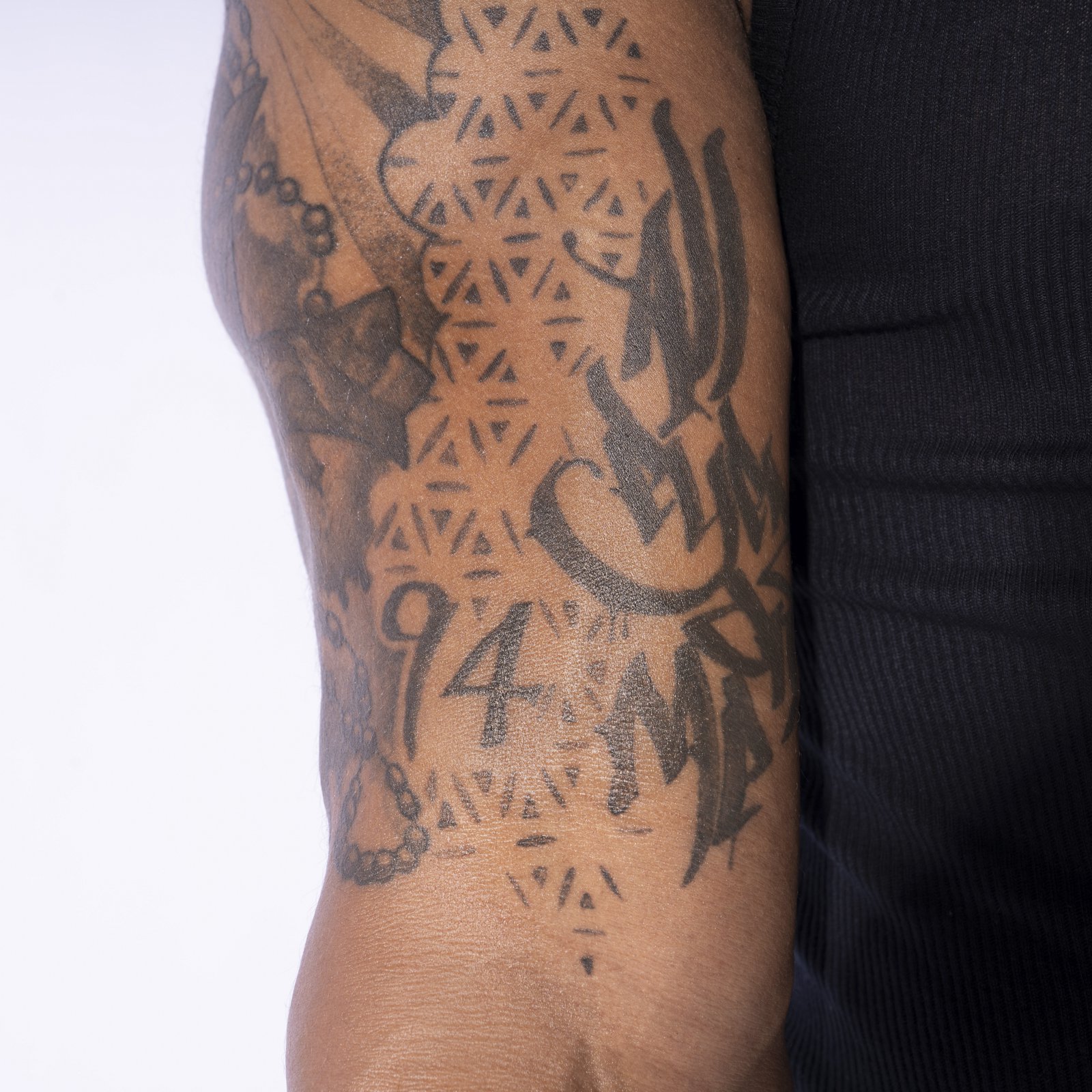
The writing beside the crown has a completely different energy. Hayes’ All Eyes on Me lettering uses thick black strokes, pointed ends and sweeping curves. It takes up enough space to hold its own against the cross and surrounding patterns. The close view shows how the letters follow the arm’s rounded surface, with parts of the phrase turning away toward his body.
Hayes connects this tattoo with Tupac and confidence. He likes the rapper’s attitude and the directness of the phrase. It’s a fitting choice for someone whose job involves walking out in front of an audience. The words have a clear, attention-grabbing feel, and the size backs that up. This isn’t tiny lettering you’d only notice while standing right next to him.
The style does a lot of the work here. The thick strokes look solid from a distance, while the pointed tips and curved flourishes become more obvious up close. There’s no box around the text. Instead, the writing shares the arm with the other designs, so it feels like part of a larger arrangement. The narrow strip of repeating triangles beside it adds detail without trying to become the main attraction.
The number 94 is visible nearby as well. It’s smaller and simpler than the large lettering, giving the eye somewhere quieter to land between the busier shapes. You can see the contrast between those plain numerals, the decorative text and the tiny repeated marks. Even though they’re all black ink, their different sizes keep them from blending into one flat patch.
For anyone considering a big text tattoo, the main lesson is that placement affects how a phrase reads. A curved arm won’t show every letter at once from every angle. Hayes’ design makes use of that curve rather than pretending the skin is a flat page. The words have enough weight to be recognizable, and the other elements leave them a distinct space. It’s a bold piece, but the layout gives that boldness some order.
Eye of Horus shoulder tattoo
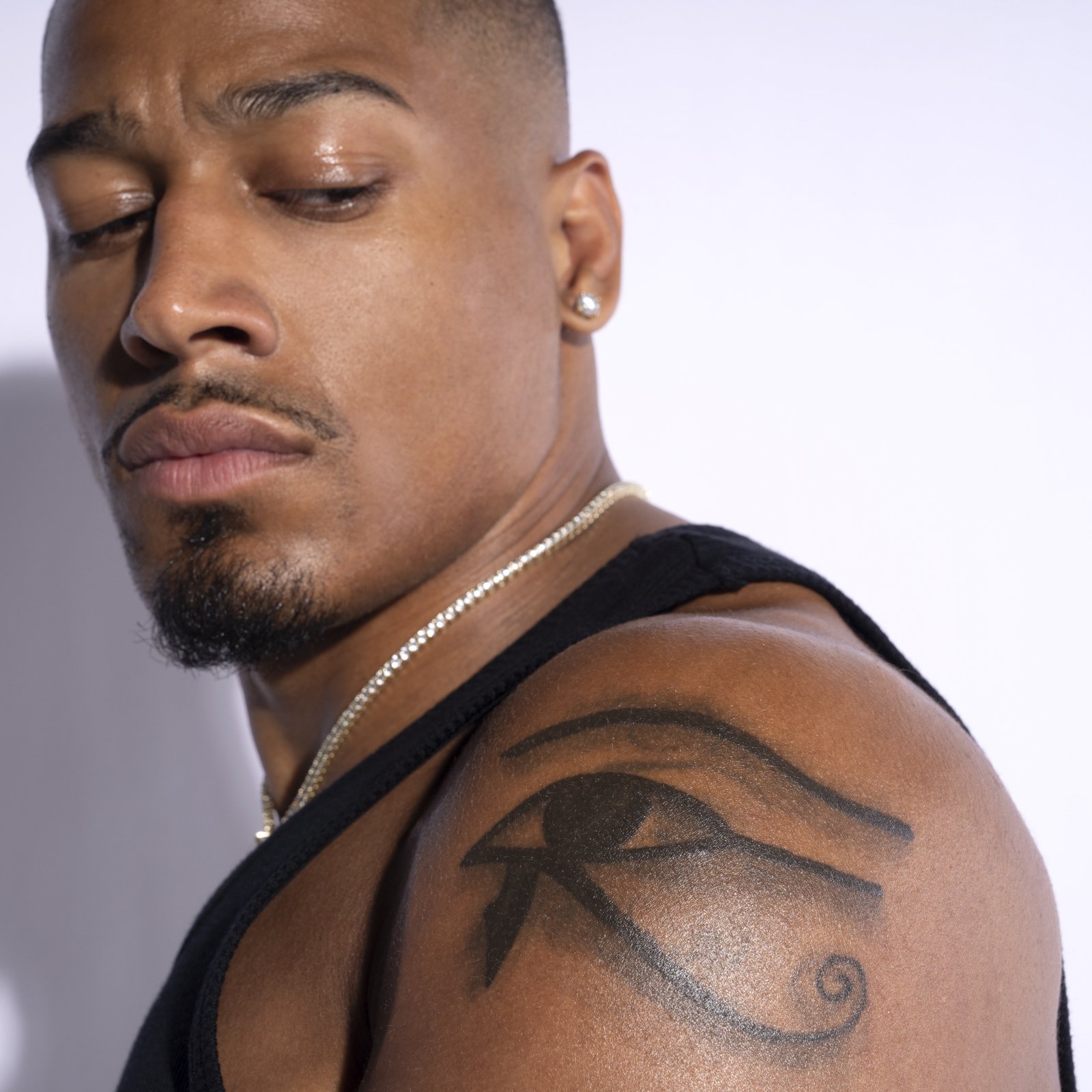
On the opposite shoulder, the Eye of Horus has much more room to breathe. A long upper line arcs over the eye, the dark center sits beneath it, and a curved lower extension ends in a small spiral. The outline is clean and easy to follow. Compared with the dense designs on his other arm, this shoulder has a simpler, more open look.
Hayes describes the eye as a protection symbol. He also says the area started with an earlier eye tattoo that he wanted to change. After talking with his artist, the idea developed into this larger version. That gives the piece a different kind of history from a design planned from scratch: an old choice became the starting point for something he could connect with more clearly.
You can see why the shoulder works for it. The long eyebrow-like stroke follows the rounded top of the arm. The lower curl sits further down, so the design has a clear top and bottom without needing a frame. It looks comfortably fitted to the body. There’s space around the outside edges, which makes the dark lines stand out even when only part of the shoulder is visible.
The contrast inside the eye also matters. The solid central shape and heavier lower strokes sit against softer gray areas. Those changes in tone stop the design from feeling like a simple outline drawn with one thickness of pen. The skin between the lines helps each element keep its own shape, especially around the curling end.
This is one of the easiest tattoos in his collection to recognize quickly. It doesn’t depend on reading several words or picking out lots of overlapping details. If you like the look, pay attention to that restraint. A familiar symbol can still feel substantial when it’s placed well and given a strong outline. Hayes’ version has presence because it fills the shoulder thoughtfully, with enough open space for the eye’s distinctive curves to remain clear.
Wrist tattoo: four personal values in Mandarin
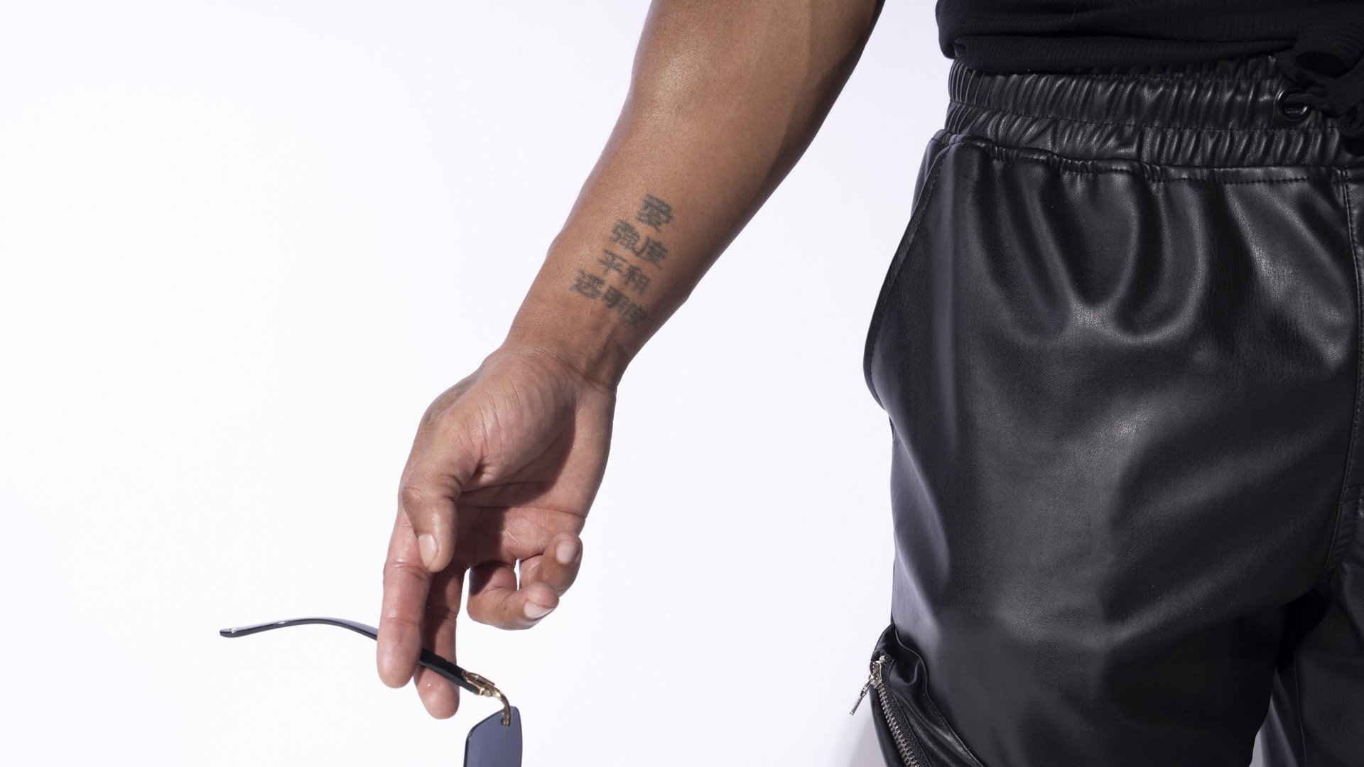
The small characters near Hayes’ inner wrist are a change of pace. They sit in a short vertical stack, with open skin around them and no large decorative border. The design is compact enough that it can disappear in a wider view of his whole arm. Up close, the separate rows and individual strokes give it a tidy, deliberate look.
In his tattoo interview, Hayes identifies the ideas behind the writing as love, strength, peace and clarity. He says he had the wording checked, and he still values what he chose when he was younger. That is his explanation of the tattoo, rather than a fresh translation of each character from a photograph. The personal point is clear: these are qualities he wanted to carry with him.
There’s something appealing about how little extra decoration this piece needs. The other arm has a crown, a cross, lettering and repeating patterns competing for space. Here, the simple arrangement makes the writing the whole subject. The characters don’t need shading behind them to create a background. Their size and the gaps between the rows give the design its structure.
The placement also makes it feel different from the shoulder pieces. A wrist is somewhere the wearer can bring into view easily. The writing is close to the hand, on the inward-facing side of the arm, so it has a more tucked-away feel than the broad crown. That visual difference fits a design built around personal values rather than a phrase meant to catch a room’s attention.
If this sort of tattoo appeals to you, its simplicity is useful to notice. Compact writing needs enough space for the strokes to remain distinct. The rows here don’t run into a dense sleeve background, so you can see where one group ends and the next begins. Hayes’ tattoo shows how a small piece can still have its own identity in a collection full of much larger work. It doesn’t have to compete on size to matter.
Forearm tattoo: lion, clock and flower
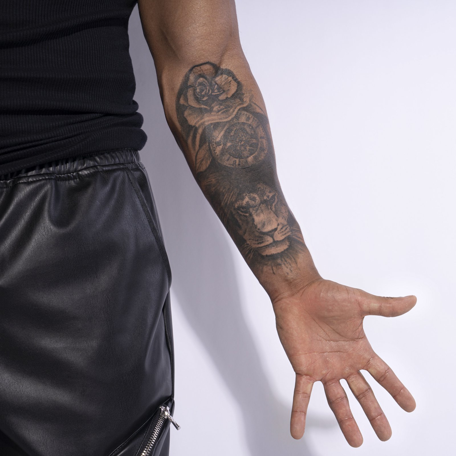
The inside of Hayes’ left forearm brings three recognizable images together. A flower sits near the top, a clock occupies the middle, and a lion’s face fills the lower part near the wrist. The dark shading between them makes the group feel connected. Rather than three separate stickers placed along the arm, it reads as one tall composition.
Hayes ties the lion to being a Leo and to strength. The clock develops an older idea about making good use of time, while the flower brings in a softer feeling and an appreciation of life’s beauty. Those explanations suit the visual balance of the piece. The lion has a direct, intense expression, and the flower gives the upper end a gentler shape.
The lion is the part that draws you in first. Its eyes sit beneath a darker brow, the nose is strongly defined, and the lighter muzzle stands out against the shaded mane. The face points outward from the wrist area, where it gets a natural stopping point before the hand. The artist has used the forearm’s length to give the animal enough room without flattening it into a narrow band.
Above it, the clock adds a circular shape between the lion and flower. That circle breaks up the long vertical flow of the arm. The flower’s rounded petals then echo the clock’s curve while changing the texture. You get fur, a clock face and overlapping petals in one design, all held together by black and gray shading. Each subject has its own outline, but the transitions keep the group from looking chopped into pieces.
This is a good piece to look at slowly. From a distance, it reads as a dark section of sleeve. Closer up, you can separate the three subjects and see how they’re arranged. The darkest parts help the lighter details stand forward, especially around the lion’s muzzle and the flower’s petals. Hayes’ forearm shows how several personal ideas can share one space while still being easy to pick out.
Taken together, these tattoos give his arms a mix of loud statements and quieter reminders. The big text and crown have an outward confidence, while the wrist writing feels more reserved. The eye has a clean silhouette, and the forearm group rewards a closer look. You don’t have to choose a favorite to enjoy the contrast. Each piece brings a different shape and mood to the collection.
Hear Hayes talk through the stories behind his ink in the video below.