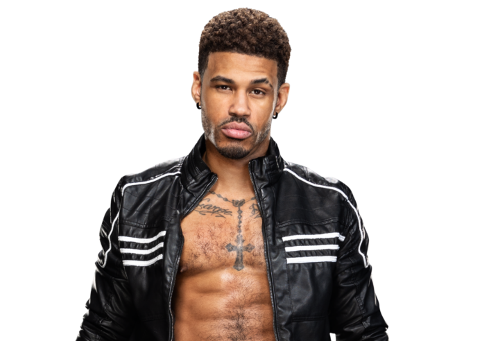
Wes Lee’s tattoos are easy to spot when he’s standing still and a little harder to follow when he’s flying across a ring. The rosary down his chest is the quickest landmark. Look a little longer and you’ll notice the script above it, the dreamcatcher on his right arm, and a large figure beneath the lettering on his back.
Fans also know him as Dezmond Xavier, so older and newer wrestling photos may use a different name for the same person. This guide takes a closer look at the designs visible during his NXT years. His collection mixes fine lines, dark symbols and open skin, rather than covering every available inch with one continuous pattern.
The fun part is how differently the front and back are arranged. His chest has a necklace shape with short words on either side. Turn him around and the layout becomes a broad line of lettering over a tall central figure. Here’s how those pieces fit together.
The rosary and cross tattoo down his chest
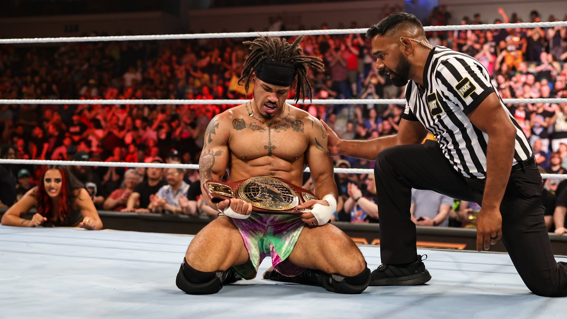
The rosary tattoo follows the shape of a necklace around the base of Lee’s neck. A chain of small bead shapes curves across his upper chest, meets in the middle, then drops toward a dark cross on his sternum. You can follow the design from the collarbone area down to the lower edge of his chest without it turning into a solid block of ink.
That spacing matters. The beads are individually outlined, and the vertical strand is fairly narrow. The cross has much heavier shading, so it becomes the piece your eye lands on first. From a distance, the lower cross stays visible even when the little bead details become harder to pick out. Close up, the upper loop makes the whole necklace shape clear.
Lee sometimes wears an actual necklace too. In the Battleground photos, the real chain and its small pendant sit over the upper part of the tattoo. The dangling cross farther down his chest is ink. It’s a useful distinction if you’ve seen a quick entrance shot and wondered which part was jewelry.
Rosaries and crosses have familiar religious associations, but the design alone doesn’t tell us Lee’s personal reason for choosing it. A tribute, a particular event or a date would need his own explanation. What we can see is a carefully centered piece that gives his chest a clear vertical line.
The same front-facing shot shows how much room he leaves below it. His stomach isn’t filled with a matching panel in these photos. That open area keeps the cross separate from his wrestling gear and lets the necklace effect work. It also makes this one of the easiest designs to recognize when his arms or shoulders are partly hidden.
The Carpe Diem lettering across his upper chest
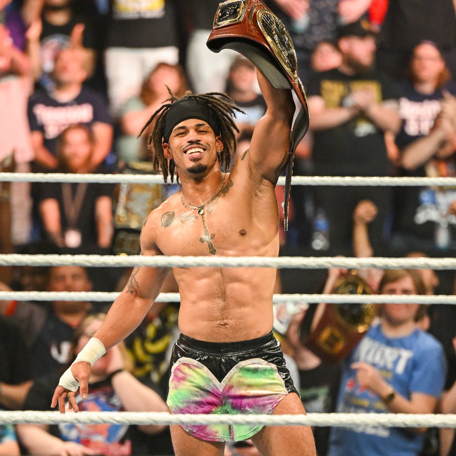
Above the cross, Lee has Carpe Diem written across his upper chest. The two words sit on opposite sides of the rosary’s central strand. It’s a short phrase, but the script gives it plenty of movement: tall opening letters, joined strokes and long curls beneath the words.
The usual English translation of carpe diem is seize the day. That explains the phrase itself, without turning it into a story about a specific moment in Lee’s life. The phrase itself doesn’t tell us whether he chose it for a career milestone or for something away from wrestling.
The lettering sits high enough to stay visible above the center of his chest. It follows the broad line below his collarbones, while the rosary drops between the words. Those two directions give the front a simple structure: the writing runs across, and the necklace runs down. Neither has to cover the other to make an impression.
There are also small, dark illustrated shapes toward the outside of the words. They have much denser shading than the lettering and give the ends of the chest arrangement extra weight. Their exact subjects are less clear than the phrase, so it’s better to enjoy the contrast than assign them a name that the photos don’t settle.
In the celebration photo, Lee raises a championship belt with one arm. His chest stretches, and the lettering curves with it. That’s part of why script can look quite different in a match shot and a straight portrait. The underlying design hasn’t necessarily changed; the angle, skin movement and reflected light change what catches your eye.
If you’re drawn to this piece, the layout is as interesting as the wording. The phrase is split without losing its connection, and the fine curls sit comfortably beside a heavier central symbol. You don’t need a long sentence to use a wide placement well.
The dreamcatcher and angular tattoos on his right arm
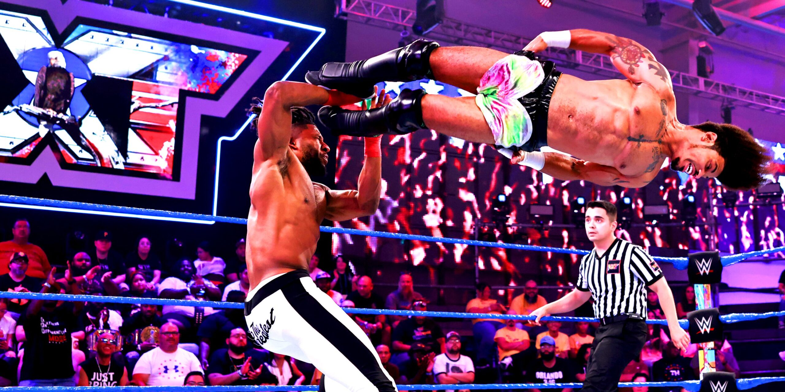
Lee’s right arm brings a different set of shapes into the collection. A dreamcatcher-style tattoo has a rounded outer edge, an interlaced center and hanging details below it. Nearby, darker angular marks use much simpler outlines. The contrast is especially clear in the action photo where his right arm bends above his torso.
The circular design sits lower on the arm than the bold marks near his shoulder. Its web-like interior uses thin lines inside a stronger border, so it has detail without needing to be huge. The hanging elements extend its shape along the arm. Even when the arm is bent, you can still pick out the round center and the pieces trailing away from it.
The upper marks work almost the opposite way. They rely on dark fill and pointed edges, with strips of bare skin separating the shapes. They look bold at a glance, while the dreamcatcher asks for a closer look. It’s a good example of different drawing styles sharing an arm without blending into an uninterrupted sleeve.
There’s no need to turn the dreamcatcher into a claim about Lee’s ancestry, spiritual beliefs or dreams. The visual resemblance identifies the design, but its private meaning belongs to him. Likewise, the angular symbols shouldn’t be given an alphabet, translation or group affiliation just because their outlines invite guesses.
His white wrist tape helps show where the visible tattoo area ends in this shot. The arm has separate pieces above it, with space between them. That makes the arrangement feel closer to a collection of individual choices than a sleeve built around one background.
The angle is unusual because Lee is airborne, but it reveals something a flat front view can hide: the designs wrap around the curve of the arm. The round shape turns away from the camera as the shoulder rotates. Watching that movement makes it easier to understand why one tattoo can look narrow in one photo and broad in another.
The large muscular figure tattoo on his back
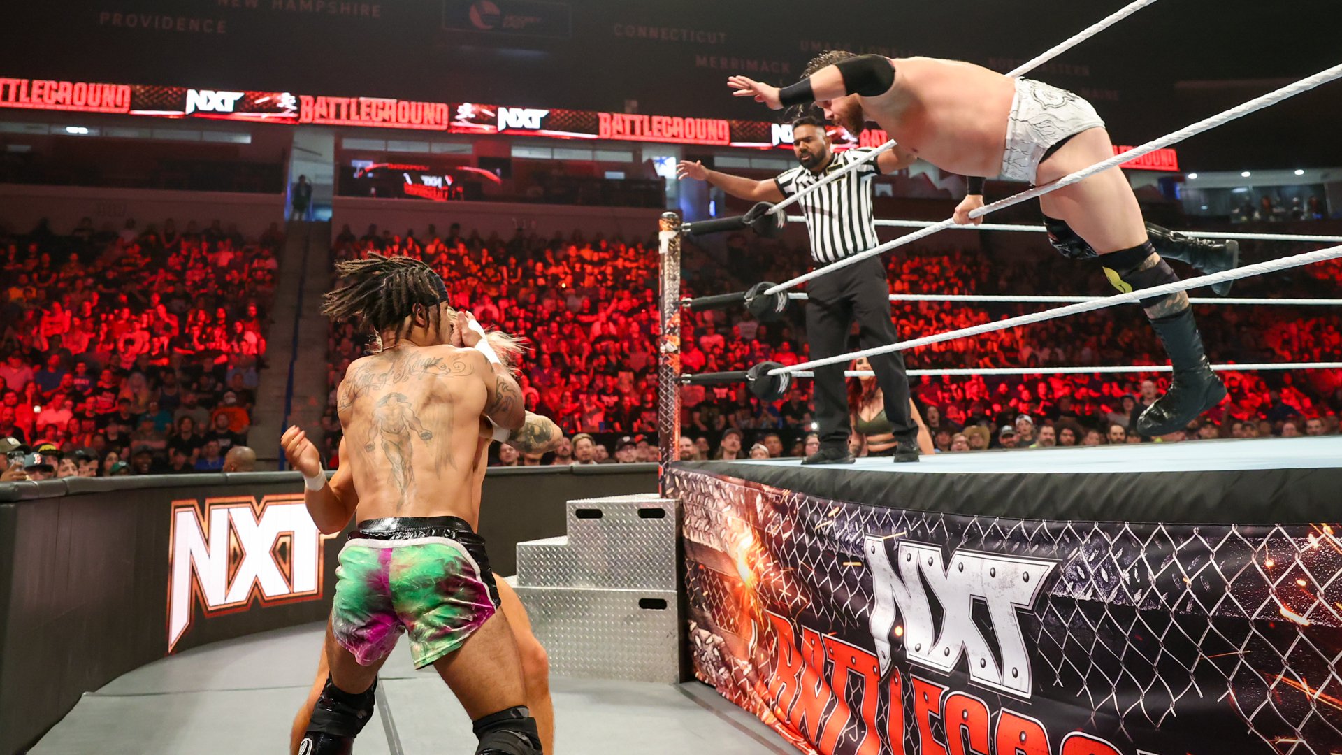
The large back figure is one of Lee’s biggest illustrated pieces. It sits down the center of his back beneath the upper lettering. The subject has a muscular torso, arms held out from the body and long legs extending toward his waistband. Loose shaded strokes around it give the image a wider, softer edge.
Unlike the chest cross, this design uses several levels of grey. Dark outlines help define the limbs, while shading inside the body gives the figure volume. The surrounding strokes are lighter and less sharply bounded. That difference lets the main body stand out without turning the entire back into a dark rectangle.
The figure’s exact identity isn’t obvious enough to name confidently. It’s tempting to see a familiar hero, religious figure or character in a large muscular drawing, but resemblance isn’t an identification. Calling it a muscular figure describes what you can actually see and leaves room for Lee to explain the subject himself.
Placement is a big part of its effect. The upper body starts below the shoulder-blade lettering, and the legs narrow as they move down his back. That tall shape follows the middle of the torso. The lighter marks on either side spread the composition outward, so it doesn’t feel like a small sticker stranded in a large empty area.
In the ringside photo, Lee is turned away from the camera while the action continues around him. His back remains exposed from the lettering to the waistband, which shows the overall proportions well. The illustration takes up a substantial part of that space, but it still leaves bare skin at the edges.
It’s a very different approach from the dense connected work seen in Randy Orton’s tattoos. Lee’s central image has its own boundary and breathing room. If you like a large back piece without full coverage, that balance is the detail to notice.
The King of Kings script across his upper back

Across the top of his back, Lee wears King of Kings in decorative script. The phrase stretches across the shoulder blades, with large opening letters and sweeping curls that extend beyond the main letter shapes. It’s much broader than the short wording on his chest.
The writing and the figure below it have separate jobs. The phrase fills the wide upper area, while the illustration carries the design down the center. Together they make a large composition without requiring one continuous background. You can read the top as a lettering piece and still follow the lower image on its own.
The script’s flourishes are especially noticeable when his shoulders turn. They reach into the open skin beside the words, giving the tattoo width without making every stroke equally heavy. Some lines loop back toward the phrase; others curl outward. The result has a handwritten feel rather than the straight edges of block capitals.
King of Kings can carry religious associations, and wrestling fans may recognize the phrase in other contexts too. Neither connection proves why Lee chose it. There’s no confirmed explanation here tying it to another wrestler, a particular character or a specific belief. The wording is visible; the personal story isn’t something we should fill in for him.
The back lettering also helps distinguish his collection from photos of other wrestlers in the same match. It’s easy to mix up tattooed arms when bodies overlap in an action shot. The broad script above the central figure is a much more useful landmark, especially when Lee’s face is turned away.
His collection is strongest when you look at those relationships: fine chest words around a hanging cross, rounded arm detail beside hard-edged marks, and wide back lettering above a tall illustration. Each area has its own pace. None needs every inch covered to feel complete.
For a moving view of the same collection, watch Lee against Tyler Bate and Joe Gacy at NXT Battleground 2023 below. The match shows why the chest and back designs look different from one angle to the next.