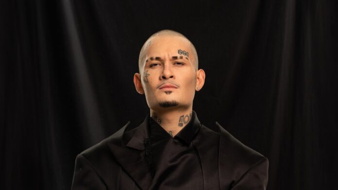
Morgenshtern is one of the most visibly tattooed figures in Russian rap, and the available photographs show why his ink has become part of his public identity. The record is not a single posed close-up. It includes a front-facing outdoor photograph, a red-lit stage frame, a candid image beside a vehicle, a gym photograph and a monochrome performance shot. Together they show a large colorful chest composition, neck lettering, face marks and separate arm coverage from genuinely different angles.
The clearest documented tattoo source is the GQ Russia interview in which Morgenshtern discusses his tattoos, including the first skateboard tattoo he made as a teenager and his views on face ink. Peopletalk’s report on that interview also connects the right-arm work with memories of adolescence. Later coverage records additional facial designs, while the inspected photographs establish how the chest and arms are actually arranged on his body.
This guide keeps the visual record specific. Tattoo-bearing originals carry the design claims; the featured portrait is a separate face-visible identity route. The article names only forms that the photographs or reporting can support, and it treats uncertain small symbols as part of the broader visual field rather than inventing a complete catalogue. That approach makes the page useful for tattoo research without confusing a dramatic celebrity image with proof of every detail.
The chest centerpiece and flower frame
The strongest visual anchor in Morgenshtern’s collection is the large chest composition that spreads from the upper chest toward the centre of the torso. In the outdoor photograph, the design reads as a dense, colorful arrangement with floral forms at the sides and a darker central figure or emblem. The linework has a deliberately crowded energy, which suits the performer’s high-contrast public style while still giving the eye a clear centre to follow.
The available reporting does not publish a complete official key for every part of this chest piece. A careful description therefore stays with what can be seen: bright flowers, layered leaves, dark outlines, and a central vertical element that continues toward the lower chest. The composition is large enough to remain legible in a mid-distance portrait, which is why it becomes the first design readers notice.

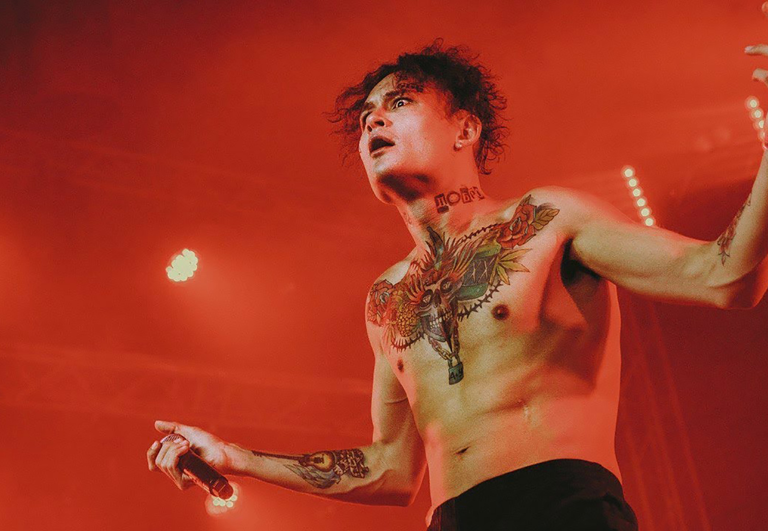
The stage photograph changes the impression of the same area. Red light compresses the color palette and makes the black outlines feel heavier, while the performer’s movement reveals how the design follows the chest rather than sitting like a flat sticker on a still body. The candid backyard frame supplies another comparison, showing the chest at a calmer distance with the strap crossing part of the image. Scale remains readable in both settings.
For design study, hierarchy matters. A broad central piece can carry the visual weight of a collection when its outer flowers frame the central subject. The main image and its supporting foliage need to be developed together, then checked as the shoulders lift, twist or reach toward an audience.
The neck lettering and face ink
Morgenshtern’s neck lettering is visible in nearly every tattoo-bearing photograph, but each angle makes it read differently. The outdoor frame shows block-like letters beneath the jaw, the stage image places them against red light, and the gym photograph brings the lettering close enough to compare with the facial marks. These photographs support the existence and placement of the neck work without requiring a guess about every letter’s intended translation.
The face tattoos are smaller but more identity-defining. The inspected images show a star-shaped cheek design, marks near the eyes and forehead symbols that have appeared across different public periods. The GQ interview is especially important because it documents Morgenshtern speaking about “face tattoos” directly and acknowledging the professional and personal consequences of placing ink in such a visible area. The face is part of the composition.
A face tattoo also changes the balance of a portrait. The cheek star creates a graphic point beside the eye, while the forehead marks create a second horizontal emphasis above the brows. The neck lettering then extends that visual field downward, linking the face to the chest. In the gym photograph, the three zones can be read together because the camera is close and the subject is not hidden by a shirt collar.
The responsible design takeaway is not to copy the symbols blindly. Face and neck work require exact references, careful scale and a realistic conversation about visibility. Morgenshtern’s public comments show that he has considered the drawbacks himself. That context makes the tattoos more interesting, not less: the placement is part of the design’s meaning because it cannot be separated from the wearer’s daily presentation.
The wider candid tattooed-body view
The Meduza photograph beside the vehicle provides the most useful wider view of how the collection sits on Morgenshtern’s body outside a stage. The chest piece is still the centre, but the frame also shows the neck, face and both arms in a single relaxed posture. This helps establish that the ink is not a collection of isolated close-ups; it is a connected visual system spread across several areas.
The forearms add a different rhythm from the chest. Their denser marks sit farther from the central composition and appear in bands that become clearer when the arms hang naturally. The image does not resolve every small symbol, and the article does not assign names to indistinct details. What it does show is the way arm coverage extends the look downward and gives the torso a stronger perimeter. The outer zones frame the centre.

Candid photographs are valuable because they reduce the staging that can distort tattoo scale. The vehicle, strap and outdoor light create ordinary context, so the viewer can compare the chest design with the actual width of the shoulder and arm. It becomes easier to see where the tattoo is dense, where skin remains open and how the design changes when the subject is moving through a normal day rather than posing for a studio campaign.
For a custom concept, the wider frame suggests planning the body as a series of related zones. A large chest image can remain the anchor, while arm designs echo its line weight or colour without filling every available centimetre. Open skin is part of the composition. The photographs are strongest when they show contrast between the saturated centre and the separate, more fragmented marks on the limbs.
The gym close view of face, chest and arms
The Spletnik gym photograph is a distinct close view that brings several parts of the collection together. Morgenshtern sits shirtless between workout equipment, looking directly toward the camera. The chest composition is visible from above, the neck lettering is unobstructed and the face marks are sharp enough to identify the same person seen in the outdoor and stage images.
This angle is particularly helpful for understanding density. The central chest piece has many overlapping elements, yet the upper edges still create a readable silhouette across the pectorals. The arms are darker in patches, with separate designs appearing on the forearms. Because the camera is closer than in the stage frame, the viewer can distinguish changes in texture and colour instead of seeing one continuous black shape.

The gym setting also changes the mood of the tattoos. Under concert lights, the chest design feels theatrical. In the gym, it reads as part of the body during an ordinary pause. That contrast is useful for anyone evaluating a tattoo idea: a design must work in a dramatic photograph and in the flat, unromantic light of everyday life. Morgenshtern’s collection remains recognisable in both environments because its major shapes are bold.
The image should not be used to claim a definitive meaning for every mark. It is strongest as visual evidence for placement, scale and the relationship between face, neck, chest and arms. The GQ interview supplies the documented personal commentary, while this photograph supplies the body map that words alone cannot provide.
The monochrome tattoo performance composition
The black-and-white FON MUSIC photograph shows the collection under movement and high contrast. Morgenshtern raises both arms while holding a microphone, and the chest design becomes a pale graphic field against the darker stage. Without colour, the viewer notices the structure: the central vertical element, the flanking floral shapes, the neck lettering and the separate arm marks that continue toward the hands.
Monochrome is useful because it strips away the colour drama visible in the outdoor photograph. The chest piece still reads as one composition even after its reds, greens and yellows disappear. That suggests the linework and silhouette are doing much of the design work. The image also demonstrates why tattoo coverage should include more than one original: a still stage pose and a moving black-and-white frame answer different questions. Structure survives the change in palette.
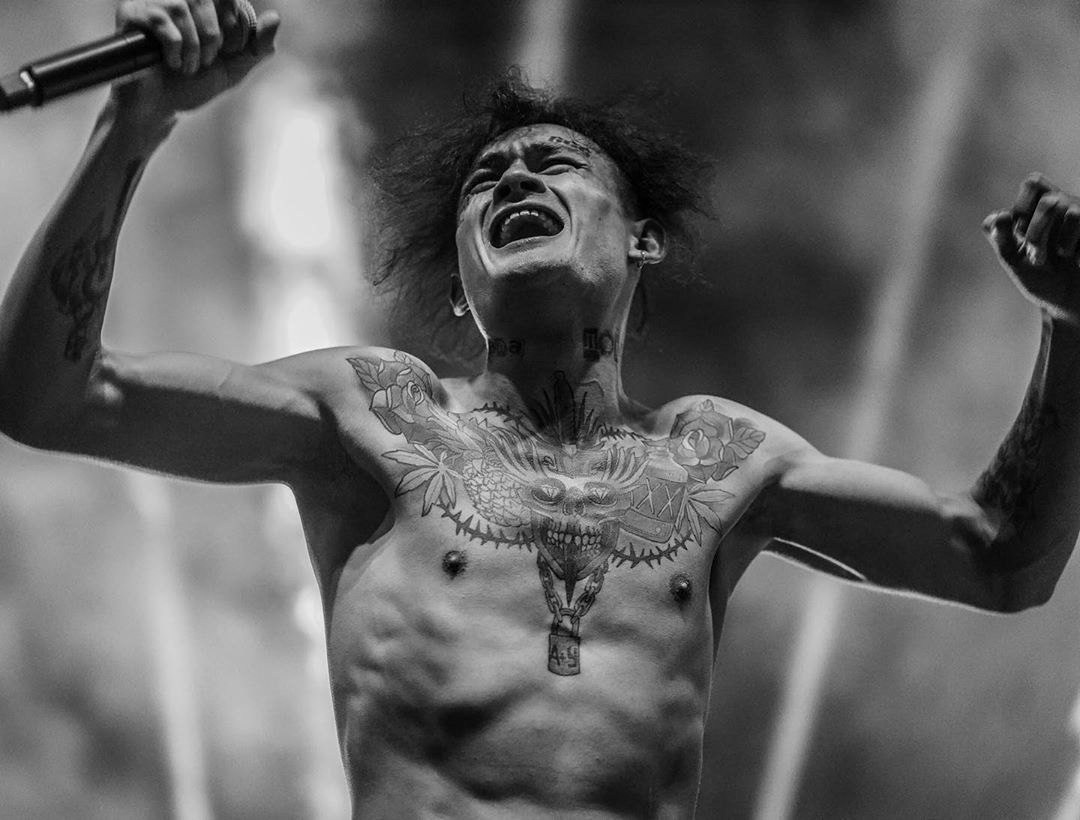
The raised-arm posture changes the skin plane across the chest and shoulders. Some details stretch, others fall into shadow, and the lower pendant-like element points toward the centre of the torso. These are practical observations rather than claims about symbolism. The public sources describe Morgenshtern’s tattoo history and attitudes, but the photograph itself is the authority for how the piece behaves under performance movement.
For tattoo inspiration, the strongest idea is the relationship between a bold central image and supporting border shapes. A design can feel expansive without becoming an undifferentiated block if the main figure has a clear axis and the surrounding leaves or flowers create a frame. The stage photograph makes that architecture visible even when colour is removed.
What the interview record supports
The GQ Russia interview is the strongest first-person source in the dossier. Morgenshtern describes making a skateboard tattoo at fourteen and explains that the tattoos on his right hand connect with memories of his youth. The interview also records his view that many people later regret face tattoos. Those details give the collection a documented personal timeline without pretending that every visible chest or facial symbol has an officially published explanation.
Peopletalk’s coverage repeats the right-arm context and places the comments within a broader discussion of his image. Later reports about facial tattoo removal show that the visible record can change over time. That is why the article treats the photographs as dated visual evidence rather than a permanent inventory. A tattoo seen in an older image may be altered, covered or removed in a later period.
The sources also support a useful distinction between biography and design. The interview tells readers something about why certain marks matter to Morgenshtern. The photographs show the colour, placement and scale. Both kinds of evidence are valuable, but neither should be stretched into a complete explanation for ink that the source never names.
How the five photographs differ
The inline set is intentionally varied. The outdoor frame gives the clearest full chest-and-arm view. The stage photograph shows the same body art under red concert lighting. The wider candid image provides ordinary context and a different posture. The gym shot brings the face, neck and chest closer. The monochrome performance frame clarifies structure by removing colour. Five distinct originals make the visual record more useful than one image repeated five times.
The separate featured portrait has a different role. It shows Morgenshtern dressed against a dark background with his face clearly visible, giving visitors an immediate identity anchor before they reach the tattoo sections. The tattoo claims remain attached to the five inline photographs where the ink can be inspected. Keeping those roles separate prevents a portrait from doing evidentiary work it cannot do.
That separation is also important for accessibility. Descriptive alt text names the visible tattoo areas and the subject rather than relying on vague labels. Readers who cannot see the photographs still receive a concise account of what each original contributes: chest, neck, face, forearms, stage movement or wider placement. The page becomes a documented guide rather than a gallery with unexplained files.
What remains uncertain
Published reporting does not provide a definitive diagram of every mark on Morgenshtern’s body. Some small facial and hand designs are visible only briefly. The available photographs also come from different periods and settings, so they should not be treated as a single appointment-day record. The article therefore avoids naming uncertain symbols and leaves room for changes caused by cover-ups, removal or new work.
The chest design is visually clear as a large floral and central composition, but the sources do not establish a complete official meaning for each figure. Likewise, the neck lettering is visible, yet a translation should not be invented from low-resolution pixels. A careful tattoo guide can describe the form accurately while respecting the difference between an observed shape and a confirmed explanation.
Language, references and symbolism should be verified with the original source or a qualified specialist. A celebrity photograph can suggest scale and placement, but it cannot substitute for personal meaning, professional consultation or a stencil review. The most durable principle in this collection is the value of evidence before commitment.
A final visual comparison
Morgenshtern’s tattoos demonstrate how a body can support a bold centre with smaller zones around it. The chest piece supplies colour and mass. The neck lettering creates a bridge between torso and face. The facial marks form compact points of contrast, while the forearm designs extend the composition into movement. The result feels connected because the pieces share visual intensity even when their individual motifs differ.
Colour is another important lesson. The outdoor and gym photographs show how saturated flowers and darker outlines can keep a large composition readable. The monochrome stage image proves that the underlying structure still works without colour. A custom design inspired by this approach should be tested in linework, grayscale and colour before the final palette is chosen.
Finally, the collection shows why spacing matters. The tattoos are dense, but not every square inch is equally filled. Areas of open skin help the chest centre and arm marks remain distinct. A large design should be photographed while standing, sitting and lifting the arms. Morgenshtern’s performance images make that practical point visible: movement changes the composition, and a tattoo should be designed for a living body rather than one frozen pose.