KeiyaA tattoos are easiest to understand as part of the musician’s approach to visibility. She has discussed wanting to show her ink, and recent interviews describe tattooed arms that are difficult to miss. The selected photographs support that account while keeping the visual record careful: three different tattoo-bearing originals show the arms and chest, and two later portraits provide face-visible context without being presented as tattoo evidence.
This guide separates what the photographs show from what the surrounding interviews suggest about meaning. The arm coverage is clear. Some lettering and chest work are visible. The exact history of every mark is not publicly documented in the selected sources, so the descriptions stay with placement, scale and confirmed statements rather than turning a blurred detail into a guess.
KeiyaA tattoos across the arms and chest
KeiyaA has described her tattoos as something she likes to show rather than hide. The Guardian interview presents that preference in the context of clothes, performance and the pressure to look like a public version of oneself. The accompanying portrait is useful because it records the ink in a real editorial setting: the upper arms and chest are visible, the subject is identifiable, and the designs are visibly on skin.
The frame should be read as an overview, not a complete catalogue. It shows more than one tattooed area, but the lighting and the red dress do not make every line legible. The strongest claim is therefore that KeiyaA has multiple tattoos across both arms and the upper chest. The photograph does not, by itself, establish when each piece was made, who designed it or what every symbol means.
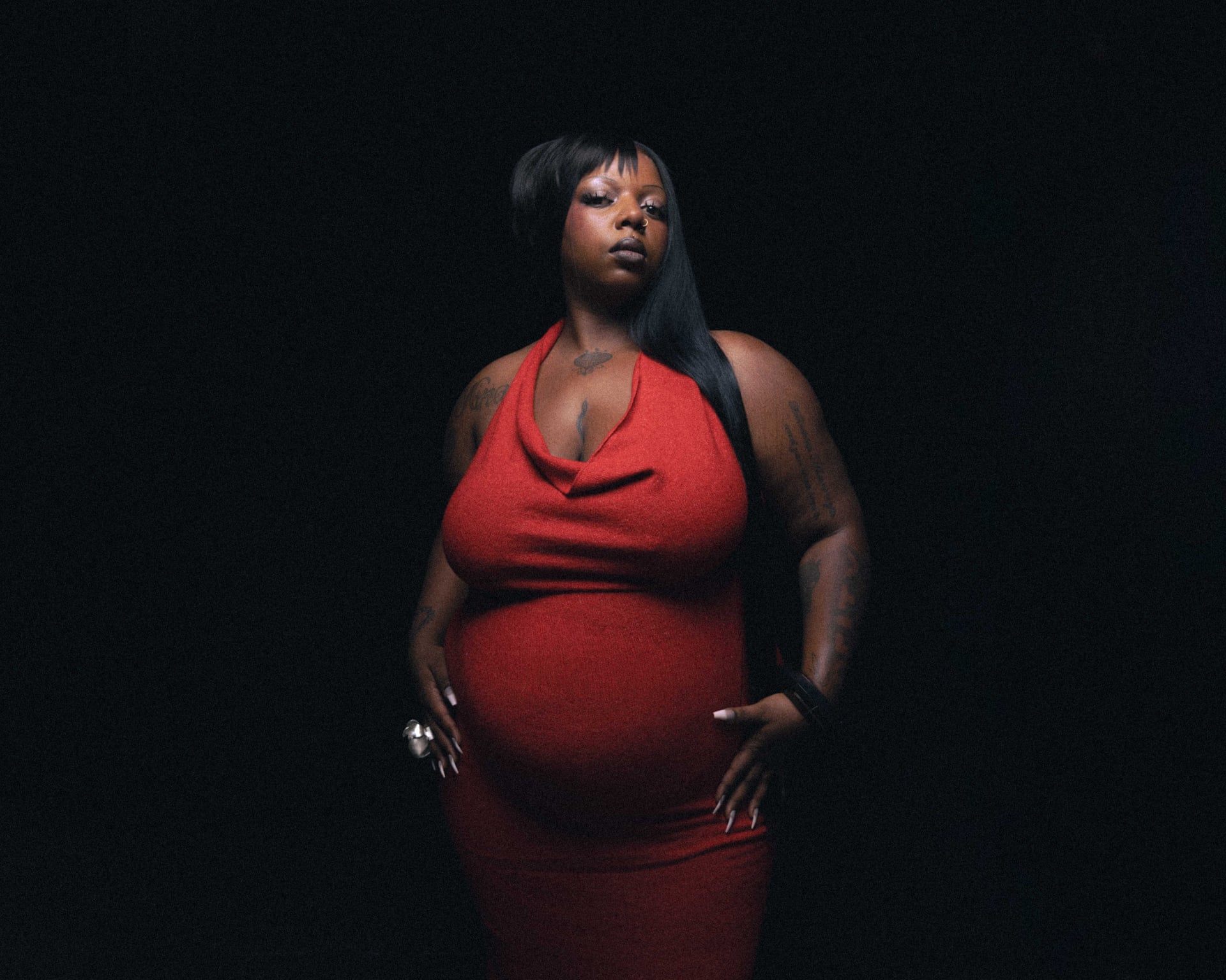
That restraint still leaves a useful design reference. The overall effect is a collection that follows the body rather than a single isolated emblem. The upper-arm pieces sit within the natural shape of the shoulders, while the chest work creates a separate focal area. The visual language is personal and layered, but the documented meaning remains limited to what KeiyaA has chosen to discuss publicly.
The Guardian text also connects the tattoos to agency. KeiyaA says she prefers close-fitting black clothes and likes to show her ink, pushing back against styling that makes her feel covered or translated for someone else. That statement is evidence about presentation, not a claim that the tattoo designs all have one theme. It helps explain why photographs with exposed arms are relevant to the record.
The tattooed arms that KeiyaA wants to show
The Crack Magazine portrait provides a second angle on the arm coverage. KeiyaA is photographed in a dark outfit with one shoulder and both arms more exposed than in many performance images. The frame is not a close-up, yet it separates the tattooed areas from the clothing and shows that the ink is distributed across the upper limbs rather than limited to one small wrist mark.
This image is especially useful beside the Guardian portrait because it is a different original photograph from a different editorial setting. The repeated visual fact is arm coverage, while the changing pose prevents the article from treating one frame as if it were several views. A tattoo guide benefits from that distinction. Two angles can confirm a placement, but they should not be counted as two separate designs.
The visible work appears to combine lettering with darker illustrative shapes. The photograph is not sharp enough to transcribe every letter, and no responsible description should invent a phrase from an indistinct mark. What can be said is that the upper arm and shoulder carry substantial ink, with the lines following the contours of the body. The designs are not printed graphics or styling details.
The source search also covered the artist profile routes, the Guardian interview, Crack Magazine images, the Vogue editorial and the Tiny Desk performance route. Those sources provide a stronger base than a single social repost because they place KeiyaA in identifiable editorial or performance contexts. The selected frame therefore carries identity evidence and tattoo evidence at the same time, while keeping the claims narrow.
The left-arm lettering and chest designs
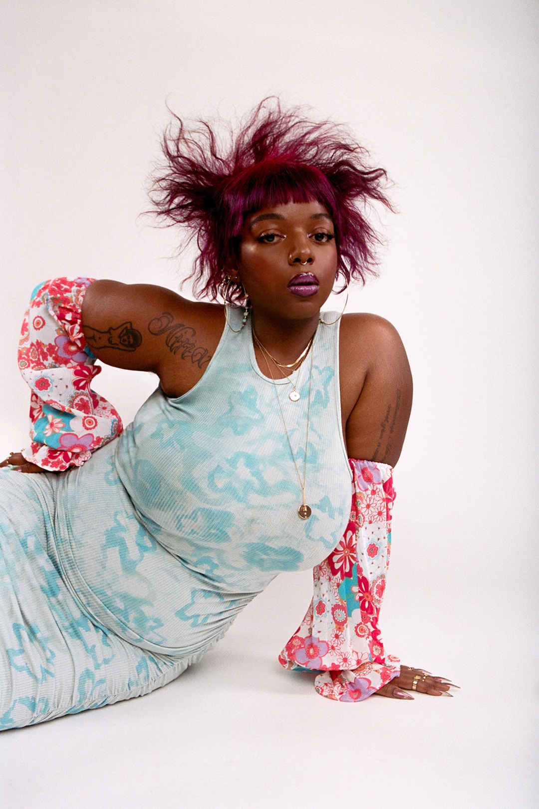
The Vogue image offers the clearest selected view of the left upper arm. KeiyaA faces the camera in a bright studio portrait, and the exposed arm shows a large dark design with lettering and additional linework lower down. The file is high resolution and visually distinct from the Guardian and Crack frames, so it earns its own placement rather than being used as a crop or substitute for another photograph.
The lettering is tempting to overread. At this resolution, a viewer can see that text-like forms are present, but a visual guide should not turn partial shapes into a confident transcription. The documented biography gives the broader context that KeiyaA has meaningful tattoos, including a script tattoo connected with Nina Simone, but the selected image is not used to assign that specific identity to every visible mark.
Placement is clearer than meaning. The arm piece sits high on the upper arm and continues toward the lower exposed section, while the chest and opposite arm are partly hidden by the pose and clothing. This makes the Vogue photograph a useful reference for scale and body position. It also illustrates why a design inventory should distinguish a visible location from an interpretation of the artwork.
The article keeps the portrait face-visible because identity matters when tattoo coverage is being discussed. It also keeps the alt text tattoo-specific and factual. The wording describes the left-arm tattoos without claiming that the photograph reveals a complete sleeve or a definitive list of symbols. That is a small editorial choice, but it protects the record from becoming more certain than the source material allows.
What the photographs can and cannot identify
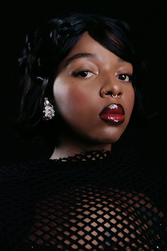
KeiyaA appears in several other portraits from the same Crack Magazine session, and they serve a different purpose. The dark close portrait used here identifies her face and styling while leaving most of the tattooed body covered. It is retained as supplemental context because a reader benefits from seeing the subject beyond one repeated body-art pose, but it is not mapped into a tattoo section and does not support a tattoo claim.
A face-visible portrait can be valuable without showing ink. It gives the page a separate identity route, helps readers connect the performer to the cited interviews and makes clear that the tattoo photographs are not generic stock imagery. The boundary is explicit: this photograph establishes who is pictured, not what is tattooed beneath the clothing.
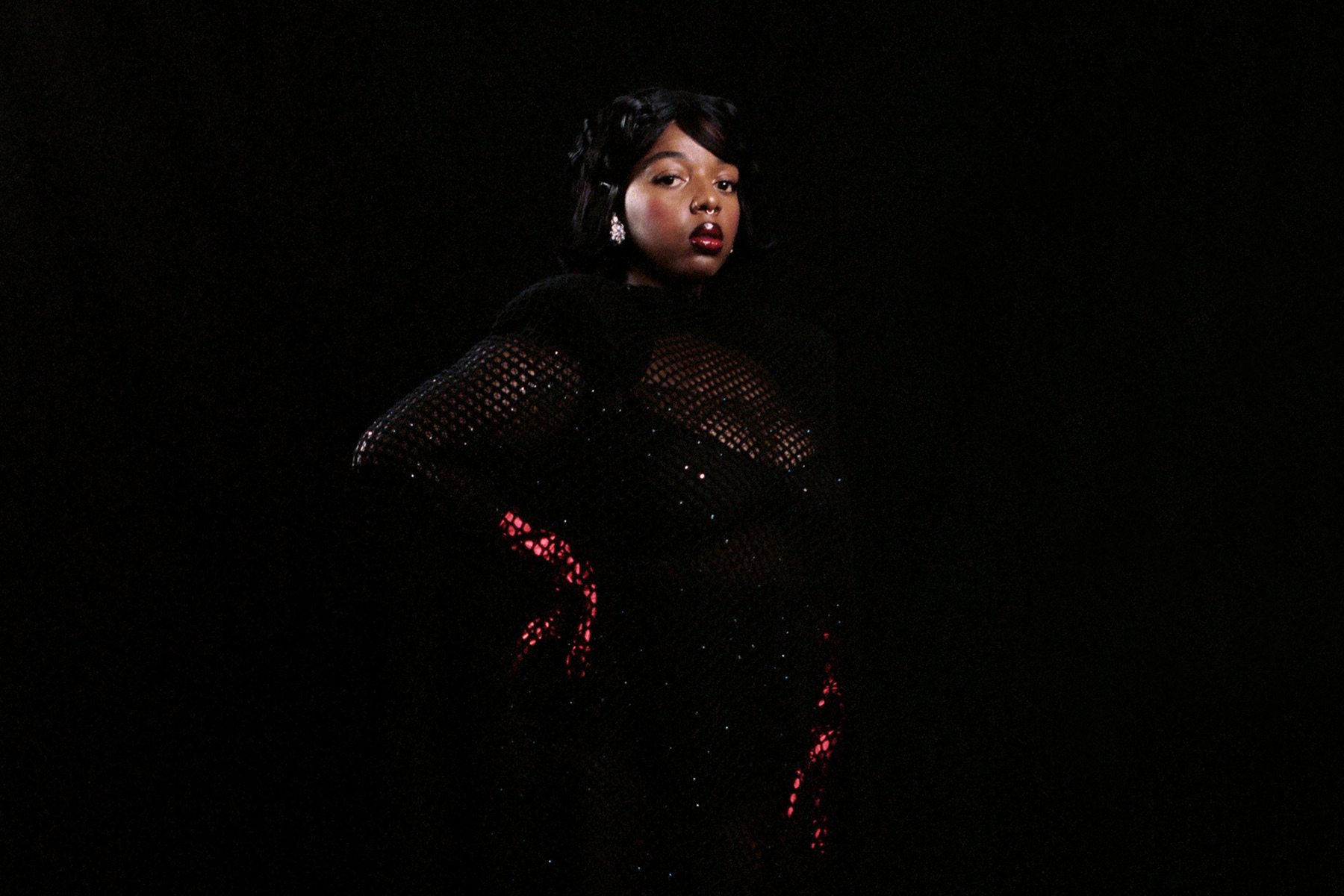
That separation is important when the subject is photographed in fashion or performance settings. Mesh, shadows and bare skin can create misleading shapes, while jewellery and styling can resemble small marks at a quick glance. The inspected image does not offer enough evidence for a tattoo description, so the article leaves it in the portrait category.
The result is a more honest visual rhythm. Tattoo-bearing photographs appear first, each in a section that explains the relevant body area. Supplemental portraits arrive later, after the tattoo search has been exhausted, and their descriptions say exactly what they do. The page can still be visually rich without quietly promoting every portrait into evidence.
Performance context around KeiyaA
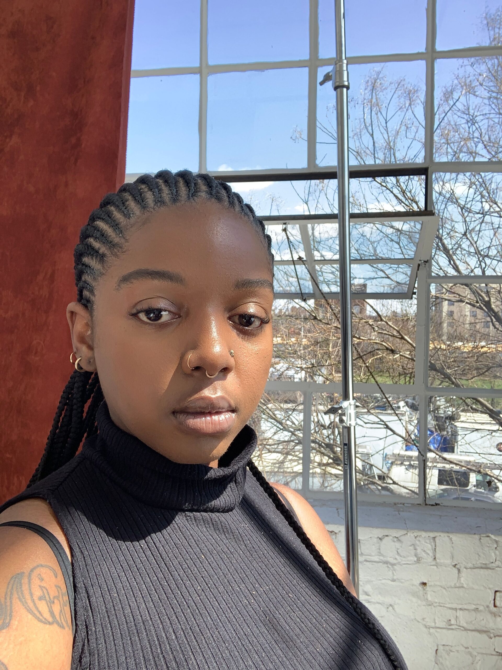
The second supplemental portrait shows KeiyaA in a performance-style setting. Her face is visible, but the pose, lighting and clothing make the arms and chest unsuitable for a careful tattoo reading. It is therefore used for career context only. The photograph shows the performer in motion and gives the article a different visual register from the quieter editorial portraits.
The Tiny Desk route is useful in the same way. KeiyaA has spoken about feeling over-covered in one Tiny Desk styling choice, and the Guardian interview connects that experience to her preference for showing her tattoos. That does not mean every frame from the performance reveals the designs. The source gives context about presentation, while the selected photographs carry the direct visual evidence.
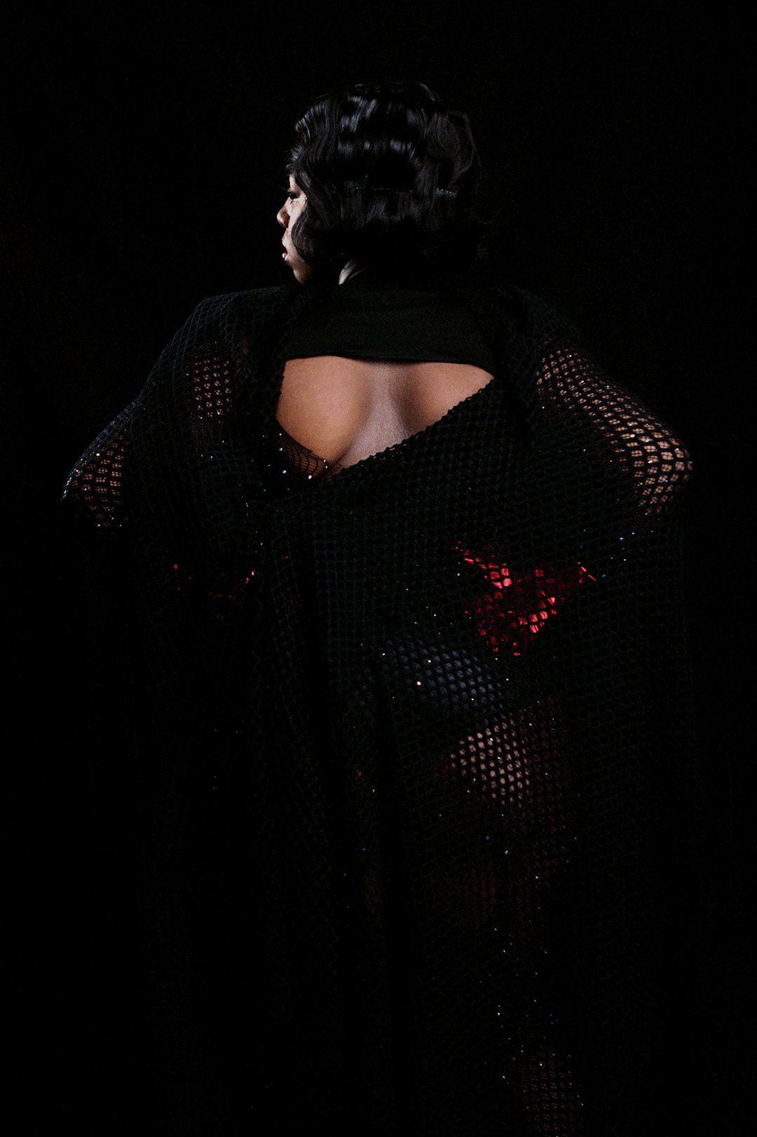
The visual search was deliberately broad. It included the Guardian interview and its two editorial photographs, the Crack Magazine profile and gallery files, the Vogue portrait, the Tiny Desk route, official artist pages and candidate-specific image searches. Three distinct tattoo-bearing photographs survived inspection, and the remaining files were kept only as supplemental portraits because they did not add reliable tattoo detail.
This is also why the article does not pad the collection with near-identical crops. The Guardian portrait, Crack portrait and Vogue image show different poses and dates, while the two Crack supplemental portraits have their own compositions and source paths. Each inline slot has a separate job. The result is a visual record of the documented tattoos, not a gallery that repeats one frame until the page reaches an arbitrary image count.
Notes from the interviews
The strongest public statement is about visibility rather than a numbered inventory. KeiyaA has said that she likes to show her tattoos, and the Guardian describes tattooed arms as part of her appearance. Crack Magazine adds a separate biographical detail: she has a tattoo of Nina Simone’s name in script on the left side of her chest. That detail is useful because it comes from a profile about the artist, but it should not be used to label every script-like shape in the selected photographs.
The images suggest several kinds of work. The upper arms carry lettering and heavier illustrative forms, while the chest has a distinct central area. The pieces are arranged across visible anatomy instead of being treated as one uniform block. That is a design observation, not a claim that the tattoos were planned as a single project. The available sources do not establish the dates, artists or order of every appointment.
The distinction between evidence and interpretation is particularly important with tattoos. A photograph can show the placement and the broad visual language. An interview can identify a name or a personal association. Neither source should be stretched into a complete meaning statement when the subject has not supplied one. This record keeps the documented Nina Simone reference separate from cautious descriptions of the arm linework.
For readers studying placement, the collection offers a useful contrast between the upper arm and chest. The shoulder allows a design to curve around the body and remain visible in a sleeveless portrait. The chest work sits closer to the centre line and changes appearance with neckline, posture and shadow. The photographs show those differences without turning them into a prescription for copying another person’s tattoo.
Reading the photographs
The best reference value here is structural. The images show how lettering can sit beside illustrative shapes, how a shoulder piece can follow the round of the arm and how chest ink can become a focal point in an otherwise restrained portrait. They also show why scale matters. A small design can disappear in a stage photograph, while the same mark becomes legible when the pose exposes the arm.
A designer borrowing ideas should translate principles rather than copy the visible marks. Consider the body area first, then the amount of movement required by the subject, then whether text remains readable as the arm turns. The meaning should belong to the wearer. KeiyaA’s documented Nina Simone connection is personal evidence, not a generic symbol to reproduce without the same relationship.
The images are also a reminder to plan for changing clothes. KeiyaA’s interviews connect fashion and tattoo visibility, and the portraits show how a sleeve, mesh layer or neckline can either reveal or conceal the work. That is useful for placement decisions: a tattoo may be designed for daily visibility, occasional reveal or a private location. The photograph alone cannot tell us which choice was intended.
Finally, avoid treating one portrait as the whole collection. The Guardian frame gives an overview, the Crack photograph adds a wider arm view and the Vogue image clarifies the left upper arm. Their overlap confirms coverage, but their differences preserve the limits of the record. Distinct originals are more informative than repeated crops, especially when the goal is to understand placement rather than fill a gallery.
An open record
KeiyaA is an active musician whose visual presentation changes across performances, editorials and personal appearances. New photographs may reveal details that are hidden in the selected files, and future interviews may connect a design to a person, place or period that is not yet documented. This article records the evidence available in the searched source families and leaves room for a later verified update.
The current record is already more useful than a generic list. It establishes multiple tattooed areas, confirms that the arms are a visible part of KeiyaA’s presentation and preserves the Nina Simone chest reference from a profile. It also refuses to overclaim. Where a design is too dark or too distant to identify, the description stops at location and form.
That approach protects both accuracy and the subject. Tattoo documentation should not turn private meaning into public certainty, and it should not mistake a fashion photograph for a complete medical or biographical record. The selected image order keeps the tattoos first, then uses portraits only to add identity and performance context.
The result is a practical visual guide for readers interested in arm and chest placement, lettering, layered collections and the relationship between clothes and visible ink. It is also a reminder that the most respectful tattoo reference is specific about what can be seen and equally specific about what remains unknown.
For additional subject-specific context, the embedded Tiny Desk performance route is included after the article. Its title, KeiyaA Tiny Desk Concert, identifies the performer and supports the discussion of presentation. The video is not used as a substitute for the inspected photographs or as proof of a design that is not clearly visible in the frame.