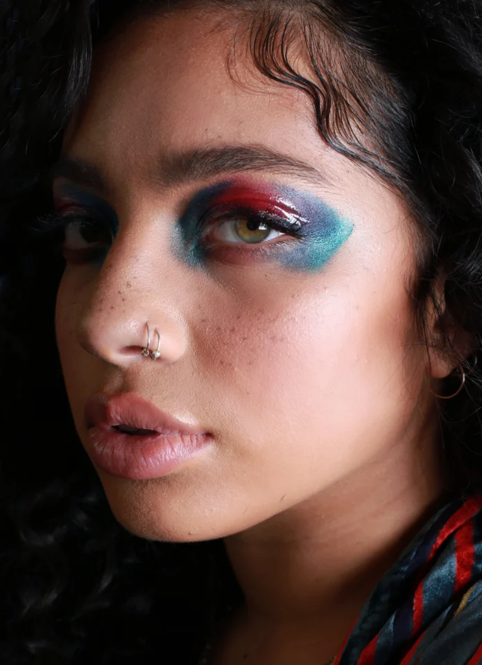
Kiana Ledé’s tattoos feel like a scrapbook drawn in black ink. There are tiny text pieces, little character sketches, a boot, flowers, and enough small linework to make her arms look collected rather than planned as one giant sleeve. The designs don’t all have a public explanation, and that’s part of the charm. You can see the style clearly without pretending every mark has a story attached to it.
One thing Ledé has explained is that she has matching tattoos with close friends. In a conversation with Revolt, she named a blueberry she got with her best friend Alex and a heart she got with Rudy, a friend she’s known since she was fourteen. She said those pieces are fine enough that they can be hard to see. That detail tells you a lot about her approach: the most meaningful tattoos aren’t necessarily the biggest ones or the easiest ones to spot in a photo.
Her visible collection leans toward fine-line work and small illustrative ideas. The overall look is casual, personal, and a little playful. The tattoos read as a record of separate choices rather than one finished statement.
Kiana Ledé’s tattoos are a collection, not one sleeve
In clear portraits, Ledé has tattoos spread across both arms, her shoulders, hands, and legs. Some are only a few centimeters wide. Others are large enough to read at a glance, especially the bold lettering on her upper arm and the plant-like designs around her lower leg. The pieces sit beside each other without being forced into one matching theme.
That mix gives the collection a lived-in feel. A strict sleeve usually has a planned flow: the artist builds a main shape, leaves breathing room, then adds details that connect everything. Ledé’s tattoos look more like separate memories that happened to find room on the same body. Leaving open skin between the pieces is part of the look, so each small drawing gets to stay legible.
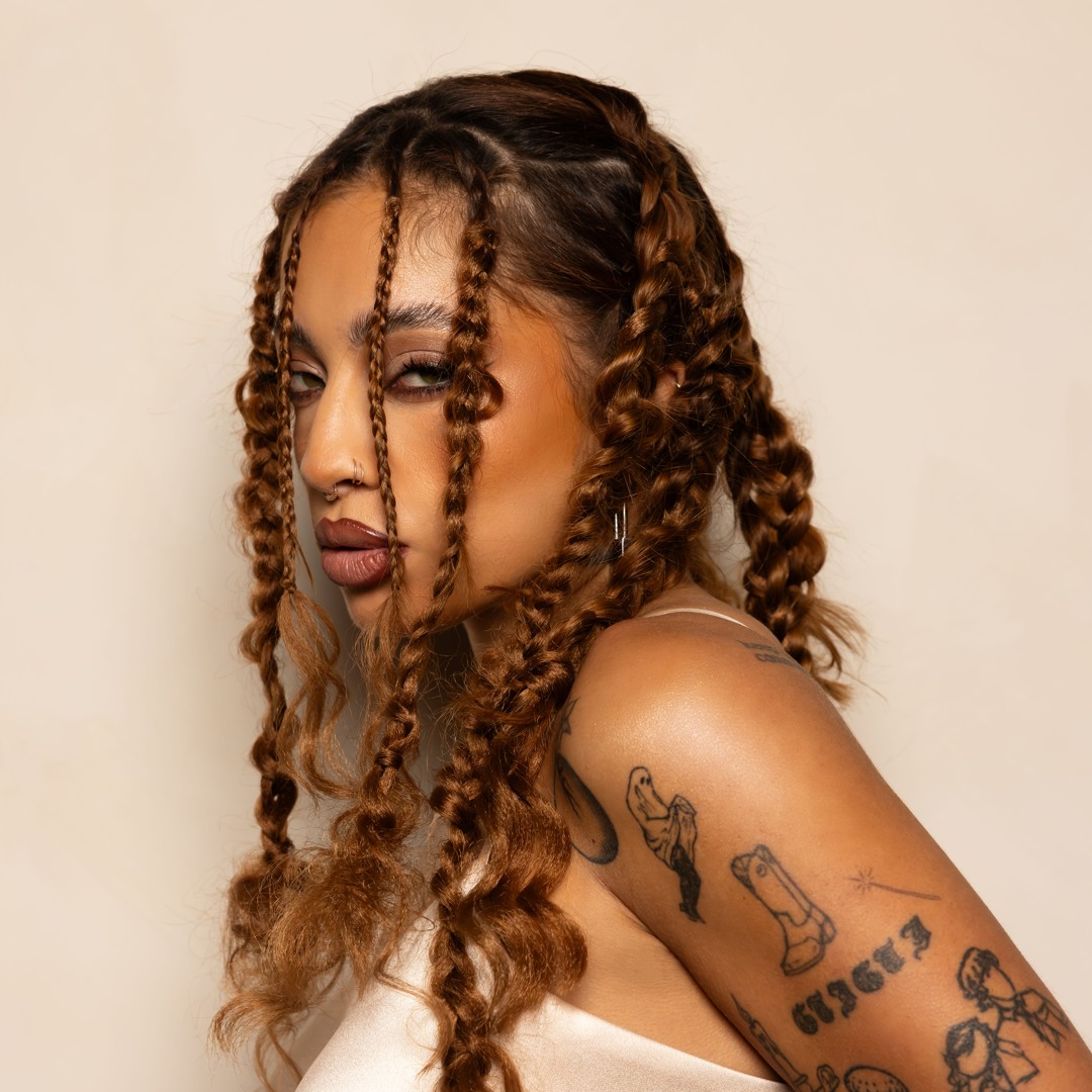
This close portrait from SoundCloud shows the kind of scale she wears well. A small linework design sits on the exposed shoulder and upper arm, while the rest of the image stays uncluttered. It’s a useful example of why tiny tattoos need room around them. The piece doesn’t have to be dark or oversized to be visible; it just needs enough clear skin to keep the outline from disappearing.
The blueberry and heart tattoos have the clearest stories
Ledé’s answer about her most meaningful tattoos was refreshingly specific. She didn’t point to the largest tattoo in a shoot or select the design that looked most dramatic on camera. She mentioned a blueberry and a heart because they connect her to two people she trusts.
The blueberry tattoo is a matching piece with Alex. Ledé said there was a story behind it that she couldn’t really share publicly, which makes the design feel even more personal. The heart is another matching tattoo, this time with Rudy. She has known him since she was fourteen, so the mark carries the kind of history that doesn’t need a long caption.
Both designs are fine and easy to miss. That’s a good reminder that a meaningful tattoo doesn’t need to be obvious in every photograph. A tiny heart can be more useful than a huge symbol if it belongs to a specific friendship. The same goes for a tiny fruit, a private joke, or a shape that only makes sense to two people.
Ledé’s matching pieces are notable because the designs came from existing friendships rather than a public-facing theme. The blueberry and heart remain visually simple, while the private relationships behind them supply the detail that the small marks cannot show on their own.
Fine-line arm tattoos with a sketchbook feel
One of the strongest things about Ledé’s collection is the amount of small illustrative work on her arms. Several photos show line drawings that look almost like quick sketches: figures, small objects, and simple outlines with just enough detail to be recognizable. They don’t have the heavy black borders or dense shading you’d expect from traditional flash.
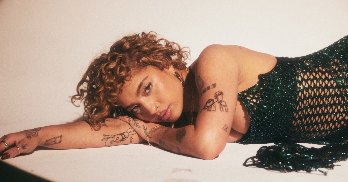
The Jam Productions portrait gives a good look at that lighter style. Her arm is under her head, and the tattoos run through the frame as a loose group of fine lines. The pieces don’t all point in the same direction, which keeps the composition relaxed. Instead of building one solid block, she lets the tattoos behave like separate notes.
This style works best when the artist is honest about scale. Fine lines can soften as they heal, and tiny details can merge if the design is pushed too small. The answer isn’t always to make everything bold. Sometimes it’s better to remove a few details, give the lines more space, and let the main silhouette carry the idea. Small doesn’t mean disposable.
That’s especially true for little character tattoos. In Ledé’s photographs, the small figures and objects remain readable because the outlines are restrained rather than crowded with miniature detail. The effect is closer to a sketchbook mark than a dense illustration, which keeps the fine-line group visually light.
The boot, lettering, and small symbols on her upper arm
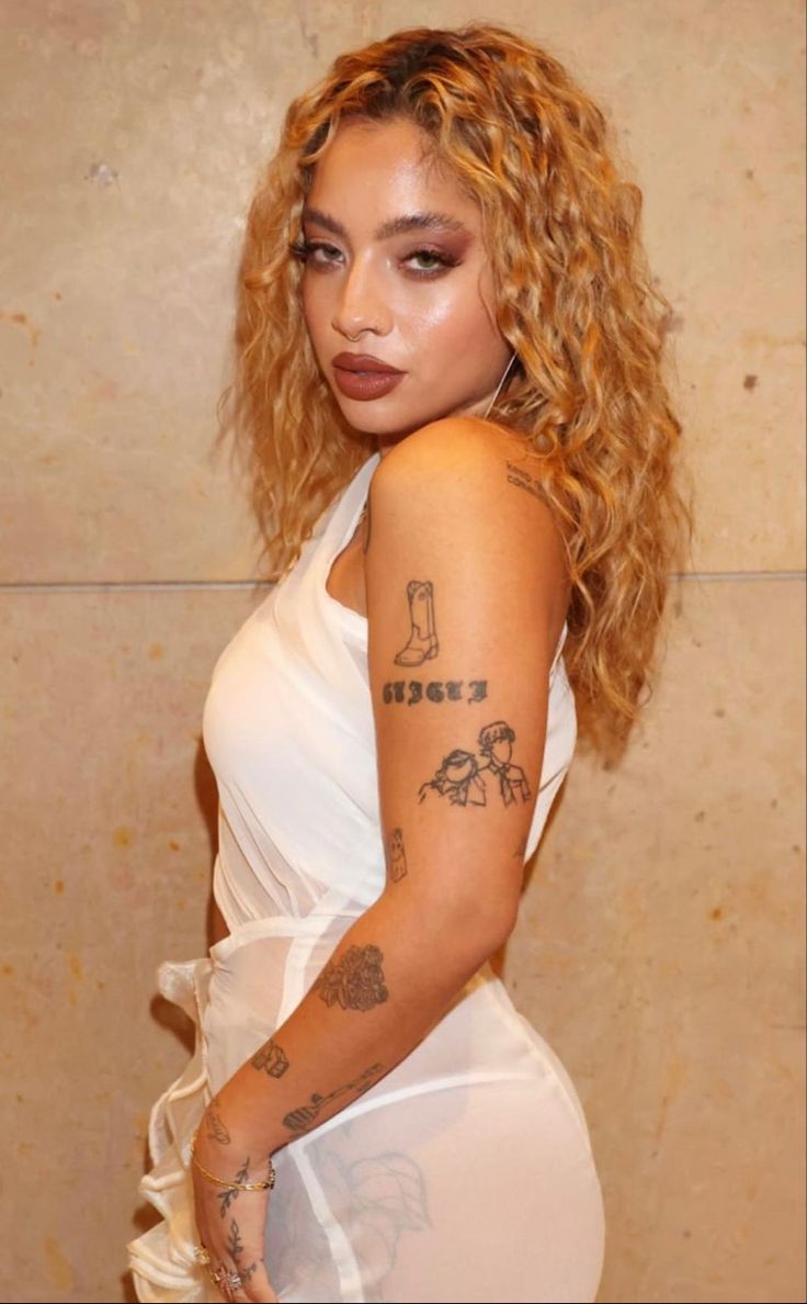
In several full-body and half-body portraits, Ledé has a boot-shaped tattoo on her upper arm, followed by a bold block-letter word underneath it. The design is easy to spot because it has more visual weight than some of her finer pieces. It reads as a small graphic stack: object first, lettering second.
There are also small drawings around it, including what looks like a pair of figures or characters. It’s better to describe what the photo actually shows than to assign a meaning that Ledé hasn’t given publicly. The important visual point is the contrast. A heavier wordmark can sit next to thin linework without making the rest of the arm look busy.
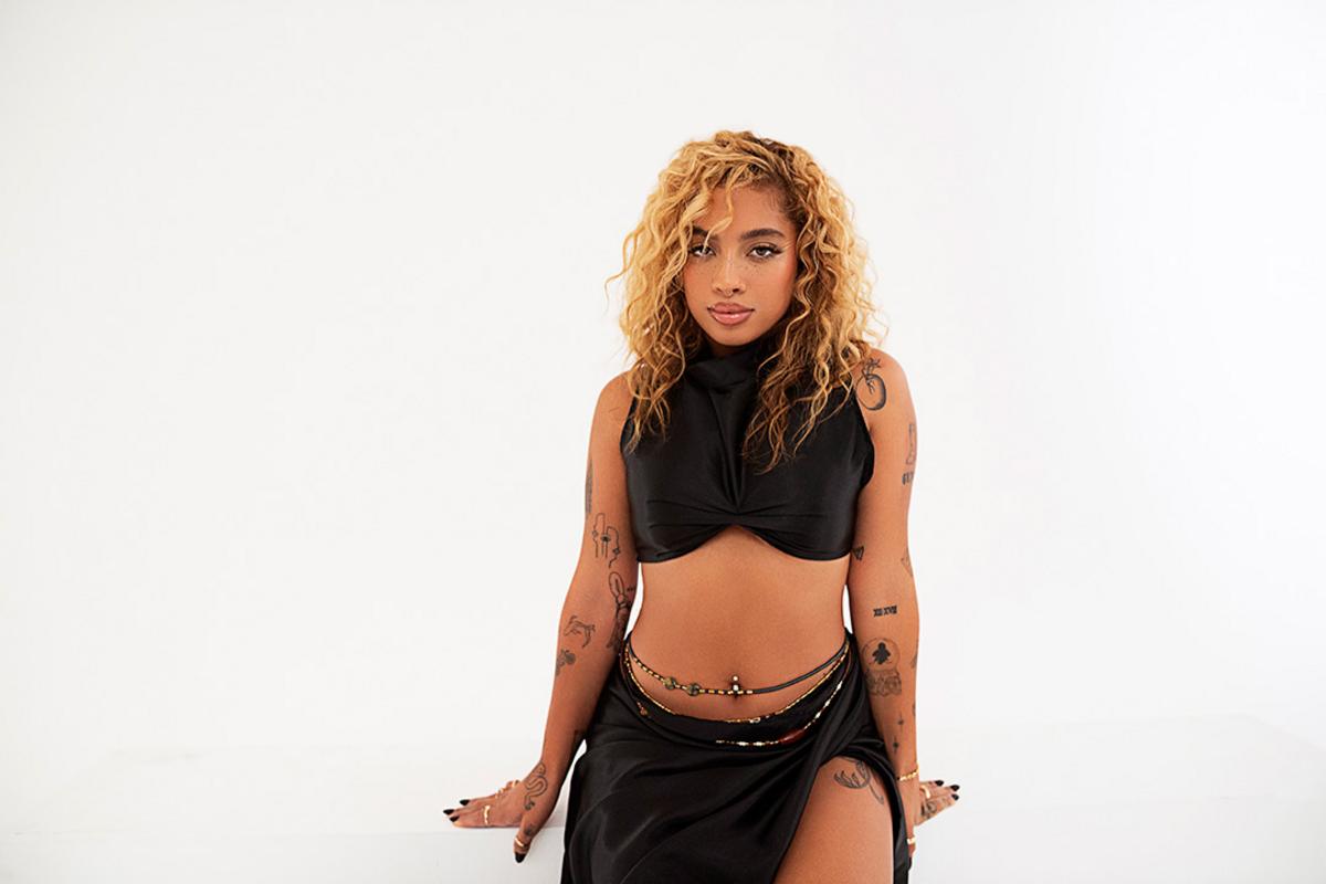
The XXL portrait shows how the collection changes when the whole body is in view. The upper-arm pieces become part of a wider layout that includes smaller marks on the forearms, hands, and leg. Nothing is perfectly symmetrical, and the unevenness is what keeps the tattoos from feeling like a costume. They look like they were added when each idea felt right.
The contrast is part of the collection’s identity. Similar line weight and open skin let a boot, a piece of text, a flower, and a tiny character sit together without repeating the same subject matter. Each design keeps its own scale and direction.
Shoulder tattoos that keep the collection soft
Ledé also has small tattoos around the shoulders and collarbone area. In the sharper studio portraits, you can see delicate shapes near the shoulder, including a rounded botanical-looking design and smaller marks tucked closer to the chest. They soften the transition between the face, jewelry, and larger arm pieces.
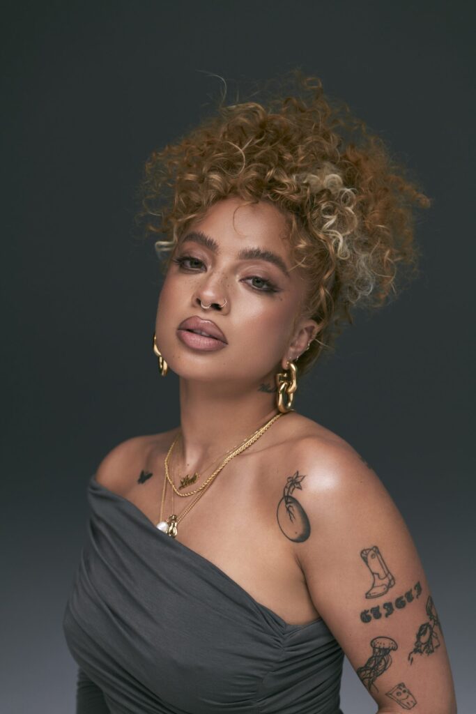
This Rated R&B portrait is useful because the close framing exposes the shoulder and upper-arm area at once. The tattoos don’t look like one continuous drawing. They read as individual pieces placed on different parts of the body, each with its own scale and direction.
The shoulder placement also changes with clothing. A small design near the shoulder strap can peek out in a sleeveless look and disappear under a shirt, giving the collection a shifting visibility across different photographs.
Leg tattoos add a different rhythm
The tattoos on Ledé’s legs have a slightly different rhythm from the little arm drawings. In a seated portrait, fine plant or leaf-like lines are visible along the lower leg, while other photos show larger linework around the thigh. The designs follow the shape of the leg instead of sitting like isolated stickers.
The leg pieces follow the body’s movement. In seated and standing photographs, the same fine plant and leaf-like forms change shape with the knee, calf, and thigh, giving the lower-body work a different rhythm from the compact arm drawings.
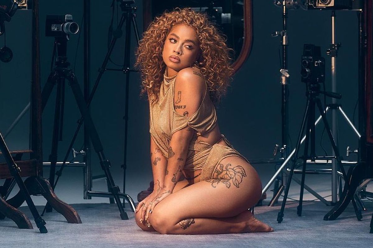
Ledé’s collection looks different from different angles. A design can be partly hidden in a standing portrait and clearer in a seated or turned pose, so the placement remains tied to the movement of the leg rather than appearing as a flat graphic.
The collection’s visual balance in ink
A lot of celebrity tattoo coverage focuses on perfect close-ups, but Ledé’s ink has more personality because it doesn’t look overly coordinated. Some pieces are crisp and graphic. Others have a softer hand-drawn quality. A few are almost hidden until a sleeveless outfit or a different camera angle brings them out.
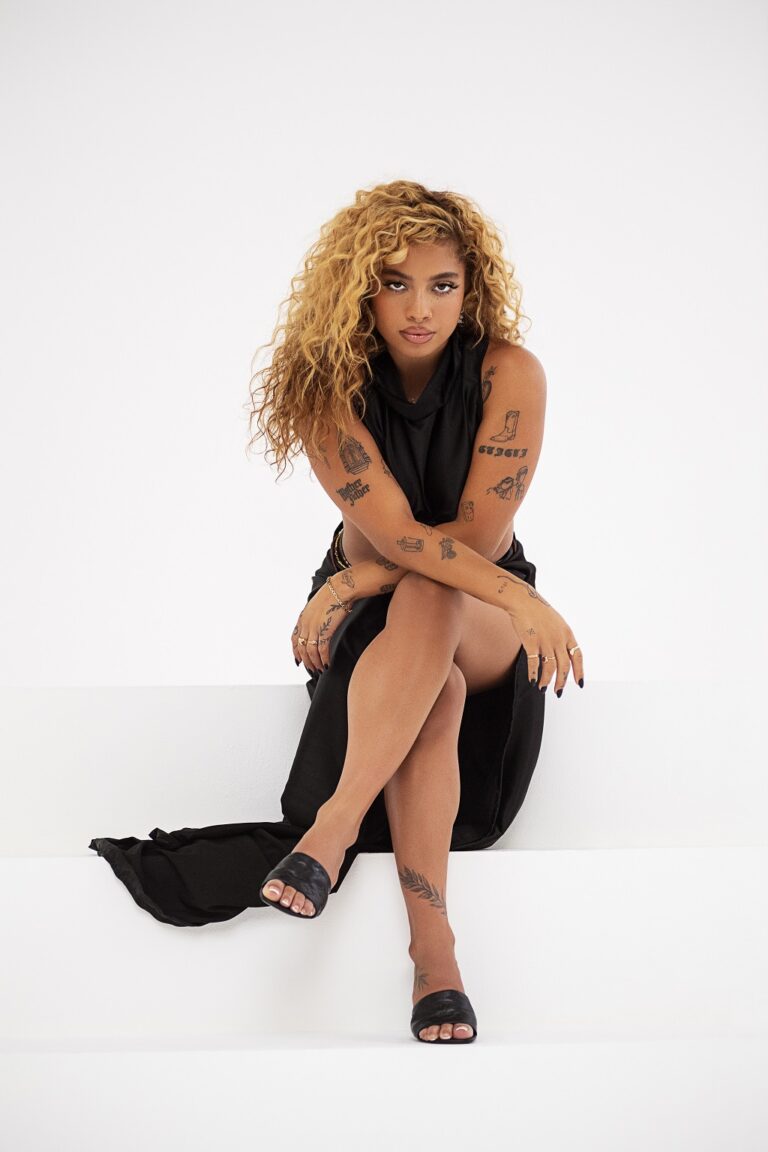
That contrast is visible in this Sonical.ly portrait. The fine-line marks across her arms sit next to text and darker little symbols. The tattoo collection feels like a record of changing taste rather than a set designed in one sitting.
The loose quality is part of the visual story. The small illustrated object, shared fruit, flower, and lettering remain recognizable as Kiana Ledé’s documented pieces because they are tied to her own relationships and photographs, not to a single repeated motif.
Full-body editorial framing
When Ledé appears in a full-body portrait, the distance between the pieces becomes easier to read. The upper-arm lettering, shoulder marks, fine-line figures, and lower-leg forms occupy separate visual zones, while the open skin keeps the collection from becoming a single dense field.
What the collection reveals about her visual style
The clearest pattern in Ledé’s collection is the connection between small scale and personal history. The blueberry and heart are tied to named friendships, while the boot, lettering, flowers, and character-like drawings remain visible as distinct pieces without a single public explanation.
The open skin between Ledé’s pieces is equally important. It keeps the small outlines legible and allows the arm, shoulder, hand, and leg tattoos to read as separate marks rather than one dark block.
Line weight varies across the collection. The bold wordmark carries more visual weight than the fine botanical forms, while the small figures and objects depend on clean outlines and clear space around them.
The blueberry and heart pieces Ledé discussed may be small, but their meaning is not. The size is simply the visual scale of a much larger friendship history.
Kiana Ledé’s tattoo collection is a strong example of personal ink that doesn’t need one grand theme. It mixes friendship tattoos, small illustrations, lettering, objects, and botanical shapes. Some pieces are easy to identify, while others stay private. That balance makes the collection feel real. It leaves space for the wearer to keep changing, adding, and deciding what belongs on the skin next.