
Disha Patani’s tattoo record centres on a documented PD design on her inner forearm, supported by one clear tattoo composite and a separate set of face-visible portraits.
Disha Patani’s PD forearm tattoo
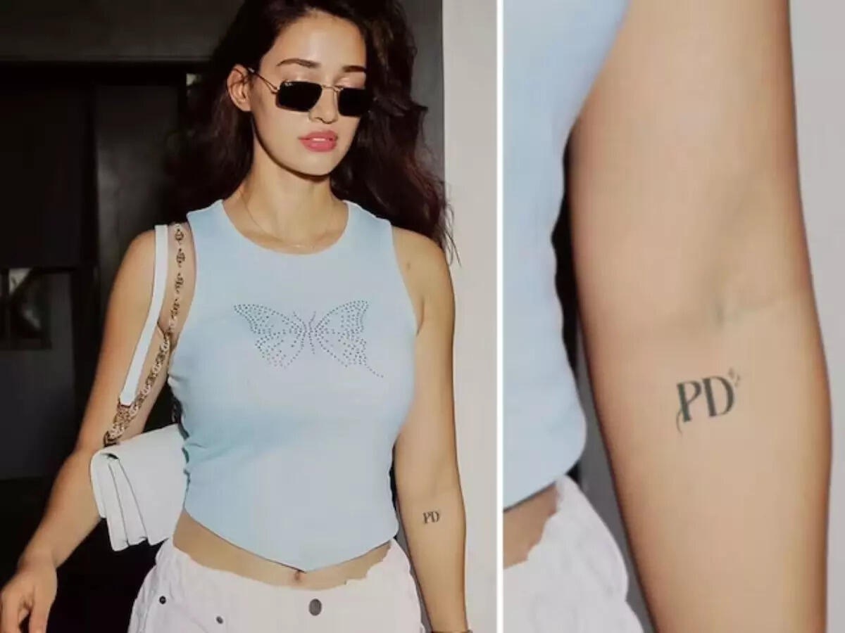
Disha Patani’s small PD tattoo became a talking point after a published photograph showed the lettering on her inner forearm. The Economic Times described the image as a new tattoo mystery and connected the initials to the speculation surrounding her film work, while also noting that Patani did not provide a definitive explanation. The useful starting point is therefore visual and modest: the letters are visible, the placement is clear, and the meaning remains open.
The main image is especially useful because it contains both a full portrait and a close crop. Patani appears in a pale blue top with sunglasses and a white bag, while the adjoining detail isolates the forearm. The letters PD are dark enough to read without magnification. That pairing gives the reader a direct relationship between the person in the photograph and the small design being discussed, rather than relying on a caption alone.
The Economic Times report places the design on the forearm and describes the initials as the feature that drew attention. The tattoo is compact, black and set in a simple serif-like style. It is not a large illustrative piece, so the most useful description concerns its scale, lettering and location. The close-up does not establish an artist, a studio, a session date or a final explanation from Patani, and those details should not be supplied by guesswork.
The full image also shows how easily a small tattoo can be missed in an ordinary celebrity photograph. Patani’s outfit, sunglasses and bag dominate the frame, while the ink sits lower on the arm. The crop turns a fleeting detail into the subject of the report. This is why the close-up matters: it preserves the shape of the letters and makes the placement visible without turning the image into a claim about a private relationship.
The first published photograph
The initials prompted online speculation because readers tried to connect them with people and projects associated with Patani. The published report mentions her work with Prabhas and the broader conversation around her public appearances, but it does not confirm that the letters stand for a particular person. The responsible account keeps the possibilities separate from the evidence. A tattoo can be documented clearly even when its personal meaning is not disclosed.
The subject match is reinforced by the additional published portraits. In the Newsband photograph, Patani faces the camera in a white top with her long hair over one shoulder. The National Herald image gives a different angle and styling, with her hair pulled back and a softer interview setting. These are distinct photographs from different pages, so they help readers recognise the same actress without presenting ordinary portraits as close-ups of the ink.
A floral promotional still adds another visual lane. Patani is shown holding pale flowers with a brighter background and a different expression. The composition is more polished than the interview frame, but the face, hair and overall features remain easy to compare. The value of this image is identity and context: it helps a reader understand who is being profiled before returning to the smaller forearm detail.
Position and scale
A further supplemental portrait provides a different angle and lighting from the tattoo photographs. It gives the article another way to establish Patani’s face without pretending that an ordinary portrait is a close-up of the ink. That wording keeps the visual record accurate and lets the tattoo photographs carry the tattoo-specific detail.
Across the photographs, the PD lettering remains the only design detail that can be described with confidence from the cited coverage. The image shows two characters, a compact placement and dark ink on the inner forearm. It does not reveal a larger surrounding composition, and no source in this dossier identifies additional connected work. The narrow description is a strength because it gives the reader something concrete without inventing a symbol, date or dedication.
The placement also affects how the design reads. Inner-forearm ink is visible when the arm turns toward the camera but can disappear when the hand is relaxed or the body is photographed from a distance. Patani’s full-frame photograph demonstrates that contrast: the letters are present, yet the close crop is required for comfortable reading. That is why the photo pair is more informative than a single event image or a generic red-carpet frame.
Identity in the published photographs

The article’s identity checks are deliberately simple. Patani’s face appears in the tattoo composite, and the supplemental photographs repeat her facial features in unrelated settings. The hair, eye shape and overall profile remain consistent even as the styling changes. The featured portrait then supplies a clean opening reference from an India Today visual story. The separate featured frame anchors the page to Patani herself before the article moves into the tattoo discussion.
The available reporting does not say when the PD tattoo was applied, who designed it, or whether the letters refer to a private nickname. It also does not establish that the tattoo was intended as a romantic message. Those limits are important because celebrity tattoo coverage often turns a small set of initials into a complete story before the person has spoken. Here, the image is strong evidence of the ink, not of every theory surrounding it.
A second published image
Patani’s public image is closely tied to film promotions, fitness work and fashion photography, which means tattoos can surface in many different kinds of photographs. A close crop may come from a casual outing, while another image may hide the same arm under clothing. The page therefore uses the reports and portraits together: one source documents the letters, and the others help the reader keep the subject and the visual setting straight.
The Economic Times image is also valuable because the tattoo is shown on the person rather than recreated in a graphic. The forearm crop preserves skin texture, scale and the relationship between the letters and the arm. That makes it possible to discuss the design without relying on fan art or a stylised redraw. Keeping the description close to the published photograph is the safest way to handle a design whose personal meaning has not been confirmed.
What the reports support

The initials themselves are visually plain. They do not appear as a dense sleeve, a large back illustration or an elaborate ornamental composition. A useful profile should not inflate a two-letter mark into a catalogue of supposed motifs. Instead, the available detail can be explained in practical terms: dark lettering, inner forearm placement, a small scale and a clean crop that makes the design readable. That is enough for a useful tattoo profile.
The question of meaning is still part of the story, but it belongs in the language of uncertainty. Readers may encounter suggestions linking PD to a person, a project or a private phrase. The cited report records that interest, while the photograph confirms only what is visible. Patani’s own explanation would be needed before any one interpretation could be presented as fact, so the page keeps the speculation labelled as speculation.
Why the initial meaning remains unconfirmed
The supplemental images also demonstrate why a useful gallery should not repeat one tattoo photograph. The single verified tattoo photograph carries the tattoo evidence, while the four supplemental portraits add different faces, settings, lighting and compositions. Together they give readers a fuller reference set while keeping every image in its proper role. A page about ink can include context, provided each portrait is mapped only to identity and visual context.
The featured portrait is separate from the inline gallery and gives the page a clear visual entry point. Patani’s face is visible, the crop is large enough for a comfortable reference and the image comes from a named India Today visual story. The article then moves to the Economic Times composite for the tattoo itself. This sequence makes the page easier to scan and avoids asking one photograph to do every job.
The wider visual context

The strongest conclusion is therefore straightforward. Disha Patani has a documented PD tattoo on her inner forearm, and a published close crop shows the lettering clearly. The source coverage records public curiosity about what the initials mean, but it does not provide a confirmed explanation. Four distinct portraits and a separate featured image add identity context without being treated as tattoo close-ups. The result is a grounded record of what the photographs establish and what they leave open.
For readers comparing the images, the practical checklist is short: look for the PD letters on the inner forearm, compare the face in the composite with the separate portraits, and distinguish the close crop from the wider celebrity photographs. The page’s visual logic follows that same order. It begins with a face-visible introduction, shows the tattoo in its clearest available frame, then uses distinct portraits to add context around the documented design.
What readers can see