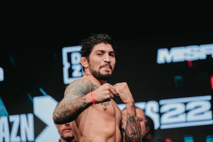
Dillon Danis’s right-arm sleeve is the first thing most people notice: a large Japanese-style dragon, waves, scales, flowers and dark background work that continues into the chest. Other pieces on his left arm add detail, but the right side carries most of the visual weight.
Shirtless weigh-in, gym and cage photos show the tattoos from several angles. The sleeve shifts when Danis turns or flexes, while the chest pieces tie the upper body together without covering all the skin.
The dragon sleeve is the clear centerpiece
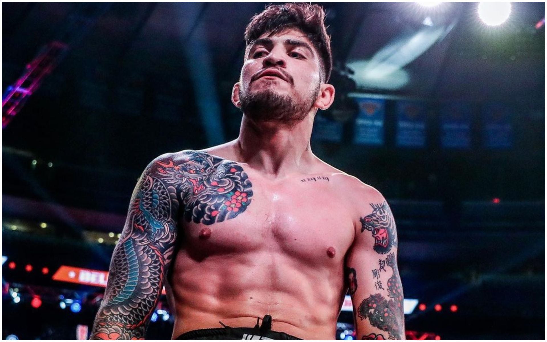
The large Japanese-style sleeve on Danis’s right arm leads the collection. It runs from the shoulder toward the wrist, with a dragon, wave-like scales, flowers and dark background shading packed into the space. The design changes with the arm as he bends, turns or reaches.
The shoulder is the densest part. A dragon head and curved shapes sit close to the chest; repeating scales and darker shading continue down the arm. Red and blue accents break up the black and gray so the sleeve doesn’t read as one shadow.
The parts overlap, which keeps the dragon from looking like a single image placed on bare skin. Flowers, scales and background lines lead the eye around the bicep and forearm. From straight on, you can’t see the whole wrap, but the lines still give the tattoo a clear direction.
For a large sleeve, think of the design as something that has to travel around a moving arm. A dragon needs a route around the muscles: the head can sit near the shoulder, the body can run down the arm, and smaller background details can join the sections.
A closer Bellator view shows how the sleeve wraps
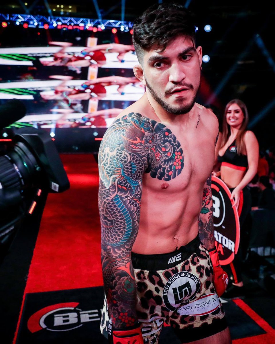
A vertical Bellator photo shows the sleeve from the side. The front view makes the chest connection clear; the side angle shows how the ink wraps around the outside of the bicep and continues down the forearm.
The dragon and flower shapes are easier to separate when Danis’s arm is relaxed. When he flexes, the lines bunch together and darker areas look heavier. That change is part of tattooing a moving surface; the design has to work in more than one pose.
There are smaller tattoos on the other arm, but the right sleeve remains the anchor. It gives the body a dominant side, while the chest and left arm add their own detail instead of copying it. That uneven balance keeps the collection from looking like a uniform set.
If you’re building a sleeve over time, it helps to decide which arm will carry the largest design. One strong side can organize a collection even when the other arm holds several separate pieces. Danis’s layout shows how that can work without matching both sides.
The side tattoo angle brings out the scale and wave work
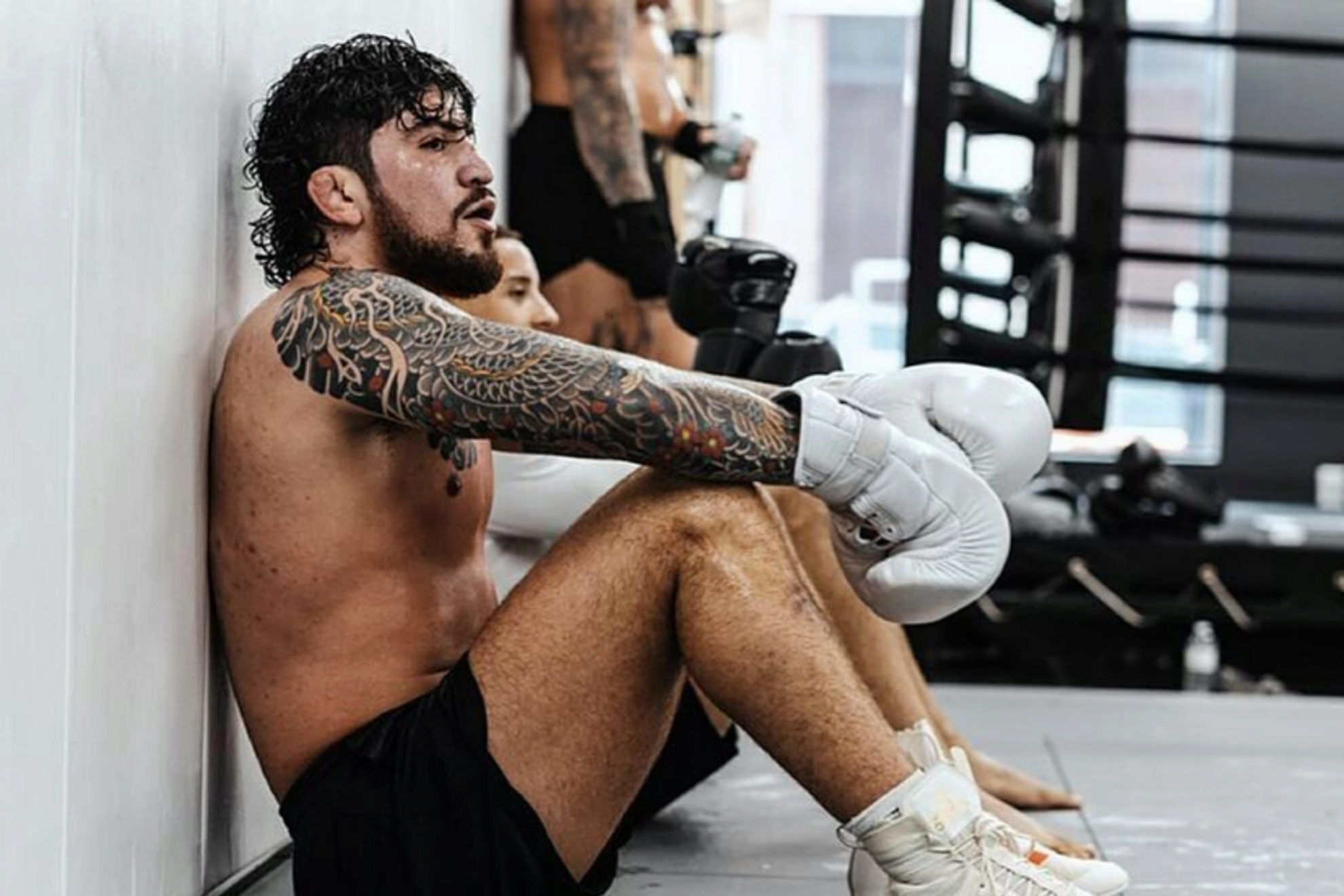
In a side training photo, Danis’s forearm points toward the camera. The angle makes the repeated scales, darker channels and color changes easier to see. From here, the sleeve looks less like separate pictures and more like one continuous movement.
Japanese-inspired sleeves often use background work to bring different subjects together. Danis’s dragon, flowers and wave-like shapes share linework and flow from shoulder to wrist; the dark background makes the gaps look deliberate.
Pale skin breaks up the darker panels, and red and blue accents give the eye a place to land. Those shifts help the lower arm stay visible in a shadowy gym photo or a busy fight-night shot.
The direction of the main subject is worth deciding before the smaller details. A dragon can coil around the arm; a flower can soften the turn at the elbow; waves or wind bars can fill the background without taking attention from the figure.
Both arms have their own visual language
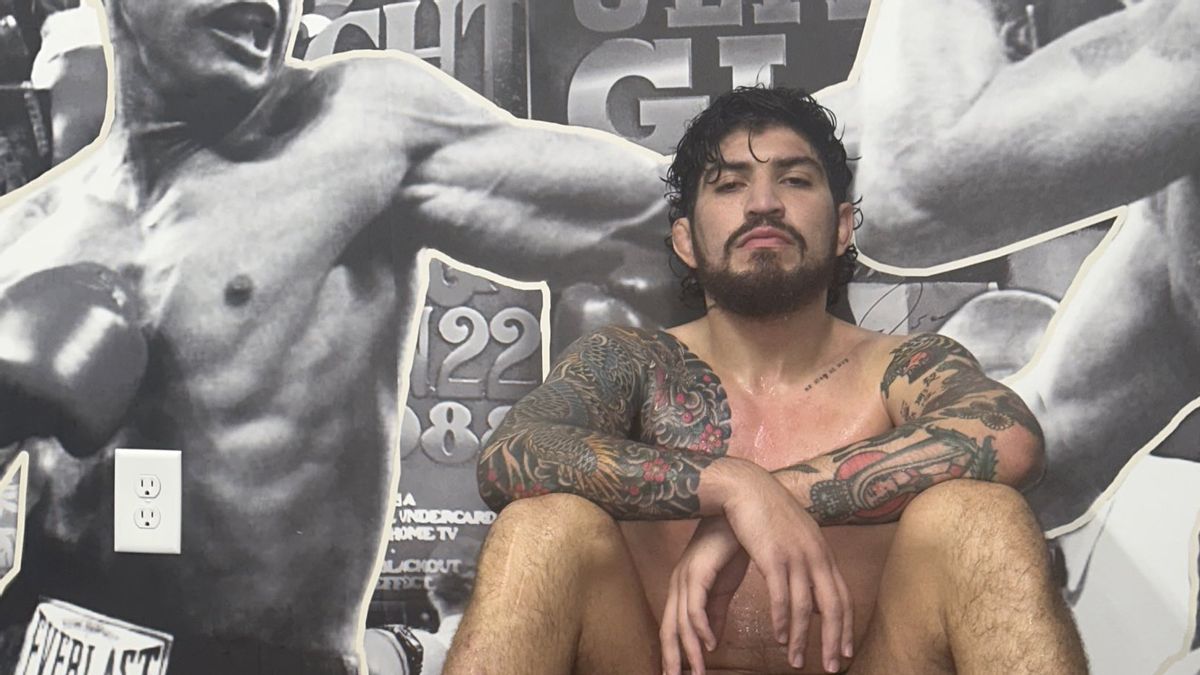
Danis’s left arm isn’t a smaller copy of the dragon sleeve. It has its own mix of darker areas and individual motifs. In a seated training photo, both bent elbows are visible at once: one arm reads as a flowing sleeve, the other as several strong pieces that have grown together.
That difference gives the collection more character. A matched pair can look polished, but unrelated sides can feel disconnected. Here, Japanese influence and dark linework link the tattoos, while the subjects and spacing stay distinct.
Ink runs from the right shoulder across the top of the chest, and smaller pieces appear on the other side. The torso isn’t covered in one solid panel, leaving bare skin to break up the heavier arms.
If you already have tattoos, a repeated style or color can connect new work without forcing every piece into the same template. Let each arm develop at its own pace, and use the shared visual details to make the collection feel related.
The chest pieces connect the arms without filling every gap
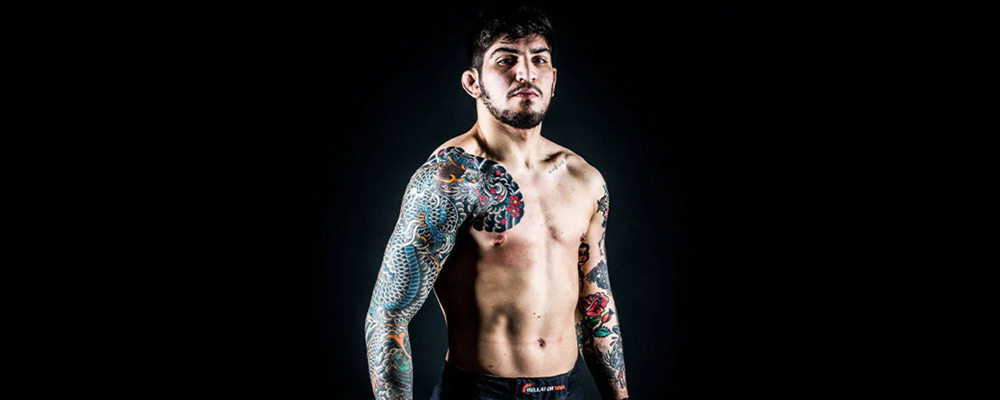
The wide studio photo makes the chest layout easier to read. The right shoulder rolls inward toward the pec; smaller tattoos on the opposite side keep the upper body from feeling empty. Bare skin remains through the center and stomach, giving the arm work somewhere to stop.
The dragon and flowers create a curved edge around the shoulder. Their lines taper toward the chest instead of ending in a hard square, so the sleeve looks attached to the body rather than placed on top of it.
The chest photo brings the style into view at once: dark shading, bright accents and curved lines. The designs read less as a set of separate meanings than as one visual approach—Japanese-inspired imagery with enough color to keep the larger sections distinct.
A chest tattoo can feel substantial without covering the whole torso. Here, the shoulder design does most of the work and smaller chest pieces support it. Leaving skin around the sternum and stomach keeps the tattoo from becoming one solid wall.
The right-arm dragon is the anchor. It carries one side of the body, while flowers and background shapes break up the large image. Small areas of red and blue stand out against the darker shading.
The chest gives the sleeve somewhere to go. The design moves toward the pec rather than stopping at the shoulder; smaller pieces on the opposite side help balance the torso. Open skin through the center keeps each area readable.
Movement matters. The sleeve looks different with an arm straight, flexed or bent. Photos from more than one pose show how the design follows a moving body rather than sitting flat like a poster.
Danis’s tattoos also show how one broad theme can connect different images. Dragons, samurai references, flowers and waves all draw on a Japanese-inspired style. Repeated linework and mood bring them together even though each section uses a different subject.
Color works as an accent. Most of the sleeve is dark, with red petals and blue scale sections adding brighter spots. That limited palette keeps the dense work from turning into one dark shape in photos, gym lights or under arena lighting.
The smaller motifs matter as well. A katana behind the ear or a compact design on the opposite arm won’t take over a shirtless portrait, but it adds another detail when the camera comes closer. Small pieces can make a large collection feel personal rather than planned like a costume.
If you’re using Danis’s tattoos for ideas, decide on placement before settling on a subject. Think about whether the main design should follow the outside of the arm, cross the shoulder or turn into the chest. Background shapes can help the image travel around the body.
Leave some skin between the major pieces. The open center chest and stomach give the arms room to stand out. A sleeve can feel finished without filling every available patch, and that space leaves options for later work.
Choose a color plan you can repeat. A few recurring accents do more to connect the designs than adding bright color everywhere. Danis’s darker base with flashes of red and blue shows how a limited palette can carry across a dense sleeve.
The overall look is bold, but it isn’t generic. The dragon brings the drama, the chest connects the pieces, and the other arm gives the composition contrast. That mix makes the tattoos easier to appreciate from different angles.