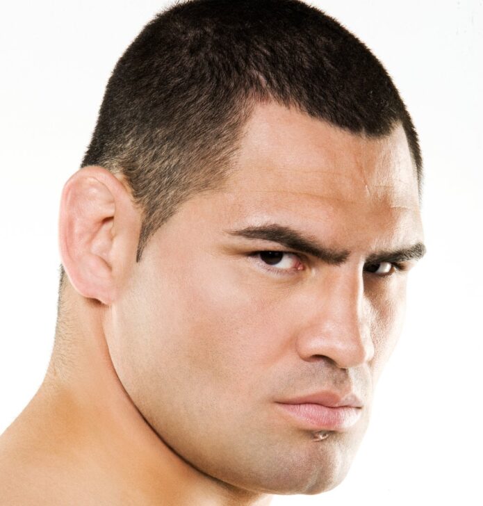
Cain Velasquez’s tattoos are hard to separate from the way fans remember him: a close haircut, a steady stare, and Brown Pride across his upper chest. You don’t have to hunt through a sleeve to find his best-known piece. Those two words sit right where the camera catches them when he squares up.
The meaning isn’t a puzzle, either. Velasquez has explained it himself, repeatedly, as pride in his Mexican heritage and respect for his parents. The interesting part is how such a short inscription became so closely attached to a fighter who usually seemed happier getting on with his work than talking about himself.
Brown Pride chest lettering
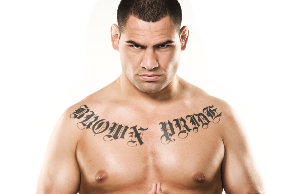
The tattoo reads Brown Pride in large, dark, decorative letters. It stretches across both sides of his upper chest, with a gap between the words near the middle. The outside ends sit higher toward his shoulders while the inner letters dip lower. That curved arrangement gives the inscription its recognizable shape even before you’ve read it.
Look closely at the studio photograph and you can see why the lettering has so much presence. The thick strokes carry most of the weight, while thin curls extend around the edges. Sharp points and elaborate capitals give it an Old English or blackletter look. There’s no need for color or a background scene to make the message noticeable.
For Velasquez, the phrase means Mexican pride. He gave that plain explanation when Latin Post asked about it in 2015. It’s useful to keep his own answer close to the image. A stranger might attach a different meaning to a phrase, but that doesn’t replace the wearer’s explanation of why he chose it.
There’s also a practical reason this particular tattoo is so easy to remember. The words occupy a broad, uncluttered part of his torso. You can pick out the overall shape in a fight photograph, then see the finer details in a still portrait. It works at both distances without relying on a tiny hidden symbol.
Family comes first
Velasquez has linked his choice to what his parents went through to build a life in the United States. When he talks about pride, the emphasis is on family, sacrifice and where he came from. That gives the phrase a personal starting point, rather than leaving it as a slogan floating free of any history.
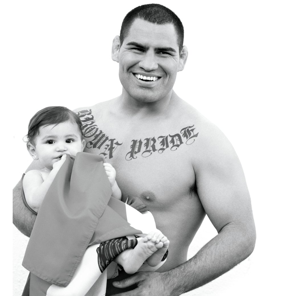
The family photograph here offers a different view of the person fans saw competing. He’s smiling and holding a child, a very different mood from the straight-ahead stare of a promotional shoot. It’s an older magazine photograph, not a picture of his family today. The point is the ordinary closeness it captures, away from a cage or a press conference.
That quieter side was present in the reporting about him early on. Fighters Only’s May 2010 profile described him becoming much more animated when the conversation turned to his daughter. The piece also followed him getting a haircut and spending time around teammates. Those small scenes help put a familiar sports image back into everyday life.
You don’t need to turn every family moment into a hidden explanation for a tattoo. His stated connection to his parents is already clear. The photograph simply adds some human context to a man often remembered through highlights, weigh-ins and the intensity of a heavyweight fight.
A wrestler before the spotlight
One useful detail in the timeline comes well before his championship fame. The State Press was writing about the inscription while Velasquez was a senior wrestler at Arizona State in February 2006. Its profile described the letters partly showing above his wrestling singlet. He already had the piece during college; it wasn’t something that first appeared after a UFC title win.
That early report also said his best friend from high school had the same inscription. It doesn’t establish the exact day either man was tattooed, but it does place the choice within his life before the biggest cameras arrived. That’s a more grounded way to think about its age than guessing from an old fight clip.
The same profile described a wrestler whose older brother helped spark his interest in the sport. It also recorded his confidence, his competitiveness and the support of his family. You can see the outlines of the athlete people would later recognize, even though the setting was a college wrestling room.
That earlier setting matters. A recognizable piece can eventually look inseparable from a public persona, yet it may have belonged to the person long before that persona existed. In Velasquez’s case, the college reporting gives us a firm point on that timeline without pretending to supply an exact appointment date or an artist’s name.
The work inside the cage
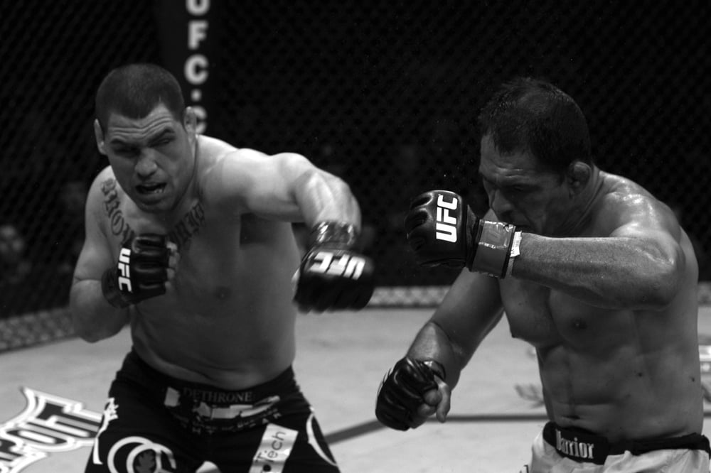
The standing action photograph catches Velasquez in the middle of an exchange. His body is turned, his gloves are up, and the neat symmetry of a studio pose has disappeared. It’s a useful reminder that most fans first encountered him through movement. A fight photograph freezes only one instant of something that was happening fast.
His chest piece remains recognizable in that setting, but the photograph here is included as a view of his competitive career. It’s not a close-up for studying the finer edges of a letter. To understand the actual shapes, the front-facing studio image gives you a much cleaner look.
Sports photography can change a tattoo’s appearance quite a bit without the tattoo itself changing. An arm crossing the torso may hide part of a word. A shoulder turning away compresses the space between letters. Strong overhead lighting can make one side appear much darker than the other.
That’s why it’s worth looking at the whole person in an action shot before deciding you’ve spotted different lettering. Pose, angle and light all matter. Here, the difference between the two photographs is easy to follow: the calm studio view lets you read, while the cage photograph puts the same familiar athlete into his working environment.
The quieter days between fights
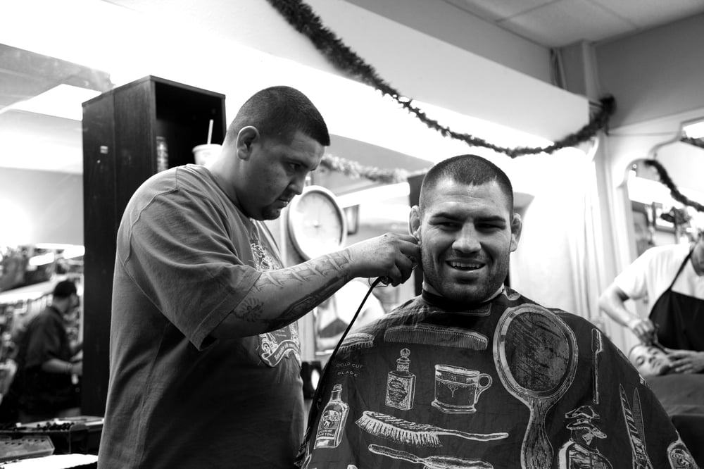
The barbershop photograph is a welcome break from the usual fight imagery. Velasquez is sitting beneath a barber’s cape, smiling as his hair is trimmed. There’s no attempt to make this a dramatic sports portrait. The setting feels busy and ordinary, which is exactly why it adds something useful alongside the more formal photographs.
It’s also a good place to remember how much a public image leaves out. Fans can recognize an athlete immediately from a few visual cues and still know very little about how he spends a normal afternoon. A haircut doesn’t explain an entire personality, but it does interrupt the idea that a fighter lives permanently in fight mode.
Fighters Only included the scene in its early profile of Velasquez, alongside training and family life. Keeping that setting intact is better than treating every photograph of him as if it were part of a tattoo shoot. This one is simply about the man between sessions and appearances.
The contrast in mood is part of the appeal. His familiar close haircut and broad features are still there, but his expression is relaxed. You can recognize the same person without the gloves, the squared stance or a camera-ready glare. That makes a fuller picture than another near-identical promotional pose would.
A heavyweight built on repetition
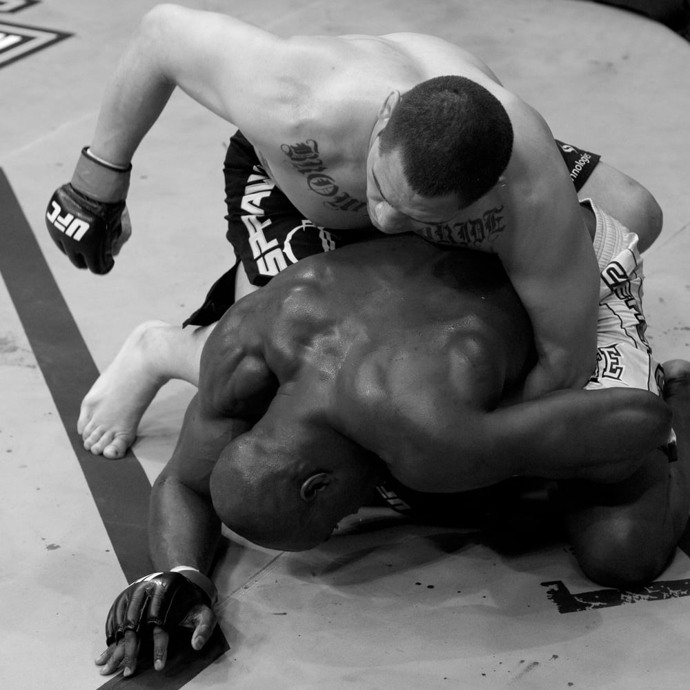
The ground-fighting photograph brings the focus back to competition. Velasquez is above his opponent, bent forward with one glove drawn back. It’s an entirely different composition from the standing exchange: bodies overlap, the canvas fills the background, and the view comes from above rather than straight ahead.
This image is included for that sporting context. It isn’t a separate tattoo reveal or proof of another design. A different angle on someone’s torso doesn’t automatically mean there’s a new piece to catalogue, particularly when the body’s position makes the details harder to read.
That distinction helps keep a tattoo discussion sensible. You can enjoy a strong action photograph for what it contributes to the athlete’s setting without forcing it to support a claim it can’t establish. Here it adds the physical reality of the sport around an image that is often reduced to a single famous inscription.
It also explains why a clean portrait belongs beside the action shots. The two kinds of photograph answer different questions. One gives you an uncluttered look at the person and his lettering; the other captures effort, position and the pace of a contest. Together they feel closer to how fans actually remember a fighter.
What his own explanation clears up
Velasquez’s choice drew criticism and questions during his career. At a December 2012 press conference, the subject came up again, and Dana White defended him. The important starting point remains what Velasquez said about himself: pride in his background and appreciation for his family. You don’t have to guess at an elaborate private meaning when he’s already supplied a direct one.
There’s a difference between describing that explanation and claiming to know every thought behind the decision. His interviews support the connection to his heritage and parents. They don’t give us permission to invent a private conversation at a studio, an exact price, or a dramatic account of the session.
The exact artist and appointment date aren’t established here. The February 2006 college profile confirms that the chest inscription was already present by then. That’s a useful fact on its own. It doesn’t need to be stretched into a more precise origin story than the reporting supports.
If you’re drawn to the piece as lettering, its most useful lesson is probably how closely the words fit the wearer. The phrase is short enough to recognize, large enough to read and tied to something he can explain plainly. Copying the exact wording would miss the personal connection that made it memorable in the first place.
Hear Cain explain his roots
Photographs give you the look, but hearing Velasquez speak adds his own pace and tone. VICE Sports’ 2016 Ride Along follows him in conversation about his upbringing and fighting. It’s a fitting companion to the portraits because it puts a voice beside the familiar face.
The appeal of his best-known tattoo is easy to understand once those pieces sit together. The lettering has a strong shape, the placement is immediately recognizable, and the meaning comes directly from the person wearing it. For all the attention those two words attracted, his explanation stayed close to home.