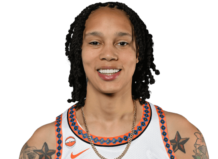
Brittney Griner’s tattoos are hard to miss when she’s on a basketball court. The WNBA center has a colorful nature sleeve, star tattoos on both shoulders, smaller pieces on her forearms and a little cross on her hand. Her ink doesn’t sit quietly in the background. It moves with her, flashes under a jersey and gives every game photo a bit more texture.
Griner has also talked about her tattoos directly. The old AOL Originals series My Ink followed her while she finished a nature-themed sleeve, and later profiles filled in some of the personal details. She has described the linked female symbols on her hip as a tattoo connected to her identity, while other reporting has noted the star designs on her shoulders and a pair of skulls on her lower back.
There’s enough real information here to talk about the collection without guessing at every shape. That matters with tattoo photos. A floral patch is easy to see, but the exact meaning of every leaf or shaded figure isn’t always public. The best way to read Griner’s ink is to separate what she has explained from what the photographs show clearly.
Brittney Griner’s tattooed arm
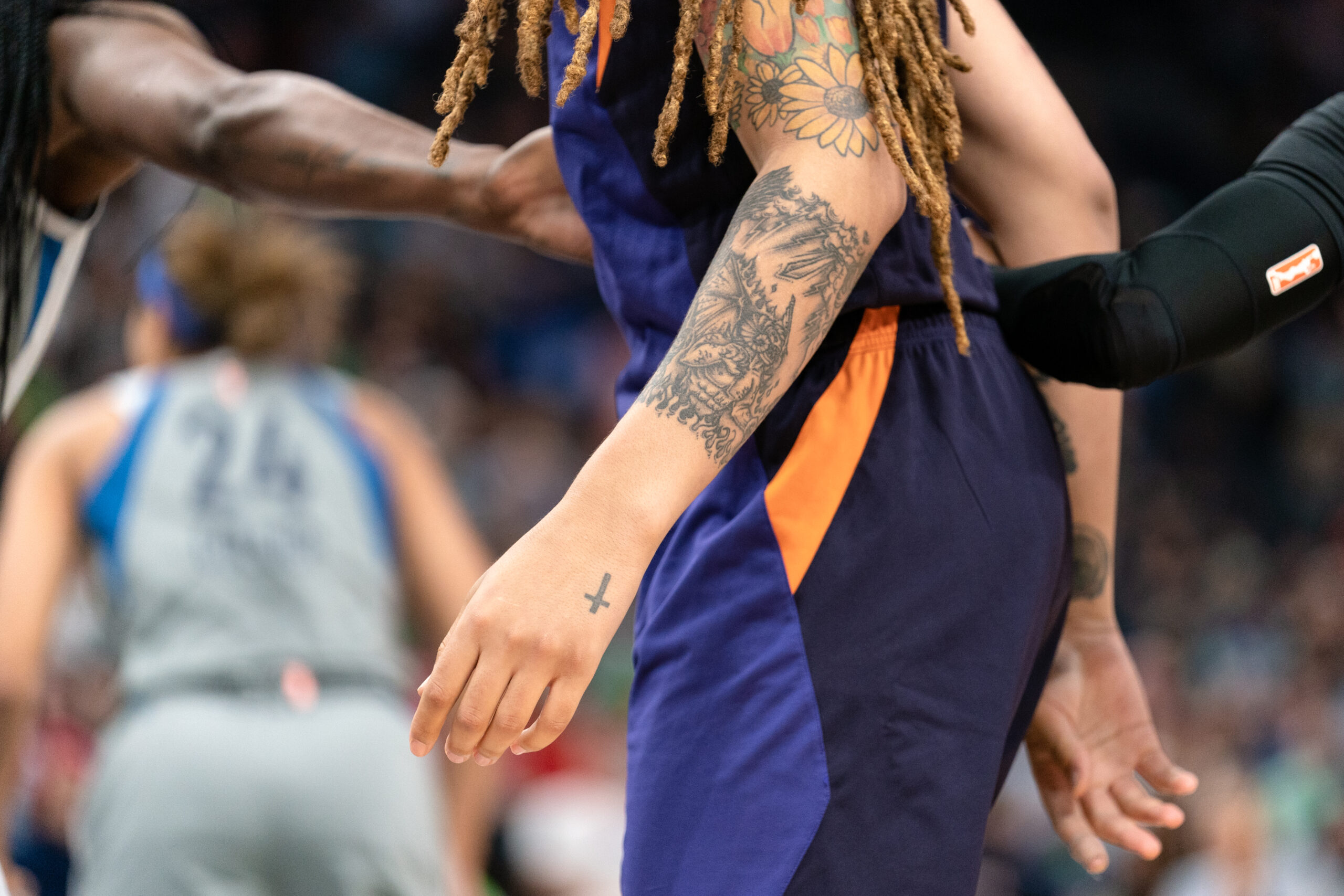
The clearest close-up of Brittney Griner’s tattoos shows how much work is packed onto the forearm and hand. The arm is covered with layered linework, shaded forms and floral details. There’s a small cross on the hand, while the forearm carries a busier mix of flowers and image-based pieces that look connected without becoming one flat block of black.
That combination is what makes the sleeve interesting. It isn’t just one huge, solid panel. You can see individual shapes, open skin and different levels of detail. Some areas are dark and heavy, while others are lighter, letting the flowers and smaller marks breathe. From a distance the arm reads as a full sleeve. Up close, it feels more like a group of tattoos that grew together over time.
The hand cross gives the collection a clear visual endpoint. It is small compared with the work above it, but its placement carries the ink past the wrist. That makes the mark more exposed than the upper-arm pieces and adds a quiet detail to an otherwise dense arm.
Brittney Griner’s star tattoos
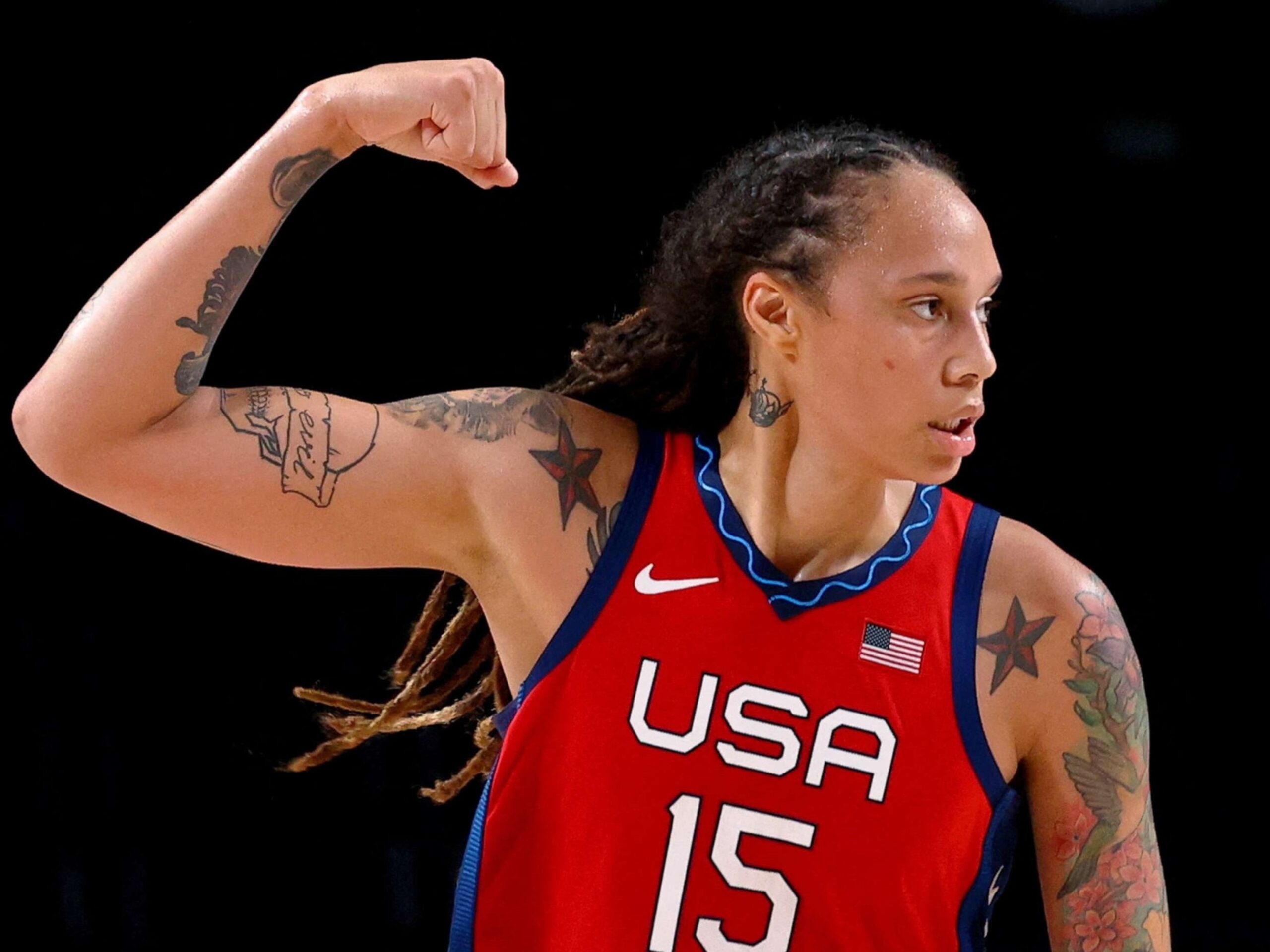
The star tattoos on Griner’s shoulders are among the most recognizable pieces in her collection. In a red USA jersey, they sit high on either side of the chest and shoulders, giving the design a balanced look when both arms are visible. They’re bold enough to read in a game photograph, but they don’t swallow the floral work below them.
Stars can be a predictable tattoo choice, but scale and placement make a big difference. Griner’s stars work partly because they frame her upper body. They show up when she raises an arm, flexes or turns toward the camera, which is often exactly what happens in basketball photos. The design has a clean silhouette, so it survives bright arena lights, sweat and motion better than tiny lettering would.
The shoulder placement also gives the collection a bit of symmetry. The rest of Griner’s ink is more organic, with flowers, leaves and shaded scenes running down the arm. The stars act like fixed points at the top. They make the sleeve feel planned even when the smaller pieces have different shapes and levels of color.
The floral shoulder tattoo
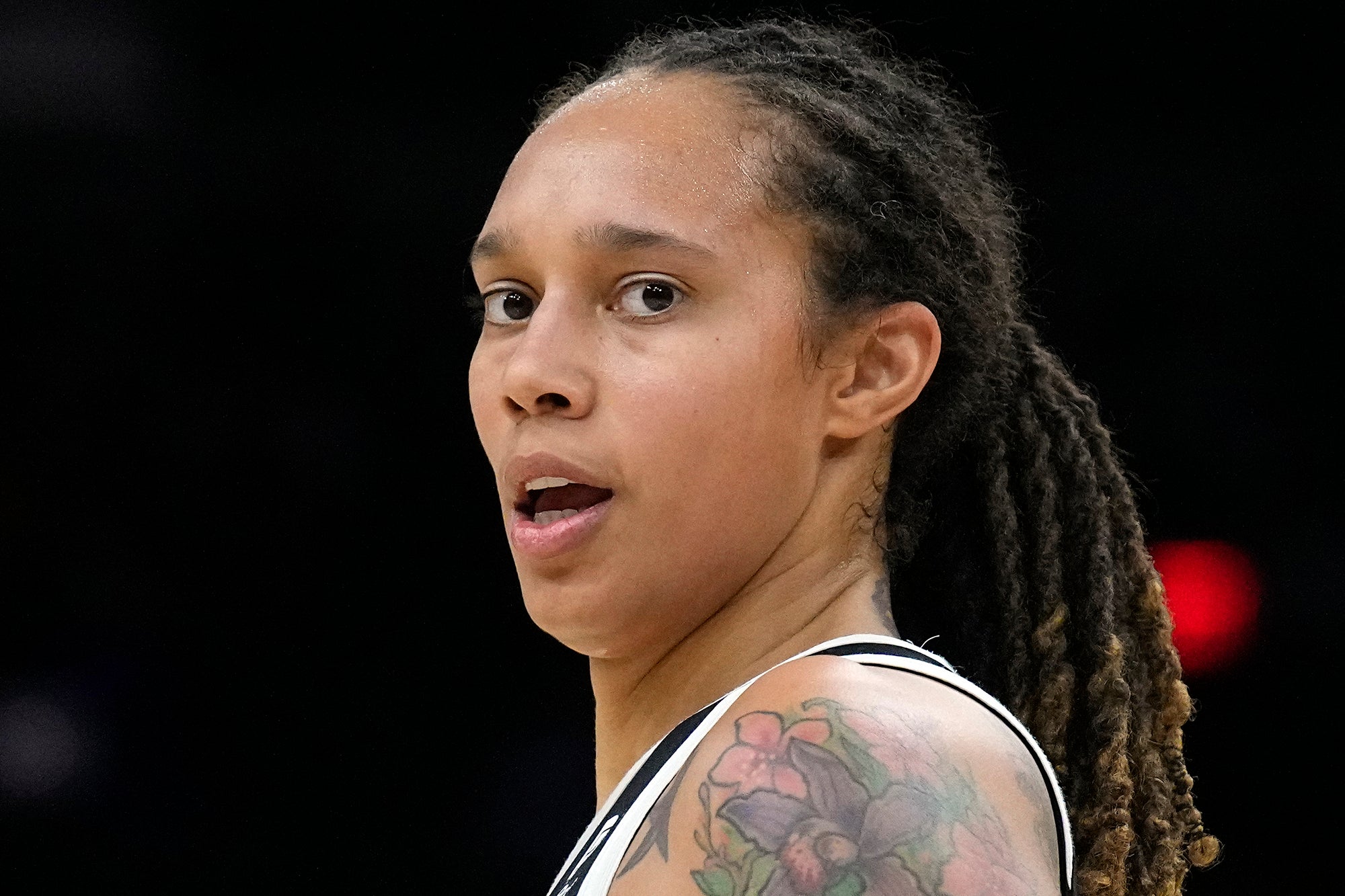
A side-angle photograph of Brittney Griner brings the floral shoulder tattoo into focus. The flowers spread across the upper arm in soft color, with green leaves and darker outlines holding the shape together. It looks more colorful than the black-and-gray portions of her forearm, which gives the collection some contrast instead of making the whole sleeve one visual note.
Floral tattoos are popular for a reason: they can be made delicate, graphic, dark, realistic or almost cartoon-like. Griner’s version lands somewhere between bold and natural. The blooms have enough color to stand out, but the outlines keep them from disappearing when the arm is moving. It’s the sort of work that looks different in a close-up than it does under a game jersey.
The floral shoulder piece also gives Griner’s sleeve its clearest transition from the upper arm into the forearm. The larger blooms and leaves follow the curve of the shoulder before the darker, denser work continues below. In photographs, that transition makes the floral area feel connected to the rest of the sleeve rather than separated by a hard line.
Brittney Griner’s ink in game photos
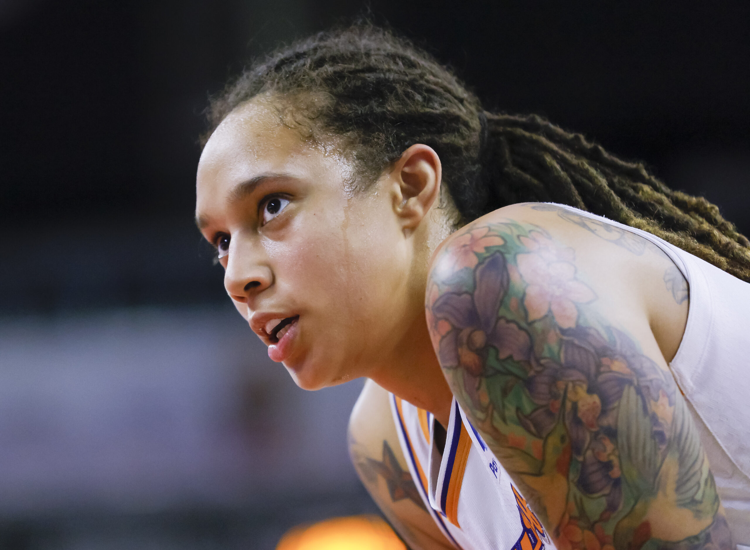
Game photos show why Brittney Griner’s tattoos are so recognizable. She often appears in motion, leaning into a play or communicating with teammates, and the ink catches the eye before you get a perfect view of the design. The floral shoulder piece is usually the first thing people notice. The stars can sit just outside the jersey line, while darker forearm work appears when her arms are extended.
This is also where tattoos get misread. A quick sports photograph can flatten a three-dimensional arm, hide part of a design behind a defender or make a small black mark look like part of a larger sleeve. It’s better to compare several clear photographs than to assign a name to every shape in one frame. Griner’s collection has enough consistent features to identify the main pieces without turning blurry details into facts.
The overall effect is confident rather than fussy. The tattoos are visible, but they do not look tied to one uniform or one era of basketball. They travel with her from the Phoenix Mercury to Team USA and keep their own identity under different colors and lighting. The photographs show a collection with strong structure even while Griner is moving on court.
Brittney Griner’s tattoos in Team USA colors
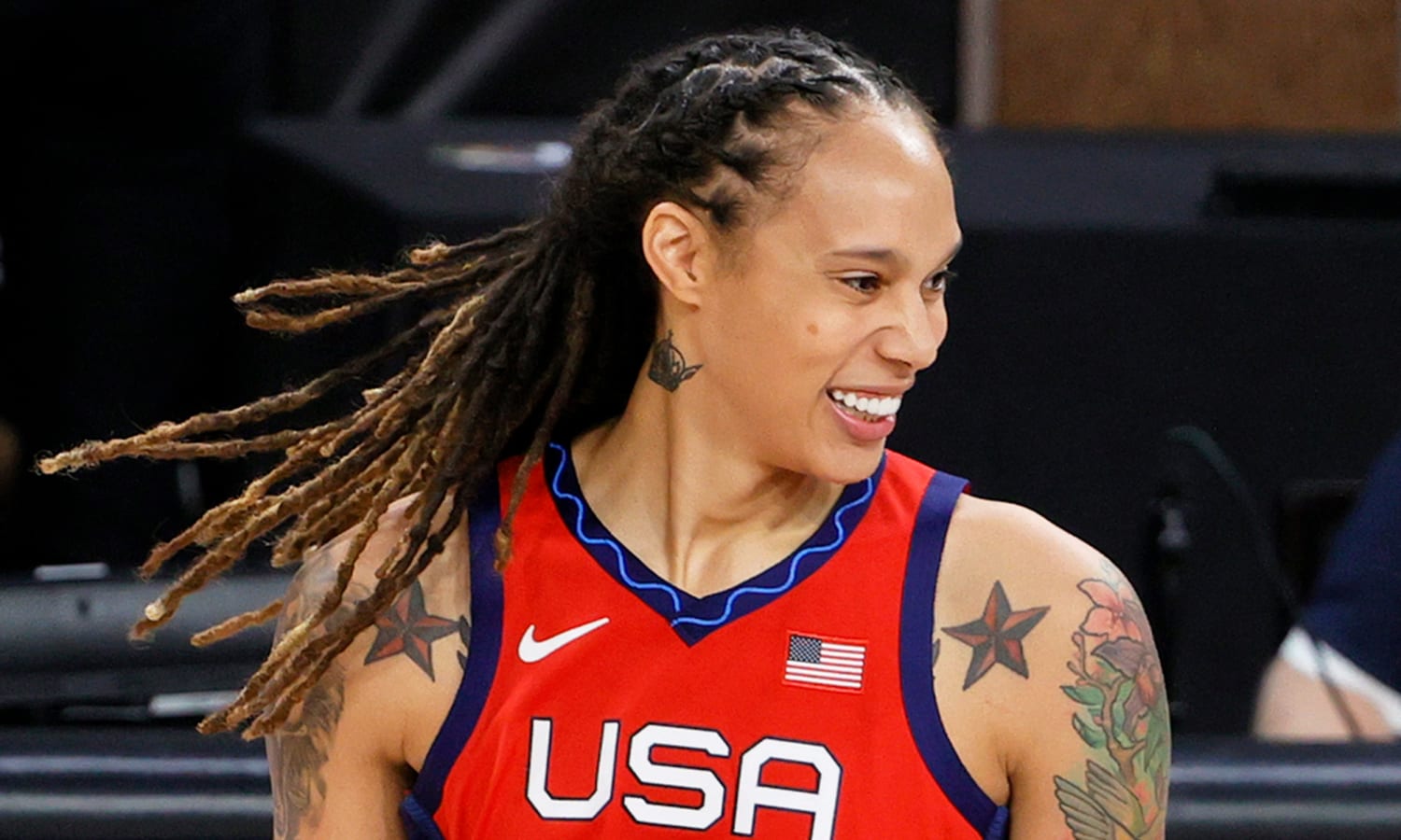
In a USA jersey, Griner’s tattoo layout becomes even easier to read. The red fabric creates a strong background for the stars and flowers, and the open neckline leaves the shoulder work visible. The colors in the ink feel connected to the uniform without being overly matchy. It’s a nice example of how clothing can change the way a tattoo looks without changing the tattoo itself.
The Team USA photographs also show the relationship between her two arms. The shoulder stars give one kind of balance, while the nature sleeve carries most of the detail. That unevenness keeps the collection from looking like a mirrored sticker set. One side can carry more visual weight while the other helps frame it.
That balance is visible across Griner’s tattoos. The larger nature sleeve carries more visual detail, while the stars and smaller symbols on the opposite side create a lighter counterweight. The uneven distribution gives the collection a deliberate rhythm without making the arms mirror images.
Building a visual rhythm over time
Griner’s nature sleeve is the arm project documented in the My Ink episode. The show follows her as she finishes work built around natural imagery, and later photographs show flowers, leaves and shaded figures across the arm. The sleeve is not just a single floral band. It has several visual layers, with softer color near the shoulder and darker, more detailed work through the forearm.
Nature imagery gives Griner’s sleeve a broad visual vocabulary. Leaves fill narrow spaces, stems follow the line of the arm, and flowers create focal points while smaller marks keep the background from feeling empty. The different pieces meet without a heavy border around each one.
The photographs also suggest that the sleeve developed over time. The finished effect can look unified even when tattoos were added at different times. Repeated line weight, related color choices, and the body’s natural movement create cohesion without forcing every image into exactly the same style.
A private chapter away from the court
One of the more personal tattoos Griner has discussed is a set of linked female symbols on her left hip. Pride’s report on the My Ink episode describes the design as a tattoo connected to her identity and her decision to be open about being a lesbian. It’s a different kind of piece from the arm sleeve because the placement is private and the meaning is more direct.
That contrast is worth keeping in mind. Not every tattoo has to be visible in every outfit or explained on a red carpet. Some pieces are for the wearer first. A hip tattoo can stay hidden during games and public appearances, while the stars and sleeve are part of Griner’s everyday visual identity. Both choices can be personal; they just operate in different spaces.
Linked symbols are a clean part of Griner’s tattoo language. They mark relationships, identity, and shared experience without spelling out a whole paragraph, giving the collection a visual shorthand alongside the larger nature sleeve.
Keeping one reminder private
ESPN has reported that Griner got two skulls on the lower right side of her back as a reminder to “laugh now, cry later.” The placement makes sense for a piece that doesn’t need to be on display all the time. It’s close to the body, easy to keep private and still carries a simple visual contrast: two skulls, two moods, one reminder.
Skull tattoos can get stuck in the same old tough-guy lane, but the meaning here is more flexible. The phrase doesn’t say to ignore hard things. It suggests keeping perspective and making room for joy even when life gets heavy. That gives the design a bit more warmth than the usual skull-and-flames treatment.
Placement also shapes the meaning of Griner’s ink. A back tattoo does not appear in every photograph; it can remain a private reminder while the shoulder and arm pieces carry the most visible part of the collection.
How the pieces fit together
Griner’s tattoos work as a collection because they have different jobs. The stars frame her shoulders. The nature sleeve carries texture and color. The small cross adds a detail on the hand. The hip symbols hold a more private identity marker, and the skulls keep a personal phrase close to the back. It’s a broad mix, but the pieces don’t compete for exactly the same space.
There’s plenty of contrast too. Some tattoos are bright, while others use black linework and shading. Some are obvious in a game photo; others are only known because Griner has discussed them. That range makes the collection feel lived-in rather than assembled as one photo-ready set.
The collection developed into a layered sleeve rather than a single uniform panel. The nature imagery, open skin, darker forearm work and private symbols give Griner’s tattoos different visual weights. The finished arrangement is not perfectly symmetrical, but the repeated lines, related colors and natural imagery keep the separate pieces visually connected.
The facts, without the guesswork
The documented version of Brittney Griner’s tattoos includes a colorful nature sleeve, star tattoos on both shoulders, smaller arm and hand details, linked female symbols on her hip and two skulls on her lower back. She has talked about some of the pieces, and clear photographs support the main visual descriptions.
That’s enough for a strong tattoo collection without inventing a meaning for every flower or calling every dark patch a confirmed design. Griner’s ink is bold, colorful and easy to recognize, but it still has private edges. Some tattoos belong to public game photos. Others belong to her own story.
Brittney Griner’s tattoos remain distinctive because of their strong placement, mix of small and large work, breathing room in the color, and symbols with clear personal context. The collection does not rely on volume; each piece has a defined place within the larger arrangement.