
Jessica Alba’s tattoos have become a small visual timeline of family, change and the moments she wants to keep close. Some are easy to spot; others only show when she wears a sleeveless top or turns her back to the camera. The newer designs make the collection feel more personal than decorative. Her tattoos mark real chapters, from motherhood to a difficult transition and a fresh start.
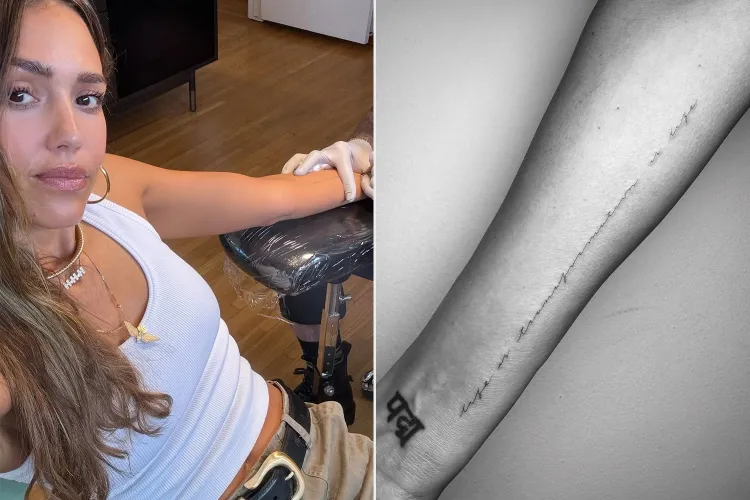
That variety is what makes Alba’s tattoos interesting. There’s no single style across the collection: fine script, tiny symbols, constellation work and a large back piece all have a place. She has also been candid about tattoos she regrets, which makes the newer choices feel more considered. Here’s a guide to the designs that are clearly documented, what they seem to mean and why they matter.
Jessica Alba’s new “life is transformation is life” script
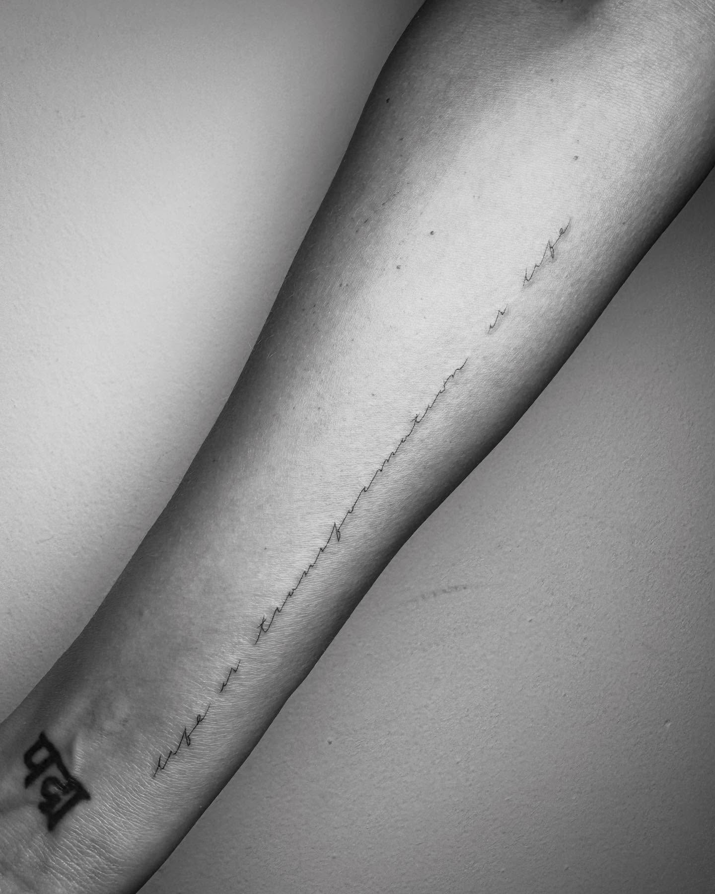
The most discussed recent piece is a fine line of script on Alba’s forearm. It has been reported as “life is transformation is life,” a short phrase that feels more like a reminder than a slogan. The tattoo appeared during a period of major personal change, so its wording naturally became part of the conversation around her next chapter.
The lettering is restrained: thin, spaced out and placed to follow her arm instead of dominate it. That’s a different approach from heavy blackwork or a large traditional design. The quiet scale is part of its appeal. Alba can show it when she wants without letting it take over every outfit or photo.
Artist Winterstone created the script. In close-up, the spacing is what makes it work: the words are clear without looking crowded, more like a personal note than a formal quote. The sentence does the emotional work without added decoration.
It’s also the clearest example of Alba using a tattoo to mark a transition. She hasn’t needed to explain every detail of her private life; the phrase stands on its own. Anyone can read it as a thought about resilience, while its timing gives it a more specific meaning for her.
The eye and infinity tattoo she shares with Honor
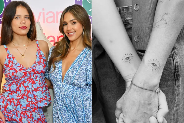
Alba and her daughter Honor Warren share a pair of small symbols: an eye and an infinity sign, placed around the wrist. They showed the matching tattoos together in a black-and-white photo. The eye can feel watchful and protective; the infinity mark suggests a lasting connection.
Matching tattoos between a mother and daughter can become elaborate, but these stay simple. The symbols are small enough to read as a pair without becoming a large matching mural. Side by side, the connection is clear; on their own, each one still works as a tidy design.
The timing gives the tattoos another layer. Honor was getting ready for college, and the shared ink offers a way to carry their family bond into a new stage of life. It’s a familiar idea, but the minimal design keeps it personal. The meaning comes from who shares it, not how much skin it covers.
The scale and placement are practical, too. Small black symbols are easy to keep crisp, and the wrist makes them visible without being the first thing people notice. Alba has several delicate tattoos, so these sit naturally within that fine-line side of her collection.
Three constellation tattoos for her children

Another family tribute on Alba’s forearm is a group of three astrology constellations representing her children, Honor, Haven and Hayes. She chose small star patterns rather than names or large portraits. Each child has a separate design, but together the three make one connected group.
Constellations suit the idea because they can stay delicate, with open skin between the stars. From a distance, the group looks like a light scatter of marks; up close, each pattern is easier to make out. That gives the tattoo a private quality even though its idea is easy to understand.
The patterns also let the children remain individuals. Rather than using one block of lettering or making the designs identical, each child is represented by a different constellation. It’s a family tattoo that leaves room for individuality.
Beside the script and wrist symbols, these star maps show the gentler side of Alba’s collection. The linework stays light, giving the tattoos more of a jewelry-like feel than a bold body-art statement. They carry meaning without needing a long explanation each time they appear in a photo.
The phoenix on her back
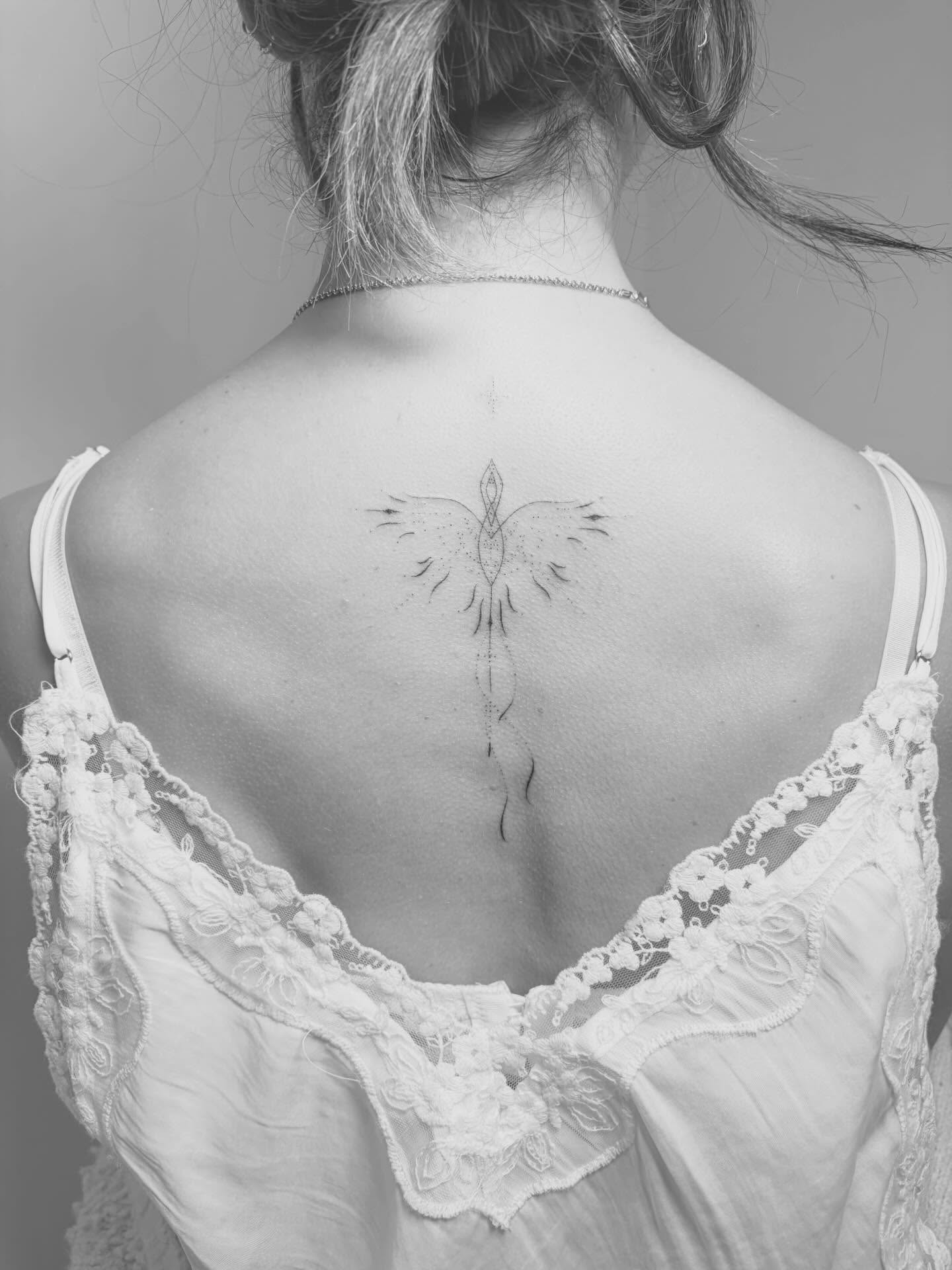
Alba’s newer back tattoo takes a different direction: a fine-line phoenix, a familiar symbol of renewal and starting over. It’s larger than the small wrist and constellation designs, but the artist kept the lines elegant rather than making the bird look heavy.
The placement gives Alba control over when the tattoo enters public view. A back design can stay hidden most of the time, and the phoenix has room of its own rather than competing with the script on her arm. It reads as a separate chapter in the collection.
Winterstone’s photo shows the bird high on her back, with its wings and body drawn in fine black lines. It’s recognizable without dense shading, which helps it sit alongside Alba’s recent tattoos even though the subject is more dramatic.
The phoenix also echoes the idea in her forearm script. The words refer to transformation, while the bird turns renewal into an image. Together, the two tattoos make a clear visual pair: one states the change and the other gives it a symbol.
Alba’s collection started well before these recent family designs. She has talked about earlier tattoos, including a lower-back bow she has joked about and other pieces connected to past relationships or earlier stages of her life. Her comments make clear she doesn’t consider every tattoo untouchable or perfect.
That candor changes how the newer work reads. The script, constellations and phoenix come from someone who knows that ideas can change over time. They feel deliberate, with light placement and links to her current life, rather than attempts to recreate her early-career image. Their meanings may evolve too, but they weren’t chosen to capture an old moment.
It’s worth separating documented tattoos from guesses based on red-carpet photos. In some images, a mark might be ink, makeup or shadow. A reliable guide should stick to designs that Alba, her family or the artist has discussed, or that are clearly visible.
Seen together, the collection isn’t built around one signature style. Each tattoo uses the scale that suits its meaning: small, airy constellations; a simple shared wrist design; script that needs room to read; and a phoenix with a larger canvas.
That flexibility is the collection’s most interesting quality. Alba hasn’t tied herself to one trend or tried to make every piece look like it came from the same flash sheet. Intention connects the tattoos: family appears in the constellations and shared symbols, while transformation appears in the words and phoenix.
For anyone looking to Jessica Alba’s tattoos for inspiration, start with the story and then choose a scale. A meaningful idea doesn’t have to become a huge tattoo, and a larger design doesn’t have to be loud. Good placement can make a simple image feel personal, especially when it connects to the life around it.
The new pieces also show how a collection can grow without erasing the past. Some earlier tattoos may feel imperfect or belong to memories she has outgrown, but they help explain how she arrived at the work she wears now. The collection feels lived in, honest and still open to change.