Kevin Hart has more tattoos than his usual red-carpet clothes suggest. His chest, shoulders, arms and back are all inked, with family names, an angel, theatre masks and smaller symbols spread across the body. The back piece is the biggest visual statement, but it is the combination of large and small work that gives his collection its character.
This guide keeps the designs separate and uses different photographs for different areas. A headshot cannot prove a back tattoo, and one shirtless photo cannot show every bit of lettering clearly. Hart’s tattoos are best understood through several views and a little context from the coverage around them.
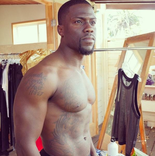
Kevin Hart’s chest tattoos include family names and a large angel
Kevin Hart’s chest is one of the clearest parts of his collection. The work includes an angel and lettering connected with his family, including the names of his children. Those names are the kind of detail that makes the tattoo personal without needing a dramatic explanation. A sharp shirtless photograph shows how the words sit across the chest rather than turning them into a blur.
The angel is a bigger visual piece. It gives the middle of the chest a strong shape, while the lettering adds smaller lines around it. The two parts should be described separately because an angel tattoo and a family-name tattoo do different jobs on the body. The image also shows how chains, lighting and muscle definition can make the same design look different in different photographs.
Hart’s chest has been photographed during workouts, beach trips and tattoo sessions. That makes the collection easy to spot, but it does not mean every photo is equally useful. A wide portrait can show that the chest is covered, while a closer frame lets readers read the names and see the edges of the angel. The family names deserve the clearer view.
The meaning here is safer than guessing at smaller symbols. Hart has publicly connected parts of the tattoo work with his children and family. Other marks can be described by shape and placement until he gives them a direct explanation. That keeps the article friendly and detailed without turning every line into a made-up life story.
The comedy and tragedy masks cover most of Kevin Hart’s upper back
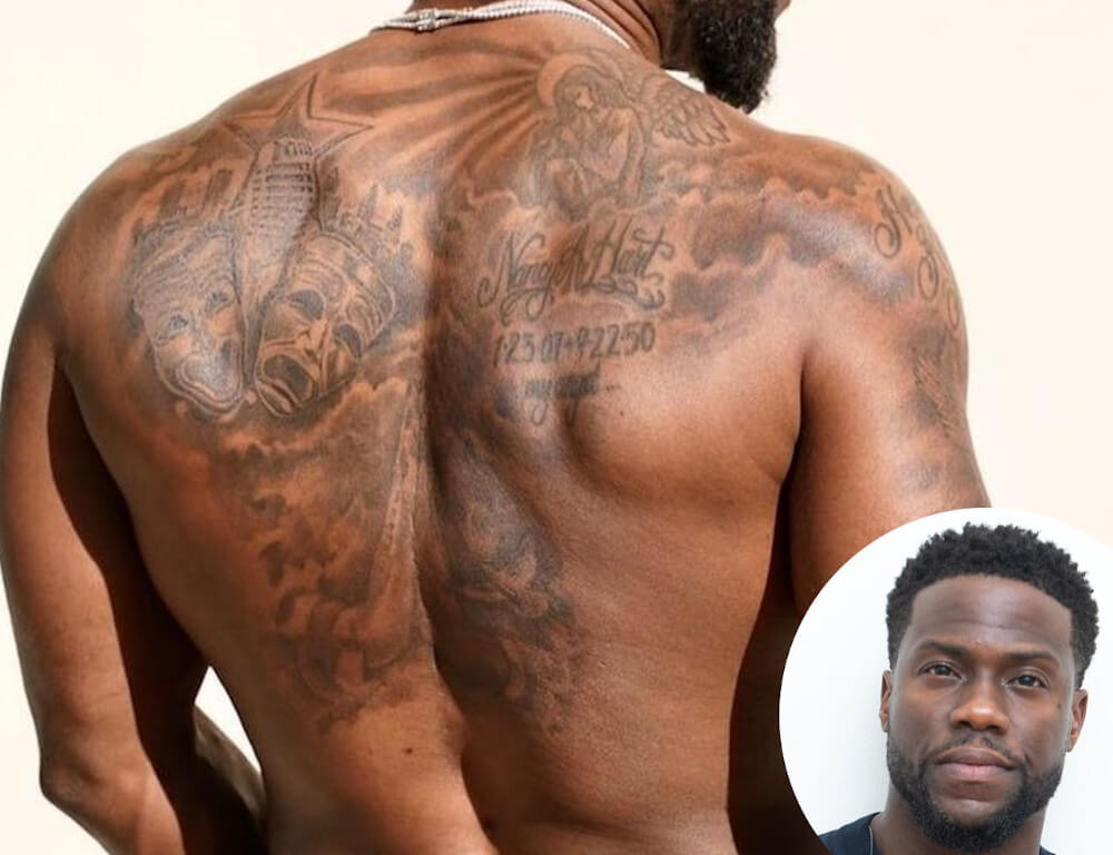
The back tattoo is Hart’s biggest single piece. It uses comedy and tragedy masks across the upper back, which is a neat fit for a comedian who has built his career around performing. The masks are shaded in black and grey and stretch from shoulder to shoulder, so they read as one strong composition when he turns away from the camera.
The design works because the two faces have different expressions. One looks lighter and more playful, while the other carries the darker theatre mood. That contrast gives the back a clear centre without needing lots of colour. The masks also make more sense when shown in a full back photograph, not as a tiny crop surrounded by blank page.
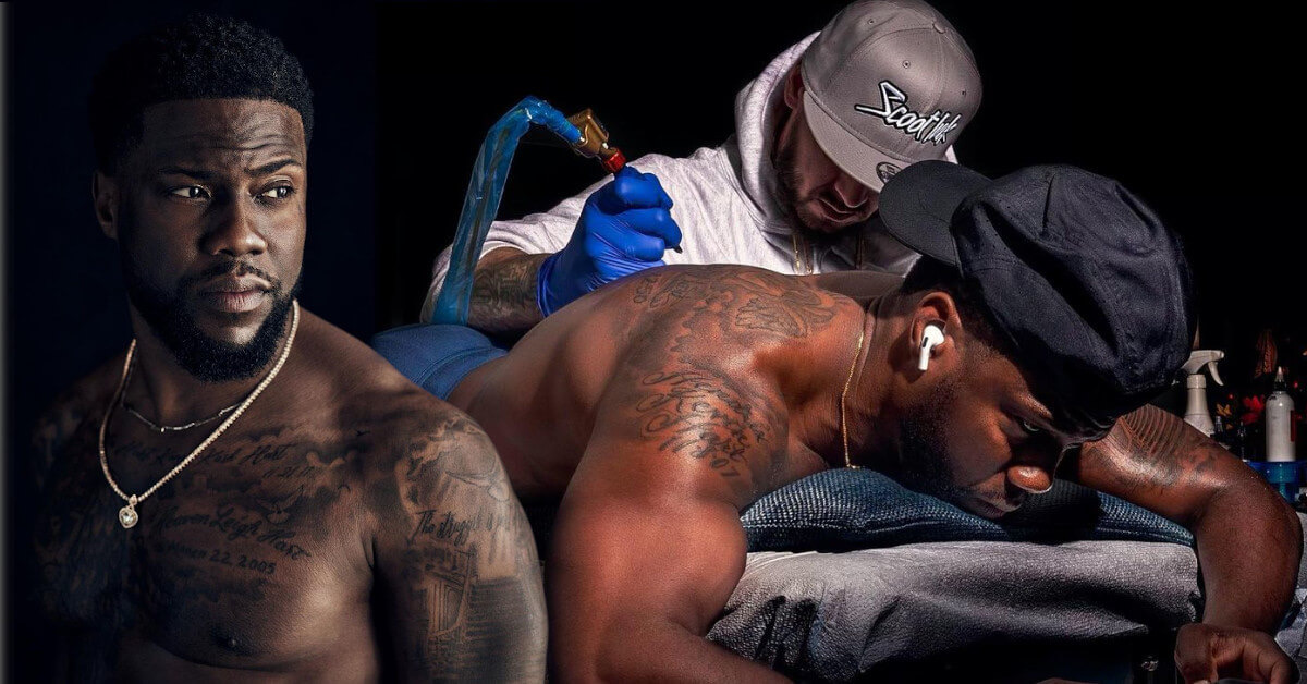
Hart revealed the work during a workout-style photo session, and later images show how it sits with the smaller shoulder tattoos. A tattoo artist working on his back has also appeared in coverage, which supports the timeline of the piece. It was not simply a mark that had always been there in its finished form.
This is the section where a generic portrait would fail. The featured image can show Hart’s face, but it cannot show the tattoo that covers his back. The separate back photograph does the job properly and gives readers a real look at the masks, shading and placement.
Hart’s arm tattoos sit beside the chest work and smaller symbols
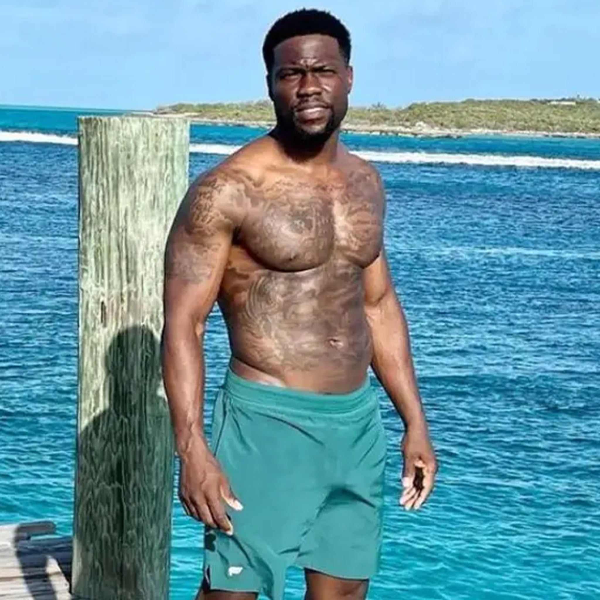
Hart’s arms carry smaller tattoos that are easy to miss when he is wearing a T-shirt. The right and left arms have lettering, dark symbols and pieces that connect visually with the chest. A beach photograph is useful because the arms are uncovered and the lighting is strong enough to show the difference between individual marks.
The arm work is not one perfectly planned sleeve. Some pieces sit alone, while others are close enough to look connected in a wide photograph. That is normal with a collection built over years. The best description names the visible pieces and keeps the uncertain edges open instead of pretending the whole arm has one theme.
Hart has also been photographed while getting new work done, which shows how the collection develops. A session photograph may show the artist working on the back while older tattoos remain visible around the shoulders. That kind of image helps with the timeline, but it should not be treated as proof that every mark was added during that one appointment.
The arm lettering is another reason to use a large image. Small words lose their shape when a photograph is compressed. A clear body photograph lets readers see where the text sits, while the surrounding paragraph explains only the context that is actually supported.
The shoulder and side tattoos fill in the gaps around the main pieces
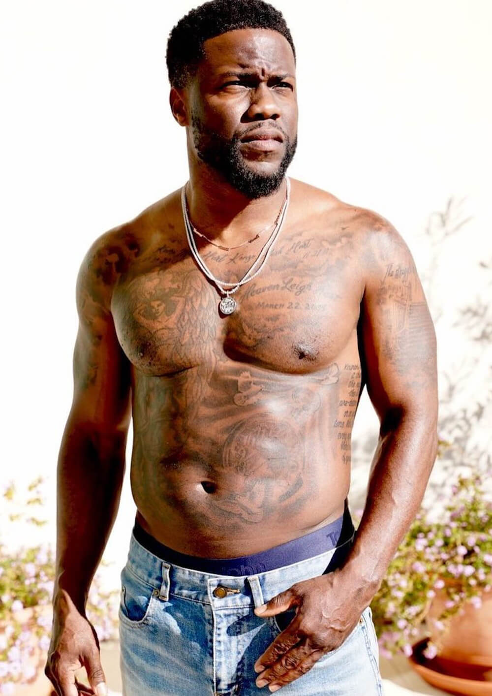
Hart’s shoulders and sides hold the smaller pieces that make the upper body look fuller. Some are close to the collarbone, while others sit beside the angel and extend toward the ribs. These are not as famous as the back masks, but they help explain why a shirtless photograph looks more heavily tattooed than a quick list of four designs might suggest.
The shoulder work also changes with posture. When Hart lifts his arms, the skin stretches and the lines appear farther apart. When he relaxes or turns, the tattoos bunch up beside the chest. A tattoo guide needs more than one angle because a single pose can hide the placement completely.
Reports and tattoo galleries identify an angel, family lettering and additional shoulder designs, but not every small symbol has a confirmed meaning. It is better to say what can be seen: a dark outline, a small word, a mark near the shoulder or a design running toward the side. That is more useful than filling empty space with guesses.
The shoulder details also give the article a natural place to talk about scale. Large pieces need wide photographs, while small lettering needs a closer frame. Both are part of Hart’s tattoos, and both deserve clear visuals rather than being buried in one long paragraph.
Kevin Hart’s tattoo collection changes with each workout and studio photograph
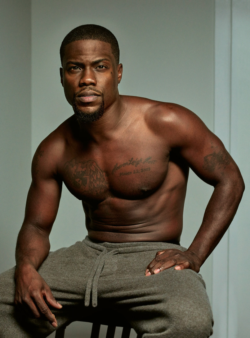
Hart’s collection is often seen in fitness photos, where the camera catches his arms, chest and torso at once. Those pictures make the body art easy to notice, but they can also flatten the detail. Sweat, hard light and shadows may make one piece look darker than it does in a quieter portrait.
The workout image here is separate from the beach and gallery photographs. It shows the tattoos while Hart is moving and posing naturally, which helps explain why the layout looks different from a straight-on studio shot. The chest may appear wider, the shoulder may disappear under an arm and the back will usually be hidden altogether.
That changing view does not necessarily mean Hart has added or removed a tattoo. Clothing, posture and camera distance do a lot of the work. A reliable article should date the photograph where possible and avoid calling every visual difference a cover-up. The overall layout is easier to understand when several genuine photographs are compared.
Hart’s ink has a relaxed, personal feel. There are family names, an angel, performance masks and smaller symbols that sit around the arms and shoulders. It is not one rigid sleeve built around a single idea. The collection looks like it grew as his family, career and interests changed, which is why the photographs are as important as the list of designs.
The tattoos are easier to read as a timeline than as one finished mural
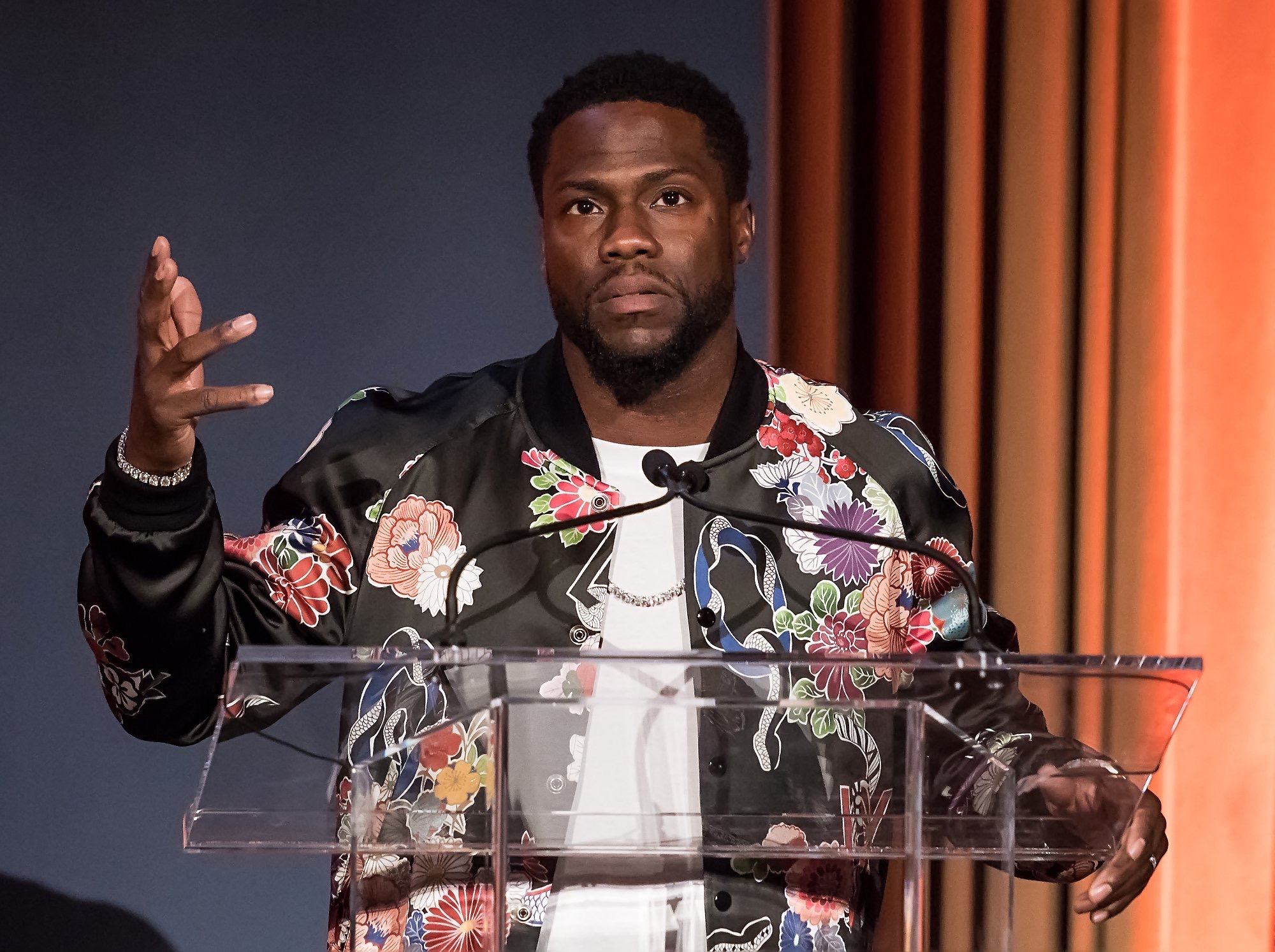
Hart did not unveil every tattoo at the same time. The back masks became especially visible during later fitness photos, while older chest and arm tattoos had already appeared in public pictures. That timeline helps explain why an early portrait can look much less crowded than a newer one.
The family lettering belongs to the personal side of the collection, while the masks connect neatly with comedy and performance. The angel adds a different mood, and the smaller shoulder marks bridge the spaces between them. It is fine for the tattoos to have different reasons. They do not need to be forced into one polished message.
The strongest visual inventory includes the comedy and tragedy masks, the angel, the children’s names and the arm, shoulder and side work shown in close photographs. Less clear marks should stay described as uncertain. That is not a weakness. It tells readers where the evidence is solid and where the photograph simply does not give enough detail.
Overall, Hart has enough documented ink to justify several large body photographs, not one generic headshot. The featured portrait is separate, and the five tattoo images are spaced beside the sections they support. That gives the reader a proper look at the chest, back, arms, shoulders and changing layout of the collection.
There is also a practical reason the article needs room. A full back piece should be shown at a size where the masks remain recognisable, while a child’s name or small shoulder symbol needs a closer view. Using one low-quality photograph for every part would make the collection look thinner than it is. The images here are different photographs, not the same file cropped five ways.
Hart’s tattoo story is fairly easy to follow once the body is broken into areas. The chest carries family and angel imagery, the back carries comedy and tragedy, and the arms and shoulders fill the spaces between. The meaning is strongest where Hart or a reliable report gives it directly. The design itself does the rest of the work.
For readers searching for Kevin Hart tattoos, the useful takeaway is simple: there is plenty to see, and the pieces do not all belong to one session. The collection has grown alongside his public life, his family and his training routine. It looks better when the page gives each group a clear photograph instead of rushing through a short list.