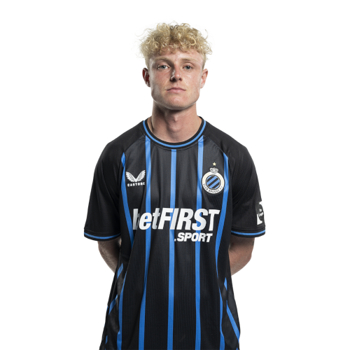
Joaquin Seys is a Belgian footballer associated with Club Brugge, and his public tattoo record is unusually readable because the reporting combines close-up studio material with match photographs. The clearest published evidence shows a forearm script reading “Sempre con voi”, a family-linked phrase, and a newer religious design described through Cirusso Art coverage. Sports photographs add scale by showing the same player with forearm ink visible in action.
The most responsible way to read the photographs is to separate what is plainly visible from what journalists report. The script can be read in the HLN image. The praying figure is visible in the Cirusso Art image. The wider match frames show additional marks but do not resolve every motif. That distinction matters because a tattoo page should document the ink that can actually be seen rather than turning partial pixels into a complete catalogue.
This feature therefore treats tattoo-bearing originals as the primary evidence and keeps one later portrait explicitly supplemental. The featured image provides a separate face-visible route for identity, while the inline sequence moves from the family phrase to the religious design and then to wider football photographs. The final Club Brugge portrait is included only to provide a calm identity frame after the tattoo search has been exhausted.
The Sempre con voi forearm script
The most legible design in the available coverage is the forearm script Sempre con voi. The phrase is placed along the exposed forearm and is photographed at a useful distance, so the lettering can be read without relying on an aggressive crop. The blue Club Brugge shirt and Seys’s face make the subject easy to identify at the same time.
HLN’s profile of Seys connects the phrase with his father and explains its Italian wording as always with you. That reported context gives the design emotional weight, but the photograph itself still matters most: it establishes the phrase, the placement and the scale. It does not prove every biographical detail surrounding the appointment.
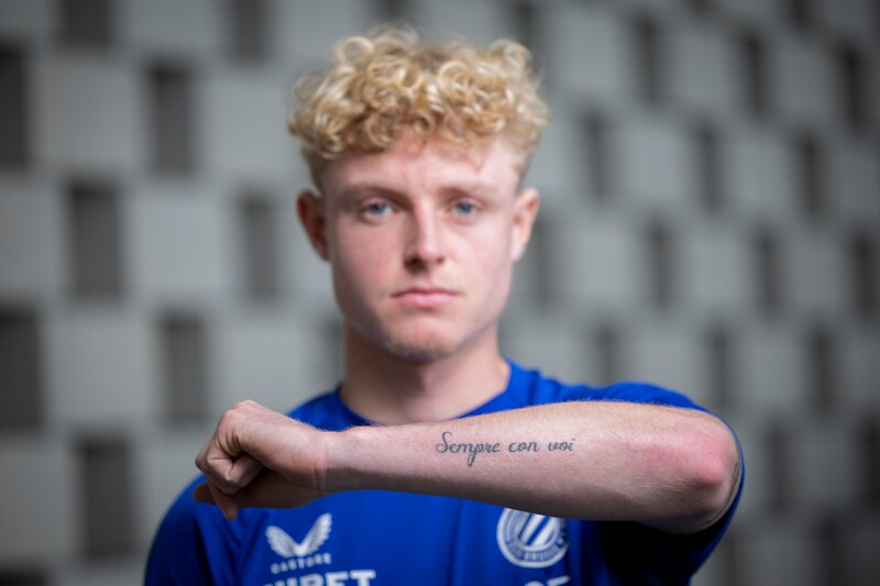
The script is a strong example of a personal tattoo that works through language rather than a large illustration. Its horizontal flow follows the forearm and remains visible when Seys raises his arm toward the camera. The lettering is compact enough to sit comfortably beside other marks, suggesting that the phrase forms one part of a broader arm story rather than a standalone sleeve.
For design analysis, the central principle is restraint. The phrase is already specific because of its family association. Adding decorative symbols, dates or translated variations would create details that the source image does not show. A faithful study keeps the wording, placement and proportion intact.
The praying child and angel design
The Cirusso Art photograph supplies the most distinctive visual motif in the dossier. A close section of the image shows a praying child or angel figure rendered in shaded black and grey work. The hands, face and folded posture are visible in the forearm close-up, giving the design a devotional character without requiring a speculative story about every line.
The accompanying report identifies Cirusso Art as the studio and describes the new tattoo as a praying angel. Nieuwsblad reports the Portuguese protection phrase associated with the design as “Livrai-me de todo mal. Amem.”, translated as deliver me from all evil, amen. The coverage says Seys kept the deeper meaning private, so the safe conclusion is religious symbolism with a documented protective text, not a complete personal confession.
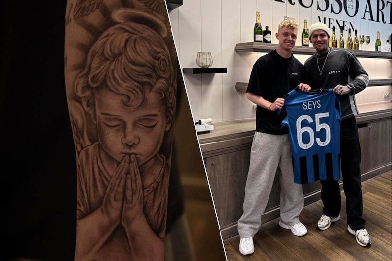
The image also shows why studio photographs are valuable. The skin is closer to the lens than it is in a football match, allowing the shading and the direction of the figure to be assessed. The design occupies a meaningful section of the forearm and appears intended to extend the wider arm coverage rather than replace it.
The devotional subject creates a visual contrast with the script phrase. One design is typographic and family-oriented; the other is figurative and faith-oriented. Together they show how a single forearm can carry different kinds of memory. The article keeps them separate because the photographs support two different visual readings.
The wider match-day forearm view
The VRT sports photograph changes the scale of the discussion. Seys is shown in Club Brugge kit during match action, with his face visible and the lower forearm exposed. The tattoo marks are not as readable as the studio close-up, but the frame proves that the ink is part of his public appearance rather than something seen only inside a tattoo shop.
A wider photograph is valuable for placement. It shows how the forearm looks beside the wrist, hand, sleeve and football shirt. That relationship helps explain why the script and religious design can be understood as pieces of a larger arrangement. At the same time, the pixels do not justify naming every indistinct shape, so this image is used for coverage and proportion rather than an invented motif list.
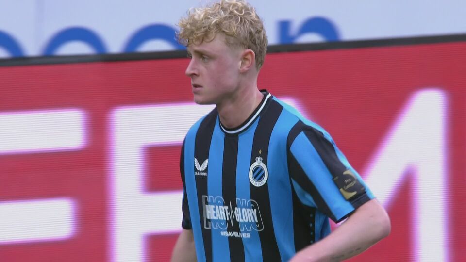
The celebratory pose also shows the practical way tattoos enter football coverage. A player may reveal an arm while gesturing, sprinting or acknowledging supporters, but the moment is not staged for tattoo documentation. Shadows, motion and distance can soften smaller marks. The responsible description records the visible arm coverage and leaves uncertain symbols unresolved.
This evidence is complementary to the close-up. The close-up tells us what one design looks like. The match frame tells us how the ink sits on Seys’s body while he performs his profession. Those are different questions, and both are useful to anyone studying the composition as a real wearable design rather than an isolated flash image.
A Club Brugge identity frame
The RTBF photograph is a separate face-visible portrait of Seys in a Club Brugge shirt. It is included after the tattoo-bearing images because it gives the page a clean identity frame without pretending that a generic sports portrait proves a tattoo. The face, hair and shirt make the subject unmistakable, while most of the forearms remain outside the evidence needed for design analysis.
This distinction protects the page from a common editorial mistake. A portrait can be useful, attractive and relevant to the subject, yet still say nothing reliable about the ink. The tattoo claims here come from the readable script, the Cirusso Art close-up and the VRT match photograph. This RTBF frame is supplemental context only.
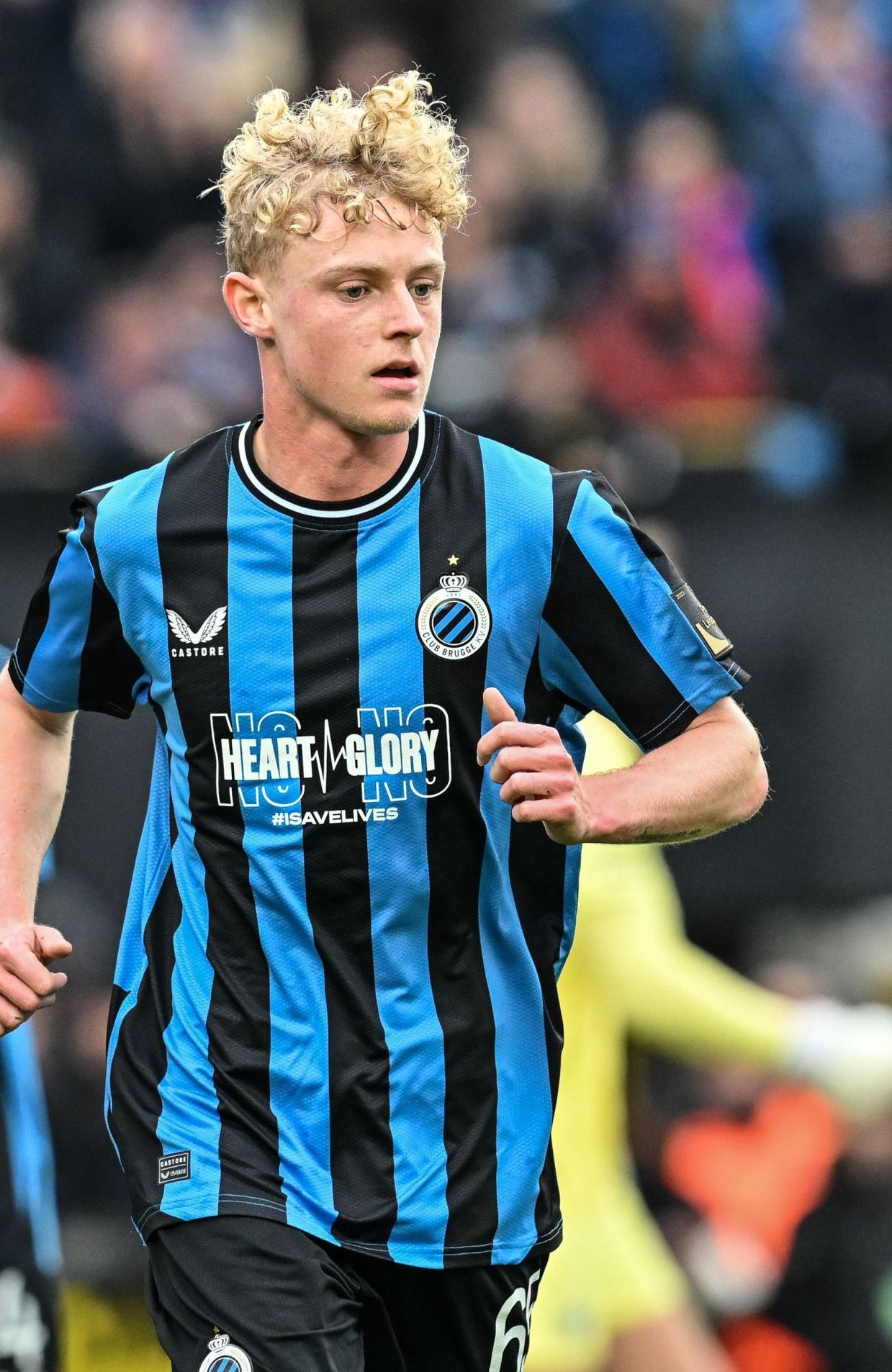
It also helps the article move back from detail to person. The close-ups invite attention to lettering, shading and placement. The identity frame returns attention to the young full-back whose tattoos are being documented. That change of scale is useful on a long page because it prevents every photograph from carrying the same visual burden.
The photograph should therefore be read as an identity anchor rather than as a fifth tattoo claim. Its role is clearly labelled in the manifest and its neutral heading keeps the distinction visible in the final layout. The public football context remains separate from the photographs that carry tattoo evidence.
A supporter-side identity frame
The De Morgen photograph offers a separate face-visible portrait of Seys against a Club Brugge crowd setting. His face is sharp, the shirt identifies the club and the supporters remain softly out of focus behind him. The image is not used to identify a tattoo because the visible crop does not expose the arm clearly enough for that claim.
This image helps a long tattoo article feel connected to a real person without being mistaken for tattoo evidence. It gives the page another identity route after the close-ups and the match frame, but it leaves the tattoo discussion to the originals that actually show skin and ink.
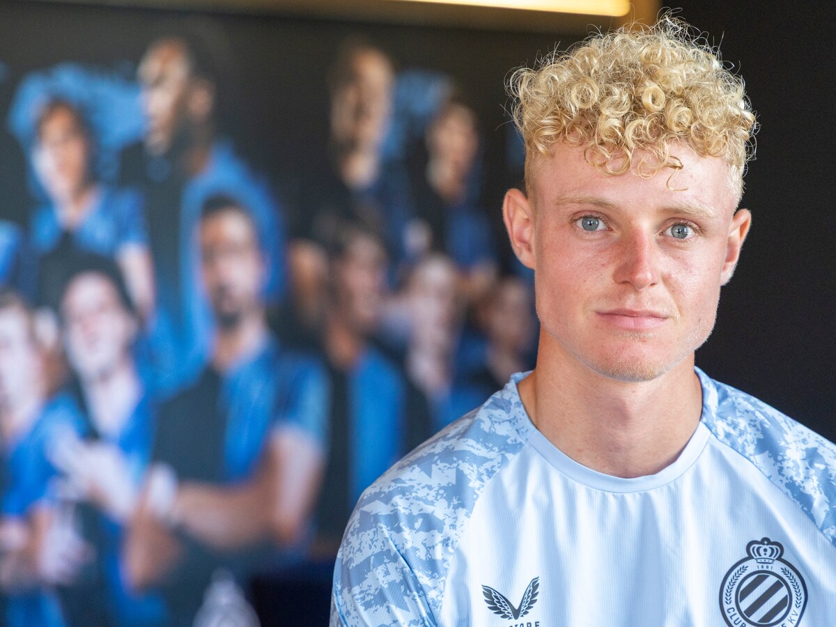
The neutral public setting also adds a different kind of context from the RTBF frame. One image places Seys in a kit portrait, while the other places him among supporters. Neither is mapped to a tattoo-specific heading. That separation keeps the article visually honest and makes the evidence trail easy to follow.
Placed last, this portrait closes the visual sequence without padding the tattoo record. The page has already exhausted its useful tattoo-bearing photographs, so this distinct frame is labelled as supplemental context and nothing more.
What the published record supports
The strongest documented claims are specific. Seys has a forearm phrase reading Sempre con voi, and HLN connects it with his father. A Cirusso Art report and related Belgian coverage show a praying child or angel design and describe a Portuguese protection phrase. The sports photographs then establish that the forearm carries additional visible marks when Seys plays in short sleeves.
The record does not justify a complete body map. The available images do not resolve every symbol, date or boundary of the sleeve, and the reporting does not publish a definitive catalogue of artists or appointments. That is not a weakness in the article. It is the honest limit of the evidence and a reason to avoid confident labels for shapes that remain indistinct.
The religious design deserves the same restraint. The reported phrase gives the tattoo a documented protective context, while the visual close-up establishes the praying figure and its shaded treatment. The deeper personal meaning was kept private in the reporting. A good guide can respect that privacy while still explaining what the photograph and named sources make clear.
How to read the visual evidence
The five inline images work as a sequence. The first resolves the family phrase. The second gives the religious design its closest view. The third widens the frame into football action, showing body placement and additional arm coverage. The last two are neutral Club Brugge portraits that anchor identity without being used as tattoo proof.
This structure also explains why generic portraits are last-resort supplements. They can help establish the subject, but they cannot replace a tattoo-bearing original. The tattoo photographs are mapped to the claims they support, and later prose separates the portrait from the evidence so the page never implies that a shirted identity frame reveals hidden ink.
Future interviews or studio posts may clarify more of the arm, especially if Cirusso Art or Seys publishes a full sleeve view after another session. Until then, the defensible record is already meaningful: a family phrase, a devotional figure with protective wording and wider football photographs that show a developing forearm collection. The photographs document the design without pretending to know what they do not show.
How the evidence fits together
The strongest design takeaway is the balance between text and image. The phrase works because its lettering is intimate and legible. The devotional piece works because the figure has a clear silhouette and a controlled shaded treatment. The wider view shows how both ideas live on a moving arm. That combination is more instructive than a random list of unverified symbols.
For placement analysis, the forearm provides a natural vertical field. Script can follow the length of the arm, while a figurative design can occupy a broader section where shading remains readable. The match frame shows that visibility changes with movement and clothing, which is an important practical consideration for any design intended to be seen in public.
The page therefore keeps its conclusion narrow and useful. Joaquin Seys has documented forearm tattoos with family, faith and protective language in their reported context. Several distinct originals show those tattoos or their wider placement. The remaining details should be allowed to emerge from future first-party or reputable editorial images rather than being supplied by guesswork.