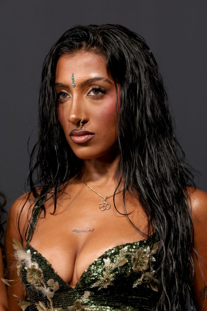
Lara Raj’s tattoos have the kind of mix that makes a collection feel personal instead of overly planned. There’s zodiac ink, family lettering, a lyric tied to two close friends, a tiny fairy, and a hand tattoo that has become one of the easiest pieces to spot. Nothing about the set feels like it was chosen to make one big visual statement. It’s more like a growing scrapbook, with each small mark attached to a person, a date, a song, or a piece of Lara’s life.
That’s also why it’s tricky to count every piece. Some of Lara’s tattoos are private, while others show up only for a second in a performance, a music video, or a quick Weverse peek. The most recent breakdown from Teen Vogue lists 11 tattoos, although not all of them are equally easy to see. The visible designs give us plenty to talk about, but the details matter here. A small symbol behind the ear isn’t the same thing as a big flash-style design, and a lettering tattoo can look completely different depending on how Lara’s hand or arm is angled.
Small, fine-line tattoos with a personal thread.
At a glance, Lara’s collection leans toward fine-line work and compact lettering. The designs sit in places that can disappear under a sleeve or stay hidden during a stage outfit change: behind the ear, on the wrist, along the ribs, on the hand, the inner bicep, the shoulder, and the chest. That placement gives her a lot of control over when each tattoo is visible.
There’s a nice balance between symbols and words, too. Her scorpion and Scorpio sign bring in the obvious zodiac references, while the hand stars are arranged as a Taurus constellation. The lettering is more intimate. “Habibi” connects to her family, “Paranji” is written in Tamil for her grandfather, and “APRIL V” marks her sister Rhea Raj’s April 5 birthday. Even the designs that look decorative at first have a clear personal anchor behind them.
For anyone using Lara’s ink as reference, the useful takeaway is scale. These aren’t giant back pieces or dense sleeves. They’re small tattoos that rely on clean placement and enough breathing room around the lines. That’s a style that can age nicely when it’s done carefully, but it also means the tattooer has less room to hide wobbly lettering or muddy detail.
The scorpion behind Lara’s ear.
One of Lara’s most distinctive placements is the scorpion behind her ear. The design connects to her zodiac sign, Scorpio, and it’s exactly the sort of tattoo that can stay private most of the time and then appear clearly when her hair is pulled back. Behind-the-ear tattoos are small by necessity, so the shape has to read quickly without being overloaded with detail.
The placement also suits the subject. A scorpion has a recognizable silhouette even when it’s reduced to a compact fine-line design. If you like the idea but don’t want a literal copy, the same spot could work for a simplified scorpion tail, a tiny constellation, or another symbol that means something to you. The important part is keeping the design clean enough to work at that size.
The “ZZZ” tattoo on her ring finger.
Lara has “ZZZ” on her ring finger, connected to the idea of three cats. It’s one of the smallest tattoos in the collection, but finger placement gives it extra visibility. Every gesture becomes a chance to see it, especially in close-up photos or while Lara is holding a microphone.
Finger tattoos are fun, but they’re also a commitment to regular touch-ups. Hands take a lot of wear, and fine lettering can fade faster there than it would on the upper arm or thigh. Lara’s simple three-letter design works because it doesn’t try to pack a whole illustration onto a tiny surface. If you’re borrowing the idea, keep the lettering bold enough to stay readable and choose a tattooer who’s comfortable working at that scale.
The Taurus constellation on her hand.
Stars on Lara’s hand form a Taurus constellation. She has connected the tattoo to her late grandmother, which gives the design a quieter emotional weight than the star pattern might suggest at first glance. The stars are delicate, but the placement makes them easy to notice alongside the “angel” tattoo that came later.
Constellation tattoos can be very literal, with each star placed to match the chart, or more relaxed, with the general shape kept while the spacing is adjusted to fit the body. Lara’s version looks like the kind of design that can sit lightly on the hand without taking over the whole area. It’s also a good example of how a simple cluster of dots and lines can carry a very specific memory.
“Love is life and life is free” on her wrist
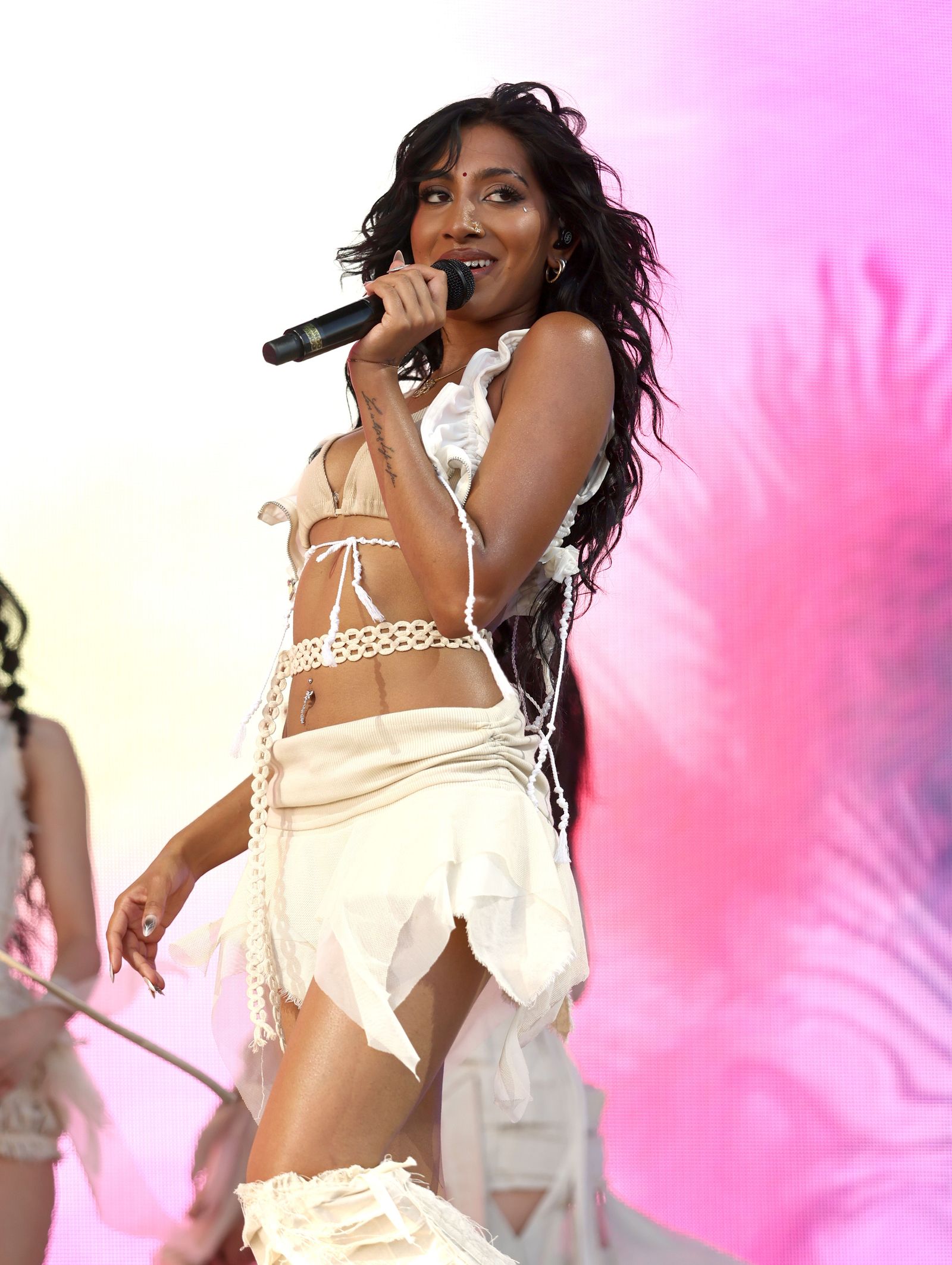
One of Lara’s longest pieces of lettering is the phrase “Love is life and life is free” on her wrist. The line comes from Erykah Badu’s “Didn’t Cha Know”, and the lettering is based on the handwriting of two of Lara’s best friends. That combination makes the tattoo feel less like a standard quote tattoo and more like a message that has been made physical by the people around her.
Handwriting tattoos succeed or fail on the source material. A phrase can be meaningful, but the personality in the original handwriting is what makes it worth keeping. If you’re planning something similar, bring the actual handwritten note or signature to your consultation rather than choosing a typeface that only imitates it. Your tattooer can clean up spacing while keeping the uneven details that make the handwriting yours.
“Habibi” for her family.
On her upper forearm, Lara has the word “Habibi,” a matching tattoo connected to her family. The word is short, which keeps the design visually light, but the family link gives it more meaning than a random piece of script. It’s also in a spot that can be shown easily or covered with a sleeve, depending on the outfit.
Short words can be surprisingly hard to place. Letter height, spacing, and the natural curve of the forearm all affect how the tattoo reads. Lara’s piece fits the clean, understated direction of the rest of her collection. There’s no need for extra flourishes when the word already does the emotional work.
“Paranji” in Tamil for her grandfather.
Lara’s shoulder tattoo reads “Paranji” in Tamil and is connected to her grandfather. It’s a good reminder that meaningful lettering doesn’t have to be in English to be powerful. The script gives the tattoo its own visual rhythm, while the family reference keeps the design grounded in something specific.
With tattoos in a language you don’t read fluently, accuracy is the first priority. Bring a trusted native speaker into the process, check the spelling more than once, and make sure the reference image shows the exact characters in the right order. A tattooer can reproduce the lettering beautifully, but they shouldn’t be asked to guess what it says.
The Scorpio symbol and “APRIL V” on her ribs.
Lara has a Scorpio symbol on her ribs, creating a second zodiac reference alongside the scorpion behind her ear. She also has “APRIL V” in Roman numerals on her ribs. That date marks her sister Rhea Raj’s birthday on April 5. Rib tattoos can be hidden most of the time, which makes them a natural place for dates, names, and symbols that feel more private.
“APRIL V” is a compact way to combine a month and a Roman numeral without turning the tattoo into a full sentence. The design has a slightly old-school feel, but the placement keeps it personal. If you’re considering a date tattoo, decide whether you want other people to understand it immediately. Lara’s version leaves a little room for curiosity, which can be part of the appeal.
The fairy tattoo on her inner arm
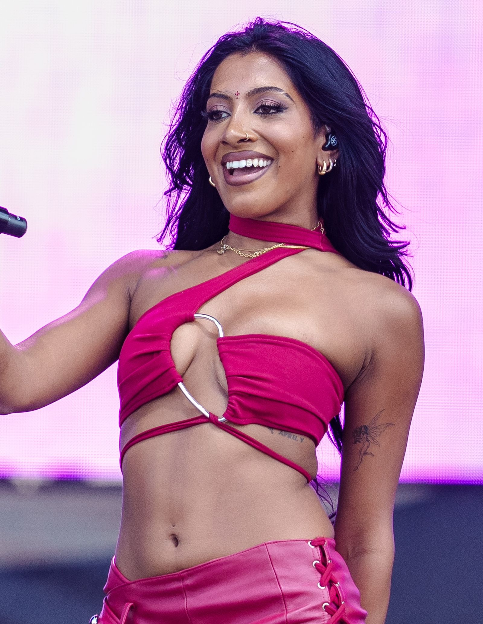
Lara’s fairy tattoo sits on her inner bicep. The design was done by Tyler Dillon at The Fig Leaf Tattoo in Los Angeles, the same artist and studio connected to the Taurus constellation. It was shown in a Weverse peek after the 2025 Kids’ Choice Awards and before Lollapalooza, so fans got a look at it before it became familiar from performance photos.
An inner-bicep tattoo has a softer feel than a hand or rib piece. It can be hidden when the arm is resting against the body and revealed when the arm lifts or the sleeve changes. A fairy also gives the tattooer room to work with a small figure, wings, and movement without needing a huge canvas. Lara’s design fits that placement well: it reads as a delicate little character rather than a loud centerpiece.
The Gothic “angel” hand tattoo.
The word “angel” is tattooed on Lara’s left hand in Gothic typography. It sits near the star constellation, so the two pieces read as part of the same small hand collection even though they have different visual personalities. The Gothic lettering gives the word more weight than a plain script tattoo would, while the nearby stars soften the overall look.
Hand lettering needs a realistic plan. The skin moves constantly, the surface is exposed to sunlight and friction, and tiny details can blur over time. A bold Gothic style can help the word stay legible, but it still needs to be sized for the hand rather than copied from a large reference image. Lara’s tattoo is a good example of using typography as the main design instead of adding extra decoration around it.
The Tamil name on Lara’s chest.
The newest tattoo in the reported breakdown is the Tamil name விஜயலட்சுமி, transliterated as Vijayalakshmi, on Lara’s chest or sternum area. The tattoo was shared in January 2026 and made a red-carpet debut at a Spotify Best New Artist party before the 2026 Grammys. It’s placed centrally and sits above the neckline, making it easier to glimpse in a low-cut stage or red-carpet look.
Chest lettering has a very different presence from finger ink. The skin gives the tattoo more room, but the sternum also has a natural center line that affects how the characters sit. Tamil script has its own flow and proportions, so the best result depends on using an accurate reference and respecting the shape of the writing. The finished tattoo feels personal without needing a frame, flowers, or extra imagery around it.
What makes Lara’s tattoo collection work.
The strongest thread through Lara’s tattoos is connection. Her grandmother, grandfather, sister, family, and best friends all appear in the collection. So do her zodiac identity, a favorite lyric, and a few whimsical choices like the fairy and the angel lettering. That mix keeps the tattoos from feeling like one theme copied across several body parts.
The placements help, too. Visible spots like the hand and finger carry the pieces fans recognize quickly. More private areas, including the ribs and chest, give Lara space for names and dates that don’t need to be on display every day. The inner bicep and behind-the-ear placements sit in between: easy to reveal, easy to cover, and ideal for small designs.
If you’re building a collection with a similar feel, start with the story rather than the Pinterest board. Choose the people, words, or symbols you genuinely want to keep. Then ask whether the design still works at the size and placement you’re considering. Lara’s ink shows how much personality can fit into small tattoos when the references are real and the lettering is handled carefully.
Some of Lara’s private tattoos may stay private, and that’s part of the point. A tattoo doesn’t become more meaningful because every detail is public. The pieces we can see already give a clear picture of her style: fine lines, thoughtful wording, small symbols, and placements that let each tattoo have its own moment.
Lara’s stage context
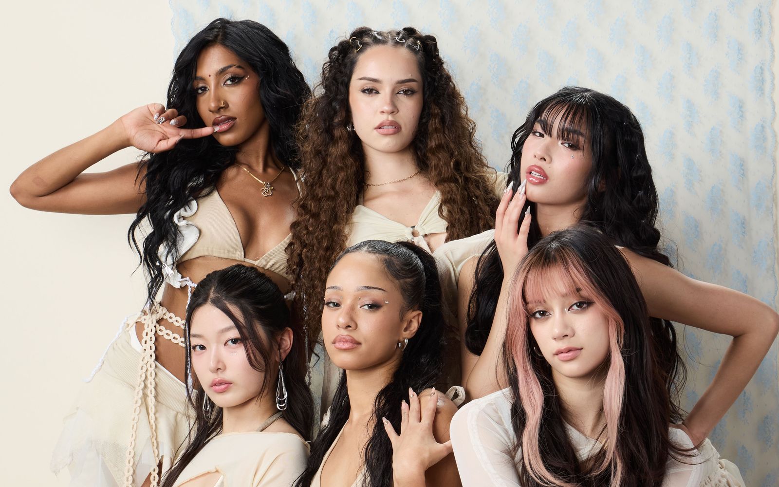
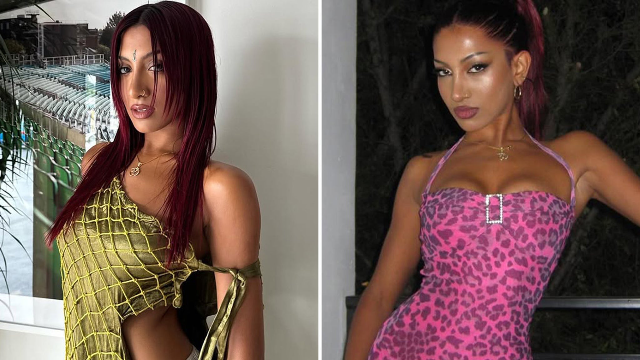
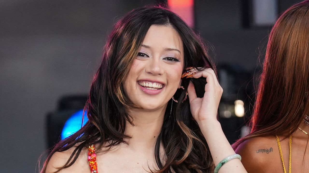
Stage photos give the collection a different feel than close-up tattoo shots. Lara’s hand, arm, and wrist ink can appear for a second while she’s singing or moving through choreography, while the smaller behind-the-ear and rib pieces usually stay out of frame. That mix of visibility is part of what makes her tattoos interesting to follow: some designs are easy to recognize, and others remain occasional glimpses rather than constant accessories.
Watch KATSEYE’s “Gnarly.”
Lara’s tattoos also appear in flashes during KATSEYE performances and music videos, including “Gnarly.” Here’s the official choreography version: