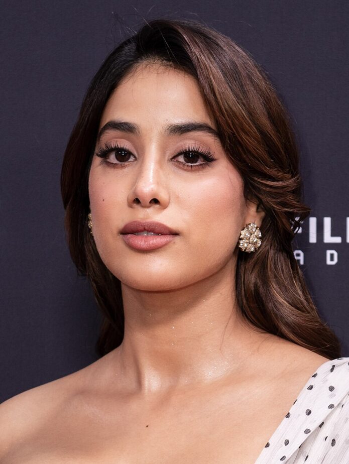
Janhvi Kapoor’s tattoos are small and personal, and easy to miss unless she happens to lift a sleeve or turn her wrist toward a camera. That feels right for the two pieces that have been documented most clearly. One is a fine handwritten tribute to her mother, Sridevi. The other is a little evil-eye design connected to her sister, Khushi Kapoor. Neither tattoo is trying to fill an arm or make a loud style statement. They work because the meaning is doing most of the heavy lifting.
There is also something refreshing about how ordinary the designs look at first glance. The script tattoo is just a few words in black ink. The evil eye is a small symbol near the wrist. But both pieces have a story behind them, and the details make them much more interesting than generic celebrity ink. Janhvi’s collection is a good reminder that a meaningful tattoo doesn’t need to be huge or complicated, or instantly explained to everyone who sees it.
A quick look at the collection
The two tattoos most consistently reported are:
- “I love you my Labbu” on her arm, copied from Sridevi’s handwriting.
- A small evil-eye tattoo on the inner wrist, described as matching Khushi Kapoor’s ink.
There have also been online rumours about other marks and possible initials, but those are a different category. A clear photo can show that something is on skin without proving what it means. For a tattoo guide, it makes sense to stick with the designs supported by clear images and credible reporting. That leaves us with two pieces that can actually be described without guessing.
The Sridevi handwriting tattoo
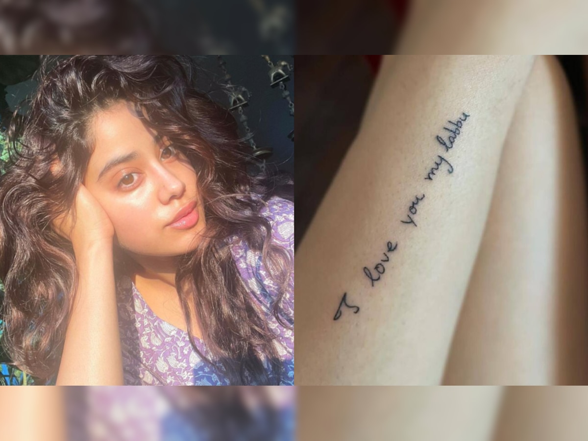
Janhvi’s best-known tattoo is the phrase “I love you my Labbu”, written in a delicate cursive style on her arm. The lettering comes from a note written by her late mother, actress Sridevi. Reports in 2021 identified Labbu as the affectionate name Sridevi used for Janhvi, which gives the short sentence a very specific emotional weight.
The tattoo doesn’t look like a polished lettering design pulled from a font catalogue. It keeps the loose, slightly uneven quality of real handwriting. The first capital letter, the spacing between the words, and the rising movement of the line all help it feel like a message rather than a decorative quote. That choice matters. If the point is to preserve one person’s voice, perfectly tidied-up lettering can sometimes make the result feel less personal.
The phrase is part of a longer note Sridevi wrote to Janhvi: “I love you my Labbu. You are the best baby in the world.” Janhvi had shared the handwritten message around her mother’s death anniversary before the tattoo appeared. Turning the first line into permanent ink creates a direct link between the old note and her adult life. It is not a vague memorial symbol. It is her mother’s actual way of speaking to her.
That makes the placement work too. The writing sits where Janhvi can see it herself, even when it is not being shown in a photo. Fine script on the forearm or wrist is easy to keep private under a sleeve, but it can also be turned outward for a close-up. It is a practical spot for a short sentence that the wearer may want to read more often than other people do.
What the tattoo looks like up close
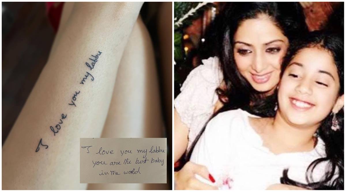
In close photos, the tattoo reads as a narrow line of dark cursive rather than a heavy block of lettering. The words travel along the arm with plenty of skin around them, so the design has room to breathe. That open spacing helps the handwriting stay readable and keeps the piece from looking crowded.
The visual character is soft but not overly delicate. It is still a real tattoo with a clear black outline, not a temporary pen mark. The letters have enough variation to show that they were based on handwriting, and the line sits naturally with the shape of the arm. If you like memorial tattoos but don’t want a portrait, this is a strong example of another route: preserve a sentence, signature, or phrase that belongs to the person you miss. The handwritten source is the design, not just background research.
There is a useful lesson here for anyone planning a handwriting tattoo. A photograph or scan of the original note is much safer than asking a tattoo artist to recreate the idea from memory. The small quirks are the point. Bring the original writing, decide which part can be shortened without losing its meaning, and talk with the artist about how large the lettering needs to be to age well.
The moment behind the tribute
Janhvi also shared a glimpse of the tattoo session itself. In the photo, she is masked and visibly flinching while the artist works. It is a quick, unglamorous moment, and that actually suits the tattoo better than a perfectly posed reveal would. The finished piece is sentimental, but getting it still involved the ordinary sting and awkwardness of sitting through a tattoo.
The session image also helps confirm that the writing was a fresh tattoo rather than a temporary mark used for a photoshoot. The close-up that followed shows the finished phrase, while the session photo shows the process. Taken together, the two views give a clearer picture of how the tribute moved from a private idea to permanent ink.
That combination is worth remembering when you are researching a celebrity tattoo. A single red-carpet photo may show the finished design but not the location, timing, or context. A session photo can fill in the gap, even if it isn’t a perfect tattoo reference. In Janhvi’s case, the two images support each other without changing the simple design of the piece.
The small evil-eye tattoo
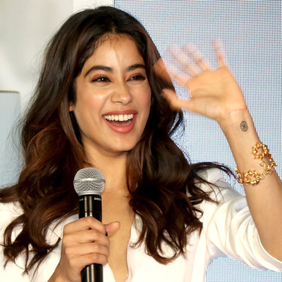
Janhvi’s other clearly reported tattoo is a small evil-eye symbol on the inner wrist. Vogue India described it as appearing to match a tattoo worn by her sister, Khushi Kapoor. The design is compact and graphic: an eye shape with a dark centre and a few clean rings around it.
Unlike the handwriting tribute, this tattoo is not built around a sentence. It works as a symbol. The evil eye has been used in many cultures as a protective motif, and its meaning can shift depending on the person wearing it. In Janhvi’s case, the reported connection to Khushi gives the small symbol a sibling angle. It can be read as a matching tattoo without needing to be identical in scale or placement.
The inner wrist is a natural location for a design like this. It is small enough to stay understated, but it becomes visible when the hand is lifted, a bracelet moves, or a camera catches the arm at the right angle. The placement also lets the symbol sit on its own instead of competing with the longer script piece elsewhere on the arm. It is a quiet matching idea rather than a loud set-piece.
From a design point of view, an evil eye is easy to adapt. You can keep it as a simple black outline, add colour, make it geometric, or soften it into fine linework. Janhvi’s version looks restrained, which keeps the focus on the symbol rather than on extra decoration. If you want a matching tattoo with a sibling or close friend, this is the sort of idea that can stay recognizable even when each person makes small changes.
Why these two pieces feel connected
On paper, the tattoos are very different. One is handwriting, the other is a symbol. One points directly to Sridevi, while the other has been linked to Khushi. Still, they share a quiet family theme. Both pieces are about closeness, and both are small enough to feel like something chosen for the wearer first.
That is probably why the collection feels more thoughtful than a random set of trendy designs. Janhvi hasn’t used one visual style to tie everything together. The connection comes from the reasons behind the tattoos. Script preserves a real voice. The evil eye marks a shared bond. The ink doesn’t need matching linework to belong to the same personal story.
There is a practical side to that approach as well. Personal tattoos do not have to be obvious to make sense. A phrase can be shortened. A shared symbol can be kept tiny. A design can sit somewhere that the wearer sees every day without turning into a public announcement. Those choices make the tattoos easier to live with, especially when the meaning is emotional.
What to borrow from Janhvi’s ideas

If you like Janhvi’s tattoos, the most useful thing to borrow is the level of specificity. “Family” is a broad tattoo idea. A line written by one particular family member is much more personal. “Protection” is a broad idea. A symbol chosen with a sibling, in a size and placement that feels natural to both of you, tells a more complete story.
For a handwriting tattoo, start with the real source. Use a letter, card, recipe, note, or signature that has already lived in the person’s hand. Ask the artist to preserve the features that make the writing recognizable. You can crop the message, but don’t smooth out every wobble. Those small imperfections are often what make the tattoo feel alive.
For a matching symbol, agree on the part that should stay consistent and leave the rest open. You might share the same icon but choose different sizes. You might use the same design on opposite wrists. You might keep the outline identical and let each person add one small detail. Matching tattoos are more comfortable when they leave room for both people to be themselves.
Placement deserves the same thought as the design. The wrist and inner forearm are visible, but they are also easy to cover. That balance can be helpful for a tattoo with a private meaning. Before booking, move your arm through normal daily positions and think about how the design will look when the skin bends. Tiny script and small symbols need enough space and contrast to stay legible as they age.
Final take
Janhvi Kapoor’s tattoos are not a giant catalogue of elaborate pieces. The documented designs are much simpler: a handwritten message from Sridevi and a small evil eye connected to Khushi. What makes them stand out is the thought behind them. The script keeps a mother’s voice close. The symbol turns a familiar protective motif into a sibling connection.
That is a good place to land if you are looking for celebrity tattoo inspiration. You don’t need to copy the exact words or symbol. Pay attention to the method. Start with something real, keep the design honest, and choose a placement that works for the way you live. A small tattoo can carry a lot when it comes from a specific memory rather than a passing trend.