
Matt Damon has never been the loudest tattooed celebrity in the room. He doesn’t have a full sleeve that shows up before he does, and he’s spent most of his career wearing clothes that keep his ink fairly easy to miss. That’s part of why the tattoos people do know about feel so personal. His right upper arm carries his wife’s nickname, the names of his four daughters, and a separate line attributed to his late friend Heath Ledger. They’re quiet pieces, mostly fine lettering and light linework, but they say a lot about how Damon uses tattoos: close to the body, close to family, and without much need for an audience.
What Damon’s collection actually includes
There’s a bit of confusion around celebrity tattoo lists because one visible design can get repeated across a dozen sites, sometimes with new details added along the way. Damon’s confirmed collection is more compact than the internet often makes it sound. The clearest reporting covers the right-bicep tribute he got in 2019: four daughter names written in cursive beside “Lucy,” the nickname he uses for his wife, Luciana Barroso.
A separate tattoo directory identifies a thin, squiggly line on Damon’s right arm as a tribute to Heath Ledger. That piece sits among sparse geometric marks and a circular eye-like design. The attribution is useful, but published reports don’t give us a long explanation from Damon about the exact shape or why he chose that particular line. So it’s better to call it what the sources support: a small Ledger tribute, not a design with a fully documented backstory.
There’s also recent talk around role-related ink. During coverage of The Odyssey, reports discussed Damon getting bicep tattoos while preparing to play Odysseus. Those images and comments belong to the film’s production conversation, and they shouldn’t automatically be treated as new permanent tattoos. Movie work can involve makeup, temporary pieces, or designs made for the character. The family names, Lucy, and the Ledger tribute are the safer starting point when you want to talk about Damon’s actual collection.
The family-name bicep tattoo
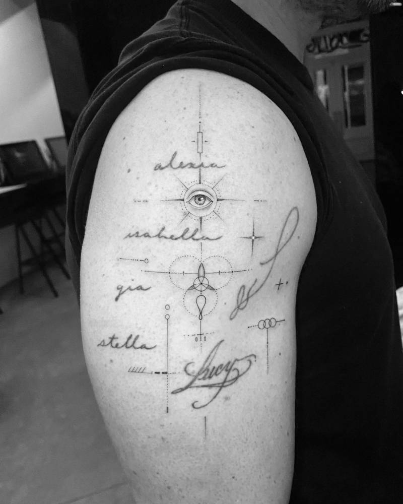
The most recognisable Matt Damon tattoo is the group of names running down his right upper arm. Alexia, Isabella, Gia, and Stella are written one under another in thin, loose cursive. The lettering doesn’t look like a formal plaque or a blocky memorial design. It feels closer to handwriting, which is exactly why the piece works. The names are legible without taking over the whole arm.
The placement is practical, too. The outer bicep gives the names enough room to breathe, while a T-shirt sleeve can cover most of the work when Damon wants it out of sight. That balance matters with script. Put four names too close together and the lines blur; spread them across a huge area and the design starts to feel like a roll call. Damon’s arm lands somewhere in between. Each name has its own line, and the group reads as one piece.
“Lucy” sits nearby in a larger, more sweeping signature. It gives the family tattoo a visual anchor and makes the relationship between the names clear without adding a lot of decoration. There are no dates, portraits, hearts, banners, or oversized symbols competing with the lettering. The arm is doing the talking.
Why the lettering still looks clean
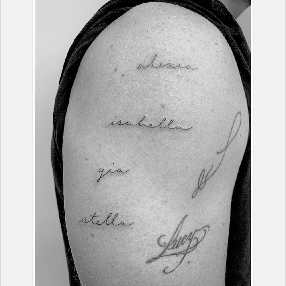
The work was done by Los Angeles artist Daniel Stone, better known professionally as Winter Stone. Coverage from the original 2019 reveal describes the names as cursive, and the photos show the kind of fine-line approach Winter Stone is known for. The strokes stay light, the spacing is open, and the names don’t all have to match perfectly to belong together.
That’s a useful detail if you’re studying the tattoo for design ideas. A family-name piece doesn’t need heavy shading to feel finished. In fact, too much weight would change the mood. The names are meant to stay readable and personal, not become a graphic panel. A steady hand matters more than a complicated layout.
It’s also worth paying attention to the way the lettering follows the arm. The lines don’t curve dramatically around the muscle, but they sit comfortably with the shape of the bicep. That keeps the words easy to read in a relaxed position and avoids the stretched look you can get when script is placed across a sharply moving joint.
The Lucy tattoo beside the names
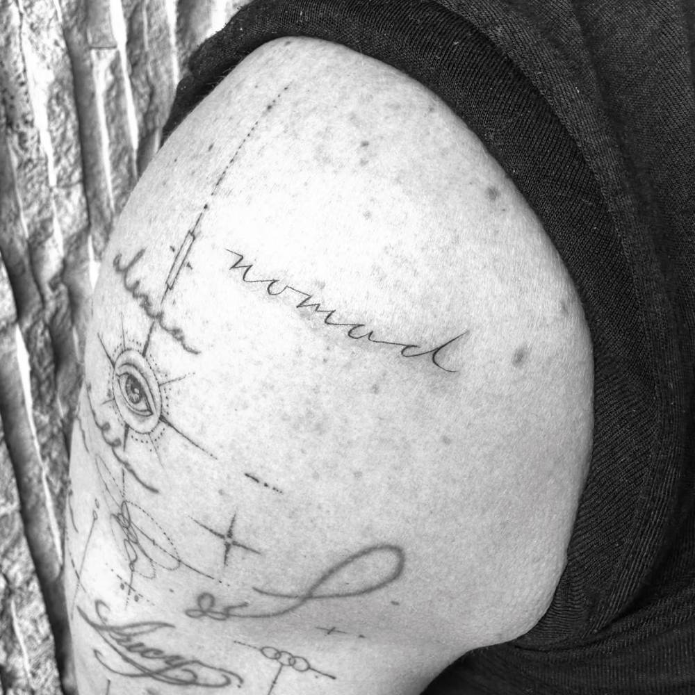
Before the four daughter names were added, Damon already had “Lucy” tattooed for Luciana. The newer lettering was placed next to it, so the arm became a small family map rather than a collection of unrelated words. That’s a smart way to build a tribute tattoo over time. The first piece doesn’t have to be redesigned when the story grows; new names can be added in a matching scale and the whole thing can settle into one composition.
The contrast between the names is part of the charm. “Lucy” is larger and more flowing, while Alexia, Isabella, Gia, and Stella are arranged in a neat vertical stack. It gives the arm a little movement without turning it into a busy sleeve. If you’re planning a similar tattoo, leaving room for future additions is one of the most useful choices you can make. Skin is easier to work with when the artist isn’t forced to squeeze a new word into an old gap.
The Heath Ledger arm tattoo tribute
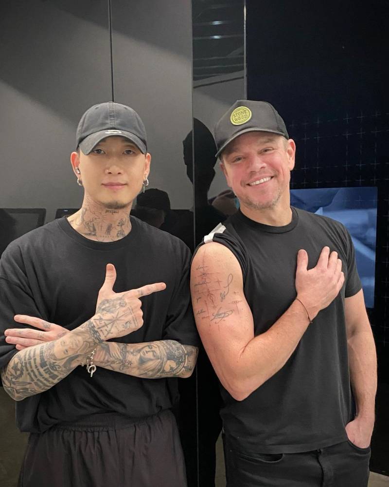
The other documented Damon design is much harder to spot. Tattoofilter describes a squiggly line on his right arm as a tribute to Heath Ledger. In the available close-up, it sits above a small circular eye motif and thin geometric marks. The line has an uneven, almost hand-drawn rhythm. It doesn’t look like a polished logo, and that looseness is probably why it feels more like a personal mark than a piece of public branding.
There’s no need to force a deeper meaning onto it. Tribute tattoos can be simple. A line, a symbol, or a small reference can hold a memory without spelling out the whole relationship for strangers. In Damon’s case, the source gives us the connection to Ledger but not a full explanation of the design. That’s where the honest description ends, and it’s better to leave it there than invent a story the wearer hasn’t told.
The placement also separates it from the family lettering. The names are easy to identify and read. The Ledger piece is quieter, tucked into a patch of linework that only really makes sense when you can see the arm up close. It feels like the kind of tattoo a person gets for himself first and the public second.
What the Odyssey reports do and don’t prove
Damon’s arms got extra attention in 2026 while he was promoting The Odyssey. The role called for a lean, muscular look, and coverage of his preparation mentioned bicep tattoos during production. That’s interesting context, especially because the ink would have been visible alongside the physical transformation, but it isn’t enough to add a new permanent design to his tattoo list.
That distinction matters with actors. A tattoo seen during filming may belong to a character, a temporary makeup setup, or a design used to make a period setting look believable. Damon’s real arm tattoos are documented in older reports and close-up photos. The role-related images are useful for understanding why his arms were in the news, but they shouldn’t be mixed into the permanent collection without a clear statement from Damon or the production team.
Why Damon keeps his collection low-key
Damon’s ink has a consistent feel even though the pieces don’t all come from the same moment. The names are small and readable. The Lucy signature is personal rather than decorative. The Ledger tribute is light and easy to miss. None of them needs a giant canvas to make its point.
That makes the collection a good reference if you like meaningful tattoos that can stay private. The right upper arm is visible when Damon chooses a short sleeve, but it’s also easy to cover for a premiere, a role, or a regular day. The fine-line approach keeps the designs from becoming visually heavy, and the limited palette lets the handwriting do most of the work.

If you’re borrowing the idea, borrow the planning more than the exact look. Think about how many names can fit comfortably, whether the writing will still be readable after it settles, and what happens if you want to add another person later. A good artist can help turn a list into a layout that follows your arm instead of sitting on top of it like a label.
Ideas worth stealing from Damon’s approach
The strongest idea here is simple: keep the design tied to the people it represents. Damon didn’t need a complicated emblem for each family member. He used names, a familiar nickname, and a consistent line weight. That leaves plenty of room for the pieces to age without losing their point.
For a tribute to a friend, the Ledger example shows another route. A small abstract mark can be enough when the meaning belongs to the person wearing it. You don’t have to explain every tattoo in the design itself. Sometimes a private reference will age better than a detailed portrait or a phrase that locks the story to one particular year.
And if a tattoo is connected to a film, photoshoot, or costume, check whether it’s permanent before treating it as part of the celebrity’s collection. Damon’s recent The Odyssey coverage is a good reminder that “seen on skin” and “permanent tattoo” aren’t always the same thing.
Matt Damon’s tattoos are easy to overlook until you see the close-ups. Then the pattern is pretty clear: family names in careful script, a wife’s nickname nearby, and a small tribute that doesn’t ask for attention. It’s a restrained collection, but there’s enough thought in the placement and lettering to make it useful reference material for anyone planning a personal arm tattoo.