
Robbie G.K. doesn’t seem to be chasing a huge, impossible-to-miss sleeve just yet. The newest piece fans noticed is much smaller: a guitar-pick tattoo on his upper thigh with the word “Koovy” inside it.
It’s a sweet little piece, and the photos make the whole thing feel more personal than performative. Robbie is lying on a tattoo table, laughing with the people around him, while the artist works on a design that looks like it was made for one particular person rather than a mood board. The available report describes the name as seemingly a tribute to a friend, but Robbie hasn’t given a longer explanation that would let us pin down the story behind it.
That’s part of what makes the Robbie G.K. tattoo interesting. It isn’t a giant reveal built around shock value. It’s a simple shape, a short name, and a placement that can stay private most of the time. If you like tattoos that carry a little meaning without announcing themselves across the room, this one is a good example.
The Koovy tattoo starts with a guitar pick
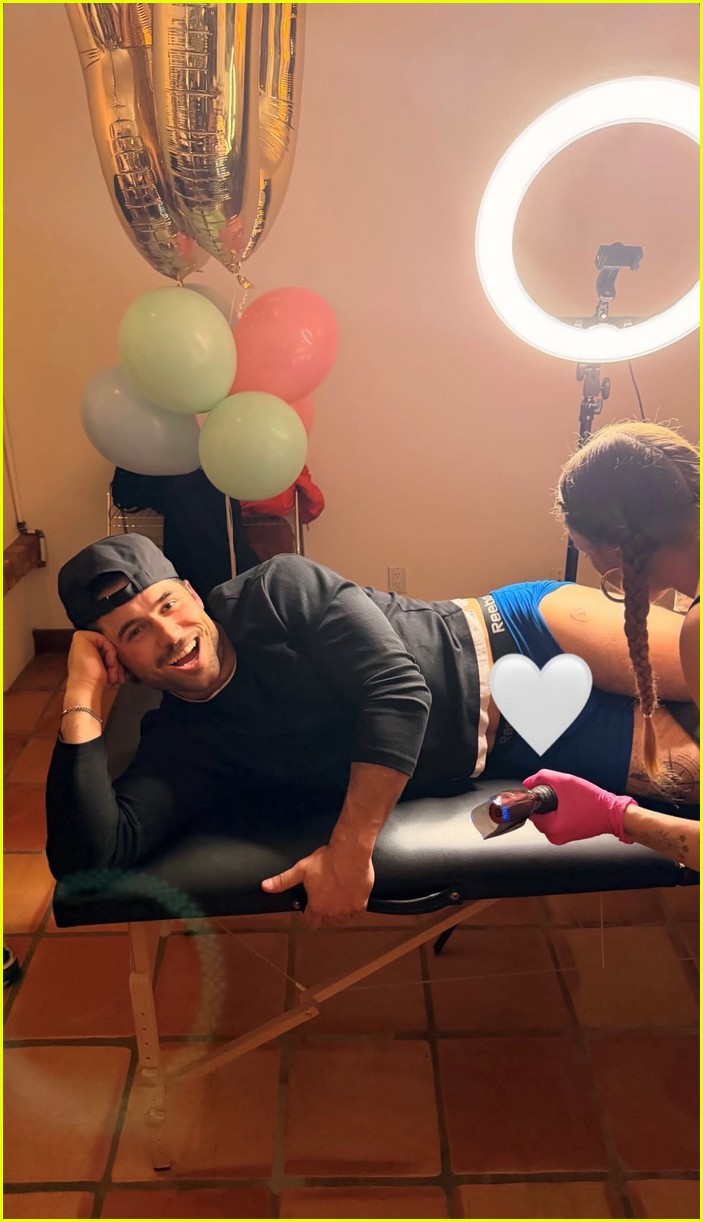
The basic design is easy to read. It’s a guitar pick outline with “Koovy” set inside it, placed high on Robbie’s thigh. The pick gives the lettering a clean boundary, so the word doesn’t float on the skin as a loose line of script. That little frame also gives the tattoo an obvious link to music, even though there’s no public explanation saying the piece is about a band, a song, or a particular musical memory.
That distinction matters. A lot of celebrity tattoo coverage jumps straight from a visible symbol to a confident backstory, but the only safe read here is the one supported by the photo and the report: Robbie got a new upper-thigh tattoo, the design says “Koovy,” and it appears to nod to someone close to him. Anything beyond that is guesswork.
Visually, the idea works because it’s compact. A guitar pick is already a familiar silhouette, and the lettering does the emotional work. You don’t need a lot of shading, extra stars, or a full scene around it. The shape gives the artist enough structure to make the word legible, while the small scale keeps the design casual.
A second angle keeps the design simple
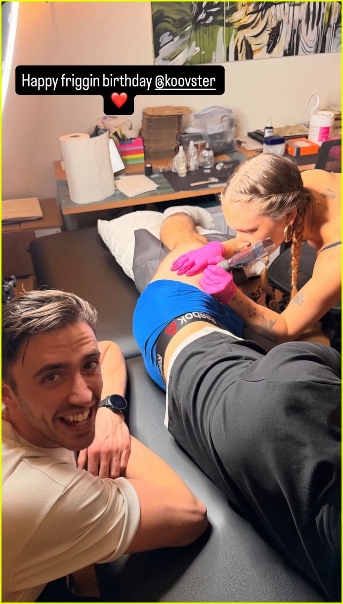
The second photo is useful because it changes the feel of the reveal. Instead of seeing only a finished mark, you get the room, the artist, the birthday message, and the people who seem to be part of the moment. The tattoo reads like something shared among friends. It doesn’t feel like a carefully staged red-carpet accessory.
The image also shows why a small tattoo can be harder to judge than a big one. The upper thigh is curved, the body is angled, and the design is photographed during an appointment rather than in a flat studio close-up. You can identify the pick and the lettering, but you shouldn’t pretend the picture proves every line of the finished tattoo. Skin stretches, the angle changes, and fresh work can look different once it settles.
That’s a useful point if you’re thinking about copying the idea. A small framed word tattoo needs room to breathe. If the pick is drawn too narrowly or the letters are packed together, the design can turn into a dark little blob over time. Robbie’s version looks deliberately open, with the outline doing enough work that the lettering doesn’t have to be oversized.
A quieter part of the story
Placement changes the whole personality of a tattoo. Put the same guitar pick on a forearm and it becomes part of your daily outfit. Put it on a finger and everybody sees it immediately. Put it high on the thigh and the piece can stay connected to you without becoming public property.
That feels right for a name or nickname. The word “Koovy” looks like it has a specific audience, and the placement keeps that audience small. Robbie can show it when he wants to, but a normal shirt-and-trousers look won’t turn the tattoo into a conversation starter every time he walks into a room.
There’s also enough space on the upper thigh for a small design to remain readable. It’s a relatively broad area compared with a finger, wrist, or ankle, so the artist can keep a clean outline without forcing the letters into a tiny strip. The placement gives the tattoo a little privacy while still leaving room for the pick shape to look intentional.
The reveal lands in a much bigger public moment
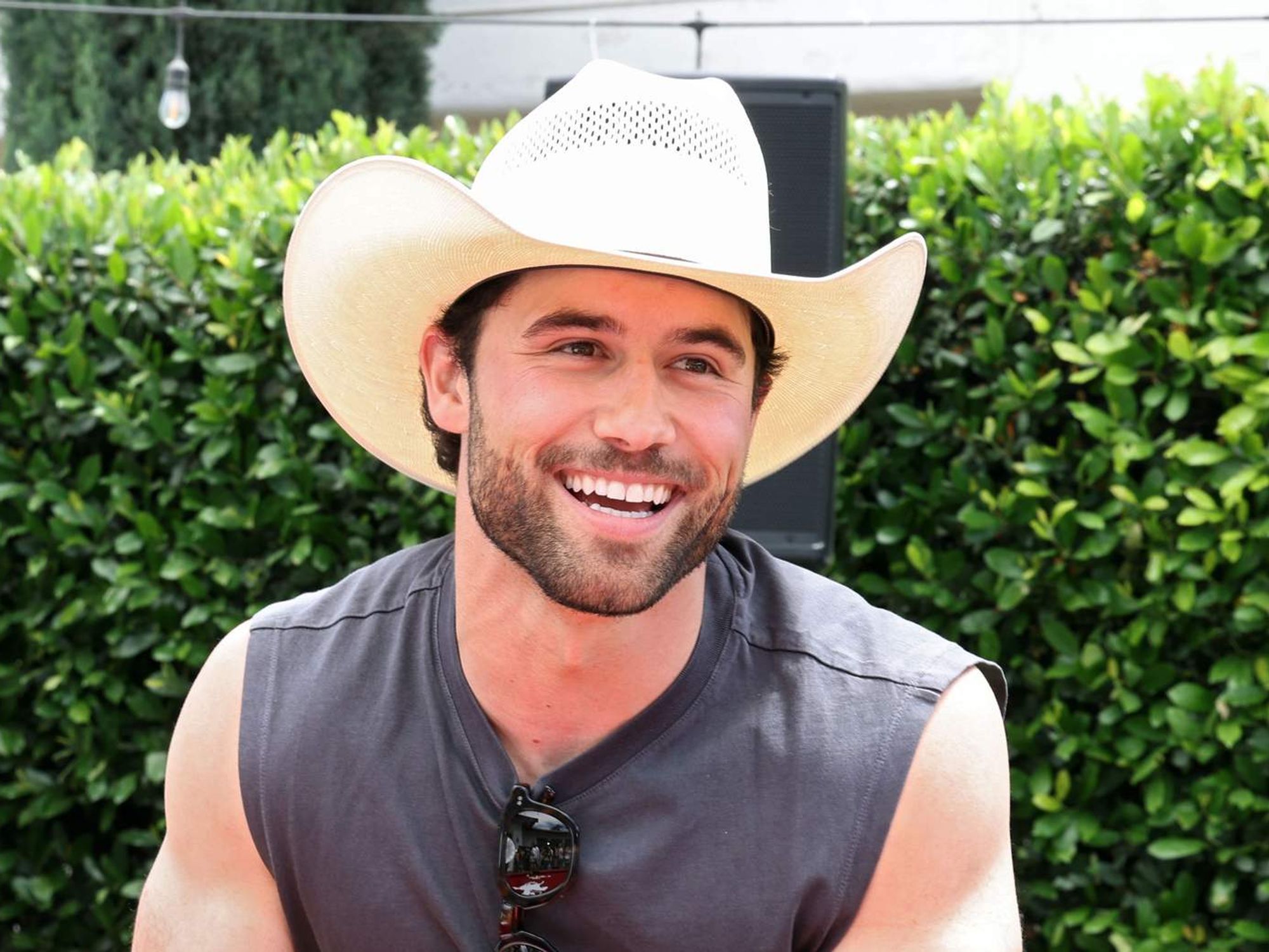
Robbie has had a busy stretch of public appearances since Heated Rivalry put him in front of a much wider audience. The new tattoo showed up in a very different kind of image: not a red carpet, not a formal portrait, and not a magazine cover. It appeared in a casual tattoo-session set, with Robbie on the table and the mood looking loose and celebratory.
That contrast is worth keeping in mind. Public images tend to flatten people into one clean version of themselves. A polished event portrait gives you the actor in a suit. A scene from a show gives you the character. A tattoo appointment gives you a glimpse of the person who is willing to sit still while someone permanently writes a name into their skin.
In Robbie’s case, the design is especially low-key compared with the kind of huge body-art reveal that usually gets attention online. There’s no dramatic blackout work or full back piece to decode. It’s a small symbol that probably matters because of who “Koovy” is, not because the design needs to impress strangers.
His public style is polished, but the new piece is personal
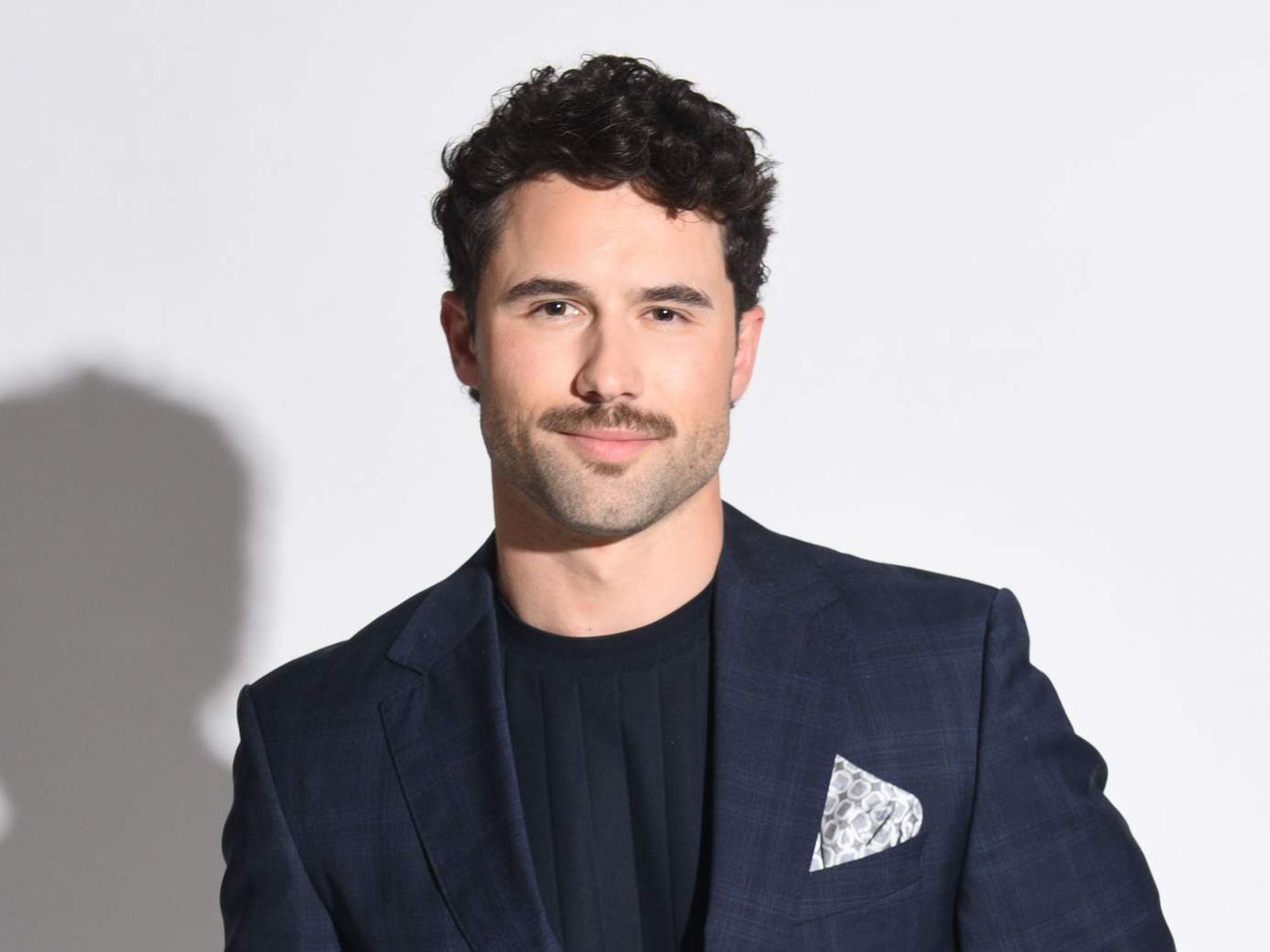
Robbie’s recent photo coverage has moved between fashion, entertainment, and fan-focused portraiture. That range makes the small tattoo feel like a nice counterpoint. He can show up in a fitted suit, a campaign look, or a playful shoot, then keep a tiny piece of private meaning tucked under everyday clothes.
It’s easy to overthink tattoos on public figures because every visible detail gets treated like a clue. Sometimes the design is just a design. Sometimes the meaning is obvious only to the people who were there. A nickname inside a guitar pick is exactly the kind of thing that may be more important to Robbie and his friend than it is to anyone trying to build a theory from a photo.
For tattoo inspiration, the lesson is pretty practical: you don’t need to explain everything with the artwork itself. If a name matters, the name can be enough. The frame can come from something connected to the person, like a guitar pick, a playing card, a matchbook, or a small object they’re known to carry. That gives the tattoo visual shape without covering up the personal part.
The placement is easy to keep private
The upper thigh is one of those placements that can shift between private and visible depending on the person’s clothes. Shorts can show it. Swimwear can show it. A long trouser leg can hide it completely. That flexibility is useful when the tattoo is tied to a relationship, friendship, or memory that doesn’t need to be on display all day.
It’s also a comfortable place for a design with lettering because there’s more room to work than there is on the ribs or the side of a finger. A tattoo artist can think about how the pick sits with the curve of the leg instead of squeezing the whole thing into a narrow patch of skin.
If you’re considering a similar piece, bring the artist a few references for the object and a real sample of the lettering you want. A nickname can look completely different in a heavy typeface, loose handwriting, or simple block letters. The guitar-pick idea is flexible, but the word inside it is the part you’ll be living with. It needs to be readable at the size you actually want, not just at phone-screen size.
What we can and can’t say about “Koovy”
The available coverage says the tattoo is seemingly a tribute to a friend. That’s the sensible place to stop. “Koovy” may be a nickname, a private joke, or a reference to somebody who has nothing to do with Robbie’s work. The images include a birthday message and a social handle, which gives the moment a friendly feel, but they don’t spell out the full relationship.
That uncertainty doesn’t make the tattoo less interesting. In fact, it makes it more relatable. Most people don’t get a tattoo because they want every stranger to understand it. They get it because one person, one memory, or one phrase matters enough to keep close. The audience may only see a guitar pick and a name. The wearer gets the rest of the story.
It’s also a reminder to be careful with celebrity tattoo reporting. A clear photo can tell us the placement and the broad design. It can’t automatically tell us the emotional meaning. Unless Robbie explains more, “a small guitar-pick tattoo that appears to honor a friend” is a better description than a dramatic claim about exactly who the design is for.
How to borrow the idea without copying it
The strongest part of the design is the combination of an object and a word. You can build something similar around your own memory without using the same pick or lettering. Think about the object that naturally belongs with the person you’re honoring: a recipe card, a bus ticket, a chess piece, a tiny camera, or a single flower.
Keep the object simple enough to survive at the size you want. Fine lines can look great when they have enough breathing room, but a small design still needs a clear silhouette. Ask your artist to show you the stencil at its actual size and look at it from a normal distance. If you have to squint to read the word, it probably needs more space or a cleaner font.
Placement comes next. The upper thigh works for a private tribute, but it isn’t the only option. The inner arm is easier to see, the ribs feel more hidden, and the shoulder gives a small object a little more room. Decide whether the tattoo is meant to be shared, tucked away, or able to do both before you settle on the final spot.
And give the name some time. A nickname can feel perfect when it’s connected to a fresh moment, but tattoos last longer than the moment around them. That doesn’t mean every tribute needs to be formal or serious. It just means you should know why the word matters to you before the stencil goes on.
Keep the idea small
Robbie G.K.’s newest tattoo is small, readable, and personal: a guitar pick with “Koovy” on his upper thigh. The design doesn’t need a lot of decoration because the name carries the weight. The placement keeps it flexible, and the session photos show a relaxed moment rather than a staged attempt to make the tattoo look bigger than it is.
For anyone collecting ideas, it’s a good reminder that meaningful ink can stay simple. Start with one object, one word, and one placement that feels right for the relationship behind it. Let the artist make the lines work at the size you choose, and don’t fill the space just because you can.
Robbie may eventually explain more about who “Koovy” is or why the guitar-pick shape matters. For now, the photo tells us enough: it’s a compact tribute, it was made in a friendly room, and it looks like the kind of tattoo that means more to the person wearing it than it needs to mean to everybody else.