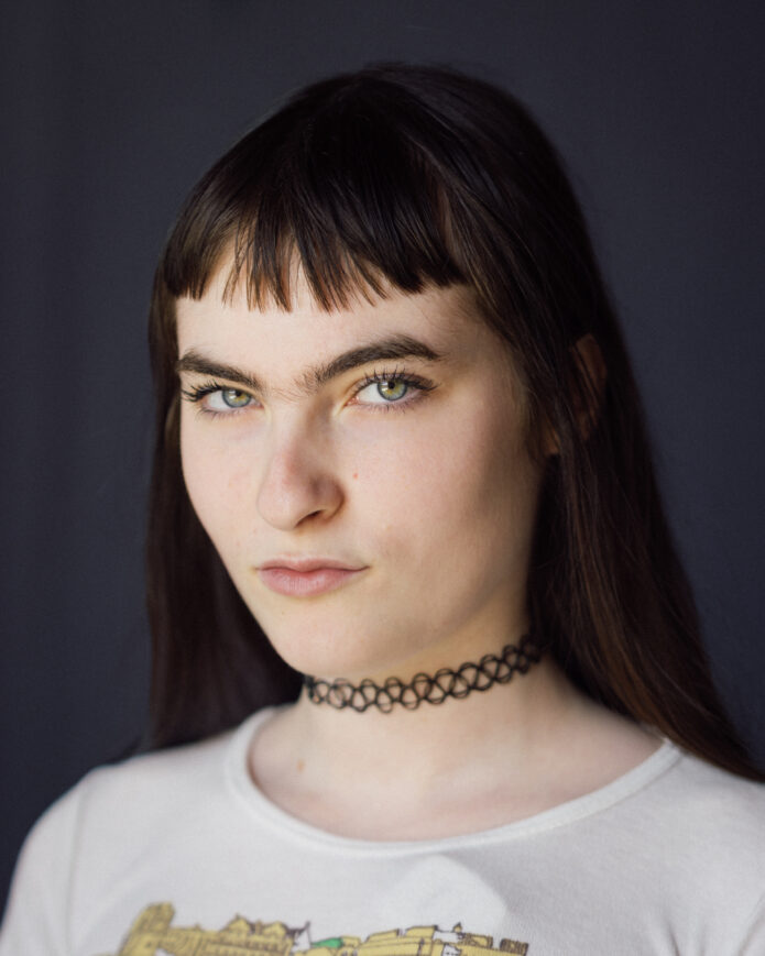
Ivy Wolk’s tattoos fit the rest of her public style: a little theatrical, a little funny, and more personal than they first look. The actor and comedian has a star-and-script piece across her upper back, a portrait of Courtney Love on her arm, and a handful of smaller marks that show up in the relaxed photos around those bigger designs.
There’s no giant catalogue to pretend we know by heart here. The clearest details come from a 2026 profile and its photo essay, so this is a look at the pieces that can actually be identified. The useful part isn’t guessing at every bit of ink in a wide shot. It’s seeing how Wolk uses placement, scale, and a few strong images to build a collection that feels tied to her taste.
Ivy Wolk’s Hollywood Forever back tattoo
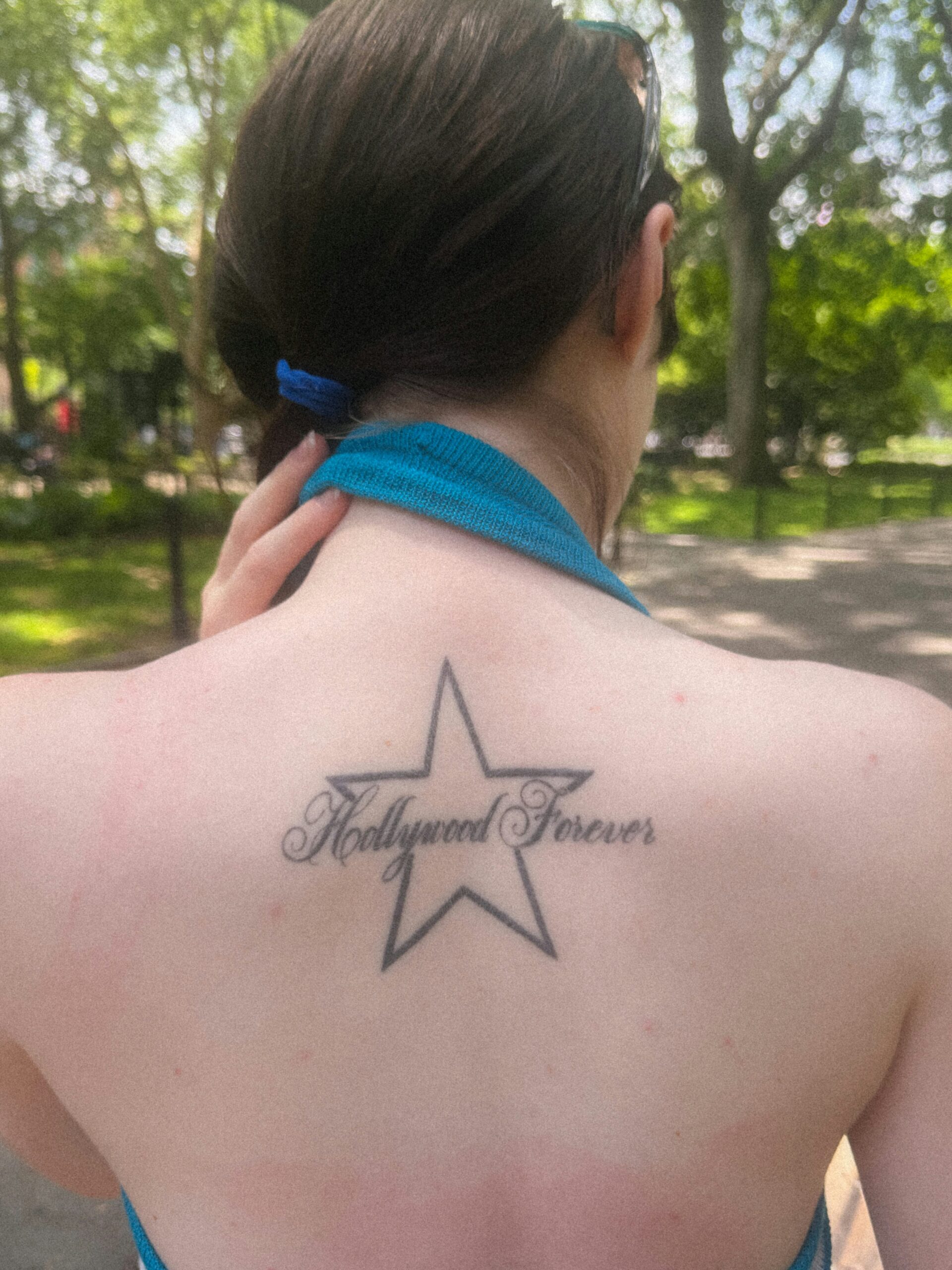
The easiest piece to recognize is the tattoo across Ivy Wolk’s upper back. It’s a large, black outlined five-point star with the words Hollywood Forever running through the middle in a loose, old-school script. The star gives the tattoo a clean shape from a distance, while the lettering makes it feel specific instead of generic.
The placement is doing a lot of work. The design sits high enough to appear when a top drops off the shoulders, but it can disappear completely under an ordinary shirt. That gives Wolk plenty of control over when the tattoo becomes part of her look. It isn’t trying to cover the whole back. It’s more like a sign or emblem placed where the body naturally frames it.
The best part of the design is how much it says without filling the whole back.
Visually, the piece has a slightly faded, lived-in quality. The star is bold, but the script is softer and more decorative. That contrast keeps the design from feeling like a logo. It has the look of a personal reference that happens to photograph well, rather than a tattoo chosen only for maximum impact.
If you like the idea, borrow the structure rather than copying the words. A simple shape can hold a short phrase, a place name, or a line that means something to you. The important decision is the relationship between the outer symbol and the lettering. Give both parts enough room to breathe, especially if you’re using a script font with loops and long flourishes.
How Wolk keeps the composition open
A star is one of those tattoo motifs that can go in almost any direction. It can be tiny and delicate, heavy and traditional, or part of a bigger celestial design. Wolk’s version lands somewhere in the middle. The outline is uncomplicated, but the size gives it presence. The words soften the shape and make the piece feel more like a memory than a flash-sheet symbol.
There’s also a nice balance between the open skin inside the star and the darker lines of the script. That balance matters on the upper back, where a design can start to look flat if every part is filled with the same weight. Keeping the center relatively open lets the phrase remain readable while the star holds the composition together.
For a custom version, think about how the design will look when your shoulders move. Back tattoos can stretch or compress depending on posture, and lettering that looks perfect on a flat stencil can feel cramped once the body is relaxed. An artist should size the phrase for the actual space, not for a screenshot or a page of lettering references.
The Courtney Love portrait on her arm
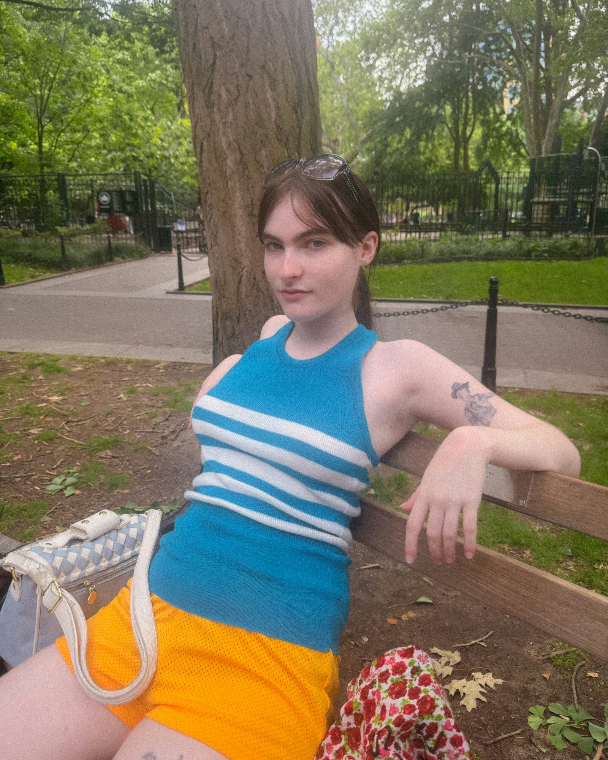
Wolk’s other especially memorable piece is a portrait of Courtney Love on her arm. In the park photograph, the tattoo appears as a black-and-gray face inside a compact upper-arm design. It’s not a huge realism sleeve. The portrait sits in a smaller area, which makes the reference feel intimate instead of turning the arm into a full celebrity shrine.
The choice makes sense when you know a little about Wolk’s taste. Her public work and interviews circle around women who are polarizing, funny, messy, and impossible to ignore. Love fits that orbit. The tattoo reads less like a random musician portrait and more like a marker for an influence that has stayed with her.
It’s a fan tattoo, but it doesn’t feel like merch.
Portrait tattoos are hard to get right at small sizes. Tiny changes in the eyes, mouth, or hair can change the likeness. That’s why a clear reference matters, and why the artist needs to decide which features will survive as the ink ages. Wolk’s piece is compact enough to stay wearable, but it still has a recognizable face rather than a vague outline.
Anyone thinking about a portrait should be honest about scale. If the design needs a lot of shading to look like the person, it probably needs more room than you first expect. A smaller portrait can work when it uses a strong expression, a distinctive hairstyle, or a simplified black-and-gray approach. The goal isn’t to squeeze a full photograph into the skin. It’s to keep the face readable.
A relaxed photo shows her everyday style
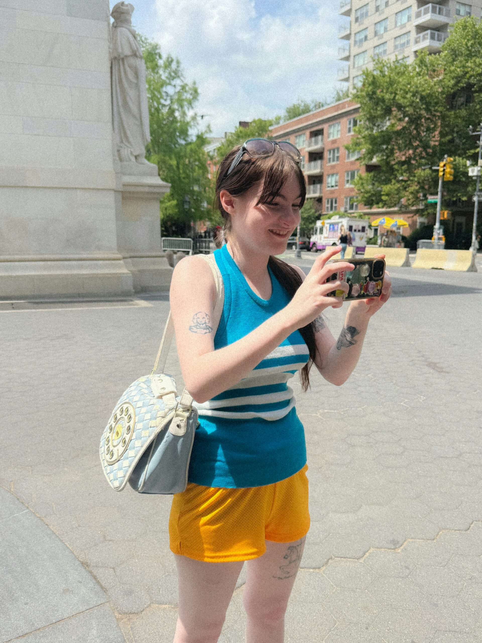
This separate street photo gives a wider sense of Wolk’s arm tattoos. She’s holding her phone and wearing a bright blue-and-white top, with ink visible on both arms. The image isn’t a clean catalogue of designs, so it shouldn’t be used to name every mark. It is useful as context, though: the tattoos are part of her everyday silhouette, not something that only appears in a carefully staged reveal.
That difference is easy to miss with celebrity tattoo coverage. A close-up can make one design feel like the person’s whole identity. A casual photo shows how the pieces actually live together. Some marks are bold enough to catch the eye. Others fade into the movement of a hand or the edge of a sleeve. That mix makes the collection feel more believable.
The arm is also a practical place for a collection that grows over time. There’s room to work around an existing portrait, and smaller pieces can be added without forcing everything into one matching style. The result doesn’t have to look like a single planned sleeve. It can feel more like a stack of references gathered at different moments.
Variety is the point, not a mistake to be edited out.
New York is part of the visual mood
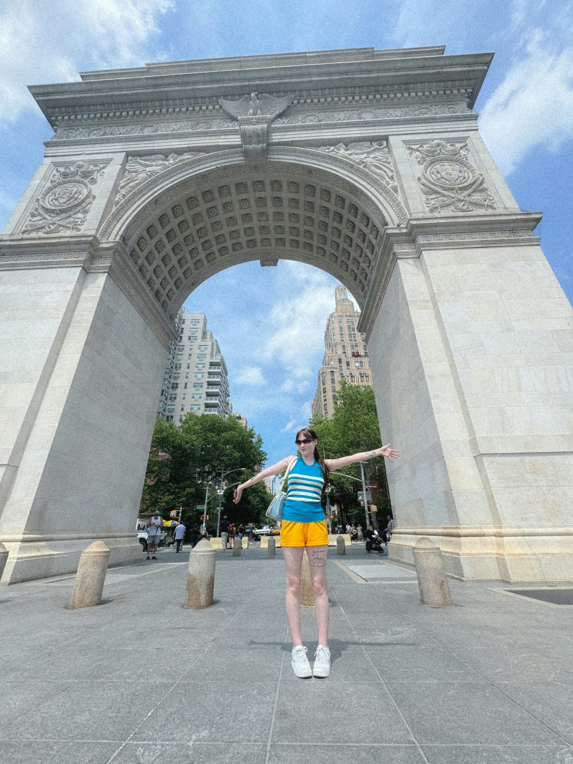
Wolk’s photo essay was shot around New York, and the setting adds a lot to the way her tattoos read. In this wide image, she stands beneath Washington Square Arch in the same bright, sporty outfit that appears in the closer photos. The tattoo details aren’t the point of this frame. It’s a contextual image, not evidence for a particular design.
Still, the setting helps explain why the collection feels less polished than a traditional red-carpet tattoo gallery. Wolk’s style moves between downtown comedy, internet culture, acting, and personal references. Her tattoos sit inside that mix. They don’t need to coordinate perfectly with one outfit or one career lane.
That’s a useful lesson if you’re collecting inspiration. A tattoo can look completely different under stage lighting, at a premiere, or in a photo taken while you’re walking through a park. Rather than chasing one fixed aesthetic, it can be smarter to choose pieces that each feel right on their own. The common thread can be your taste, not a matching set of symbols.
The smaller marks are harder to identify

This close photo focuses on Wolk’s bag and hands. A few bits of ink appear near the edge of the frame, but the image doesn’t give enough information to name them confidently. They’re best treated as background details, not as proof of another specific tattoo. That restraint matters because small tattoos are easy to misread when a photo is cropped, soft, or partly covered.
It’s tempting to turn every visible line into a story. Maybe it’s a word, maybe it’s a symbol, maybe it’s just part of the image texture. Without a source describing the design, there’s no reason to make the claim. The strongest articles leave room for uncertainty instead of filling every blank with a dramatic meaning.
What we can say is that Wolk’s visible ink has variety. The back piece is graphic and legible. The Courtney Love portrait is more specific and referential. The smaller marks appear to be scattered around the arms and hands. That combination gives her plenty of visual range without requiring every tattoo to belong to the same style family.
What the collection says about influence
The Courtney Love tattoo is the clearest clue to how Wolk uses body art. It isn’t just a decorative portrait. It points toward a person whose work and public image have mattered to her. The Hollywood Forever tattoo adds a different kind of reference, one tied to place, performance, and the mythology of Los Angeles.
Together, the pieces feel like a map of influences rather than a mood board assembled for one photoshoot. One tattoo names a place. Another names a person through their face. That’s a strong way to build a collection because the designs can stay meaningful even if your clothing, hair, or job changes.
You don’t need to tattoo a famous person’s face to use the same idea. A portrait could become a small object, lyric, book title, or image associated with someone who changed your life. A place reference could be a street sign, a building outline, or a phrase only people from that place would recognize. The trick is to make the reference specific enough that it still feels like yours.
Borrowing the same easygoing attitude
Start with the placement you actually want to live with. If you like the back star, decide whether you want a design that appears only with open-back clothing or one that stays visible most days. If you like the arm portrait, think about whether you’ll be comfortable explaining the reference over and over. A good tattoo can be personal without being a conversation starter every time you leave the house.
Placement changes the whole conversation.
Next, be realistic about detail. The Hollywood Forever script needs enough space for the letters to stay separate as the tattoo ages. The portrait needs enough room for the face to read. Small tattoos can be great, but small does not mean infinitely detailed. A clean design with a little extra breathing room will usually age better than a tiny illustration packed with lines.
It also helps to show an artist the tattoo’s placement, not just a cropped image. A back design should be redrawn for your shoulder width. An arm portrait should account for how the skin turns when you bend your elbow. The best reference is a starting point, not a stencil to trace.
The short version
The clearest pieces are easy to sum up: a five-point star with Hollywood Forever script across the upper back, and a Courtney Love portrait on the arm. Around them are smaller and less clearly documented marks that show up in relaxed photographs. The collection feels varied because it’s built around references and placement, not one rigid tattoo style.
What stands out most is how naturally the pieces fit the person. Wolk’s tattoos don’t read like a brand package. They look like bits of influence, memory, and taste that have found a place on her body. That’s probably the best part to borrow. Choose images and words that still mean something when the trend around them has moved on, then let the rest of the collection grow at its own pace.