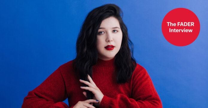
The first thing that jumps out in the clearest photos is how naturally the ink sits on the body. Nothing feels pasted on for a single shoot. The lines follow the arms, the neck, the hands, and the open spaces between them. It looks like a collection built over time, with each new piece adding another little change in texture instead of turning everything into one heavy block.
That matters because celebrity tattoo coverage can get sloppy fast. A styled album image might use body paint, eyeliner, or temporary lettering, and a dramatic portrait can make one design look like three. The famous chest lettering tied to Forever Is a Feeling belongs in that category: it was drawn on for the artwork, so it shouldn’t be presented as permanent ink. The real tattoos are easier to appreciate when the photo actually shows the skin, the placement, and the linework.
Here’s the useful part: the visible collection has a relaxed black-and-grey feel, a mix of botanical shapes and figurative details, and enough breathing room to keep the arms readable. There are flowers, snakes, roots, eyes, small marks on the fingers, and other motifs that show up differently depending on the pose. Not every design has a public explanation, and that’s fine. A tattoo can be personal without coming with a caption.
Lucy Dacus’s floral hand and forearm tattoo
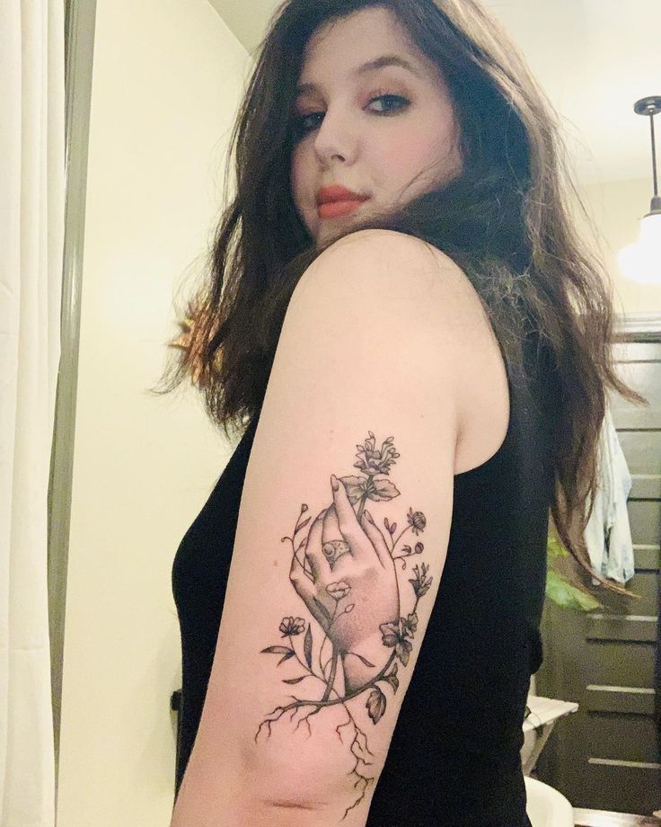
The floral hand and forearm piece is the easiest design to study up close. It shows a hand surrounded by flowers, leaves, thin stems, and roots that travel down the arm. The composition has a nice push and pull: the hand gives the eye a clear focal point, while the plants keep the shape moving outward. It feels illustrative without becoming fussy.
The roots are especially helpful. They stop the flowers from floating like separate stickers and give the whole tattoo a visual base. That kind of connection is useful when you’re planning a larger arm piece. The artist can use stems, branches, or a little shading to link separate ideas without forcing them into one literal scene.
There’s also a lot of skin left visible around the lines. That keeps the flowers crisp and lets the design age with some room around it. If you like the look but don’t want a dense sleeve, this is a good direction to bring to a tattooer: a central image, a few natural elements, and enough open space that the arm still looks like skin rather than a solid panel.
The close-up is also a reminder to think about scale. Tiny petals can look beautiful on a phone screen, but the artist needs enough room for the details to stay clean. The hand itself is a strong anchor because it can be read quickly, while the surrounding plants soften the edges. It’s a smart balance between recognisable imagery and loose, organic movement.
The full floral and snake tattoo collection
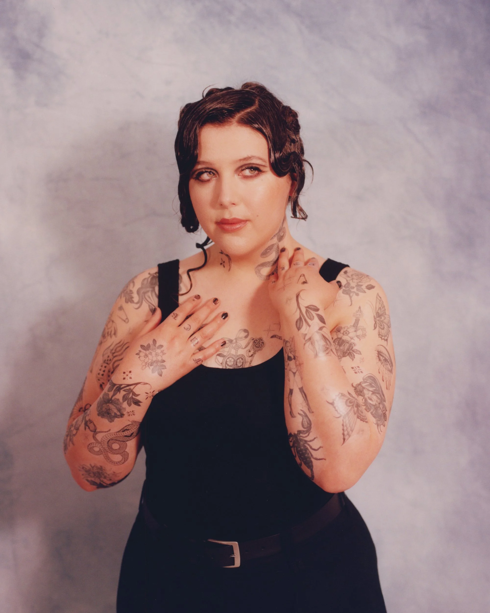
A wider studio frame makes the collection feel much more connected. Both arms carry several separate pieces, and the neck snake gives the upper half of the composition a small, dark turn. The flowers repeat without becoming identical. One bloom might be fuller, another lighter, and the surrounding leaves shift depending on the body part they’re filling.
The arms don’t read like perfectly matched sleeves. They feel more like two related notebooks. One side may carry a heavier snake or a darker cluster, while the other has lighter flowers and smaller symbols. That unevenness is what makes the collection look personal. It leaves room for memories, spur-of-the-moment designs, and future work that doesn’t have to obey a strict theme.
Look closely at the way the black and grey values change. Some tattoos have a soft wash, some use more defined outlines, and some small marks are so light that they disappear when the arm turns. That variation keeps the collection from looking flat. It also shows why copying a celebrity’s exact design is usually less useful than borrowing the approach. Your artist can build a similar sense of rhythm around your own anatomy.
The hand tattoos help the composition feel finished near the top of the arms. Small finger marks can easily look scattered, but here they act like punctuation. They give the eye a place to land when the larger floral pieces start to blur together. If you’re collecting small tattoos, placement can do a lot of the organising for you.
Lucy Dacus’s snake and eye tattoos
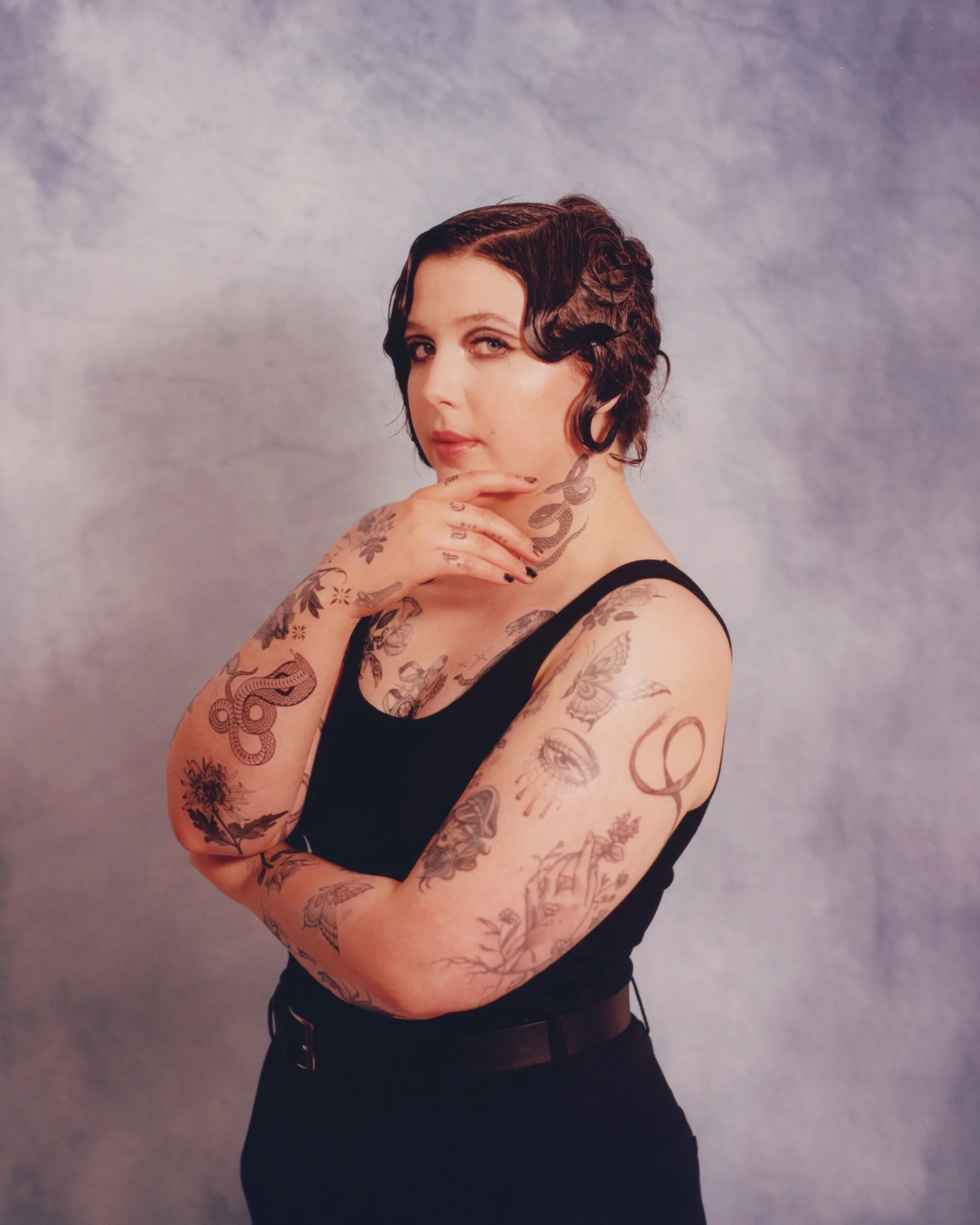
The three-quarter view is the clearest look at the snake and eye motifs. A snake curves along the neck, and another coiled form sits on the forearm. The eye design on the upper arm is more delicate, with fine lines that make it feel separate from the heavier snake. These pieces give the collection a little tension beside all the flowers and leaves.
Snakes are useful tattoo shapes because they can follow a body instead of sitting inside a stiff rectangle. A neck design can curve with the throat, while a forearm snake can wrap or coil around the natural line of the muscle. That movement is visible here. The motifs don’t need to be explained as a single symbol; they work first as shapes that fit the places where they were put.
The eye brings a different kind of focus. It’s round, central, and instantly recognisable, so it creates a pause among the longer botanical lines. If you’re planning a patchwork arm, one compact image like that can keep the collection from feeling like a field of repeating leaves. The trick is to let it have space rather than crowding it with another large focal point.
The photo also shows why a tattoo can look completely different when the arm changes angle. A design on the outer arm may be obvious in a front-facing pose and partly disappear when the elbow turns. That isn’t a problem. It’s part of designing for a moving body. A good tattoo has a best angle, but it shouldn’t need to be held perfectly still to make sense.
How the tattoos work together across both arms
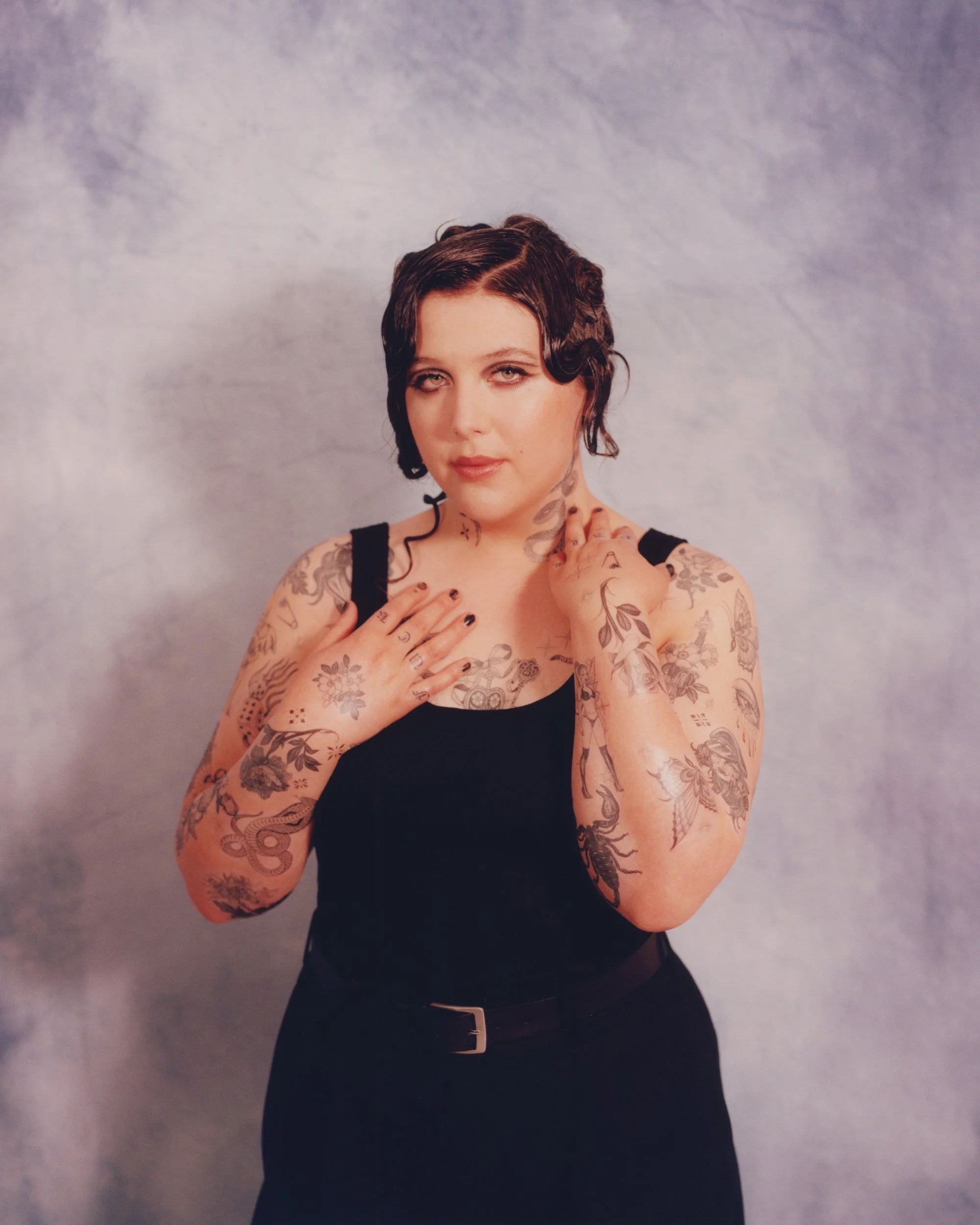
The centred portrait is useful for comparing the two arms at once. You can see flowers, snakes, eyes, leaves, hand marks, and darker shaded pieces sharing the same frame. The work doesn’t rely on one colour to tie it all together. The common thread is the line quality and the way the designs leave small gaps between one another.
That spacing is doing more work than it might seem. When every gap is filled, separate tattoos can merge into visual noise. Here, the open skin gives each piece a border. It also makes the lighter designs visible next to the bolder ones. Negative space is part of the collection, not leftover space.
There’s a practical side to this approach. A person who starts with one tattoo doesn’t have to know exactly what the whole arm will look like ten years later. Smaller pieces can be added when they make sense, and the composition can grow without requiring one massive appointment. If the style stays in the same neighbourhood, the result can feel intentional even when the tattoos were done at different times.
For a tattoo appointment, bring references for the mood rather than a screenshot to trace. Talk about whether you want soft shading, crisp outlines, botanical filler, or a little oddness beside the pretty elements. Then ask the artist to draw something that follows your arm. The collection here looks good partly because it belongs to a particular body, not because the individual motifs are impossible to find elsewhere.
The animal and architectural arm tattoos
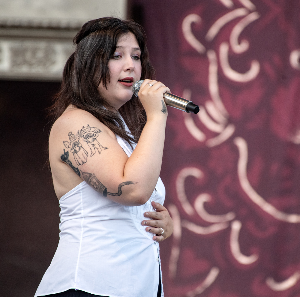
The live-performance photo gives the tattoos a different kind of honesty. The lighting is less controlled, the pose is active, and the white top leaves one upper arm exposed. In that setting, an animal-and-architectural design becomes easier to pick out. There’s also darker linework lower on the arm, which gives the visible section more weight than the softer studio portraits suggest.
Concert photos are useful because they show how ink behaves in everyday movement. The tattoo isn’t arranged for a perfect reveal. The shoulder turns, the arm bends, and the microphone gets in the way. Even so, the larger shapes keep their identity. That’s a good sign for anyone thinking about a design that needs to work while walking, playing an instrument, or reaching across a table.
Animal imagery can bring a little narrative energy to a floral collection. Flowers and leaves tend to flow; an animal or building gives the eye a firmer shape to hold on to. The architectural elements do something similar. They add angles and structure beside the curves of stems and snakes. That contrast is what keeps the arm from feeling too sweet.
The live view also shows how tattoo colour and contrast change outside a studio. Soft grey can fade into stage shadow, while a darker outline remains readable. If you’re choosing a design for a spot that will mostly be seen in daylight, ask your artist how much contrast it needs to hold up across different lighting. A tattoo that looks airy in a bright appointment room may need stronger edges to survive real life.
Why the collection feels balanced
The big lesson is restraint. There are lots of details, but the arms don’t feel like they’re competing for attention. Some designs are large, some are small, and some are only clear when the camera is close. That mix gives the collection a lived-in quality. It suggests a person who keeps finding images she likes rather than someone who planned an entire sleeve in one sitting.
Patchwork tattoos work best when the empty space is planned as carefully as the ink. You don’t need every piece to touch. In fact, a little separation can make a floral design, a snake, or a symbol easier to read. The collection also shows the value of repeating a few visual ideas without copying them exactly. Leaves can appear in different shapes, and fine black linework can connect pieces that don’t share a literal subject.
There’s no need to assign a secret meaning to every visible mark. Some tattoos clearly come with a story, especially when the owner has talked about them. Others are simply part of a visual language. Describing what the photo confirms is more respectful and more useful than filling gaps with fan theories. If you love a specific design, use it as a starting point and make the final piece yours.
Ideas to borrow without copying the exact ink
Start with the part of the collection that feels most like you. If that’s the floral hand, think about a central figure surrounded by plants that mean something in your life. If it’s the snake, consider how a long shape could follow your neck, calf, or forearm. If the eye and architectural forms catch your attention, use that contrast to give a softer patchwork sleeve a little structure.
Choose an artist whose healed work matches the feeling you want. A delicate floral tattoo needs a different hand from a heavy black-and-grey piece, even if both look good online. Bring the artist a small group of references, explain what you like about each one, and let them draw around your body. The best celebrity-inspired tattoo is usually the one that stops looking like a celebrity reference once it’s finished.
Think about future space, too. Fingers, hands, neck, and outer arms are visible choices, and they can affect work, clothing, and how later tattoos fit around them. None of that makes them bad placements. It just means they deserve a little more thought. The public photos here make the collection look effortless, but effortless-looking patchwork usually comes from years of making small decisions.
The overall feel is warm, strange, botanical, and a little gothic without becoming a costume. That’s why the collection has so many good reference points. You can borrow the linework, the balance of soft flowers with sharper imagery, or the way separate tattoos share one mood. You don’t need to reproduce every snake or leaf to get the same sense of a personal archive written across the skin.
For a final visual reference, here’s an official music video that gives a little more context for the artist behind the collection.