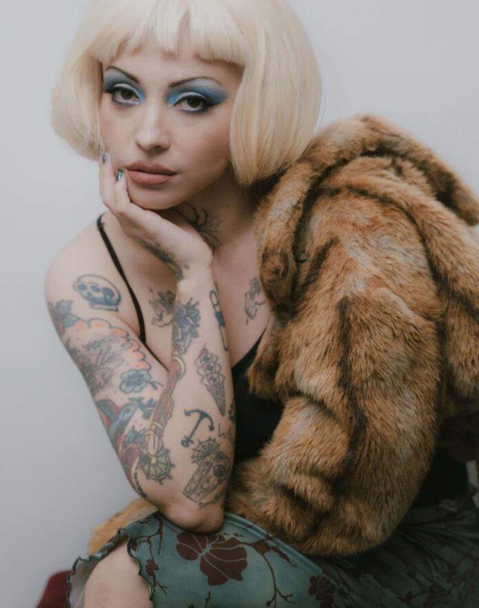
There’s a lot going on when you look closely at the ink: a blue bird tucked into a cloud, a woman with an umbrella, a strange little cat beside a unicorn, and a bright guitar with a face. The collection feels theatrical without looking like it was designed in one sitting. Every arm has a different rhythm, and the older pieces sit comfortably beside newer, more deliberate work.
The clearest recent detail is a spider on the neck. In a 2025 Billboard en Español interview, she said she chose it partly because she had wanted something in that area after thyroid cancer surgery. The tattoo also helps cover the scar. She was refreshingly honest about the rest of her collection: once you have so many tattoos, not every one needs a grand explanation. Sometimes the design is simply the one you liked enough to keep.
That mix of personal meaning and visual instinct is the key to reading the photographs. Some designs have a reported story behind them. Others are best described by what the camera actually shows. The difference matters, especially with older photos where a small tattoo can be cropped, blurred, or mistaken for another piece.
The bird, rose, and Mary lettering tattoo
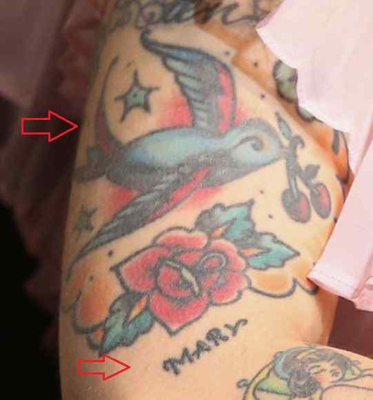
This close-up shows one of the most recognizable sections of the collection. A blue-gray bird stretches across the arm, with a red rose and green leaves underneath it. Stars sit around the design, and the name “Mary” appears below the flower in a loose handwritten style. The colors have softened with time, but the image still gives you a clear sense of the old-school layout.
The bird is not floating in empty skin. It sits among the flower, lettering, and small stars, so the whole piece reads like a patchwork illustration rather than a single isolated emblem. That is part of the charm. A clean, minimal tattoo would make the bird the only thing you noticed. Here, the eye moves between the wing, the rose, and the lettering.
The wording is easy to see, but its exact personal reference is not explained in the source material. It would be a mistake to assign a family story or romantic meaning just because a name appears on the arm. What can be said confidently is that it sits as a small text element inside a much larger vintage-style composition.
The linework also shows how the collection has aged. The outer shapes are still readable, while some of the smaller details have blended together. That is normal for color work, especially on an arm that gets a lot of sun and movement. If you’re planning a similarly packed piece, spacing and line weight matter as much as the subject itself.
The woman with the umbrella tattoo
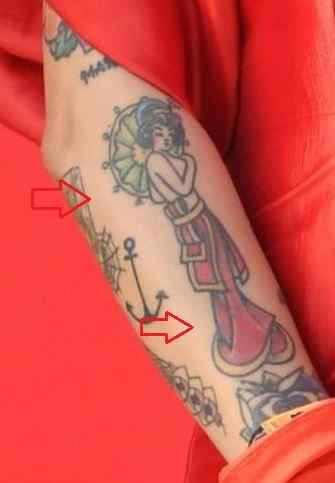
One of the more storybook-looking pieces is the long-dressed woman on the arm. She stands with an umbrella, surrounded by fine outlines and small decorative marks. The figure is narrow and vertical, which suits the forearm. Instead of spreading across the skin, it follows the length of the arm like a little illustrated panel.
The dress is the part that catches the eye first. It has a flowing shape and a darker lower section, while the upper body is framed by a round, leafy-looking detail. There are smaller tattoos around it, including an anchor-like form lower down. The red clothing in the photograph makes the ink look even more colorful, but the tattoo itself has enough contrast to hold together without that background.
Body Art Guru describes the woman as a symbol of beauty, desire, empowerment, and independence. That is an interpretation of the design rather than a direct statement from her, so it should be treated as context, not a confirmed quote. The visual idea is still easy to appreciate. She looks like a character from a vintage poster, and the umbrella gives the figure a clear silhouette.
This is a useful placement example if you like figurative tattoos. A forearm gives a tall subject room to breathe, but the image needs to be planned around the wrist and elbow. A figure that looks balanced on a flat stencil can become cramped once the arm bends. The design here works because its main vertical shape follows the body instead of fighting it.
The cat and unicorn tattoo
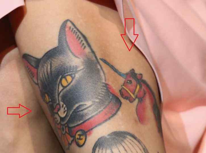
The cat-and-unicorn tattoo has a completely different mood. The cat’s head is large, dark, and slightly fierce, with bright eyes and a heavy outline. Beside it, the unicorn is smaller and more colorful. Both figures are framed by other ink, so the tattoo feels like part of a larger sleeve rather than a standalone cartoon.
There’s a playful tension in the pairing. A cat and a unicorn don’t naturally belong in the same scene, which is exactly why the combination works. The cat brings weight and attitude; the unicorn adds a lighter, more fantastical note. The little yellow details around the cat help keep the darker head from becoming one solid block.
The photograph is a tight crop, so it doesn’t show the full boundaries of the surrounding work. That’s important when describing it. We can identify the two figures and the way they sit together, but we shouldn’t pretend the picture proves every neighboring shape belongs to the same tattoo. Close-ups are great for detail and weak at showing the whole map of a body.
If you’re borrowing the idea rather than copying the exact drawing, the lesson is contrast. Pair one subject with a strong silhouette and another with a more delicate outline. A sleeve full of equally dark designs can lose its focal points. A smaller, brighter figure can give the eye somewhere to rest. Contrast keeps a busy sleeve readable.
The mermaid tattoo on the arm
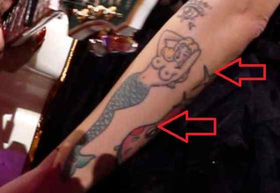
The mermaid is another design that leans into the collection’s illustrated, slightly surreal side. In the visible crop, the upper body has a small face and curling hair, while the tail extends down the arm in blue-green scales. A red flower sits nearby, and the lines are looser than the heavy black outlines used on the cat tattoo.
The design is partly obscured by the angle, which makes the placement more interesting than a perfectly flat studio shot. You can see how the tail follows the arm’s length, while the figure’s upper body turns toward the surrounding tattoos. It feels like the image was fitted into an existing landscape rather than placed on a blank section of skin.
There isn’t a confirmed public explanation for why this mermaid was chosen. That doesn’t make the tattoo less interesting. The readable facts are enough: it’s a large figurative piece, it uses a cool color palette, and it sits among several other character-based designs. A meaning can be private, unfinished, or simply not something the wearer wants to explain.
From a tattoo-design standpoint, the tail is doing useful work. Long, curved shapes are good for moving around the arm, especially when a design needs to connect the upper forearm with the wrist area. The scales also create texture without requiring a dense background. That gives the piece detail while leaving some visual air around the figure.
The face guitar tattoo and surrounding stars
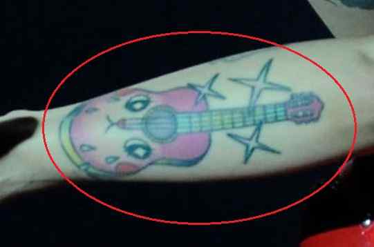
The guitar is probably the easiest design to connect to her work as a musician. It has a pink body, a face built into the instrument, and several stars around it. The tattoo is colorful and slightly odd in a way that fits the rest of the collection. It doesn’t look like a realistic guitar; it looks like a character that happens to be shaped like one.
Body Art Guru notes that music is central to the design’s reported meaning. She began her career young and has spoken about the importance of the instrument in her life, so this is one of the stronger places to discuss a likely connection between the image and her work. Even here, it’s better to keep the wording careful. The guitar obviously relates to music; the private story behind the exact drawing belongs to her.
The surrounding stars help the tattoo read as a complete little scene. Without them, the instrument could feel like a single object floating on the arm. The stars give it movement and make the shape feel more deliberately composed. They also balance the bright pink and blue colors, which could otherwise pull too much attention toward the center.
This is a nice reference if you want a personal tattoo without using a literal name or date. An object can carry a clear connection to your life while still leaving room for style. A guitar, microphone, camera, or sewing machine can be drawn realistically, turned into a character, or surrounded by unrelated symbols. The important part is choosing a shape you’ll still enjoy looking at after the obvious meaning has settled.
Context around the collection
There’s also an older lower-back design that deserves a separate mention. BioBioChile reported on a 2019 Instagram post in which she called it her first tattoo and joked that, in the early 2000s, getting a lower-back tattoo was considered cool. The photograph showed the upper points of what appeared to be a pair of bird-like wings, although the full design wasn’t visible.
That image is a good reminder to keep an evidence line between a clear photograph and a confident description. We can say the post showed a partial winged design. We can’t use one cropped view to map the complete tattoo or claim a meaning she didn’t give. The design is still part of the collection’s history, and her own comment gives it more context than a generic list of celebrity ink.
Older tattoos often get judged too harshly because they belong to a different moment in someone’s life. A lower-back piece may feel dated now, but that doesn’t make it a mistake. It can mark a period, a trend, or simply the first time someone decided to put permanent art on their body. The joke about the early 2000s gives this one a sense of time without turning it into a punchline.
A newer chapter in the story
The spider is the most recent design she discussed publicly. In the Billboard interview, she said she had wanted ink on her neck for a while and connected that area to the scar from thyroid surgery. She chose the spider from designs shown by her tattoo artist in Mexico City. The reason is partly symbolic, but she also admitted that she simply loved how it looked.
That combination feels honest. Not every tattoo needs to be a coded autobiography. Sometimes the placement carries meaning and the drawing is chosen because it suits the body. A neck tattoo is visible, central, and difficult to hide, so even a small design changes the balance of a face and hairstyle. The spider gives that area a dark, graphic mark without covering the entire neck.
It also shows how a tattoo can respond to the body’s history. Covering or reframing a scar doesn’t erase what happened. It changes how the area is seen and gives the wearer a new image to associate with it. That’s a personal decision, and her explanation is more useful than a generic claim that spiders always represent patience, danger, or rebirth.
What makes the collection work
The common thread is not one tattoo style. There are old-school colors, storybook characters, lettering, animals, music imagery, and small symbols. The collection works because it’s allowed to be a collection. The pieces don’t all have to match perfectly to belong together.
There’s also a clear preference for images that feel drawn rather than purely decorative. The bird, woman, cat, unicorn, mermaid, and guitar all have personality. Even when a meaning is unknown, the artwork has a point of view. If you’re planning several tattoos of your own, that’s a better takeaway than copying a single subject. Choose images you can live with visually, then let the personal reasons stay as simple or complicated as they need to be.
Finally, the photos show why placement deserves as much attention as the design. Arms bend, shoulders turn, backs disappear under clothing, and neck tattoos change the way a portrait reads. A tattoo can look completely different in a close crop, a red-carpet photograph, or an ordinary candid shot. That’s part of the fun of looking at a long-running collection: you’re seeing the same artwork move with the person who wears it.