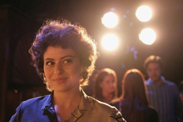
Alia Shawkat has never seemed interested in looking overly polished. Even when she is dressed for a premiere, there is usually something a little offbeat in the mix: a strange color combination, an unexpected silhouette, or the kind of expression that makes the whole room feel less serious. Her tattoos fit that same instinct. They look personal, a little odd, and deliberately un-grand.
That matters because celebrity tattoos are often presented like a neat collection of symbols. A rose means love. A date marks a milestone. A quote sums up a whole personality. Shawkat’s ink doesn’t work that way. She has said she draws her own tattoos first, repeats the idea until it stays in her head, and then gets it because she likes how it looks. That is a much more relaxed approach than trying to turn every mark into a public statement.
There are still real stories behind some of the designs. The two finger letters “AY” connect to her friend Anton Yelchin, and the word “lurker” on her arm is another tribute to him. She also has small doodle-like designs on her forearms and a little smiley on her chest. Taken together, the collection feels less like a planned sleeve and more like a sketchbook that slowly moved onto skin.
The Two Forearm Doodles
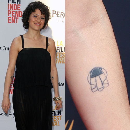
The clearest photographs of Shawkat’s tattoos show how loose and hand-drawn the designs are. One forearm piece looks like a small abstract doodle, with uneven lines and a shape that feels closer to a quick cartoon than a carefully shaded piece of realism. It has the charm of something that was drawn in the margin of a notebook and then kept because the first version already felt right.
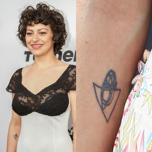
Another forearm tattoo is built around a triangle. The design has a geometric outline with a small rounded, almost acorn-like form inside it. It is black linework without much extra decoration, so the shape does all the work. The slightly imperfect edges are part of the appeal. This isn’t a tattoo trying to look mechanical or mathematically perfect. It still feels like a person drew it.
Steal Her Style lists a third forearm doodle as a “mister jones” animated character. That detail is useful because it shows the range of the collection. Shawkat’s pieces aren’t all built around one visual language. Some are simple symbols, some are tiny characters, and some are inside jokes that only make sense to her and the people close to her.
If you are looking for inspiration in these pieces, the lesson is not to copy the triangle or recreate the exact doodle. The stronger idea is to keep the drawing honest. A tattoo can look finished without looking overworked. A slightly strange line or an unexpected shape can make a small piece feel more alive than a perfectly symmetrical design pulled from a flash sheet.
Another Alia Shawkat Tattoo: A Triangle Doodle
Shawkat’s tattoos make more sense when you know that drawing and painting are not side hobbies for her. She has talked about building a regular studio practice and spending time with friends who make art. She has also written and co-written film projects, and she tends to talk about acting as one part of a wider creative life rather than the only thing she does.
That background comes through in the way she describes choosing her tattoos. She has said that she draws the pieces herself and will place the idea on her body repeatedly before committing to it. That sounds less like shopping for a symbol and more like testing a character design. You live with the shape for a while, notice whether it keeps interesting you, and then decide whether it deserves to stay.
It also explains why the tattoos don’t all match. A person who draws for the pleasure of drawing is going to move between moods. One week the idea might be a clean little triangle. Another might be a cartoon figure or a face. The collection can change direction without needing to become a single cohesive sleeve.
Her approach is especially refreshing for anyone who feels pressure to make a first tattoo deep and permanent in every possible way. Meaning can be serious, but it can also be visual. You can like the way a line sits on your arm. You can get something because it makes you laugh. You can let a private memory sit beside a design that is simply fun to look at.
Why Her Style Feels More Like a Sketchbook
The word “doodle” gets used as if it means careless, but Shawkat’s pieces show the opposite. A doodle is often a record of attention. You draw while thinking, talking, waiting, or trying to work out a feeling. It may not start as a finished image, but it carries the rhythm of the person who made it. That quality is hard to fake with a generic minimalist tattoo.
Her forearm designs keep that looseness. The lines are bold enough to read, but they don’t try to create a lot of depth. There is no need for a dramatic black-and-grey gradient or a complicated explanation. Small tattoos like these rely on silhouette and placement. They look good because they are easy to recognize at a glance and still reward you when you look closer.
There is also a nice contrast between the public image of Shawkat as an actor and the private feeling of the tattoos. Her most memorable characters are often clever, restless, or slightly chaotic. The designs on her skin have a similar energy, but they are private first and public second. They don’t announce a new era or ask the viewer to decode a grand personal philosophy. They just sit there, like small pieces of her visual language.
That is one reason her collection works as tattoo inspiration. It leaves room for a little weirdness. If your own idea is a character, an uneven symbol, or an image that only makes sense because of a specific memory, you don’t have to smooth it into something more conventional. A good tattoo artist can help the shape age well while keeping the part that made you draw it in the first place.
A Quiet Memory
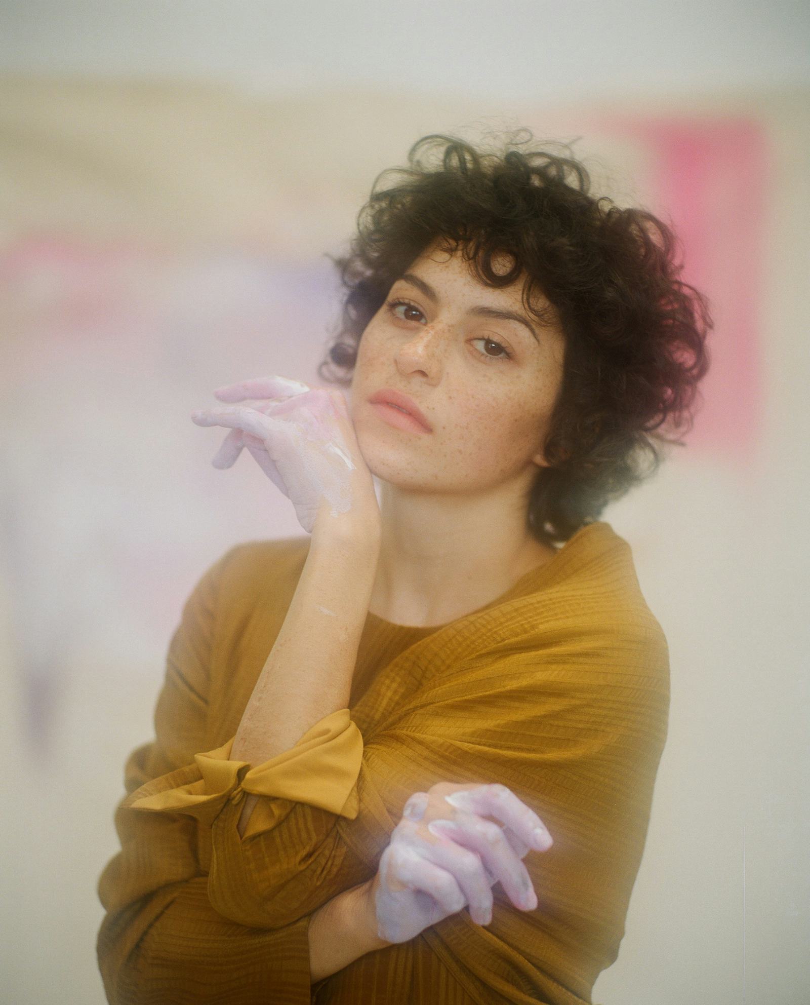
The most openly emotional pieces in Shawkat’s collection are connected to Anton Yelchin. After his death, friends got tattoos based on the letters “AY,” and Shawkat has the letters on two fingers. She also has “lurker” on her arm, a word tied to Yelchin and the way he stayed present in the memories of the people who loved him.
Those tattoos show that her relaxed attitude toward design doesn’t mean the collection is without weight. She can like a tattoo just because it looks good and still choose another one to hold grief, friendship, and memory. The two approaches don’t cancel each other out. In fact, they make the overall group feel more believable.
The finger placement gives the letters a quiet visibility. They are small enough to disappear when her hands are busy, but they can be seen in photographs or while she is drawing. That kind of placement makes sense for a tribute that is personal first and public second. It isn’t a giant name across the arm. It is a compact reminder that stays close.
“Lurker” has a different visual mood because it is a word rather than an icon. Lettering tattoos can easily become too formal, especially when they are set in a perfect script. A simple word in a straightforward type keeps the feeling closer to handwriting or a note. Shawkat’s choice feels consistent with the rest of her collection: direct, slightly offbeat, and not dressed up more than it needs to be.
Alia Shawkat Beyond the Camera
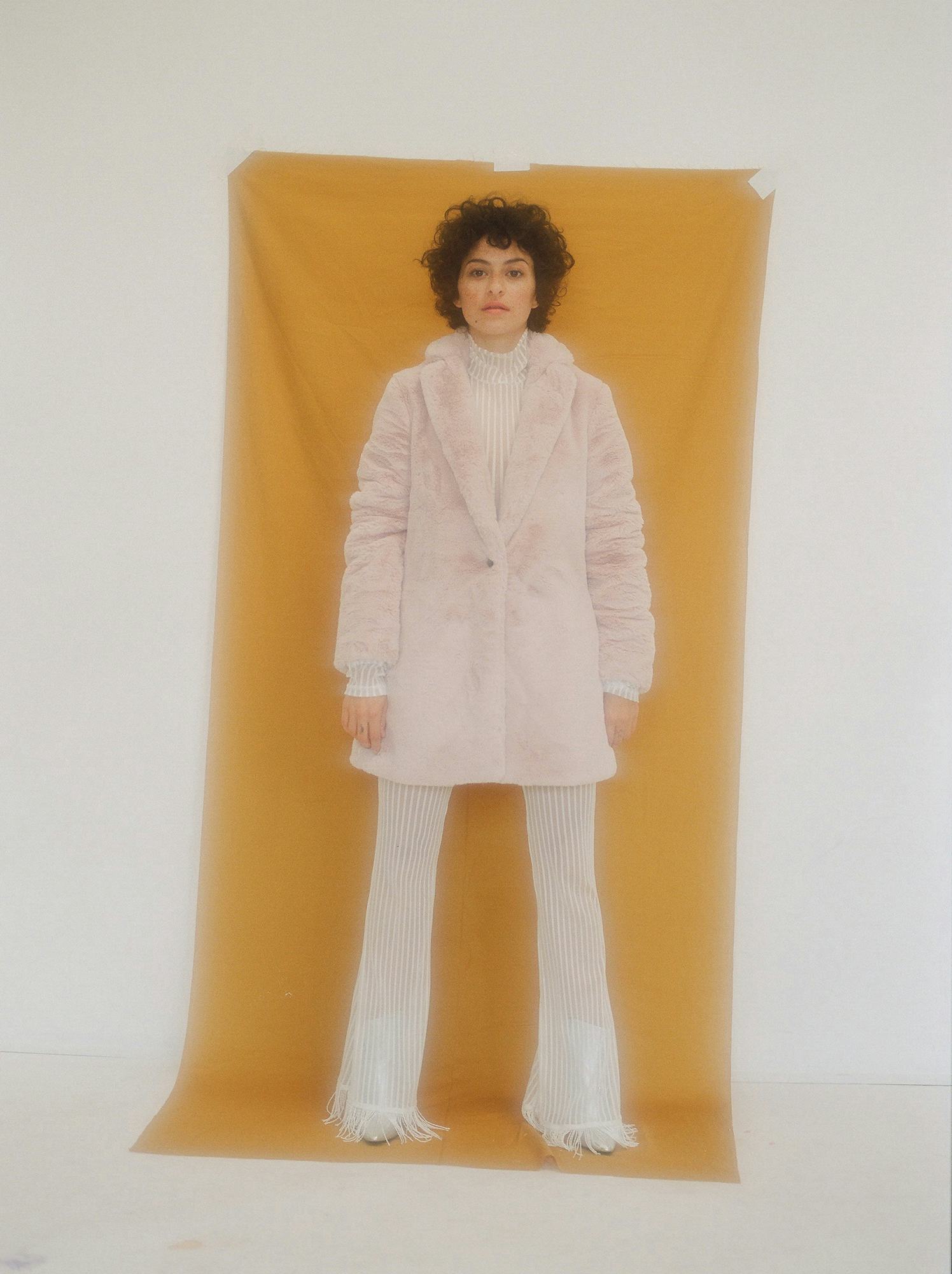
It is tempting to talk about Shawkat’s tattoos without mentioning the rest of her creative life, but the context helps. She has spent years moving between television, independent film, writing, painting, and other art projects. She is known for playing Dory in Search Party and Maeby in Arrested Development, but those roles only cover part of what she does.
Her public image has always had a little friction in it. She can look glamorous in a fashion story and then make the interview feel like a conversation in an art studio. She can be funny without smoothing away the awkward parts. That quality shows up in her tattoos, especially the small character and doodle designs that refuse to look like luxury accessories.
For someone considering a similar style, placement is worth thinking about. Forearms give small drawings enough room to be seen without turning them into a full statement piece. Fingers make letters and tiny marks more noticeable, but they also live through more friction and movement. A chest design can stay private under clothing and appear only when you want it to. None of those placements is automatically better. They simply change how often the piece enters your day.
Scale matters too. Shawkat’s designs are small, but they are not so tiny that every line disappears into a blur. If you like the delicate look, ask an artist how the design will age and whether a slightly larger version will hold the same character. The best small tattoo is not the smallest possible tattoo. It is the smallest version that still has enough room to breathe.
Her collection is a good reminder that a tattoo doesn’t need to look expensive to look personal. A black outline, a strange little figure, or a few letters can carry plenty of personality when the idea comes from somewhere real. The point is not to make a replica of Alia Shawkat’s arm. It is to notice what makes her pieces feel like hers: she draws them, lives with them, and lets them stay a little imperfect.
That is probably the best way to sum up Alia Shawkat’s tattoos. They are not a catalogue of dramatic symbols. They are small visual decisions made over time, with a few deeply personal marks sitting beside designs chosen simply because they looked right. The result feels casual, creative, and human, which is exactly why the collection is so easy to remember.