
Luke Evans keeps his tattoo collection fairly focused. There’s a fine line running around his right forearm that hides the initials of his parents and himself, and there’s a newer bird design on his thigh that gives the collection a different feel. Neither piece is trying to cover his whole body. They’re personal marks, placed where they can be seen when he wants them to be and forgotten when a shirt or pair of trousers covers them.
That balance suits Evans. His public image moves between big-screen action roles, stage work and quieter interviews, so his tattoos show up in very different settings. One photograph might catch the fine line around his arm. Another might show a quick glimpse of the thigh design during a beach trip. The images don’t form a perfect catalogue, and it’s better to be clear about what can actually be identified than to pad the list with guesses.
The most personal piece is the line around Evans’s right arm. He has explained that the pattern contains a hidden D, Y and L for David, Yvonne and Luke: his father, his mother and himself. It was his first tattoo, made when he was around 39 or 40. The design looks minimal at a glance, but the small peaks in the line give it a private code. It’s a family tribute without turning into a large name tattoo.
The family heartbeat tattoo
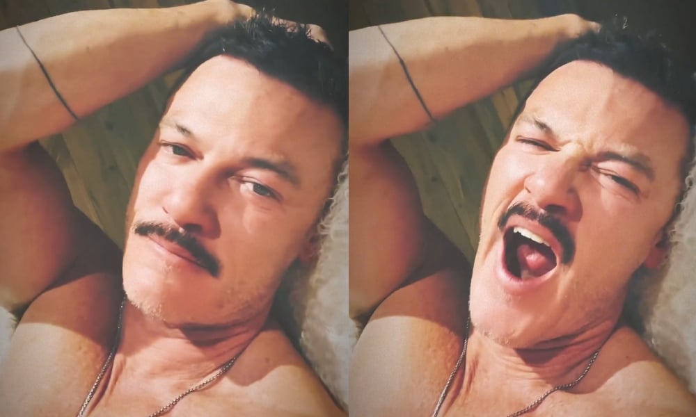
Evans’s family tattoo runs around the right arm and reads visually like a heartbeat monitor line. It’s a thin black mark with small rises and dips rather than a heavy band. In a close photograph, the line is easy to spot along the forearm. The important detail is that the shapes aren’t random decoration. Evans has said the peaks conceal the initials D, Y and L, linking the tattoo to his parents and to himself.
That makes the design work on two levels. Someone looking at it casually sees a clean, modern line. Someone who knows the explanation can look again and notice the letters hidden inside the rhythm. It’s the kind of tattoo that doesn’t need a caption every time it appears. The meaning is there for Evans, while the visible design stays simple enough to fit with almost anything he wears.
The wraparound placement is smart for a piece like this. A straight line on the outer forearm would read like a graphic stripe, but a line that travels around the arm feels more connected to the body. It also gives the artist a little room to adjust the spacing as the design reaches the inside of the arm. Fine work like this has to account for the curve of the limb, not just the flat shape seen on a screen.
The strongest idea here is the hidden lettering. If you like the look of minimalist ink but still want a personal reference, a symbol or line can carry more weight than a full quote. The letters don’t have to be obvious to everyone else. In fact, keeping them subtle is what lets the tattoo feel like a family piece rather than a label.
Why the line feels more personal than decorative
There are plenty of heartbeat tattoos that use the same basic outline, so the initials are what separate Evans’s version from a generic flash design. The family connection gives the line a reason to exist. It isn’t there only because the shape looks good. The design is carrying three people in a compact way, and the arm placement keeps that message close without making it overly formal.
The tattoo also shows why scale matters with thin lines. If the band were much thicker, the hidden initials could disappear inside a dark stripe. If it were made too small, the peaks would flatten into a shaky mark. The version Evans wears leaves enough breathing room for the pattern to remain readable while still looking light from a distance.
Arm tattoos get a lot of movement and sunlight, so the long-term look depends on clean spacing and sensible line weight. A good artist will think about how the line behaves when the elbow bends, when the wrist turns and when the forearm rotates. Those details matter more than making the stencil look impressive for five minutes before the appointment.
There’s also something nice about the fact that the tattoo doesn’t need extra imagery. No frame, dates or portrait has been added around the initials. The line itself is enough. That restraint keeps the piece flexible and leaves Evans room to add something else later without making the original tattoo feel crowded.
The bird tattoo on his thigh
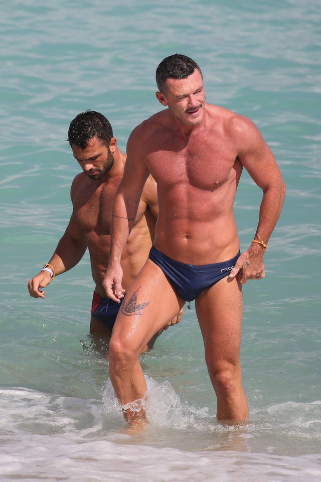
A separate photograph from a beach trip shows a bird or swallow design on Evans’s thigh. The image is taken at a distance, but the shape is clear enough to identify the tattoo as a bird in flight. It sits on the upper thigh, where the design can be hidden under shorts or shown when the leg is exposed. That placement gives the tattoo a more relaxed, summery presence than the family line around his arm.
The bird appears to be a dark, traditional-style silhouette with the wings spread out. Because the available photograph is a candid beach image rather than a close studio shot, it’s sensible to keep the description at that level. The exact species, lettering or extra details aren’t clear enough to state with confidence. What is clear is the placement and the broad shape of the design.
Thigh tattoos give artists more room than wrist or finger pieces. A bird can be sized so the wings have space between them, and the upper leg gives the design a broad surface without forcing it to wrap around a joint. It’s also a spot that can feel private in everyday clothes. Evans can choose when the tattoo becomes part of the look, which is useful for a performer whose work often involves costumes and formal styling.
The contrast with the arm tattoo is what makes the two-piece collection interesting. The heartbeat band is narrow, coded and tied directly to family. The bird is more open and visual. One is read by noticing the line. The other is understood in a second because the outline gives you an immediate image. They don’t need to match stylistically to sit comfortably on the same person.
If you’re considering a thigh bird, pay attention to the amount of open skin around the wings. A simple silhouette needs room to breathe. Cramping the wing tips against clothing lines or the natural crease of the leg can make the design look smaller than it needs to. A good reference photo should show the general placement, but your artist should redraw the shape for your own leg and preferred scale.
Two pieces, two different kinds of privacy
Evans’s arm and thigh pieces also show how placement can control how often a tattoo enters your public life. The forearm band can appear in short sleeves, red-carpet photographs and casual portraits. The thigh bird usually stays out of frame unless he is wearing swimwear or shorter shorts. That difference lets each tattoo have its own level of visibility.
Visibility isn’t only an aesthetic choice. It can affect work, clothing and the way strangers ask questions. A small family line on the forearm may be easy to explain if someone notices it. A thigh tattoo may be more personal simply because fewer people see it. When you’re choosing a placement, it helps to imagine the healed tattoo in your normal week rather than only in the outfit that inspired the idea.
Evans also avoids the feeling of a collection that was designed all at once. The family band came first, and the bird appeared later. That gives both pieces a little independence. The arm doesn’t need the thigh tattoo to make sense, and the bird doesn’t need a matching symbol beside it. They can be appreciated separately.
The person behind the story
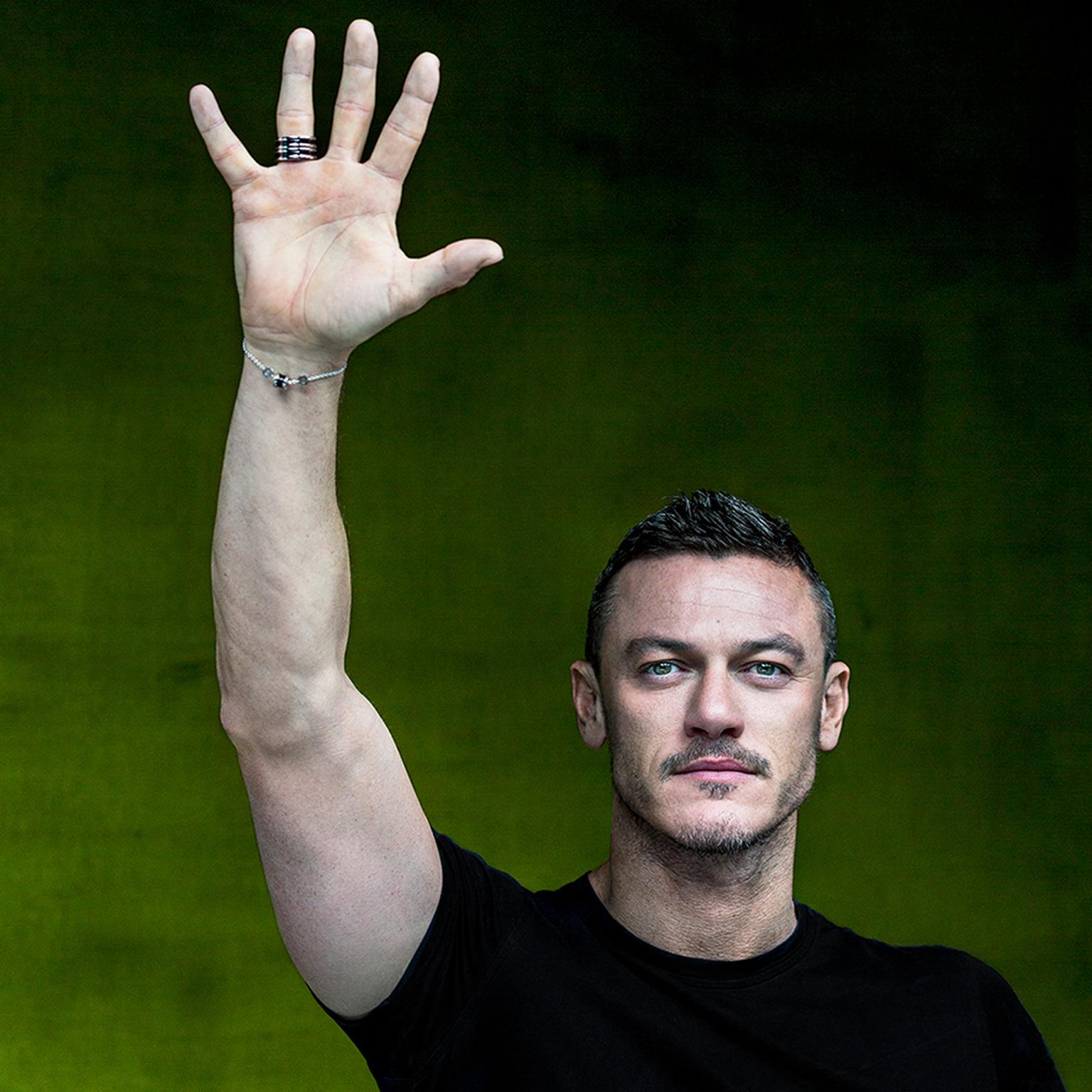
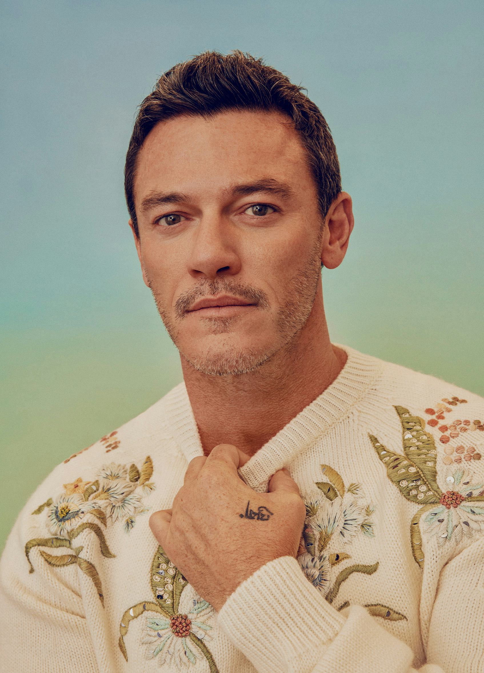
A campaign portrait gives some useful context for how Evans’s ink sits alongside his public image. The raised arm and face-visible framing make the photograph about the person, not about proving a tattoo. That distinction matters. Contextual pictures can show how a celebrity presents himself, the kind of clothes he wears and the settings in which a tattoo might appear, but they shouldn’t be treated as evidence for a design that isn’t clearly visible.
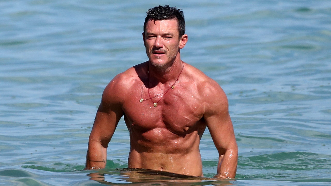
A beach photograph adds a different kind of context. Evans is shown outdoors and shirtless, but the point of the image is the setting and the portrait, not a close reading of his ink. It helps explain why photographs from holidays or promotional shoots often become the source of tattoo sightings: more skin is visible, even when the camera isn’t close enough to identify every line.
A wider beach portrait shows how easily a tattoo can become a small detail in a full-body image. The body, clothing, water and landscape all compete for attention. That’s why a useful tattoo reference should be paired with a careful description. A contextual photo can help readers recognize the person and the moment, while the tattoo-specific images do the actual work of showing the design.
What his choices suggest
The first lesson is that a meaningful tattoo doesn’t have to be complicated. Evans’s heartbeat line is visually restrained, but the hidden initials give it a clear emotional centre. If you’re thinking about family ink, you don’t have to use a portrait or a long sentence. A shape, line or set of initials can be enough when the design is built around a real connection.
The second lesson is to let placement change the mood. The forearm makes the family band part of Evans’s everyday silhouette. The thigh lets the bird appear on different terms. Those choices make the tattoos feel considered without making the whole collection look overly planned. A private spot can be just as important as a visible one.
The third lesson is to leave room for uncertainty when the source image is limited. The bird is clearly a bird on the thigh, but the available photograph doesn’t justify claiming a precise species or a detailed backstory. That kind of restraint is useful when you’re building your own reference folder too. Save the close view for line work, the wider view for placement and the source explanation for meaning.
There’s no need to copy either tattoo exactly. The better approach is to notice the decisions underneath them: a family reference hidden inside a simple line, a strong silhouette placed where it can stay private, and enough open skin for each design to remain readable. Those are ideas an artist can adapt to your body, your story and the way you actually dress.
Luke Evans’s visible tattoos are a good reminder that a small collection can still have range. One piece is quiet and coded. The other is direct and graphic. Together, they show how personal ink can move between memory and image without turning into a full sleeve or a matching set.