
Kit Connor doesn’t have a huge collection of obvious celebrity ink. The tattoo people keep spotting is small, clean, and easy to miss unless his sleeve is pushed up. It reads CALL ON ME in compact uppercase lettering on his bicep, and it came out of the intense bond he formed with the cast of Warfare.
That makes it a more interesting tattoo than the usual red-carpet glimpse. Connor and several of his co-stars got the same words in different places after months of training together. The phrase connects directly to the movie, but the reason they kept it goes beyond a film reference. They wanted a simple reminder that the group could still rely on one another after the cameras stopped.
There isn’t a second confirmed Connor tattoo that needs to be added to the list just to make the story look bigger. The useful detail is the one piece we can actually trace: a small script-style “Call On Me” tattoo on his upper arm, tied to a very specific cast experience. Everything else works best as context around that piece.
Kit Connor’s Call On Me bicep tattoo
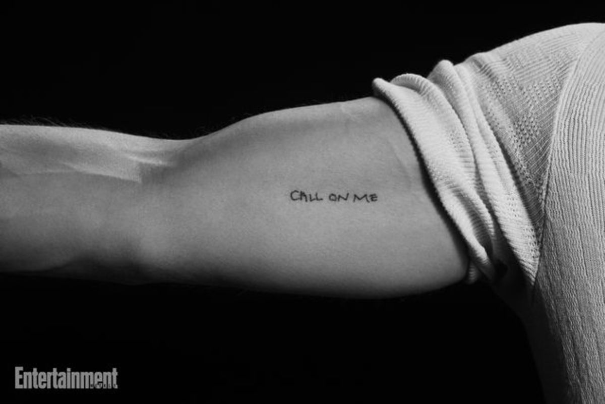
The tattoo is a small line of lettering on Connor’s bicep. In the close-up shared by Entertainment Weekly, the words sit horizontally across the arm in a loose, hand-drawn style. The letters are uppercase, narrow, and slightly irregular rather than looking like a heavy block font. It has the feel of a quick personal mark: readable at close range, but not designed to dominate the whole arm.
Connor confirmed the placement himself in a British Vogue interview with D’Pharaoh Woon-A-Tai. When the pair were asked about the commemorative tattoos, Connor said his was “here on my bicep,” while Woon-A-Tai said his was on his upper thigh. That difference matters. The cast shared the words, but each actor made the tattoo their own by choosing a placement that suited them.
The upper arm is a practical spot for a small phrase like this. It can disappear under a T-shirt, show when the sleeve moves, and stay relatively easy to protect from everyday rubbing. It also gives a short line of text enough flat skin to remain legible. The design doesn’t need extra decoration around it. The words do the work.
Visually, this is a good example of why tiny lettering still needs room. “CALL ON ME” is short, but eight letters can turn muddy if they’re squeezed too tightly or drawn with lines that are too fine for the chosen size. Connor’s version has a little breathing space between the characters, which helps it read as a phrase instead of a dark stripe.
Life inside the cast’s boot camp
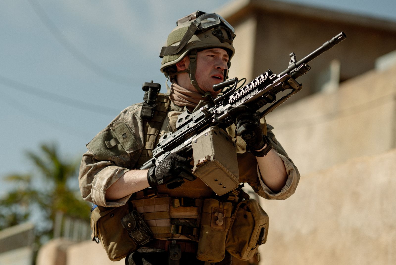
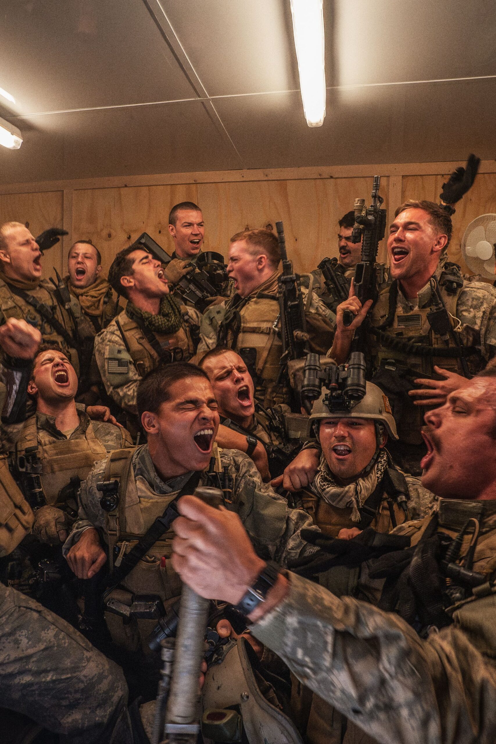
The matching ink wasn’t a random piece Connor picked up between jobs. It grew out of the preparation for Warfare, the A24 film directed by Alex Garland and Ray Mendoza. The cast played Navy SEALs in a story set during the Iraq War, so the actors went through a demanding training period before filming. They learned how to move, communicate, and work together under pressure.
That kind of preparation can create a strange, compressed version of friendship. People who might not have known each other well suddenly spend long days together, eat together, train together, and repeat the same difficult exercises until the group starts operating as a unit. Connor and his co-stars have talked about that shared time as a major part of what made the film work. It also explains why the small matching piece feels connected to a real memory instead of a publicity stunt.
Charles Melton described the cast’s immersive training and said the group bonded enough to shave their heads and get matching ink. Other reporting placed the decision around the same period of close preparation. The point wasn’t to pretend the actors were actual soldiers. It was to build the kind of trust the movie needed, then keep a small reminder of that trust once the production was over.
Connor’s piece sits in the middle of that story. The word choice was collective, but the final mark is quiet. It doesn’t look like a piece of movie merchandise or a matching logo. It looks like a phrase that happened to matter to a handful of people at the same time.
Why “Call On Me” became the right phrase
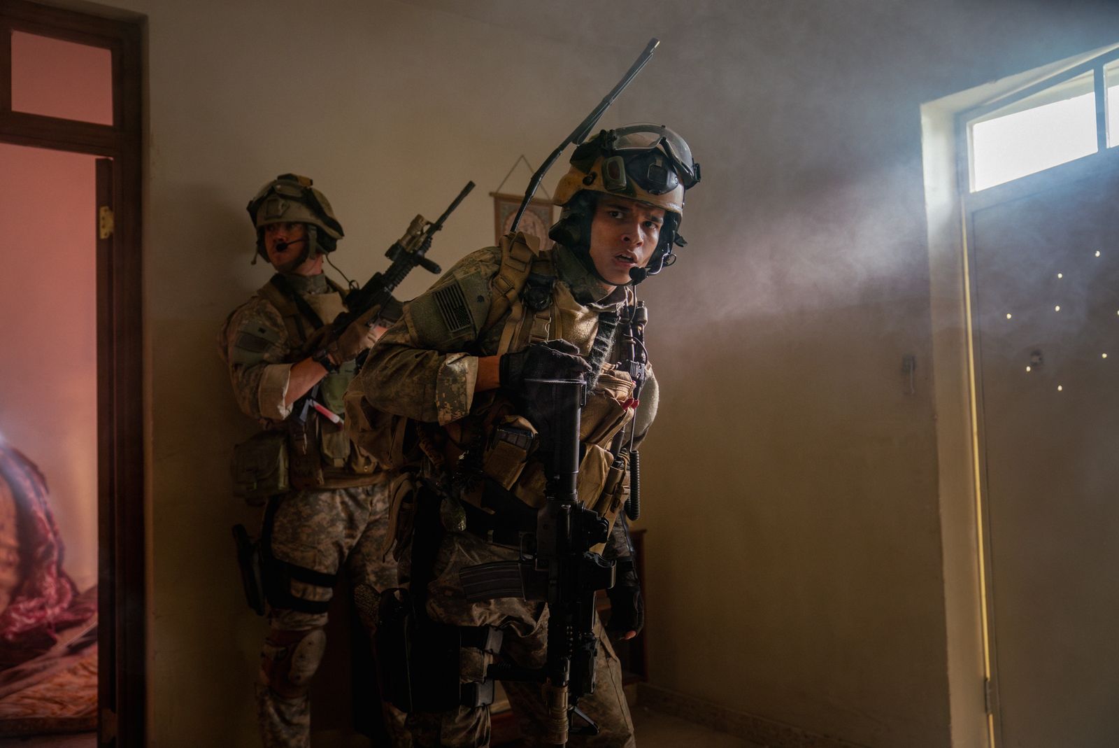
“Call On Me” is tied to the opening of Warfare. The movie begins with the SEALs watching the music video for Eric Prydz’s 2004 song “Call on Me,” so the words were already part of the cast’s shared reference point. Once the actors decided to get matching ink, the title gave them something that belonged to the film and also worked as a message between friends.
Woon-A-Tai explained that the phrase meant they could call on each other after the project, whenever they needed to. He admitted that the idea could sound a little cheesy, but that was part of why it worked. The tattoo wasn’t trying to be mysterious or clever. It said exactly what the group wanted it to say: the bond was supposed to survive the shoot.
That is a strong lesson in choosing words for a tattoo. A phrase can look good on paper and still feel hollow once it is on the skin. Connor’s works because its meaning has a clear origin, a group of people attached to it, and a real situation that tested the promise behind it. The film reference gives the words an anchor, while the cast connection keeps the tattoo from feeling like a novelty.
The lettering also avoids turning the reference into a full illustration. There is no microphone, music note, film logo, or military symbol wrapped around the words. If Connor wants the tattoo to stay private, he can cover it with a sleeve. If somebody notices it, the explanation is available, but the design doesn’t force the explanation on anyone.
For anyone thinking about a quote tattoo, that balance is worth copying. Start with the exact words that carry the memory. Then ask whether the design still feels right without an entire scrapbook of symbols around it. Sometimes one short phrase has more staying power than a crowded composition that explains every part of the story at once.
A small phrase with a big cast connection
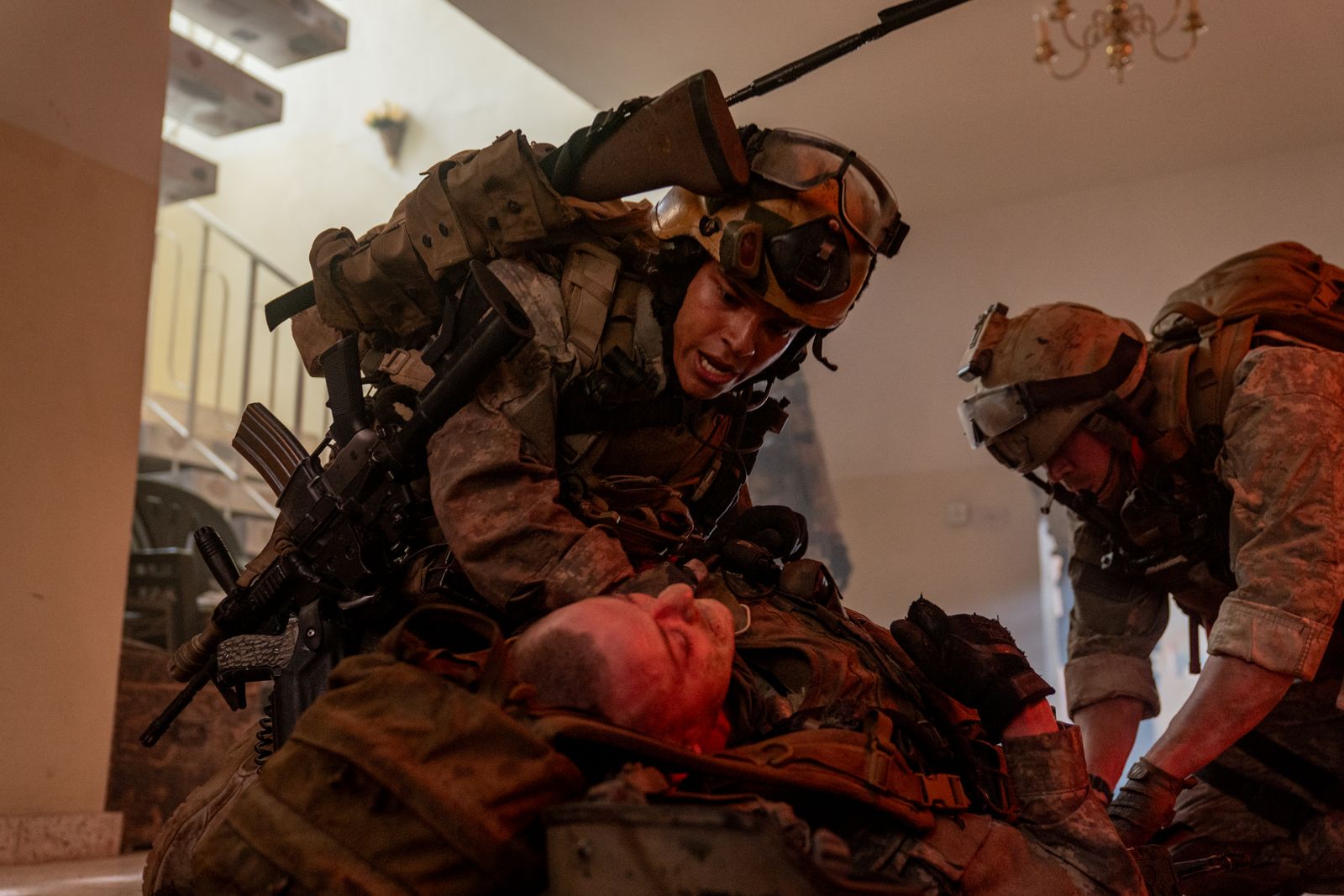
Connor’s Warfare tattoo is especially interesting because the cast didn’t put all of their copies in the same place. Some actors chose their thighs, while Connor placed his on his arm. That makes the set feel less like a corporate matching tattoo and more like a shared idea interpreted by different people.
Matching tattoos don’t have to be identical in every detail. The shared element can be the phrase, the symbol, or the date, while the placement and scale change with each person. That gives everyone a little ownership. It also means the tattoo can fit the wearer’s day-to-day life rather than forcing the whole group into one visual decision.
In Connor’s case, the bicep gives the words a straightforward shape. The phrase follows the natural width of the muscle, and the arm can be turned to reveal or hide it. On another person, the same lettering might make more sense on the ribs, thigh, shoulder blade, or forearm. The important thing is that the placement feels believable on the individual body, not that the group photo looks perfectly coordinated. Placement becomes part of the meaning because Connor can choose when the reminder is visible.
The tattoo also has a good amount of restraint. A small text piece can be made more dramatic with banners, flames, a crest, or a full quote, but none of that is needed here. The cast already had a complicated story behind the words. The ink only needed to hold the reminder. The phrase is simple, not casual, which is why the design doesn’t need a logo or extra symbol to explain it.
That restraint is what keeps the tattoo from dating too quickly. Trends change. A particular lettering style can look tied to one year, and a symbol that feels obvious now can become less interesting later. Simple words with a real personal connection are more likely to keep their weight, even if the wearer stops thinking about the original film every day.
What to borrow from the idea
Connor’s tattoo is a good one to study if you like meaningful text but don’t want a large statement piece. The first thing to borrow is the clarity. “CALL ON ME” is easy to read, easy to explain, and short enough to fit a small area without turning into a paragraph. If you need three sentences to explain the words before you get tattooed, the design may need another pass.
The second is the placement logic. A bicep tattoo can be visible in a tank top or disappear under a regular tee. That gives Connor control over when the tattoo enters the conversation. The same idea works for people who want a reminder close by without making the tattoo part of every outfit or every photograph.
The third is the difference between inspiration and copying. You don’t need to use the exact phrase or mimic Connor’s lettering. You can take the useful parts, the short wording, the personal group connection, the clean scale, and the flexible placement, and build something that belongs to your own circle. A matching tattoo should feel like an agreement, not a uniform.
Before booking, decide how the lettering should age. Your artist can talk through minimum size, line weight, spacing, and whether the chosen font will stay readable. A tiny tattoo still deserves a proper consultation, especially when the design depends on letters being distinct. Give the phrase enough room, choose an artist who is comfortable with small text, and don’t let the urge to make it microscopic win the argument.
It also helps to be honest about the meaning. Connor’s tattoo came after a period when the cast had spent serious time relying on one another. That doesn’t mean every friendship needs a tattoo after a busy job or a holiday. The idea works when the group has a memory strong enough to keep mattering after the shared moment has passed.
That’s the appeal of Kit Connor’s “Call On Me” tattoo. It’s not a full sleeve, a flashy portrait, or a design built for instant recognition. It’s a small line of text connected to a very specific friendship, a demanding film, and a phrase that the cast wanted to keep close. The tattoo is simple, but the reason behind it gives the simple lettering enough weight to last.