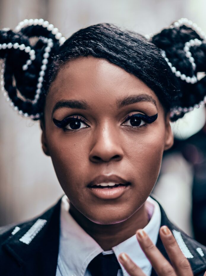
Janelle Monáe has always treated personal style like a full visual language. The tuxedos, the sharp black-and-white palette, the sculpted hair, the flashes of red and the futuristic details all feel deliberate without looking stiff. Her tattoos fit that same idea. They don’t read like random filler added between bigger pieces. They feel graphic, a little strange, and built around contrast.
The clearest tattoo photo connected to Monáe shows a large thigh piece with several things happening at once: a geometric flower-of-life pattern, a colorful side-profile portrait, a rose, and heavy black angular shapes. It has the density of a collage, but the repeating geometry keeps the whole thing from turning messy. That balance is what makes the design worth studying if you’re collecting celebrity tattoo ideas.
There’s also a useful bit of context in a 2015 interview with her stylist, who mentioned that Monáe has hand tattoos. The source doesn’t spell out every symbol or attach a meaning to each mark, so there’s no reason to invent one. What we can say is that her visible approach to ink is consistent with the rest of her image: graphic rhythm, unusual placement, and enough negative space for the details to stay readable.
Janelle Monáe’s abstract thigh tattoo
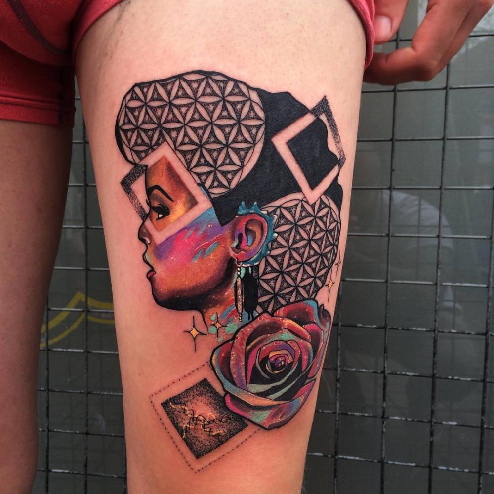
The thigh piece is the standout design. At the top and sides, a repeated geometric pattern creates a field of interlocking petals. It has the familiar circular rhythm of a flower-of-life layout, but the tattoo isn’t treated like a clean, isolated sacred-geometry panel. The pattern breaks around the portrait and folds into the darker sections, so the design feels assembled rather than stamped on.
The portrait is the part that pulls your eye first. It’s shown in profile, with warm reds, blue accents and deep shadows giving the face a painted quality. A long earring drops beside the neck, and a rose grows below it. The face isn’t rendered in a hyper-realistic way. Instead, the color blocks and black outlines give it a poster-like look, almost as if a piece of album artwork had been cut into the surrounding geometry.
That combination gives the tattoo a nice bit of tension. The flower pattern is orderly and repetitive, while the portrait and rose are softer and more organic. The black shapes in the background act like breaks in the rhythm. They make the lighter geometric sections pop and keep the colorful face from floating without structure.
For a tattoo inspired by this idea, the smartest move would be to choose one main subject and let the geometry support it. A face, flower or figure needs room to breathe. If the background is packed too tightly, the focal point disappears once the tattoo heals. A good artist could also simplify the repeated pattern, keeping the strongest shapes instead of copying every small cell.
Why the placement works
A thigh gives a design like this enough surface area to spread horizontally and vertically. That’s important here because the tattoo has a clear top-to-bottom movement: the patterned field sits behind the portrait, the rose opens below it, and the darker fragments pull the eye around the leg. On a smaller area, those pieces would have to be compressed, and the portrait could lose its expression.
Placement also changes how private or public the tattoo feels. A thigh piece can stay covered for work or formal events, then become much more visible with shorts, stagewear or a red-carpet look. That flexibility suits Monáe’s style. Her public image is bold, but she still controls when the most personal details come forward.
The curve of the leg adds another design advantage. A flat stencil can look good on paper and awkward once it wraps around the body. This piece uses the thigh’s shape well because the main portrait sits across a broad front-facing area, while the geometry can travel toward the sides. The result has a natural flow instead of looking like a square image pasted onto skin.
If you’re planning something similar, ask for a stencil that shows the design from more than one angle. Stand, sit and turn slightly while checking it. A portrait that looks centered from the front can shift when the leg relaxes. The artist should be able to explain where the face, flower and strongest lines will land before the needle starts.
Color, linework and the black shapes
The color palette is controlled rather than rainbow-bright. The face carries the warmest tones, with red and orange around the features, then blue and cool green touches that keep the portrait from becoming one flat block. The rose below echoes the warm color without simply repeating it. That connection makes the two elements feel related, because color carries the focal point instead of decorating every inch.
The geometric sections are mostly black and grey, with small areas of open skin inside the repeated forms. Those gaps matter. They stop the pattern from becoming a solid mass, and they’ll help the design stay legible as the ink softens over time. The dark angular sections are heavier, but they work like framing devices rather than random blackout patches.
There are a few lessons here for anyone building a large tattoo. First, decide where the highest contrast belongs. In this case, the portrait and rose get the strongest color, while the geometry gives them a quieter stage. Second, mix textures with intention. Fine repeating lines, broad black fill, smooth color and stippled detail can live together when each texture has a job.
It would be easy to overdo this concept. Adding more symbols, extra flowers and a second portrait might sound exciting during the sketching stage, but the design already has a lot of information. The better reference is the way the existing piece leaves some breathing room around the focal elements. More isn’t automatically more interesting.
Monáe’s style and the role of contrast
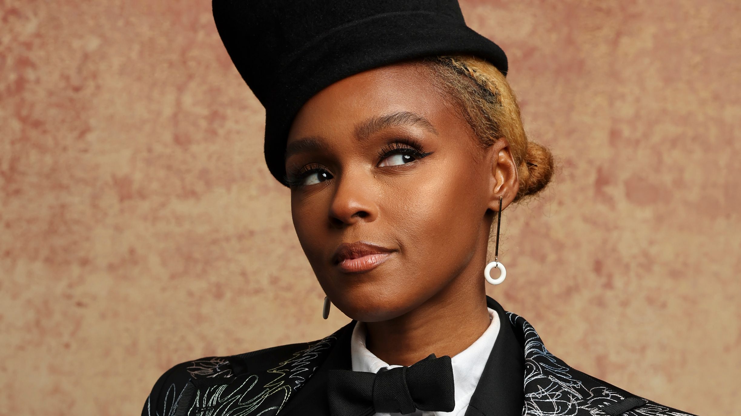
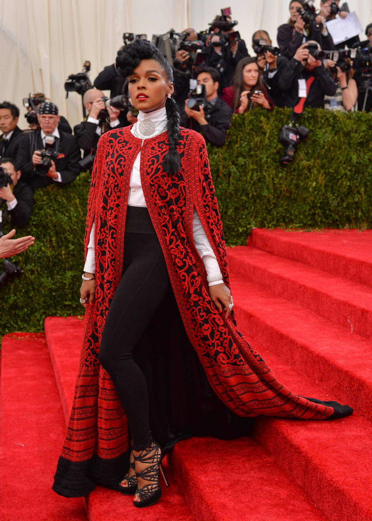
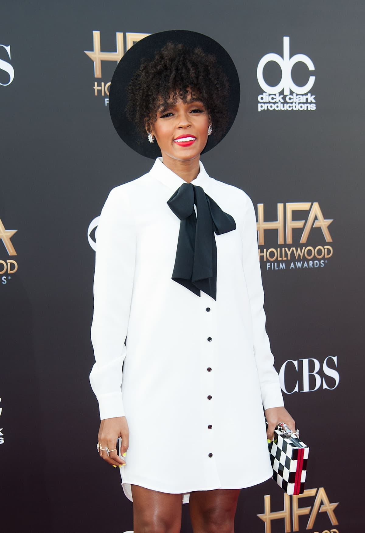
Monáe’s fashion makes the tattoo easier to understand. Her best looks often put polished structure beside something playful or unexpected. The same thing happens in the thigh piece. The geometry is precise, the black shapes are graphic, and the portrait brings in an expressive human element. None of those parts has to win completely.
That contrast can be useful when you’re designing your own celebrity-inspired tattoo. Instead of copying a celebrity’s exact piece, think about the visual relationship that makes it work. Maybe your version pairs a clean ornamental frame with a loose sketch. Maybe it sets a realistic flower against a blocky background. Maybe the main subject stays black and grey while one small detail carries the color.
The hand tattoos mentioned in the interview point in the same direction, even though the available source doesn’t identify their individual designs. Hand ink has a different job from a thigh piece. It is immediately visible, it moves constantly, and small details can fade faster because of washing, sun and friction. A hand tattoo usually works best when the shape is simple enough to read at a glance.
That difference between a private large piece and a visible small piece is part of what makes a collection feel personal. Not every tattoo needs to match. Repeating one idea, like graphic shapes or strong black framing, can be enough to connect different placements without turning the body into one giant mural.
Reference portrait
Portrait tattoos are hard because a face can look wrong with only a tiny change in proportion. The reference here avoids the pressure of a strict photographic copy. Its profile is stylized, and the surrounding colors and shapes are allowed to be part of the image. That gives the artist room to make the face readable without pretending the tattoo is a scanned photograph.
The angle is a smart choice, too. A profile can be designed with a strong silhouette: forehead, nose, lips and chin all create one clean outer line. The long earring adds another vertical accent, while the rose gives the lower half of the composition weight. Those simple landmarks help the portrait read even when you’re looking at it from a distance.
Anyone considering a portrait should bring a reference that shows the expression and the lighting they actually want. One photo might have the perfect pose but flat lighting. Another might have beautiful shadows but an awkward angle. Talk through those differences with the artist. The best result usually comes from a reference image plus a tattoo plan, not from handing over one photo and hoping it translates perfectly.
It’s also worth thinking about scale. Fine facial details need enough room to heal cleanly. If the portrait has to be tiny, a graphic interpretation may age better than a miniature realistic face. The piece shown here makes that choice naturally by using bold color shapes and a clear outline around the profile.
What to borrow from the design
The strongest takeaway isn’t one particular rose or geometric symbol. It’s the way the tattoo gives every element a clear role. The repeated pattern provides rhythm. The black blocks create contrast. The portrait supplies personality. The rose softens the lower edge and gives the eye somewhere else to land. That balance comes from negative space doing real work.
That kind of planning is more useful than chasing a celebrity’s exact tattoo. Start with the feeling you want the finished piece to have. If you like the futuristic side, use crisp geometry and a controlled palette. If the portrait is the important part, keep the background quieter. If you want a softer result, let the floral element take up more space and reduce the solid black.
Before booking, ask the artist to show healed examples in a similar style. Fresh ink can make every line look sharper and every color look louder than it will later. Healed work gives you a better idea of how small geometric gaps hold up, how color settles into your skin and whether the artist knows how to keep a large composition balanced.
Monáe’s tattoo style works because it has personality without losing structure. That’s a useful line to keep in mind. A design can be unusual and still easy to read. It can carry several references without becoming a scrapbook. And it can feel bold without filling every inch of available skin.
For people looking at Janelle Monáe tattoos for ideas, the thigh piece is a strong starting point because it offers more than one route. You can pull out the flower-of-life geometry, the colorful profile, the rose, the graphic black shapes or the larger lesson about contrast. Take the part that actually fits you, then let your tattoo artist build a composition that belongs on your body.
That approach leaves room for the tattoo to feel personal instead of copied. The best celebrity tattoo references work like a mood board: they show what is possible, how different textures can sit together and how placement changes the whole read. The final design should still have its own point of view.