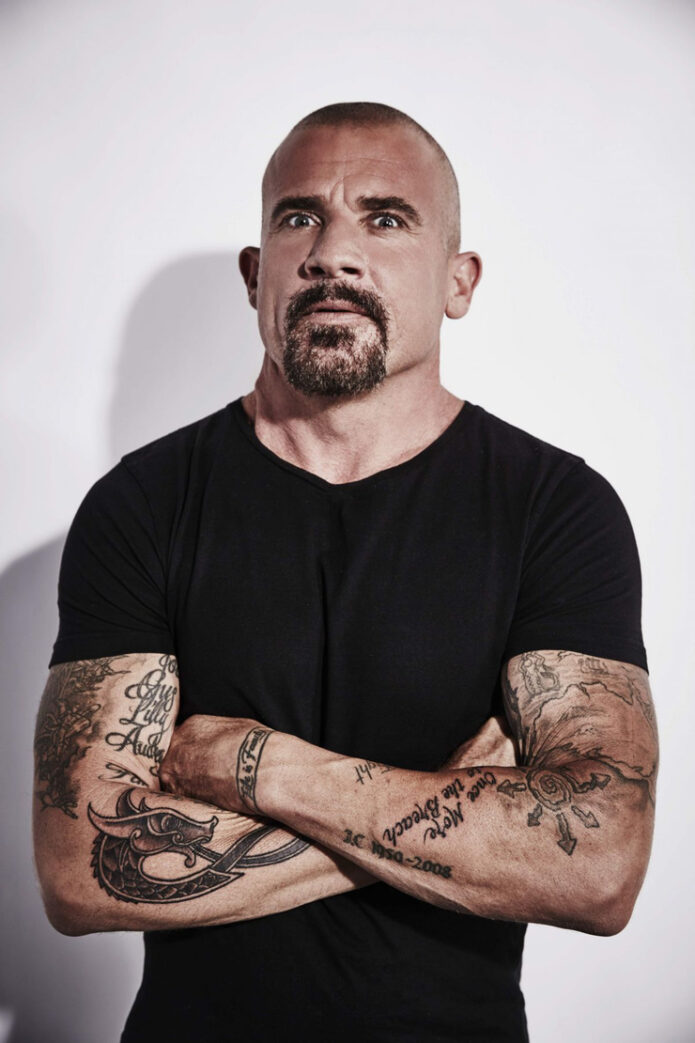
Dominic Purcell has never looked like someone who would settle for a tiny symbol and leave it at that. His collection is mostly large, easy-to-spot work: heavy lettering, old-school shapes, map-like lines, family references, and a lot of black ink that sits comfortably against his rugged screen presence. The newest addition fits that pattern perfectly, but it also gives the whole collection a sharper personal angle.
Across his upper back, Purcell now has RIFF in huge block letters. The word is a nickname for Penrith, the Western Sydney suburb where he spent much of his childhood. He shared the reveal with a caption about Penrith, New South Wales, the 1970s and 1980s, and being proud of what made him. That context matters. This isn’t a random word chosen because it looks good in a stencil. It is a hometown marker, and the scale makes the point before you even know the story.
The RIFF back tattoo is pure Penrith pride
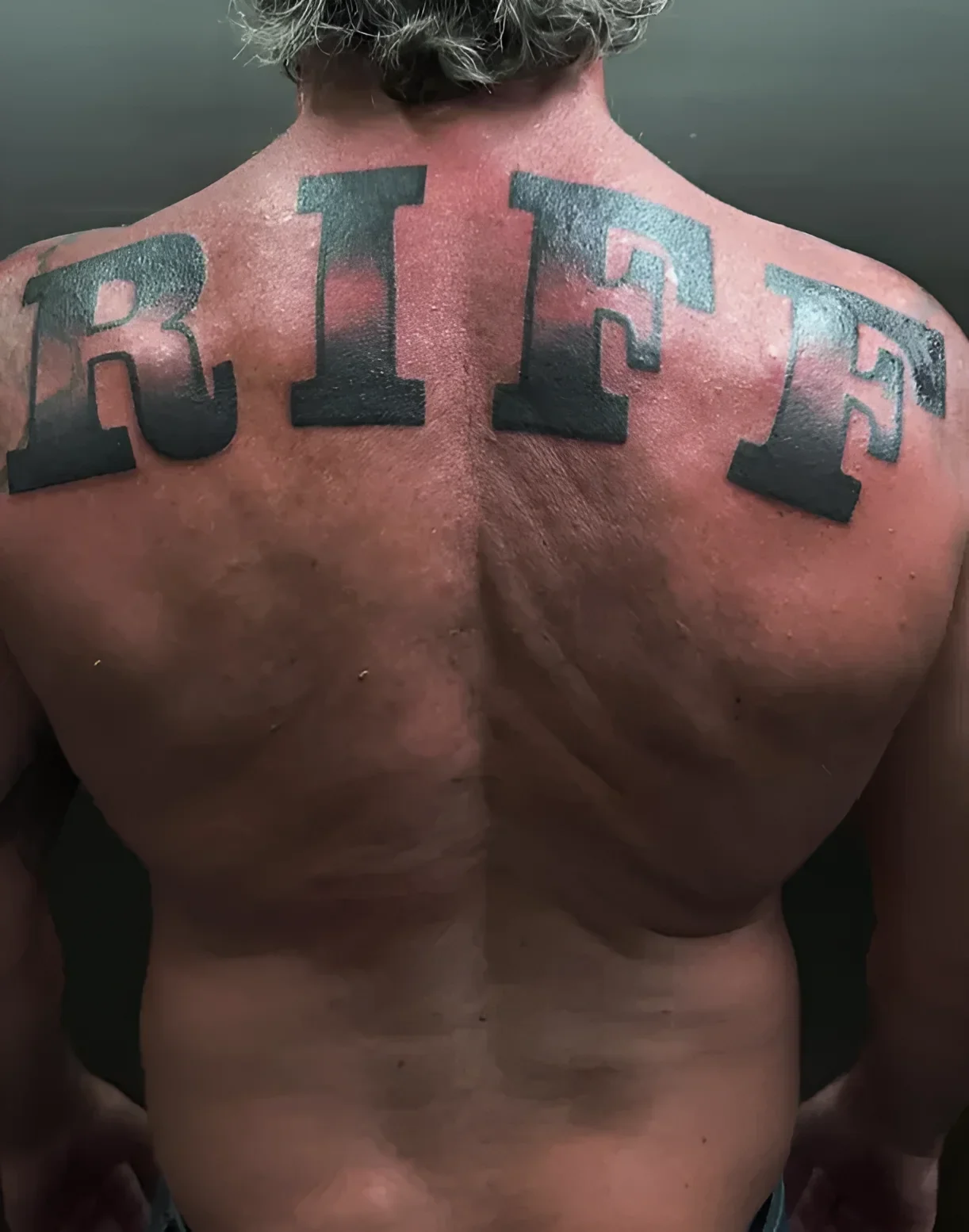
The RIFF piece is broad, dark and deliberately uncomplicated. The letters run across the shoulder-blade area in a bold type style, with enough fill to read clearly from a distance. There are no delicate flourishes trying to soften it and no busy background competing with the word. It works almost like a sports jersey or a sign on a local street: direct, familiar to the people who know it, and slightly mysterious to everyone else.
That local shorthand is the best part of the design. Someone outside Western Sydney might read “riff” as a music reference, but Penrith locals know the word as a badge of place. Purcell’s caption made that distinction clear, and the tattoo turns a bit of regional slang into a permanent piece of autobiography. The lettering also suits him visually. A fine-line version would have told a different story. This one feels solid, blunt and confident, which is exactly why it lands.
Reports from 7NEWS and The Nightly identify LA tattoo artist Jamie Gene Lopez as the artist behind the work. The tattoo was done at Joy Studio in downtown Los Angeles, which gives the back piece a nice little bridge between Purcell’s Australian roots and his current working life in the United States. He may live on the other side of the world now, but the design keeps Penrith close.
The newer chest work leans into Australian symbols
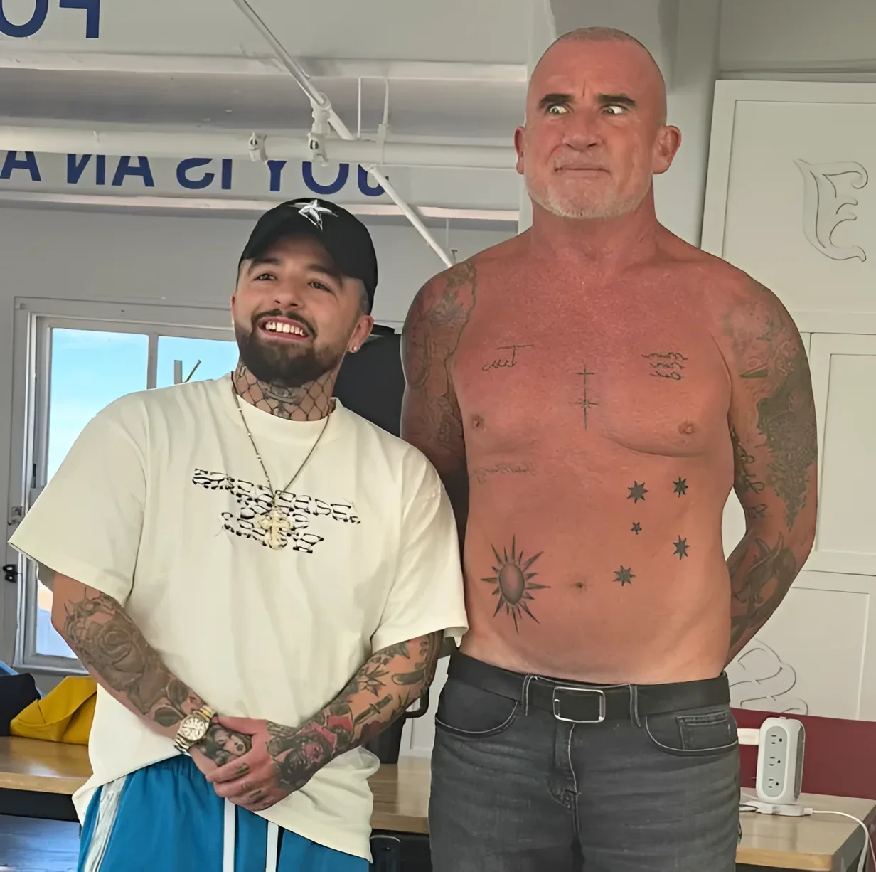
Purcell’s more recent Australian-themed additions take a different visual route. Instead of one giant word, the chest and abdomen pieces use small symbols spread across the body. The images show cross shapes, star-like elements associated with the Southern Cross, and a radiating sun. They read as a loose collection rather than a single boxed-in composition, leaving plenty of skin between each mark.
That spacing helps the tattoos feel personal rather than over-designed. The individual shapes are easy to see, but they don’t look like they were forced into one giant mural. The sun has a graphic quality, while the stars bring a more emblem-like rhythm to the stomach. Together, the placement creates a visual map of Australian identity without relying on a flag or a literal outline of the country.
Tatufoto’s September 2026 report connects the new work to the country where Purcell grew up and identifies tattoo artist Jamie Gene Lopez in the accompanying coverage. It also places these pieces alongside the RIFF back tattoo, which makes the theme pretty obvious: the latest part of his collection is about memory, geography and the places that shaped him.
For anyone looking at the design as inspiration, the useful detail is the restraint. Several small tattoos can still feel connected when they share a subject and a visual language. The symbols don’t need identical borders or matching sizes. A common idea can do the work.
The Fail Better quote keeps the arm lettering direct
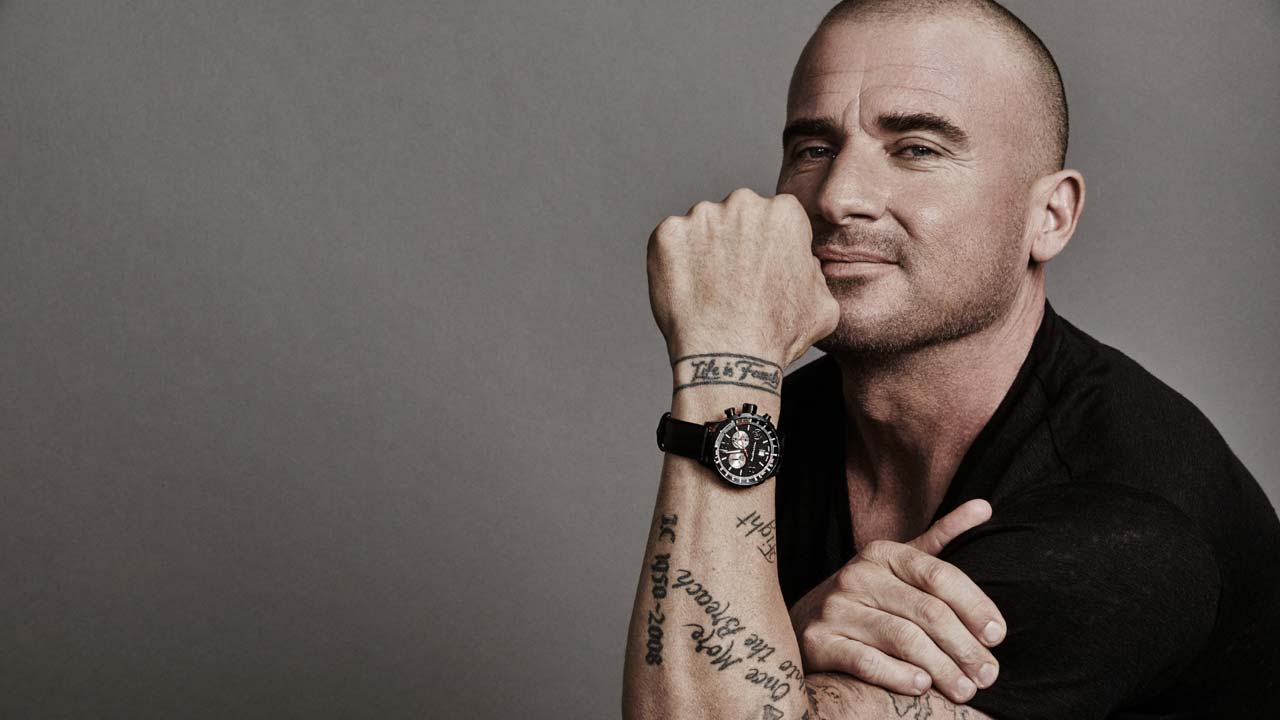
Older photos of Purcell’s arms show how comfortable he is with text tattoos. One of the best-known pieces is the Samuel Beckett line commonly shortened to “Fail Better,” taken from Worstward Ho! The fuller quote reads, “Ever tried. Ever failed. No matter. Try again. Fail again. Fail better.” On the arm, it appears as stacked script that follows the shape of the limb instead of sitting in one perfectly straight line.
The lettering has a lived-in look rather than a polished logo finish. That suits the words. A quote about trying again would feel strange if it looked too precious, and the slightly rougher appearance gives it some grit. It is the kind of tattoo that rewards a closer look because the meaning is carried by both the sentence and the way the sentence occupies the skin.
Purcell’s collection often works this way. He tends to choose designs that are readable, but he doesn’t make every piece look like it came from the same flash sheet. The quote has its own lane. It is narrow, text-heavy and intimate compared with the large back lettering, yet the black-and-grey approach keeps the overall collection from feeling disconnected.
Life is Forever wraps around the wrist
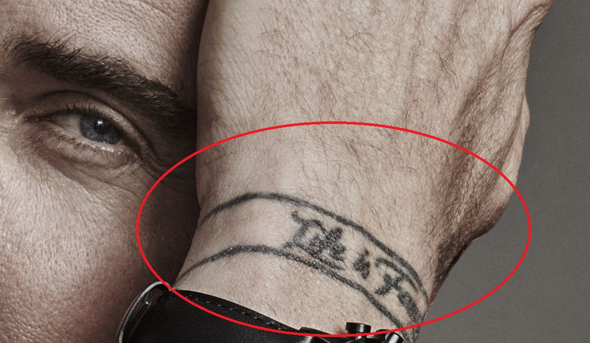
On the wrist, Purcell has a band-like tattoo that reads Life is Forever. It circles the wrist in a way that makes the words feel almost like a bracelet, although the uneven hand-lettered quality keeps it from looking like jewellery. The phrase is short, which is important in that location. Longer writing would be difficult to follow as the wrist turns, while these words remain easy to catch in a photograph.
Wrist tattoos get a lot of movement. They bend, crease, disappear beneath a watch and reappear when the arm shifts. The design has to survive all of that. Purcell’s lettering is bold enough to stay legible, and the wraparound placement gives a simple phrase more presence than it would have as a small line on the forearm.
There is also a practical side to the placement. A wrist message can be private when covered, but visible whenever the wearer wants it to be. That balance fits the phrase: it can function as a personal reminder without needing to be displayed like the RIFF piece.
Another clear feature in Purcell’s arm collection is an outlined anchor placed near the forearm lettering. The shape is familiar, but it isn’t tiny or overly decorative. The flukes and shank give it a sturdy silhouette, and the open interior lets the skin do some of the work. It sits close to text, so the contrast is useful: words on one side, a simple symbol on the other.
Anchor tattoos can mean a lot of different things depending on the person wearing them. Stability, loyalty, home and staying grounded are the usual readings, but it is safer to separate common symbolism from Purcell’s confirmed intentions. The available tattoo coverage identifies the design, while the personal meaning isn’t fully explained in his own words. That doesn’t make the piece less interesting. It just means the image should be described honestly instead of giving it a made-up backstory.
As a design reference, the anchor is a good reminder that a basic symbol can carry a whole section of a sleeve or arm without becoming background noise. Strong outlines and clear negative space keep it readable. The neighbouring writing adds texture, but the anchor remains the visual stop your eye notices first.
A split view puts the collection in context. It makes the contrast between the broad back lettering and the smaller arm pieces easy to see, even though the images come from different moments in Purcell’s tattoo history.
Purcell’s older tattoos also include family names, dates and a large compass-style piece on the shoulder. Body Art Guru describes the compass as using initials connected with his children in the directional positions, with dates included in the surrounding design. Other lettering is described as a tribute to his father, while additional dates and names appear across the arms.
That mix explains why the collection feels more like a record of a life than a carefully matched set. The same body carries a hometown nickname, a quote about failure, a wrist phrase, an anchor and family references. Some are loud and public. Others are only clear when the camera gets close. That contrast is what gives the tattoos character.
The compass idea is especially fitting beside the newer Australian pieces. A compass naturally suggests direction and home, while the RIFF lettering names the place that helped shape him. The designs aren’t identical, but they speak to the same subject. You can build a coherent personal theme without repeating one visual motif over and over.
What makes Dominic Purcell’s tattoos work
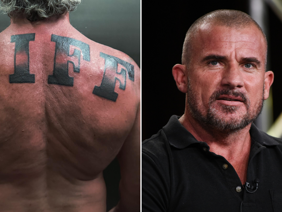
The strongest quality in Purcell’s body art is clarity. His tattoos are not shy about being seen, but most of them have a reason for their scale and placement. The RIFF back piece needs large letters because it is a hometown statement. The wrist phrase works as a band because it is meant to wrap. The anchor has a simple outline because it has to sit beside text without getting lost.
There is also a useful lesson in the way the designs have accumulated over time. They don’t all look freshly planned together. That is normal, and it often creates better results. A collection can grow around real events, family, work, memories and changing taste. Matching every piece perfectly can make a sleeve look neat, but it can also remove the personality that made someone want the tattoo in the first place.
If you like this style, focus on the parts that feel true to you before worrying about copying the look. Big lettering is powerful, but it needs wording you will still stand behind years later. A compass, anchor or sun is easy to find, so the personal angle has to come from the placement or the details around it. And if several small symbols share one idea, leave enough breathing room for each one to stay readable.
Purcell’s newest work brings that approach into focus. RIFF is simple, but it isn’t generic. It points to a very specific place, a very specific period and a very specific sense of pride. That is why a few heavy letters across the back can say more than a complicated design packed with symbolism.
Final take
Dominic Purcell’s tattoos are bold without feeling random. The new RIFF back tattoo is the headline piece, a huge Penrith reference that turns local slang into a clear identity marker. The newer chest symbols continue the Australian theme, while the older arm work adds quotes, family references, a wrist phrase and traditional imagery.
What ties it all together is honesty. The collection doesn’t pretend every design needs the same style. It lets a large block-letter back piece sit beside small stars, script, an anchor and a compass. If you’re collecting celebrity tattoo ideas, that’s probably the most useful takeaway: choose a design that says something specific, then let the rest of your collection grow around your actual life.