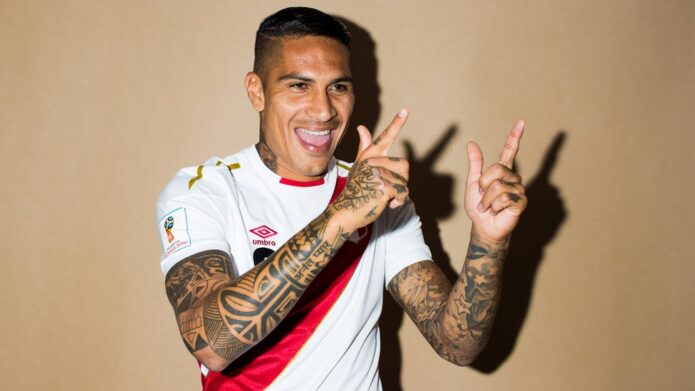
Paolo Guerrero’s tattoos are easy to spot on a football pitch, but they’re much more interesting than a quick look from the stands suggests. His arms are packed with heavy black geometry, portraits, lettering, religious imagery and the kind of smaller details that make a full collection feel personal instead of planned by a branding team. The whole thing reads like a visual timeline: Peru, family, faith, football and a few pieces that are simply part of his life.
What makes Guerrero’s ink work so well as tattoo inspiration is the mix. There isn’t one single style covering everything. Some pieces are bold and almost tribal, some are delicate script, and others lean into realistic portrait work. That gives you plenty to borrow without copying a celebrity tattoo one-for-one.
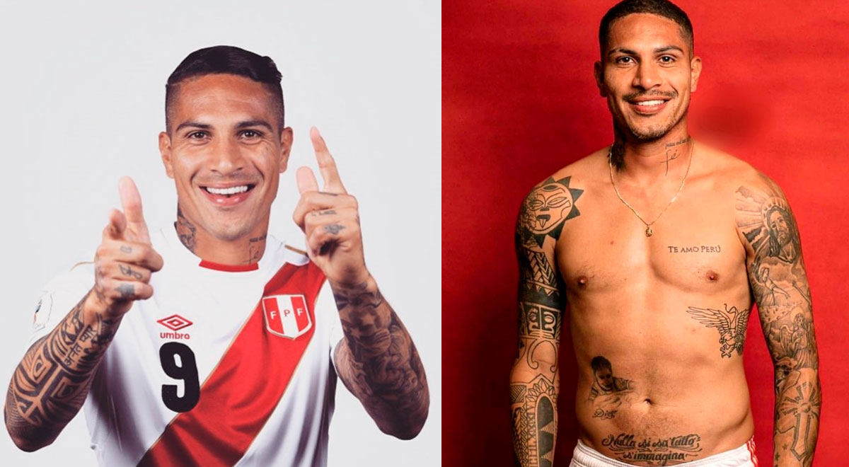
The “Te Amo Perú” chest tattoo
The clearest starting point is the lettering across Guerrero’s chest: “Te Amo Perú.” It’s direct, readable and tied to his identity as Peru’s longtime number nine. In photos, the phrase sits cleanly across the pectoral rather than being hidden inside a larger composition. That placement matters. Chest lettering can feel balanced and intentional when it follows the natural width of the body, but it can also look cramped if the type is too small or the spacing is rushed.
For a design inspired by this idea, think about the place or people you’d actually stand behind. A hometown, a family name or a short phrase can work better than a long quote. Use a typeface with enough breathing room to stay legible as it ages. Guerrero’s tattoo is a good reminder that a simple line of text doesn’t need extra decoration to carry weight.
Blackwork geometry across the arms
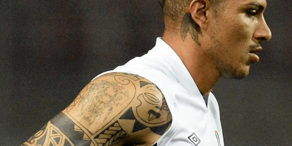
Guerrero’s arms are where the collection gets busiest. There are bands, angular shapes, repeating patterns and large sections of dark fill. The work has a strong blackwork feel, even when the exact designs change. That’s useful inspiration if you want a sleeve that looks connected without making every inch match.
The trick is to choose a visual language first. Maybe that’s sharp geometry, heavy black bands or a repeated motif. Once you have that anchor, individual tattoos can still be added over time. Guerrero’s arm photos show how separate pieces can start to read as one sleeve when the line weight and contrast stay consistent.
There’s also a nice lesson in spacing. Some of the lighter skin breaks keep the arms from becoming one solid block. If you’re planning a sleeve, leave room for the eye to rest. Negative space isn’t empty; it gives the darker work more impact.
Religious imagery and portrait realism
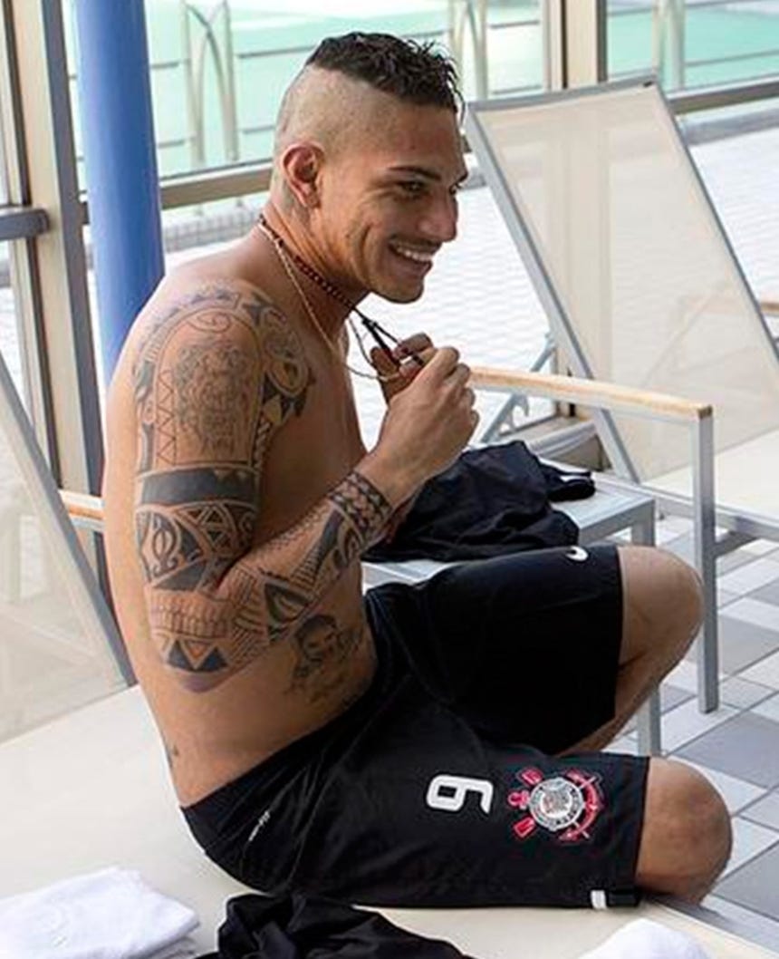
Alongside the geometric work, Guerrero has realistic and religious imagery across his torso and arms. The photographs show faces, figures and shaded details that sit in contrast with the harder-edged bands. That contrast keeps a large tattoo collection from feeling flat. Smooth shading gives the eye somewhere to slow down after it moves through all the graphic blackwork.
Realistic tattoos need a strong reference image and a tattooer who understands how that image will move on skin. A face that looks perfect on a screen can lose its expression when it’s squeezed into the wrong space. Guerrero’s larger pieces work because they have room to breathe. If you want this kind of design, pick the body area before you pick the picture. The placement should shape the composition, not just hold it.
The neck tattoos add a sharper edge
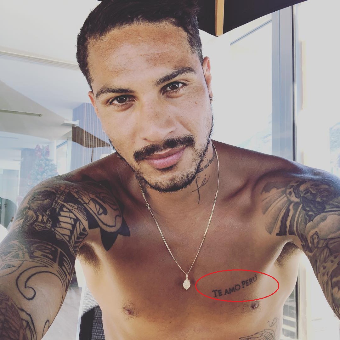
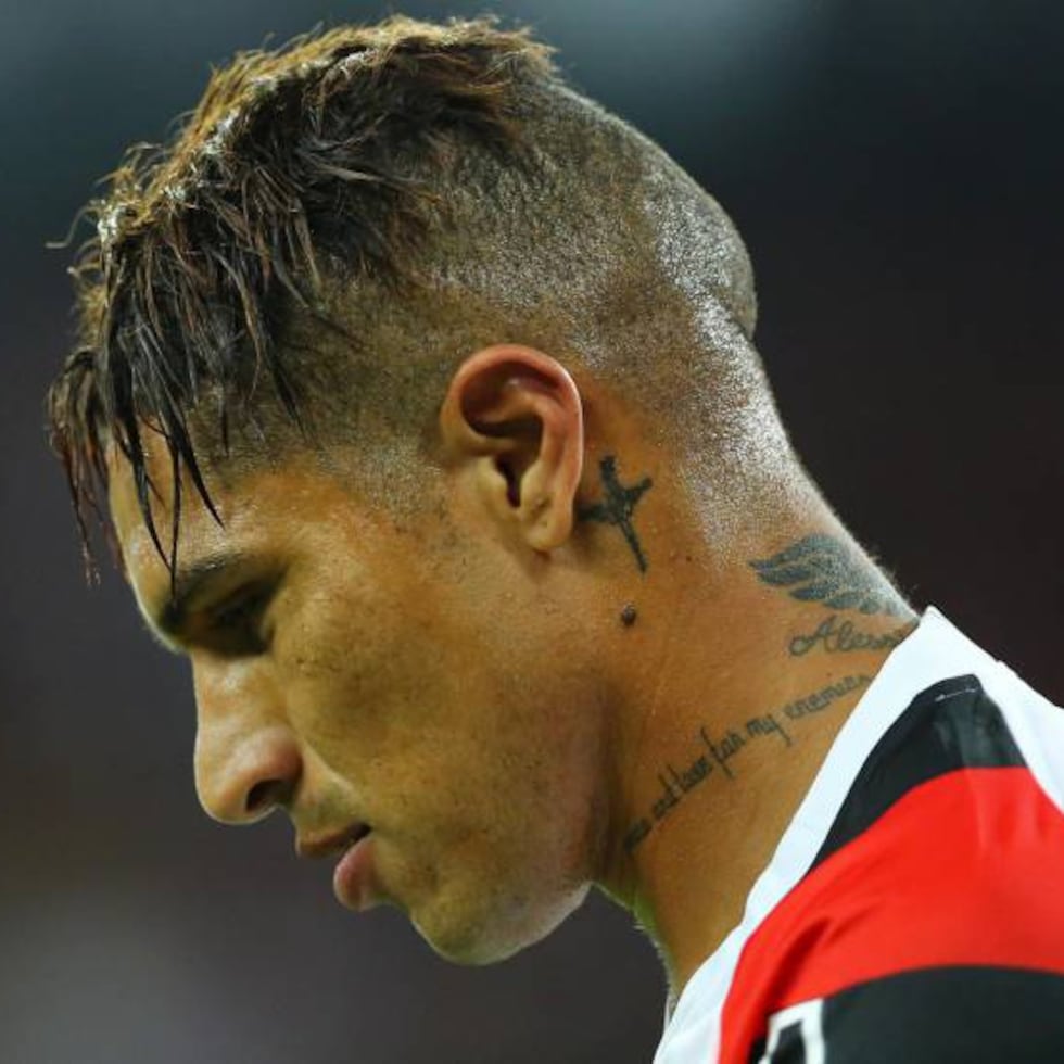
Guerrero’s neck ink is more compact, but it changes the feel of his whole look. A small script mark and darker symbols sit close to the jawline and behind the ear. Neck tattoos are always visible in a way an upper-arm piece isn’t, so the design needs to make sense with your everyday clothes, work and style.
His profile photos also show why a neck tattoo should be judged from more than one angle. A piece can look balanced from the front and crowded from the side. Ask your tattooer to place the stencil while you move your head naturally. The goal isn’t just a good photograph; it’s a design that works while you’re talking, turning and living in it.
How football and identity show up in the collection
Football is part of the context around Guerrero’s tattoos even when a design isn’t a literal team badge. He has spent his career carrying Peru’s colors, and photographs of him in the national kit make the connection hard to miss. His ink and his football identity sit next to each other rather than competing.
That’s a smart approach for anyone thinking about a sports tattoo. You don’t have to use a logo. A number, a date, a stadium outline, a flag detail or a small symbol can say more without looking like merchandise. The best personal sports tattoos leave room for the person behind the jersey.
Shoulder and profile details
One of the easiest details to miss in a full-body tattoo photo is the way a design wraps over the shoulder. Guerrero’s shoulder work follows the curve of the upper arm, so parts of the image appear and disappear as he turns. That movement is worth considering if you’re planning a tattoo in the same area.
A shoulder piece doesn’t need to be a perfect circle or a flat sticker. Curved placement can make the tattoo feel more natural, especially when the main subject has a strong direction. Let the tattooer draw for the body instead of forcing a finished sketch onto it.
Main takeaways from Paolo Guerrero’s collection
Guerrero’s collection works as inspiration because it isn’t locked into one neat trend. It combines bold geometry, meaningful lettering, personal imagery and realistic shading. If you like the overall look, start by choosing the part that actually feels like you. Maybe it’s the strong blackwork. Maybe it’s the “Te Amo Perú” idea of putting a place close to the heart. Maybe it’s the way a sleeve grows over time instead of arriving as one giant appointment.
Bring your tattooer a clear brief, not a pile of screenshots with no explanation. Say what you like about the references: the contrast, the layout, the type, the amount of skin break or the way the design wraps. Then let the artist build something that fits your body. Good tattoo inspiration should give you direction, not leave you with a copy.
That’s the real takeaway from Paolo Guerrero’s tattoos. The collection is personal first and aesthetic second. The strongest pieces connect to Peru, family, faith and football, while the darker geometry gives everything a common visual rhythm. Take that balance into your own design, and you’ll end up with ink that looks good now and still feels like yours years later.
Take photos of the stencil from the front, side and back before the needle starts. That quick check catches awkward angles early, especially on shoulders, ribs and necks. It also helps you notice whether lettering follows the body naturally. A few extra minutes in the studio can save a lot of second-guessing later.
And don’t forget the practical side. Large blackwork and detailed portrait pieces can take several sessions, so plan healing time between appointments. Your artist may also adjust the design after seeing how your skin takes the first pass. That’s normal. The strongest finished tattoo usually comes from good communication, patience and a willingness to let the work develop.
Before you book a piece
If you’re pulling ideas from these photos, make a short list before booking anything. Start with the message, then decide how visible you want it to be. Chest lettering can stay private under a shirt, while neck and hand work becomes part of your everyday introduction. That choice affects the scale, the amount of detail and even how much contrast the tattoo needs.
Next, separate the parts you genuinely like. “I want Paolo Guerrero’s tattoos” is too broad for a useful consultation. “I like the heavy geometric bands, the readable chest script and the way the sleeve leaves small skin breaks” gives an artist something to work with. You can also say what you don’t want. Maybe the realistic portraits aren’t for you, or maybe you want softer lines instead of dense blackwork.
Think about age as well. Fine script, tiny details and pale shading can change faster than bold lines and solid black. That doesn’t mean you have to choose a heavy style, but you should know what you’re signing up for. A good artist will explain how your chosen design may settle, fade or need a touch-up later.
Finally, let the design have some room. Guerrero’s tattoos look like a collection because each one has a job. One piece carries the message, another fills the arm, another adds a face or figure, and smaller marks connect the gaps. Your version can work the same way. Start with the tattoo that matters most, place it properly, and let the rest grow only when the next idea feels right.