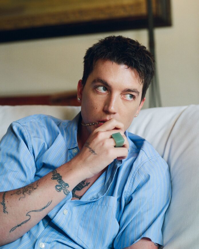
Paul Klein’s tattoos don’t feel like a matching set. They feel collected. One mark comes from the apartment where LANY wrote its early music, another is tied to a friend, another is just a tiny bit of handwriting, and the bigger pieces still keep that loose, black-line look running through his arms.
That’s what makes Klein’s ink fun to look at. The designs are simple enough to read in a photograph, but the reasons behind them aren’t generic. In GQ’s Tattoo Tour, he talks through the pieces in a relaxed way, pointing out the number 9, the heart, seven tally marks, the LA finger tattoo, a magnet, a whale, the matching date tattoo he got with Halsey, and several small words and symbols. There’s a lot there, but it doesn’t come across as one giant plan.
His collection has grown in the way real collections usually do: a new song, a friendship, a family memory, a joke, or a place gets turned into a small piece of black ink. The tattoos stay clean and fairly open, so you can see the individual ideas instead of one dark block covering the arm.
Paul Klein’s tattoo style in one look
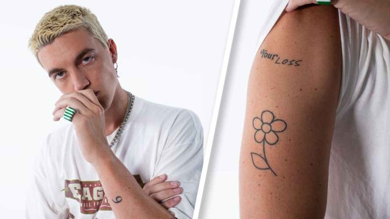
The clearest starting point is the flower and “Your Loss” combination on Klein’s upper arm. The flower is a straightforward black outline with rounded petals and a narrow stem. Above it, the words “Your Loss” sit in a loose handwritten style. Neither design is overloaded with shading. The open skin does a lot of the work, which gives both tattoos a light, almost sketchbook quality.
That photograph also gives you a quick sense of how Klein wears his tattoos. He doesn’t need a dramatic pose to make them visible. A raised sleeve and a turned arm are enough. The pieces can look soft and casual in one frame, then more graphic when the camera moves closer.
GQ identifies the flower as part of the visual language around LANY, while “Your Loss” is one of the more direct text pieces in the group. It’s easy to understand why the two work beside each other. The flower brings shape, the lettering brings attitude, and both stay simple enough that they don’t compete.
Paul Klein’s small black-line tattoos
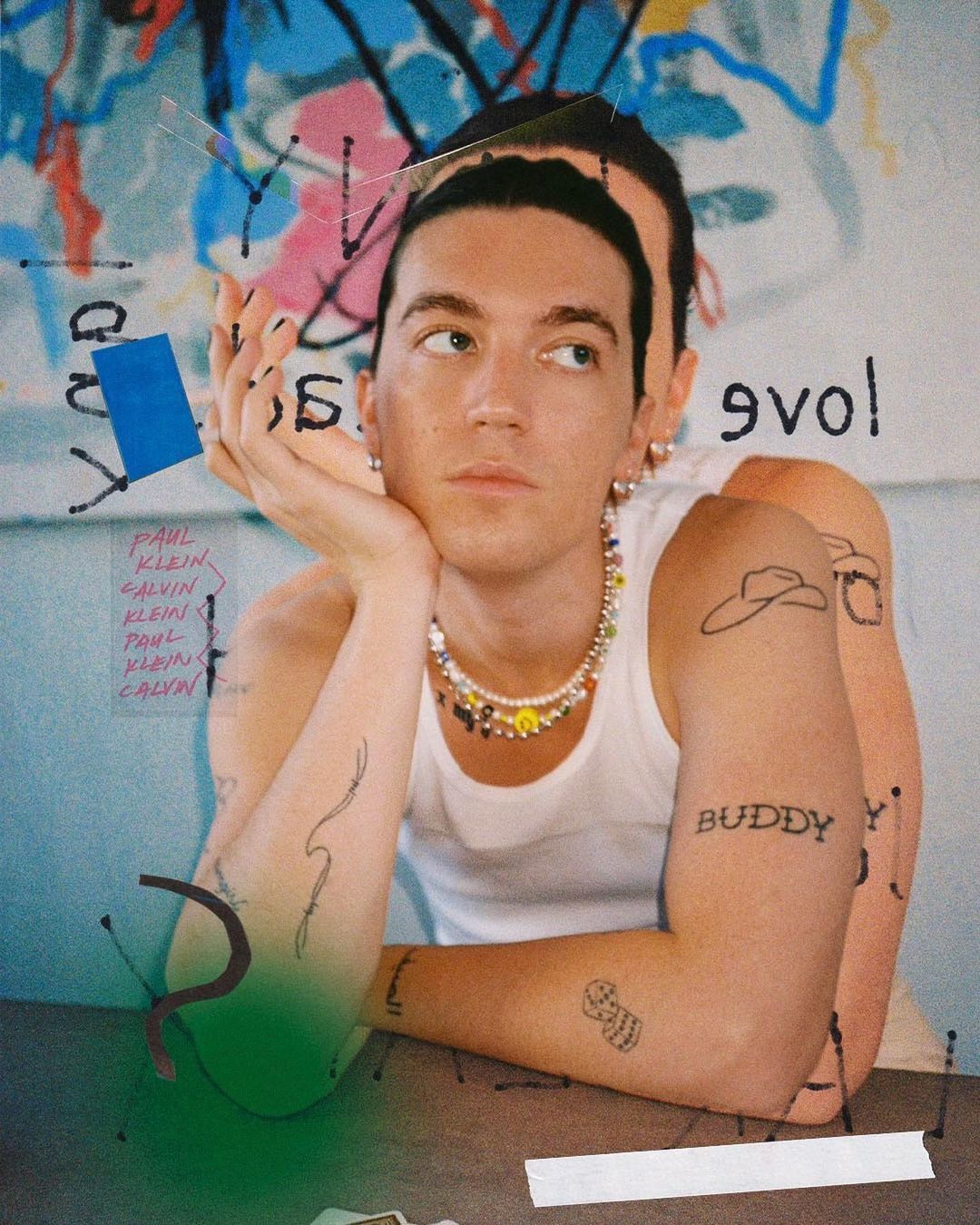
A wider portrait shows more of the collection at once. Klein is wearing a sleeveless black top, and several of the smaller marks are visible across both arms. There’s the flower on one upper arm, a small outline low on the other, a mark near the wrist, and lettering across the shoulder. The image isn’t a diagram, so it shouldn’t be used to assign a name to every shape, but it’s useful for seeing how the pieces sit together.
His approach is consistent even when the subjects change. The whale is reduced to a fine outline. The LA tattoo is tiny. The heart is uncomplicated. The seven tallies are exactly the kind of design that can stay small because the idea is carried by the count, not by detail.
Klein told GQ that the whale is his favorite animal and connects to childhood memories around Free Willy and a Michael Jackson song. That’s a good example of why a basic outline can still have a lot of weight. From a distance, it looks like a small animal drawing. For him, it holds a much bigger memory.
The magnet works in a similar way. Klein described it as a reminder of being called magnetic and as a symbol for drawing good things toward him. It’s a neat visual idea for a tattoo because the object already has a clear silhouette. You don’t need a huge shaded illustration to make the meaning legible.
Paul Klein’s 9, whale, and simple black-ink tattoos

In this seated portrait, Klein’s arm tattoos are easier to read as a group. The flower and “Your Loss” sit high on one arm, while the opposite arm carries small lettering and several compact symbols. The image gives you a better sense of the spacing: the pieces aren’t jammed together, and the gaps between them are part of the look.
The number 9 has one of the most specific explanations in the GQ interview. Klein says it refers to the apartment where LANY lived and wrote some of its early EPs. That’s a very unflashy reason to get a tattoo, which is exactly why it works. A single number can look mysterious to everyone else while still being completely obvious to the person wearing it.
He also has seven tally marks connected to seven John Mayer arena dates. Tally marks are almost comically plain, but they turn a run of shows into a compact visual record. That’s the sort of idea that suits Klein’s collection: a personal detail translated into the fewest lines possible.
There’s a small LA tattoo on one finger too. Klein explained that the original version faded after too much sun exposure in Malibu and had to be redone. Finger tattoos are a practical reminder that placement changes the maintenance story. Hands get washed, exposed, rubbed, and put to work constantly. A tiny design can need more patience than a larger arm piece.
None of this means every small tattoo has to carry a biography. Sometimes a symbol just looks right. But Klein’s collection shows how well a simple shape can hold a private reference without needing to announce the whole story.
The Buddy tattoo and the personal pieces
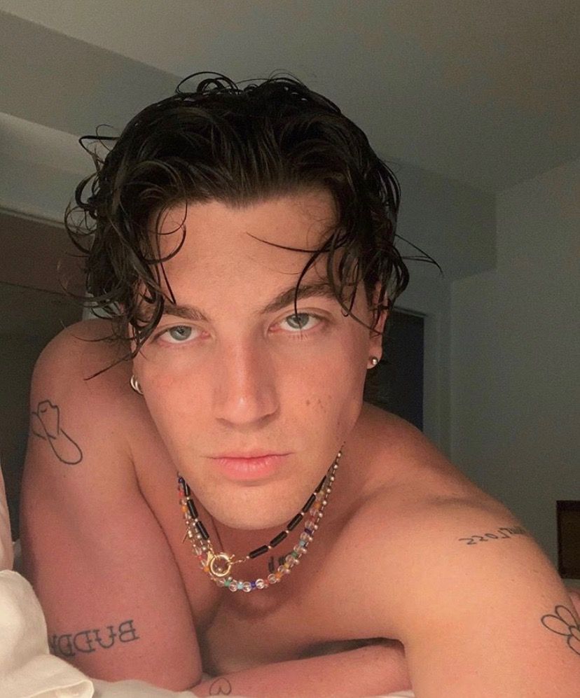
The word “BUDDY” is one of the most personal tattoos in the group. Klein told GQ that it honors his uncle, who acted as a stand-in grandfather. The lettering sits on the forearm in a direct, readable style. It isn’t hidden inside a complicated illustration. The relationship is the point.
That kind of text tattoo can be difficult to get right because lettering has nowhere to hide. The spacing, stroke weight, and size all matter. On Klein’s arm, the word has enough room to read as a word rather than turning into a dark strip of ink. The surrounding skin also gives it some breathing room.
Another text piece is “thx,” written in Klein’s own cursive handwriting. He described it as a gratitude tattoo. The lowercase letters feel more like a note than a formal typeface, which makes sense for the idea. A personal handwriting tattoo doesn’t need to look polished in the traditional way. The irregularity is what makes it belong to the person.
This is one of the better lessons in Klein’s collection if you’re thinking about meaningful lettering. A short word can be more convincing when it stays close to the way you actually write. Before handing an artist a typed font, try writing the word several ways on paper. Your natural rhythm may have more character than a pre-made script.
The matching tattoo with Halsey has its own story. GQ explains that the pair got the date connected to a November 5 show, with the tattoo happening on the sixth. The numbers are small and clean, but the context gives them a fixed moment in time. It’s not just a date pulled from a calendar; it’s tied to a shared night and a decision they made together.
Paul Klein’s flower and “Your Loss” tattoos

This outdoor portrait shows another clear view of Klein’s understated line work. The number 9 sits near the wrist, and a small whale-like outline appears farther up the forearm. The flower and other marks remain visible even though the photograph is more about the setting than about a tattoo reveal.
The “Your Loss” tattoo has a different mood from “BUDDY” or “thx.” Those pieces are tied to family and gratitude. “Your Loss” sounds sharper, almost like a message left behind after a breakup or a bad decision. Klein hasn’t needed to turn the phrase into a large statement. The handwritten treatment keeps it personal and a little casual.
The flower softens that edge. It’s not a realistic botanical study, and there’s no heavy shading to make it dramatic. The round petals and slim stem look like a quick drawing made permanent. Paired with the text, it creates one of the most recognizable sections of his collection.
There’s also a useful placement idea here. The upper arm gives the flower enough room to stay readable, while the words sit above it without needing to touch. If you like the look of a text-and-symbol pairing, leaving a little distance between the two can make each part stronger. They don’t have to be locked into one emblem.
What makes Paul Klein’s collection work
The common thread is restraint. Klein has plenty of tattoos, but most of them are not trying to fill every inch of skin. The black ink stays crisp, the symbols are easy to recognize, and the spaces between pieces keep the arms from feeling crowded.
There’s variety too. A number, a heart, a tally, a city abbreviation, a whale, a magnet, a flower, a date, a family word, and a short thank-you don’t all need to look alike. They feel connected because the scale and line quality are related, not because every tattoo uses the same subject.
That makes the collection a good reference for anyone who likes patchwork tattoos but doesn’t want a full sleeve right away. You can start with one symbol that matters, let it settle, and add another later. The blank space isn’t a problem to solve. It’s what lets the next piece have its own place.
There’s also a practical side to the style. Simple black linework can be easier to read at a small size than a tightly packed realistic image. That doesn’t mean small tattoos never spread or fade. It means the artist has a clearer job: keep the shape open, give the lines enough room, and don’t force details into a space that can’t hold them.
Ideas to borrow without copying
If you like Klein’s tattoos, borrow the thinking rather than the exact designs. A number can stand for a place that mattered to you. Tally marks can record a tour, a goal, or a stretch of time. A small animal can carry a childhood memory. Your own handwriting can turn a short word into something that doesn’t look like a stock design.
Try describing the reason in one sentence before you choose the artwork. “This is for the apartment where we started the band” is more useful than “I want a cool 9.” “This is my uncle’s nickname” gives an artist a better starting point than “I want BUDDY in a script font.” The story doesn’t have to appear in the finished tattoo, but it helps you decide what the design needs to keep.
Placement should come after the idea has some shape. Finger tattoos are visible and vulnerable to fading. The inner wrist moves a lot and catches sunlight. The upper arm offers more room and can be covered easily. A tattooer can help you adjust the scale, but it helps to know whether you want the piece to be a quiet detail or something you’ll see every time you lift your sleeve.
And don’t copy a celebrity tattoo from a screenshot. Use the reference to figure out what you like about it: the open line, the simple silhouette, the handwritten feel, or the amount of space around it. Then make the idea yours. That’s closer to the way Klein’s own collection seems to have developed.
The simple takeaway
Paul Klein’s tattoos are memorable because they’re specific without being overworked. The number 9 holds a band memory. The whale carries a childhood connection. The tallies mark a run of shows. “BUDDY” honors family, “thx” keeps gratitude in his own handwriting, and the flower with “Your Loss” gives his arm a recognizable visual pair.
None of the pieces needs a huge explanation on the skin. They work as small drawings first, then become more interesting when you hear why they’re there. That’s a solid formula for a personal collection: choose a shape you’ll still like, give it a reason that belongs to you, and leave enough room for the next idea to arrive later.