
Charles Melton’s newest tattoo is small, simple, and tied to one of the most intense films in his recent run. While making Warfare, Melton and several of his castmates got matching ink that reads “Call On Me.” The phrase connects directly to the film’s running reference to Eric Prydz’s dance track, but the meaning is less about the song itself than the promise sitting underneath it: when things get rough, these guys can call on one another.
That makes this a fun tattoo to look at because it doesn’t try to do too much. There isn’t a giant illustration, a complicated sleeve, or a stack of symbols to decode. It’s a short handwritten phrase, done in black ink, with the kind of private meaning that can stay important long after the cameras stop rolling. The cast made the tattoo after the experience of shooting the movie, turning a shared work memory into something they could carry away.
Charles Melton’s “Call On Me” Tattoo
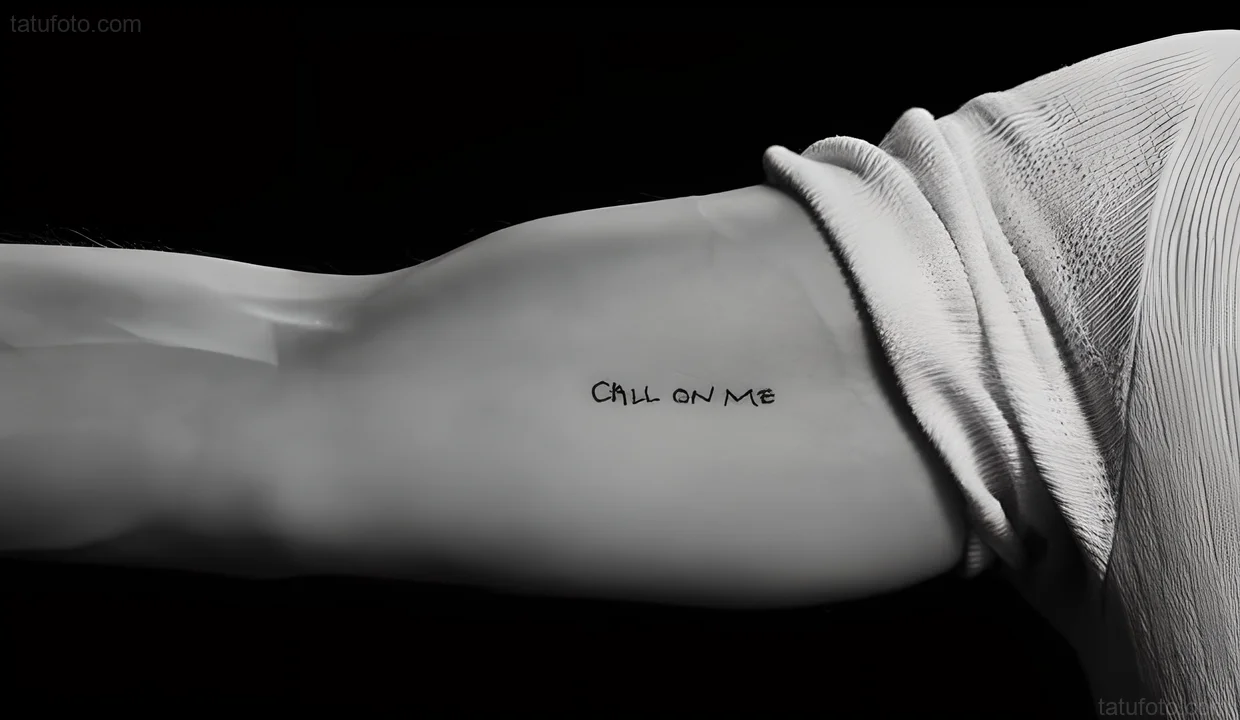
The design is exactly what the words suggest: a compact line of handwritten script that reads “CALL ON ME.” The letters are dark, slightly loose, and much more personal than a polished typeface would feel. It looks like a phrase someone might write quickly in a notebook, which suits the idea. The point isn’t to make the words look precious. The point is that they feel direct.
There is one useful bit of caution with the available photograph. The close-up shows the tattoo clearly and comes from a report about the Warfare cast, while multiple interviews confirm that Melton and his costars got the matching design. The arm in a tight crop doesn’t show a face, though, so it shouldn’t be used to claim an exact placement on Melton’s body. It is best understood as a visual reference for the shared tattoo itself, not as a forensic body map.
That distinction matters with celebrity ink. A tattoo can be associated with a star through reliable reporting without every online close-up proving which cast member’s skin is in the frame. Here, the strong part of the evidence is the combination of the cast interviews and the simple design. The phrase, the timing, and the reason for getting it are all consistent. The close-up gives readers a clear look at the lettering without asking it to prove more than it can.
Castmates, Pressure, and Trust
Small script tattoos work best when the wording does the heavy lifting. “Call on me” already sounds like something you would say to a friend, a teammate, or somebody who has been through a hard stretch with you. It doesn’t need a date underneath it. It doesn’t need a banner, an outline, or a decorative border. The phrase can stand on its own.
What makes Melton’s version more specific is the way it connects to Warfare. The film follows a group of Navy SEALs during a chaotic operation, and the cast had to build a believable sense of trust quickly. The actors went through demanding preparation together, then spent the shoot working inside a story where relying on the person next to you is the difference between getting through a moment and losing control of it.
In that setting, the words don’t read like a vague motivational quote. They sound like a practical promise. The movie’s opening uses Eric Prydz’s “Call on Me” as a memorable piece of the characters’ shared routine, and the cast turned that reference into something permanent after filming. It is a neat example of how a phrase from a production can become personal once the people involved have lived with it for months.
With the Cast
Matching tattoos can go wrong when the design feels like a piece of merchandise. This one avoids that problem. The lettering is plain enough to feel like a note passed between people who already know what it means. Anyone outside the group can read the sentence, but only the cast knows every layer behind it: the training, the long days, the jokes, the shared pressure, and the strange little details that turn a job into a bond.
There is also something smart about choosing a phrase instead of a logo for a cast tattoo. A logo would lock the memory to a particular production. These words can keep working even when the film is no longer the first thing people think about. Melton can look at the tattoo years later and still read it as a message between friends, even if the original set stories become less immediate.
The design is easy to adapt as inspiration, too. Someone could use the same idea with a different private phrase, a line from a song, or a reminder shared with a sibling or a close friend. The useful lesson isn’t to copy a celebrity’s lettering exactly. It is to choose language that sounds like something you would genuinely say. If the words would feel awkward coming out of your mouth, they will probably feel awkward on your skin as well.
On Set Together
The strongest matching tattoos usually have a clear origin. That doesn’t mean they need a dramatic public explanation. In fact, the best ones often work because the people wearing them don’t need to explain every detail. Melton’s “Call On Me” tattoo has that quality. The phrase is understandable at a glance, but the full reference belongs to the people who made Warfare together.
It also helps that the tattoo came after the cast had already done the hard part. This wasn’t a publicity stunt announced before production to create a headline. The reported timing puts it after the cast had gone through the experience and understood what they had shared. That gives the ink a different feel. It is a keepsake first and a celebrity detail second.
Melton has also talked about the idea of matching tattoos in connection with a previous cast experience, so the choice fits a pattern rather than appearing completely random. Still, each group memory has its own language. With Warfare, the phrase is tied to mutual support and to the film’s very specific musical reference. That gives this tattoo enough character to stand on its own.
After the Shoot

Visually, the tattoo is a good reminder that readable doesn’t have to mean oversized. The letters are small but clear, with a handwritten rhythm rather than strict geometric spacing. The ink stays black, and there are no extra flourishes competing with the words. A design like this depends on a tattooer getting the scale right. Too tiny and the letters can blur. Too clean and it starts to look like a font. The slight irregularity is part of its charm.
If you like the basic idea, bring the exact phrase you want to your artist and talk through how it will age. Script needs enough room for each letter to stay separate. The shape of the body also changes how a line of writing reads, especially around an arm or ribcage. A tattooer can adjust the spacing and size without changing the character of the phrase.
It is also worth being honest about what the reference image can and cannot tell you. The available close-up is useful for seeing the lettering, but it doesn’t establish Charles’s individual placement. That is fine. A good article about celebrity tattoos shouldn’t turn a cropped image into a certainty. The meaningful part here is the shared design and the story confirmed by the reporting around the cast.
Away From Work

There is a reason short phrases keep showing up in good tattoo collections. They can hold a lot without taking over the whole body. “Call on me” is especially flexible because it can mean loyalty, availability, or a reminder to accept help when you need it. Those are different ideas, but the same three words can carry all of them.
For Melton, the phrase has the added weight of a cast that had to function as a unit. He didn’t choose an abstract symbol that only a few people would recognize. He chose a sentence that still sounds natural in everyday life. That keeps the tattoo from becoming trapped in a press-kit explanation. Even if someone has never seen the film, the message still makes sense.
That is probably the most useful takeaway from this piece of ink. Personal tattoos don’t need a complicated explanation to be worth getting. They need a reason you will still respect later. A small line of script can work when it points to an actual relationship, a real season of life, or a promise you want close by. The words have to matter before the needle touches skin.
A Look at Charles Outside the Film
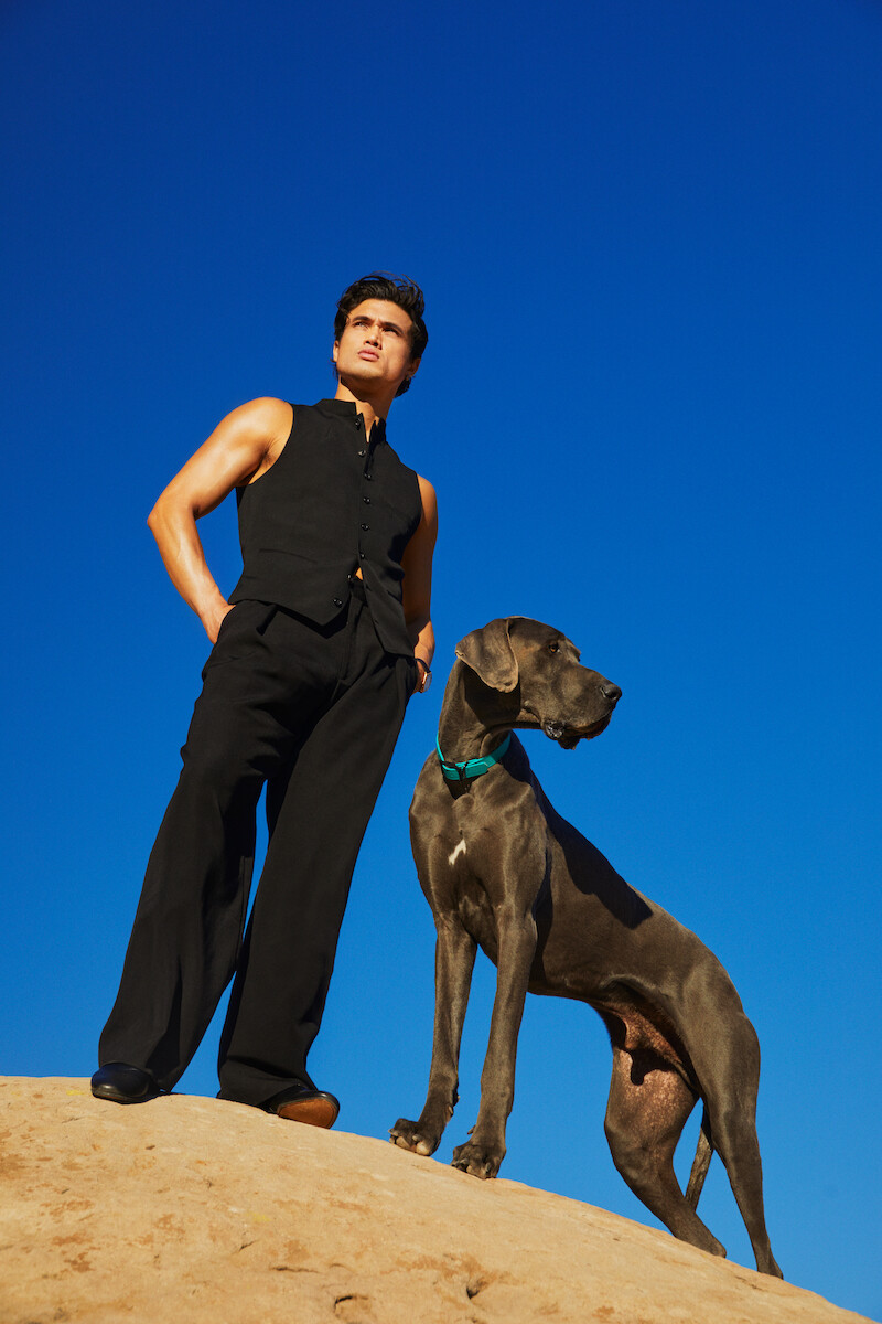
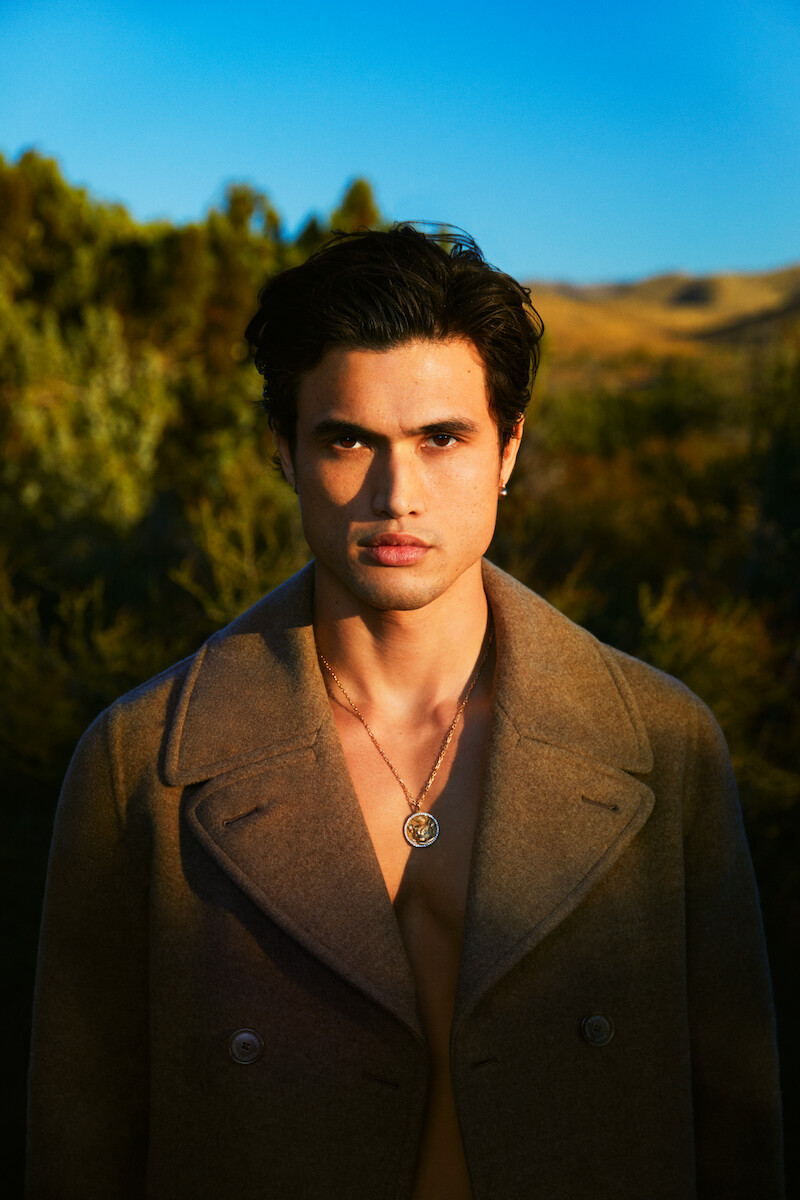
The Netflix gallery images here are contextual portraits, not additional tattoo evidence. They show Melton in a mix of outdoor settings and relaxed editorial poses, giving the page a face-visible look at the actor without pretending every image is an ink reference. Keeping those roles separate makes the tattoo section easier to trust: one image shows the reported design, while the other photos give the story some breathing room.
That split is useful for anyone collecting inspiration. A tattoo photograph should answer a specific question about the ink. A portrait can establish the person, mood, or era without being asked to prove a detail it doesn’t show. Mixing the two carelessly is how celebrity tattoo pages end up filled with attractive but irrelevant pictures. The best galleries know what each image is doing.
For more celebrity tattoo ideas, you can browse the actors tattoo archive. Melton’s “Call On Me” piece is a good example of a design that looks simple on the surface but has a strong private anchor underneath. The lettering is direct, the story is specific, and the tattoo doesn’t need to shout to stay memorable.
In the end, Charles Melton’s reported matching tattoo is less about celebrity style than shared history. Three words turned into a small black script design, and that design now carries the memory of a cast learning to rely on one another. If you want a phrase tattoo of your own, that is the part to borrow: choose words with a real person, place, or promise behind them. Keep the lettering readable, give it enough room to age well, and let the meaning do the work.