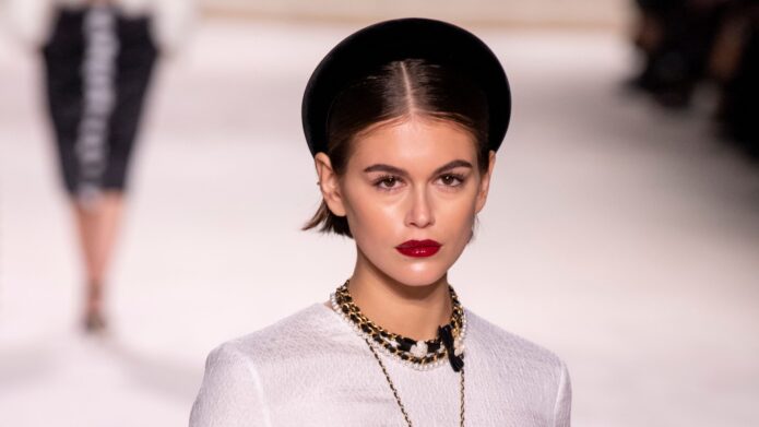
Kaia Gerber Tattoos: Tiny Fine-Line Designs and Their Meanings
Kaia Gerber’s tattoos are easy to miss, which is kind of the point. Most of them are small, fine-line pieces that sit quietly on an elbow, wrist, ankle, ribcage, or arm. They don’t compete with what she’s wearing, but they still give a close-up a little extra detail. When one does appear in a photo, it usually feels like a personal note rather than a big announcement.
Her collection includes a tiny 23, delicate flowers, an angel, lettering, a female torso drawing, and matching ideas shared with people close to her. Some designs have a clear explanation behind them. Others are private, connected to a friendship, a family moment, or a piece of art she likes. That mix makes her style useful to study if you’re thinking about a small tattoo that won’t take over your whole look.
Kaia Gerber’s tiny 23 tattoo
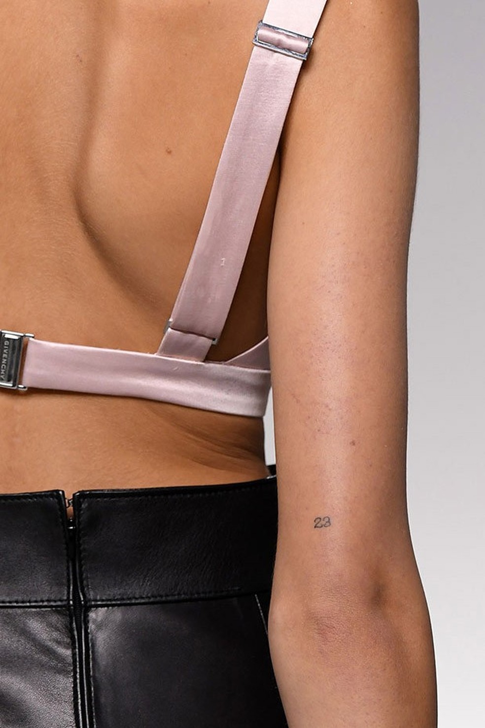
The little 23 near Kaia’s elbow is one of the most recognisable pieces in her collection. It is small enough to disappear when her arm is relaxed, but the placement lets it show when she bends her elbow or wears a sleeveless top. Teen Vogue linked the number to the beginning of her career, giving the design a straightforward personal meaning without making it feel overly literal.
Numerals work well at this scale because they have a naturally clean shape. There isn’t much for the artist to simplify, so even a tiny pair of numbers can stay readable as the tattoo settles. The key is spacing. If the digits are packed too closely together, they can blur into one mark over time; if they have a little air around them, the piece keeps its crisp, almost handwritten feel.
Kaia’s version also benefits from its position. The elbow is a moving area, so a design there will look slightly different when the arm is straight compared with when it is folded. That movement gives a very simple tattoo more character. It doesn’t need shading, a frame, or extra decoration to feel finished.
The ankle lettering is easy to miss
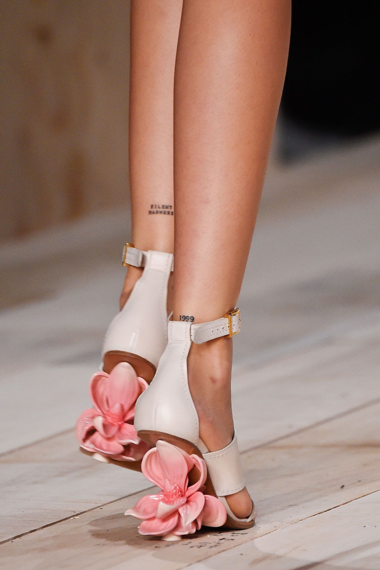
Kaia also has small lettering around her ankles, including SILENT MADNESS and 1999. The words sit low on the leg, where they can be covered by trousers or hidden behind a pair of shoes. In a full-length photograph, you might notice the footwear first and only catch the lettering after looking twice.
That low placement gives the pieces a different mood from the more visible arm tattoos. Ankle lettering can feel almost like a private label, especially when the type is kept narrow and the line weight is light. It also gives the wearer a little more control over when the tattoo is part of an outfit. Roll up a trouser leg and it becomes a detail; cover it and the rest of the styling stays clean.
Words need extra care at a small size. A good tattooer will talk through the typeface, the width of the letters, and how the phrase needs to sit around the ankle. The goal isn’t to make the text microscopic. It is to make sure the tattoo still reads comfortably after the skin has healed and the lines have softened.
A small flower on the wrist
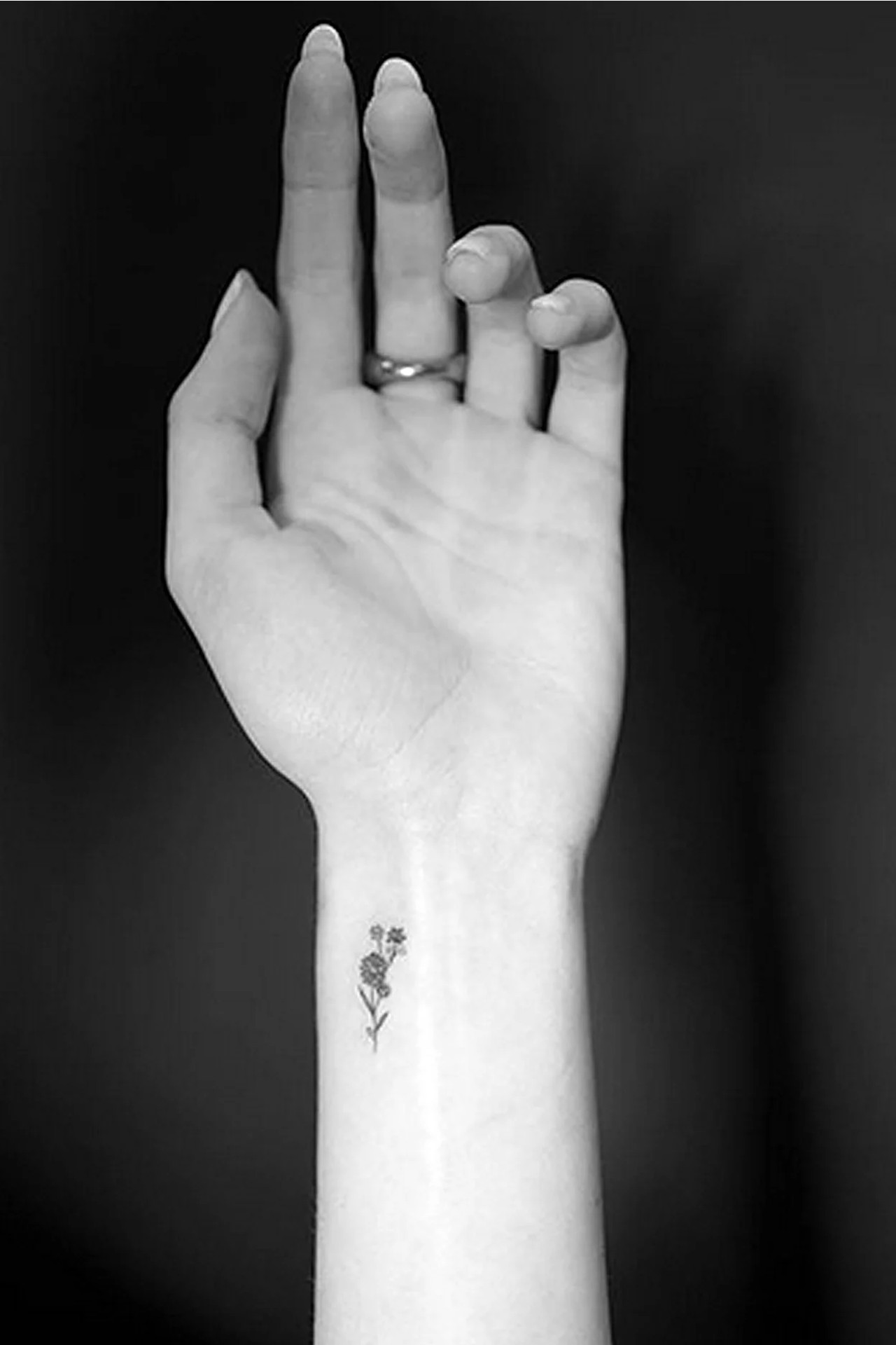
One of Kaia’s wrist tattoos is a tiny flower sprig. The design is light and uncomplicated: a few fine stems and petals, with enough open skin around it to keep the shape clear. It has the kind of scale that works with a watch or bracelet without trying to become the centre of the whole wrist.
Small botanical tattoos are popular for a reason. Flowers can be recognisable without needing heavy outlines, and they leave plenty of room for the artist to adjust the shape to the body. A wrist piece can be made more vertical along the side of the arm, turned toward the hand, or placed where it peeks out beneath a sleeve. Kaia’s approach is particularly restrained, using the idea of a flower rather than a dense, fully shaded bouquet.
The open space matters as much as the lines. Fine-line work can lose its lightness if too many details are squeezed into a tiny area. Here, the small gap between petals and the simple stem keep the tattoo looking airy. It is a good example of why a minimal tattoo doesn’t mean an effortless one. The fewer marks there are, the more each mark has to do.
The female torso tattoo with a personal edge
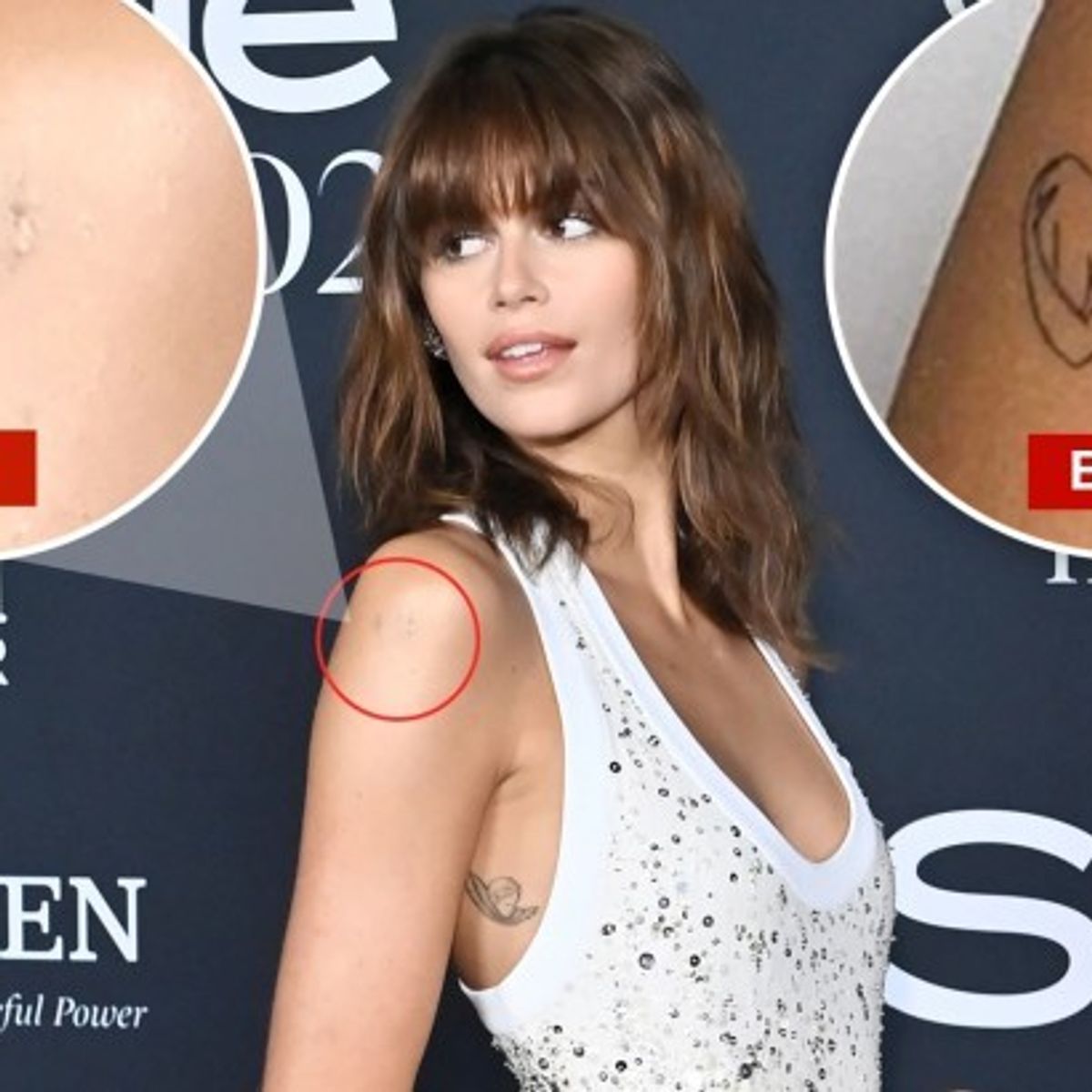
During a 2020 studio session, Kaia got two delicate pieces connected to her brother Presley: a female torso outline on her arm and tiny flowers on her wrist. The torso design is the more distinctive of the two. It uses a single continuous-looking outline, with the figure’s arms folded into a heart shape. The image is simple, but the pose gives it a clear emotional centre.
This is the kind of fine-line tattoo that can look almost like a sketch from a notebook. There is no need for a thick border or a large block of colour because the silhouette does the work. A design like this depends on a steady hand and sensible sizing. Too small, and the curves can lose their separation. Too large, and the quiet, sketch-like feeling changes.
Later coverage has shown the tattoo in the context of its possible removal, so it shouldn’t be described as a permanent fixture without qualification. That detail is useful for anyone studying celebrity tattoos: photographs capture a moment, while tattoos can be changed, covered, lightened, or removed. A clear image is evidence of what was visible at that time, not a promise that the piece looks exactly the same today.
Why the small scale works
Across Kaia’s collection, the common thread is restraint. The tattoos are mostly fine-line, compact, and placed where they can be shown or hidden without much effort. That gives her plenty of flexibility. A tiny number can sit beside a formal outfit. A flower can disappear under a cuff. Lettering at the ankle can be part of a casual look without changing the silhouette of the clothes.
Small doesn’t automatically mean subtle, though. Placement changes how much attention a tattoo gets. A wrist is seen during everyday gestures, while a ribcage design may stay private for most of the year. An elbow mark moves with the body. An ankle piece becomes more visible in sandals. The same two-inch tattoo can feel completely different depending on where it lives.
Kaia’s choices also show the advantage of leaving room around a design. None of these pieces needs to be crowded against another one. The skin between tattoos gives each mark its own shape, which is especially helpful when the designs are made from thin black lines. If you’re planning a small collection, spacing is worth thinking about before you book the appointment. A little breathing room now can make future additions easier.
Matching ideas with Cara and Ayo
Kaia’s matching tattoo with Cara Delevingne is a good example of a design that plays with language. The pair have solemate tattooed along the arches of their feet, turning a familiar word into a small private joke. The location makes the idea even better: you don’t notice it unless the feet are visible, and the wording only really lands when you know both people have the same piece.
Kaia was also reported to have a fresh matching tattoo with Ayo Edebiri. E! reported the reveal but made clear that Kaia was keeping the design hidden, so there is no responsible way to fill in the motif or placement. That lack of information is part of the story. Matching tattoos don’t have to be public-facing announcements. Sometimes the point is simply that the people involved know what they share.
If you’re considering a matching tattoo, the practical lesson is to choose an idea that still works on its own. A shared joke, a tiny word, or a simple symbol can feel personal without requiring the other person to be standing beside you. It also helps to agree on size and placement while leaving room for each tattooer to adapt the design to the individual body.
The details she keeps quieter
Not every piece in Kaia’s collection has a big public explanation. Teen Vogue has also reported a tiny angel on her ribcage and Jordan, her middle name, on her arm. Those details fit the same overall pattern: personal references, light linework, and placements that don’t demand attention every day.
She has also discussed I know tattoos that were crossed out, connecting the idea to Tracey Emin’s neon work, and Vogue has referenced never rush in the context of a 2024 profile. The exact visibility of a tattoo can change depending on the photo, styling, or later edits, so those phrases are best treated as documented parts of her tattoo history rather than a complete current map of her body.
That uncertainty is normal. Celebrity tattoo galleries often collect images across several years, sometimes from different angles and with different levels of editing. A design can look darker when it is fresh, softer after healing, or partly hidden by clothing. Good tattoo reporting should separate what can be seen in a photograph from what has been confirmed by the person or a credible publication.
The visual language around her work

Kaia’s fashion images help explain why these tattoos read as accents rather than a single loud statement. Her styling often changes dramatically, but the small pieces stay adaptable. A clean black line can sit beside tailoring, denim, eveningwear, or a casual T-shirt without fighting the outfit. That flexibility is one reason minimal tattoos continue to appeal to people who want something personal but not visually heavy.
It also explains why close-up photographs are more useful than a distant red-carpet shot when you’re researching a design. Distance can make a tiny tattoo look like a shadow or a stray mark. A close view lets you see the actual line quality, the scale, and whether the design is placed on the wrist, elbow, ankle, or somewhere else. For your own appointment, use reference photos to discuss the idea, then let the tattooer redraw it for your body rather than copying a celebrity piece exactly.
What to borrow for your own idea
The easiest thing to borrow from Kaia’s tattoos isn’t a specific number or phrase. It’s the sense of editing. Pick one small idea and give it enough space to breathe. If it is lettering, make sure the words can be read at the size you want. If it is a flower, remove extra detail instead of forcing every petal into the design. If it is a figure or symbol, keep the silhouette clear.
Placement should follow your real habits, too. Think about whether you want to see the tattoo every day, whether your job affects what can be visible, and how the area moves. Ankles rub against socks and shoes. Wrists get washed and exposed to the sun. Elbows crease. Ribs can be more private but may be a tougher spot for a first appointment. Your tattooer can talk through the trade-offs and suggest a size that will age well.
Most of all, don’t rush a small tattoo just because the appointment will be short. A simple design has nowhere to hide if the spacing is off or the placement doesn’t suit you. Bring references, explain what the piece means to you, and leave room for the artist’s experience. Kaia’s collection works because the tattoos feel considered, even when they are only a few lines long.
That is the appeal of her style: quiet pieces with enough meaning behind them to stay interesting. A tiny number can mark a career beginning. A flower can hold a family connection. A private matching tattoo can be a joke shared by two friends. None of those ideas needs to be oversized to matter.