Franklin Jonas has a new piece of ink that feels very specific to him. It isn’t a random flash design or a giant statement tattoo built for a red-carpet reveal. It’s a small, clean Ponyo and Sosuke illustration on his forearm, made as a matching tattoo with Noah Cyrus. The idea works because the film is part of their shared history, and Franklin has a direct connection to the character he voiced.
The design is simple at first glance: two familiar figures leaning in close, drawn in black outline. Look a little longer and the appeal becomes clearer. It has the warmth of a favorite movie, the slightly odd charm of a hand-drawn animation still, and the quiet meaning that matching tattoos can carry when two people have actually grown up around the same reference.
Here’s what we can see in the tattoo, why the Ponyo choice fits Franklin so well, and what makes the design useful inspiration if you’re thinking about a small paired tattoo of your own.
The matching Ponyo and Sosuke tattoo
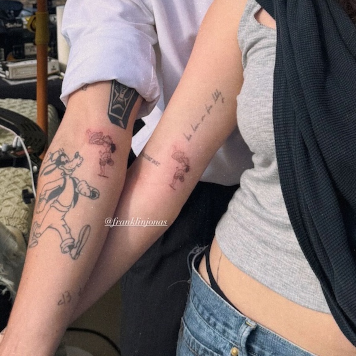
The clearest view shows Franklin and Noah with their inner forearms turned toward the camera. Each person has a matching black-outline scene: Ponyo and Sosuke are drawn nose-to-nose, with the characters facing one another across the small design. It reads like a tiny animated frame rather than a heavy, sticker-like character portrait.
That choice of framing matters. A full-color Ponyo tattoo could easily become busy, especially at a smaller size. The pair went with a graphic outline that keeps the faces and silhouettes readable without filling the forearm with color. The open skin around the drawing also gives it room to breathe. That’s useful when you want a character tattoo to stay recognizable as it ages instead of turning into a dark little block.
The reporting around the reveal described the tattoo as a matching piece and included a caption translating the idea as “Ponyo loves Sosuke.” That gives the image a little more context, but the tattoo itself doesn’t need a long explanation. Ponyo and Sosuke leaning toward each other already communicates affection, trust, and the kind of closeness the film is built around.
Franklin’s tattoo sits on the inner forearm, where a horizontal or slightly vertical illustration can be shown without much distortion. It’s a practical spot for a piece like this. The skin is broad enough for two faces and a few small details, while the design can still be covered with a sleeve or shown when he turns his arm over.
The visible line work is deliberately light and sketch-like. There’s no attempt to make the characters look realistic, and that’s the right call. The charm comes from keeping the animated shapes intact: Ponyo’s rounded face, Sosuke’s simple profile, and the little space between them. A tattoo artist who tried to add too much shading could lose that soft, hand-drawn feeling.
Why the reference matters to them
Matching tattoos can get sentimental in a hurry, but this one has a strong anchor. Franklin and Noah aren’t just choosing a popular animated movie because it looks cute. The film connects to their family and work history, and the matching design points to a shared reference they can both carry.
It’s also better that the two tattoos don’t need to be placed together to make sense. Each forearm holds the same complete little scene. If you see Franklin’s tattoo by itself, you still get Ponyo and Sosuke. When the two arms are shown side by side, the matching idea becomes obvious without requiring the images to line up perfectly.
That’s a smart way to plan a paired tattoo. Designs that only work when two people stand in one exact position can be fun, but they’re harder to live with. A self-contained image gives each person ownership of the tattoo. The shared meaning is there, but neither piece looks unfinished when the other person isn’t around.
The tattoo also avoids the usual symbols people reach for when they want to mark a close friendship. There are no names, dates, matching initials, or locked-together hearts. Instead, the pair chose characters with a real connection to their lives. It feels personal without being too literal.
If you’re looking for a similar approach, start with a reference that belongs to both people. That could be a movie, a game, a song, a childhood book, or even a strange phrase that only makes sense to your group. The best matching tattoos usually have an answer to the question “why this?” that goes beyond “we liked the picture.”
The Ponyo connection

Franklin’s link to Ponyo is unusually direct. He voiced Sosuke in the English-language version of the film, so the character isn’t just an image he liked after seeing it online. His voice is part of the movie people know. That makes the matching tattoo feel less like general fan art and more like a nod to a specific chapter in his life.
Ponyo is built around the friendship between Sosuke and a magical fish who wants to become human. The story is bright and strange, but the emotional center is easy to understand: two young characters meet, choose to look after one another, and keep moving through a world that keeps getting bigger and more chaotic. That combination of odd imagery and simple feeling translates well into tattoo form.
The nose-to-nose pose is a good piece of visual shorthand. It doesn’t try to summarize the whole film. It picks one small relationship moment and lets the two faces carry the feeling. That’s usually the strongest route for a character tattoo. Pick one gesture, prop, or expression instead of cramming an entire plot onto somebody’s arm.
There’s another useful lesson in the choice of black outline. Animation often gives tattoo artists clean shapes to work with, but not every frame should be copied exactly. A good tattoo version may simplify a background, remove tiny details, or adjust the characters so they read clearly on skin. The goal isn’t to recreate a screenshot at full resolution. It’s to keep the part that made the reference meaningful in the first place.
For a Ponyo-inspired tattoo, you could go in several directions. A tiny Ponyo face would suit someone who wants a minimal piece. A small ocean wave could work for a more abstract reference. Ponyo and Sosuke facing one another, like Franklin’s design, makes the friendship theme clear. You could also use the little bucket, a fish silhouette, or a simple pair of shapes that only fans of the film would recognize.
Whichever route you take, bring the original reference to the artist and talk through scale before settling on a final drawing. Details that look fine on a phone screen may disappear when reduced to tattoo size. A few minutes spent simplifying the design can make the finished piece much stronger.
Franklin and Noah before the new drawing
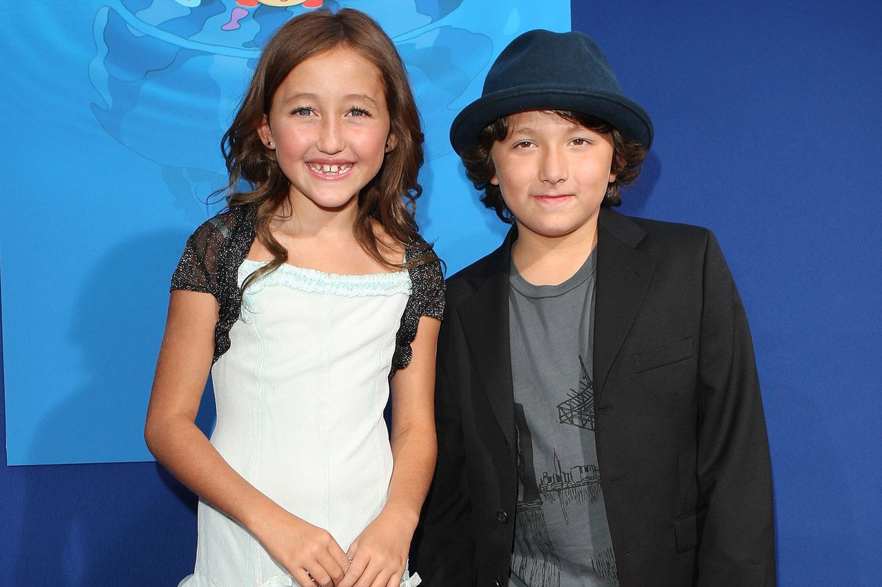
The new tattoo makes more sense when you remember that Franklin Jonas and Noah Cyrus have known each other since they were young. The matching Ponyo design lands as a shared-history tattoo, not a sudden concept pulled from nowhere.
That kind of history is exactly what makes a matching tattoo feel comfortable. People often worry that a paired tattoo has to represent a single dramatic event. It doesn’t. Sometimes it can mark years of knowing someone, a period when your families overlapped, a project you made together, or a piece of media that stayed in the background while your lives changed.
It also helps that the design is compact. The tattoo doesn’t try to explain every part of the friendship. It leaves plenty of room for the people wearing it to know the private details without putting all of them on display. That balance is one reason small illustrative tattoos age well as personal objects. The image can be understood by strangers, while the full meaning remains with the owner.
Placement can help with that balance too. The inner forearm is visible when Franklin wants to show the piece, but it isn’t the first thing everyone sees. It’s a good middle ground for someone who wants a tattoo that feels present without making it the center of every outfit or photograph.
If you and a friend are planning something similar, talk about whether you want identical tattoos or two images that belong together. Identical pieces are straightforward, but a pair of complementary designs can give each person a little more individuality. One person might get Ponyo while the other gets Sosuke. One could use the ocean and the other the shore. The strongest option is the one that still feels good to each person separately.
Franklin’s style outside the reveal

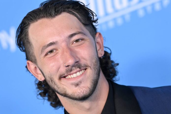
Franklin’s broader look makes the small line tattoo feel believable. The piece doesn’t read like a one-off stunt designed only for the reveal. It sits comfortably with a more relaxed, creative personal style, where an animated reference can be worn without needing to be treated as a formal symbol.
This image is included as a contextual portrait, not as evidence of another Franklin tattoo. That distinction matters when you’re researching celebrity ink. A clear portrait can help you recognize the person and give an article some visual breathing room, but it shouldn’t be used to claim that a barely visible mark is a confirmed tattoo.
For the Ponyo piece itself, the practical design details are worth borrowing. Keep the line weight consistent. Give the faces enough size to remain readable. Don’t crowd the characters with a background unless the background is essential. If you love the color palette from the film, consider using one small accent instead of trying to reproduce every bright shade.
Think about the way the tattoo will move, too. The inner forearm bends and twists, so the artist should check the design from a few angles. A pose that looks perfect with the arm flat may feel stretched when the wrist turns. That doesn’t mean the placement is bad. It just means the drawing should be built for a body rather than copied onto one.
Size is the other big decision. Going tiny can make the tattoo feel delicate, but there’s a limit to how small two faces and their expressions can be. If the main reason you love the design is the nose-to-nose interaction, give that part enough room. A slightly larger tattoo with clean negative space will usually age better than a miniature drawing packed with lines.
Ask the artist how they expect the outline to settle after healing. Fresh black ink can look sharper and darker than it will later. Follow the aftercare instructions, keep the tattoo out of unnecessary sun while it heals, and don’t judge the final look on day one. A simple illustration relies on clear lines, so taking care of the skin is part of protecting the design.
Franklin Jonas’s Ponyo and Sosuke tattoo works because every part of it points in the same direction. The reference is familiar, the pose is warm, the line work stays light, and the matching format connects it to a real friendship. There’s no need to overcomplicate the idea. Two characters, two forearms, and a movie that already meant something to both people are enough.
That’s a pretty good formula for any matching tattoo: choose a reference with history, simplify it until it works on skin, and make sure each person would still like the design even if it were seen on its own.