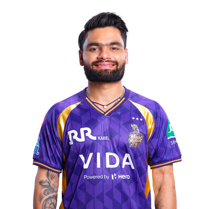
Rinku Singh’s tattoos are easy to miss when he’s in full match mode, but the ink on his forearms has a lot going on. There’s a clock, a rose, the word “Family,” a few smaller phrases and the now-famous God’s Plan design. None of it feels random. Most of the pieces point back to the people, moments and breaks that changed his life.
That’s what makes Rinku’s collection worth a closer look. He isn’t just wearing generic cricket symbols or a stack of fashionable flash. The tattoos connect to his family, his faith and the exact moments when cricket opened a door for him. He has also explained enough of the designs publicly that we can talk about the meaning without guessing at every line of ink.
The clock, dove and Family tattoo
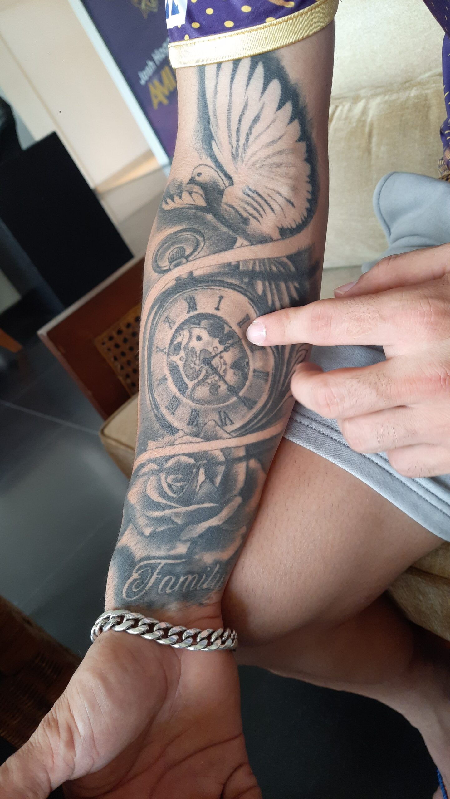
The biggest visible piece on Rinku’s right forearm is a shaded black-and-grey composition built around a clock. A dove spreads its wings above it, while the lower section includes the word Family in flowing script. There’s also a rose worked into the surrounding design, so the whole tattoo reads more like one connected scene than five separate stickers.
The clock is the detail that catches your eye first. The hands are fixed around 2:20 or 2:21, depending on how the moment is described in different reports. Rinku has connected that time to the 2018 IPL auction, when Kolkata Knight Riders picked him for 80 lakh rupees. He has said that the money changed life for his parents and siblings, giving the family a home and making things easier at a time when they had very little.
That makes the clock more personal than a standard timepiece tattoo. It isn’t meant to mark a birth or a romantic anniversary. The moment is the message. It freezes the minute when his future suddenly looked different. A clock normally suggests time moving forward, but this one stops at the moment Rinku wants to remember.
The word Family makes the reason even clearer. It sits low on the forearm in a large, old-school script that holds up well from a distance. The lettering is heavier than the fine lines around the clock, so it works as an anchor for the rest of the composition. If you were planning something similar, that contrast would be a smart move: keep the central lettering readable, then let the surrounding imagery carry the softer detail.
Why the dove and rose matter
Rinku has explained the rose as a symbol of blooming and the beginning of a better life. That idea fits the tattoo’s placement. The flower grows out of the lower section of the forearm piece, close to the Family script, while the clock sits above it. Read from bottom to top, the composition moves from family support to the moment that changed everything and then into the future that followed.
The dove adds another quiet layer. It spreads across the upper arm portion of the tattoo with broad shaded wings. In the public photographs, it’s not a tiny minimalist bird. It has enough texture and weight to balance the clock beneath it. Rinku has also talked about “peace” and taking flight when describing some of his other ink, so the bird feels like a natural part of that same idea without needing a forced explanation.
What I like about this piece is that it doesn’t rely on one obvious emblem. You could remove the clock and still have a meaningful family-and-growth tattoo. You could focus on the bird and read it as freedom. You could look at the rose and see a new beginning. Together, the symbols make a fuller picture of the story Rinku has told about his rise.
Rinku Singh’s God’s Plan tattoo
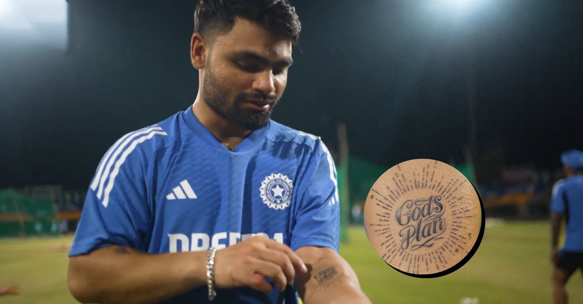
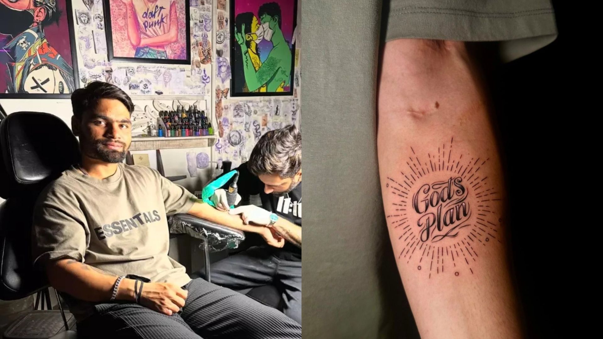
On the other forearm, Rinku has the words God’s Plan in large black script. The lettering sits inside a circular burst of short lines, giving the piece the look of a small sun or radiant seal. It’s a clean, high-contrast design: the words do most of the work, and the rays push the eye back toward the centre.
Rinku has linked the design to the five sixes he hit in the final over against Gujarat Titans in IPL 2023. He described the straight lines around the lettering as a visual reference to the directions of those shots. That detail gives the tattoo a clever structure. The lines aren’t just decoration around a quote. They turn a famous cricket moment into a graphic pattern.
The phrase itself had already become part of Rinku’s public vocabulary, but putting it on his arm made it more permanent. In the tattoo-studio images, you can see the fresh lettering and the surrounding rays before the ink has fully settled. The work is fairly open, with lots of skin between the lines. That breathing room is important because script tattoos can blur when they’re packed too tightly.
There’s also a bit of personality in the choice of lettering. This isn’t a plain computer font. The capitals curl and the smaller letters have a hand-drawn rhythm, which keeps the phrase from looking like a piece of merchandise. It feels more like a motto written into the arm than a logo copied onto it.
Different views of the same forearm ink
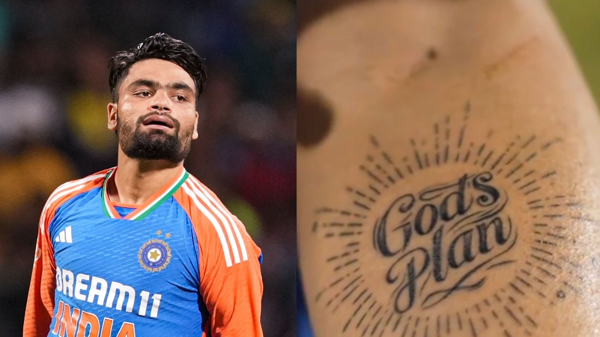
One photograph shows how the God’s Plan tattoo sits alongside the older right-arm work. From a distance, the two arms have very different textures. The clock piece is shaded, crowded and illustrative. The newer script tattoo is lighter and more graphic, with a simple black outline and repeated rays. That difference keeps Rinku’s arms from looking too symmetrical.
It’s also a useful reminder that tattoos can look completely different in a close-up and in a full-body photograph. A tight crop makes the lettering the subject. A wider shot shows how the design works with a jersey sleeve, a watch or a bracelet. For anyone collecting tattoo references, both views matter. The close-up helps with line weight and spacing. The wider image helps with placement and proportion.
Rinku’s arm work has a practical quality, too. Most of the ink sits where it can be covered by a short sleeve, but it becomes visible naturally when he raises his arms, celebrates or speaks to the camera. That gives him some control over how prominent the tattoos are. They’re part of his look without becoming the only thing people notice.
The smaller words: peace and taking flight
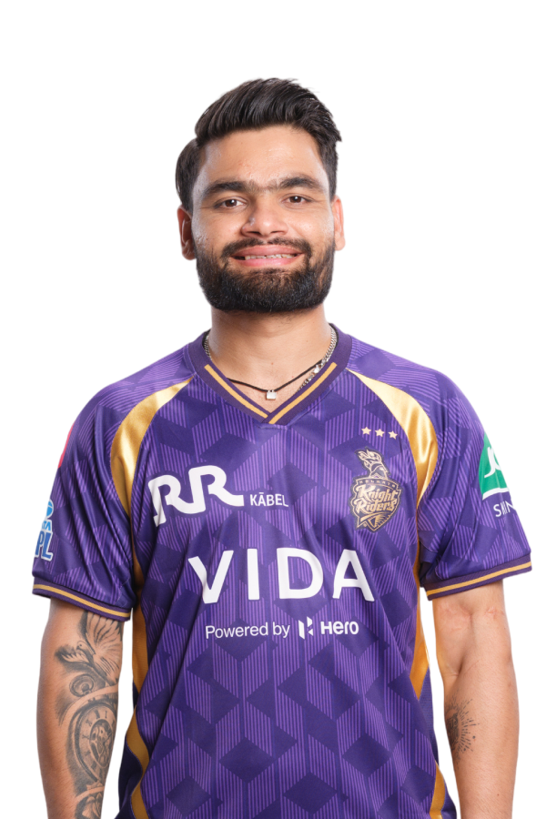
Alongside the larger designs, Rinku has mentioned the phrase “thodasa peace and udaan,” which roughly points toward peace and taking flight. The smaller writing is harder to read in every photograph, so it’s better to stay careful here rather than pretend every letter is perfectly visible. What is clear is the direction of the idea: calm, movement and a life that keeps opening up.
That phrase works with the dove and rose particularly well. The dove brings the feeling of peace. The bird’s wings suggest movement. The rose brings the image of something growing. Rinku’s tattoo collection uses a lot of familiar symbols, but the personal timing behind them gives those symbols a sharper edge.
If you like the concept but want a smaller tattoo, the words could stand alone in a narrow serif or handwritten script. The important design choice would be keeping the text readable. Small lettering needs enough spacing between characters and a placement that won’t constantly stretch or rub against tight clothing.
What makes the collection feel connected
There are five distinct tattoos on Rinku’s forearms, but the collection doesn’t feel like a random catalogue. The repeated themes are easy to spot: family, faith, a career turning point, peace and forward motion. Even the God’s Plan piece, which is visually simpler than the clock composition, belongs to the same timeline.
The clock remembers the auction that changed his family’s circumstances. The word Family explains who benefited from that change. The rose turns that improvement into an image of growth. The dove and the smaller phrase add peace and flight. Then the God’s Plan tattoo records the five-six moment that pushed Rinku into another level of attention. These are separate designs, but they all point toward the same idea of a life moving forward after a major break.
That’s a good lesson in building a larger tattoo collection. You don’t need every piece to match in style. Rinku’s arm combines realistic shading, script, symbols and open linework. The common thread is the meaning, not a single tattoo artist’s palette. If your own ideas come from different periods of life, letting the styles vary can make the finished collection feel more honest.
Placement and style takeaways
Rinku’s tattoos are mostly placed on the forearms, which gives them plenty of visibility without making them impossible to cover. The outer and inner arm surfaces also give each design a different viewing angle. A clock can wrap slightly around the curve of the forearm. Script can sit flatter and read more clearly. A burst design can face outward like a small emblem.
The strongest visual choice is the balance between dense and open areas. The clock piece has a lot of shading, but the God’s Plan tattoo leaves more skin between the rays. That variety helps the arm breathe. If every inch had the same level of detail, the pieces would start to run together.
Another smart feature is the use of readable lettering. “Family” and “God’s Plan” are not hidden inside microscopic details. They’re large enough to understand in the photographs, which means the tattoos still work as statements even when the surrounding images are less clear. Good lettering can carry a design, but it needs room to age.
Why the collection hangs together
Rinku Singh’s tattoos centre on a few big ideas: the family he wanted to support, the auction moment that changed his circumstances, the five sixes that helped define his rise and a general sense of faith and forward movement. The main pieces are the clock-and-dove forearm composition, the Family lettering, the rose, the smaller peace-and-flight phrase and the God’s Plan script tattoo.
They’re meaningful without being overly complicated. The best parts are the specific details: a clock stopped at a life-changing minute, rays that refer to five shots and a rose used as a picture of things finally beginning to bloom. That kind of personal reference is what turns a familiar symbol into your own tattoo.
For a design inspired by Rinku’s ink, start with the moment you want to remember. Then decide whether it needs text, a symbol or both. Keep the main idea clear, leave the lines enough room to age and let the placement do some of the storytelling. You don’t need to copy the exact clock, dove or script to borrow the feeling behind the collection.