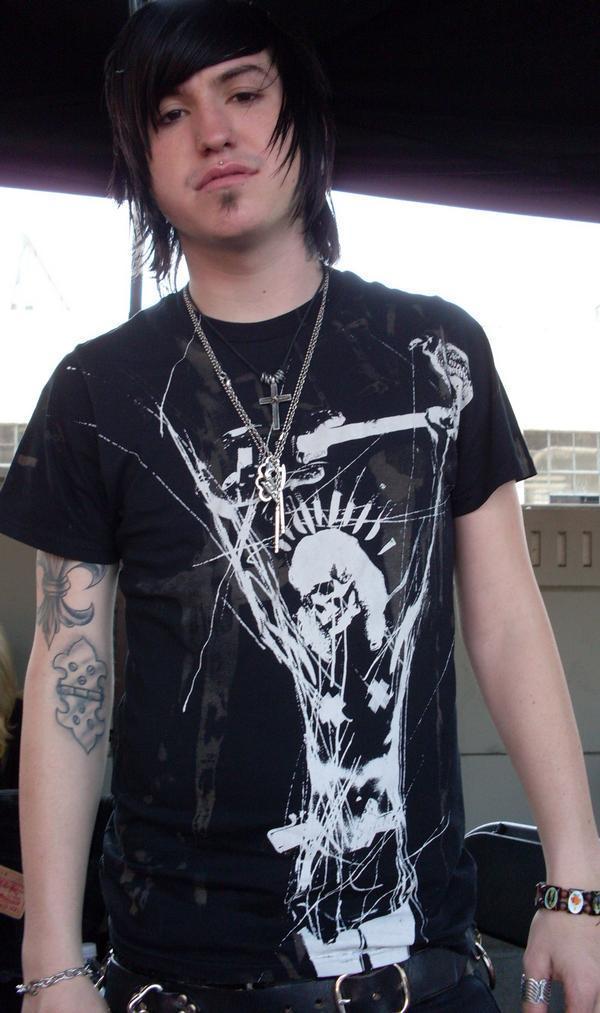
Craig Mabbitt’s tattoos are a big part of his look onstage with Escape the Fate. The singer’s arms carry dense black and color work, while his hands, neck and chest add smaller pieces that appear whenever a shirt or vest shifts. His collection has the rough, lived-in quality that suits post-hardcore music. It does not look like everything was planned in one appointment, and that is part of the appeal.
The photos show a mix of full-sleeve coverage, lettering, shaded faces, color blocks and smaller marks that sit close together. Some designs are easy to read in a concert photograph, while others are softened by red lights or movement. This guide sticks to the visible details and the placement lessons they offer. The point is not to guess a private meaning for every mark. It is to see how a real collection uses scale, contrast and body shape.
Craig Mabbitt tattoos work because the individual pieces share an attitude even when the drawings do not match. The arms stay visually heavy, the open spaces are limited but useful, and the smaller hand and neck marks help the look feel finished. If you are planning a similar direction, the best ideas to borrow are the balance and the confidence, rather than an exact copy of any one piece.
His upper arms use large color blocks and strong contrast

The upper-arm tattoos are the first thing that stands out in a clear performance photo. Large shapes sit beside black shading, with color appearing in focused areas instead of covering every inch evenly. That gives the arm a readable outline from a distance. A sleeve can be busy and still look organized when its darkest areas and brightest colors have a clear rhythm.
On Mabbitt’s left arm, the visible work moves from the shoulder toward the elbow in layered sections. The designs include rounded forms, lettering and darker outlines, but the whole arm reads as one solid visual field during a show. The skin is not treated like a blank border around one isolated picture. It becomes the space where several separate ideas overlap.
That approach is useful for anyone who likes the look of a collected sleeve. Start with the piece you want people to notice first, then decide how the next tattoos will support it. A tattooer can use background shading, repeated line weight or a few shared colors to make the pieces sit together. The link between separate tattoos can be subtle; it does not have to be a repeated logo or identical frame.
The concert setting also makes the scale easy to judge. Mabbitt’s arm is visible while he is moving, holding a microphone and leaning into the crowd. The work still reads because the primary shapes are large enough to survive changing angles. Designs that rely on tiny details alone would be much harder to follow under stage light.
Dense forearm coverage keeps the collection connected

The forearm work is where the collection becomes especially dense. Multiple images sit close together, and the shading gives the lower arm a darker weight than the bare upper arm in some photographs. A close performance image shows how the designs continue around the arm rather than ending in a straight vertical panel.
There is a practical lesson in that wraparound layout. A forearm is seen from several directions during a normal day, so a design can feel unfinished if it only works from one angle. Mabbitt’s visible pieces turn with the limb. The result changes when he reaches for the microphone, bends his wrist or turns his shoulder toward the camera.
The color is also placed with some restraint. Red and warm tones appear inside darker work, while skin breaks up the heavier areas. If every tattoo used the same saturation, the sleeve could become one flat block. A few lighter pockets help the eye separate the motifs and keep the older pieces from disappearing.
The useful idea here is to plan the negative space before filling every gap. Even a heavily tattooed arm needs breathing room around the strongest forms. Leave small spaces where the body bends, where a watch or cuff may sit, and where the next appointment might need a clean edge. That makes future additions easier and helps the existing ink stay readable.
Hand and wrist tattoos bring the details closer to view

Mabbitt’s hands and wrists add a different scale to the collection. The marks are smaller than the sleeve pieces, but they appear in every gesture. A microphone, cable or raised hand can bring the ink into the center of a photograph. That makes these tattoos feel connected to performance even when the design itself is simple.
Hand skin takes a lot of wear, so bold lines matter. Washing, sunlight, friction and constant movement can soften fine detail faster than it does on a protected area. The tattoos visible in Mabbitt’s stage photos use shapes and lettering that remain recognizable even when the hand is angled or partly covered.
Wrist placement also creates a natural bridge between the hand and the forearm. A small mark near the thumb or inner wrist can pull the eye into the sleeve instead of leaving a hard border. You do not need to fill every finger to get that effect. One compact symbol can be enough if its weight fits the larger work above it.
When planning hand ink, look at the design with the fingers open, curled and relaxed. The skin shifts in all three positions. A word that looks level in a closed fist may slope when the hand is open. Good hand tattoo planning treats movement as part of the design, not as a problem to hide in the finished photo.
Chest and neck pieces frame the face and microphone

The chest and neck tattoos do a quieter job than the sleeve, but they help frame Mabbitt’s face during a performance. The ink sits close to the collar, stretched ear jewelry and microphone, so the upper body reads as one strong silhouette. Those marks become especially visible when he wears a vest or a sleeveless shirt.
A chest tattoo does not need to be a single giant image to have impact. Several medium designs can create the same weight if the spacing is intentional. The photos show smaller areas of ink working with the neckline rather than competing with it. That is a useful reference for anyone who wants a tattoo that can disappear under a shirt but still feel prominent when exposed.
The neck is a high-visibility placement, which makes clear shapes even more important. Fine detail can get lost when hair, shadows and stage lights cross the area. Compact lettering, solid outlines and controlled shading tend to hold their form better. If you like Mabbitt’s look, ask your artist how the design will read from the front, side and three-quarter view.
Body placement changes the mood of the same drawing. A skull or script piece on an upper arm may feel casual, while the same subject near the throat can feel much more confrontational. Mabbitt’s arrangement uses that difference to keep the upper body visually direct without making every tattoo oversized.
Stage photos show how the sleeve moves with him

A still image can make a sleeve look flat, but a performance photograph shows how the ink travels with the body. Mabbitt reaches, leans, grips the microphone and turns his shoulders while singing. The tattoos stretch across those movements, so the collection becomes part of the action rather than a decoration that only works in a posed portrait.
The two arms also give the eye different levels of detail. One angle may show a broad color panel, while another catches a smaller image near the wrist or the back of the hand. That changing view is why several different photographs are more helpful than one perfect close-up. Each frame reveals a different part of the layout.
Stage lighting can alter the way tattoo color looks. Red light makes warm ink blend into the background, while a cool spotlight can make black outlines appear sharper. For your own reference folder, compare tattoos in daylight and in indoor light before deciding which colors you want. A design that looks soft in the studio may read much more strongly once it is surrounded by black clothing.
The strongest design lesson from Craig Mabbitt’s collection is commitment to a clear visual direction. The tattoos are not identical, but they belong to the same world of heavy outlines, dramatic shading, compact symbols and visible placement. You can build that feeling slowly. Choose one anchor piece, decide how dark or colorful the overall collection should be, and let later tattoos answer the first one instead of fighting it.
There is no need to invent a story for every mark to appreciate the work. Some pieces are easy to see, while other details remain private or unclear in public photographs. That is normal. A tattoo guide is stronger when it describes what is visible and leaves room for the wearer to keep the rest for himself.
The sleeve photographs also show why scale should be decided before the first appointment. A large upper-arm piece needs room to breathe, and a dense forearm design needs a plan for how it will wrap. Smaller wrist and hand tattoos can then act as transitions rather than random add-ons. This order makes the collection easier to expand without forcing every new design into a narrow gap.
If you like the same rough alternative energy, bring your artist references that explain what you respond to: saturated red, heavy black shading, old-school forms, portrait work, lettering or a particular stage-era mood. Talk about your skin, your job and how visible you want the tattoos to be. The best result will fit your body and schedule while keeping the attitude that drew you to the collection.
Craig Mabbitt tattoos are a useful reminder that a full sleeve can grow over time and still feel intentional. Strong placement, repeated contrast and a willingness to leave some meanings unexplained give the work its character. Start with a design you would still want years from now, then build the surrounding pieces with the same patience and visual confidence.
One final rule is worth keeping in mind: use the energy as inspiration, not the exact artwork. A tattooer can reshape the balance for your arm, adjust the scale for your skin and create a composition that will age well. That is how a reference becomes your own tattoo instead of a duplicate.