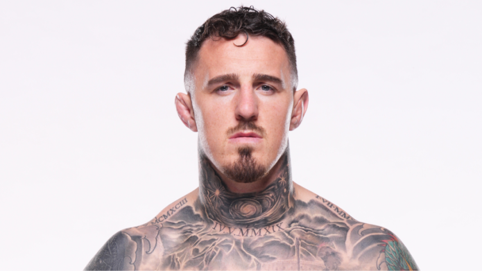
Tom Aspinall’s tattoos cover much of his upper body. A large colour piece sits on his back, with work across his chest and shoulders, visible ink on his neck, and smaller marks among the larger designs. The collection seems to have grown with his career rather than being planned as one matching set.
The back is colourful and large; the front has architectural details, lettering, black shading, and smaller symbols. That contrast gives each area a different feel while keeping the whole collection connected.
Aspinall has talked about the time and thought behind his tattoos. The back piece took more than one quick appointment, and the front designs have their own placements and stories. This guide looks at the main pieces and what their layout can teach someone planning a tattoo.
The back piece brings colour, movement and a clear focal point together
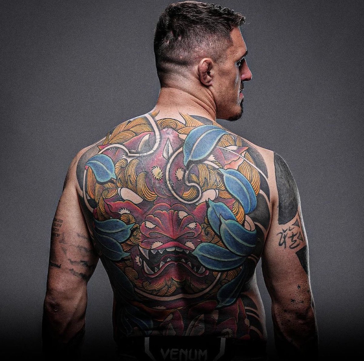
The back piece changes Aspinall’s silhouette. A stylised face sits near the centre, with blue and green shapes around it and dark outlines giving the design a graphic edge. The face catches your eye first; leaves and smaller forms carry the colour out toward the shoulders.
A large tattoo needs one shape that reads from across a room. Here, the central mask-like face does that. Colour adds movement, while the black lines help the image hold up in arena photographs.
The back gives the artist room to build around the spine and shoulder blades. The composition doesn’t need to be perfectly symmetrical; slight differences from side to side can keep it from looking like a sticker placed in the middle of the body.
Colour works best when it has a strong black structure underneath it. Blue and green can draw attention, while outlines and darker shadows help preserve the image’s shape over time. That matters when much of the piece will be seen from a distance.
If you’re planning a back tattoo, start with the shape of the main subject. Then ask the artist to build around the body’s lines instead of dropping a finished rectangle onto the skin. The design should work with the muscles and movement.
The scale gives the back a different mood from Aspinall’s front. It is colourful and expressive; the chest is more structured and broken up. That contrast gives the collection room to breathe.
The chest combines Roman numerals, architecture and atmosphere
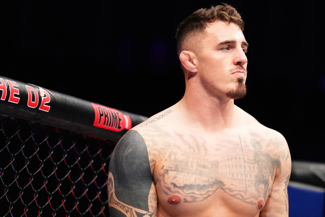
Roman numerals and architectural shapes sit across Aspinall’s chest. The shading gives the design a stone-like, historical feel. It’s less colourful than the back, so it adds a quieter focal point when his whole upper body is visible.
Roman numerals can mark a date without looking like a plain string of digits. Here, they sit within a larger composition; the architecture gives them context and darker areas keep the lettering readable when photographed from an angle.
Straight lines can be hard to place on a curved chest. A doorway or column that looks level on paper may bend across the pectoral or toward the shoulder. Place the strongest vertical lines where the body gives them support, then let the smaller forms follow its curve. Good chest lettering should be checked while the wearer is standing normally, not only while the skin is stretched flat.
Stonework and numerals can suggest memory or milestones without spelling everything out. If you like meaningful tattoos but don’t want a portrait or quote, an architectural design can leave some of the story open.
Leave a little skin around the chest piece so its forms remain clear and later work has room to connect. A darker, structured design on the front can sit beside a more colourful back piece without copying its palette. Placement and contrast do much of the linking.
The black shoulder sleeve shows how cover-ups can evolve

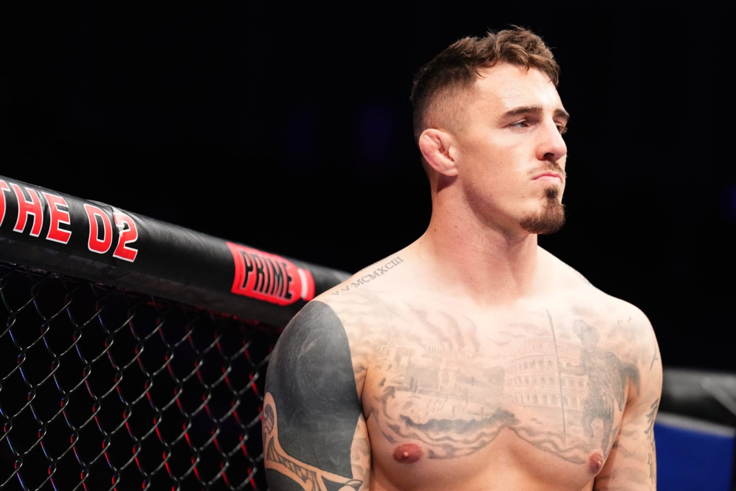
Aspinall’s shoulder and upper arm carry heavy black shading that frames the chest. In some views, it looks like cover-up work or a later stage in an evolving sleeve. Either way, the darker sections give the collection stronger structure.
Large black areas need careful edges. A clean curve around the shoulder can make the chest look wider; an awkward border can make two tattoos seem to compete. The edge matters as much as the filled area.
If an older tattoo sits underneath, a cover-up needs enough weight to hide it while still forming a clear design. The artist may adjust the angle, deepen a shadow, or use open skin to build a new focal point. A successful cover-up is not only about hiding the past; it should give the new tattoo a reason to exist on its own.
The rounded shoulder is a natural place for a dark frame linking the chest and upper arm. Not every sleeve needs solid black, but a repeated shadow or controlled border can help tattoos from different sessions feel related.
Think about the balance of dark and open skin. A little negative space keeps the arm from feeling heavy all the way around and gives the main shapes somewhere to stand out. A collection can change over time. Sometimes the smartest tattoo plan is the one that leaves enough flexibility for the next chapter.
The neck tattoo changes the whole face-up look
Aspinall’s neck ink covers less skin than the back piece, but it changes his look in a shirt. A visible mark near the neck frames the face and shows up in interviews and walkout photos.
The neck turns from front to side and moves whenever someone speaks or looks over a shoulder. A busy image can lose its shape there. Aspinall’s design has enough contrast to remain legible in changing light and ordinary movement.
Check a neck stencil from several angles. Turn your head and relax your shoulders. The design should sit well against the collar and jaw. Visibility is part of the tattoo design, not an accidental side effect.
Neck ink is hard to cover, so it becomes part of everyday first impressions. If that’s what you want, a visible tattoo can be a deliberate choice. If you’d like a quieter option, the side of the neck or behind the ear can still show in profile.
A small, clear shape often works better there than a tiny detailed picture that may blur with time. Aspinall’s neck piece also balances the larger back and shoulder tattoos: it brings the eye toward the face without competing with the main designs.
His arms and smaller marks keep the collection personal
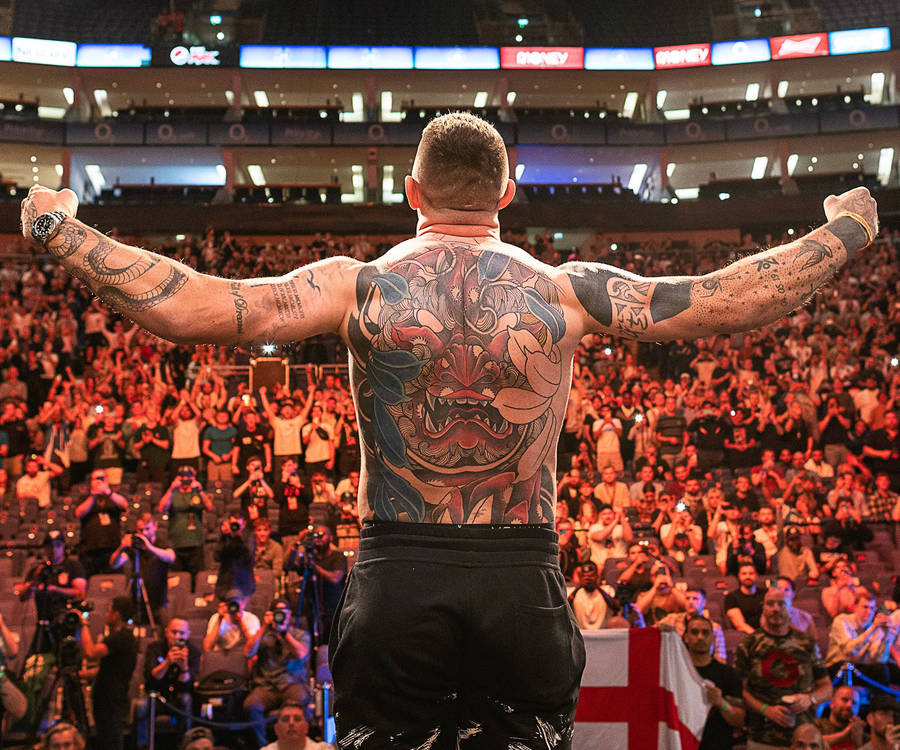
The smaller marks on Aspinall’s arms keep the collection from feeling like one large back piece plus a few unrelated tattoos. They appear from different angles as he moves, and give the work the uneven feel of a collection built over time.
A body can look planned without every piece matching. A few large designs, medium-sized tattoos, and smaller marks added when the idea mattered can all sit together. The artist’s job is to manage the space between them.
The arms offer different panels: an outer bicep for a larger symbol or portrait, a forearm for lettering, and an inner arm for something more private. The elbow and wrist fold and take more wear, so those areas often suit simpler designs.
If you’re adding tattoos over time, photograph the whole arm before each appointment. It’s easy to focus on one empty patch and miss how the new piece will look from across the room. The overall layout should guide the next choice.
Step back often, because a tattoo is part of a moving body and not a collection of isolated flash cards. One important image needs enough room, and smaller tattoos should support it rather than fill every opening immediately. Open skin leaves choices for later.
Aspinall’s collection has a colourful back piece, architectural chest work, a dark shoulder cover-up, visible neck ink, and smaller arm details. If you like the style, choose the main piece first, place it for the body you have, and leave space for the person you’ll become.