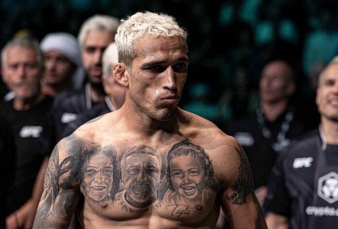
Charles Oliveira’s tattoos mix family portraits with larger images and lettering tied to his public identity. The former UFC lightweight champion has portraits across his chest, a lion on his back, dark work on both arms, and lettering at his neck. Smaller designs fill some of the space between.
His mother, father, and daughter appear in the chest portraits. The back lion adds a larger symbol, while realism, dark shading, and script give the collection a common look. It feels built over time, with different pieces marking different parts of his life.
Oliveira is known as Do Bronx, and that name appears in his tattoos and public image. This guide looks at the designs that stand out in photos and how their placement works for someone planning personal black-and-grey ink.
The chest portraits make family the centre of the collection
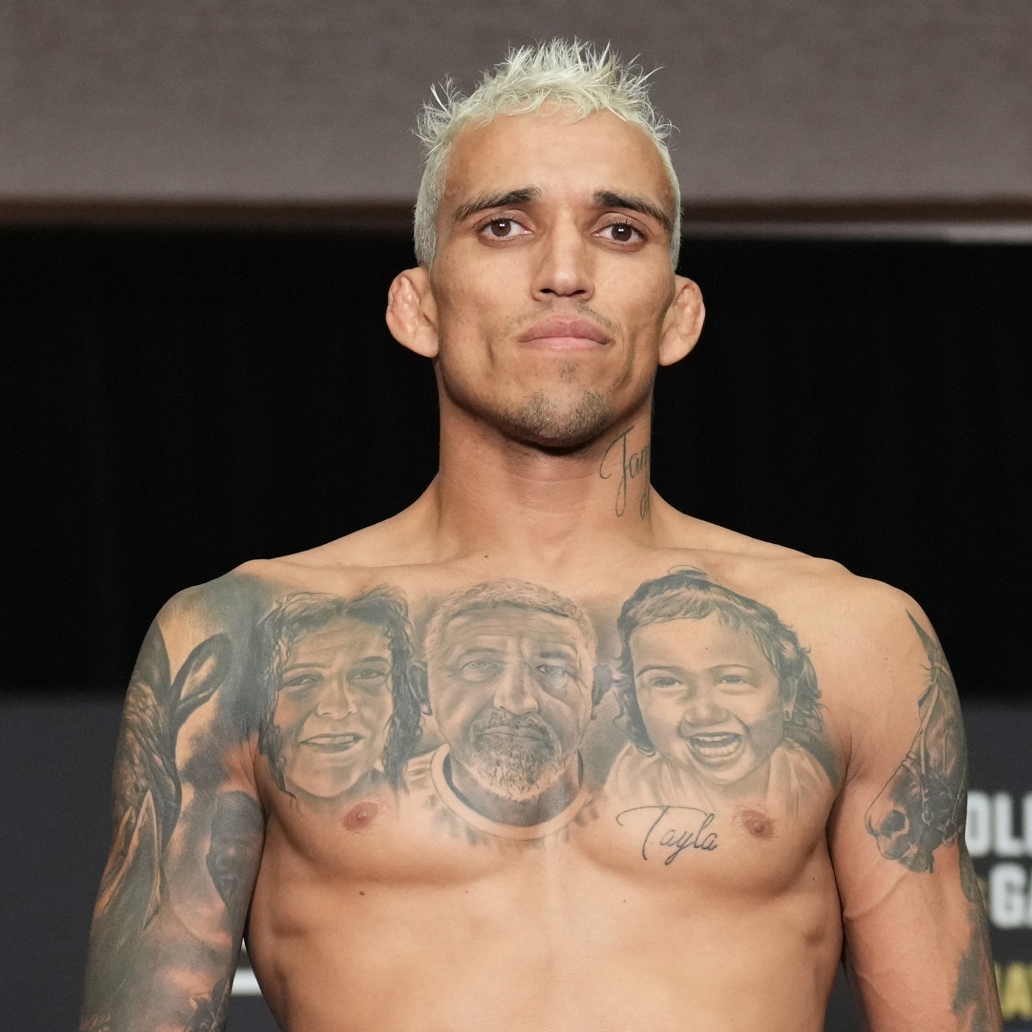
Three large faces sit across Oliveira’s upper chest: his mother, father, and daughter. The realistic portraits use soft shading around the eyes, hair, and cheekbones. They sit close enough to read as one family tribute rather than three unrelated pieces.
The chest gives each face space, while shared grey tones connect them. Script near the lower chest adds another personal detail without drawing attention away from the portraits. When Oliveira faces the camera, the design reads like a family photo brought onto the skin.
Portrait tattoos leave little room for error. Small changes around the eyes or mouth affect the expression, and the body moves under the image. Oliveira’s portraits use darker shading around the hair, brows, and clothes, while the faces stay lighter so their features remain clear from a normal distance.
If you’re considering a family portrait, bring a sharp reference photo with the expression you want. A blurry phone image may not show enough detail. Decide whether the faces should look forward or toward each other. The best portrait tattoos feel like real people, not generic faces with names added later.
Chest portraits can be covered by a shirt, giving the wearer control over when the most personal part of the collection is visible. The wide area also lets an artist balance the design across both pectorals instead of squeezing one face into a narrow arm panel.
The lion back piece gives his tattoos a bold focal point
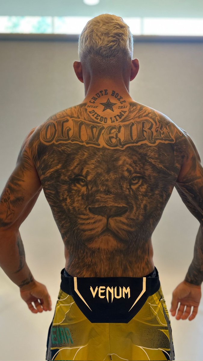
A large lion fills Oliveira’s back. Its face sits at the centre, and the mane reaches toward his shoulders. From a distance, the outline is easy to recognise; up close, you can see the fur, eyes, and shading around the shoulder blades.
The lion adds a different scale and mood to the collection. The chest portraits are personal; the back piece is broader and more symbolic. Its watchful expression gives the design a strong presence from behind.
The lion’s eyes are the main focal point, with the mane providing texture and movement. A strong back piece needs contrast that still works when the tattoo is photographed from across a room. Keep the central expression clear, then use details around it to support the image.
The back offers room for an animal, mask, or large religious image that might lose impact on an arm. Fur can fade into the surrounding skin, and darker shading can sit around the edges without turning the whole design into a solid patch.
Consider how the tattoo will follow the body. A stencil should account for the spine and shoulder blades, and still look centred when the shoulders are relaxed. It shouldn’t only work in a straight-on pose.
His arms use dark realism and heavy framing
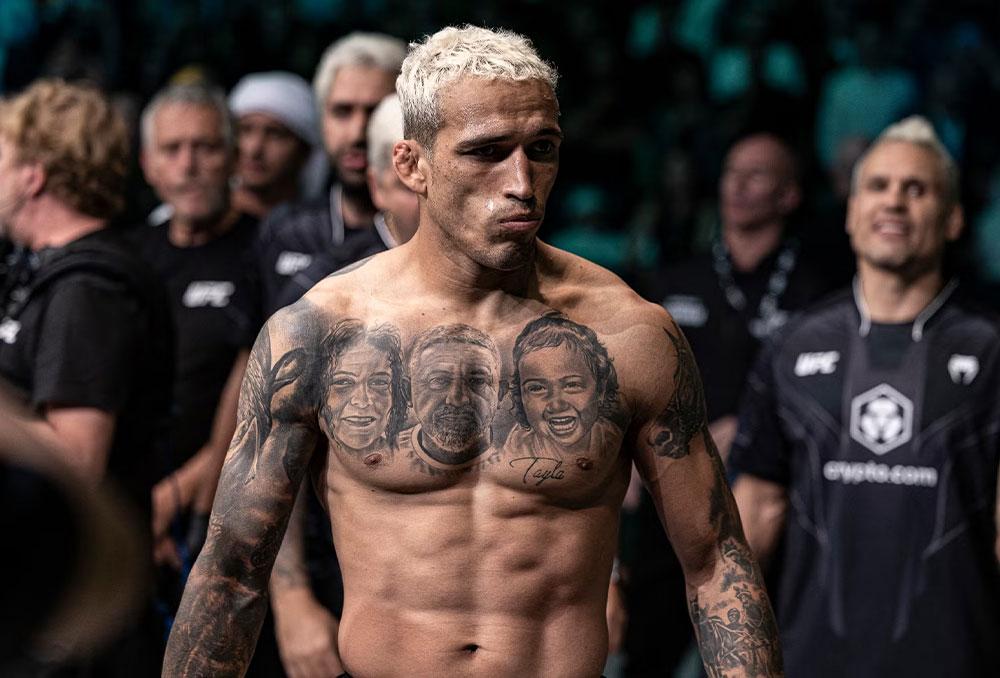
Oliveira’s arms are darker and more densely tattooed than his chest. Shaded areas cover the shoulders and upper arms, with portraits, animals, lettering, and ornamental details within the larger shapes. Strong outlines keep the ink from reading as one patch of black.
The designs have to work with a moving arm: the biceps flex, the elbow bends, and the forearm rotates. Oliveira’s larger images sit where they’re still visible through those changes; smaller text and texture wrap around the limb.
Black-and-grey realism gives different images a shared base, even when the subjects don’t match. Family portraits, animals, and religious or symbolic designs can sit together because the shading helps connect them.
If you’re building an arm over time, place the main images before filling gaps. Leave the elbow and inner-arm transitions to an artist who can plan the whole flow, even if the sessions happen months apart. A design added just because space is easy to reach can crowd a larger idea later.
The darker work near the shoulders also helps the sleeves connect to the chest. You don’t need to copy Oliveira’s subjects to get the same effect. Repeating a shadow level, border, or background texture can link tattoos from different sessions.
Neck lettering adds a visible Do Bronx signature
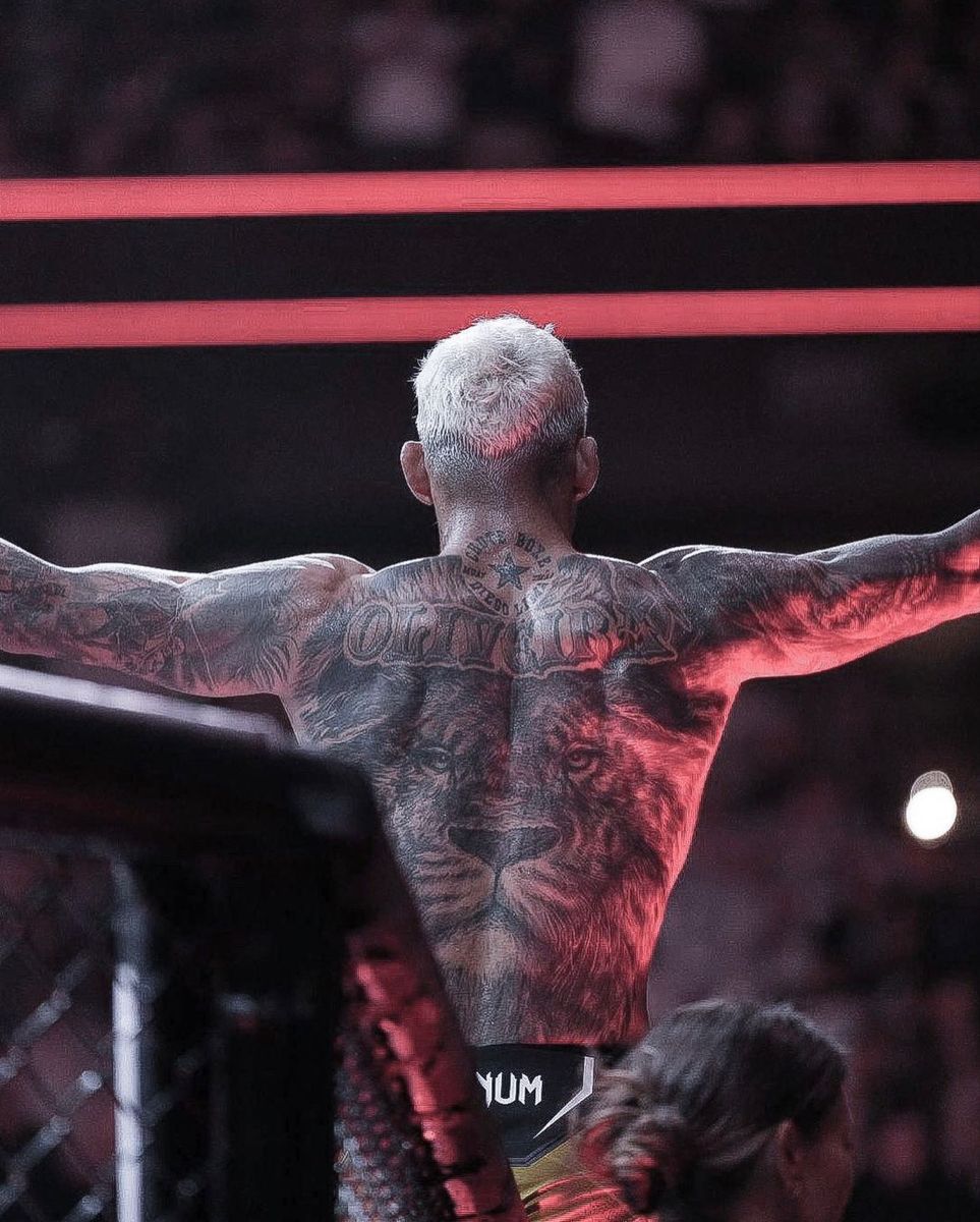
Lettering beneath Oliveira’s jaw follows the curve of his neck. It’s a smaller piece than the chest or back work, but you can see it when the rest of his body is covered. The name gives his look a quick signature without replacing the more personal story across the chest.
Neck skin turns from the front to the side and moves whenever the head turns. Oliveira’s script stays fairly simple, so it can still be read when he speaks or looks to the side.
A neck tattoo changes how the face is seen and makes a collection feel more visible. If you like the placement but want a quieter option, a small word behind the ear or along the side of the neck can show in profile without covering as much. One clear word can carry more impact than a whole row of tiny marks.
Check the stencil with your head turned both ways. Lettering should follow the neck’s movement without becoming so curved that the word loses its natural shape. A short phrase is usually easier to keep legible here than a long sentence.
The neck lettering works as a direct accent, while the chest and back hold the more detailed images. That balance keeps it from competing with the larger tattoos.
Family names, small symbols and newer pieces keep the story moving
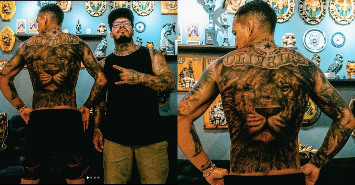
The collection includes smaller lettering, symbols, and designs among the portraits and lion. Some details stand out in photos; others only show when Oliveira turns or raises an arm.
Smaller pieces can mark a person, place, or period in a career without becoming a full back tattoo. The larger realism gives the body its structure, while smaller designs make it feel like more than one session’s work.
Leaving some skin open also allows room for later ideas. An artist can connect pieces with shading or background texture when it makes sense. Open space is not a failure to finish; it gives a tattoo collection somewhere to go next.
Not every tattoo has to come with a public explanation. The chest portraits are recognisable; the lion can stand as a symbol; the lettering is direct. Together, the designs feel personal and still read clearly in fight-week photos.
If you’re planning your own collection, choose the image that matters most and give it the best placement. Pick a style that can support other ideas later. Black-and-grey realism, lettering, and controlled shading can connect different subjects. Add colour when it helps a design, not just to fill a gap. Good planning makes a collection feel personal, not pieced together by accident.
Oliveira’s tattoos balance family portraits, the back lion, darker arm work, and neck lettering tied to Do Bronx. If you like that approach, think about what you want closest to you, give a large design room, and leave space for future changes.