
Mia Khalifa tattoos are easy to spot once you know where to look. Her collection runs across both arms, her wrists, her hands, and the side of her body, with a mix of Arabic lettering, tiny symbols, simple line drawings, and darker pieces. Some designs are small enough to disappear under a sleeve. Others show up the moment she lifts a hand or turns toward a camera.
The collection does not follow one strict style. There is delicate script beside a bold red cross, small finger marks beside larger arm drawings, and newer pieces that feel more graphic than the older lettering. That variety gives the tattoos a relaxed, lived-in feel. Nothing looks like it was chosen to make every piece match. Each design has its own shape and its own place on the body.
Her tattoos have also changed over time. The red wrist cross became part of a public conversation about Lebanon, and she later discussed covering it with another design. That makes it useful to look at the photos as a record of different points in her life, instead of treating one image as the final version of the collection. Here is a closer look at the designs that read most clearly in high-resolution photos.
Mia Khalifa’s Arabic forearm script is one of her clearest tattoos
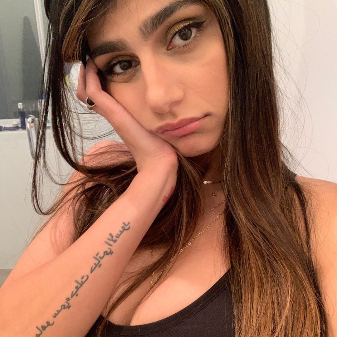
The long Arabic script on Mia Khalifa’s forearm is one of the most recognisable pieces in her tattoo collection. It runs in several lines along the arm, giving the design a strong vertical shape. The lettering is dark and fairly open, so the words stay readable even when the arm is photographed from a short distance.
Script tattoos depend heavily on spacing. If the lines sit too close together, the lettering can turn into one dark block as it heals. In Khalifa’s photo, the lines have enough room to breathe, and the rounded Arabic forms create their own visual rhythm. The arm stays soft around the words instead of looking packed from wrist to elbow.
The placement also changes how the tattoo appears in everyday photos. A bent arm brings the writing toward the camera, while a relaxed arm lets the design follow the natural length of the forearm. It is a useful example of choosing a body area that supports the shape of the lettering. A long quote or several short words usually need a little more room than people expect.
If you like the look of Arabic script, work with someone who understands the language and can check the text before it reaches your skin. The lettering should be reviewed by a fluent reader, not copied from a random image. The design can still be simple, but the details need to be right.
The red cross on her wrist carries a complicated chapter
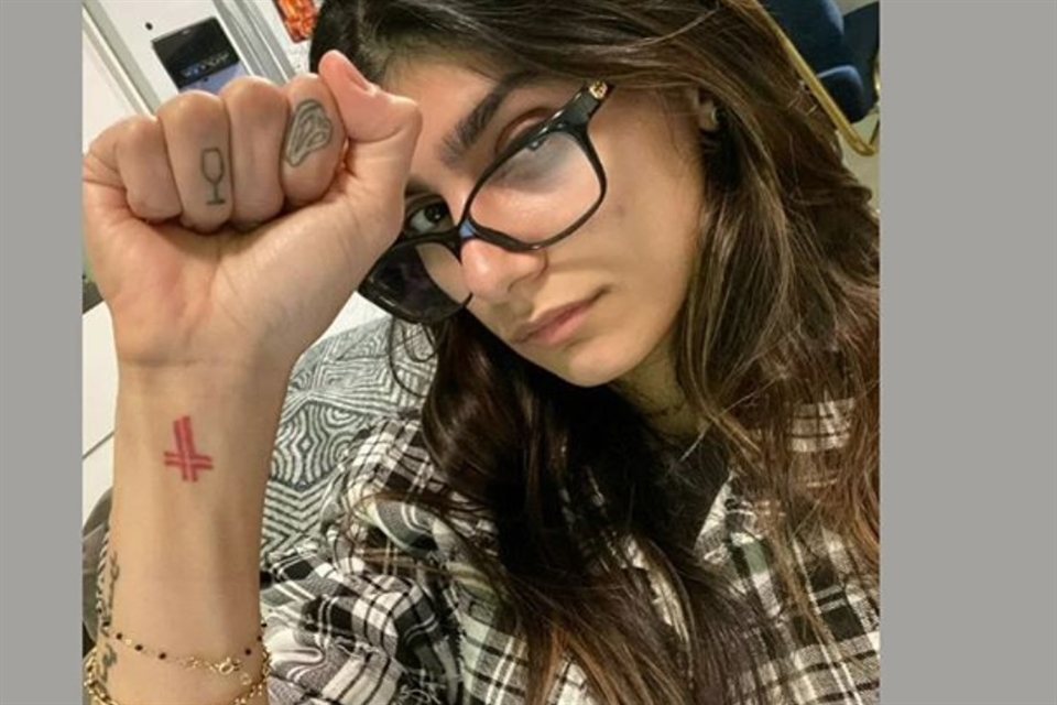
The red cross on Khalifa’s wrist is one of the most visible pieces in close-up portraits. Its colour sets it apart from the black lettering around it, and the small size keeps it from taking over the whole arm. When she raises her fist, the cross becomes the first detail most people notice.
The design was connected to her Lebanese background and to her father’s political views. Later, after the Beirut explosion, she said she wanted to replace it with a map of Lebanon and use the moment to support relief work. The tattoo therefore sits inside a bigger personal and public story. It is not simply a decorative red symbol.
From a design point of view, the wrist is a demanding spot. It moves constantly, rubs against clothing, and gets plenty of sun. A compact symbol works well there because it can stay clear without needing fine detail. The strong red ink also gives the design a little visual weight even though the tattoo itself is small.
The change in the piece is worth remembering if you are planning a tattoo with a political or relationship meaning. A design can feel completely right at one point and different later. Khalifa’s wrist shows how a cover-up or replacement can become part of the history of the collection instead of something that has to be hidden.
Her hand tattoos include tiny symbols and a wine glass
Khalifa’s hand tattoos are small, but they are some of the easiest to recognise in a selfie. A tiny wine-glass outline sits on one finger, while another finger carries a small rounded symbol. The marks are light compared with the larger arm drawings, so they read like little pieces of punctuation around her jewellery and manicure.
Finger tattoos have a different visual rhythm from forearm work. They move with the knuckles, disappear when the hand closes, and can look wider or narrower depending on the angle. A tiny outline that looks neat in a straight-on photo may spread when the finger bends. That is part of the charm, but it is also why simple shapes tend to work best in this area.
The hand pieces also show how a tattoo collection can mix serious subjects with playful details. The Arabic lettering carries a message, while the wine glass feels lighter and more everyday. Putting both on the same hand keeps the overall look from becoming too formal. It feels like a collection built over time, with room for small impulses as well as larger decisions.
Anyone considering finger ink should think about visibility and upkeep. Hands are exposed to soap, sun, friction, and constant movement. Fine lines may need a touch-up sooner than a tattoo on the upper arm. Small symbols like Khalifa’s still work because their shapes are clean and uncomplicated.
The arm collection mixes line drawings with bolder black ink
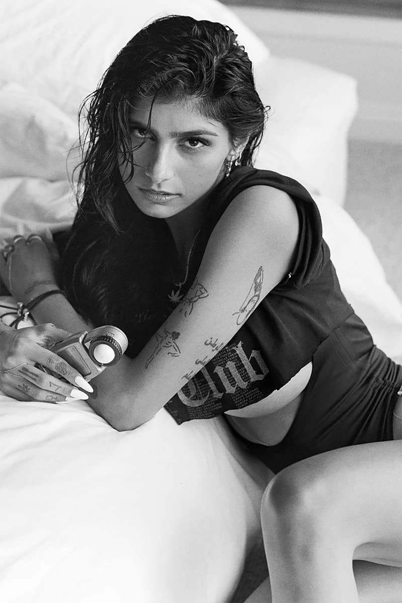
A black-and-white portrait gives the clearest sense of how much the arm collection has grown. Several line drawings sit along the upper arm and forearm, with Arabic script, small figures, and darker outlines appearing together. The pieces do not form one solid sleeve. There is open skin between them, which lets each design keep its own identity.
That spacing is one of the strongest parts of the layout. Large open areas help the eye move from one image to the next, while the darker sections act as anchors. If all of the designs were pushed together, the details would compete. The gaps make the collection feel less crowded, even though there is a lot happening on both arms.
The line drawings have a handmade quality. They are not trying to look like one polished illustration. Some are delicate, some are heavier, and some are placed at slightly different angles. That unevenness gives the tattoos character. It also makes the collection easier to build slowly because a new piece does not have to match a complete sleeve.
There is a practical lesson here for anyone planning several tattoos. Leave enough space for future work, but do not treat every blank patch as a problem that must be filled. A few clear designs with breathing room can age better than a crowded layout. Khalifa’s arms show how contrast and spacing can do as much work as the tattoo subjects themselves.
A close look at the map and star-style designs
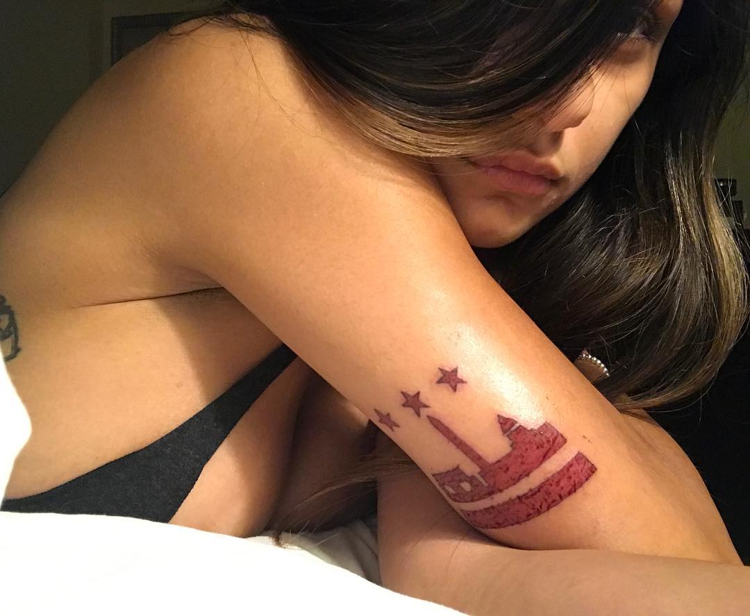
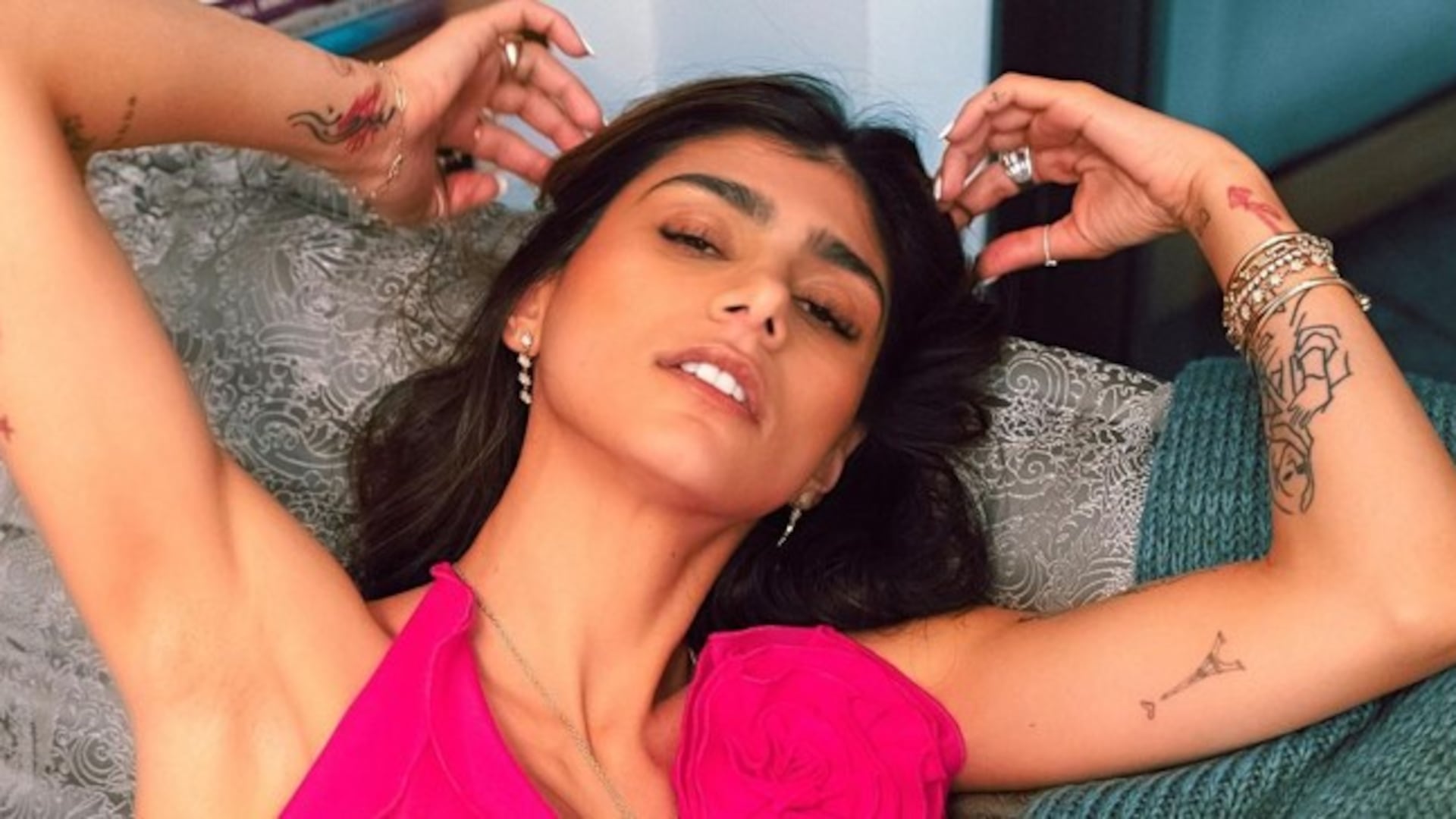
Other photos show smaller graphic marks around Khalifa’s arms and the side of her body. A map-style outline, star shapes, and short symbols sit beside the larger lettering. These designs are simple enough to recognise quickly, but they still add a different texture to the collection.
Small symbols are useful when you want a tattoo to feel personal without making it the centre of the whole look. A map can point toward a place or a family connection. Stars can work as decoration, a memory marker, or just a shape the wearer likes. The meaning is not always public, and a clear photo does not automatically explain why a design was chosen.
The placement keeps these pieces from competing with the script. They sit on the arm and upper body as separate stops for the eye, rather than becoming one large composition. That makes the collection feel more casual. You can notice one symbol in a close portrait, then see a completely different piece when she changes clothes or raises her arm.
What ties the designs together is the use of clear shapes. Even the more detailed pieces rely on outlines that read well in ordinary photographs. There is no need for every tattoo to be large or heavily shaded. A small map, a star, or a short line of script can hold its place if the placement gives it enough space.
Why this mix works
The strongest feature of Mia Khalifa tattoos is the contrast between scale and mood. The Arabic forearm script is calm and deliberate. The red wrist cross is bright and immediately visible. The finger symbols are tiny and playful. The arm drawings bring in more texture, while the smaller map and star shapes keep the collection from feeling heavy.
Her placement choices help the mix feel organised. The forearms carry the most readable words and pictures. The wrists and fingers hold the smallest marks. The upper arms and side areas give the larger designs room to sit without turning every inch of skin into one block. It is a good reminder that a collection can feel connected without using the same style everywhere.
If you are using Khalifa’s ink as inspiration, start by deciding what deserves the most space. A meaningful sentence needs a different plan from a tiny symbol. A hand tattoo needs more maintenance than an upper-arm design. A bright colour like red will pull attention faster than a soft black outline. Those choices matter before the needle starts.
Most of all, the collection shows the value of letting tattoos record change. Some pieces carry family or national meaning. Others are small marks chosen for their shape. Some designs may be covered or reworked later. That does not make the earlier tattoo pointless. It gives the overall collection a timeline, with different chapters visible in different photos.
Mia Khalifa’s tattoos feel personal because they are not over-organised. The lettering, cross, hand symbols, maps, stars, and line drawings sit together like real memories do. There is enough space for each design to be noticed, but not so much matching detail that the collection loses its relaxed edge. The result is easy to recognise and still full of small details worth studying.