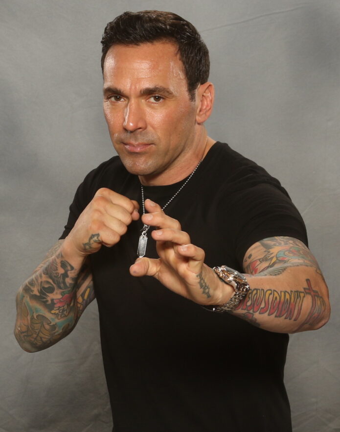
Jason David Frank spent much of his career in motion. As Tommy Oliver, he moved from the Green Ranger to the White, Red and Black Rangers, then brought that martial arts energy to real fight work and appearances around the world. His tattoos share that direct, high-impact feel: large, colorful designs that remain visible when he moves or poses.
The amount of coverage stands out first. Jason David Frank’s tattoos run across both arms, forearms, hands and neck. It isn’t one matching sleeve; the collection looks more like several chapters, with color, black shading, lettering and smaller symbols sharing the same space.
Photos clearly show the large color work on his arms, the neck lettering, the Jesus Didn’t Tap design on his forearm, and smaller pieces on his hands and wrists. Some tattoo stories have been discussed publicly, but not every meaning is confirmed. The safest read is the visible one: scale, style and placement. His ink is striking because of where and how it sits, not because we need to supply a private backstory.
The lettering on Jason David Frank’s neck gives the collection a sharp centre
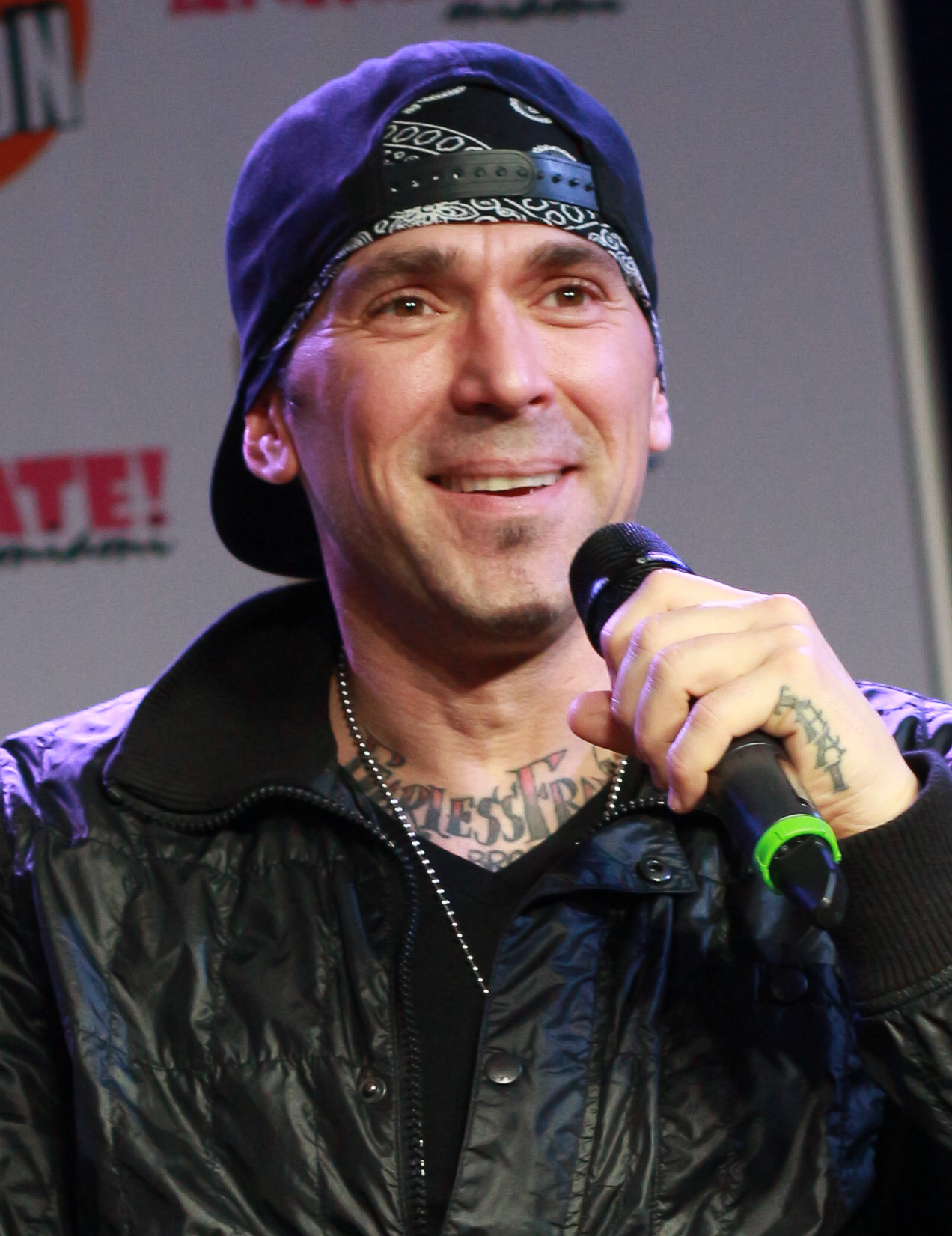
The neck lettering is easiest to make out in a close portrait. It crosses the front of his neck, with heavier tattoos framing it on either side. That placement gives his face a stronger outline and keeps the ink visible even when his clothes cover the rest.
Neck lettering has a different presence from a sleeve. It can’t disappear under a watch or a relaxed pose; it sits in the center of the portrait. Jason’s design uses dark, compact lettering that stays clear under bright event lights.
The tattoos around it help the lettering feel connected to the rest of the collection. Darker designs rise from the shoulders and upper chest, giving the neck piece a base. If you’re planning neck ink after work on your chest or arms, it helps to think about how the pieces will read together.
A turn of the head changes what you can see. One side of the tattoo slips out of view while the other comes forward. The placement gives a still design a sense of movement.
His forearm ink mixes bold lettering with character and shading
Some of Jason’s clearest individual designs sit on his forearms. The Jesus Didn’t Tap lettering spans enough of the arm to read at a glance, while the surrounding color work gives it the weight of a larger patch. In photos with his hands raised, the words become part of the pose.
The martial arts influence comes through in the look of the lettering. It has the direct feel of a phrase on training gear, while the illustrations around it make the arm less like a simple text band. From a distance the message is clear; closer up, the colors and other shapes add detail.
Forearm lettering is easy for the wearer to see and can still be covered with a long sleeve. Jason spent years in costumes designed to conceal his tattoos, so the difference between his covered and uncovered looks is part of how the collection has been seen over time.
If you want a similar phrase, leave enough room for it to stay readable when your wrist bends. Good lettering depends on a clear shape, not on fitting in more words. Jason’s larger design shows why a forearm can suit bold type better than tiny, crowded text.
Jason David Frank’s hand tattoos make the larger designs feel more personal
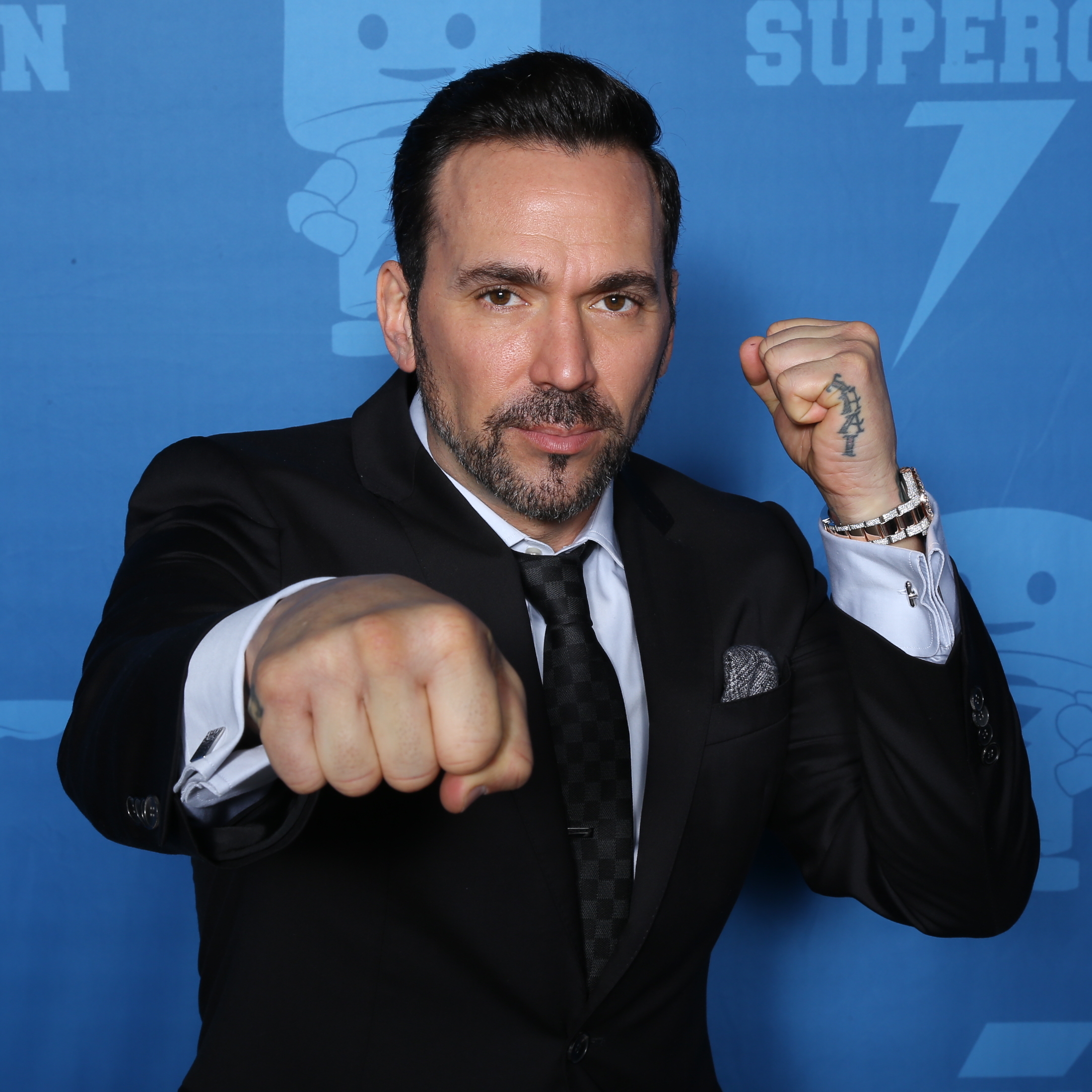
The hand tattoos are smaller than the sleeves, but they change the overall look. Close-ups show ink on the back of his hand and around the fingers, with the forearm designs continuing down toward the wrist. They show up in ordinary gestures, not only in posed tattoo shots.
Hand ink is hard to miss. It appears whenever someone reaches, grips or holds something, which makes it feel more immediate than a tattoo under clothing. The skin also moves often and wears quickly, so the design needs to account for that.
Jason’s hand pieces don’t compete with the sleeve. Darker, simpler shapes bridge the forearm and fingers, standing apart from the brighter color work higher up. That contrast helps the small designs stay legible where several placements meet.
If you’re considering hand tattoos, keep the main shape clear and expect that touch-ups may be needed. A design doesn’t have to be delicate to feel personal. Simple hand ink has a presence because it stays in view through so much of the day.
The wrist details show how Jason’s tattoos work in motion
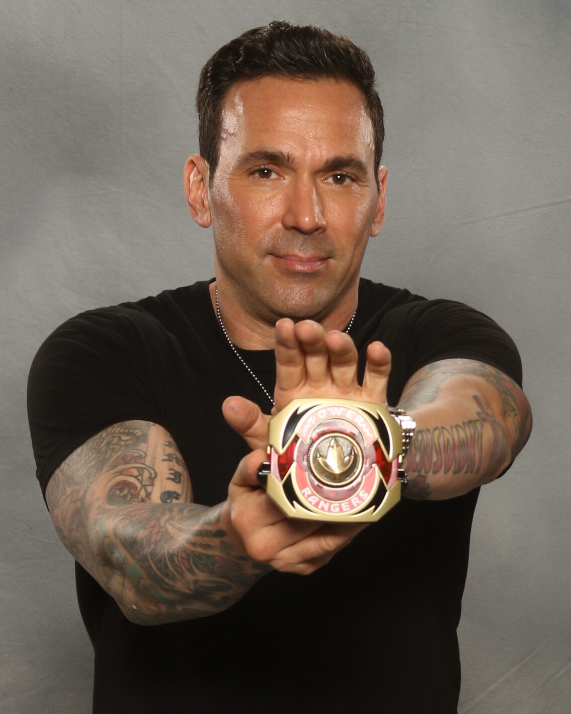
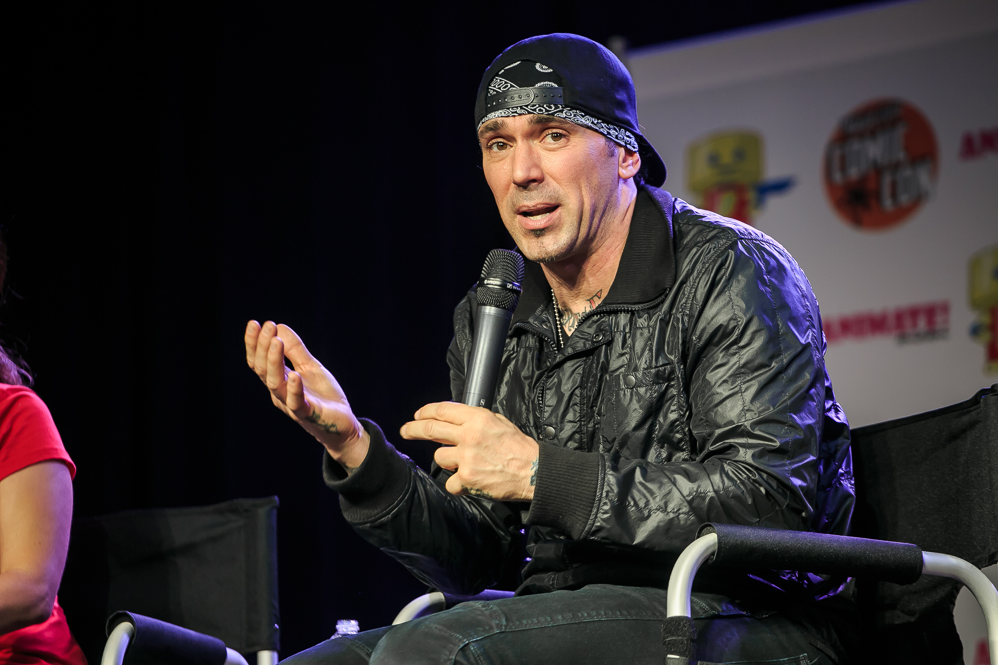
At the wrist, the larger forearm designs narrow into smaller marks. Photos of Jason holding a belt or raising his hands show the ink wrapping around the joint and continuing toward the back of the hand. The shapes shift as his wrist turns.
That movement suits the action in many of his public photos. Rather than seeing the tattoos in a still pose, you often see them while he gestures or moves. The wrist pieces become part of the frame, whether his hand is raised or in motion.
The wrist can also give a sleeve a natural stopping point. Smaller marks and open skin around the joint break up dense coverage, before the hand tattoos continue the line. That pause keeps every part of the arm from feeling equally busy.
When choosing a wrist placement, look at how it sits with your hand relaxed as well as in a reference pose. A photo of you moving can show details a mirror misses.
Why Jason David Frank’s tattoo style still feels recognizable
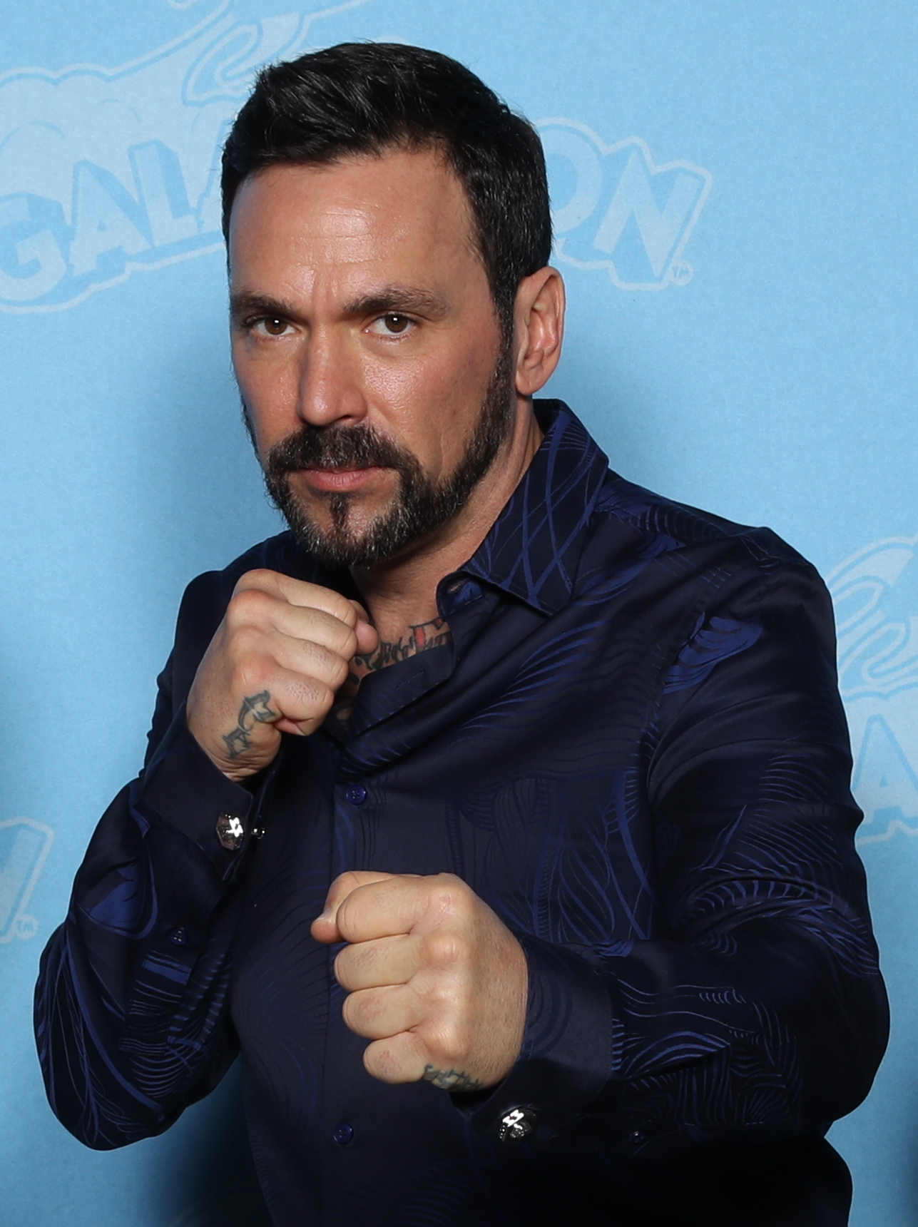
The tattoos vary, but they share a clear visual attitude: bright color, dark outlines, readable lettering and placements that stay visible. The pieces don’t have to match when they share that sense of scale and confidence.
The collection also fits the way Jason presented himself in public. Martial arts, Power Rangers and his other work all involved movement, costumes and larger-than-life characters. His tattoos look at home in that setting: easy to spot at a distance, with more to see up close.
A tattoo collection can build over time. You might start with a word and add a larger image later, using different styles as long as each has room. A shared attitude and scale can tie designs together without making them identical.
His tattoos look suited to a body in motion: arms that bend, hands that work and a neck that turns. Photos where he’s gesturing show the ink as part of him, rather than a flat catalogue of designs.
The neck tattoo changes shape as Jason turns his head
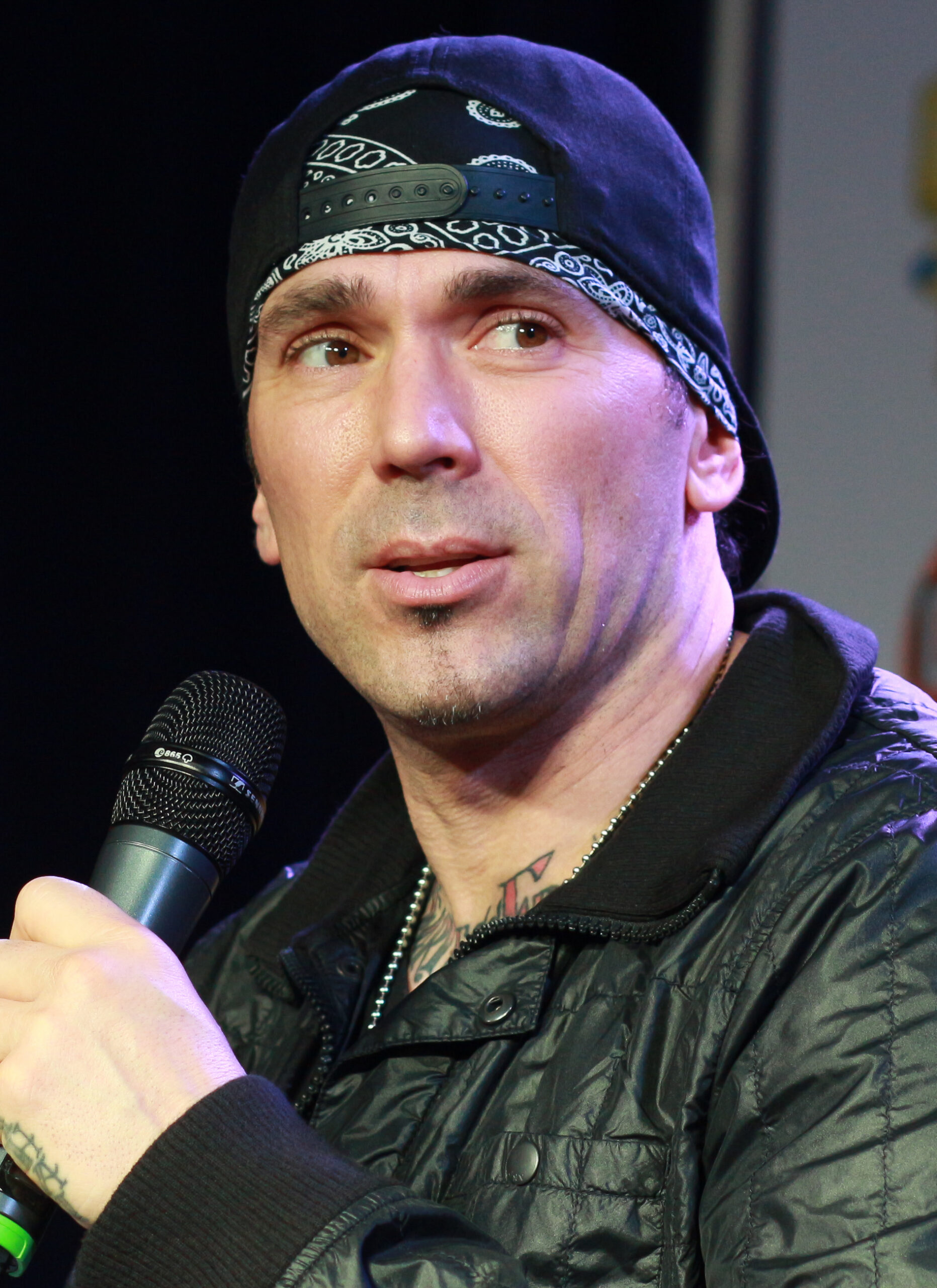
In another close portrait, much of the neck lettering disappears as Jason turns from the camera. The visible edge still links his jaw, collar and upper chest, while darker shapes at the base of the neck anchor the design.
A neck tattoo can read differently from different angles. From the front, lettering takes focus; from the side, the surrounding shapes stand out. As the body reveals more of the design, the whole piece can feel larger.
Watch Jason David Frank get his hand tattoos

The video shows the hand-tattoo process and how the new ink fits beside Jason’s existing arm work. The portrait above also makes the connection clear: hand tattoos are easier to plan when the wrist and forearm are part of the same layout.