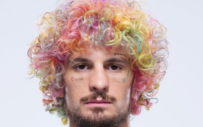
Sean O’Malley’s tattoos are visible even in a quick portrait: a broad, colorful chest piece, crowded arms, lettering across the fingers and small marks on his face. The chest bird draws the eye first. The script and symbols around it are what make the whole collection recognizable.
I’ve focused on the placements that show up in fight, weigh-in and portrait photos. Where O’Malley has explained a meaning publicly, I’ve included it. For designs without a clear explanation, I stick to what the photos show instead of guessing.
The owl chest tattoo sets the whole look
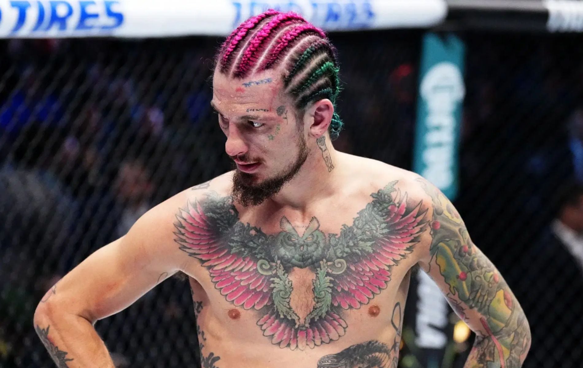
O’Malley’s chest is hard to miss. A large colored bird stretches across his upper torso, with layered feathers reaching toward the shoulders. It’s wide and detailed, and often visible during weigh-ins and walkouts when he’s shirtless.
The middle is darker than the outer feathers, giving the design a clear center. Pink and green break up the black shading; the wings make a strong horizontal line across the chest. Their edges narrow toward the upper arms rather than stopping in a hard square.
People often call the piece an owl, though some photos make the bird look like a wide-winged hybrid. The photos show a feathered bird with a face at the center and bright color across its wings. That description leaves room for what’s unclear while keeping the focus on the shape and placement.
The scale is the useful detail if you’re studying it for ideas. A chest piece this wide needs a center that reads and enough room around the wings. O’Malley’s design anchors at the sternum and carries color toward the shoulders, so it stays legible when he lifts his arms or moves.
The arm lettering keeps the chest piece from doing all the work
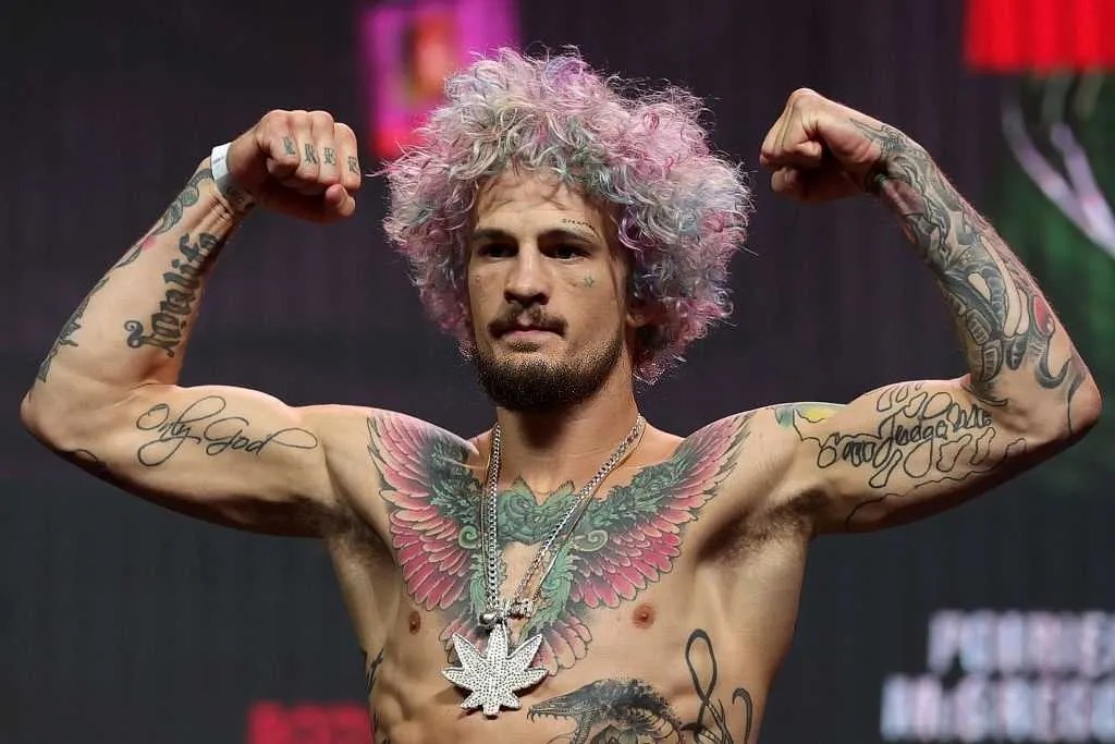
The arm photos show several kinds of ink alongside the large chest design. Script crosses the biceps, darker shapes cover parts of the forearms, and small block letters sit across the fingers. The arms don’t mirror each other, giving the collection a look built up over time.
Only God is the clearest phrase in these shots. It runs in flowing script along one arm; depending on the angle, it looks like it sits on the bicep or forearm. The long letters soften the look beside the heavy bird on his chest. Smaller marks fill around the elbow and wrist on the other side.
Short block letters cross O’Malley’s fingers and show whenever he raises his fists. They can disappear in a full-body shot, then stand out in a weigh-in close-up. Hand tattoos stay in view as the hands move, gesture or come up in front of the face.
One photo can’t show every placement at once. A flex brings out the biceps; a fight pose shows more of the forearms and fingers; a shirtless portrait makes the chest bird easiest to read. Each angle shows a different part of how the tattoos sit together.
Only God and the rose details bring the arms into focus
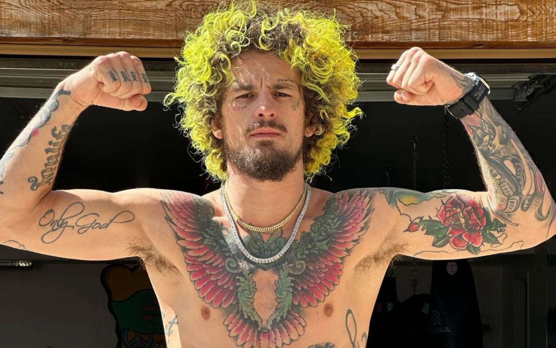
A close flex photo makes the script and smaller arm pieces easier to see. The phrase follows the muscle instead of running in a straight strip, and rose petals with dark outlines give the forearm another layer of texture.
Script can lose clarity when it wraps around a moving part of the body. O’Malley’s letters are large and spaced out, so the phrase still reads when his arm turns toward the camera.
The same close-up catches some face ink: a small heart, a star and forehead lettering above the chest design. That gives the face and arms a visual link, even in a photo where a shirt or fight gear hides part of the owl.
The small pieces each have a different role. The phrase gives the arm a long line; roses soften the darker work; tiny marks frame the face. Keeping those sizes distinct helps the collection feel layered without packing every area equally.
Rose work and sleeve pieces fill the space around the owl
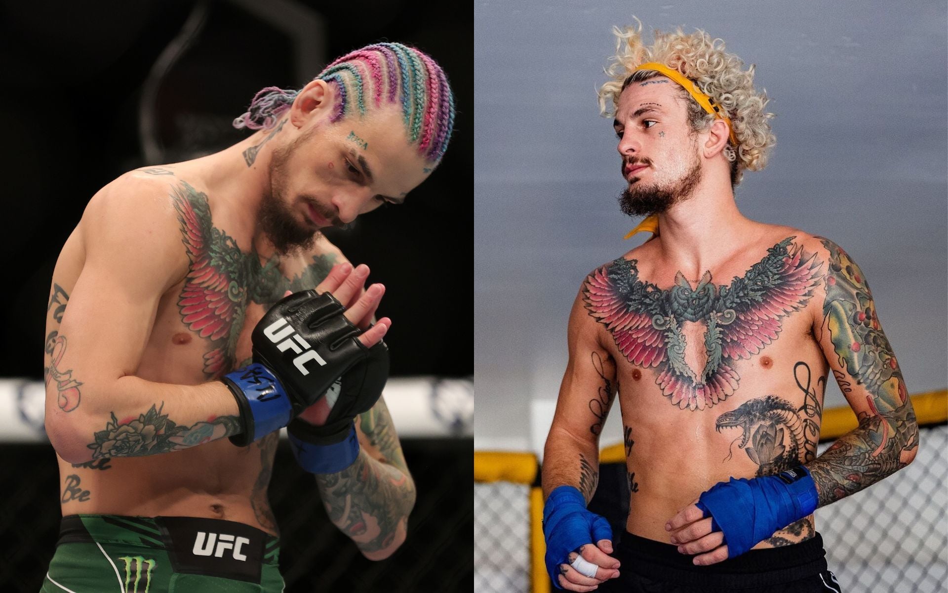
Red and pink roses appear around the upper arms and shoulders. Dark green leaves and black outlines sit beside the petals. The flowers carry the chest design toward the arms, but their detail also holds up in a closer photo.
The fight photos show one arm more densely covered than the other. On the fuller side, flowers, shading and fine lines sit close together; the other leaves more skin between designs. That unevenness makes the collection feel less like a matched set and lets the arm’s shape stay visible.
The roses and chest bird share rounded shapes. Feathers fan outward from the torso; petals turn inward around the bicep. The subjects differ, but their curves and overlapping colors help the designs read as one composition.
If you’re adding a sleeve around an existing chest tattoo, the placement is worth a look. O’Malley’s roses fill the shoulder and upper-arm areas that need weight, while gaps keep the bird clear. The flowers don’t fill every open patch.
The face, fingers and neck add smaller marks up close
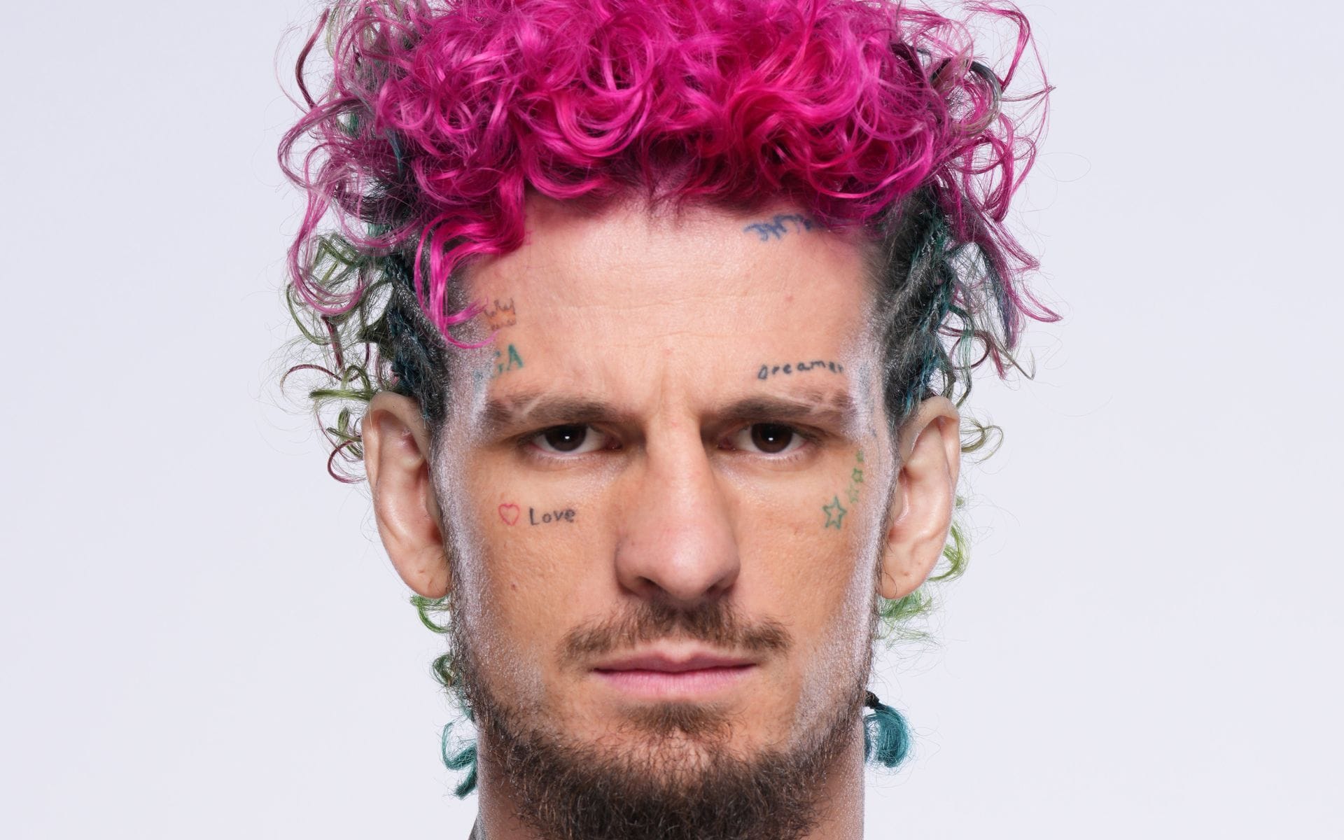
O’Malley’s face tattoos are small but prominent. Suga sits above one eyebrow; a reversed word crosses the forehead; a small heart and the word Love sit near the cheek; and a star rests under the eye. The marks are spread out, leaving his expressions easy to read.
Thin lettering and simple shapes sit below the jaw, while the larger color work starts at the shoulders. That shift in scale connects the face and neck to the chest without asking the smaller marks to compete with the bird.
Block letters on O’Malley’s fingers show when he raises his fists, bringing the hands into the frame. Unlike ink under clothing, finger tattoos are visible whenever the hands move in front of the camera. That gives them more presence than their small size suggests.
Dark letters read quickly against skin; tiny colored symbols need the right light and distance. If you’re considering face or hand ink, the scale and spacing matter as much as the design because there’s little room to hide a mark once the camera moves in.
The chest bird is the anchor. It spreads across the torso, and the rose and shaded arm work echo its curves. Script adds longer lines that draw the eye toward the forearms.
Face tattoos change how a portrait reads. The forehead, eyebrow and cheek marks sit close to O’Malley’s expressions, so they appear before the camera reaches his chest. They bring his face into the same visual mix as the colorful body work.
The arms are shown in motion. Biceps flex, wrists turn and fingers close around gloves. The script follows the muscle, while the small symbols sit across moving joints and fingers. A different pose makes different parts readable.
Color helps the separate areas relate to one another. Pink and green feathers on the chest recur in the roses on the upper arms, with darker shading along the forearms. The subjects vary, but the palette helps carry the eye from one section to the next.
There’s contrast in the scale as well. The bird needs space around its wings; script needs gaps between letters; and tiny face tattoos need clear outlines. Those differences keep the collection from becoming one solid block.
A portrait and a tattoo photo show different things. A close face shot brings out the forehead and cheek marks. A shirtless fight photo shows the chest and sleeves, while a flex brings out how the script bends with the bicep. Each view fills in something the others miss.
If the layout appeals to you, take the placement ideas rather than copying O’Malley’s exact phrases. Pick the main shape and where it should sit, then leave room for later pieces. Script can follow the line of a muscle; smaller symbols are easier to read when they’re away from the busiest edges.
The collection feels loud because its areas have different scales: face marks, colorful chest work and dense arms. No single piece has to compete with every other one, so the eye keeps moving.