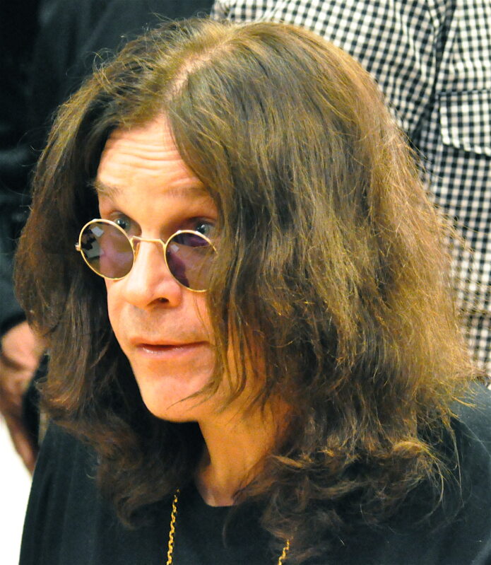
Ozzy Osbourne never needed a giant collection of ink to look like Ozzy Osbourne. The tattoos he chose are loud in their own way: a rough hand-poked name, colorful chest work, a rose for Sharon, and old-school pieces that look like they came straight out of a heavy metal photo shoot.
Some details are easy to confirm because Ozzy has shown them for years. Others are harder to pin down from a stage photo, especially when his hair, jewelry, or a microphone gets in the way. So this is a look at the tattoos that can actually be seen, plus the stories that have been reported about them. No guessing at tiny marks in a blurry concert shot.
Ozzy’s tattoos started with the OZZY knuckles
The most famous part of Ozzy’s tattoo story is probably the word OZZY across his knuckles. It was not a polished studio piece. He has said it was done when he was young with a needle and pencil lead, which makes it feel very different from the carefully planned sleeves many rock stars have today.
That rough beginning fits him almost too well. The letters are basic, direct, and impossible to miss when he throws up a hand onstage. They also became part of his visual identity before tattoos were as normal in mainstream celebrity culture as they are now. When you see the old photos, the knuckles do not feel like decoration. They look like a decision made quickly and then carried through an entire career.
The dragon and claw chest work is the big visual anchor
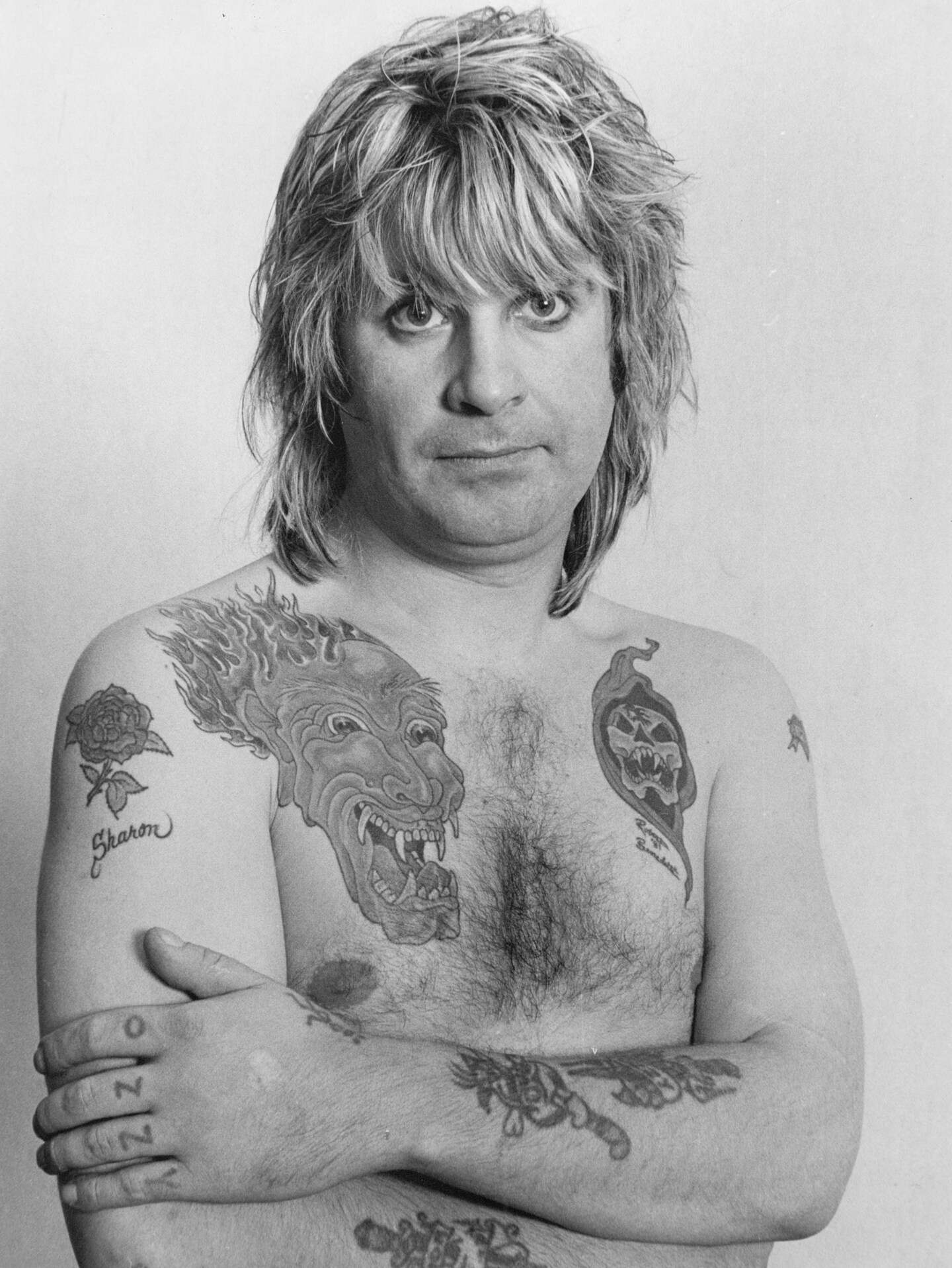
Ozzy’s chest is where the collection really opens up. The large dragon design is the piece that tends to grab your eye first, with blue and red color, a fierce face, and flame-like shapes spreading across the upper chest and shoulder. In some photos, the work looks almost like a full painted panel rather than a group of separate little tattoos.
The dragon also shows why it is risky to describe every detail as if there is one official diagram. The ink looks different depending on the year, the lighting, and whether Ozzy is standing under stage lights or posing indoors. The safest way to describe it is as a bold, colorful dragon and claw composition across the chest and shoulder area. The main idea is clear even when a smaller line is not.
That large piece sits beside older black and gray work, so the overall effect is not perfectly matched. It is more like a personal scrapbook. Bright color, faded outlines, lettering, and smaller symbols all share the same space. The mix is part of the charm.
The black and white photos show how much ink is on his arms
In a clear black and white portrait, you can see more than the headline pieces. One shoulder carries a flower and the name Sharon, while the dragon fills the center of the chest. A darker design sits on the opposite side, and the forearms show extra line work that tends to disappear in a fast live shot.
This is one of the better ways to look at Ozzy’s tattoos because the photo is not fighting colored lights or a moving microphone. The arm pieces are not all one tidy sleeve. There are gaps, older outlines, and designs that overlap in a way that feels very 1980s rock rather than modern tattoo-studio perfection.
It is also a reminder that tattoos change with time. Ink fades. Skin changes. A piece that looked sharp in a magazine portrait can look softer decades later. That does not make it less interesting. It gives the collection a real timeline.
The Sharon rose is one of the clearest personal tattoos
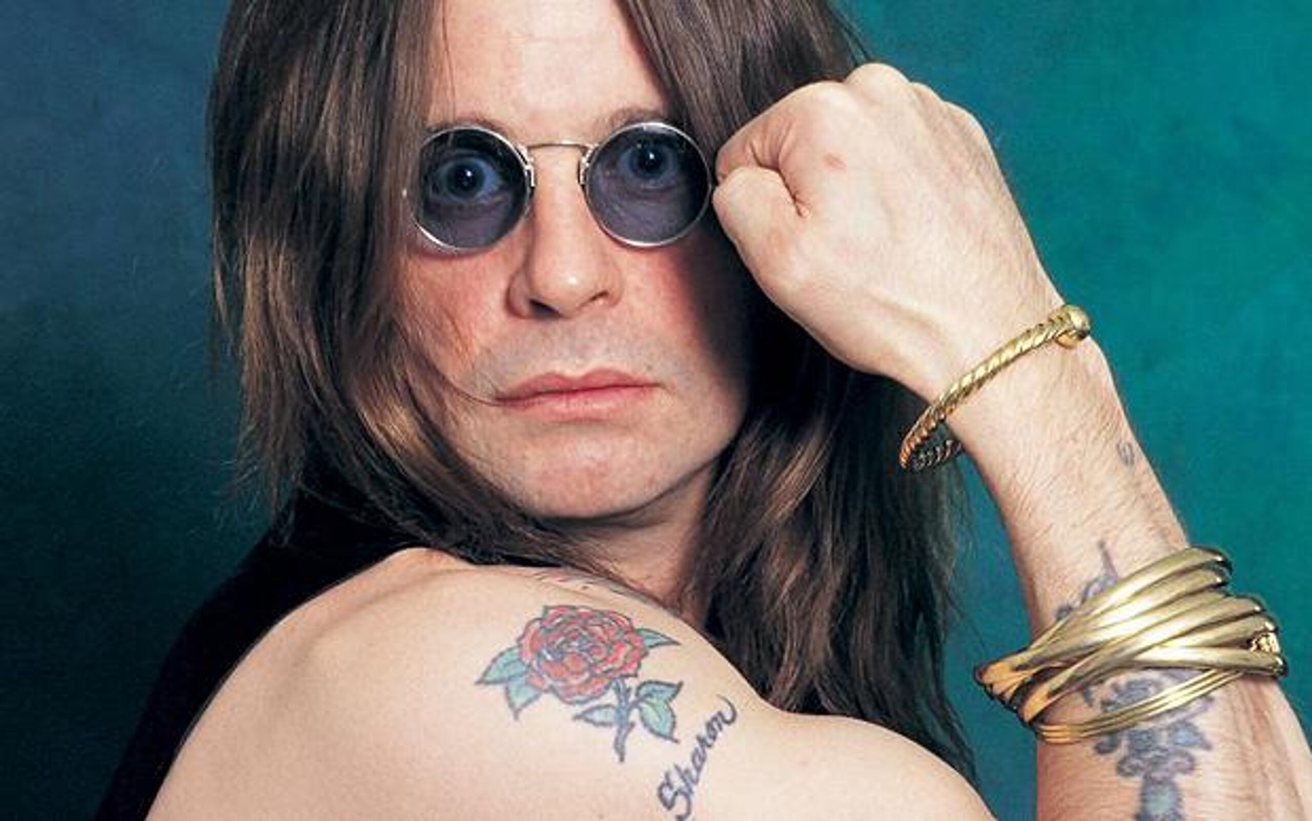
The rose and Sharon lettering on Ozzy’s upper arm are among the easiest pieces to identify. You can see the flower in several portraits, and the name sits close enough to the design that the meaning is not really a mystery. It is a straightforward tribute to the woman who has been beside him through his Black Sabbath years, solo career, family life, and all the chaos in between.
That simplicity stands out next to the monsters and dragons. A name tattoo can be sentimental without being delicate. In Ozzy’s case, the rose keeps the piece recognizable while the surrounding arm work gives it that darker rock-and-roll frame.
His older portraits reveal the arm pieces more clearly
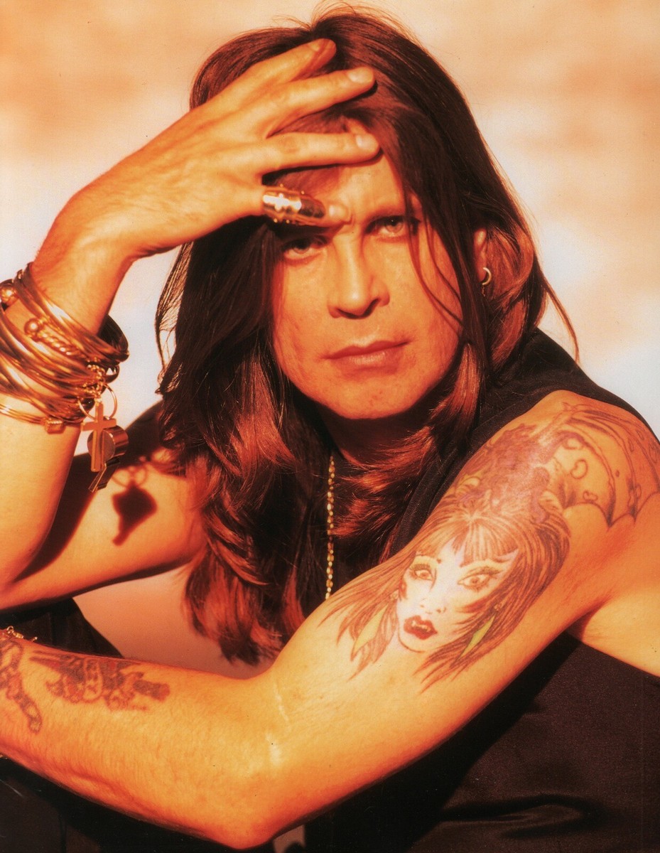
One of the most useful photos comes from the 1990s, when Ozzy is sitting with both arms in view. The image shows a large portrait-style design on the forearm, flowers and lettering on the upper arm, and more ink running toward the wrist. It is a much better reference for the actual placement than a recent crop that only shows one shoulder.
The photo also makes the collection feel more human. You can see that some designs are carefully shaded while others are simple black outlines. They were not all planned as one matching look. Ozzy added pieces at different points, and the result records different moods and eras.
Ozzy’s tattoos are not just about the chest piece
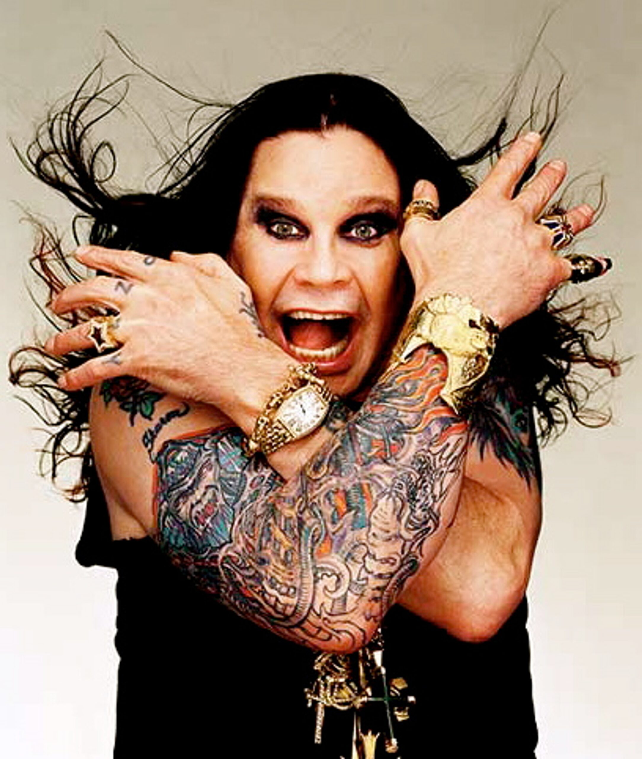
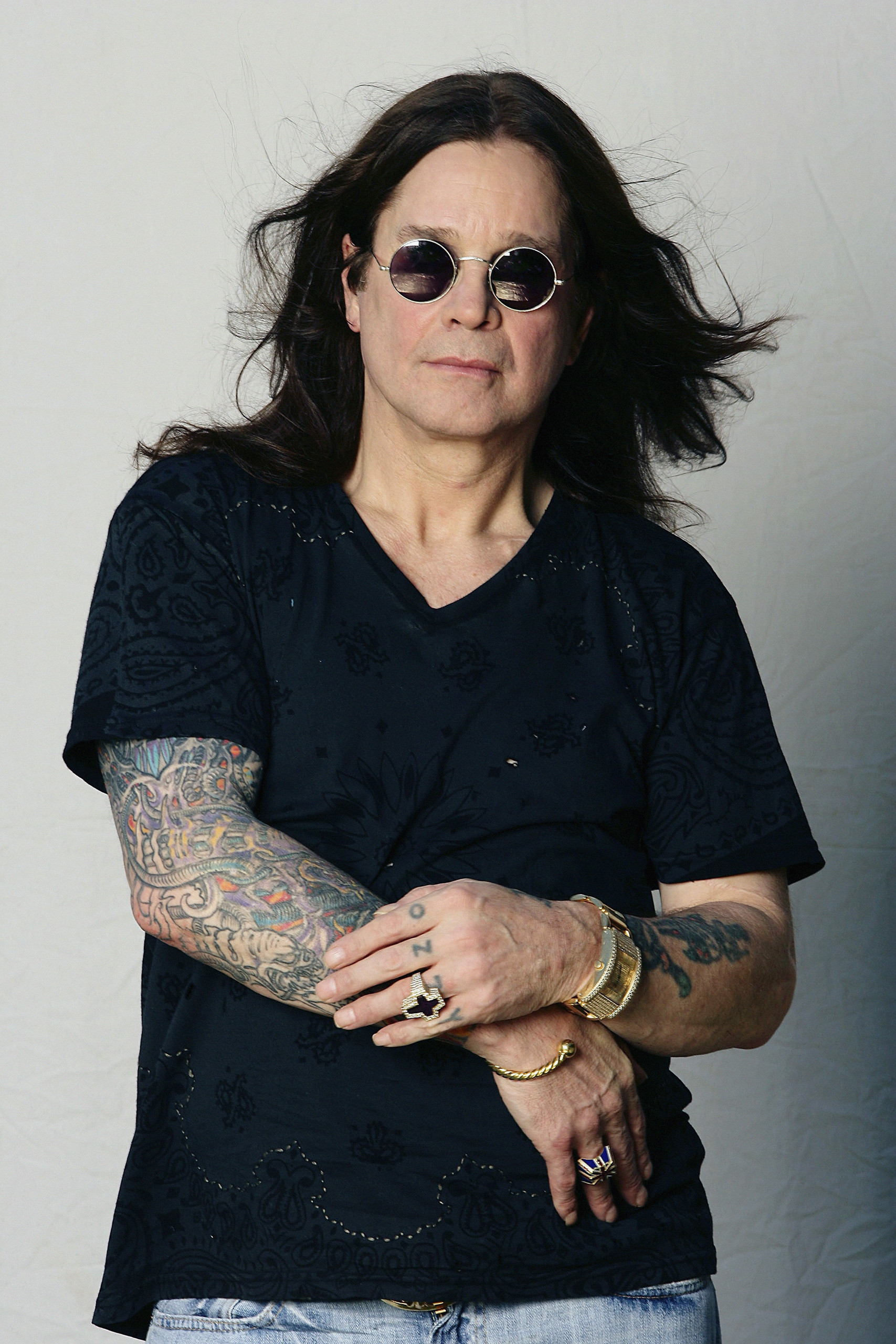
It is easy to focus on the dragon and miss the smaller marks. His hands show the famous knuckle lettering. The upper arms carry flowers, names, and older designs. The forearms bring in denser work, including portrait-style ink and smaller symbols. You can also spot additional lines around the wrists and lower arms depending on the photo.
That scattered layout is why calling the collection a full sleeve can be misleading. Some images make the arms look almost fully covered, especially when he crosses them over his chest. Other photos reveal open skin and separate pieces. Both views can be true because the tattoos were built over decades.
What can we actually confirm about the meanings?
The OZZY knuckles are the safest piece to discuss because the story has been repeated for years. The Sharon rose is clear from the name and the flower. The dragon and claw are obvious visual motifs, but a detailed meaning has not been consistently explained in a way that lets us state every symbol as fact.
That is fine. A tattoo can be worth looking at even when the owner has not given a complete explanation. Ozzy’s collection works because it reflects a certain kind of old-school rock attitude: personal names, dramatic creatures, bold color, and pieces that were allowed to age rather than being constantly redesigned for a clean social media reveal.
For more heavy music ink, take a look at Rob Zombie’s horror-inspired tattoos, Lemmy Kilmister’s Ace of Spades ink, or Zakk Wylde’s bat hand tattoo. They all have a different feel, but they share that same connection between stage identity and body art.
Why Ozzy’s tattoo style still feels like him
Ozzy’s tattoos do not look like they were chosen to fit one trend. They are bright in places, rough in others, sentimental when they need to be, and a little strange on purpose. The dragon gives the chest a signature image. The rose and name keep family close. The knuckles turn his name into something he carries every time he raises a hand.
That mix is why the collection still works. It is not trying to be a perfect catalog. It looks like a life lived in public, with tattoos added when the moment felt right. If you like celebrity tattoos that have some age and personality to them, Ozzy’s are much more interesting than a fresh, matching sleeve designed for one photo.
In short
Ozzy Osbourne’s best-known tattoos include the hand-poked OZZY knuckles, the large colorful dragon and claw chest work, the Sharon rose and lettering, and a collection of older arm and forearm pieces. The photos show a musician whose ink grew alongside his career. Some designs are easy to identify, while others are best left as visible but unconfirmed details.
Watch the short video below for Ozzy talking about tattoos, then compare the details with the photos above. The big pieces are easy to spot. The smaller marks are where the story gets interesting.