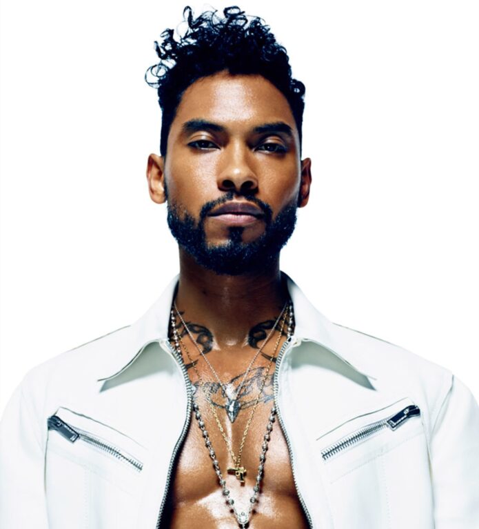
Miguel’s tattoos are hard to miss because they sit right in the middle of his style. Open shirts, tank tops and stage outfits leave his chest and arms in view, so the ink becomes part of how he presents himself. His collection includes large lettering, old-school symbols, animals, religious imagery and pieces that look closer to small paintings than quick flash designs.
That makes Miguel tattoos useful to study as a layout, not just as a list of pictures. The chest gives the eye a place to land, while the arms add movement. Neck pieces pull the look toward the face, and smaller tattoos keep the open spaces from feeling accidental.
Miguel has spoken about several designs and their meanings. A Guardian interview describes the scorpions, the Aristotle quote across his chest, the brass knuckles, a feather, a Dalí skull and the phrase “Amar hasta la muerte.” Those details give the collection a personal thread and a better starting point for anyone looking for tattoo ideas with a story behind them.
This guide looks at the visible areas first, then at the choices that make the designs feel connected. The idea is not to copy Miguel’s exact tattoos, but to understand the balance, scale and attitude that work with his clothes and music.
Miguel chest tattoos make the whole look feel deliberate
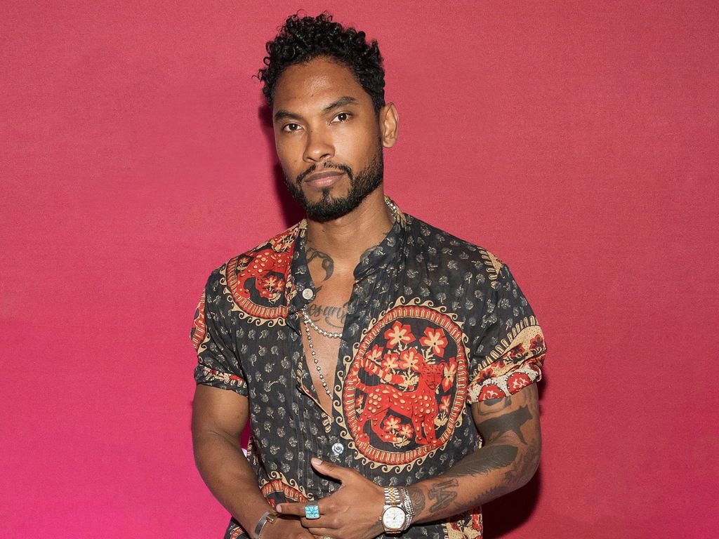
The chest is the strongest visual anchor in Miguel’s collection. In shirtless portraits, lettering and larger illustrations stretch across the pectorals and shoulders. The broad shapes register before the smaller details, so the chest tattoos still read from a distance.
The placement matters as much as the drawings. Lettering can follow the curve beneath the collarbones, while an image can sit lower and leave room near the neck. The pieces don’t need to touch. A little open skin gives the eye a break and keeps several large designs from blending into one dark patch.
A chest tattoo has to work when the body is still and when it moves. Skin stretches as you reach, twist or take a deep breath. Miguel’s photos show why clear outlines and enough spacing help the main shapes stay recognizable through those changes. Fine detail can sit inside the design, but the overall silhouette needs to hold.
Pick the chest anchor before adding the supporting pieces. It might be a phrase, an animal, a portrait or a family symbol. Once that shape is settled, an artist can use the surrounding space for smaller tattoos that belong there. Random filler can make a torso look busy without making it feel complete.
If you like Miguel’s open-shirt look, think about how the tattoo will sit under clothes too. It may be fine if it disappears under every shirt; that can be a deliberate choice. If you want it visible, check the neckline, sleeve and jacket lines before settling on a size. The placement should work with the clothes you wear most, not only one dramatic reference photo.
Miguel arm tattoos mix lettering with bold images
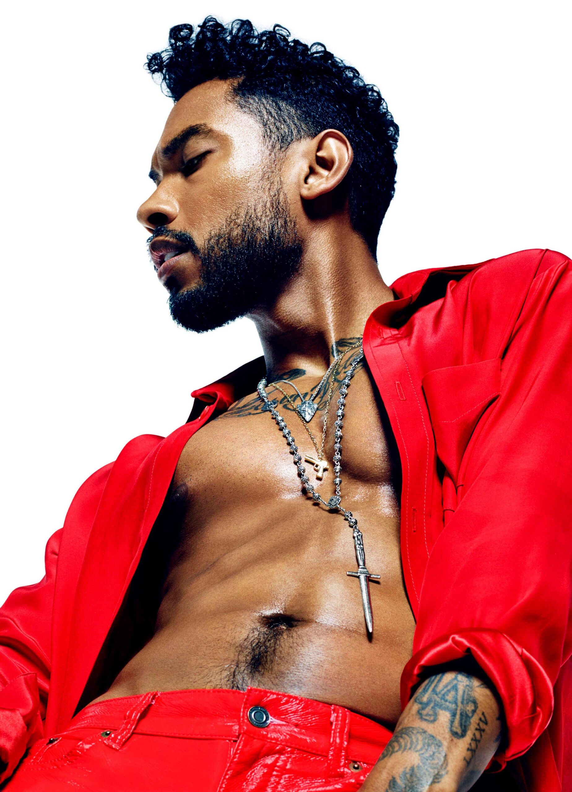
Miguel’s arms carry much of the collection’s contrast. Some photos show heavy black shapes and lettering; others reveal more illustrative work around the biceps and forearms. The mix keeps the arms from becoming one repeated pattern. Each piece has its own weight, but the overall arrangement still feels connected.
The upper arm gives a larger tattoo room. It can hold a portrait, a painted scene or a symbol with a clear outline. The forearm is more visible in everyday life, so it suits words and designs you want to see often. Miguel’s photos show how a short sleeve can reveal enough ink to change the feel of an outfit.
Arm tattoos move with the body. When the elbow bends, the design folds into a different shape. Turn the wrist, and a line that looked straight on paper starts to wrap around the arm. That movement is part of the placement; the stencil should be checked with the arm relaxed, bent and hanging naturally.
Let each arm have a clear visual job instead of forcing perfect symmetry. One side can carry the largest image, while the other holds smaller marks or lettering. Matching both arms exactly can make the layout feel stiff. A little difference leaves room for later choices and lets the collection grow.
Pay attention to the wrist and elbow transitions. A strong shape near the elbow can link the upper and lower arm. A smaller word near the wrist can sit below the larger work without competing with it. These transitions make separate tattoos feel placed on a body, not stuck wherever there was room.
Miguel neck and shoulder tattoos frame the face
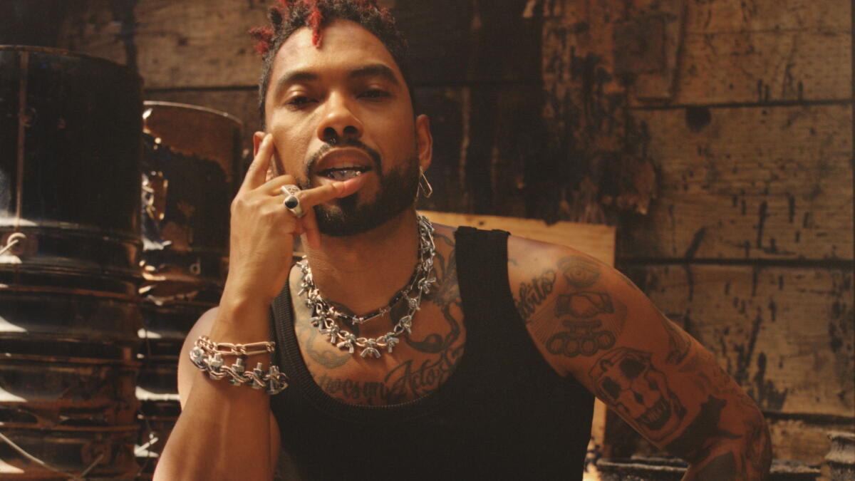
The neck and shoulder tattoos change the feel of Miguel’s portraits. Dark shapes near the collar frame his face, while the shoulder and upper chest widen the silhouette. With an open jacket, the neck ink sits beside chains and fabric, so it reads as part of the outfit.
Neck tattoos are visible but give more flexibility than a face tattoo. A curved design can follow the side of the neck, or a smaller piece below the ear can connect with the shoulder. The placement should follow the body’s lines instead of sitting like a flat rectangle.
Close portraits show how lighting changes what stands out. Bright light brings the collarbone and lettering forward; a darker image makes the neck shapes read as one frame. If you’re planning ink here, look at it in daylight as well as under dramatic studio lighting. It should work without a photographer setting the mood.
Check the neck stencil from the front, side and three-quarter view. Turn your head, relax your shoulders and look down. Skin folds and muscle movement can shift a small design more than you expect. It should follow the curve of the neck and look centered when you stand naturally.
The shoulder can give neck ink space before the larger chest or arm designs begin. That breathing room keeps the face from sitting inside a wall of tattoos. It also leaves a place for a future piece without forcing unrelated designs into a narrow gap.
Miguel tattoo details carry personal meaning
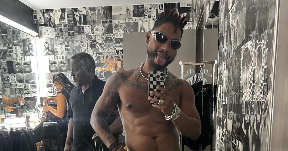
Several of Miguel’s tattoos have a personal explanation. The scorpions connect to his zodiac sign. The Aristotle quote across his chest is a line he chose to carry with him. The brass knuckles have been described as representing friendship, while the feather honors his Native American grandfather. Those details give the designs a personal history beyond their appearance.
He has also described images tied to art and mortality, including Saint Michael defeating Satan and a Dalí skull. Not every tattoo needs a public explanation. A collection feels more intentional when the wearer knows why a particular image belongs there, even if the meaning stays private.
Small tattoos can hold as much meaning as larger ones. Miguel has spoken about a tiny king of diamonds and matching infinity tattoos connected to his relationship. A small mark may barely register in a portrait, then stand out when you look closer. It can balance a larger chest or arm piece without competing with it.
Choose the reason before you choose the reference image. Write down what you want the tattoo to hold onto, then look for a shape that expresses it. The final design may be simpler than the first picture you saved. A clear idea gives the artist room to draw something original.
Lettering needs the same care. A clean typeface and spacing that follows the body can keep a quote legible, while tiny script may lose its shape over time. Ask to see several stencil sizes from a normal viewing distance. The best one should be readable without leaning into a mirror or zooming in on a phone.
How to build a Miguel inspired tattoo layout
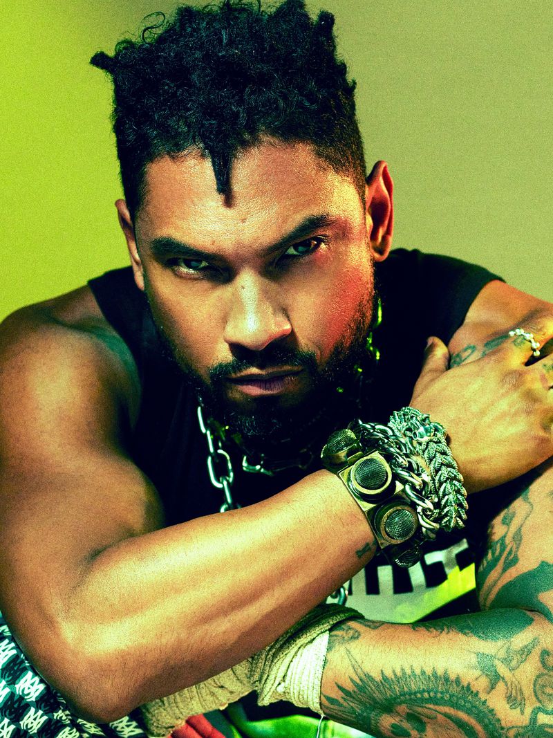
A Miguel-inspired layout starts with contrast. Put the largest image or phrase on the chest or upper arm, then use smaller symbols to guide the eye toward the neck and forearm. Give the main pieces room, with quieter tattoos between them.
Start with a placement that fits everyday life. Chest and upper-arm tattoos are easier to cover; neck, wrist and hand tattoos are visible more often. If you like Miguel’s open-shirt look but want more control, keep the main design on the chest and let the surrounding pieces show when you choose.
Bring an artist references that show the details you like: the lettering’s scale, how a design wraps, the open skin and the balance between black ink and skin. Don’t ask for an exact copy of someone else’s tattoo. An artist can keep the mood and make a design for your body and your story.
Leave space for the collection to grow. Miguel’s tattoos look like they were added over time, not planned in one afternoon. You can start with one piece, see how it settles, then decide what belongs beside it. Open skin gives the tattoos room.
Check the layout with the clothes you wear most. Try a T-shirt, an open shirt, a jacket and a tank top. See what shows, what disappears and where the eye lands. That can help you avoid a placement that only works in a posed photo.
Miguel’s tattoos have a clear center and different details around it. The chest carries larger statements, the arms add movement, and the neck pieces draw attention toward the face. Smaller symbols and lettering add personal notes without crowding the larger work.
If you’re studying Miguel tattoos for ideas, look at the choices behind the images: scale, open skin, words that follow the body and personal symbols beside larger art. You can use those ideas without copying the designs.
Here is Miguel discussing his music and the visual world around his work:
One thought on “Miguel Tattoos: Chest, Arms, Neck and Meanings”