
Maitreyi Ramakrishnan’s tattoos are small, playful, and very clearly hers. Instead of building a collection around generic symbols, she’s gone for the things she actually loves: anime, Nintendo, and the slightly weird little characters that have been part of her life for years.
There are five designs that have been documented clearly enough to talk about: two Attack on Titan references, a Kirby piece, a pair of hearts, and a small design identified as Navi from The Legend of Zelda. The collection jumps between pop-culture references and simple graphic shapes, but it still feels coherent because every piece has a light, personal energy.
The photos don’t always give us a perfect studio view. Some of the tattoos sit high on the hip or upper leg, and one is partly hidden by a bikini tie. That’s normal with celebrity ink. A design can be easy to recognize without pretending we know every tiny detail or the exact story behind it.
The Eren Yeager eyes tattoo
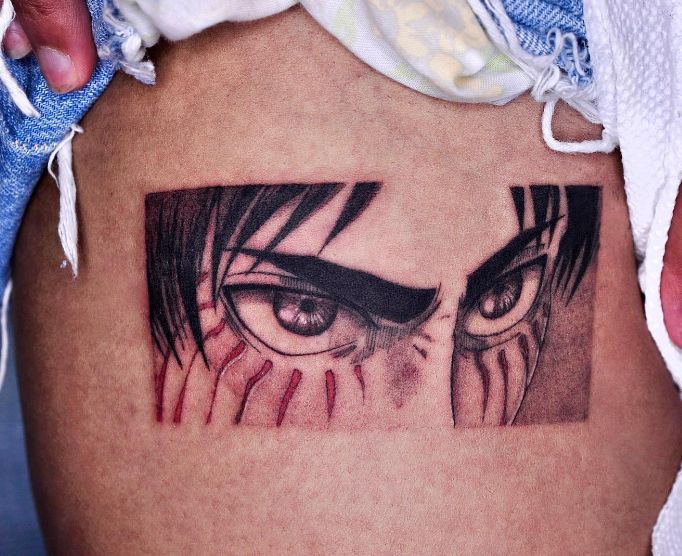
The most dramatic design in Maitreyi’s collection is the Attack on Titan tattoo on her upper leg. The close-up shows a rectangular black-and-red composition built around Eren Yeager’s eyes. Heavy dark hair frames the eyes, while red lines drop beneath them and give the piece a sharper, almost battle-worn look.
It isn’t a vague reference that only fans would recognize after a long explanation. The eyes do most of the work. They’re expressive, slightly intense, and drawn with enough contrast to read even when the tattoo is seen from a distance. The rectangular framing helps too. It gives the anime portrait a clean edge and stops the design from spreading into a larger, less controlled shape.
Maitreyi has talked openly about loving the series, so this one feels like a proper fandom tattoo rather than a random image chosen because it looked cool on a mood board. The placement makes practical sense as well. An upper-leg tattoo can be shown when she wants to show it, but it can stay covered for acting work, events, or any outfit that calls for less visible ink.
The visual decision is the focus on one recognizable feature. A full character can become crowded quickly, but Eren’s eyes carry the reference through expressive shapes, dark hair, and red accents. The portrait remains readable without turning the upper-leg tattoo into a larger scene.
Kirby hip tattoo

The Kirby tattoo is much smaller and softer than the Eren design. It sits on Maitreyi’s hip and appears to show the round pink Nintendo character riding on a star, with a little cloud detail around the figure. The beach photograph only gives us a partial view because the tattoo is close to the bikini string, so it’s best described as a small Kirby design rather than pretending every line is fully visible.
That placement fits the reference. Kirby is cheerful, compact, and instantly recognizable, so the tattoo doesn’t need a huge canvas. The rounded body and simple face do enough on their own. Keeping the design small also matches the way people tend to carry game characters they’ve loved for a long time: as a personal nod, not necessarily as a large piece meant to dominate the body.
Maitreyi has connected Kirby with her wider Nintendo fandom in interviews. She grew up playing Nintendo, carries that interest into her present life, and has described Kirby as a favorite character. That background makes the tattoo feel less like a trendy gaming reference and more like a little marker for a genuine childhood obsession.
The scale makes Kirby distinct from the larger anime design. The character’s strong silhouette does most of the visual work, while the rounded body and simple face remain readable in the small hip placement. The partly hidden photograph leaves some details uncertain, but the compact mascot shape is clear.
The hearts forearm tattoo
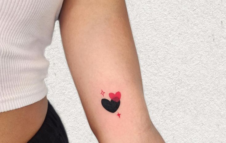
One of Maitreyi’s more graphic tattoos is the heart design on her left forearm. The image shows two dark heart shapes tucked together, with a red heart layered above them and small sparkle marks on either side. The larger black form looks almost like two rounded shapes meeting, while the colored heart gives the otherwise monochrome piece a quick flash of warmth.
It’s a simple design, but it doesn’t feel generic. The uneven, cartoon-like shapes keep it from looking like a standard flash heart. The sparkles are important too. They make the piece feel more playful and give the tattoo a little breathing room instead of leaving the hearts floating by themselves.
Reports place the tattoo just above the inner elbow, an area that gives the design a natural vertical home. The placement is visible when Maitreyi wears short sleeves, but it’s still easy to cover. A small tattoo like this also works well on a part of the arm that bends and moves because the design doesn’t rely on a long straight line or a perfectly symmetrical frame.
The heart design gets its character from the overlap of the shapes and the single color accent. The red heart and small sparkle marks interrupt the black forms without overwhelming them. That limited palette gives the forearm tattoo a clear focal point while preserving its cartoon-like line work.
Navi tattoo from The Legend of Zelda
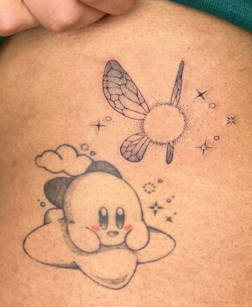
The fourth documented piece is a small Navi tattoo from The Legend of Zelda. It’s shown as a delicate character design with fine lines, a round central body, wing details, and little sparkles scattered around it. The exact photo is more useful as a visual reference than as a reason to over-explain the design. You can see the airy outline and the way the surrounding marks make the character feel as though it’s glowing.
Maitreyi reportedly got this one during a trip to New York and credited tattoo artist Rachel Song. That connection to a Nintendo store visit makes the piece sit neatly beside the Kirby tattoo. They aren’t identical styles, but they come from the same general world of games and childhood comfort.
Navi is a smart choice for a small tattoo because the character already has a light, floating quality. The wings and sparkles can stay open instead of being packed into a heavy black shape. That gives the artist room to use fine line work and a little negative space, which helps a small design remain crisp as it settles into the skin.
The Navi tattoo depends on the spacing of its fine details. The winged figure remains airy because the wings, sparkles, and central body are separated rather than packed into a dark block. Its delicate construction gives the collection a lighter note beside the heavier Eren eyes.
A second Attack on Titan tattoo
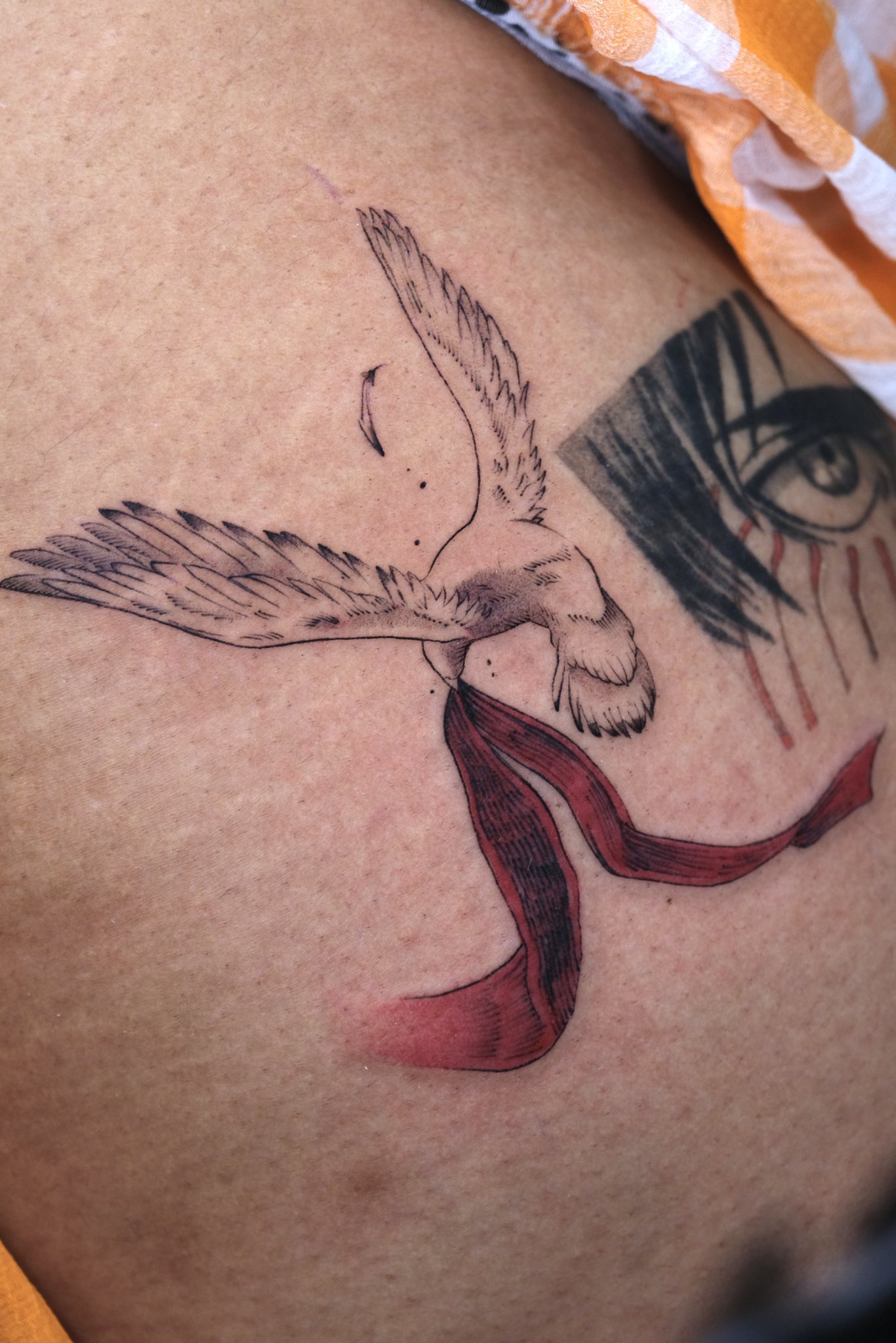
A later close-up shared by Maitreyi adds another Attack on Titan-inspired design beside the original eyes. This one shows a fine-line dove carrying a vivid red scarf, with part of the earlier eye tattoo visible at the edge of the frame. The contrast is striking: the older piece is dark and boxed in, while the dove is lighter, more open, and built around movement.
The red scarf gives the image its strongest hit of color. It also makes the reference easier to read for fans who know the series, without turning the whole tattoo into a full-color illustration. The bird’s wings are drawn with loose, feathery lines, so the design keeps a sketchbook feel even though the scarf is filled more heavily.
Placing the two references close together creates an interesting little cluster. They don’t match exactly, and they don’t need to. The eye tattoo carries the intense expression of Eren’s transformation, while the dove and scarf pull toward another emotional part of the story. Together they feel more like two separate memories from the same fandom than one oversized scene.
A collection built around games and anime
This editorial portrait is included for context, not as evidence of another tattoo. That distinction matters because Maitreyi’s designs are often photographed in casual settings where a mark can be partly hidden, blurred, or distorted by the angle. A clear face-visible portrait helps identify the subject, but it shouldn’t be used to claim that an unconfirmed mark is part of her collection.
Looking at the five documented designs together, the common thread is obvious. Maitreyi’s tattoos aren’t trying to look expensive or intimidating. They’re little pieces of fandom. The Eren eyes and dove bring a harder anime edge, while Kirby and Navi keep the gaming side bright and playful. The hearts sit between those two moods, using a familiar symbol but drawing it in a cartoon style that still feels personal.
That mix is a useful reminder that a tattoo collection doesn’t need one strict visual style. People sometimes feel pressure to make every new tattoo match the last one, but meaning can be the thing that ties a collection together. A fine-line game character and a bolder anime portrait can live on the same body if both designs feel connected to the person wearing them.
There’s also something refreshing about choosing references that don’t need to be translated into a serious symbol. A favorite character can be enough. You don’t have to turn Kirby into a metaphor for resilience or explain why a heart represents every relationship you’ve ever had. Sometimes you just love the game, the show, or the memory attached to it.
How Maitreyi’s fandom references work together
Maitreyi’s collection starts with recognizable references rather than a single uniform style. The documented designs preserve the parts of each fandom image that matter most: Eren Yeager’s eyes, Kirby’s compact silhouette, Navi’s wings and sparkles, and the red scarf carried by the dove. Each tattoo keeps a different visual fragment from the source material.
The scale changes from piece to piece. The Eren tattoo holds more contrast because it has a larger rectangular area. Kirby stays compact because the outline is simple. Navi leaves more open space around the wings and sparkles. Those are different drawing solutions, even though all three designs come from Maitreyi’s fandom tattoos.
The placements reinforce those differences. The rectangular anime eyes sit on the upper leg, the compact Kirby appears at the hip, and the heart design occupies the forearm above the inner elbow. The locations keep the pieces visually separate while allowing the anime and gaming references to read as individual memories.
Color also shifts with the subject. Maitreyi’s collection uses strong black and red contrast for Eren, a brighter character-focused treatment for Kirby, and delicate line work for Navi. The red scarf in the second anime reference becomes a single vivid accent against the lighter dove, while the hearts provide another small flash of color on the forearm.
Why the collection feels so natural
The best thing about Maitreyi Ramakrishnan’s tattoos is that they don’t feel forced into a brand. They look like the kind of pieces someone chooses after living with a favorite game or anime for years. The collection is young, and it may grow, but the existing designs already have a clear personality.
The tattoos also leave room for future changes. A small Kirby piece could sit beside another Nintendo reference. The hearts could remain a standalone pop of color. The Eren eyes already have enough presence to anchor a larger collection without needing extra decoration around them. Navi adds a lighter, more delicate note, which keeps the overall group from becoming too dark or too serious.
The pattern is consistent across Maitreyi’s documented ink. Each reference remains recognizable, each placement gives the design room to read, and the collection moves between bold anime imagery and lighter game characters without losing its personal tone. The tattoos do not need one shared drawing style because the connection is the set of memories behind them.
Maitreyi’s collection works because it stays close to those simple ideas. It’s two anime references, a Nintendo favorite, a pair of playful hearts, and a delicate Zelda nod. The designs are different, but they all feel like small windows into the same person.