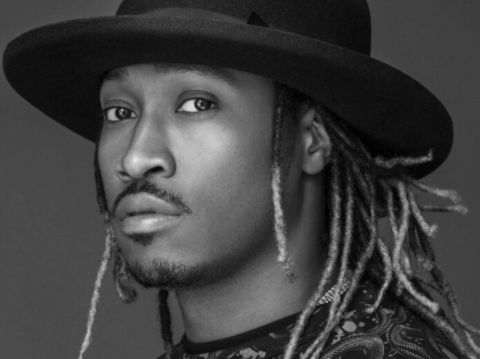
Future has never treated tattoos like background decoration. His ink is part of the way he presents himself, from the black-and-grey work spread across his chest to the lettering that runs down his arms. Some pieces are easy to spot when he performs shirtless. Others sit under chains, sleeves, and stage clothes, then show up for a second when he lifts a microphone or reaches across a console.
That mix makes Future’s collection useful for anyone planning a tattoo with a strong music connection. The designs move between family references, names, stars, portraits, birds, script, and heavy shading. The common thread is placement. Future gives larger areas room to breathe, then lets smaller marks fill the gaps around them.
This guide focuses on the designs and placements that can actually be seen in clear photographs. It also looks at the choices that make his collection feel cohesive even when the individual tattoos come from different moments in his life.
Future’s tattooed chest: portraits, symbols and layered blackwork
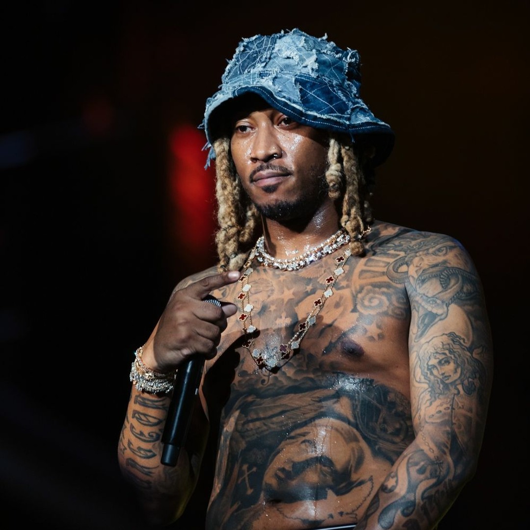
The chest is the first place most people notice when Future performs without a shirt. It reads as a broad field of black and grey rather than one single centerpiece. Large shaded forms sit beside smaller symbols, and the designs follow the shape of the pectorals instead of stopping at a straight line. That gives the collection a natural flow when he moves.
Portrait-style work sits beside simpler marks. A face or figure brings a softer edge, while stars, crosses, and dark filler areas keep the overall look grounded. The contrast matters. If every part of a chest piece used the same heavy black, the individual designs would disappear into one block. Future’s lighter skin breaks and open areas help the eye separate one image from the next.
For a person borrowing this idea, the useful lesson is scale. A chest tattoo does not need to be a single giant image. A group of medium designs can feel just as deliberate when the spacing and shading are planned together. Start with the piece that carries the most meaning, then place supporting symbols around it. An artist can use the sternum, pectorals, and upper ribs as separate zones while still making the finished work look connected.
Future also shows why photographs can make chest tattoos look different from one day to the next. Stage light can flatten grey shading, while daylight reveals softer gradients and small line details. The strongest references are photographs where the chest is visible at a useful angle, not a cropped image that only shows a logo or necklace. Chest placement rewards a clear focal point.
The Dungeon Family ink on Future’s forearms

Future’s forearms carry some of the clearest identity-driven lettering in his collection. The Dungeon Family reference is especially important because it links the tattoo to Atlanta’s music history and to the artists who shaped his early path. It is not simply decorative script. The placement makes it visible during a performance, which suits a mark connected to music and belonging.
The forearm is practical for lettering because it gives the artist a long, readable surface. Script can follow the length of the arm, while stars and smaller symbols can fill the spaces near the wrist and elbow. In Future’s case, the surrounding work keeps the lettering from looking isolated. The arm has enough other ink that the words sit inside a larger visual story.
That approach works well for anyone considering a name, crew reference, or meaningful phrase. Choose the type style before choosing the exact size. Tall lettering can make a forearm look longer, while compact lettering leaves more space for symbols around it. Think about how the words read when the arm turns. A design that looks perfect facing the wearer may appear upside down to everyone else, and some people prefer that private orientation.
The photo also shows the value of leaving some skin between different tattoos. Negative space gives the lettering room to breathe and helps each symbol stay legible as the collection grows. Future’s arms feel busy, but they do not look like one unreadable slab. The varied line weights and open patches create rhythm from the wrist upward.
Strong lettering needs strong spacing. The best reference image is one where the letters, nearby symbols, and direction of the arm are all visible. That gives a tattoo artist enough information to design a piece that belongs on the body instead of copying a flat graphic.
Lettering, stars and Freebandz energy across the arms
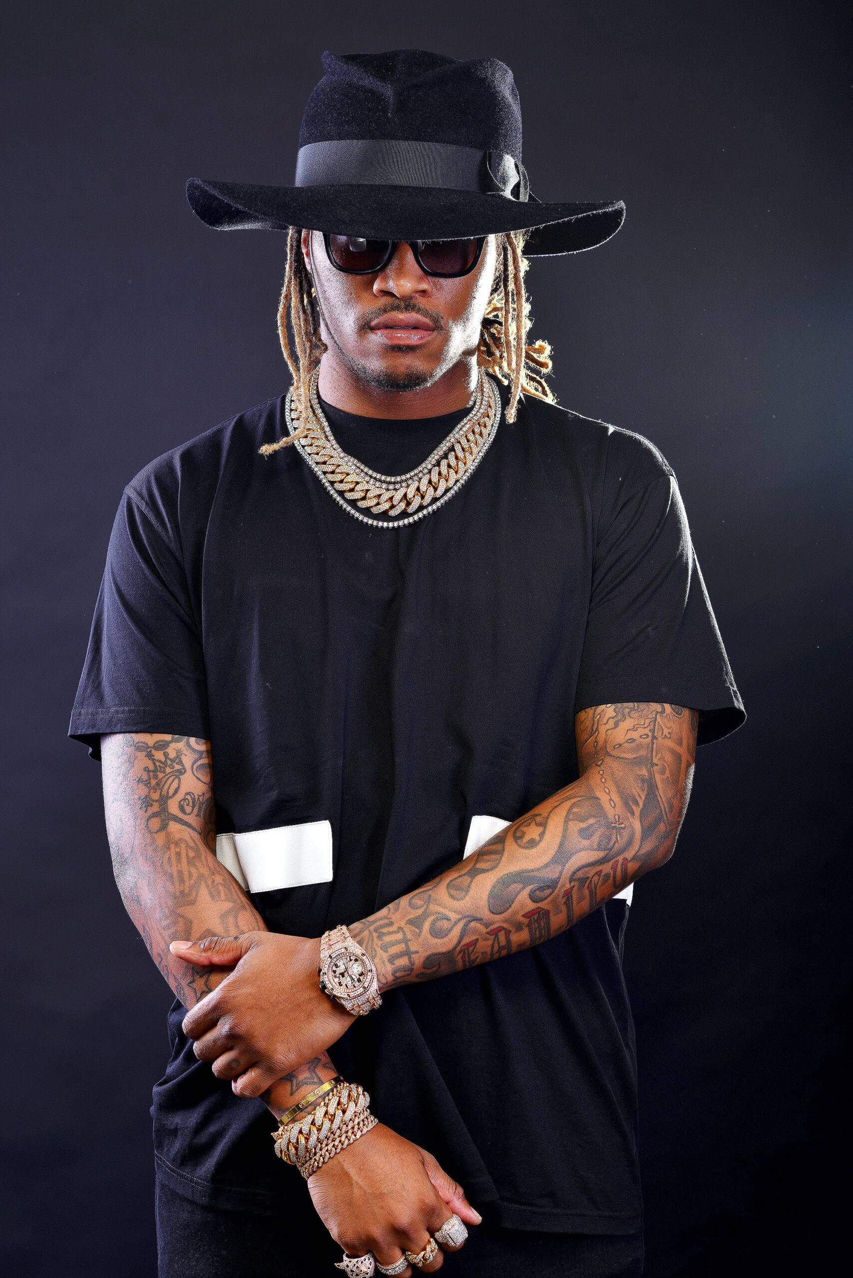
Another part of Future’s style is the way his arm tattoos mix words with small graphic symbols. In a close view, lettering, stars, shaded shapes, and decorative marks share the same space. The result feels personal without being overly polished. Some lines are bold and clean, while others fade into the surrounding work, giving the arms the lived-in look of a collection built over time.
Stars are useful in a layout like this because they can fill awkward gaps. They work around the elbow, between larger script pieces, or near a wrist where a full portrait would feel cramped. Future uses that kind of visual punctuation to keep the arm moving. If you are planning a sleeve, small symbols can act as bridges between the main tattoos rather than being added at random.
Words can do the same job. A short name or phrase creates a strong horizontal or vertical line, and the smaller marks around it can be angled to match the arm. This is one reason an artist should map the whole limb before starting. The same phrase can look balanced on the inner forearm but crowded on the outer arm if the surrounding designs are ignored.
There is also a useful color lesson in Future’s arm work. Most of the visible pieces rely on black and grey, with skin breaks doing much of the separating. That keeps different tattoos from competing for attention. A person could add one muted color accent, but the structure should still work without it. Black and grey contrast keeps a crowded arm readable.
When looking at reference photographs, pay attention to the arm position. Bent elbows compress the skin and can make lettering look shorter. A straight arm gives a clearer sense of scale. Future’s public photos show both views, which is helpful for judging how the designs behave while the body is moving.
The large shoulder and upper-arm pieces
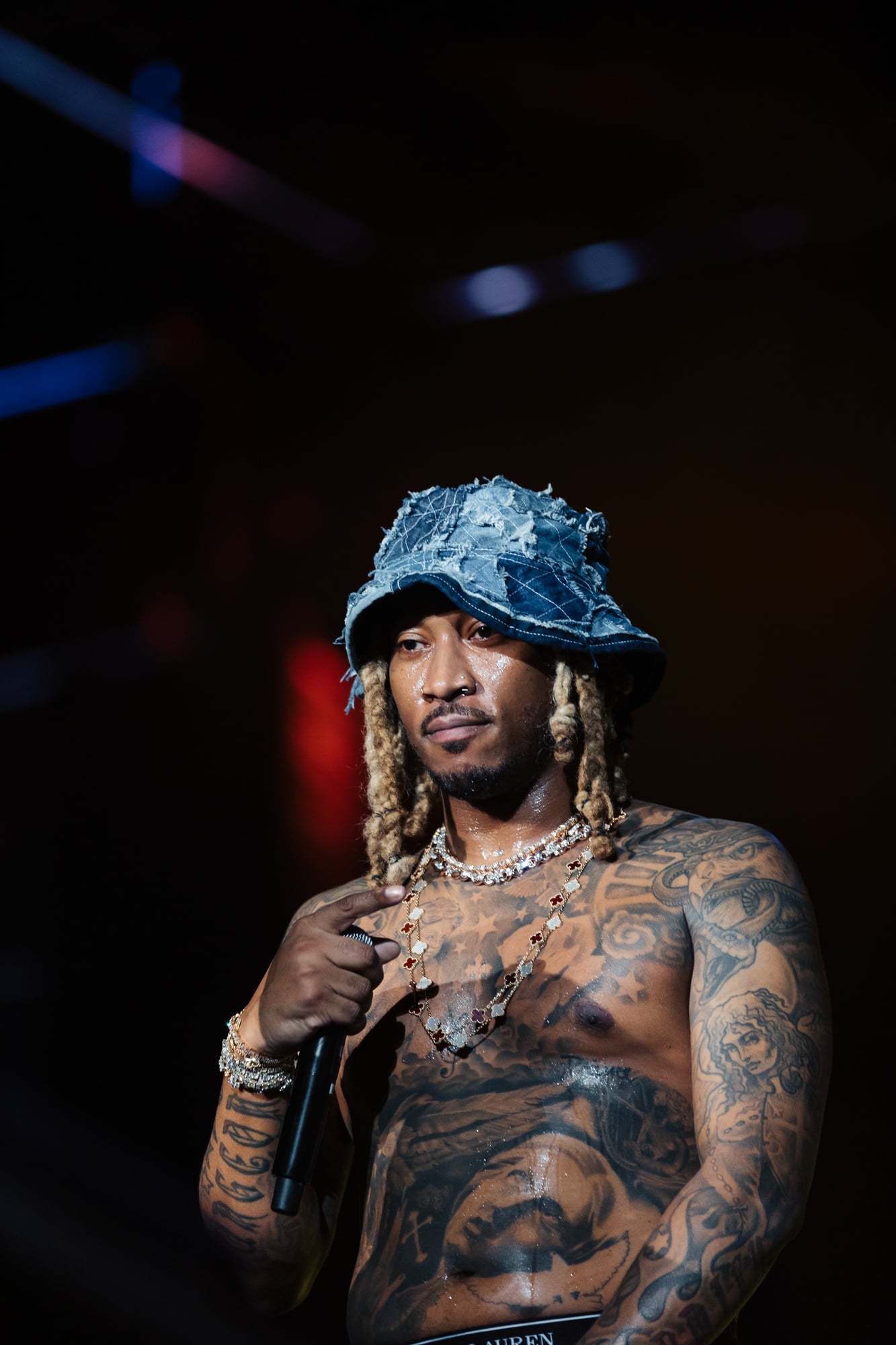
Future’s shoulder and upper-arm tattoos show how a collection can gain weight without turning into a solid block. Larger pieces follow the curve of the shoulder and continue down the arm, giving the sleeve a rounded edge. Portrait details, heavy shadows, and curved lines work together so the artwork stays connected when the arm is relaxed or lifted.
Shoulder placement is especially good for designs that need room. A face, animal, or larger symbol can sit on the rounded cap, while lettering and smaller marks travel toward the biceps and forearm. This creates a visual hierarchy. The biggest tattoo gets the first look, then the eye follows the lines down the arm.
That hierarchy is visible in Future’s photographs because the shoulder work remains clear even when the rest of the outfit is simple. The tattoos are not hidden behind a busy costume or a dramatic edit. Good lighting catches the grey wash and makes the edges easier to study. It also shows why a reference should include the whole shoulder, not only a close crop of one design.
If you want a similar feel, think about how the tattoo will look from the front, side, and back. A shoulder piece can be impressive straight on but lose its shape when the arm turns if the design does not wrap properly. Ask the artist to draw the stencil around the body rather than treating the arm as a flat rectangle. The body changes the picture.
Future’s upper-arm work balances detail with distance. From across a concert venue, it reads as a strong dark sleeve. Up close, the smaller symbols and linework become visible. That two-level effect is a good sign in a large tattoo. It means the design has a clear silhouette as well as details that reward a closer look.
How Future’s tattoo style comes together
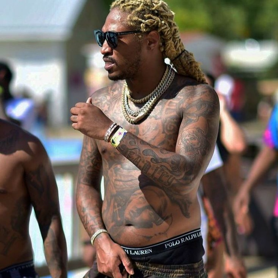
Future’s tattoos feel consistent because the collection shares a visual language even when the subjects differ. Black and grey shading does most of the heavy lifting. Script adds direction. Stars and smaller symbols fill gaps. Portraits and larger figures create focal points. The result is not a perfectly matched sleeve, but it has enough repeated choices to look intentional.
There is a personal side to that mix as well. Family names, music references, crew ties, and spiritual or protective symbols all sit beside fashion-forward imagery. That makes the collection feel like a record of different chapters instead of a single branding exercise. New tattoos can join the layout without erasing older pieces because the style leaves room for contrast.
For your own design, start by listing the meanings that matter before picking images. A name might need clean lettering. A memory might suit a portrait. A period of change might work better as a symbol than a literal scene. Once the ideas are clear, decide which ones deserve the most space. Future’s collection suggests that the largest placements should carry the strongest visual or emotional weight.
Then choose a limited visual approach. You might use black and grey, fine line, traditional color, or a mix, but repeating a few decisions will make separate tattoos feel related. Consistency does not mean every tattoo has to match. It means line weight, shading, spacing, or color choices give the collection a steady rhythm.
Finally, leave room for the collection to grow. A sleeve packed from wrist to shoulder on the first visit can be hard to expand later. Future’s tattoos show the value of negative space and varied scale. Let the main images breathe, use small symbols to connect sections, and revisit the layout whenever a new idea feels important.
If you like musician tattoo layouts with a heavier full-sleeve approach, the Travis Barker tattoo guide is a useful comparison. Future’s approach is more mixed and open, but both collections show how placement can carry as much personality as the subject itself.